Thru app icon
Photo & VideoScreenshot teardown14 min read

Thru App Store screenshots

The App Store screenshot strip for Thru builds its entire argument around a single, disciplined visual contract: the black bottom sheet. Every framed shot cuffs the lower third of the iPhone in absolute black, letting the terrain above change while the information architecture stays put. It is a textbook example of modular storytelling—swipe by swipe, the set trades biomes, not layouts. For designers building their own storefront narratives, the set offers a clear lesson in how to let art direction carry the product promise while UI chrome recedes into rhythm. It also offers a few hard cautions about continuity, truncation, and the moment you break your own frame.

Set published by PRND Corp. · 7 frames analysed

3.0 · 2 ratingsFreev1.10.1Updated 4y ago
Thru App Store screenshot 1
01At a glance

The set in one screen

Framing
iPhone 14 Pro with Dynamic Island, frames 1–6; frame 7 is bezel-less.
Captions
Centered, two-line stack. Semibold/bold sans-serif. Light backgrounds in frames 1–3; dark backgrounds in frames 4–7.
Backdrop
Illustrated landscapes (frames 1–3), Apple Maps hybrid (frame 4), photography (frame 5), badge grid (frame 6), widget previews (frame 7).
Type
SF-style grotesk. Body #9CA3AF, headlines #FFFFFF or #0F172A. Nav icons #4B5560.
UI / copy split
Frame 1-3: roughly 55% illustration, 45% black chrome. Frame 5: 45% photo, 55% text.
Frame 1 job
Establish the core loop—illustrated hiking, daily mileage, waypoint cards.

Sampled palette

#A0C4E0#A0C4E0
#C4C8B8#C4C8B8
#38BDF8#38BDF8
#0A1F1C#0A1F1C
#1A2E24#1A2E24
#1E2E22#1E2E22
02The challenge

What this screenshot set had to solve

The central design challenge is competing against two very different mental models of a hiking app. Shoppers arrive either expecting a fitness tracker or a travel guide. Thru’s screenshots must resolve that tension in the first three swipes without showing enough UI chrome to feel like a spreadsheet, and without showing so much illustration that the app looks like a static picture book. The set needs to prove the art is functional—that the hiker sprite, the mileage counter, and the waypoint card are systemic, not decorative. It also needs to justify a premium position in a category where free map apps already dominate. That means every frame must feel like evidence of depth, not just a pretty wallpaper.

The black bottom sheet is the set’s closest thing to a brand signature—seven frames, six bezels, and one uninterrupted slab of information architecture that refuses to move.
03The approach

How the set argues its case

The designer chose a locked-viewport strategy. Rather than cropping full-screen art and letting UI float, they anchored every framed screen to a bottom black sheet with fixed corner radius, fixed nav height, and fixed stat placement. This makes the device feel like a window whose lower third is always the dashboard and whose upper half is the world. The gamble is that shoppers scrolling at speed will recognize the repeating silhouette before they read a single caption. To reduce cognitive load, the first three frames keep the status bar at Apple’s default 9:41, use light outer backgrounds, and place the hiker sprite at the same visual latitude. By frame 4 the set pivots hard: dark outer background, live map, real photography, and eventually no bezel at all. The strategy is essentially bait-and-switch—lure with cozy illustration, then prove utility with data density.

The screenshots treat Thru as a lifestyle collector’s app first and a utility second. The illustration frames lead because they signal taste; the map and photo frames follow because they signal substance. It is a luxury-goods sequencing logic applied to a fitness-adjacent product.

04Frame by frame

Every screenshot, and the job it does

Thru App Store screenshot 1 — Virtually hike the Pacific Crest Trail
01

Virtually hike the Pacific Crest Trail

On-frame caption: “Virtually hike the / Pacific Crest Trail

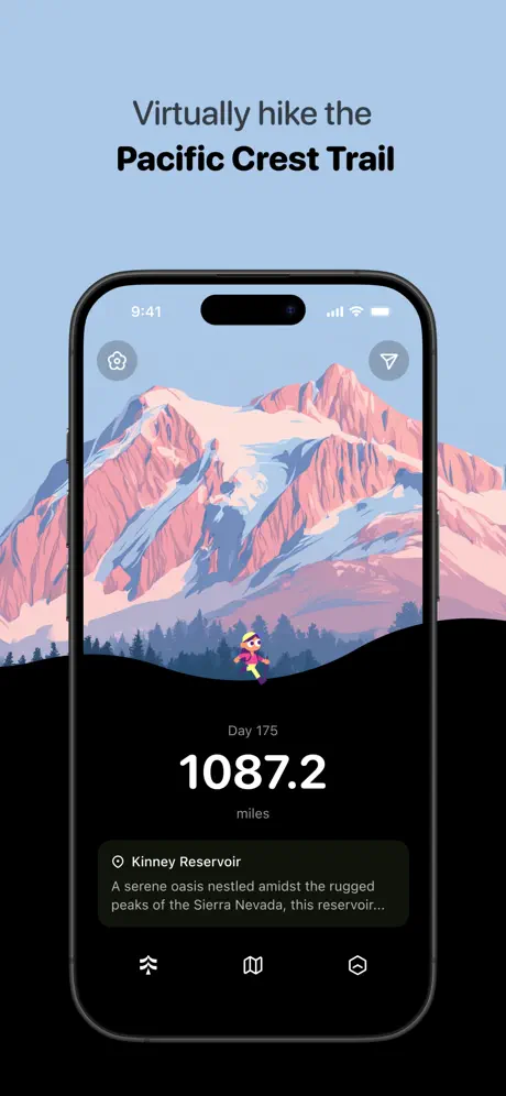
The opening shot sets the template that frames 2 and 3 will repeat. The outer background is a flat, powdery blue at roughly #A0C4E0. Centered above the device, the caption splits its weight: “Virtually hike the” is rendered in a medium-weight sans-serif at approximately 32 pt, while “Pacific Crest Trail” drops to a heavy bold near #0F172A, closer to 40 pt. Inside the iPhone 14 Pro bezel, the upper 55 percent is an illustration of the Sierra Nevada in dusty rose #E8A0A0 and periwinkle shadow #8CA8C8. A tiny hiker sprite—pink torso, yellow hat, trekking poles—sits dead center where the mountain slope meets the black foreground sheet. That sheet is absolute black #000000 with a gentle upward arc that scallops across the lower third. Centered within it, “Day 175” appears in #6B7280 at caption size, “1087.2” in a stark white bold at roughly 48 pt, and “miles” back in #6B7280. Below, a waypoint card labeled “Kinney Reservoir” uses a slightly lifted black surface—perhaps #111111—with 16 px corner radius and #E5E5E5 body copy reading “A serene oasis nestled amidst the rugged peaks of the Sierra Nevada, this reservoir…” The bottom nav shows three 24 px icons in #4B5560: a hiker, a map, and a hexagon. The status bar reads 9:41. Everything about this frame is measured to feel calm, aspirational, and mechanically repeatable.
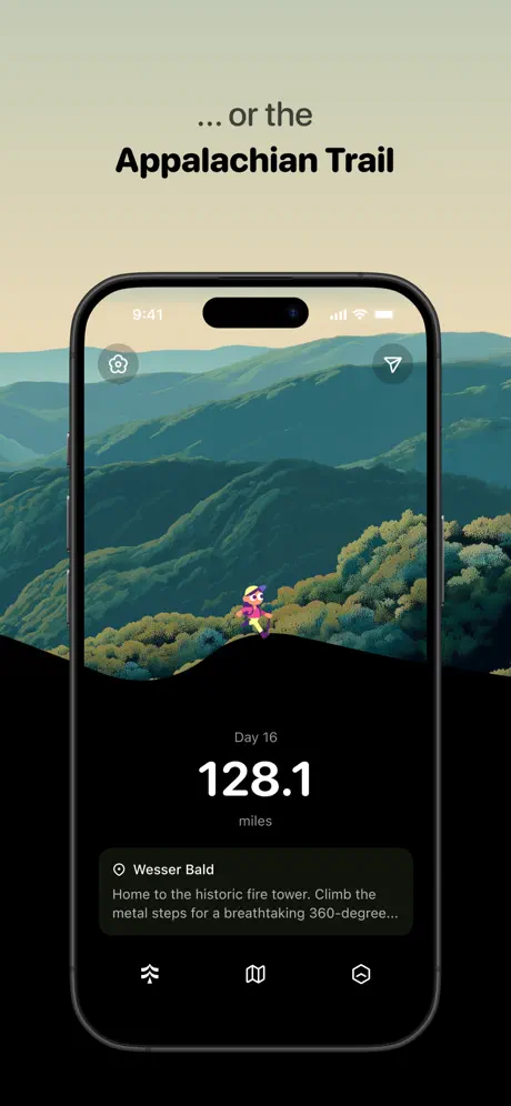
Thru App Store screenshot 2 — … or the Appalachian Trail
02

… or the Appalachian Trail

On-frame caption: “... or the / Appalachian Trail

Frame 2 proves the first frame was a system, not a one-off. The outer background shifts to a muted olive-beige at #C4C8B8, and the caption swaps to “… or the” in regular weight and “Appalachian Trail” in the same bold sans-serif. The device frame, status bar, and black bottom sheet are pixel-identical to frame 1. Only the biome changes: the illustration now shows layered Appalachian ridgelines in deep emerald #1A4D3E and moss #6B8E23, fading into atmospheric haze. The hiker sprite is repositioned to the same visual latitude, maintaining the stage-like composition. Inside the black sheet, the label now reads “Day 16” and the mileage is “128.1,” set in the exact same typographic lockup. The waypoint card introduces “Wesser Bald” with body copy “Home to the historic fire tower. Climb the metal steps for a breathtaking 360-degree…” The truncation is identical in character count to frame 1, suggesting the card component enforces a strict three-line clamp. By keeping every scrap of chrome identical, the designer forces the viewer’s eye to the art—exactly what a catalog-style set should do.

Thru App Store screenshot 3 — … through beautiful illustrated landscapes
03

… through beautiful illustrated landscapes

On-frame caption: “... through beautiful / illustrated landscapes

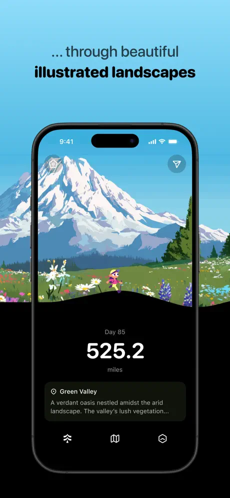
The third frame completes the triptych. The outer background is now a saturated cerulean #38BDF8—much more electric than the dusty palettes of frames 1 and 2. The caption reads “… through beautiful” in regular weight and “illustrated landscapes” in bold. Inside the phone, the illustration switches to an alpine meadow: a white-capped peak reminiscent of Mount Rainier (#F3F4F6) rises against a bright sky, while the foreground is a field of white, yellow, and purple wildflowers. The hiker sprite is again centered at the fold. The black bottom sheet now hosts “Day 85,” “525.2,” and a card for “Green Valley” with the text “A verdant oasis nestled amidst the arid landscape. The valley's lush vegetation…” This frame is doing the heavy lifting of proving the art direction is a platform, not a single asset. It also introduces the most saturated color in the set so far, acting as a visual crescendo before the sequence pivots to darker, more utilitarian frames. The三本連続 light-background captions give way after this point, making frame 3 the last time the viewer sees pastel negative space behind the phone.

Thru App Store screenshot 4 — Track your progress on an interactive map
04

Track your progress on an interactive map

On-frame caption: “Track your progress on / an interactive map

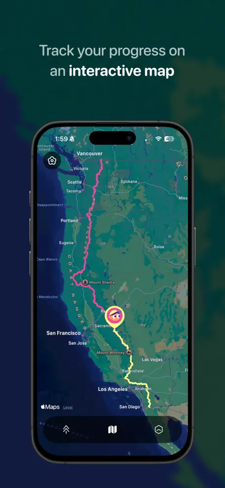
Here the set pivots hard. The outer background becomes a deep teal-black #0A1F1C with a faint green halo blur behind the device. The caption switches to “Track your progress on” in #9CA3AF and “an interactive map” in #FFFFFF—reversing the previous dark-on-light logic. Inside the phone, the illustration is gone, replaced by Apple Maps in hybrid satellite mode showing the western United States. A thick route stroke runs from the Canadian border to Southern California: hot pink #EC4899 in the northern half, shifting to yellow #FDE047 below what appears to be Mount Shasta. The hiker sprite is now a map marker with a neon glow. City labels—Vancouver, Seattle, Portland, San Francisco, Los Angeles—appear in Apple’s standard type. The bottom nav is still present but now frosted over the map, and the “Maps” attribution is partially visible at the lower left. The status bar now reads 1:59 and shows a location-services arrow, a jarring break from the 9:41 continuity of the first three frames. The frame is dense and informative, but the tonal shift from pastel illustration to dark map is so abrupt that it risks feeling like a different app.

Thru App Store screenshot 5 — with recent photos and trail information
05

with recent photos and trail information

On-frame caption: “with recent photos / and trail information

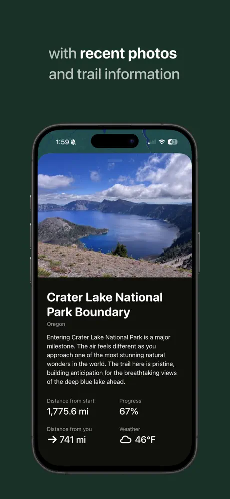
Frame 5 keeps the dark outer background at #1A2E24 and the light-on-dark caption treatment: “with recent photos” in #9CA3AF, “and trail information” in #E5E7EB. Inside the device, the top 45 percent is a photorealistic image of Crater Lake—deep blue water, rugged caldera rim, scattered clouds. This is the first time the set abandons illustration for photography, and the effect is stark. Below the photo, the black sheet resumes, now packed with text. The title “Crater Lake National Park Boundary” sits in a bold white sans-serif, followed by “Oregon” in #6B7280. The body copy reads: “Entering Crater Lake National Park is a major milestone. The air feels different as you approach one of the most stunning natural wonders in the world. The trail here is pristine, building anticipation for the breathtaking views of the deep blue lake ahead.” Beneath that, a 2×2 stat grid uses #6B7280 labels (“Distance from start,” “Progress,” “Distance from you,” “Weather”) and white values (“1,775.6 mi,” “67%,” “→ 741 mi,” “☁ 46°F”). The typography is smaller here than in the mileage counters of frames 1–3, prioritizing reading over scrolling. It is the most information-dense frame in the set, and it finally answers the question of what the app actually *does* with a trail.

Thru App Store screenshot 6 — Unlock unique milestone badges
06

Unlock unique milestone badges

On-frame caption: “Unlock unique / milestone badges

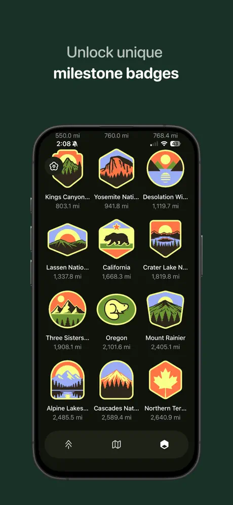
The sixth frame adopts the same dark forest-green background #1E2E22 used in frame 5. The caption says “Unlock unique” in #9CA3AF and “milestone badges” in white. Inside the phone, the screen is a 3-column grid of collectible badges rendered in a flat, vintage park-service illustration style. Each badge sits on a near-black rounded cell—perhaps #151B18—with a hexagonal or shield-shaped icon above a truncated title and a mileage threshold. Visible rows include: “Kings Canyon…” at 803.1 mi, “Yosemite Nati…” at 941.8 mi, “Desolation Wi…” at 1,119.7 mi, “Lassen Natio…” at 1,337.6 mi, “California” at 1,668.3 mi, “Crater Lake N…” at 1,819.6 mi, “Three Sisters…” at 1,908.1 mi, “Oregon” at 2,101.6 mi, “Mount Rainier” at 2,405.1 mi, “Alpine Lakes…” at 2,485.5 mi, “Cascades Nat…” at 2,589.4 mi, and “Northern Ter…” at 2,640.9 mi. Above the first row, small labels read “550.0 mi,” “760.0 mi,” and “768.4 mi,” suggesting category thresholds. The truncation is aggressive: “Yosemite Nati…” and “Desolation Wi…” are cut mid-word rather than faded or ellipsized cleanly, which makes the grid feel cramped. The palette of the badges themselves—orange #F97316, yellow #EAB308, slate #475569—introduces warmth that fights the cool green background. Structurally, this frame validates the loop: hike enough miles, earn a patch. It is gamification shown rather than told.

Thru App Store screenshot 7 — + Beautiful widgets for your home screen
07

+ Beautiful widgets for your home screen

On-frame caption: “+ Beautiful widgets / for your home screen

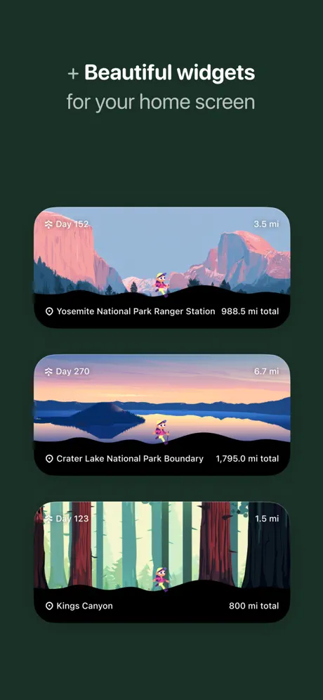
The final frame breaks the device-frame convention entirely. There is no iPhone bezel, no Dynamic Island, no status bar—only the dark green #1E2E22 background and three standalone widget previews stacked vertically with generous padding. The caption reads “+ Beautiful widgets” in white with a literal plus prefix, and “for your home screen” in #9CA3AF. Each widget is a wide-rounded rectangle, roughly 3.5:1 aspect ratio, with 22 pt corner radii. They reuse the illustration language from the first three frames: a Yosemite cliffs scene at “Day 152,” a Crater Lake sunset at “Day 270,” and a redwood forest at “Day 123.” Every widget keeps the hiker sprite at the bottom center, above a black info bar. The top left of each widget shows the day count and a small trail icon; the top right shows the daily mileage (“3.5 mi,” “6.7 mi,” “1.5 mi”); the bottom left shows the location name; and the bottom right shows the cumulative total (“988.5 mi total,” “1,795.0 mi total,” “800 mi total”). Because there is no bezel, the widgets float like native iOS artifacts, which is arguably the point—but after six frames of rigid iPhone framing, the structural absence feels like a mistake rather than a deliberate reveal.

05The craft

Captions, colour and the mechanics of the sell

Caption pattern

The captions use a staggered emphasis pattern. Frames 1–3 front-load the trail names and visual promise: “Virtually hike the / Pacific Crest Trail,” “… or the / Appalachian Trail,” “… through beautiful / illustrated landscapes.” Frames 4–7 switch to feature claims: “Track your progress on / an interactive map,” “with recent photos / and trail information,” “Unlock unique / milestone badges,” “+ Beautiful widgets / for your home screen.” The copy is terse, but the typographic hierarchy is inconsistent—the light-background frames use near-black #0F172A for the bold word, while dark-background frames use white #F9FAFB. The shift happens at frame 4 without a transitional device, so the caption voice feels like a different designer took over at the halfway mark.

Visual system

At the heart of the system is a high-contrast binary: vivid, textured illustration above; flat, informational black below. The illustration style is low-poly, posterized geography with a consistent warm-cool palette—salmon and periwinkle in the Sierras, emerald and teal in the Appalachians, cerulean and white in the alpine meadow. The black sheet uses a subtle upward curve that crops the landscape, creating a stage-like proscenium for the hiker sprite. UI elements inside the sheet are tokenized: waypoint cards sit at 16px internal padding, stats are centered with a 4pt baseline shift between number and label, and the bottom nav uses 24px icons with no labels. The result is a UI that feels like a heads-up display rather than a mobile app.

The thumbnail test

Frame 1 wins on scroll. The pink Sierra peaks against powder blue are high-contrast and unlike the green topo maps that dominate the category. The sprite adds character scale. At thumbnail size the black bottom sheet reads as a bold horizon line, not clutter.

Conversion mechanics

The set moves from emotional promise (frames 1–3) to functional proof (frames 4–5) to retention mechanics (frames 6–7). The strongest conversion beat is frame 5, where real photography and hard data finally answer the shopper’s unspoken question: “What do I actually get?” The weakest is frame 7, which exits on a feature rather than a feeling. Widgets are nice, but they do not close the narrative loop opened by the Pacific Crest Trail in frame 1.

06Where it slips

What we would change

Status bar discontinuity

Frames 1–3 show the Apple-default 9:41. Frames 4–6 jump to 1:59 and add a location arrow. At screenshot scale, this reads as careless staging rather than storytelling. The fix is simple: lock every framed screen to 9:41 and remove extraneous status icons. If the 1:59 timestamp was meant to signal a different time of day, it is too subtle to register; shoppers will only notice that something feels off.

Frame 7’s missing bezel

After six frames of identical iPhone 14 Pro chrome, frame 7 removes the device entirely. The widgets float on the dark green background with no context—no Home Screen grid, no app icon pairings, no shadow offset. The abrupt absence of the bezel breaks the parallax rhythm of the set. The fix is to either place the widgets inside a device frame showing the iOS Home Screen, or to add a faint drop shadow and page dots so the widgets read as native objects rather than orphaned rectangles.

Mid-sequence tonal whiplash

Frames 1–3 use light, airy outer backgrounds and dark captions. Frames 4–7 switch to dark outer backgrounds and light captions. There is no bridge frame. The transition happens between frame 3 (bright cyan) and frame 4 (deep teal), and it feels like two different campaigns stitched together. A transitional fourth frame—perhaps a dark-mode trail vista—could have eased the shift and preserved chromatic continuity.

Photography versus illustration tension

Frame 5 introduces a photorealistic Crater Lake image after three fully illustrated frames. The juxtaposition is honest—the app clearly mixes both media—but the sudden shift undermines the art-direction promise made in frame 3 (“beautiful illustrated landscapes”). The fix is to either preface the photo with a caption that reads “Real trail photography” or to move frame 5 later in the sequence so the illustrated world is fully established before reality intrudes.

Badge grid truncation

Frame 6’s 3-column grid forces mid-word truncation on nearly every badge. “Yosemite Nati…” and “Desolation Wi…” look broken, not stylized. The component needs either a 2-column layout at this width, which would allow full names like “Yosemite National Park” to breathe, or a fade-to-black ellipsis treatment rather than a raw character clamp. Alternatively, dropping the mileage from the cell and moving it to a detail view would free up horizontal space for the labels.

07The recipe

How to apply this to your own app

  1. Preserve a repeating UI silhouette across your first three frames so that art changes register immediately as variety, not chaos.

    Thru’s black bottom sheet is the set’s closest thing to a brand signature. By keeping the nav, stat placement, and corner radius identical through frames 1–3, the designer trained the eye to look only at the landscape. If you are selling a content-rich app, identify the one surface—nav bar, bottom sheet, or card—that can become your visual constant, then rotate everything else around it.

  2. Use the status bar as a continuity tool, not a realism prop.

    Apple’s 9:41 exists for a reason: it signals a controlled presentation. If your screenshots hop between times and battery percentages, you inject noise. Lock the clock, hide unnecessary icons, and treat the status bar as part of the layout grid rather than an afterthought.

  3. Match your device-frame commitment to your final frame.

    If you begin with a bezel, end with a bezel, or build a deliberate off-ramp. Frame 7’s naked widgets feel like a rendering error because frames 1–6 established such strict spatial rules. When showing Home Screen features, place them on an actual Home Screen mockup—with wallpaper, page dots, and adjacent app icons—so the shopper can project the widget onto their own device.

  4. Truncate with taste, or reflow.

    Mid-word truncation is a sign that your grid is too dense for the content. If your screenshot shows a catalog of named items, test it at thumbnail size. If the labels break, move to fewer columns, smaller type, or a tiered information architecture. Clean data reads as premium; broken words read as unfinished.

08Takeaways

Five things worth stealing

  • The black bottom-sheet is the set’s structural spine; every frame reinforces it.
  • Illustration-led frames should outnumber utility frames if your app’s differentiation is visual.
  • A single structural break—like dropping the device bezel—can undo the continuity built over six prior frames.
  • Status bar consistency is invisible until it is missing, then it dominates.
  • Information density (frame 5) converts best when it is preceded by emotional context (frames 1–3).
09The verdict

What the set actually achieves

A narrative arc that reads: trail variety (frames 1–2), art quality (frame 3), geographic scope (frame 4), informational depth (frame 5), achievement systems (frame 6), and platform integration (frame 7). The sequence converts a simple virtual-hike concept into a collectible, mappable, widget-able experience.

Designers launching content-forward lifestyle apps—especially those relying on illustration, map integration, or collectible mechanics—who need a template for balancing beauty with proof. Also useful for anyone debating whether to end on a feature (widgets) or a feeling (the trail).

10Questions

Frequently asked

Why does the app show 9:41 in some frames and 1:59 in others?

It appears to be an oversight. Frames 1–3 use Apple’s default 9:41 presentation time, while frames 4–6 shift to 1:59 with a location arrow. There is no persuasive visual reason for the change; it reads as a staging inconsistency.

Why does frame 7 lack an iPhone bezel?

The designer likely wanted the widgets to read as native iOS Home Screen objects. However, because frames 1–6 establish such a rigid device-frame rhythm, the absence feels abrupt. A Home Screen context mockup would have solved this while keeping the widgets prominent.

Is the illustration style consistent across all biomes?

Yes. The low-poly, posterized treatment, hiker sprite, and color palette proportions remain consistent from the Sierra Nevada frame through the Appalachian and alpine meadow frames. Only frame 5 introduces photography, and frame 4 introduces the Apple Maps layer.

What typeface is used in the captions?

The captions appear to use a clean, neo-grotesque sans-serif—likely SF Pro or a close equivalent—with a weight contrast between the regular first line and the bold second line. Exact font identification is impossible from raster screenshots alone.

11Keep reading

Build your own screenshot set

The full set

7 shots
Thru App Store screenshot 1Thru App Store screenshot 2Thru App Store screenshot 3Thru App Store screenshot 4Thru App Store screenshot 5Thru App Store screenshot 6Thru App Store screenshot 7

About the app

불안하던 중고차, THRU가 바꿉니다. 기술 인증 중고차 - THRU (쓰루) 1. 품질이 뛰어난 차만 선별해서 판매합니다. Dynamo 주행 테스트, 전문 미케닉 점검을 통과한 차만 판매합니다. 2. 이력이 깨끗한 차만 선별해서 판매합니다. 사고 교환 이력이 없는 무사고에 렌터카 이력이 없는 차만 PRND Corp., via the App Store listing.

Screenshots and store metadata belong to PRND Corp.. They are shown here for design commentary and criticism. The analysis on this page is original work by floow.design. View the original listing.

More Photo & Video teardowns

Browse all →