sway app icon
Photo & VideoScreenshot teardown14 min read

sway App Store screenshots

Most App Store carousels treat screenshots as spec sheets. Sway treats them as a zine spread: eight frames, eight personalities, and a single pastel gradient holding the chaos together. This is a case study in maximalist cohesion—how to sell a multi-mode camera app without letting the UI skins fragment the narrative.

Set published by RockyRoad · 9 frames analysed

4.8 · 3.4K ratingsFreev1.0.35Updated 8mo ago
sway App Store screenshot 1
01At a glance

The set in one screen

Framing
Centered iPhone hardware mockups, occasionally overlapped by collage assets; continuous pastel gradient background.
Captions
Bold rounded sans-serif, near-black or white depending on background contrast; lowercase, emoji-heavy, abbreviated copy.
Backdrop
Organic lavender #C8B6FF, tangerine #FFB067, soft cyan #A0C4FF, and lemon #FDFFB6 blobs that persist across all frames.
Type
Headlines live in the upper third outside the device. No two frames share the exact same sizing, but the voice—playful, casual, Gen Z—is constant. Copy reads like a text thread rather than a feature list.
UI / copy split
Heavy emphasis on in-app UI; 70–80% of each frame is device screen real estate. Captions are short, usually one to two lines.
Frame 1 job
Brand positioning and tonal promise. The frame privileges mood over feature documentation, establishing that this is not a utilitarian camera replacement.

Sampled palette

#C8B6FF#C8B6FF
#FFB067#FFB067
#A0C4FF#A0C4FF
#FDFFB6#FDFFB6
#1A1A1A#1A1A1A
#0F0F0F#0F0F0F
02The challenge

What this screenshot set had to solve

The central design tension here is breadth versus brand. Sway does not ship one camera experience; it ships at least eight distinct ones, each with its own color system, knob geometry, background texture, and cultural reference point. In the App Store, that multiplicity is a liability if the frames read as disjointed demos. The team had to solve three problems at once. First, signal instant camera utility to a scroller who is judging in under two seconds. Second, prove variety without making the app feel like an incoherent filter pack. Third, maintain a recognizable silhouette across frames when the internal UI jumps from glossy black VHS scan-lines to wood-grain photobooth casings to neon club dials. The external canvas—pastel gradients, emoji, 3D assets—had to work overtime as the glue. Additionally, because each mode is so visually loud, the screenshots risk UI fatigue; there is no quiet frame, no negative space to reset the eye. The challenge, then, was not just unification but modulation: how to keep the energy high without turning the carousel into a visual scream.

Maximalism only works when the grid underneath is invisible. Here, the grid peeks through.
03The approach

How the set argues its case

The team anchored the chaos with three non-negotiable constants. First, the background gradient never changes its palette; whether the frame shows dark-mode VHS or soft-pink Lovecam, the same lavender-to-orange-to-cyan wash sits behind the phone. That continuity trains the eye to recognize Sway instantly. Second, every frame centers a physical device, so the shopper always knows where to look. Even when collage elements overlap, the phone remains the focal point. Third, the copy strategy was flattened into a single conversational register—lowercase, abbreviations, emojis—so the voice feels like one person speaking even as the visuals mutate. The sequencing itself follows a deliberate energy arc: Frame 1 establishes the blur/editor premise, Frame 2 adds retro nostalgia, Frame 3 widens to the full mode library, Frames 4–8 drill into individual spices (dreamy, booth, fisheye, club, love). It is a product tour disguised as a mood board.

Sway positions itself as the anti-system camera. The native iOS Camera is invisible; Sway is hyper-visible. The screenshots never compete on professionalism or precision. Instead, they sell personality and subcultural fluency—VHS grain, photobooth strips, club magenta, sticker-bombed hearts. The target user is someone who thinks of photos as artifacts rather than documents.

04Frame by frame

Every screenshot, and the job it does

sway App Store screenshot 1 — Blur
01

Blur

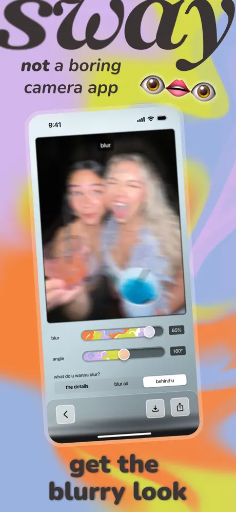
On-frame caption: “sway / not a boring camera app / get the blurry look

The opening frame is brand-first. A white iPhone bezel floats dead-center against the signature gradient. The interior UI loads the blur editor: a dark header with the word 'blur' in small white sans-serif, a photo viewport showing two figures smeared by heavy directional motion blur, and a gray control panel below. Two horizontal sliders dominate the panel. The 'blur' slider uses a psychedelic track of orange, yellow, and purple smears with a circular lavender knob; a small '85%' label sits right-justified. The 'angle' slider repeats the motif, reading '180°'. Beneath them, a three-up segmented pill group asks 'what do u wanna blur?' with options 'the details,' 'blur all,' and 'behind u.' The active pill uses a solid white fill against the gray ground. A bottom action bar holds a back chevron, download, and share icon inside soft rounded-square containers with 1pt borders. Outside the phone, the word 'sway' is cropped aggressively at the top edge in a bulbous black serif, while 'not a boring camera app' sits below in italic sans-serif. The 👁️💋👁️ emoji cluster anchors the right side. The caption 'get the blurry look' is set in bold near-black sans-serif at the bottom. The frame refuses to explain mechanics; it sells attitude.
sway App Store screenshot 2 — VHS
02

VHS

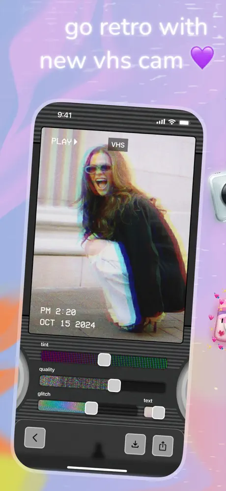
On-frame caption: “go retro with new vhs cam 💜

Frame 2 pivots to dark mode. The device bezel is black, and the app interior uses a charcoal ground (#0F0F0F) with subtle horizontal scan-line texture. The viewport simulates a camcorder: a 'PLAY ▶' badge in the upper left, a 'VHS' pill in the upper right, and a burned-in timestamp reading 'PM 2:20 OCT 15 2024' at the lower left of the footage. The photo shows severe chromatic aberration—cyan and magenta fringing around the subject. Below the viewport, three sliders use square white knobs rather than circles, immediately signaling a different toolset. The 'tint' track gradients from magenta to green; 'quality' is filled with TV-static noise; 'glitch' uses a rainbow holographic strip. A 'text' toggle sits at the bottom right. The bottom nav is dark with standard icons. Externally, the background shifts to a grainy lavender with faint scratch textures. A silver camera body intrudes from the right edge, and a small pink Game Boy–like device with hearts floats further right. The headline is white, creating a light-dark alternation with Frame 1. The frame reads as a love letter to analog decay.

sway App Store screenshot 3 — Fresh Cams
03

Fresh Cams

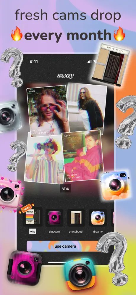
On-frame caption: “fresh cams drop 🔥every month🔥

This is the mode-selector proof point, and it breaks the single-device grammar established in the first two frames. A black iPhone sits slightly off-center, surrounded by a maximalist collage of foil question-mark balloons, 3D cameras, and a 'PHOTO BOOTH' sign. On-screen, the app shows four stacked polaroids demonstrating VHS output, a 'vhs' label, and a horizontal row of camera modes: 'vhs,' 'clubcam,' 'photobooth,' 'dreamy.' Each mode has a skeuomorphic camera icon; 'vhs' carries a 'new!' banner. A rainbow-gradient 'use camera' button sits at the bottom. The internal 'sway' wordmark appears centered at the top of the screen in white script. Externally, the headline returns to near-black, flanked by fire emojis. The density is intentionally overwhelming—there are at least six peripheral props competing for attention. While it communicates variety, the UI elements inside the phone become hard to parse because the assets outside fight for the same contrast range. This frame functions as the set's catalog page, but the visual noise is an order of magnitude higher than its neighbors.

sway App Store screenshot 4 — Dreamy Cam
04

Dreamy Cam

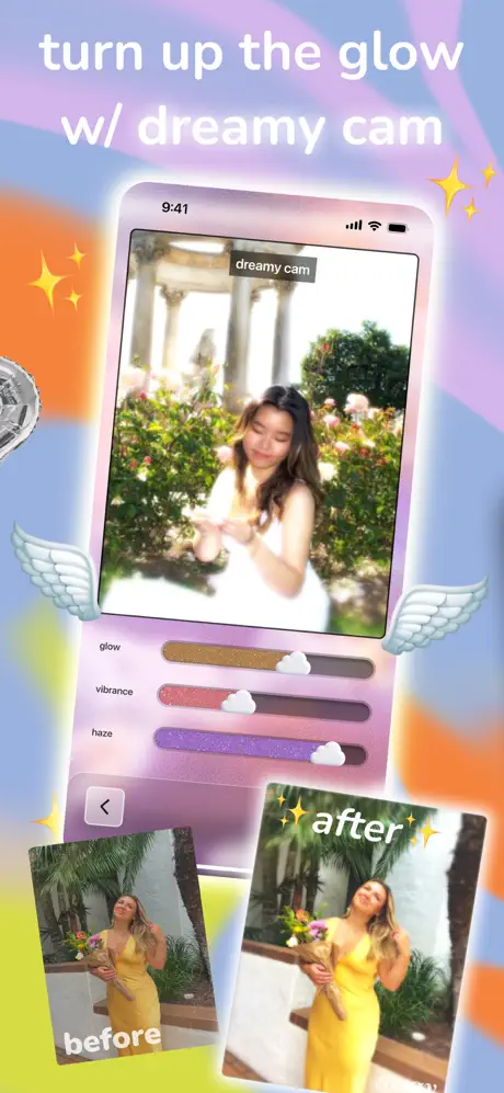
On-frame caption: “turn up the glow w/ dreamy cam

Frame 4 re-centers the device and introduces a before/after persuasion tactic. The phone appears to glow with a lavender aura that bleeds into the background. The interior UI is light again, labeled 'dreamy cam.' The photo shows a figure in a garden with heavy bloom and lifted blacks. Three sliders—'glow,' 'vibrance,' and 'haze'—use distinct glitter textures (gold, rose, purple) and cloud-shaped knobs, a tactile motif not seen elsewhere. A back chevron sits bottom-left. Outside the device, small angel wings flank the mid-section. At the bottom, two physical photo thumbnails tilt in opposite directions: the left labeled 'before' shows a flat image of a figure in a yellow dress; the right labeled 'after' shows the same image with haze and glow added. The 'after' tag is decorated with yellow sparkles. The exterior headline is white, with additional sparkles on the right. This frame is the most explicit about utility; it literally shows the value proposition in a split comparison. The soft focus throughout gives it the lowest contrast of the set, which makes it feel gentle but slightly harder to read at thumbnail scale.

sway App Store screenshot 5 — Photo Booth
05

Photo Booth

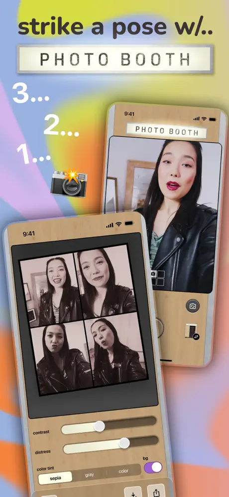
On-frame caption: “strike a pose w/.. PHOTO BOOTH

Here the set abandons the standard iPhone shell for twin devices wrapped in faux-wood casings that evoke vintage photobooth machines. The front device dominates lower-left, showing a four-up strip of black-and-white portraits with a figure making varied faces. Its UI sits on a tan ground: 'contrast' and 'distress' sliders with cream tracks, and a 'color tint' segmented control with options 'sepia,' 'gray,' and 'color,' the active tab filled with a saturated violet (#8B5CF6). The rear device is smaller, offset to the upper right, showing a live preview with a 'PHOTO BOOTH' marquee label at top and a grid icon and shutter button on the right rail. A countdown '3... 2... 1...' with a retro camera graphic runs down the left margin. The external headline uses near-black for 'strike a pose w/..' and a lightbox marquee treatment for 'PHOTO BOOTH.' The amber wood grain introduces a warm material completely absent from the surrounding pastel spectrum. While charming, the jump in device material and layout grammar fractures the swipe narrative; nothing in Frames 1–4 prepared the shopper for wooden hardware twins.

sway App Store screenshot 6 — Fisheye
06

Fisheye

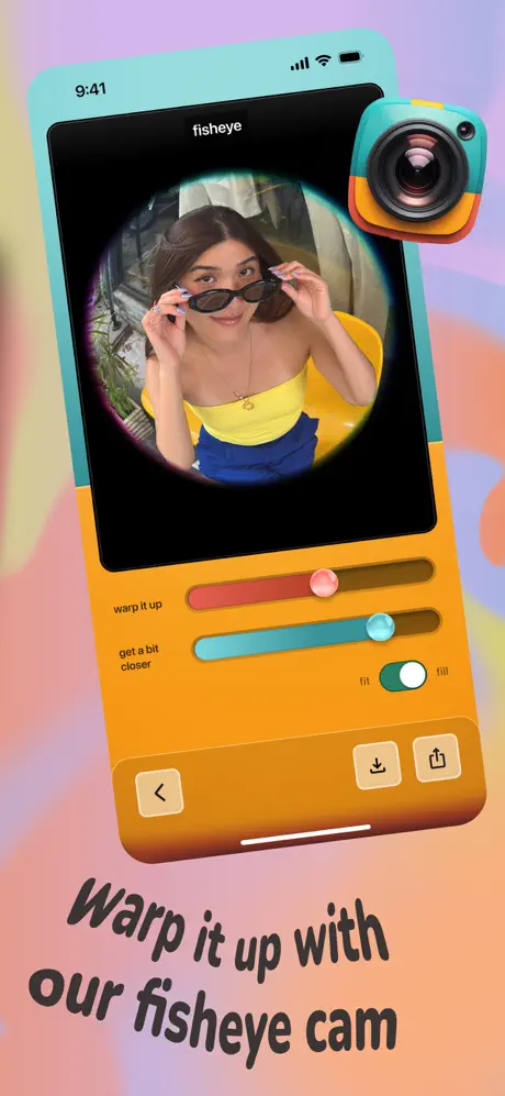
On-frame caption: “Warp it up with our fisheye cam

Frame 6 returns to a single device but wraps it in a two-tone skin: aqua top (#2EC4B6) and warm orange bottom (#FF9F1C). The screen is black, framing a circular fisheye lens view of a figure in a yellow top and blue bottoms holding sunglasses. Two horizontal sliders read 'warp it up' (red track, round red knob) and 'get a bit closer' (aqua track, round aqua knob). A 'fit / fill' toggle uses a green active pill (#22C55E). The bottom action bar is orange. A 3D camera icon matching the device colorway hovers at the top right. The headline is italicized near-black and unusually placed in the lower third rather than the upper third. The circular photo crop and the tilted italic type give this frame the strongest rotational energy in the set. The color contrast between the black viewport and the orange/aqua shell is severe and effective, though the bottom headline placement disrupts the top-heavy pacing of the carousel.

sway App Store screenshot 7 — Club Cam
07

Club Cam

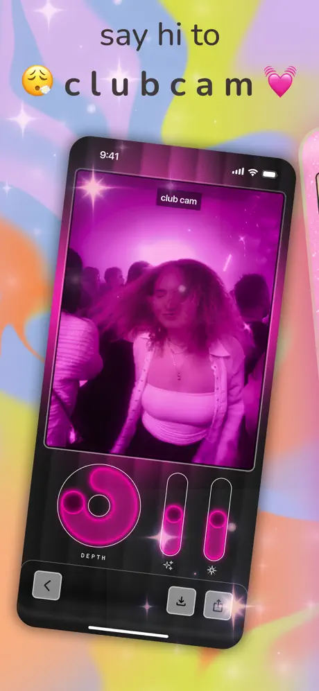
On-frame caption: “say hi to 😮‍💨 c l u b c a m 💓

The aesthetic goes full nightlife. The iPhone is black. The viewport shows a figure dancing under heavy magenta lighting with lens orbs and light streaks; a 'club cam' pill sits at top center. The control panel abandons horizontal sliders for a large circular 'DEPTH' dial rendered in neon pink (#FF006E) with concentric rings, plus two vertical faders with matching neon fill. One vertical slider is labeled with a sparkle icon, the other with a starburst. The bottom nav is dark with subtly glowing icons. Externally, the background continues the standard pastel wash, but the headline is widely kerned—'c l u b c a m'—with a yawning emoji and a vibrating heart emoji. White sparkles overlay the background. The neon against pastel is deliberately abrasive, simulating the disorienting chroma of a club. Of all the frames, this one pushes farthest from iOS design language, which is precisely the point. However, the vertical sliders sit very close to the device edges, visually compressing the interactive area.

sway App Store screenshot 8 — Lovecam
08

Lovecam

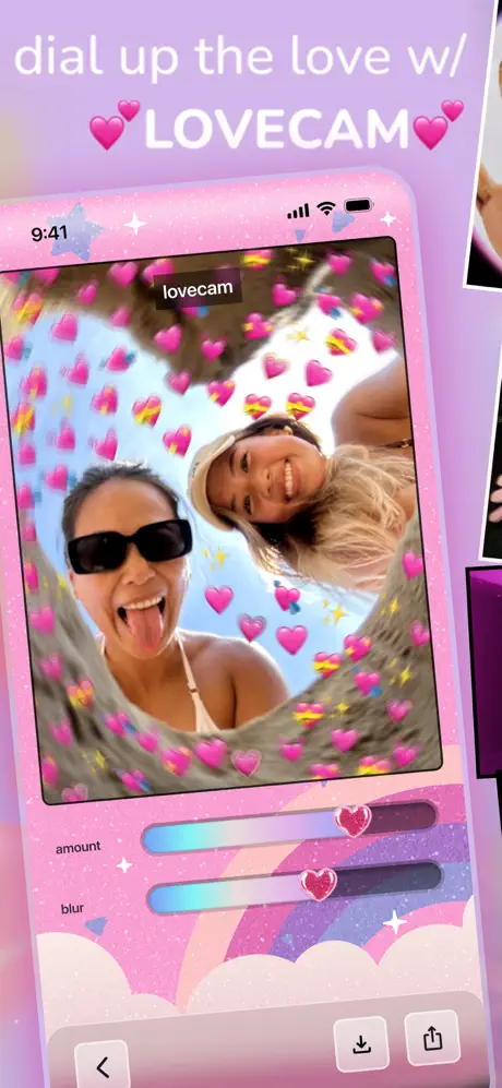
On-frame caption: “dial up the love w/ 💕LOVECAM💕

The final frame uses a pink glitter border baked into the device itself. The screen is sticker-bombed with dozens of pink hearts and small yellow stars over a photo of two figures. The interior UI label reads 'lovecam.' Two sliders, 'amount' and 'blur,' use gradient tracks shifting from cyan to lavender and heart-shaped knobs with glitter texture. The panel behind the sliders shows illustrated clouds and a soft rainbow arc. A star icon sits in the upper left of the app chrome. The bottom nav is light pink. Externally, the background is a uniform soft purple with scattered white sparkles. The headline is white, making it softer than the near-black headlines used in Frames 1, 3, 5, and 6. A second pink device bleeds in from the right edge, teasing continuation beyond the last frame. The overall effect is diary-like and juvenile-in-a-deliberate-way, recalling early-2000s sticker culture. It ends the carousel on a note of affection rather than utility, reinforcing that the app is a social toy first and an editor second.

05The craft

Captions, colour and the mechanics of the sell

Caption pattern

The headline-copy pair follows a consistent formula: a verb phrase setting up the mode, followed by a feature noun. Frame 1: 'not a boring camera app' → 'get the blurry look.' Frame 2: 'go retro with new vhs cam 💜.' Frame 4: 'turn up the glow w/ dreamy cam.' The abbreviations ('w/', 'u') and emoji function as tonal shorthand, not decoration.

Visual system

The external system is built on soft-body gradients and 3D skeuomorphism. The internal system is deliberately inconsistent—each camera mode invents its own slider track, knob shape, and bottom-nav finish. The blur mode uses round colorful knobs; VHS uses square white knobs on a noise texture; Dreamy uses cloud-shaped knobs on glitter; Club uses neon vertical pills. This is a feature, not a bug: it proves customizability. The cost is that no two frames look like they belong to the same codebase.

The thumbnail test

At thumbnail size, the pastel gradient and black headline of Frame 1 read cleanly, but Frame 3’s collage density collapses into gray noise. Frame 7’s neon pink punches hardest in a grid of competitors because of its high chromatic contrast.

Conversion mechanics

App Store shoppers typically seek proof of a single 'hero' feature in the first two frames and evidence of depth in the next two. Sway inverts this: Frame 1 sells tone, Frame 2 sells nostalgia, and Frame 3 only then reveals that there are multiple cameras. For a browser looking for a VHS filter specifically, Frame 2 might convert immediately. For someone seeking a general camera upgrade, Frame 1's refusal to show a normal photograph could cause drop-off. The before/after in Frame 4 is the strongest conversion lever for pragmatic users, but it arrives late.

06Where it slips

What we would change

Grammar Inconsistency

The set never settles on a device-count rule. Frames 1, 2, 4, 6, 7, and 8 show one phone. Frame 3 shows one phone plus a riot of overlapping props. Frame 5 shows two phones. Because Frame 5 is the first and only multi-device shot, the wooden photobooth casing feels like a category error rather than a feature. The fix: either introduce multi-device layouts earlier—perhaps Frame 3—or constrain Frame 5 to a single device and let the wood casing do the storytelling alone.

Headline Placement Drift

Six of the eight headlines sit in the upper third, which creates a predictable scan path. Frame 6 drops the headline to the lower third ('Warp it up with our fisheye cam'). On a fast swipe, the eye misses it entirely because it expects information at the top. The fix: relocate the Frame 6 headline to the upper third and reserve the bottom for a sub-caption or social-proof badge.

UI Header Misalignment

The in-app top labels—'blur,' 'VHS,' 'dreamy cam,' 'club cam,' 'lovecam'—appear at varying heights and in different container styles (some pills, some plain text). When the user swipes rapidly, these headers do not align vertically, which subtly suggests the modes are disconnected prototypes rather than tabs in a unified app. The fix: standardize the top safe zone so every mode label shares the same Y-position and padding inside the device frame.

Frame 3 Density

The mode-selector screen is critical for proving breadth, but the surrounding collage props foil readability. The 3D cameras and silver question marks overlap the device edges and draw contrast away from the selector row. At thumbnail size, the row of camera icons becomes illegible. The fix: reduce the external prop count by half and increase the shadow separation behind the device so the in-app iconography pops.

Edge Bleed on Club Cam

Frame 7's neon vertical sliders sit so close to the left and right interior edges of the device that they feel cropped. The 'DEPTH' dial also hugs the bottom action bar. The fix: add at least 12–16pt of internal padding between interactive controls and the device bezel to let the neon breathe.

07The recipe

How to apply this to your own app

  1. Your grain should move.

    If your app has distinct internal themes, do not let them float in a vacuum. Sway ties its chaos together with a single external gradient and a consistent copy voice. Before you vary the UI inside the phone, lock the world outside it.

  2. Caption rhythm is layout rhythm.

    Sway alternates between dark and light headlines (black, white, black, white) in a roughly alternating pattern. This contrast modulation keeps the thumb swiping. Plan your headline colors as a rhythm track, not an afterthought.

  3. Show the artifact, not the slider.

    Frame 4’s before/after thumbnails are the most persuasive piece of the set because they show the photograph people actually want to post. Whenever possible, pair the control UI with the social object it produces.

  4. Emoji are tone, not decoration.

    Sway uses 👁️💋👁️, 💜, 🔥, 💓, and 😮‍💨 as semantic content, not garnish. They signal subcultural fluency. If your brand voice permits it, treat emoji as logographic punctuation rather than clip art.

  5. One surprise per frame.

    Each screenshot introduces exactly one new UI motif—cloud knobs, square knobs, heart knobs, a circular dial. This keeps discovery high without overwhelming memory. If you pack two novelties into one frame, both get lost.

08Takeaways

Five things worth stealing

  • A relentless external system can unify even wildly divergent internal UIs.
  • Placing the headline in the same vertical zone across 7 of 8 frames trains the eye; violating that zone on Frame 6 breaks the scroll spell.
  • Before/after comparisons remain the highest-utility conversion asset for photo editors.
  • Collage maximalism works best when it frames the device; when it overlaps the screen, it competes with the product.
  • Each mode’s custom controls (clouds, hearts, neon pills) act as product signatures, but they need a consistent navigation header to feel like siblings rather than strangers.
09The verdict

What the set actually achieves

A bold, tone-first screenshot set that sacrifices traditional feature taxonomy for vibe-based storytelling. The gradients, device mockups, and collage props successfully brand the carousel, but internal inconsistency in navigation headers, headline placement, and device count creates hitches in the swipe rhythm.

A design team building a feature-rich tool whose primary differentiator is personality. If your app contains multiple 'cameras' or editing paradigms, Sway proves you can sell them as a unified suite—but only if you nail the scaffolding around the chaos.

10Questions

Frequently asked

Does this work without 3D assets?

Yes, but you would need to replace the collage props with another continuity device—perhaps a consistent illustration style or typographic frame. The 3D objects provide depth; without them, the gradient alone might feel too thin.

Is the dark-mode VHS frame too niche?

Not for the target demographic. The frame assumes fluency in VHS nostalgia. However, the timestamp ('PM 2:20 OCT 15 2024') grounds it in a specific temporal joke that may date the asset faster than a generic treatment.

Why does Frame 5 feel so different?

It is the only frame with twin devices and the only frame with a non-pastel hardware finish (wood grain). The photobooth concept justifies the material, but the layout grammar was not established in earlier frames, so the shift feels abrupt.

What is the weakest frame?

Frame 3. The surrounding collage props cannibalize the screen space needed to sell the mode-selector UI. It tries to prove breadth and personality simultaneously, and the two goals collide.

What is the strongest frame?

Frame 4. The before/after thumbnails provide concrete proof of value, the cloud knobs are memorable, and the angel wings external prop frames the device without overlapping it. It balances persuasion and personality.

11Keep reading

Build your own screenshot set

The full set

9 shots
sway App Store screenshot 1sway App Store screenshot 2sway App Store screenshot 3sway App Store screenshot 4sway App Store screenshot 5sway App Store screenshot 6sway App Store screenshot 7sway App Store screenshot 8sway App Store screenshot 9

About the app

Live Game Shows on Your Phone! Now you can join real game shows, live, interactive, and hosted by your favorite creators, all on your phone. Sway is where live game shows happen RockyRoad, via the App Store listing.

Screenshots and store metadata belong to RockyRoad. They are shown here for design commentary and criticism. The analysis on this page is original work by floow.design. View the original listing.

More Photo & Video teardowns

Browse all →