
(Not Boring) Camera app icon
Photo & VideoScreenshot teardown12 min read

(Not Boring) Camera App Store screenshots

(Not Boring) Camera builds its App Store argument on a near-black stage, using safety orange and canary yellow accents to weld a playful 3D brand identity to a prosumer feature set—eight frames that move from novelty to output to trust without ever lifting the lights.

(Not Boring) Camera App Store screenshot 1
01At a glance

The set in one screen

Framing
Mixed—alternates between full-device mockups, extreme hardware close-ups, and edge-to-edge photography with only a sliver of device bezel.
Captions
Short verb-forward headlines in a heavy geometric sans, paired with restrained subheads rarely longer than one line.
Backdrop
Consistent near-black canvas, roughly #0F0F0F to #1A1A1A, letting warm accents and white type maintain contrast at thumbnail scale.
Type
Geometric sans serif, tightly tracked and heavily weighted for headlines; lighter weight for explanatory copy, creating a strict H1/H2 hierarchy without relying on dramatic size jumps.
UI / copy split
UI dominates roughly half the frames; the other half are led by photography or 3D rendered objects with supporting copy.
Frame 1 job
Establish brand identity and social proof before showing any functional interface.

Sampled palette

#0F0F0F#0F0F0F
#FF5F1F#FF5F1F
#FFD60A#FFD60A
#FFFFFF#FFFFFF
#2D8F2D#2D8F2D
#7EE0B1#7EE0B1
02The challenge

What this screenshot set had to solve

Competing in the App Store’s Photo & Video category means fighting both Apple’s own Camera app and a sea of third-party shooters that look nearly identical at swipe speed. The merchant here is called “Not Boring Software,” which sets an expectation of playfulness and industrial-toy charm, yet the actual utility advertised—SUPER RAW capture, manual controls, focus peaking, and 3D LUTs—speaks to a prosumer audience that values precision over play. The screenshot set therefore has to sell two contradictory ideas at once: that the app is expressive and customizable, and that it is a serious, pro-grade capture tool. It also has to overcome the shopper’s standard objections in a strict order: Will my photos look better? Can I control the look? Is it fast? Is my data safe? All of this must happen inside a visual language that feels cohesive when the images are seen as tiny parallax slices on an iPhone storefront.

“The camera you'll love.”
03The approach

How the set argues its case

The designers committed to a strict dark-field palette—deep graphite and near-black—across all eight frames, which lets two accent families dominate: a warm safety-orange (#FF5F1F) and a canary yellow (#FFD60A) borrowed from industrial labeling and RAW badge aesthetics. Type is a geometric sans, heavy and tightly tracked for headlines, with lighter weights for subheads, preserving a clear H1/H2 hierarchy without inflating point sizes. Rather than opening with a sterile viewfinder, the sequence begins with a 3D product shot to establish the app’s tangible personality, then immediately pivots to photographic output proof, and only afterward reveals the UI chrome. This narrative architecture—Brand, Proof, Personalization, Style, Control, Feel, Speed, Trust—mirrors a classic attention-to-retention funnel. Device framing is deliberately varied, alternating between full-device mockups, extreme macro crops of skeuomorphic dials, and edge-to-edge photographs. The copy is minimal, rarely more than eight words per headline, letting the 3D camera assets and macro photography carry the persuasion while the text handles the technical specifics.

ChainSequence – each frame hands the user a single reason to keep swiping, building from brand curiosity to social proof to output quality before ever exposing the densest controls. The 3D camera asset is the connective tissue that makes disparate frames feel like chapters of the same object.

04Frame by frame

Every screenshot, and the job it does

(Not Boring) Camera App Store screenshot 1 — Frame 1
01

Frame 1

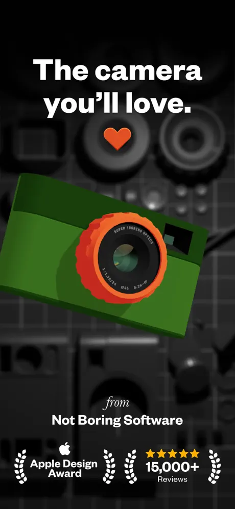
On-frame caption: “The camera you'll love. / from / Not Boring Software / Apple Design Award / 15,000+ Reviews

The opener is a pure branding frame that shows zero app UI. A rendered green camera body—approximately #2D8F2D—with an orange (#FF5F1F) lens barrel floats diagonally against a defocused background of machined hardware and lens elements. The headline reads “The camera you'll love.” in oversized white geometric sans, centered in the upper safe zone. Below the headline sits an orange heart icon, acting as a literal glyph between the promise and the product. At the bottom, the word “from” in an italic serif bridges to “Not Boring Software” in bold sans, placing the studio name before the user has even seen the app icon. A bottom row of social proof—Apple Design Award laurels, five yellow stars, and the text “15,000+ Reviews”—is pinned to the lower safe area. The frame bets entirely on curiosity and industrial charm rather than utility.
(Not Boring) Camera App Store screenshot 2 — Frame 2
02

Frame 2

On-frame caption: “SUPER RAW™ / Film-like Photos / Faster, sharper, film-like exposures with natural grain & no AI artifacts.

Proof of output arrives immediately. The frame is dominated by a tight macro photograph of a weathered stone dragon carving in warm browns and slate grays, filling the canvas edge-to-edge. A dark, reflective bezel edge intrudes at the top right, suggesting a device frame without fully containing the image. A rounded yellow badge reading “SUPER RAW™” in black, stocky sans sits in the lower-left quadrant, followed by “Film-like Photos” in large white type. The body copy states: “Faster, sharper, film-like exposures with natural grain & no AI artifacts.” By front-loading a photograph rather than the capture interface, the set answers the shopper’s first question about image quality before explaining any mechanics.

(Not Boring) Camera App Store screenshot 3 — Frame 3
03

Frame 3

On-frame caption: “Make it Yours / Customize your camera to fit your vibe. / Body / Top / Lens / Buttons

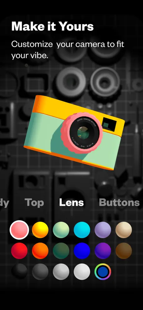
Customization is sold through the same 3D camera asset, now recolored with a yellow top (#FFC700), mint body (#7EE0B1), and salmon lens ring (#FF9AA2). The headline “Make it Yours” and subhead “Customize your camera to fit your vibe.” float in the upper third. The lower half displays a three-row color grid of circular swatches ranging from salmon, yellow, mint, cyan, lavender, and beige on top, through saturated primaries, to grayscale and a rainbow dial on the bottom row. Above the grid, category labels read “dy” (visibly truncated from “Body”), “Top,” “Lens,” and “Buttons,” with “Lens” selected in white and the active swatch outlined by a white ring. This frame uses the 3D model as a live preview, letting color and material do the persuasion instead of a feature list.

(Not Boring) Camera App Store screenshot 4 — Frame 4
04

Frame 4

On-frame caption: “Cinematic / REALTIME LUT / Pro Styles / Skip the edits. Pro-grade 3D LUTs for film-inspired looks.

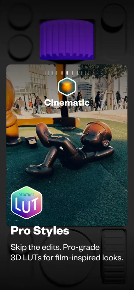
Styles are communicated with a hardware-dial motif. The background is dark graphite. At top, a purple ribbed dial (#6B3FA0) peeks into frame. Center stage is a photograph with rounded corners showing a bronze figure reclining on turf,graded with heavy teal shadows and amber highlights. Overlaid is the word “Cinematic” in white, capped by a hexagonal icon with an orange center and teal border. A bottom-left badge reads “REALTIME LUT” inside a glossy hexagon with a purple-cyan gradient border. The headline “Pro Styles” and subhead “Skip the edits. Pro-grade 3D LUTs for film-inspired looks.” ground the effect in professional terminology. The rounded photo card creates depth against the matte hardware behind it, transitioning the set from toy to tool.

(Not Boring) Camera App Store screenshot 5 — Frame 5
05

Frame 5

On-frame caption: “Pro Control / Manual mode to dial in exactly what you need. / MACRO / .02m / ∞ / EXPOSURE / SHUTTER SPEED / WHITE BALANCE / ISO / MANUAL FOCUS / FOCUS PEAKING / ZEBRA STRIPES / HISTOGRAM

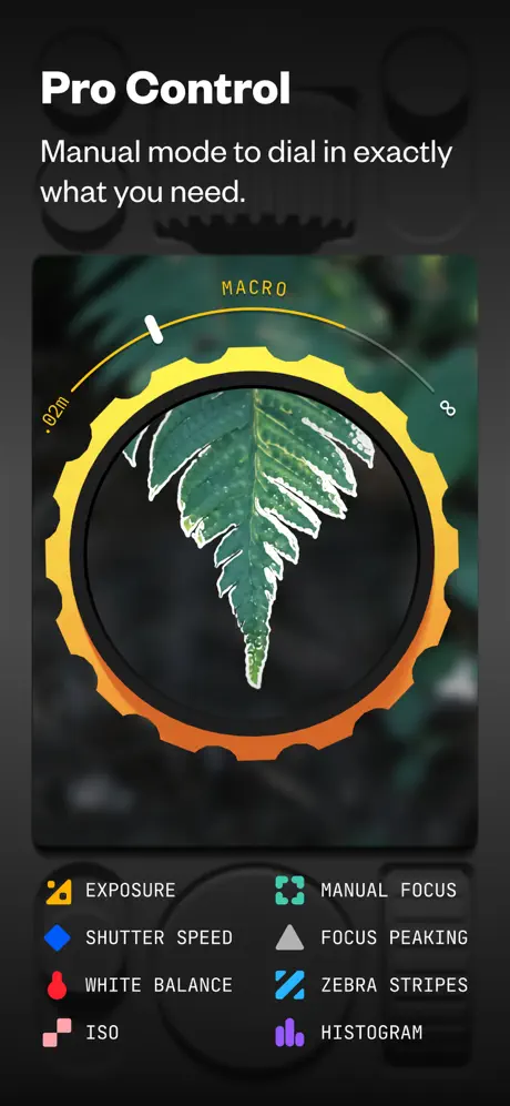
Manual control is the densest frame. Headline “Pro Control” with subhead “Manual mode to dial in exactly what you need.” sit top-left. The central UI is a circular focus dial: a serrated yellow-to-orange gradient ring (#FFD60A to #FF5F1F) with a white tick, labeled “.02m” and an infinity symbol. Inside the ring, a macro leaf photograph shows white focus-peaking outlines along its edges. Below, an eight-item grid lists controls with color-coded icons: a yellow camera for “EXPOSURE,” a blue diamond for “SHUTTER SPEED,” a red droplet for “WHITE BALANCE,” pink squares for “ISO,” a teal double-square for “MANUAL FOCUS,” a gray triangle for “FOCUS PEAKING,” blue slashes for “ZEBRA STRIPES,” and purple bars for “HISTOGRAM.” The dark background lets each icon’s hue read cleanly even at thumbnail scale.

(Not Boring) Camera App Store screenshot 6 — Frame 6
06

Frame 6

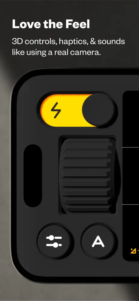
On-frame caption: “Love the Feel / 3D controls, haptics, & sounds like using a real camera.

Tactile quality is conveyed through an extreme macro of the skeuomorphic interface. “Love the Feel” and “3D controls, haptics, & sounds like using a real camera.” occupy the top safe zone. The visible UI shows a yellow flash toggle with a black lightning bolt, its black knob positioned on the right side of the yellow track; beneath sits a large black ribbed thumb wheel with soft inset shadows; below that, two matte black circular buttons carry a sliders icon and an “A.” The graphite surface catches a soft rim light along the left bezel. No photograph is shown—this frame is entirely about materiality, using refined skeuomorphism with tighter shadow diffusion than older iOS realism.

(Not Boring) Camera App Store screenshot 7 — Frame 7
07

Frame 7

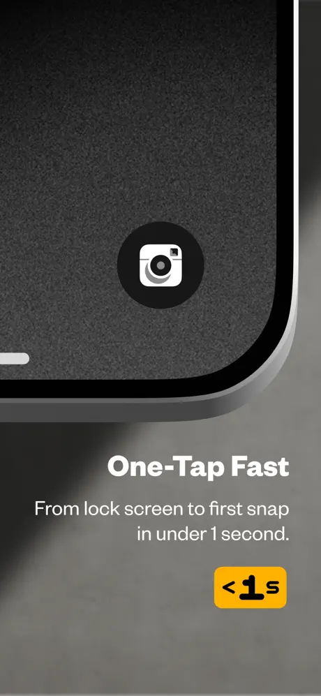
On-frame caption: “One-Tap Fast / From lock screen to first snap in under 1 second. / <1s

Speed is sold with radical restraint. The visual is a tight crop of a lock screen: a textured dark gray background near #3A3A3C, a centered app icon rendered in white inside a black circle, and a bottom-left home indicator. “One-Tap Fast” and “From lock screen to first snap in under 1 second.” sit below the image in white. A yellow rounded rectangle badge reading “<1s” in black is placed bottom-right. The decision to strip away all UI except the icon turns performance into a single, immediate glyph, letting the badge do the quantitative work.

(Not Boring) Camera App Store screenshot 8 — Frame 8
08

Frame 8

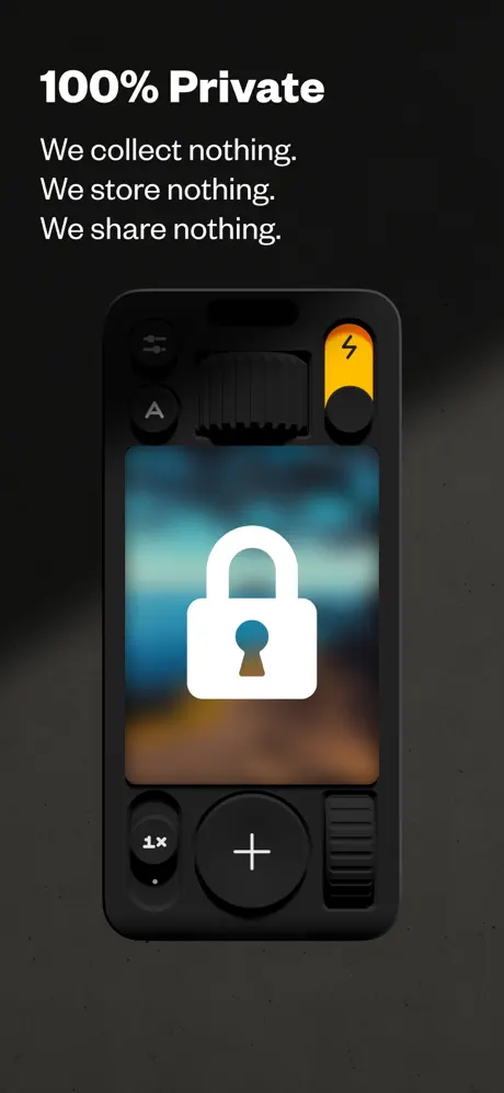
On-frame caption: “100% Private / We collect nothing. We store nothing. We share nothing.

Trust closes the set. A full-device mockup shows the camera UI with a blurred blue-brown viewfinder, overlaid by a large, flat white padlock icon. The headline “100% Private” is followed by the staccato triad: “We collect nothing. We store nothing. We share nothing.” The visible chrome repeats the yellow flash toggle seen in Frame 6, along with a “1x” indicator and a central plus button, linking back to the hardware language established earlier. By ending on privacy rather than another pro feature, the set acknowledges that camera apps are permission-sensitive and that the final objection to address is data security.

05The craft

Captions, colour and the mechanics of the sell

Caption pattern

Headlines are staccato commands or promises—“Make it Yours,” “Pro Control,” “One-Tap Fast”—set in large white sans. Subheads follow immediately below in a lighter weight, typically one to two lines, explaining the mechanic in plain language without feature-creep jargon.

Visual system

Near-black canvas (#0F0F0F–#1A1A1A) with warm hardware accents. The 3D camera model and skeuomorphic controls introduce matte materials—black ribbed rubber, glossy yellow toggles, and metallic purple dials—that unify the set under an industrial-design language.

The thumbnail test

At small scale, frames 3 and 5 read as colorful UI grids that pop against the black background, while frame 2’s dragon photo and frame 1’s green camera provide enough tonal variance to interrupt a monochrome scroll. However, frames 6 and 7—extreme close-ups of graphite texture—risk looking like abstract hardware photos rather than app screenshots when compressed to thumbnail width.

Conversion mechanics

The set follows a clear problem-agitation-solution arc: Frame 1 establishes likability; Frame 2 proves the sensor; Frames 3 and 4 sell creative control; Frames 5 and 6 reassure the prosumer; Frame 7 removes friction; Frame 8 removes risk. This ordering respects the psychology of a photographer shopping for a replacement camera app.

06Where it slips

What we would change

Inconsistent Device Framing Breaks Scanning Rhythm

The set refuses a consistent chrome rule, and that choice costs it scannability. Frame 2 shows only a sliver of top-right bezel; Frame 6 is an extreme corner crop with no identifiable device edge; Frame 7 is a partial lock screen; Frame 8 is the only true full-device mockup. At swipe speed, a shopper may not register Frames 6 or 7 as app screenshots at all. The fix is to impose a unifying container: either always show a full phone silhouette with consistent corner radius, or always bleed UI edges to frame but add a subtle drop shadow that implies glass. Without that rule, the sequence feels like a mood board rather than a product demo.

Frame 1 Gambles on Curiosity Without Interface Context

Opening with a floating 3D toy camera and zero app UI is tonally charming but categorically risky. In the cramped App Store thumbnail view, a user sees only a green object and a heart before deciding to tap or scroll. The value proposition—that this is a camera app for their phone—is delayed until Frame 2. The fix is not to remove the 3D asset, but to ghost a faint phone silhouette behind it or introduce the actual viewfinder in the reflection so the category is instantly legible.

Frame 3 Suffers a Safe-Area Truncation

The category labels above the color grid read “dy,” “Top,” “Lens,” and “Buttons.” The first label is visibly truncated from “Body,” cropped by the bottom margin of the composition. This reads as a rendering error rather than an intentional design choice. The fix is straightforward: add at least 20 points of bottom padding or reduce the vertical scale of the color grid so that every label sits fully inside the safe area with equal breathing room.

Hexagonal Badges in Frame 4 Fracture the Geometry Language

Frame 4 introduces a hexagonal “REALTIME LUT” badge and a matching hex icon for “Cinematic,” yet every other badge and button in the set is either circular, rounded-rect, or skeuomorphically cylindrical. That shape appears nowhere else, so it feels imported from a different app. The fix is to unify the badge geometry: if the hardware language favors circles and pills, the LUT badge should adopt a rounded-rect form with the same glossy treatment, preserving the single object language.

Frame 8's Lock Icon Ignores the Material System

The padlock in Frame 8 is a flat, default-style white glyph that clashes with the dimensional, matte-black materiality of the surrounding shutter buttons and toggles. After seven frames of consistent hardware texture, this abstraction undermines the illusion. The fix is to render the lock with the same matte material and soft inset shadow as the physical controls, or to replace it with a hardware lock metaphor—a physical clasp or switch—that feels photographed rather than iconographed.

07The recipe

How to apply this to your own app

  1. Lead with Proof, Then Controls

    If your app produces media, show the result before the console. Frame 2’s dragon photograph does more persuasion than any viewfinder mockup because it answers the user’s primary question: what will I get? Place your best output frame second, immediately after the brand hook, to validate the promise.

  2. Pick Two Accents and Never Deviate

    (Not Boring) Camera restricts itself to safety orange and canary yellow against black. This discipline lets shoppers recognize the app at a glance even when frames are separated by parallax. Choose your own two accents, codify their hex values, and reject any third hue that is not photography or neutral material.

  3. Vary Crop, Not Chrome

    The set teaches that dramatic crops keep a sequence from feeling monotonous, but the lack of a consistent device rule creates confusion. If you crop aggressively, maintain one unifying element—such as a persistent drop shadow, corner radius, or bezel highlight—so every frame still reads as a screenshot of the same phone.

  4. End on the Objection You Can't Show

    Privacy is invisible; you cannot photograph “no data collection.” Frame 8 turns that absence into a bold visual statement with the lock icon and repetitive copy (“We collect nothing. We store nothing. We share nothing.”). If your app has a trust advantage—no ads, no tracking, on-device processing—dedicate your final frame to it, because it is the last objection a user considers before tapping Get.

  5. Match the Materiality of Icons to the Interface

    When your UI uses skeuomorphic depth, your iconography must obey the same lighting model. Frame 8’s flat padlock is a reminder that inserting a system glyph into a textured scene breaks immersion. Before finalizing, audit every overlay for lighting direction, shadow diffusion, and surface finish.

08Takeaways

Five things worth stealing

  • Near-black canvases make warm safety-orange and canary-yellow CTAs pop with industrial authority, but only if applied with strict consistency.
  • 3D rendered hardware assets can act as brand anchors that bridge playful and prosumer positioning without relying on dense feature lists.
  • Verb-forward headlines and subheads under ten words preserve readability at thumbnail scale better than explanatory paragraphs.
  • The most persuasive screenshot sequence flows from brand → output proof → customization → pro features → trust, mirroring the shopper’s risk calculus.
  • Inconsistent device framing—even artistically motivated—fractures scannability; establish a chrome rule and violate it only with clear purpose.
  • Flat iconography inserted into skeuomorphic scenes creates a material clash that undermines the tactile fantasy the surrounding frames have built.
09The verdict

What the set actually achieves

The sequence lands on a dark, hardware-inspired visual system that uses a 3D rendered camera as a recurring brand anchor. It front-loads photographic proof so the user sees output quality before encountering dense UI, then funnels through personalization, style, manual control, tactile feel, speed, and privacy. The result is a set that reads as a single industrial object—matte black, safety orange, and canary yellow—rather than a loose collection of feature dumps.

Who It's For – Camera app founders who need to bridge a mass-market brand with pro feature depth; designers seeking to use 3D brand mascots as structural narrative anchors rather than decorative hero images; anyone building a tool whose primary proof is the media it creates.

10Questions

Frequently asked

At what point should the actual app interface appear in a screenshot set?

No later than the second frame. You can open with a pure brand image, as this set does, but you must validate the product category immediately after. If Frame 1 contains no UI, Frame 2 should show either a viewfinder or the photographic output so the shopper understands what is being sold.

How do you handle both amateur and pro audiences in one set?

Stratify by frame. Lead with emotion (Frame 1: love), follow with results (Frame 2: film-like photos), then personality (Frame 3: colors), then creative power (Frame 4: LUTs), then engineering depth (Frame 5: manual control). Amateurs get the message in the first three frames; pros get the signal in the last four.

Is skeuomorphism dead in iOS screenshot design?

Not here. When the physical metaphor is consistent—ribbed dials, matte toggles, glossy badges—the texture reads as premium rather than dated. The key is restraint: one lighting direction, one shadow depth, and a palette limited to real-world materials like rubber, aluminum, and safety paint.

Should social proof like awards sit in the first frame or the last?

If the award is category-defining—like an Apple Design Award—front-loading it in Frame 1 acts as a bouncer that validates everything after. If the award is niche, bury it later. Here, the award and review count are placed immediately to reduce skepticism before the user even sees the UI.

11Keep reading

Build your own screenshot set

The full set

8 shots
(Not Boring) Camera App Store screenshot 1(Not Boring) Camera App Store screenshot 2(Not Boring) Camera App Store screenshot 3(Not Boring) Camera App Store screenshot 4(Not Boring) Camera App Store screenshot 5(Not Boring) Camera App Store screenshot 6(Not Boring) Camera App Store screenshot 7(Not Boring) Camera App Store screenshot 8

About the app

Screenshots and store metadata belong to (Not Boring) Camera. They are shown here for design commentary and criticism. The analysis on this page is original work by floow.design. View the original listing.

More Photo & Video teardowns

Browse all →