Video Effects Editor app icon
Photo & VideoScreenshot teardown12 min read

Video Effects Editor App Store screenshots

A Study in Controlled Theatrics: The Riveo App Store Screenshot Sequence

Set published by Forge and Form GmbH · 10 frames analysed

4.7 · 2.1K ratingsFreev3.98Updated 5mo ago
Video Effects Editor App Store screenshot 1
01At a glance

The set in one screen

Framing
iPhone chassis floating in infinite violet-black void
Captions
Centered heavy sans; massive gradient headline + desaturated mauve subhead
Backdrop
Near-black ground shifting between burgundy, magenta, plum, and navy to match footage
Type
Single font family in two weights; 56pt gradient display text / 20pt muted subhead
UI / copy split
Approximately 70 percent interface or rendered content, 30 percent typography
Frame 1 job
Sell high-end VFX credibility in under two seconds

Sampled palette

#1A0510#1A0510
#2A0A1E#2A0A1E
#3A0F35#3A0F35
#0A0F2E#0A0F2E
#FF5F87#FF5F87
#7EE8FA#7EE8FA
02The challenge

What this screenshot set had to solve

An advanced video editor occupies a difficult position on the App Store. The Photo & Video category is saturated with incumbents whose screenshot sets have trained shoppers to expect familiar cues: a black timeline, a preview window, and a dark theme. Breaking that pattern risks confusion; following it too closely risks invisibility. For Riveo, the design problem is specifically one of density management. The interface contains high-order tools—speed ramping, keyframe easing, multi-layer compositing, AI masking—that cannot be communicated with a simple icon. At the same time, a shopper swiping at thumbnail size needs to parse the value proposition in under two seconds per frame. The sequence must therefore perform a dual function: each screenshot needs to be legible as a standalone poster, yet the set needs to build a coherent argument that this is a professional composition environment, not a toy filter app. There is also the matter of hardware credibility. By wrapping UI inside a modern iPhone bezel with Dynamic Island, the set signals native performance and Apple Silicon optimization, a crucial trust signal for render-intensive video work. The challenge, then, is to balance theatrical emotion with forensic interface detail.

A screenshot set is not a slide deck; it is a simulated environment. Every time the device disappears, the shopper is reminded they are looking at advertisements, not holding the software.
03The approach

How the set argues its case

Riveo’s team opted for a cinematic dark-room aesthetic. Every frame anchors itself to a near-black violet ground that functions like a gallery wall—typically rooted around #1A0510, shifting toward #2E0A2E under pink-tinted frames and cooling to #0A0F2E where blue footage dominates. Against this void, a single device floats in the upper-middle of the canvas, framed by a headline set in a heavy sans-serif with a consistent pink-to-cyan gradient fill (#FF5F87 to #7EE8FA). That gradient is the only element that repeats in exactly the same form across all eight frames, acting as a navigational beacon while swiping. Inside the device bezel, the app UI is deliberately cropped to show only the relevant tool: a floating modal, a speed curve, or a highlighted timeline segment. This modular cropping keeps the chrome—the tab bars, the home indicators, the system status bar—out of view, focusing attention on the pixel-level interaction. The typography stacks the gradient headline above a centered subhead in desaturated mauve, maintaining a static vertical rhythm that trains the eye to read top-down while the device itself acts as a stage for action-footage renders.

The set targets the gap between hobbyist editors and desktop NLE users. It borrows the visual language of pro software—nodes, curves, stacked adjustment layers—but wraps those signals in the talent-first imagery typical of social-native editing apps.

04Frame by frame

Every screenshot, and the job it does

Video Effects Editor App Store screenshot 1 — Level Up
01

Level Up

On-frame caption: “Visuals and effects unlike any other

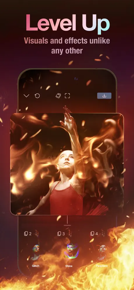
The opening frame establishes the visual contract. At top, the gradient headline reads 'Level Up' with the subhead 'Visuals and effects unlike any other' tucked beneath it in muted mauve. The background is not merely purple but actively on fire: ember particles drift across a deep burgundy ground edging toward #3B0A10, with photorealistic flame tongues licking up from the bottom edge, partially occluding the device bezel. The iPhone chassis is centered, showing a dancer in a red leotard enveloped in volumetric fire. Inside the app chrome, the top toolbar is stripped to five glyphs—checkmark, undo, layers, crop, and a blue-grey download pill at far right—while the bottom floating panel displays three effect thumbnails labeled 'Glitch', 'Shine', and 'Fireplace'. 'Shine' is current, ringed by a prismatic selection stroke. By letting the external pyrotechnics overlap the device bezel, the designers create depth; by cropping away the system status bar and home indicator, they force attention onto the effect pipeline. The dancer's red dress (#B91C3C) echoes the background warmth, so the whole frame vibrates on a single thermal frequency.
Video Effects Editor App Store screenshot 2 — Add Captions
02

Add Captions

On-frame caption: “Transcribe video and audio automatically.

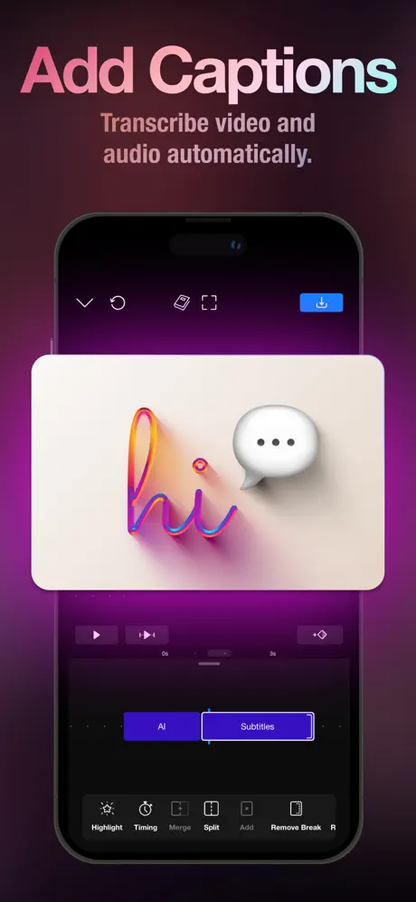
The second frame pivots to audio-text synthesis. The headline reads 'Add Captions' over 'Transcribe video and audio automatically.' The background shifts to a theatrical magenta-violet (#3A0F35) that frames the device without competing against the modal content. Inside the preview stage, a floating card displays the word 'hi' rendered as glossy 3D extruded lettering in orange-to-magenta-to-cyan, paired with a soft-white speech bubble containing three ellipses. Beneath this modal, the timeline shows a playhead parked at 0s, and a segmented control toggles between 'AI' and 'Subtitles', the latter active in an indigo fill. The bottom sheet exposes tool icons for 'Highlight', 'Timing', 'Merge', 'Split', 'Add', and 'Remove Break'. The spatial choice to float the caption preview as a large centered card rather than embedding it at the bottom makes the feature feel like an object-oriented treatment, elevating it from a basic utility to a design asset. The subhead sits slightly closer to the headline here than in Frame 1, tightening the group.

Video Effects Editor App Store screenshot 3 — Control Time
03

Control Time

On-frame caption: “Add slow motion or fast forward.

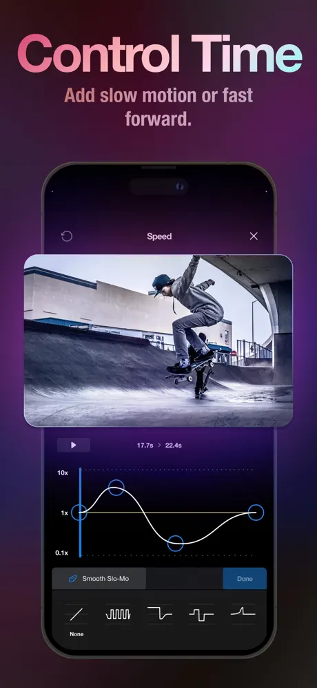
Here the headline reads 'Control Time' / 'Add slow motion or fast forward.' The device presents a modal sheet titled 'Speed' with an 'X' dismiss glyph, focusing the viewer on the most data-dense interface in the set. The preview clip shows a skateboarder at a concrete park, deliberately desaturated to near-monochrome so that the UI controls remain dominant. Under the preview, a custom speed-curve editor occupies the lower half: a black panel dotted with horizontal grid lines and vertical axis labels at '10x', '1x', and '0.1x'. A white Bezier spline with draggable cyan-ringed nodes illustrates variable speed ramping. A grey toggle pill reads 'Smooth Slo-Mo' with a blue checkmark, adjacent to a blue 'Done' button. At the very bottom, a row of preset curve silhouettes offers 'None' and four abstract waveforms. This frame sacrifices lifestyle warmth for engineering credibility, and it works because the high-contrast white-on-black graph is readable even when the image is downscaled. The color temperature is the coolest yet, shifting the set's emotional register from spectacle to precision.

Video Effects Editor App Store screenshot 4 — Get All In One
04

Get All In One

On-frame caption: “feature-grid interstitial

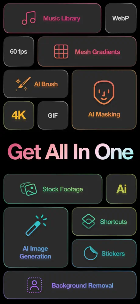
The fourth frame breaks the device convention entirely. Headlined 'Get All In One', it displays a bento-box masonry grid of rounded rectangles against a pitch-black (#000000) void. Each card pairs a minimal line icon with a feature name in brand-specific neon tones: 'Music Library' in hot pink (#FF5F87), 'Mesh Gradients' in coral, 'AI Brush' and 'AI Masking' in orange (#FFB020), '4K' in yellow (#FFD60A), 'AI Image Generation' in cyan (#64D2FF), 'Shortcuts' in mint, and 'Background Removal' in violet (#BF5AF2). Neutral cards for 'WebP', '60 fps', and 'GIF' recede in grey. The layout abandons the floating-device metaphor in favor of a spec-sheet aesthetic, functioning as a mid-sequence palette cleanser. However, the break in spatial continuity is abrupt: after training the eye to look inside a phone bezel for three straight frames, the viewer is suddenly asked to read a wall of tags. The cards lack strong drop shadows, so their #1C1C1E fill bleeds into the black background on OLED displays.

Video Effects Editor App Store screenshot 5 — Cut To The Beat
05

Cut To The Beat

On-frame caption: “Cut videos to your favorite tunes

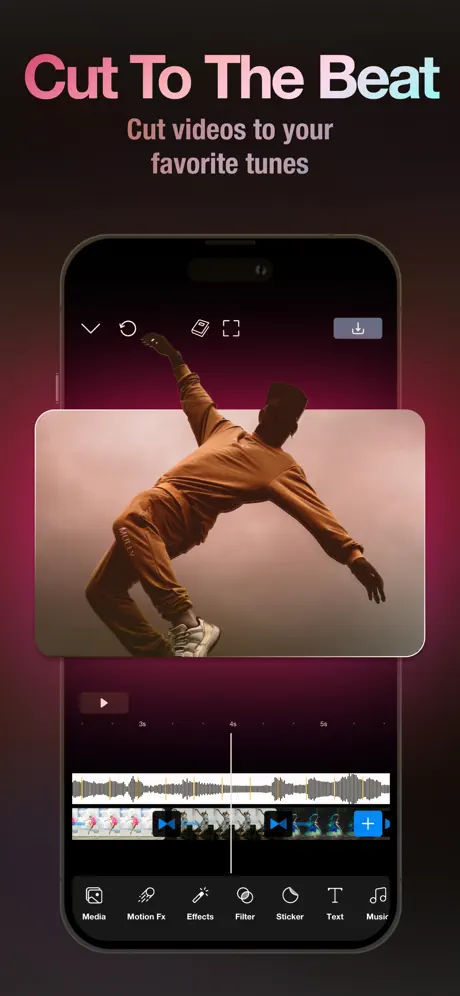
The fifth frame returns to the device with 'Cut To The Beat' / 'Cut videos to your favorite tunes'. The preview shows a dancer in earth-toned streetwear mid-pose against a warm beige cyclorama, his silhouette generating negative space that reads instantly at thumbnail size. Below the preview, the timeline reveals two tracks: a grey audio waveform above and thumbnail strips of the same dancer below, syncopated to the beat. The playhead intersects around the 3-second mark. The bottom tab bar reads 'Media', 'Motion Fx', 'Effects', 'Filter', 'Sticker', 'Text', 'Music' in a thin icon-plus-label configuration. The external background is a deep plum (#2A0A1E) suffused with a radial pink glow that echoes the warm undertones of the footage. This frame succeeds because it demonstrates audiovisual synchronization without needing explanatory text beyond the headline. The blue '+' add buttons on the timeline strips add rhythmic punctuation to the lower third.

Video Effects Editor App Store screenshot 6 — Get Started.
06

Get Started.

On-frame caption: “Pick from over 100 Templates

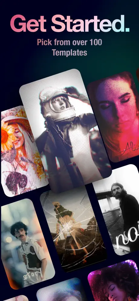
The sixth frame again drops the device. Headlined 'Get Started.' / 'Pick from over 100 Templates', the canvas becomes a deep navy (#050510) showcase for seven template preview cards arranged in a scattered, overlapping collage. The cards—an astronaut helmet, a paint-splattered portrait, a cracked-glass action shot, a bearded figure, and others—are individually rotated between roughly 5 and 15 degrees, creating a sense of casual abundance. There is no UI chrome, no buttons, no tab bars; the frame is pure editorial mood board. While this communicates breadth, it provides zero structural context for where templates live inside the navigation model. It relies entirely on the shopper trusting that the previous frames have already sold the interface logic, making it the riskiest visual in the sequence. The title's terminal period adds a grammatical full-stop that the sequence does not yet deserve.

Video Effects Editor App Store screenshot 7 — FINALIST Apple Design Award
07

FINALIST Apple Design Award

On-frame caption: “social-proof interstitial

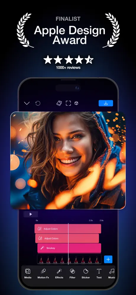
The seventh frame interrupts the feature narrative with social proof. At top, white laurel wreaths flank the words 'FINALIST Apple Design Award' above five filled stars and the text '1000+ reviews'. Only then does the device appear. Inside, a tight portrait of a smiling woman with warm bokeh and a blue hood fills the preview. The timeline shows three stacked adjustment strips in hot pink (#FF2D55) labeled 'Adjust Colors', 'Adjust Colors', and 'Smokey', each with thumbnail sequences. The bottom tab bar repeats the seven-icon configuration from Frame 5. The background is an oceanic midnight blue (#0A0F2E) that finally cools the palette down. While the award badge confers credibility, its scale dominates the upper third, pushing the actual interface—the stacked pink layers—into the lower half where thumb occlusion and small-scale compression reduce its impact. The gradient headline system, the set's strongest navigational anchor, is entirely absent here.

Video Effects Editor App Store screenshot 8 — Animate
08

Animate

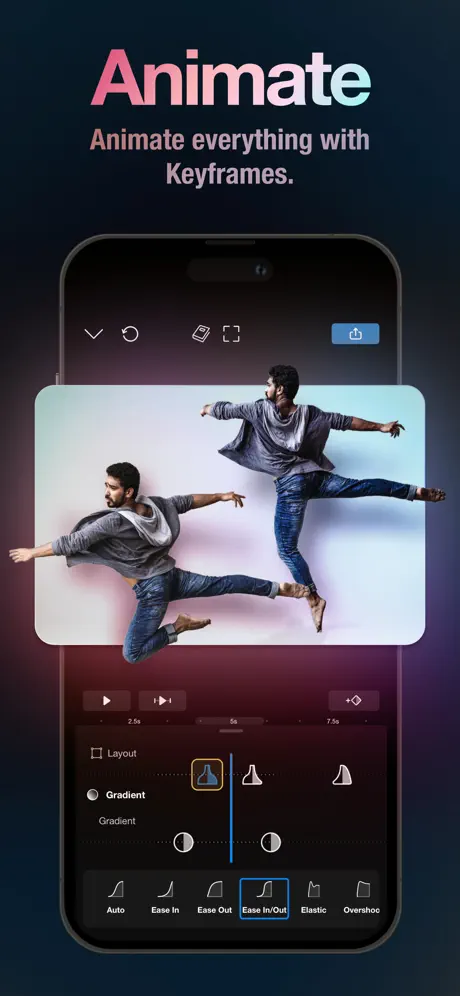
On-frame caption: “Animate everything with Keyframes.

The final frame closes on engineering depth. 'Animate' / 'Animate everything with Keyframes.' sits above the device, which contains a clone-composite of a male dancer captured twice in mid-leap against a pale cyan-white backdrop, proving motion interpolation visually. Below the preview, the timeline shows markers at '2.5s', '5s', and '7.5s'. A panel exposes 'Layout' as an unchecked checkbox, 'Gradient' as a selected radio button, and an easing graph with six curve presets: 'Auto', 'Ease In', 'Ease Out', 'Ease In/Out', 'Elastic', 'Overshoot'. 'Ease In/Out' carries a blue (#0A84FF) selection border. The graph line is thin white with circular handles. This frame answers the promise made in Frame 1: if Level Up offered the candy, Animate reveals the rig. The background outside the device cools from burgundy at the bottom to deep teal at the top, creating a chromatic full-stop to the sequence.

05The craft

Captions, colour and the mechanics of the sell

Caption pattern

Headline verb phrase at 56pt equivalent gradient fill + subheadline descriptor in centered mauve 20–24pt. The pattern only breaks in Frame 7, where social proof replaces the branded gradient headline entirely, rupturing the cadence.

Visual system

Each frame uses the same vertical tripod: headline lockup at roughly 12% from the top, device centered at 35%, and either app UI or floating content occupying the remaining space. The background never uses a gradient behind the text; instead, it relies on uniform dark value to provide negative space.

The thumbnail test

At small scale, the gradient headline and dancer/fire combination in Frame 1 read instantly as a special-effects app, while the speed-curve graph in Frame 3 remains intelligible because of its high-contrast white-on-black graph lines.

Conversion mechanics

The set is engineered for discovery-first conversion: it leads with spectacle (fire, 3D text), moves to specification (speed curves, keyframes), and only then offers social proof. In a category where most competitors lead with templates or simple trim UIs, this ordering signals pro intent immediately.

06Where it slips

What we would change

Broken pedestal: the device disappears twice

Frames 4 and 6 abandon the iPhone bezel entirely. After establishing a spatial rule—this app lives inside this floating phone—the break creates a cognitive pothole. Frame 4’s bento grid reads as a third-party marketing slide rather than a native interface. The fix is to render those capability cards inside a device bezel—perhaps as a Settings or New Project screen—or to add a faint device outline behind the grid so the pedestal remains intact. If the device must disappear, the cards need stronger dimensional separation; currently, their #1C1C1E fill and thin borders dissolve into the black background.

Subheadline contrast failure

The mauve subheads—approximating #9C5A7A—against the deep violet ground (#2A0A1E) yield a contrast ratio below WCAG 2.1 AA for text of this size. On Frame 1, the line 'Visuals and effects unlike any other' begins to vibrate against the warmer ember background. The specific fix is to lighten the subhead to at least #D4A5C2 or shift the weight from Regular to Semibold so the letterforms survive downscaling.

Frame 7’s social proof hijacks the hierarchy

A shopper on a smaller display will see the laurels and star rating occupying the exact space where the previous frames placed the feature headline, forcing the actual interface below the fold. Social proof is valuable, but it should not displace the product. The fix is to collapse the award badge into a compact translucent pill in the upper-right corner, restoring the gradient headline system and pushing the timeline upward so the pink adjustment layers remain above the thumb zone.

Interface chrome inconsistency

The download button in the app’s top-right shifts between a desaturated blue-grey in Frame 1 and a saturated iOS blue in Frame 2, creating a subtle flicker that undermines the native-app illusion. Locking every chrome element to a single blue value—#0A84FF—would quiet this noise and make the UI feel like a single shipped build rather than stitched mockups.

Hairline graph strokes in Frame 3

The speed curve uses what appears to be a 1pt white stroke that will alias into a grey blur at thumbnail scale. Doubling the stroke to 2.5pt and adding a faint #FFFFFF outer glow at 15% opacity would preserve the curve’s readable silhouette without altering the dark-panel aesthetic.

07The recipe

How to apply this to your own app

  1. Choreograph the UI and explosion movies

    Beauty does not always beat clarity. The mismatch between the kerosene fire outside the device and the actual UI color palette is extreme; if the viewer expects vast flares inside the app based on the background, the interface itself may feel thin by comparison.

  2. Keep your container sacred

    Establish a non-negotiable spatial container—device, headline, subhead—and violate it only if the violation delivers more clarity, not merely more variety. Riveo drops the device for variety, and the set suffers a continuity fracture.

  3. Test your subheads at 40% thumbnail scale

    Pale mauve on deep purple looks elegant at full resolution but can disappear on compressed JPEGs. Always test your caption color in the actual App Store listing, not just the 3x artboard.

  4. Social proof is a spice, not a course

    Award laurels are best overlaid inside a device screenshot or tucked into a small badge. Giving an entire frame to a finalist badge stops the feature narrative dead. Move social proof to frame 1 as a small banner, or compress it into the closing frame.

  5. Match background temperature to footage

    Riveo handles this well: Frame 5’s radial pink glow warms the environment to match the dancer’s beige studio. Use the negative space around your device as a color-correction layer that makes the preview content feel luminous.

08Takeaways

Five things worth stealing

  • The gradient headline lockup is a strong piece of navigational branding that survives rapid swiping.
  • Cropping the device to show only the relevant panel keeps dense UI readable.
  • Dropping the device frame for 'variety' breaks the illusion of holding the app in your hand.
  • Subheadline contrast is a common failure mode in dark-mode screenshot sets.
  • Award badges should supplement the interface, not replace the headline hierarchy.
09The verdict

What the set actually achieves

By the time a shopper reaches Frame 8, three distinct tones have been established: warm pyrotechnic spectacle, cool precision editing, and neon-lit spec-sheet density. The set closes the loop by proving that the fire in Frame 1 is the output of keyframe curves shown in Frame 8, creating a narrative sandwich even though the middle filling wobbles.

This case study is written for product designers building screenshot sets for dense creative tools—video editors, DAWs, 3D sketching apps—who need to balance emotional lifestyle imagery with the credibility of a precision interface.

10Questions

Frequently asked

Why does the set feel professional rather than playful?

The rigid typographic lockup, lack of emoji, restrained palette, and use of motion-capture talent footage all signal post-production software rather than casual social filters.

Does the frame order matter?

Yes. Leading with fire (spectacle), then captions (utility), then speed curves (precision), then keyframes (depth) creates a crescendo that mirrors the buyer's journey from impulse to justification.

What is the biggest risk in this layout?

The mid-sequence abandonment of the device frame risks confusing shoppers who are scanning quickly for recognizable UI. Consistency of container is often more important than variety of content.

How does the set handle small-screen legibility?

It mostly succeeds through high-contrast UI panels inside the device (white on black, blue on dark grey) and oversized gradient headlines. It fails in the subheadline text and the hairline graph strokes.

11Keep reading

Build your own screenshot set

The full set

10 shots
Video Effects Editor App Store screenshot 1Video Effects Editor App Store screenshot 2Video Effects Editor App Store screenshot 3Video Effects Editor App Store screenshot 4Video Effects Editor App Store screenshot 5Video Effects Editor App Store screenshot 6Video Effects Editor App Store screenshot 7Video Effects Editor App Store screenshot 8Video Effects Editor App Store screenshot 9Video Effects Editor App Store screenshot 10

About the app

Try Riveo — the only special effects video editor and maker you need to create immersive, professionally edited videos that go viral. Riveo’s easy-to-use AI-driven FX composer Forge and Form GmbH, via the App Store listing.

Screenshots and store metadata belong to Forge and Form GmbH. They are shown here for design commentary and criticism. The analysis on this page is original work by floow.design. View the original listing.

More Photo & Video teardowns

Browse all →