
app screen design for India-first mobile flows
Build connected Indian app screens for mobile OTP, UPI, addresses and multilingual support, with practical patterns for coherent mobile journeys.

app screen design for India-first products should connect phone verification, UPI setup, address capture and support rather than treating them as separate mockups. Start with an Indian mobile-number and OTP flow, collect delivery details through PIN code, locality and landmark fields, and allow room for Hindi and regional-language text expansion across every screen.
Key takeaways
- •Treat onboarding, payment and support as one connected mobile journey with shared customer data and recovery states.
- •Use Indian mobile-number entry and OTP verification as distinct, clearly recoverable screens.
- •Build address capture around PIN code, house or flat details, locality, city, state and an optional landmark.
- •Test Hindi and regional-language layouts early because labels, buttons and help text can require more space than English.
- •Use floow.design to generate connected screen sets, then review transitions and edge states instead of approving isolated app mockups.
What's on this page
- •Map the India-first screen set before drawing the UI
- •Design mobile number and OTP screens for real recovery
- •Make UPI onboarding and payment states explicit
- •Capture Indian addresses and localise the whole journey
Map the India-first screen set before drawing the UI
A useful mobile app design workflow begins with a screen map, not a polished home screen. For a typical Indian commerce, financial or service app, map the path from phone number to OTP verification, profile details, address, UPI payment setup or selection, confirmation, order or transaction history, and support. Then add the states that determine whether the journey actually works: invalid OTP, expired OTP, no network, payment pending, payment failed, edited address and a support hand-off with the relevant order or transaction context.
Keep the customer’s verified mobile number and chosen language available throughout the flow. A payment failure screen should offer retry, another UPI option and a route to support; it should not force the customer back to an unrelated starting screen. Likewise, an address entered during onboarding should be editable from checkout without retyping every field.
Use floow.design to generate connected screen sets rather than isolated app mockups. Generate the happy path and recovery screens together, then inspect whether titles, back actions, progress indicators and data carry consistently from one screen to the next. That is where coherent app ui design is won or lost.
Design mobile number and OTP screens for real recovery
Start with a dedicated phone-number screen. Make the India country code visible, accept the local 10-digit mobile number in a readable format, show an inline validation message before the user continues, and explain that an OTP will be sent to that number. Do not make users guess whether the country code is already included.
The next screen should focus on entering the OTP: display the masked destination number, provide an edit-number action, show resend availability clearly and retain a visible help path. Android documents SMS Retriever as a way to help apps retrieve a verification code without asking for broad SMS permissions; use the platform guidance when choosing an OTP experience rather than creating an unnecessary permissions screen. Source: Android Developers.
Plan for delayed messages and wrong-number corrections. Preserve the entered number when a user returns, avoid automatically advancing in a way that hides an error, and write errors in plain language. If the product needs consent for communications beyond verification, present it separately from OTP verification. A phone verification screen should establish account access; it should not bury marketing consent inside the primary action.
Make UPI onboarding and payment states explicit
UPI is not a single payment screen. In a connected flow, first ask whether the customer wants to link or use a UPI account, then show the available account or app route supported by your product, confirmation details, authentication where required, processing status and a final success, failure or pending result. Avoid implying that a payment is complete before the product receives a definitive outcome.
On the review screen, repeat the payee or merchant name, amount in INR, and the purpose of payment. On the result screen, keep the amount, status and transaction reference available for support. A pending state needs a clear explanation that the customer should not blindly pay again; it also needs a way to check status later. A failure state needs a retry route and an alternative payment method where one exists.
NPCI publishes UPI product information and should be the reference point when a team is deciding what terminology and journey constraints apply: National Payments Corporation of India. In your app screen design, reserve enough vertical space for payment status copy, support links and reference details. These are operational screens, not decorative afterthoughts.
Capture Indian addresses and localise the whole journey
Avoid a single generic “Address” field. Start with PIN code where it helps identify the delivery area, then collect house, flat or building details, street or area, locality, city, state and an optional landmark. A landmark is valuable for Indian delivery and service journeys, but label it as optional so it does not block users whose address does not need one. Let people edit any suggested city or state instead of assuming the PIN code result is always the intended address.
India Post is the authoritative reference for the PIN code system: India Post. Keep PIN code validation and serviceability messaging close to the field, rather than revealing an unavailable area only at the final payment screen.
Localisation must be planned at the component level. Hindi and regional-language text can expand beyond English labels, and some strings may need different line breaks or clearer wording. Test long button labels, payment statuses, address instructions and support articles in the languages you intend to ship. Do not solve expansion by shrinking text until it becomes hard to read; allow flexible button height, wrapping and larger text containers from the first screen set.
India-first screen checklist
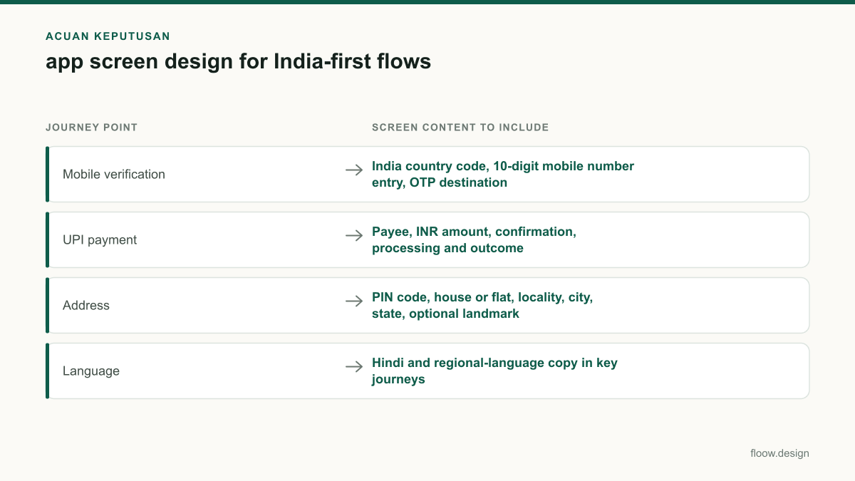
| Journey point | Screen content to include | Recovery or localisation check |
|---|---|---|
| Mobile verification | India country code, 10-digit mobile number entry, OTP destination | Edit number, resend timing, delayed or invalid OTP help |
| UPI payment | Payee, INR amount, confirmation, processing and outcome | Pending, failed, retry and transaction-reference states |
| Address | PIN code, house or flat, locality, city, state, optional landmark | Editable PIN-derived details and serviceability message |
| Language | Hindi and regional-language copy in key journeys | Wrapped labels, flexible buttons and readable error text |
Common mistakes
Designing a phone-entry screen without an edit-number route after the OTP is sent.
Show the masked number on the OTP screen and provide a clear action to change it without abandoning the flow.
Treating UPI success, failure and pending as the same generic confirmation screen.
Create separate result screens with accurate status language, transaction context, next actions and support access.
Using one free-text address field copied from a global template.
Use PIN code, house or flat, locality, city, state and optional landmark fields, with editable suggestions.
Translating only after the English UI is approved.
Place Hindi and target regional-language strings in the screen set during review and adjust component sizing before handoff.
Frequently asked questions
How do I improve app screen design?
Improve app screen design by designing connected task flows rather than polishing isolated screens. For India-first apps, link mobile-number entry, OTP recovery, address editing, UPI status and support so customer data and next actions persist across screens. Test error, pending and no-network states, then test Hindi and regional-language copy for text expansion before finalising components.
What screens are needed for UPI onboarding?
A UPI onboarding flow typically needs an entry screen, an account or UPI route selection screen where supported, review and confirmation details, any required authentication step, processing status, and separate success, failure and pending result screens. Each result screen should show the INR amount, payee or merchant context, a transaction reference where available, and a clear support or retry action.
How do I design address forms for India?
Design Indian address forms around a PIN code, house or flat and building details, street or area, locality, city, state and an optional landmark. Keep PIN code validation and delivery or serviceability feedback near the field. Allow customers to correct city or state suggestions, save multiple addresses and edit an address during checkout without re-entering all details.
How should Hindi and regional languages affect mobile UI layout?
Hindi and regional-language mobile UI should be tested in the actual screen layout, not only in a translation file. Allow labels and helper text to wrap, use flexible button heights, avoid fixed-width text containers and review payment, OTP and support error states especially closely. Readable text and unambiguous actions matter more than preserving an English-first visual rhythm.
Where this leaves you
India-first app screens work best when they are designed as a continuous journey: verify a mobile number, recover from OTP issues, capture a usable address, complete or resolve a UPI payment, and reach support with context intact. Generate that connected set in floow.design, including edge states and local-language variants, before treating any individual screen as finished.
Design the screens first
Describe the app in plain language and floow.design draws the iOS and Android screens for you, ready to refine and hand off.
Sources
Design your mobile app with AI.
Generate pixel-perfect iOS and Android screens in seconds, then export to Figma or code.
You might also like…
 Guides20 September 2026Mobile app design for India: practical guideDesign India-ready mobile app screens with Android-first patterns, UPI, cash-on-delivery, OTP verification, and Hindi and regional-language support.By floow.design Team, Mobile Design
 Guides20 September 2026app ui design for Indian mobile usersPractical app UI design guidance for India: UPI payment recovery, multilingual screen expansion, and Android-first mobile constraints with iOS support.By floow.design Team, Mobile Design
 How-to20 September 2026micro interactions for Indian mobile appsDesign micro interactions for Indian mobile apps with clear UPI and OTP feedback, low-connectivity states, and delivery tracking cues that reduce doubt.By floow.design Team, Mobile Design