
food delivery app design for India | Floow
Plan Indian restaurant discovery, address capture, UPI and cash checkout, and delivery tracking screens that handle gates, landmarks and calls without slowing checkout.

food delivery app design for India should make restaurant discovery fast, support UPI, cash and wallet choices at checkout, and capture landmarks, apartment gates and delivery-partner call preferences. Benchmark the core journey against Swiggy and Zomato, then connect discovery, cart and live order status into one mobile-first flow.
Key takeaways
- •Treat restaurant discovery, cart, payment and live tracking as one connected ordering journey.
- •Make UPI the quick path, while retaining cash and wallet options where the business supports them.
- •Ask for address details that help a delivery partner find Indian apartments, gates and landmarks.
- •Use micro interactions to confirm actions, explain order states and reduce uncertainty without adding visual noise.
What's on this page
- •Map the Indian ordering flow before designing screens
- •Build checkout around UPI, cash and wallet behaviour
- •Make address and delivery status usable at the gate
- •Prototype the connected flow in floow.design
Map the Indian ordering flow before designing screens
Start by benchmarking Swiggy and Zomato, the two dominant Indian food-delivery references. Do not copy their visual treatment; study how quickly a customer can move from location to cuisine, restaurant, menu, cart and post-order tracking. The key mobile decision is what remains visible at every step: selected address, estimated delivery expectation, cart count and the next action.
For an app screen design flow, create these connected states: location permission or manual address entry, home and search, restaurant listing, restaurant menu, item customisation, cart, payment, order confirmation, live order status and support. Include empty, loading, unavailable-item, restaurant-closed and payment-failure states from the start. They are part of the ordering flow, not edge cases.
Restaurant cards should let people compare cuisine, delivery expectation, ratings shown by the product, dietary labels where applicable and offer context without forcing a detail-page visit. On the menu, keep quantity controls and customisations close to the item. A persistent cart affordance prevents customers from losing progress while browsing.
Build checkout around UPI, cash and wallet behaviour
Payment selection should be clear, reversible and placed after the customer has reviewed items, delivery address and final payable amount. Put UPI near the top when it is available, with a direct action that hands off to the customer’s chosen UPI app or supported payment method. The National Payments Corporation of India describes UPI as an instant payment system; the UI should therefore show a pending state while confirmation is returning rather than asking the customer to retry prematurely.
Also support cash and wallet patterns when your service offers them. Cash needs an explicit “pay on delivery” label and a confirmation state so the customer knows the order was placed without an online debit. Wallet payment needs a visible available balance, any remaining amount and a clear fallback when the balance is insufficient.
Design payment micro interactions for confidence: disable duplicate taps after payment starts, animate a restrained pending indicator, then show a named success or failure state with the next safe action. Never mark an order as failed merely because the app has not yet received the final payment confirmation.
Make address and delivery status usable at the gate
Indian food delivery often fails at the final few metres, not at restaurant discovery. Address capture should separate a searchable address from practical arrival instructions: house or flat number, building or society name, apartment gate, floor, landmark and a delivery note. Let customers save home and work locations, edit instructions without retyping the entire address, and pin a map location when the formatted address is incomplete.
After ordering, the live-order-status screen should make the current stage understandable at a glance: restaurant confirmation, preparation, pickup and arrival. Delivery expectations should update as an estimate, not a promise. When a delivery partner needs help finding the location, offer a prominent, consent-aware call action and show the delivery note near it. Customers should not have to hunt through account settings to answer a call or resend gate instructions.
Use micro interactions sparingly here: a status transition can acknowledge movement, while a quiet badge can flag “partner trying to reach you.” Avoid celebratory motion during delays. The job of this screen is to reduce uncertainty and make handoff at the apartment gate practical.
Prototype the connected flow in floow.design
Create restaurant discovery, cart and live-order-status screens in floow.design as one connected flow. Begin with a home screen that has delivery location, search and cuisine-led discovery. Link a restaurant card to a menu screen, add an item with a customisation bottom sheet, and carry item count and total into the cart.
In the cart, include delivery address editing, coupon or offer space if the product needs it, and a payment selector with UPI, cash and wallet states. Prototype the UPI pending, success and failure paths rather than drawing only the ideal checkout. From successful confirmation, link into live order status with preparation, pickup, arrival, landmark and gate-instruction details, plus a delivery-partner call control.
Review the prototype on a phone-sized canvas. Check one-handed reach for cart and payment actions, text wrapping for long society names, and whether a user can recover from an unavailable item or failed payment without rebuilding the order. This is where app screen design becomes an operational ordering journey rather than a set of attractive isolated screens.
India-specific decisions to represent in the mobile flow
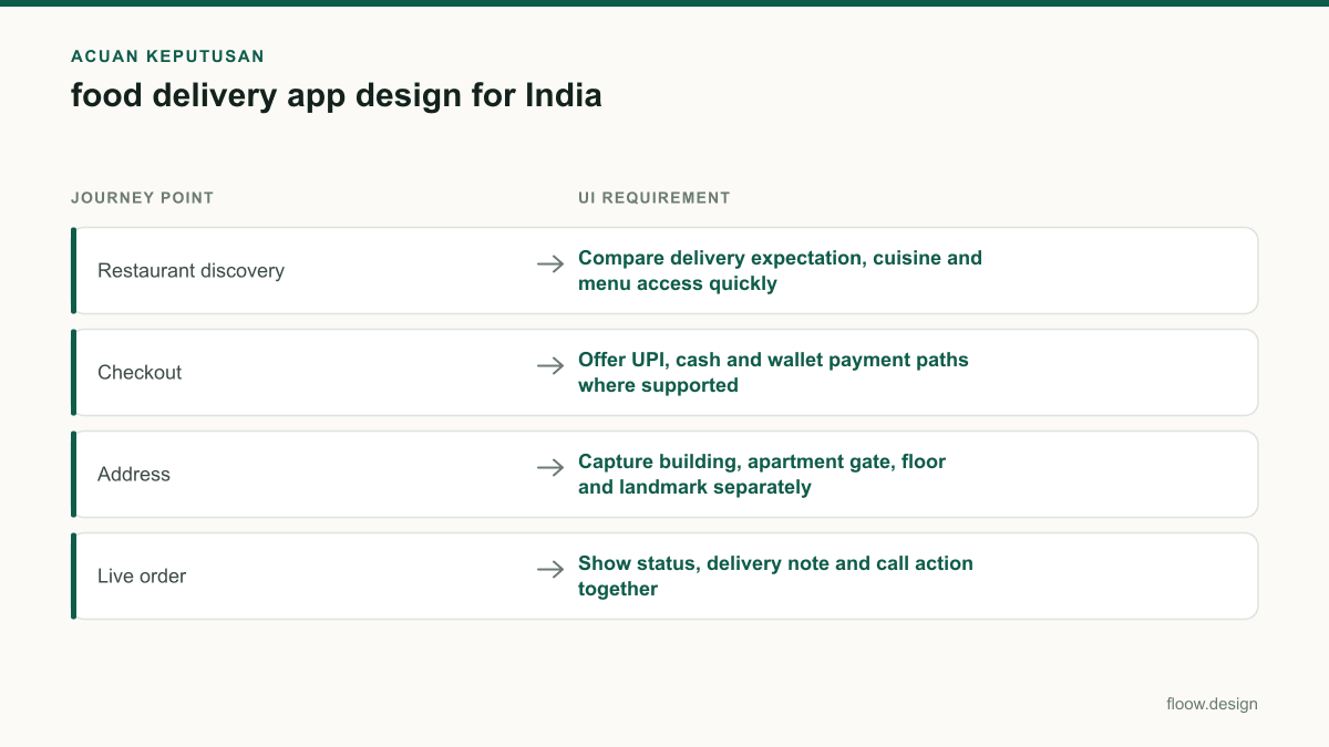
| Journey point | UI requirement | Why it matters |
|---|---|---|
| Restaurant discovery | Compare delivery expectation, cuisine and menu access quickly | Swiggy and Zomato set familiar customer expectations for rapid local restaurant browsing. |
| Checkout | Offer UPI, cash and wallet payment paths where supported | Customers need a clear choice and reliable pending or fallback states. |
| Address | Capture building, apartment gate, floor and landmark separately | A formatted address alone may not help a delivery partner complete the final handoff. |
| Live order | Show status, delivery note and call action together | Customers may need to guide a delivery partner to a society entrance or gate. |
Common mistakes
Treating the address field as a single line of text.
Use structured fields for flat or house number, building or society, gate, floor, landmark and delivery notes, while preserving a map pin.
Making UPI payment look complete before the app receives confirmation.
Show a pending state, prevent duplicate payment attempts and provide a clear recovery route if confirmation takes longer than expected.
Hiding cash and wallet choices behind a generic payment label.
Present each available method distinctly, including pay-on-delivery wording for cash and balance or shortfall information for wallets.
Designing order tracking as a decorative map only.
Prioritise readable order stages, delivery expectation, gate instructions and a delivery-partner call action over map animation.
Frequently asked questions
What screens does food delivery app design need?
Food delivery app design needs location and address capture, home and search, restaurant listings, restaurant menu, item customisation, cart, payment, order confirmation, live order status and support screens. For India, address editing should include apartment gates and landmarks, while checkout should clearly handle UPI, cash and wallet options where supported.
How should UPI work in a food delivery app?
UPI in a food delivery app should be a clearly labelled payment option that starts the approved UPI handoff or payment method, then shows a pending state until confirmation returns. Prevent duplicate taps, retain the customer’s cart if payment fails, and show whether the order was placed rather than making the customer infer status.
What makes food delivery UX work in India?
Food delivery UX works in India when it supports fast restaurant comparison, familiar payment choices such as UPI, cash and wallets, and practical delivery details. Customers should be able to add apartment gate, building, floor and landmark information, then access delivery-partner call support and readable live order status without leaving the order screen.
How can floow.design help prototype an Indian food ordering flow?
floow.design can help you create restaurant discovery, cart and live-order-status screens as one connected mobile flow. Prototype UPI pending and failure states, cash and wallet selection, address details for gates and landmarks, and delivery-partner call actions so the journey can be reviewed as a real ordering sequence.
Where this leaves you
A useful Indian food ordering flow gets the practical details right: familiar discovery patterns, explicit UPI, cash and wallet choices, and address information that gets a delivery partner through the right gate. Build and test the connected discovery, cart and live-status journey in floow.design rather than evaluating each screen in isolation.
Design the screens first
Describe the app in plain language and floow.design draws the iOS and Android screens for you, ready to refine and hand off.
Sources
Related reading
Design your mobile app with AI.
Generate pixel-perfect iOS and Android screens in seconds, then export to Figma or code.
You might also like…
 Guides20 September 2026Travel app design for Indian travellersDesign Indian travel booking screens for rail, buses, flights and stays with passenger details, PNR, UPI, GST invoices and cancellations.By floow.design Team, Mobile Design
 How-to20 September 2026micro interactions for Indian mobile appsDesign micro interactions for Indian mobile apps with clear UPI and OTP feedback, low-connectivity states, and delivery tracking cues that reduce doubt.By floow.design Team, Mobile Design
 Guides20 September 2026Mobile app design for India: practical guideDesign India-ready mobile app screens with Android-first patterns, UPI, cash-on-delivery, OTP verification, and Hindi and regional-language support.By floow.design Team, Mobile Design