
micro interactions for Indian mobile apps
Design micro interactions for Indian mobile apps with clear UPI and OTP feedback, low-connectivity states, and delivery tracking cues that reduce doubt.

micro interactions are the small state changes that tell an Indian mobile user whether a UPI payment, OTP check, or order update has progressed, succeeded, or failed. On lower-end Android phones and unreliable connections, show an immediate tap response, an explicit pending state, and a recoverable next step rather than leaving the result ambiguous.
Key takeaways
- •Treat payment confirmation as a state sequence: initiated, processing, successful, failed, or still pending.
- •Make OTP feedback specific: identify invalid codes, expired codes, resend waits, and connectivity problems without clearing user input unnecessarily.
- •Keep motion lightweight and pair it with text, colour, and persistent status so the interaction remains understandable on slower Android devices and poor networks.
- •Use delivery, payment, and booking patterns users already recognise from Swiggy, PhonePe, and IRCTC contexts.
What's on this page
- •Map the moments where uncertainty costs users
- •Build feedback that survives lower-end Android and weak connectivity
- •Use local mental models without copying another app’s interface
- •Prototype the state path, not only the happy path
Map the moments where uncertainty costs users
In Indian app screen design, prioritise micro interactions at moments when a user has committed money, identity details, or time. A UPI flow should not jump from a Pay tap to an unexplained spinner. Change the button state immediately, prevent accidental repeat taps, then show a named status such as Processing payment. If the network drops, do not imply failure before the app has a result; show Payment status pending and offer Check status.
This matters because UPI is an NPCI-operated payment system, and a payment attempt can require time to resolve across the network. Use the language of a familiar PhonePe-style payment context: the user needs to know whether to wait, check status, or safely try later—not merely that the app is loading. Reference the payment rail accurately and avoid success animation until your backend has confirmed success. NPCI publishes official UPI information at NPCI.
Apply the same discipline to OTP verification. On submit, acknowledge the tap at once; distinguish Verifying code, Incorrect code, Code expired, and Could not verify because you are offline. Keep the entered number visible after an error, move focus to the relevant field, and make resend timing explicit. These are not decorative animations; they are decision-support states.
Build feedback that survives lower-end Android and weak connectivity
For India, design the feedback system before choosing animation. Lower-end Android devices can expose expensive transitions, delayed image decoding, and repeated taps more readily than high-end test phones. Unreliable connectivity can also freeze a request between initiation and resolution. Therefore, make every critical micro interaction work with a static fallback: a label, an icon, a disabled-or-cancelled action state where appropriate, and a persistent status after the animation ends.
Use short, interruptible motion for acknowledgement: a button compression, a small progress indicator, or a checkmark reveal. Do not make the result depend on a long full-screen animation. Android’s official guidance on performance and adaptive experiences is available at Android Developers. Test on a slower physical Android device, with reduced bandwidth and interrupted connectivity, rather than only in a desktop prototype.
Dark mode design needs the same state hierarchy. A green tick alone may lose contrast or be misread in low light. Pair success with text such as Payment successful and failure with a clear next action such as Try again or Check payment status. Reserve red for a confirmed failure; use a neutral pending treatment when the outcome is genuinely unknown. This avoids telling users to repay when the first attempt may still complete.
Use local mental models without copying another app’s interface
Local references help users predict what happens next. For delivery, a Swiggy order-tracking context suggests a compact progression: order accepted, being prepared, picked up, and arriving. Each state change can use a restrained marker movement plus a timestamp or short explanatory label. If tracking cannot refresh, retain the last known step and say when it was last updated instead of replacing the timeline with a generic error.
For travel, an IRCTC booking-status context needs a different pattern. Booking status is not the same as a completed purchase: show the current status as text, keep the booking reference accessible, and make refresh a deliberate action with visible feedback. IRCTC’s official service is available at IRCTC. Do not use celebratory motion for a status that can change or is awaiting confirmation.
Create a reusable state set across these flows: idle, pressed, processing, success, recoverable error, pending, and offline. Define the copy, icon, haptic choice, and fallback for each state in the component specification. Then test whether users can answer three questions after every tap: Did the app receive my action? What is happening now? What should I do next? Use floow.design to explore clear loading, success and error-state visuals across these critical mobile interactions.
Prototype the state path, not only the happy path
A useful prototype shows the entire state path for one action. Start with a payment button at rest, then show the pressed response, processing state, confirmed success, and two alternatives: failure and unresolved status. Repeat the exercise for OTP entry and a delivery refresh. This exposes missing copy and conflicting actions before development.
Keep actions safe. During a UPI request, avoid presenting a second primary Pay action until the first request has a clear outcome or a carefully explained status check. During OTP verification, preserve the user’s entry after a temporary network problem, but allow correction after an invalid-code response. During order tracking, do not animate a rider or status marker forward without a real update.
Review the prototype in bright light, dark mode, slow-motion recording, and an interrupted-network scenario. The visual effect should support comprehension, not become the only signal. A user who misses the motion must still see an unambiguous label and a next action. That standard produces interfaces that feel responsive on fast connections while remaining honest when the device or network is slow.
State patterns for high-uncertainty Indian mobile flows
| Context | Immediate feedback | When the outcome is delayed | Recovery action |
|---|---|---|---|
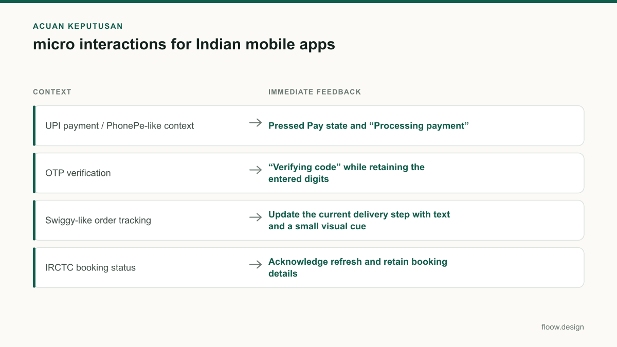
| UPI payment / PhonePe-like context | Pressed Pay state and “Processing payment” | “Payment status pending”; do not show success or failure prematurely | “Check status” with the payment reference available |
| OTP verification | “Verifying code” while retaining the entered digits | Explain whether the issue is expired code, invalid code, or offline verification | Correct the code or resend when available |
| Swiggy-like order tracking | Update the current delivery step with text and a small visual cue | Keep the last known step and show that refresh is unavailable | Retry refresh without discarding the existing timeline |
| IRCTC booking status | Acknowledge refresh and retain booking details | Show the currently known booking status rather than a celebratory result | Refresh status again when connectivity returns |
Common mistakes
Showing a success tick as soon as the user taps Pay.
Show a processing state first and render success only after confirmed payment completion; use a pending state when the result is unresolved.
Replacing every network problem with “Payment failed”.
Separate confirmed failure from unknown status. Give users a status-check route before asking them to try another payment.
Using long, heavy loading animations on all devices.
Use lightweight motion with static text and icon fallbacks, then test on lower-end Android hardware and constrained connections.
Clearing an OTP after any error.
Retain the entered code for temporary connectivity errors; identify invalid or expired codes specifically so users know whether to edit or resend.
Frequently asked questions
What are micro interactions in mobile app design?
Micro interactions in mobile app design are small responses to a user action or system event, such as a pressed button state, OTP validation message, loading indicator, success confirmation, or error prompt. They should clarify what happened, what is happening, and what the user can do next. In critical flows, they need clear text and a non-animated fallback.
How do micro interactions help UPI payments?
Micro interactions help UPI payments by making the payment state explicit after a user taps Pay. Show immediate acknowledgement, then distinguish processing, confirmed success, confirmed failure, and pending status. This reduces duplicate payment attempts when connectivity is weak or a response is delayed. A visible “Check status” action is safer than treating every delay as a failed payment.
Should micro interactions work offline?
Micro interactions should work offline because a mobile app must still acknowledge taps and explain unavailable actions when connectivity drops. The animation itself can run locally, but the interface must not claim remote success without confirmation. Preserve the last known order or booking state, label it clearly, and offer a retry or status refresh when the connection returns.
How should dark mode design handle success and error feedback?
Dark mode design should pair every success, error, and pending colour with plain-language text and an icon. A payment screen can use “Payment successful,” “Payment failed,” or “Payment status pending” rather than relying on green, red, or amber alone. Check contrast in low light and ensure the state remains understandable after any brief animation has ended.
Where this leaves you
The best micro interactions remove doubt at the exact point a user is waiting for a payment result, OTP check, delivery update, or booking status. Prototype the full state path—including pending, offline, and recovery—not just the success animation. Use floow.design to explore clear loading, success and error-state visuals across critical mobile interactions.
Design the screens first
Describe the app in plain language and floow.design draws the iOS and Android screens for you, ready to refine and hand off.
Sources
Design your mobile app with AI.
Generate pixel-perfect iOS and Android screens in seconds, then export to Figma or code.
You might also like…
 How-to20 September 2026Dark mode design for Indian mobile appsBuild dark mobile screens for India with Hindi and regional scripts, UPI payment states, and Android-first legibility for lower-cost devices.By floow.design Team, Mobile Design
 How-to20 September 2026splash screen design for Indian mobile appsDesign splash screens for Indian Android users with fast startup states, Hindi and Tamil messaging, dark mode, and honest loading handoffs for apps.By floow.design Team, Mobile Design
 Guides20 September 2026food delivery app design for India | FloowPlan Indian restaurant discovery, address capture, UPI and cash checkout, and delivery tracking screens that handle gates, landmarks and calls without slowing checkout.By floow.design Team, Mobile Design