
splash screen design for Indian mobile apps
Design splash screens for Indian Android users with fast startup states, Hindi and Tamil messaging, dark mode, and honest loading handoffs for apps.

splash screen design for Indian mobile apps should show a recognisable app icon, match the system light or dark theme, and move quickly into useful content rather than hiding a slow launch. For Hindi and Tamil variants, translate only essential startup text. Design for slower networks and lower-spec Android devices, then reveal a clear loading or retry state when data is still unavailable.
Key takeaways
- •Treat the launch screen as a short system-led transition, not an unmeasured branding intermission.
- •Keep startup copy minimal; localise meaningful status and error text for Hindi and Tamil app variants.
- •Prepare a real loading, offline, or retry state after launch for users on slower networks and lower-spec Android phones.
- •Use the same app icon, colour logic, and dark-mode treatment across the splash screen and the first usable screen.
What's on this page
- •Start with a useful launch sequence, not a branded delay
- •Localise Hindi and Tamil variants without overloading startup
- •Build light and dark states around the icon and first screen
- •Measure the handoff under Indian device and network conditions
Start with a useful launch sequence, not a branded delay
A good Indian mobile launch flow has three distinct moments: the system splash, the first rendered app screen, and any subsequent loading state. Do not keep users on a logo merely because authentication, catalogue data, or a payment balance is still being fetched. On slower networks and lower-spec Android devices, that turns a short branding moment into an unclear wait.
Use the Android splash-screen approach as the transition layer: show the app icon design, a background that works with the selected theme, and little or no text. Android documents the splash-screen API for consistent launch behaviour on supported versions at Android Developers. Then render the app shell promptly: a home skeleton, a selected journey, or a clear progress state. If the request fails, show an actionable retry control on that first screen.
This distinction matters for familiar Indian patterns. A PhonePe-style payments entry should not imply that a balance is ready before it is loaded. A Swiggy-style commerce entry can render location and category placeholders first. An IRCTC Rail Connect-style travel entry should keep a visible journey or booking context while train-search data is pending. The splash itself is not the place to explain that work.
Localise Hindi and Tamil variants without overloading startup
For Indian-language variants, decide whether the splash needs copy at all. Usually, the app name and icon are enough. The more text placed in startup, the more likely it is to wrap, appear late, or create inconsistent Hindi and Tamil layouts across devices.
Translate text when it changes what the user can do or understand. Examples include a signed-out prompt, an offline status, a retry action, or a message that the app is restoring a previous session. Keep terms consistent with the vocabulary already used in the product. Test Hindi in Devanagari and Tamil in Tamil script on compact Android screens; do not assume that an English string’s width predicts either layout.
Avoid putting an English-only slogan on a screen that immediately opens a Hindi or Tamil interface. It makes the language choice feel incomplete. Likewise, avoid translating a brand name mechanically when the product’s established app name is normally kept in Latin script. Put explanatory text on the first app screen, where users can act on it, rather than expanding the splash into a static onboarding panel.
For implementation details around Android resources and localisation, use the official platform guidance at Android Developers.
Build light and dark states around the icon and first screen
Dark mode design is not simply a black version of the light splash. Define a paired launch direction: background, icon container, brand mark contrast, status-bar treatment, and the colour of the first loaded screen. The splash should feel continuous with what follows, especially when Android opens the app in the device’s current theme.
Start from the app icon design. If the mark is low contrast on dark surfaces, use an approved adaptive-icon foreground or a contained mark rather than adding a glowing effect or a second logo. Check that the icon does not appear to jump in scale or change shape between the splash and the launcher. Android’s official design and development documentation is the practical reference for platform launch and icon behaviour: Android Developers.
For payment, commerce, and travel apps, reserve bright brand colour for meaningful emphasis after launch: a pay action, an order state, or a search action. A full-screen saturated splash can be visually heavy in dark mode and does nothing to reassure users while an API request is pending. Use a stable neutral surface, then let the first usable screen carry hierarchy.
Measure the handoff under Indian device and network conditions
Review the startup flow on physical Android devices with constrained memory and a throttled connection, not only on a current flagship phone. The test question is simple: what does a person see when the app process opens, local state is slow, and the network request has not completed? There must be a visible next state after the system splash.
Set practical acceptance checks. The icon should appear immediately without stretched artwork. The first screen should establish a recognisable structure before remote content finishes. Existing signed-in users should see their local context where safe to do so. A failure should state what could not load and offer retry; it should not return users to an endlessly displayed brand screen.
Test cold launch, warm launch, expired session, offline launch, and a language switch for English, Hindi, and Tamil variants. Also test light and dark mode design independently, because contrast failures often appear only after the system theme changes. Use app-store listings and product flows as pattern references, not proof of performance: PhonePe is available from PhonePe, Swiggy from Swiggy, and IRCTC Rail Connect from IRCTC.
Startup-screen decisions for Indian Android app flows
| Situation | Splash-screen decision | First usable screen |
|---|---|---|
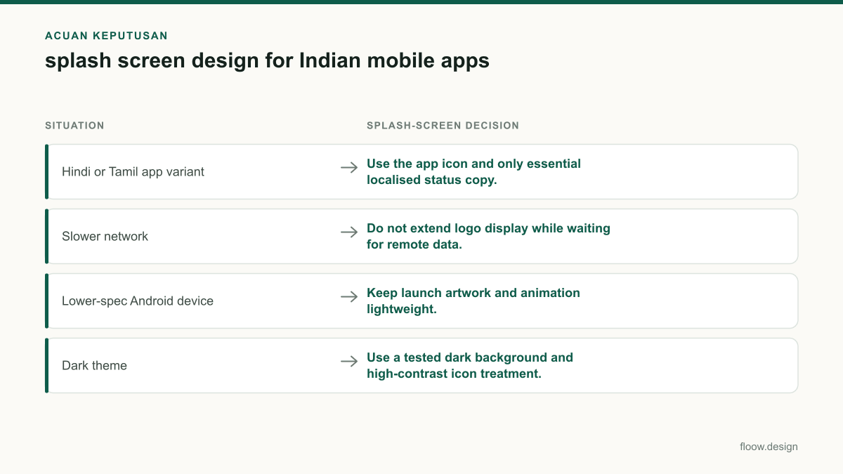
| Hindi or Tamil app variant | Use the app icon and only essential localised status copy. | Show translated loading, offline, and retry actions in the product language. |
| Slower network | Do not extend logo display while waiting for remote data. | Render placeholders or cached context, then provide retry when needed. |
| Lower-spec Android device | Keep launch artwork and animation lightweight. | Avoid heavy blocking work before the first screen appears. |
| Dark theme | Use a tested dark background and high-contrast icon treatment. | Continue the same theme and visual hierarchy into the first screen. |
Common mistakes
Using a fixed-duration logo animation to conceal API, session, or location delays.
End the splash as soon as the app shell can render, then show progress, placeholders, offline status, or retry in the first screen.
Adding a long English tagline to every launch screen.
Keep splash copy minimal and localise only necessary startup messages for Hindi and Tamil variants.
Treating dark mode as an inverted background with the same icon asset.
Test icon contrast, container shape, system bars, and the visual handoff into the dark first screen.
Testing only on fast Wi-Fi and recent devices.
Check cold starts on lower-spec Android hardware and throttled connections, including failed and interrupted requests.
Frequently asked questions
What should a splash screen design include?
A splash screen design should include a recognisable app icon, a theme-appropriate background, and only essential branding. For an Indian Android app, it should hand off quickly to a usable first screen with loading, offline, or retry feedback when remote data is not ready. Hindi and Tamil variants should translate necessary status text, not add lengthy startup copy.
How long should a splash screen stay visible?
A splash screen should stay visible only for the short launch transition needed before the app can render its first useful structure. Do not set a branding duration to hide slow authentication or network requests. On slower connections or lower-spec Android devices, move to a visible loading, cached-content, offline, or retry state instead of holding the logo.
Should Indian apps translate splash screen text?
Indian apps should translate splash-screen text when it communicates a meaningful status or action in a selected language variant, such as Hindi or Tamil. If the screen only shows an app icon and brand name, translation may be unnecessary. Keep startup text short, and place detailed explanations, loading states, and retry actions on the first app screen.
How should dark mode affect a splash screen?
Dark mode should change the splash background, icon contrast, and system-bar treatment so the launch screen matches the device theme and the first app screen. Test the brand mark on dark surfaces rather than simply inverting colours. A payment, commerce, or travel app should preserve recognisability without using a bright full-screen brand colour as a loading disguise.
Where this leaves you
Generate branded light and dark splash-screen directions in floow.design alongside the first app screen. Create the launch transition, loading state, offline or retry state, and Hindi and Tamil copy variants together so the product does not rely on a logo screen to hide startup work.
Design the screens first
Describe the app in plain language and floow.design draws the iOS and Android screens for you, ready to refine and hand off.
Sources
Related reading
Design your mobile app with AI.
Generate pixel-perfect iOS and Android screens in seconds, then export to Figma or code.
You might also like…
 How-to20 September 2026Dark mode design for Indian mobile appsBuild dark mobile screens for India with Hindi and regional scripts, UPI payment states, and Android-first legibility for lower-cost devices.By floow.design Team, Mobile Design
 How-to20 September 2026app icon design for Indian mobile productsBuild recognisable app icons for India’s Android-heavy market, with language-neutral symbols, adaptive-icon checks and a coherent splash screen direction.By floow.design Team, Mobile Design
 How-to20 September 2026micro interactions for Indian mobile appsDesign micro interactions for Indian mobile apps with clear UPI and OTP feedback, low-connectivity states, and delivery tracking cues that reduce doubt.By floow.design Team, Mobile Design