
Dark mode design for Indian mobile apps
Build dark mobile screens for India with Hindi and regional scripts, UPI payment states, and Android-first legibility for lower-cost devices.

Dark mode design for Indian mobile apps should begin with readable near-black surfaces, script-aware typography, and unmistakable UPI outcomes. Test Hindi and regional-language text on Android devices common in India, then verify that success, pending, and failure states remain distinct without relying on brightness or colour alone.
Key takeaways
- •Use a tonal dark palette rather than pure black everywhere; preserve elevation and grouping with surface levels.
- •Test Hindi and regional-language scripts at real Android text sizes, especially in dense payment and account screens.
- •Design UPI success, pending, and failure as complete states with labels, icons, receipts, and next actions—not colour-only signals.
- •Start testing on Android early, including lower-cost devices where small screens, display variation, and performance constraints expose weak contrast.
- •Generate paired light and dark mobile screens in floow.design before formalising design tokens.
What's on this page
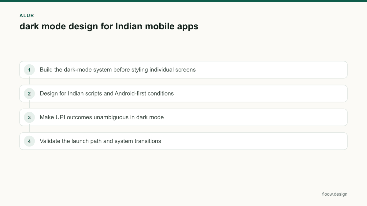
- •Build the dark-mode system before styling individual screens
- •Design for Indian scripts and Android-first conditions
- •Make UPI outcomes unambiguous in dark mode
- •Validate the launch path and system transitions
Build the dark-mode system before styling individual screens
Treat dark mode as a second theme of the same app screen design system, not as a light screen with inverted colours. Define semantic tokens first: page background, raised surface, input surface, primary text, secondary text, divider, brand action, positive, caution, and destructive. A near-black background with slightly lighter surfaces usually gives cards, sheets, and bottom navigation enough separation without harsh borders.
Keep text hierarchy deliberate. Primary text must remain readable at common Android brightness levels; secondary text, disabled states, and helper copy need enough difference to be useful but not compete with the task. Avoid placing saturated brand colours across large dark areas, because they can visually vibrate and make white text harder to read.
Use Material Design’s dark-theme guidance as a baseline for elevation, colour roles, and accessibility decisions, then validate it in your own screens. Generate paired light and dark mobile screens in floow.design to compare hierarchy before formalising tokens. Do this for the home screen, form fields, a transaction detail, and an error state—not only a marketing-style splash screen design.
Design for Indian scripts and Android-first conditions
India-facing dark mode needs script testing, not just English placeholder copy. Test dark surfaces with Hindi and regional-language scripts used by your audience, such as Bengali, Tamil, Telugu, Marathi, Malayalam, Kannada, Gujarati, or Punjabi where relevant. Different scripts change perceived density: matras, conjuncts, headlines, numerals, and longer translated labels can make a compact row fail even when its English version looks clean.
Use production-like strings for account names, address fields, payment notes, consent copy, and button labels. Check wrapping at larger system font settings, truncation in transaction lists, and contrast around thin glyphs. Do not solve overflow by reducing type below a comfortable reading size; allow two lines, shorten the translation with a native reviewer, or change the component layout.
Make Android-first testing part of the definition of done. India’s price-sensitive device market means lower-cost Android phones deserve early coverage, not a final QA pass. Inspect small displays, lower brightness, display colour variation, slow rendering, and keyboard overlap. Android’s accessibility documentation provides the platform settings and testing direction for text scaling, contrast, and assistive use.
Make UPI outcomes unambiguous in dark mode
A payment result is a high-consequence state. For UPI, create separate success, pending, and failure components rather than tinting one generic confirmation screen. A success state should pair a positive colour with a clear success icon, an explicit status label, amount, recipient or merchant, timestamp, transaction reference when available, and a receipt or sharing action. The colour confirms the result; it must not carry the meaning alone.
A pending state needs a caution or neutral status colour, a pending icon, plain wording such as that confirmation is still in progress, and a safe next step. Do not imply that money has failed or succeeded while status is unresolved. A failure state needs a destructive colour, a failure icon, a clear reason when your system has one, and actions such as retry, choose another method, or get help.
On dark surfaces, test these colours at low brightness and with colour-vision differences in mind. Keep status text and icons visible even if the coloured container is removed. NPCI publishes UPI product information; use its terminology and your payment-provider response states when defining the exact labels shown to users.
Validate the launch path and system transitions
Dark mode is often judged first in the launch path, where a mismatched splash screen design can flash white before the app theme loads. Set the Android launch experience to follow the selected theme, and verify cold start, warm start, sign-in return, permission prompts, and deep links. The first content screen should inherit the same background and status-bar treatment so the transition does not look like two different apps.
Test both system-controlled and in-app theme choices. If your product offers a manual setting, state whether it follows the device setting, stays fixed, or changes immediately. Preserve that preference across logout and updates where product policy permits. Check status-bar icons, navigation-bar icons, keyboards, bottom sheets, dialogs, and web content opened inside the app; these are frequent sources of accidental light surfaces.
Run comparison reviews with matched light and dark flows. In floow.design, generate the same payment, profile, and onboarding screens in both themes, then review content priority, tap targets, error visibility, and loading states side by side. Only after those checks should the team freeze semantic tokens and component variants.
Common mistakes
Using green, amber, and red alone to communicate a UPI result.
Add a status icon, explicit success, pending, or failure label, transaction details, and an appropriate next action.
Approving dark mode with English-only placeholder text.
Run component and flow tests with Hindi and the regional-language scripts your Indian audience actually uses.
Testing only on a flagship phone at high brightness.
Test Android-first across smaller and lower-cost devices, varied display settings, larger text, and lower brightness.
Making every dark surface pure black.
Use distinct dark surface levels so sheets, cards, inputs, and navigation retain hierarchy.
Frequently asked questions
How do I create dark mode design for an app?
Create dark mode design for an app by defining semantic colour tokens for backgrounds, surfaces, text, actions, and status states, then applying them consistently to each mobile component. Compare paired light and dark flows, test contrast at low brightness, and include loading, empty, error, and payment screens. For Indian apps, validate Hindi and relevant regional-language strings on Android devices early.
Does dark mode work well with Hindi text?
Dark mode can work well with Hindi text when contrast, line height, weight, and wrapping are tested with real Devanagari content rather than English placeholders. Matras and conjuncts can make text appear denser on dark surfaces, so check labels, transaction rows, forms, and larger text settings. Apply the same process to the regional-language scripts used by the app’s audience.
How should payment success colours work in dark mode?
Payment success colours in dark mode should support, not replace, a clear success signal. Pair the positive colour with a success icon, an explicit status label, amount, payee or merchant details, and a receipt action. For UPI, build separate pending and failure states with their own labels, icons, and next steps so users do not infer the outcome from colour alone.
Why should Indian mobile apps test dark mode on lower-cost Android phones?
Indian mobile apps should test dark mode on lower-cost Android phones because small displays, lower brightness, display variation, and performance constraints can reveal weak text contrast, cramped translated labels, and inconsistent loading states. Android-first testing helps teams catch issues that may not appear on a large flagship device, especially in payment, onboarding, and support flows.
Where this leaves you
A credible Indian dark theme is readable before it is dramatic: semantic surfaces, real Hindi and regional-language content, explicit UPI outcomes, and Android-first validation. Use floow.design to compare paired themes at screen and flow level, then convert the winning decisions into reusable tokens and components.
Design the screens first
Describe the app in plain language and floow.design draws the iOS and Android screens for you, ready to refine and hand off.
Sources
Design your mobile app with AI.
Generate pixel-perfect iOS and Android screens in seconds, then export to Figma or code.
You might also like…
 How-to20 September 2026splash screen design for Indian mobile appsDesign splash screens for Indian Android users with fast startup states, Hindi and Tamil messaging, dark mode, and honest loading handoffs for apps.By floow.design Team, Mobile Design
 How-to20 September 2026micro interactions for Indian mobile appsDesign micro interactions for Indian mobile apps with clear UPI and OTP feedback, low-connectivity states, and delivery tracking cues that reduce doubt.By floow.design Team, Mobile Design
 How-to20 September 2026app screen design for India-first mobile flowsBuild connected Indian app screens for mobile OTP, UPI, addresses and multilingual support, with practical patterns for coherent mobile journeys.By floow.design Team, Mobile Design