
app ui design for Indian mobile users
Practical app UI design guidance for India: UPI payment recovery, multilingual screen expansion, and Android-first mobile constraints with iOS support.

Good app ui design for India prioritises Android-first layouts, clear UPI payment states and room for Hindi plus regional-language copy. Build payment screens around familiar UPI actions—choose an app, approve, return and verify status—then preserve iOS support for users who need it. Avoid relying on dense English labels, uninterrupted connectivity or one fixed text length.
Key takeaways
- •Treat UPI as a stateful payment journey, not a single confirmation button.
- •Reserve layout capacity for Hindi and regional-language expansion before localisation begins.
- •Design and test for Android-first constraints such as compact screens, variable network quality and back navigation, while maintaining a credible iOS experience.
- •Generate India-ready onboarding, payment and account screens in floow.design from one product prompt.
What's on this page
- •Build payment screens around the UPI journey
- •Make multilingual UI a layout decision, not a translation task
- •Design Android-first without making iOS an afterthought
- •Use floow.design to turn requirements into screen sets
Watch: Figma Mobile App Design Tutorial
Video by Hyginus Ukeh - Building Amazing Things, embedded from YouTube.
Build payment screens around the UPI journey
For Indian mobile app design, a payment screen should make the UPI path legible at every point: amount, payee, selected UPI app or method, approval handoff, return to the merchant and final result. Use a specific pending state after the user leaves the app; do not show “Payment successful” until your product has a confirmed result.
Failure recovery matters as much as the happy path. A user may approve in a UPI app, return late, lose connectivity or see a bank-side delay. Keep the order or transaction reference visible, explain that confirmation can take time, and provide Check payment status rather than encouraging an immediate duplicate payment. If payment is not confirmed, offer an alternate action only after clearly stating whether the original payment is still pending.
UPI is operated by NPCI, so product teams should validate the payment integration and status handling against their chosen payment partner’s implementation guidance as well as NPCI’s UPI information. In app screen design, distinguish pending, successful, failed and cancelled with plain language, status icons and a recoverable next step—not colour alone. Source: NPCI.
Make multilingual UI a layout decision, not a translation task
India’s multilingual market means English-only interface assumptions can fail early, especially in onboarding, identity details, help and payment reassurance. Start by identifying the languages that match the product’s audience and service area, then design reusable components that tolerate longer labels, different line breaks and translated error messages. Hindi may be an important starting point, but it is not a substitute for regional-language support where the audience expects it.
Use familiar, explicit labels for high-risk actions. Keep primary actions short, permit two-line buttons where necessary, and avoid placing legal or payment-critical meaning only in a truncated string. Do not use an icon as the sole instruction when translated copy is needed. For account screens, allow names and addresses to be entered and displayed as users provide them; do not assume Latin-script input alone represents the customer.
Test each critical flow in its actual language variant: first-run permission explanations, UPI pending recovery, address entry, support and account deletion. India’s Census provides official context on the country’s language diversity; use audience research—not a generic national default—to choose launch languages. Source: Census of India.
Design Android-first without making iOS an afterthought
An Android-first strategy in India should shape the first set of mobile app design decisions: compact widths, modest device performance, variable connectivity, text scaling and predictable system-back behaviour. Keep initial screens light, defer non-essential media, retain form progress locally where appropriate and show useful offline or retry states rather than blank loaders. Test on smaller Android viewports and with enlarged text before treating a Figma canvas as production-ready.
Follow Android guidance for adaptive layouts and accessible touch targets. Avoid placing an essential action only at the far edge of a crowded screen, and ensure bottom sheets, keyboards and error messages do not cover the confirmation control. For UPI return flows, restore the user to a clear transaction state rather than an ambiguous home screen.
Retain iOS support where the product serves iPhone users: respect iOS navigation patterns, safe areas, permission behaviour and system typography instead of copying Android controls unchanged. The visual system can be shared, while interaction details should remain platform-appropriate. Review Android’s official design guidance and Apple’s Human Interface Guidelines during implementation. Sources: Android Developers and Apple Human Interface Guidelines.
Use floow.design to turn requirements into screen sets
Write one product prompt in floow.design that names the Indian audience, the task and the operating conditions. For example: “Create a Hindi- and English-ready grocery checkout for India, with Android-first layouts, UPI app selection, pending-payment recovery, order reference, and account support screens.” The output should include connected onboarding, payment and account screens rather than a single isolated checkout mock-up.
Review the generated screens with a localisation checklist. Confirm that button labels can expand, the UPI success screen is not shown before confirmation, pending payments have a status-check action, and the Android layout remains usable with the keyboard open. Then create the iOS variant by adapting navigation, safe-area spacing and platform controls while retaining the same product content and transaction states.
This approach makes floow.design useful at the point where teams need coverage, not just visual direction: generate India-ready onboarding, payment and account screens from a single product prompt, then test the resulting flows with target-language users and real payment-state scenarios.
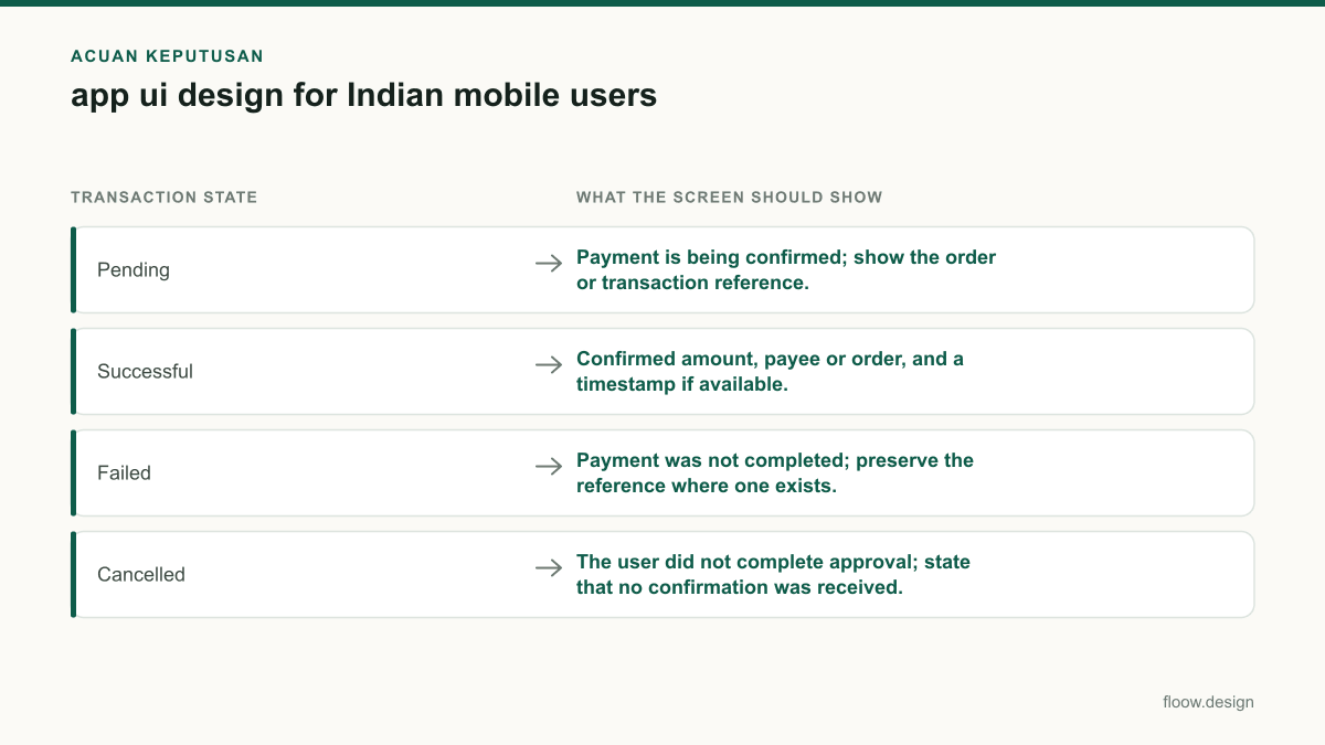
India-ready payment-state copy for a UPI flow
| Transaction state | What the screen should show | Primary action |
|---|---|---|
| Pending | Payment is being confirmed; show the order or transaction reference. | Check payment status |
| Successful | Confirmed amount, payee or order, and a timestamp if available. | View order or Done |
| Failed | Payment was not completed; preserve the reference where one exists. | Try again or choose another method |
| Cancelled | The user did not complete approval; state that no confirmation was received. | Return to payment methods |
Common mistakes
Showing a success screen immediately after a user is sent to a UPI app.
Wait for a confirmed result. On return, show a pending state and a visible status-check action when confirmation is delayed.
Adding Hindi or regional languages after fixed English layouts are approved.
Design flexible components first: allow wrapping, test translated error states and keep critical actions clear at larger text sizes.
Treating Android and iOS as identical implementations.
Share content and transaction logic, but adapt navigation, safe areas, system controls and back behaviour for each platform.
Using network errors as generic dead ends.
Preserve entered data, identify the affected step and offer retry or status recovery, especially after a UPI handoff.
Frequently asked questions
What makes good app ui design for India?
Good app ui design for India accounts for Android-first usage conditions, multilingual copy and UPI payment behaviour. It uses compact, accessible layouts; supports Hindi and relevant regional languages; and shows clear UPI pending, success, failure and cancellation states. The most important screens preserve context during weak connectivity and give users a clear recovery action rather than a vague error.
Should an Indian app support regional languages?
An Indian app should support regional languages when its target audience, geography or task makes them relevant. Hindi alone will not serve every market. Start with user research and service coverage, then localise high-impact flows such as onboarding, payments, account help and errors. Build flexible layouts first so translated labels, text scaling and non-Latin scripts remain readable.
How should UPI appear in app UI design?
UPI should appear in app UI design as a complete payment flow: amount and payee review, UPI method or app selection, approval handoff, return state and confirmed outcome. After handoff, show pending until confirmation is received. Include the transaction or order reference and a “Check payment status” action so users do not accidentally make a duplicate payment during delays.
How can floow.design help create Indian app screens?
floow.design can generate India-ready onboarding, payment and account screens from a single product prompt. Include the audience language, Android-first constraints, UPI payment states and recovery requirements in the prompt. Review the generated set for expandable copy, payment confirmation logic, compact Android layouts and an adapted iOS variant before handing it to product and engineering teams.
Where this leaves you
India-ready interface work is won in the edges of the flow: a delayed UPI confirmation, a translated error string, a compact Android device and a platform-specific navigation expectation. Specify those conditions in floow.design, generate the connected screen set, then validate the states with the people who will use them.
Design the screens first
Describe the app in plain language and floow.design draws the iOS and Android screens for you, ready to refine and hand off.
Sources
Design your mobile app with AI.
Generate pixel-perfect iOS and Android screens in seconds, then export to Figma or code.
You might also like…
 Guides20 September 2026Mobile app design for India: practical guideDesign India-ready mobile app screens with Android-first patterns, UPI, cash-on-delivery, OTP verification, and Hindi and regional-language support.By floow.design Team, Mobile Design
 How-to20 September 2026app screen design for India-first mobile flowsBuild connected Indian app screens for mobile OTP, UPI, addresses and multilingual support, with practical patterns for coherent mobile journeys.By floow.design Team, Mobile Design
 Guides20 September 2026ux writing for Indian mobile appsA practical guide to UX copy for Indian apps: UPI, OTP, KYC, payment failures, multilingual expansion and DPDP Act consent wording.By floow.design Team, Mobile Design