
ux writing for Indian mobile apps
A practical guide to UX copy for Indian apps: UPI, OTP, KYC, payment failures, multilingual expansion and DPDP Act consent wording.

ux writing for Indian mobile apps means designing short, actionable copy for familiar moments such as UPI payments, OTP verification and KYC, while planning for English, Hindi and regional languages. In high-stakes flows, name the status, explain the next safe action and avoid making users guess whether money, identity or data is at risk.
Key takeaways
- •Treat transaction copy as part of the payment experience: confirm what happened, what is still pending and what the user should do next.
- •Use English as a workable starting language where appropriate, but design content structures that can expand into Hindi and regional languages without breaking the UI.
- •Write consent and data-request screens in clear, plain language, with the data and purpose stated separately.
- •Test wording, hierarchy and button labels together on mobile screens rather than reviewing strings in isolation.
What's on this page
- •Write for decisions, not just labels
- •Build a transaction-copy framework for UPI, OTP and KYC
- •Plan English, Hindi and regional-language interfaces early
- •Make consent copy specific under the DPDP Act, 2023
- •Test language and hierarchy on the actual mobile screen
Write for decisions, not just labels
Good ux writing in India helps people make a safe next decision on a small screen, often under time pressure. The copy must work when a user is topping up a wallet, sharing a delivery address, verifying an identity or sending money through UPI. Start each state with the outcome: Payment successful, Payment pending, or We could not complete this payment. Then state the action that is safe now.
For UPI, never collapse pending and failed into one vague message. A pending payment needs a reference number, a clear instruction not to pay again immediately, and a way to check status. A failed payment needs a retry path only when retrying is appropriate. For OTP, say where the code was sent, how long it remains valid if that information is available, and what to do if it does not arrive. Avoid copy that encourages users to share an OTP; OTPs are authentication credentials, not information to send to support or another person.
In app ui design, the primary button should match the state: Check status, Try again, Use another method, or Contact support. Do not make every outcome end in OK.
Build a transaction-copy framework for UPI, OTP and KYC
Use a repeatable pattern for high-stakes screens: status → consequence → next action → support detail. This gives content designers, product teams and engineers a shared way to cover edge cases.
For example, a UPI failure can read: Payment could not be completed. No money has been transferred from your account. Try again or choose another payment method. If the system cannot yet confirm the outcome, use: Payment is being processed. Please do not pay again right now. Check the status using this reference number. The distinction matters more than a friendlier tone.
For KYC, say why verification is requested, what document or detail is needed, and whether the user can continue with limited features. Avoid unexplained instructions such as Complete KYC now. Prefer Verify your identity to increase your transaction limit only when that consequence is true for the product.
For OTP screens, make the channel explicit: Enter the 6-digit code sent to your mobile number ending 4821. Include Resend code only after the product’s actual resend rule allows it. The National Payments Corporation of India publishes UPI information for participants and users at NPCI; align payment terminology with the rails your app uses rather than inventing internal names.
Plan English, Hindi and regional-language interfaces early
Do not treat translation as a final export from English. Indian interfaces commonly need English-to-Hindi expansion and, depending on the audience, regional-language support. Design the content model before localization: allow longer labels, variable line breaks, translated error messages, and language-specific number or date treatments where your product requires them.
English may be the right default for a professional, urban or established product audience, but it is not automatically the clearest language for every task. Hindi can improve comprehension for many users, while Tamil, Telugu, Bengali, Marathi, Kannada, Malayalam, Gujarati, Punjabi and other languages may be more appropriate for a regional audience. Research the actual customer segment rather than using Hindi as a blanket substitute for all Indian users.
Keep product names, UPI IDs, bank names, reference numbers and amounts easy to scan across languages. Test mixed-script layouts carefully: a Hindi explanation may sit beside an English bank name and an INR amount. Reserve enough vertical space for translated buttons; do not solve overflow by shrinking type below a readable mobile size.
Use user research methods such as moderated task tests, comprehension checks and support-ticket review. Ask participants what they think a pending-payment screen means before asking whether they like its wording.
Make consent copy specific under the DPDP Act, 2023
When an app asks for personal data, write the request as a decision, not as legal wallpaper. India’s Digital Personal Data Protection Act, 2023 requires consent requests to be free, specific, informed, unconditional and unambiguous, and requires a clear, plain-language notice describing the personal data and purpose. See the official text through India Code.
On a mobile screen, separate the components: what data is requested, why it is needed, what feature depends on it, and the choice available to the user. For example: Allow location access to show delivery options for your address. You can continue by entering your address manually. This is more useful than We value your privacy above a broad permission request.
Do not bundle unrelated purposes into one acceptance button. A request for a phone number to send an OTP is different from a request to use that number for promotional messages. If a feature needs identity data for KYC, explain that purpose close to the upload or entry step, rather than hiding it behind a generic terms link.
Create a content inventory for permissions, consent prompts, KYC notices and account-deletion journeys. Review it with legal and privacy teams, then test whether users can accurately explain what they agreed to.
Test language and hierarchy on the actual mobile screen
Copy review in a spreadsheet will not reveal whether a Hindi button wraps badly, a payment reference is buried below the fold or an error message competes with a promotional banner. Prototype the complete state: amount, payee, status, support route and actions. Then test realistic tasks such as sending money to a UPI ID, recovering from an expired OTP or completing a KYC document upload.
Measure comprehension before preference. Can users tell whether the payment succeeded, failed or is pending? Do they know whether to retry? Can they identify the requested data and its purpose? Listen for words users naturally use—such as PIN, OTP, UPI, bank account, refund or verification—and use familiar terms consistently where they are accurate.
Include low-connectivity and interruption scenarios. A transaction may appear uncertain after a network drop, so the UI must not imply certainty that the backend cannot provide. Preserve key details such as the UPI reference number and timestamp where available.
Generate screens with contextual UI copy in floow.design, then test the language and hierarchy together. A screen generator is most useful when it helps the team inspect the copy in the payment, OTP and KYC states where users actually need it.
Recommended copy treatment for common Indian transaction states
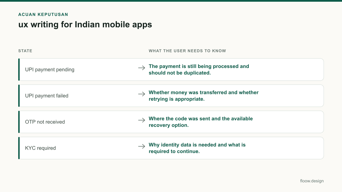
| State | What the user needs to know | Primary action |
|---|---|---|
| UPI payment pending | The payment is still being processed and should not be duplicated. | Check status |
| UPI payment failed | Whether money was transferred and whether retrying is appropriate. | Try again |
| OTP not received | Where the code was sent and the available recovery option. | Resend code |
| KYC required | Why identity data is needed and what is required to continue. | Start verification |
| Data permission request | The specific data, purpose and any alternative path. | Allow |
Common mistakes
Using one generic message for payment failure, reversal and pending status.
Create distinct states and only promise an outcome the payment system can confirm.
Translating English strings after the layout and component limits are fixed.
Design for text expansion, mixed scripts and regional-language variants from the first mobile prototype.
Hiding a broad data request behind a single consent button.
State the data and purpose in plain language near the decision, and separate unrelated purposes.
Using OK as the main action after an OTP, KYC or payment error.
Use a verb that tells users what they can safely do next, such as Check status or Use another method.
Frequently asked questions
What is ux writing for Indian apps?
ux writing for Indian apps is the practice of writing interface copy that helps users complete mobile tasks clearly in local contexts, including UPI payments, OTP verification, KYC and consent. It covers English, Hindi and regional-language planning, as well as accurate messages for payment success, failure and pending states.
Should Indian apps use English or Hindi UX copy?
Indian apps should choose English, Hindi or a regional language based on the audience, task and market rather than assuming one language fits everyone. English can suit some user groups, while Hindi or a regional language can improve task comprehension. Design the UI for multilingual expansion and validate the choice through user testing.
How do I write a UPI payment failure message?
A UPI payment failure message should state that the payment could not be completed, clarify whether money was transferred only when the system can confirm it, and offer a safe next action. For example: Payment could not be completed. No money has been transferred from your account. Try again or use another payment method.
How should an Indian app ask for consent to use personal data?
An Indian app should ask for consent in clear, plain language that identifies the personal data requested and the purpose for using it. Under the Digital Personal Data Protection Act, 2023, avoid bundling unrelated purposes. Place the explanation beside the relevant mobile decision, such as location access, KYC verification or OTP delivery.
Where this leaves you
For Indian mobile products, the best UX copy removes uncertainty at the moments that carry money, identity and personal data. Write precise states for UPI, OTP and KYC; build for Hindi and regional-language growth; and test every important message in its real screen context with floow.design.
Design the screens first
Describe the app in plain language and floow.design draws the iOS and Android screens for you, ready to refine and hand off.
Sources
Design your mobile app with AI.
Generate pixel-perfect iOS and Android screens in seconds, then export to Figma or code.
You might also like…
 Guides20 September 2026Mobile app design for India: practical guideDesign India-ready mobile app screens with Android-first patterns, UPI, cash-on-delivery, OTP verification, and Hindi and regional-language support.By floow.design Team, Mobile Design
 Guides20 September 2026app ui design for Indian mobile usersPractical app UI design guidance for India: UPI payment recovery, multilingual screen expansion, and Android-first mobile constraints with iOS support.By floow.design Team, Mobile Design
 How-to20 September 2026user research methods for Indian mobile appsChoose research methods for Indian mobile apps across metro, tier-2 and tier-3 users, regional languages, device constraints and payment journeys.By floow.design Team, Mobile Design