
ui ux case study for Indian app products
Build a credible Indian mobile app case study with UPI failure states, low-bandwidth flows, Hindi and Tamil testing, and DPDP consent decisions.

A ui ux case study for an Indian app product should connect research evidence to mobile decisions: show a UPI payment failure and retry flow that works on weak networks, test it in Hindi and a regional language such as Tamil, and explain how consent choices align with the Digital Personal Data Protection Act, 2023.
Key takeaways
- •Make the case study a chain of evidence: user problem, constraints, design decision, test result, and next iteration.
- •Treat UPI status, payment retries, and uncertain network states as core product flows rather than edge cases.
- •Test comprehension and task completion in Hindi plus the regional language relevant to the product’s launch market.
- •Document consent purpose, choice, and withdrawal paths when personal data is collected or used.
- •Use floow.design to create before-and-after mobile flow visuals that reviewers can scan quickly.
What's on this page
- •Case study scenario: fixing a UPI checkout under weak connectivity
- •Research plan: prove the Indian constraint before designing around it
- •Consent is a product flow, not a footer
- •Turn the work into a reviewable case-study narrative
Case study scenario: fixing a UPI checkout under weak connectivity
Use one bounded scenario instead of presenting a polished collection of screens. For example, document a grocery-reorder app where a customer chooses UPI at checkout while their connection becomes unreliable. The difficult moment is not entering an amount; it is the period after the customer leaves the app for their UPI app and returns without a clear payment outcome.
Frame the case around three observable risks: the order may be unpaid, payment confirmation may be delayed, or the customer may attempt to pay again. Show the original flow, the failure states, and the revised flow. The revised interface should preserve the order reference, state whether payment is processing, successful, or not completed, and give a clear next action rather than implying that a second payment is safe.
State what the product team could verify and what it could not. Do not claim a bank-side result from a client-side timeout. The National Payments Corporation of India publishes UPI information at npci.org.in; use its terminology carefully and avoid inventing payment-status rules. For low-bandwidth conditions, show compact loading states, saved cart details, and recovery after reconnecting—not a decorative offline badge.
Research plan: prove the Indian constraint before designing around it
A credible case study names the user research methods that changed the design. Start with task interviews or contextual sessions around a real purchase: choosing items, switching to a UPI app, returning to the merchant app, and resolving an unclear outcome. Ask participants to describe what they believe happened at each stage. That exposes the language they use for “pending,” “failed,” and “paid.”
Then test in at least two languages: Hindi and a relevant regional language. For a Tamil Nadu launch, that can mean Hindi and Tamil. Do not merely translate button labels. Test whether participants understand payment-state messages, order references, retry wording, and support options in each language. Record the device language, the app language, and whether the participant uses transliterated input, because these affect comprehension.
Include a constrained-network protocol. Run the same checkout task with normal connectivity, interrupted connectivity after UPI handoff, and delayed reconnection. Report participant count, recruitment criteria, task script, and the severity rule used for findings. That level of disclosure is more useful than saying the design was “validated.”
Consent is a product flow, not a footer
If the app collects personal data for account creation, delivery, communications, analytics, or personalisation, show where the user is informed and where they can make a meaningful choice. The Digital Personal Data Protection Act, 2023 sets requirements around notice and consent for digital personal data; use the official Ministry of Electronics and Information Technology material at meity.gov.in as the authoritative reference, and have counsel review the final implementation.
In the case study, distinguish essential account or order information from optional purposes. A practical mobile pattern is a short, purpose-specific notice before an optional choice, a link to fuller information, and a settings route for withdrawal or changes where applicable. Avoid a preselected optional toggle or a single vague statement that bundles unrelated purposes.
Describe the design decision in product terms: “We separated delivery updates from promotional messages because users needed to understand the choice at checkout.” Then show the evidence: confusion observed in testing, the revised consent screen, and the completion or comprehension outcome. Do not present legal review as a substitute for user testing.
Turn the work into a reviewable case-study narrative
Structure the write-up so a hiring manager, founder, or product lead can trace each screen back to a reason:
- •Context: product, audience, platform, your role, timeframe, and constraints.
- •Problem: the UPI ambiguity or weak-network checkout failure, stated as a user and business risk.
- •Evidence: research questions, participant profile, Hindi and Tamil sessions, and findings.
- •Decisions: payment states, recovery actions, content choices, and DPDP consent treatment.
- •Validation: usability testing tasks, results, unresolved issues, and what you would test next.
Keep artifacts close to the claims they support. A journey map belongs beside the research finding; an error-state sequence belongs beside the payment decision. Use floow.design to create the before-and-after flow visuals that make the UPI handoff, failure state, reconnect state, and consent choice easy to review on mobile-sized screens.
End with outcomes you can defend. If the project is conceptual, say so and report usability observations rather than fabricated conversion gains. If it shipped, separate measured product metrics from qualitative feedback and identify the measurement window.
Indian mobile checkout evidence to include in the case study
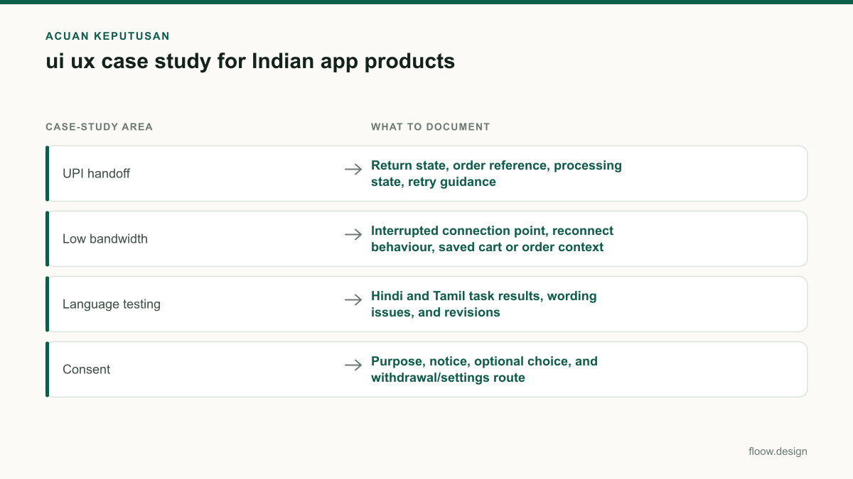
| Case-study area | What to document | Why it matters |
|---|---|---|
| UPI handoff | Return state, order reference, processing state, retry guidance | Users may return to the merchant app before payment status is clear. |
| Low bandwidth | Interrupted connection point, reconnect behaviour, saved cart or order context | A checkout cannot assume uninterrupted connectivity. |
| Language testing | Hindi and Tamil task results, wording issues, and revisions | Translation alone does not prove payment messages are understood. |
| Consent | Purpose, notice, optional choice, and withdrawal/settings route | Consent design needs to be legible in the product flow under the DPDP Act, 2023. |
Common mistakes
Showing only the happy-path UPI checkout.
Include processing, unsuccessful, and reconnect states, with explicit guidance that prevents an uninformed duplicate payment attempt.
Calling a translated interface multilingual research.
Run moderated tasks in Hindi and the relevant regional language, such as Tamil, and report comprehension findings separately.
Claiming legal compliance from a single consent checkbox.
Document the data purpose, notice, optional choice, and settings or withdrawal path; obtain legal review for the implemented product.
Reporting impressive outcomes without a method.
State whether outcomes came from usability testing, production analytics, or qualitative feedback, along with scope and limitations.
Frequently asked questions
How do I write a ui ux case study in India?
Write a ui ux case study in India as an evidence trail for a mobile task. Define the audience and constraint, show the original and revised flow, explain your user research methods, and report testing. For payment products, include UPI handoff and failure states; for language coverage, test Hindi and a relevant regional language such as Tamil.
What makes a UI UX case study credible?
A UI UX case study is credible when every major design choice has a stated source: research observation, technical constraint, policy requirement, or usability testing result. It names participant scope, tasks, limitations, and unresolved risks. For an Indian checkout, credible evidence includes how UPI status was communicated under weak connectivity and how Hindi and regional-language users understood it.
Should I include usability testing results?
Yes, include usability testing results because they show whether users could complete the intended mobile task and understand critical states. Report the task, participant profile, language, findings, severity, and the change made. If a UPI flow was tested, include what participants understood when payment was processing, unsuccessful, or delayed by low bandwidth.
How should consent appear in an Indian app case study?
An Indian app case study should show consent as a user-facing decision, not only as legal text. Explain the data purpose, the notice shown before collection or use, any optional choice, and how users can change or withdraw choices where applicable. Reference the Digital Personal Data Protection Act, 2023 and keep final legal interpretations with qualified counsel.
Where this leaves you
The strongest Indian mobile case study does not claim that a clean UI solved everything. It shows how research, UPI uncertainty, low-bandwidth recovery, Hindi and Tamil comprehension, and consent choices shaped the screens. Build the visual proof in floow.design, then pair each flow with the evidence that justified it.
Design the screens first
Describe the app in plain language and floow.design draws the iOS and Android screens for you, ready to refine and hand off.
Sources
Design your mobile app with AI.
Generate pixel-perfect iOS and Android screens in seconds, then export to Figma or code.
You might also like…
 How-to20 September 2026Usability testing with Indian mobile usersPlan usability testing across India’s city tiers, languages, devices and networks. Test UPI, OTP and PIN-code flows safely before development.By floow.design Team, Mobile Design
 How-to20 September 2026user research methods for Indian mobile appsChoose research methods for Indian mobile apps across metro, tier-2 and tier-3 users, regional languages, device constraints and payment journeys.By floow.design Team, Mobile Design
 Guides20 September 2026ux writing for Indian mobile appsA practical guide to UX copy for Indian apps: UPI, OTP, KYC, payment failures, multilingual expansion and DPDP Act consent wording.By floow.design Team, Mobile Design