
ui ux design process for Indian mobile apps
A practical ui ux design process for Indian mobile apps: research across languages and city tiers, design UPI and OTP flows, and plan consent.

A ui ux design process for Indian mobile apps should begin with research across language groups and city-tier segments, then map task flows for low or unstable connectivity. Where relevant, design UPI payments, OTP sign-in and Aadhaar-adjacent verification as separate, recoverable states. Add privacy notices and consent checkpoints that reflect the DPDP Act, 2023 before building high-fidelity screens.
Key takeaways
- •Recruit beyond English-speaking metro users: compare language preferences, device constraints and trust signals across city tiers.
- •Treat OTP, UPI and identity verification as multi-state mobile flows, including delay, failure, cancellation and retry.
- •Place consent at the moment data is requested or a purpose changes; do not bury critical choices in onboarding.
- •Prototype risky journeys early, especially payment, verification and weak-network recovery paths.
What's on this page
- •1. Define the Indian mobile journey before drawing screens
- •2. Run user research methods across languages and city tiers
- •3. Map OTP, UPI and Aadhaar-adjacent verification as stateful flows
- •4. Design privacy and consent checkpoints into the flow
- •5. Build an app prototype, test the risky paths, then move to visual design
1. Define the Indian mobile journey before drawing screens
Start the ui ux design process by writing the user’s outcome in one sentence: pay a bill, book a visit, open an account, submit a claim or find a service. Then map the smallest mobile path to that outcome, including entry points from a shared link, notification, referral or returning session.
For Indian products, identify conditions that change the path: a user may prefer a regional language, use a lower-cost Android device, share a handset, or lose connectivity during a critical step. Do not treat these as edge cases. Make them explicit assumptions to test. Define what can be saved locally, what must wait for a network response, and how a person resumes after interruption.
Turn the journey into a screen inventory: entry, eligibility, details, review, consent, verification, payment, confirmation and support. For each screen, state the user decision, required data, system response and recovery route. This prevents a polished interface from hiding an incomplete operational flow.
2. Run user research methods across languages and city tiers
Choose user research methods that expose differences rather than averaging them away. Recruit participants across the Indian language groups relevant to your product and across city-tier segments—for example, metropolitan users alongside people in tier-2 and tier-3 cities. The point is not to stereotype by location or language; it is to observe where comprehension, confidence, connectivity and support needs differ.
Use moderated task interviews for high-stakes actions such as payment or verification. Ask participants to complete realistic tasks on their own phones where possible. Combine this with short diary studies for repeated behaviour, contextual observation for assisted journeys, and usability tests on prototype flows. Capture the language used to describe fees, identity, failure and confirmation, not only whether a task was completed.
Research materials need careful localisation. Translate for meaning, test labels with native speakers, and avoid assuming that English terms are universally understood. If the app supports multiple languages, test language switching, mixed-language content, number formats and error messages in each priority language. Record device, network condition and assistance required as part of every session.
3. Map OTP, UPI and Aadhaar-adjacent verification as stateful flows
When product scope requires them, model OTP, UPI and Aadhaar-adjacent verification as journeys with multiple states—not as a single modal and success screen. For OTP, account for phone-number editing, code delivery delay, incorrect code, resend controls, attempt limits, expiry, changed SIM or number, and a route to help. Never make a user guess whether an OTP was sent.
For UPI, distinguish choosing a payment method, handing off to a payment app or approval step, waiting for confirmation, a pending result, failure and cancellation. The product should explain what happened in plain language and let the user safely check status rather than encouraging duplicate payment attempts. NPCI publishes official information on UPI at https://www.npci.org.in/.
If the product uses Aadhaar-adjacent verification, only request the identity information and verification step genuinely needed for the stated purpose. Show why it is needed, what happens next and how the user can recover if verification cannot complete. For Aadhaar information and official guidance, use UIDAI as the source of record: https://uidai.gov.in/.
4. Design privacy and consent checkpoints into the flow
Include privacy and consent checkpoints during flow design, informed by India’s Digital Personal Data Protection Act, 2023. This is a product-design activity, not a footer exercise. At the moment the app asks for a phone number, location, identity-related information, contacts or another personal-data category, explain the purpose in language appropriate to the selected app language.
Make the decision legible on a mobile screen: what data is requested, why it is needed, whether the task can continue without it where applicable, and where the person can review their choice. If a new purpose arises later, present a new contextual checkpoint instead of relying on an earlier broad onboarding acceptance. Keep confirmation text, permission prompts and support content aligned so users do not receive conflicting explanations.
Work with legal, security and operations teams before finalising copy or data fields. The official text and government materials for the Digital Personal Data Protection Act, 2023 are available through the Ministry of Electronics and Information Technology: https://www.meity.gov.in/. Design should document the intended purpose, collection point, user-facing notice and withdrawal or support route for each data request.
5. Build an app prototype, test the risky paths, then move to visual design
Create an app prototype as soon as the task flow is coherent enough to test. Start with low-fidelity linked screens for navigation, content order and decision points. Use realistic names, amounts and messages where they affect comprehension, but do not expose real personal data in research materials.
Test the highest-risk paths first: first-use onboarding, language selection, OTP verification, payment status, consent decisions and recovery after a dropped connection. Give participants a scenario and observe whether they can explain the next action, recognise pending versus completed states, and recover without researcher help. Revise the flow before investing in detailed visual treatment.
Once the flow is stable, move from flow definition to high-fidelity mobile concepts quickly with floow.design. Use the resulting concepts to compare hierarchy, component behaviour, language variants and state screens. Keep a complete state checklist beside the design file: loading, empty, offline, validation error, service error, pending, success, cancelled and support. A credible Indian mobile experience is defined as much by these states as by its happy path.
India-specific flow checklist for mobile app screens
| Flow area | Screen states to design | Practical design prompt |
|---|---|---|
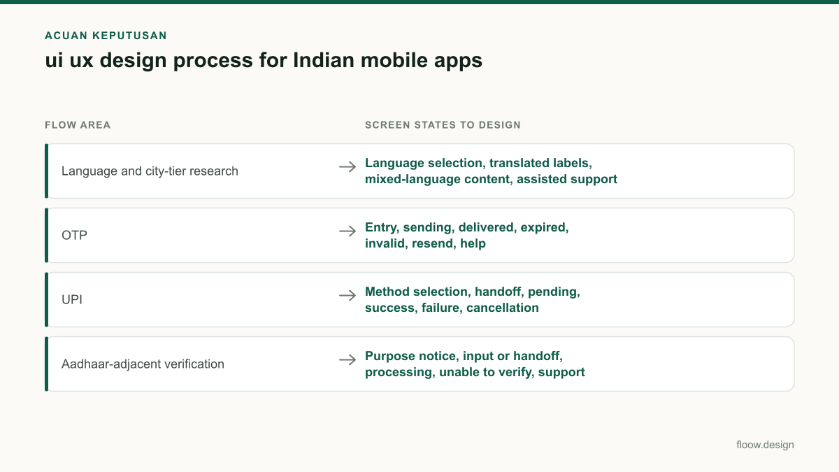
| Language and city-tier research | Language selection, translated labels, mixed-language content, assisted support | Test with relevant Indian language groups and city-tier segments before finalising labels. |
| OTP | Entry, sending, delivered, expired, invalid, resend, help | Show status and recovery without making users restart the entire task. |
| UPI | Method selection, handoff, pending, success, failure, cancellation | Make pending payment status clear and provide a safe status-check route. |
| Aadhaar-adjacent verification | Purpose notice, input or handoff, processing, unable to verify, support | Request only what the product needs and explain the verification purpose. |
| Privacy and consent | Just-in-time notice, choice, confirmation, changed-purpose checkpoint | Tie each request to a stated purpose, informed by the DPDP Act, 2023. |
Common mistakes
Testing only with English-speaking users in major metros.
Recruit across the relevant Indian language groups and city-tier segments, then compare task comprehension and recovery behaviour.
Treating OTP delivery or a UPI result as instant and guaranteed.
Design explicit delayed, expired, pending, failed, cancelled and retry states with clear support routes.
Using one generic consent screen at onboarding for every future data request.
Add contextual privacy notices and consent checkpoints when personal data is requested or the purpose changes.
Designing verification as a single success-or-fail screen.
Map every handoff, processing wait, recoverable failure and alternative support path before visual refinement.
Frequently asked questions
What are the steps in a ui ux design process?
The steps in a ui ux design process are: define the user outcome and constraints, research target users, map the end-to-end flow, create wireframes, build a prototype, test key tasks, refine content and interaction states, then produce high-fidelity mobile screens. For Indian apps, include language, connectivity, OTP, UPI, verification and consent states in the flow from the start.
How do I research users across Indian languages?
Research users across Indian languages by recruiting native speakers from the language groups relevant to the product, including participants across metropolitan, tier-2 and tier-3 city segments. Run task-based sessions in participants’ preferred languages, test translated interface copy in context, and record confusion around labels, permissions, payments and errors. Test language switching and mixed-language content if the app offers them.
When should I prototype an app flow?
Prototype an app flow once the user goal, major decisions and required system states are mapped, before high-fidelity visual design. For Indian mobile apps, prototype early when a journey includes OTP, UPI, Aadhaar-adjacent verification, consent or unstable connectivity. Testing these paths early reveals missing recovery states and unclear instructions before detailed screen production.
How should an Indian app handle privacy consent in the interface?
An Indian app should place privacy notices and consent checkpoints where personal data is requested and explain the purpose in clear, relevant language. If the product asks for data for a new purpose later, present a contextual new checkpoint rather than relying only on onboarding acceptance. Design teams should review these flows with legal and security teams using the DPDP Act, 2023 as a reference.
Where this leaves you
A useful Indian mobile process does not add localisation, payments, verification and privacy after the interface is finished. It tests them as core flow decisions. Define the states, validate them with the right users, and use floow.design to turn proven flows into high-fidelity mobile concepts.
Design the screens first
Describe the app in plain language and floow.design draws the iOS and Android screens for you, ready to refine and hand off.
Sources
- •National Payments Corporation of India — UPI
- •Ministry of Electronics and Information Technology — Digital Personal Data Protection Act, 2023
Related reading
Design your mobile app with AI.
Generate pixel-perfect iOS and Android screens in seconds, then export to Figma or code.
You might also like…
 How-to20 September 2026user research methods for Indian mobile appsChoose research methods for Indian mobile apps across metro, tier-2 and tier-3 users, regional languages, device constraints and payment journeys.By floow.design Team, Mobile Design
 How-to20 September 2026Usability testing with Indian mobile usersPlan usability testing across India’s city tiers, languages, devices and networks. Test UPI, OTP and PIN-code flows safely before development.By floow.design Team, Mobile Design
 How-to20 September 2026app prototype for Indian mobile user testingPlan an Indian mobile app prototype for UPI, OTP, addresses and language variants. Run usability testing on representative Android devices before build.By floow.design Team, Mobile Design