
app icon design for Indian mobile products
Build recognisable app icons for India’s Android-heavy market, with language-neutral symbols, adaptive-icon checks and a coherent splash screen direction.

app icon design for Indian mobile products should prioritise a simple, ownable shape and colour system that remains recognisable in Android launchers at small sizes. Benchmark visual separation from PhonePe, Paytm, Swiggy and Zomato, then avoid depending on Latin or Hindi text so Hindi and regional-language audiences can identify the product instantly.
Key takeaways
- •Design the icon as a fast visual cue, not a miniature logo lock-up.
- •Test adaptive-icon cropping and contrast in Android launcher contexts before release.
- •Use a language-neutral symbol first; reserve Hindi and regional-language copy for the app UI, store listing and onboarding.
- •Create the icon, splash screen and core UI from one visual system rather than treating them as separate assets.
What's on this page
- •Start with a recognisable visual territory
- •Design for Android launcher behaviour first
- •Use language-neutral recognition, then localise inside the product
- •Carry the icon into splash screen design and mobile app design
Start with a recognisable visual territory
India’s app folders and Android launchers are crowded, so the first job of app icon design is recognition rather than explanation. Put your candidate beside familiar Indian product icons: PhonePe’s purple field and distinctive mark, Paytm’s blue-toned wordmark treatment, Swiggy’s orange pin-like symbol and Zomato’s red identity. The point is not to copy their colours or geometry; it is to check whether your icon still has an immediate, separate silhouette.
Choose one primary visual asset: a symbol, a distinctive container shape, or a restrained colour pairing. Remove tiny details that disappear at launcher size. If a user can describe the icon only as “another blue payment app” or “another red food app”, it needs a stronger ownable cue.
Run a practical comparison: place your icon in a simulated home-screen grid with payment, commerce, food and utility apps. Look at it at actual phone scale, not only zoomed in on a design canvas. Ask whether the icon can be picked out by colour, outline and negative space within a second. That is a more useful benchmark than whether it looks elaborate in a presentation.
Design for Android launcher behaviour first
For many Indian users, Android is the primary mobile platform, so test the icon as Android presents it rather than as a flat square exported from Figma. Android supports adaptive icons: foreground and background layers can be masked differently by device launchers. Keep the crucial mark comfortably inside the safe visual area so it is not clipped when a launcher applies a circle, rounded square or another mask.
Avoid baking a thin border into the artwork just to make it look finished on one device. A launcher, wallpaper or dark mode setting can make that border vanish or create an unintended double edge. Instead, create contrast through the background layer, a solid central form and clear spacing around it. Google’s Android developer documentation is the reference for adaptive icon asset structure and launcher handling (Android Developers).
Check four situations on physical Android devices where possible: light wallpaper, dark wallpaper, a dense folder grid and notification or settings surfaces where the icon is reduced. Also inspect the icon next to PhonePe, Paytm, Swiggy and Zomato screenshots from the relevant user’s phone. A design that works only against a white artboard is not ready for launch.
Use language-neutral recognition, then localise inside the product
Do not make the app icon carry the entire product name. Latin text becomes unreadable at small sizes, and a Hindi label does not serve every regional-language audience. India’s language context makes a language-neutral symbol especially valuable: a visual cue can remain consistent while the app’s UI, onboarding, labels and support content appear in Hindi or other regional languages.
This does not mean stripping away local relevance. A product serving local commerce, travel, payments or community needs can use familiar objects, actions and colour associations, provided the symbol is not culturally ambiguous and does not resemble a category leader too closely. Test comprehension with users who use Hindi and the regional languages relevant to your launch markets. Ask what action or benefit they infer before revealing the app name.
Keep any required brand name, Hindi copy or regional-language copy in places that have room to communicate: the Play listing, splash screen, onboarding and core app UI. The icon should remain identifiable even when the launcher truncates labels, the device font changes, or a user has switched system language. That separation makes localisation easier and reduces the need to create multiple icon variants.
Carry the icon into splash screen design and mobile app design
An icon earns trust when the first opened screen confirms what the launcher promised. Build splash screen design from the same visual ingredients: the icon symbol, background colour and one supporting motion or transition. Do not introduce a new illustration style or unrelated palette during launch; it weakens recall just after the user has selected the icon.
Continue that system into mobile app design. If the icon is a bold orange symbol, define how orange appears in active states, confirmations and empty states without making every screen orange. If its key feature is a rounded container, reuse that geometry in cards, buttons or avatar treatment selectively. The icon should signal the product’s visual grammar, not dictate every UI component.
Use floow.design to generate a coherent visual direction that aligns the icon, splash screen and core app UI. Start with a prompt that states the category, intended Indian audiences, Android-first context, language plan and the visual territory you need to avoid. Generate a few directions, reject generic category symbols, then refine one direction across the launcher icon, launch state, home screen and key task flow. Validate those screens together: users should recognise the opened product as the one they chose from the launcher.
Android-first icon review checklist for an Indian product launch
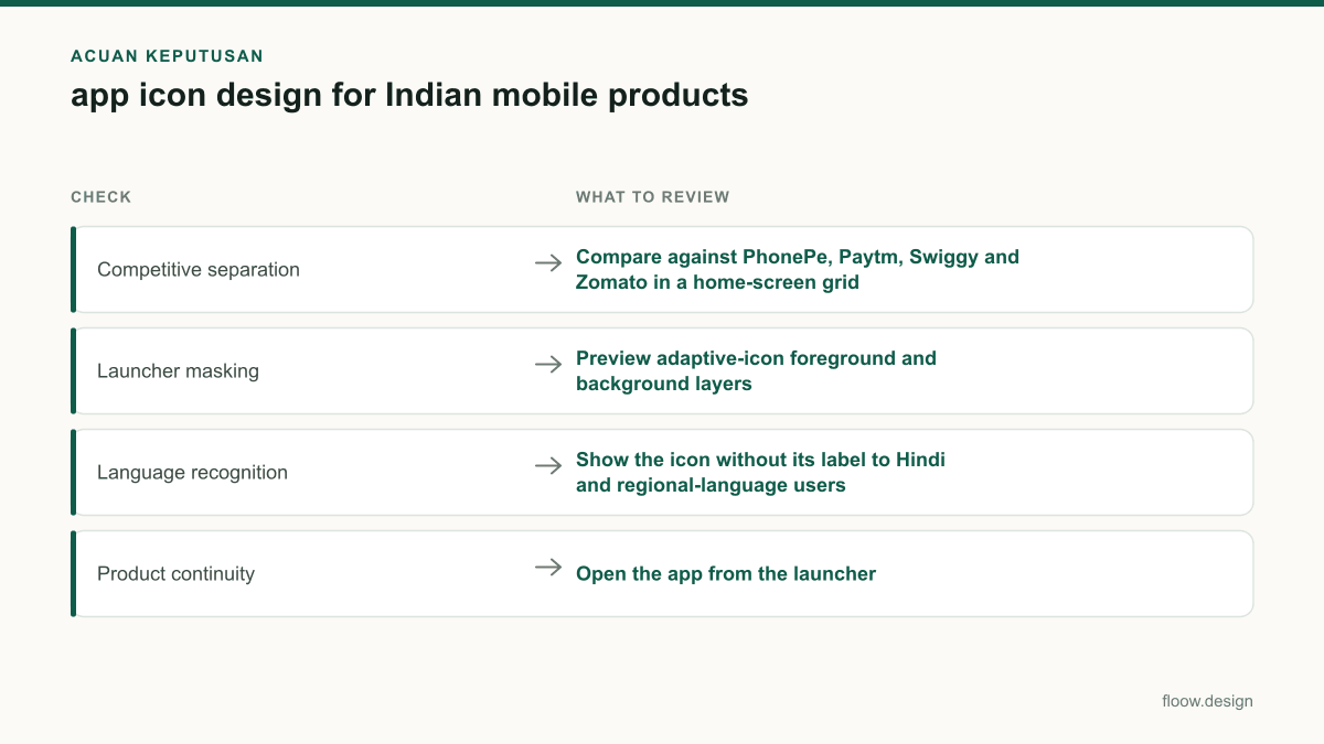
| Check | What to review | Pass condition |
|---|---|---|
| Competitive separation | Compare against PhonePe, Paytm, Swiggy and Zomato in a home-screen grid | The icon has a clearly different dominant colour, silhouette or symbol. |
| Launcher masking | Preview adaptive-icon foreground and background layers | The essential mark survives common Android masks without clipping. |
| Language recognition | Show the icon without its label to Hindi and regional-language users | Users identify the product cue without relying on Latin text. |
| Product continuity | Open the app from the launcher | The splash screen and core UI visibly belong to the same visual system. |
Common mistakes
Putting the full product name, slogan or Hindi wordmark inside the icon.
Use a compact symbol or monogram-like mark. Put readable Hindi, English or regional-language text in the store listing and in-app UI.
Copying the category signals of a familiar Indian app too closely.
Benchmark against PhonePe, Paytm, Swiggy and Zomato to find visual crowding, then select a different silhouette, palette or object metaphor.
Exporting a single square asset without testing Android adaptive-icon treatment.
Prepare foreground and background layers and inspect the result in Android launcher contexts and against different wallpapers.
Treating the icon, splash screen and product UI as separate branding tasks.
Define shared colour, shape, type and motion rules, then use floow.design to explore the system across all three surfaces.
Frequently asked questions
How do I create app icon design for an Indian app?
Create app icon design for an Indian app by selecting one simple, language-neutral symbol, an ownable silhouette and a clear colour strategy. Compare it with PhonePe, Paytm, Swiggy and Zomato in an Android home-screen grid, test adaptive-icon masking, and validate recognition with Hindi and relevant regional-language audiences before finalising it.
Should an app icon contain Hindi text?
An app icon should usually not contain Hindi text because launcher icons are small and India serves audiences across multiple languages. Hindi may be appropriate in the product UI or store assets for a Hindi-first product, but the icon itself should rely on a recognisable visual symbol that also works for regional-language users and without Latin text.
How do I make an app icon stand out on Android?
Make an app icon stand out on Android with a distinctive silhouette, strong foreground-background contrast and an adaptive-icon layout that survives launcher masks. Test it at real launcher size against varied wallpapers and beside common Indian apps such as PhonePe, Paytm, Swiggy and Zomato. Avoid fine lines, tiny text and category-colour imitation.
How should the icon connect to the launch experience?
The icon should connect directly to the launch experience by repeating its core symbol, colour and shape in splash screen design and selected mobile app design elements. This visual continuity confirms that the app opened is the one selected from the Android launcher. floow.design can generate and compare this direction across icon, splash screen and key UI screens.
Where this leaves you
A strong Indian app icon is recognisable before it is readable: distinct from established local apps, resilient in Android launchers and understandable across Hindi and regional-language contexts. Treat it as the first component of a shared product system, then carry its visual logic into the splash screen and core UI with floow.design.
Design the screens first
Describe the app in plain language and floow.design draws the iOS and Android screens for you, ready to refine and hand off.
Sources
- •Android Developers
- •PhonePe official website
- •Paytm official website
- •Swiggy official website
- •Zomato official website
Related reading
Design your mobile app with AI.
Generate pixel-perfect iOS and Android screens in seconds, then export to Figma or code.
You might also like…
 How-to20 September 2026splash screen design for Indian mobile appsDesign splash screens for Indian Android users with fast startup states, Hindi and Tamil messaging, dark mode, and honest loading handoffs for apps.By floow.design Team, Mobile Design
 How-to20 September 2026Dark mode design for Indian mobile appsBuild dark mobile screens for India with Hindi and regional scripts, UPI payment states, and Android-first legibility for lower-cost devices.By floow.design Team, Mobile Design
 How-to20 September 2026app screen design for India-first mobile flowsBuild connected Indian app screens for mobile OTP, UPI, addresses and multilingual support, with practical patterns for coherent mobile journeys.By floow.design Team, Mobile Design