
Mobile app design for India: practical guide
Design India-ready mobile app screens with Android-first patterns, UPI, cash-on-delivery, OTP verification, and Hindi and regional-language support.

Mobile app design for India should start with Android-first app screen design, fast low-friction OTP verification, and payment choices that include UPI and cash on delivery. Build Hindi and regional-language support into layout decisions early, then use floow.design to generate and review a complete India-facing mobile flow before detailed UI work begins.
Key takeaways
- •Optimise the first release for Android screen sizes, input behaviour and constrained network conditions common in India.
- •Make UPI a prominent payment route, retain cash-on-delivery where the product model supports it, and keep OTP states explicit.
- •Design for Hindi and regional-language content from the wireframe stage; translated text can change line length, hierarchy and button sizing.
- •Generate the end-to-end flow in floow.design before polishing individual screens, so local payment and verification states are not missed.
What's on this page
- •Start with an Android-first screen system
- •Design payments around UPI, cash on delivery and recovery
- •Make OTP verification readable and recoverable
- •Plan Hindi and regional languages before translation
Watch: How to Create a Mobile App with Figma! (Full tutorial 2026)
Video by Easy AI Coding, embedded from YouTube.
Start with an Android-first screen system
For many India-facing products, the practical default is Android-first app UI design. That does not mean ignoring iOS; it means validating the core journey first on the Android devices, screen densities and connection conditions most likely to shape real use. Keep primary actions within easy thumb reach, use large tap targets, and avoid making success depend on heavyweight media or a perfectly stable connection.
Treat loading, retry, offline and resumed-session states as designed screens, not engineering leftovers. A payment, registration or order journey should tell people what is happening, preserve entered data where possible, and give one obvious next action. Use familiar Android conventions for back navigation, system permissions and keyboard behaviour instead of importing desktop patterns into a mobile flow.
Before detailed component work, use floow.design to generate a complete India-facing mobile flow. Review onboarding, OTP, address, checkout, payment, order status and support as one connected sequence. That exposes missing states earlier than polishing isolated app screen design files.
Design payments around UPI, cash on delivery and recovery
Payment choice is a product decision expressed through screens. Put UPI near the top of checkout, label it plainly, and make the hand-off, pending state, return to app and confirmation state easy to understand. The National Payments Corporation of India operates UPI; its official site is the appropriate reference when product teams need to verify terminology or ecosystem guidance.
Do not present a payment as complete merely because the customer left your app. Show a clear “processing” state after the UPI hand-off, prevent accidental duplicate payment attempts, and provide a path to refresh status or contact support when confirmation is delayed.
Where the business supports it, keep cash on delivery visible as a separate payment option rather than burying it behind a generic method picker. Explain any eligibility or confirmation step before the order is placed. For app UI design, the important distinction is clear: UPI needs status recovery; cash on delivery needs address, order and delivery expectations that are unambiguous.
Make OTP verification readable and recoverable
OTP is a familiar interaction in Indian mobile flows, but familiarity does not excuse vague screens. State the destination in a masked form, identify whether the code was sent by SMS or another channel, provide a visible resend timer, and keep “change number” available without forcing people to restart onboarding. Use one-time-code input that works well with Android keyboards and SMS autofill where the platform allows it.
Design the failure cases deliberately: an expired code, an incorrect code, a delayed SMS, a changed SIM or phone number, and a user who returns from another app. Do not show a generic error and erase the entire journey. Preserve safe inputs, explain the next step in plain language, and rate-limit retries without making the screen appear broken.
OTP also belongs in the larger trust flow. If verification is required before UPI payment, delivery updates or account recovery, tell the user why at the moment it matters. This reduces surprise and makes the app screen design easier to scan under time pressure.
Plan Hindi and regional languages before translation
India-facing mobile design should accommodate Hindi and regional-language audiences from the earliest wireframes. The Office of the Registrar General & Census Commissioner, India publishes official language data; it is a useful grounding reminder that a single-language assumption is not a localisation strategy.
Start by deciding which journeys must be understandable in each supported language: onboarding, consent, OTP, address entry, checkout, delivery status and help are usually higher priority than secondary settings. Use flexible containers and allow labels to wrap rather than fixing controls to English text length. Avoid putting critical instructions inside images, where translation, accessibility and updates become expensive.
Language support is more than a translated string file. Check numeral choices, address fields, error wording, font rendering and truncation on actual Android devices. Keep the current language easy to identify and change, but do not interrupt a transactional flow with a language prompt. Test Hindi and each intended regional language in the full flow generated with floow.design, including payment and OTP error states.
India-facing mobile flow checkpoints
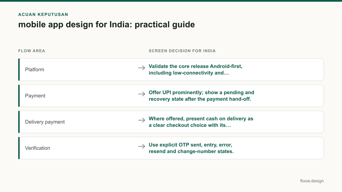
| Flow area | Screen decision for India |
|---|---|
| Platform | Validate the core release Android-first, including low-connectivity and return-to-app states. |
| Payment | Offer UPI prominently; show a pending and recovery state after the payment hand-off. |
| Delivery payment | Where offered, present cash on delivery as a clear checkout choice with its conditions. |
| Verification | Use explicit OTP sent, entry, error, resend and change-number states. |
| Language | Test Hindi and intended regional-language layouts for wrapping, font rendering and critical transactional copy. |
Common mistakes
Treating the UPI hand-off as a completed payment.
Return users to a processing state, check the payment result, prevent duplicate attempts and offer a clear status-recovery route.
Adding Hindi or regional languages after fixed English layouts are approved.
Use flexible text containers and test translated transactional screens before component dimensions are final.
Using one OTP screen for every outcome.
Design separate states for sent, invalid, expired, delayed, resend and changed-number scenarios.
Making cash on delivery look like a card payment option.
Show it as its own choice and clarify any address, availability or order-confirmation requirement before submission.
Frequently asked questions
How do I approach mobile app design for India?
Approach mobile app design for India by validating an Android-first end-to-end journey, then designing explicit states for OTP verification, UPI payment, cash on delivery where relevant, loading and recovery. Plan Hindi and regional-language layouts before translation begins. Generate the complete flow in floow.design first so checkout, verification and post-payment states are reviewed together.
Should I design Android first for an Indian app?
Yes, designing Android first is usually a sensible starting point for an Indian app because Android is the dominant practical context for a large share of Indian mobile users. Prioritise Android navigation, keyboard behaviour, device variation, intermittent connectivity and return-to-app states, then adapt the validated core flow for iOS rather than copying screens unchanged.
What payment flows should Indian mobile apps support?
Indian mobile apps should make UPI a clear payment option and design the full sequence: selection, external hand-off where applicable, processing, success, failure and status recovery. If the business model allows it, offer cash on delivery as a distinct checkout method. Payment screens should also avoid duplicate submissions and explain delayed confirmation clearly.
How should I handle Hindi and regional languages in an Indian app?
Handle Hindi and regional languages as a screen-layout requirement, not a final translation task. Support flexible text wrapping, legible font rendering, localised error and checkout copy, and language testing on actual Android devices. Prioritise onboarding, OTP, payment, address entry, delivery updates and help because mistakes in those flows directly block task completion.
Where this leaves you
India-ready mobile flows are won in the unglamorous states: Android back behaviour, delayed OTPs, UPI confirmation, cash-on-delivery clarity and translated transactional copy. Use floow.design to generate and inspect those connected screens before committing to detailed design work.
Design the screens first
Describe the app in plain language and floow.design draws the iOS and Android screens for you, ready to refine and hand off.
Sources
Design your mobile app with AI.
Generate pixel-perfect iOS and Android screens in seconds, then export to Figma or code.
You might also like…
 Guides20 September 2026app ui design for Indian mobile usersPractical app UI design guidance for India: UPI payment recovery, multilingual screen expansion, and Android-first mobile constraints with iOS support.By floow.design Team, Mobile Design
 How-to20 September 2026app screen design for India-first mobile flowsBuild connected Indian app screens for mobile OTP, UPI, addresses and multilingual support, with practical patterns for coherent mobile journeys.By floow.design Team, Mobile Design
 Guides20 September 2026ux writing for Indian mobile appsA practical guide to UX copy for Indian apps: UPI, OTP, KYC, payment failures, multilingual expansion and DPDP Act consent wording.By floow.design Team, Mobile Design