
Travel app design for Indian travellers
Design Indian travel booking screens for rail, buses, flights and stays with passenger details, PNR, UPI, GST invoices and cancellations.

Travel app design for India should make rail, bus, domestic-flight and stay booking feel like one itinerary while preserving each mode’s details. Build passenger details, berth preferences, PNR status, UPI payment, GST invoice access and clear cancellation information into the flow. Use IRCTC Rail Connect, MakeMyTrip, ixigo and redBus as pattern benchmarks, not templates to copy.
Key takeaways
- •Treat rail, bus, flight and stay as distinct booking flows that resolve into one trip view.
- •Capture Indian passenger details early enough to price and confirm correctly, but avoid asking for every traveller detail before users see viable options.
- •Keep berth preference and PNR status visible throughout the rail journey, including after booking.
- •Make UPI a first-class payment route and show payment, refund and cancellation states explicitly.
- •Place GST invoice and cancellation information in both the booking detail and the post-booking receipt area.
What's on this page
- •Map the Indian travel journey before drawing screens
- •Design a train booking flow around passenger and PNR decisions
- •Make payment, GST invoices and cancellation states part of the core flow
- •Prototype the complete itinerary, not isolated booking screens
Map the Indian travel journey before drawing screens
Indian travel products often combine a planned rail or domestic-flight leg with a bus transfer and a local stay. Your information architecture should support that mixed itinerary without forcing every mode into the same search form. Start with separate entry points for Trains, Buses, Flights and Stays, then create a shared Trips area that groups confirmed and upcoming bookings by date.
Use IRCTC Rail Connect, MakeMyTrip, ixigo and redBus as Indian travel-pattern benchmarks. Study how they frame mode selection, route and date search, traveller information, booking confirmation and post-booking support. Do not reproduce their screens; identify the expectations Indian travellers bring to a travel app.
For an app screen design, prioritise route, date, traveller count, class or service choice, total payable amount and cancellation visibility. A user choosing a train is making different decisions from someone comparing buses: rail needs class, quota and berth-related information, while buses need boarding and dropping-point clarity. Domestic flights need fare rules and baggage context; stays need guest, check-in and invoice details. Keep the shared itinerary useful, but let each booking flow retain the fields that make that mode trustworthy.
Design a train booking flow around passenger and PNR decisions
A train booking flow should move through search, train selection, class and availability, passenger details, preference selection, review, payment and confirmation. Avoid hiding consequential rail choices inside a final review screen. Show departure and arrival timing, journey duration, class, availability state and fare before users commit to entering every traveller’s details.
In the passenger step, design repeatable traveller cards for Indian passenger details and clearly label which details are required for each passenger. Keep the primary traveller easy to reuse, but allow users to edit individual travellers without restarting the form. Include berth preferences as an explicit choice where applicable, while making it clear that a preference is not the same as a confirmed berth.
After confirmation, make PNR status a persistent action in the trip detail rather than a buried support link. The booking card should also surface train number, date, passenger list, coach and berth information when available, plus an obvious route to cancellation and refund information. Use plain status labels such as payment pending, booking confirmed, waitlisted or cancelled; never make colour the only status signal. Reference IRCTC’s official rail service context when validating rail terminology and user expectations (IRCTC).
Make payment, GST invoices and cancellation states part of the core flow
For Indian bookings, payment is not a generic checkout footer. Give UPI payment flows their own clear option alongside any other supported methods. The payment screen should preserve the booking summary, payable amount and time-sensitive hold state while the user completes payment in their chosen UPI app. On return, show a decisive result: payment successful, pending, failed or booking not confirmed. A pending payment state needs a refresh path and support context, not a vague spinner.
Use UPI terminology consistently with the payment ecosystem governed by the National Payments Corporation of India (NPCI). Do not imply that payment success automatically means every supplier booking is confirmed; model payment and booking confirmation as separate states when the supplier response can lag.
After booking, include a downloadable or shareable GST invoice area where the booking type supports it. Let users find invoice details from both the receipt and the trip detail, rather than only in email. Cancellation information should appear before payment, in the booking confirmation and beside the cancel action: show the applicable cancellation terms, the amount or rule users need to review, and the refund status after cancellation. The official GST portal is the appropriate source for validating GST-facing language and documentation needs (GST Portal).
Prototype the complete itinerary, not isolated booking screens
A polished search screen can hide the hardest problems in Indian travel: passengers shared across bookings, a rail leg with berth preferences, a UPI interruption, a bus boarding point, a flight fare rule and a GST invoice after confirmation. Your app prototype should test those connected decisions.
Generate a search-to-booking travel flow in floow.design to validate complex itinerary screens early. Start with a realistic task: search a rail trip, select class and berth preference, add passengers, pay with UPI, inspect a confirmed booking and find PNR status, cancellation information and a GST invoice. Then add a bus or stay to the same trip to test whether the itinerary remains legible.
Review the app screen design on a narrow mobile viewport. Check that price and refund information do not disappear below the fold, passenger cards remain editable, the selected UPI path has a recoverable failure state, and post-booking actions are discoverable with one hand. Test with long station names, multiple passengers and mixed booking statuses. The goal is not a single attractive confirmation screen; it is a flow users can recover from when a payment, availability or itinerary detail changes.
Indian travel booking screen checklist by journey stage
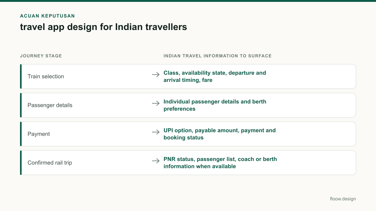
| Journey stage | Indian travel information to surface | Primary mobile action |
|---|---|---|
| Train selection | Class, availability state, departure and arrival timing, fare | Compare trains and choose a class |
| Passenger details | Individual passenger details and berth preferences | Add, edit or remove a passenger |
| Payment | UPI option, payable amount, payment and booking status | Complete payment or recover from a pending state |
| Confirmed rail trip | PNR status, passenger list, coach or berth information when available | Check status or manage booking |
| Post-booking documents | GST invoice access, cancellation information and refund status | Download invoice or review cancellation |
Common mistakes
Using one generic traveller form for train, bus, flight and stay bookings.
Use a shared traveller model, then reveal mode-specific details such as berth preferences, bus boarding points or stay guest information only when relevant.
Treating a selected berth preference as a guaranteed berth.
Label berth selection as a preference unless the booking response confirms the allocated berth.
Showing a success state immediately after a UPI handoff without distinguishing payment from booking confirmation.
Model payment success, payment pending, booking confirmation and booking failure as separate, understandable states.
Hiding GST invoices and cancellation rules in support or email.
Expose GST invoice access and cancellation information from the booking receipt and the trip-detail screen.
Frequently asked questions
What should travel app design include for India?
Travel app design for India should include mode-specific search for trains, buses, domestic flights and stays; Indian passenger details; rail berth preferences; PNR status; UPI payment flows; GST invoice access; and clear cancellation and refund information. A shared Trips area should combine confirmed bookings while preserving each mode’s operational details, such as bus boarding points or rail class.
How do I design a train booking flow?
Design a train booking flow as search, train selection, class and availability, passenger details, berth preference, review, payment and confirmation. Show fare, timing, class and availability before collecting all traveller data. After booking, place PNR status, passenger details, coach or berth details when available, cancellation information and refund status directly in the trip screen.
Should a travel app support UPI payments?
A travel app serving Indian travellers should support UPI payments when its payment setup permits it, because UPI is a familiar checkout route in India. Design the UPI path with a visible payable amount, an external-app return state, and separate outcomes for payment success, payment pending, booking confirmed and booking failure. Preserve the booking summary throughout the payment flow.
Where should GST invoice information appear in a travel app?
A travel app should place GST invoice information in the booking confirmation, the trip-detail screen and the receipt or documents area. Users should be able to identify whether an invoice is available, access it after booking and find relevant booking details without searching email or contacting support. Keep invoice access separate from cancellation and refund status.
Where this leaves you
Indian travel app design works when it respects the different decisions behind rail, bus, flight and stay bookings. Prototype the full search-to-booking path in floow.design, including passenger details, berth preferences, UPI, PNR status, GST invoice access and cancellation states, before refining individual screens.
Design the screens first
Describe the app in plain language and floow.design draws the iOS and Android screens for you, ready to refine and hand off.
Sources
Design your mobile app with AI.
Generate pixel-perfect iOS and Android screens in seconds, then export to Figma or code.
You might also like…
 Guides20 September 2026food delivery app design for India | FloowPlan Indian restaurant discovery, address capture, UPI and cash checkout, and delivery tracking screens that handle gates, landmarks and calls without slowing checkout.By floow.design Team, Mobile Design
 How-to20 September 2026ui ux design process for Indian mobile appsA practical ui ux design process for Indian mobile apps: research across languages and city tiers, design UPI and OTP flows, and plan consent.By floow.design Team, Mobile Design
 Insights20 September 2026ui design tools for Indian app teamsCompare UI tools for Indian mobile teams by INR billing, distributed collaboration, developer handoff and prototypes for UPI, OTP and multilingual flows.By floow.design Team, Mobile Design