
ui design inspiration from Indian mobile apps
Study ui design inspiration from PhonePe, CRED, Meesho, Swiggy, Kite and MakeMyTrip through Indian tasks, Android and multilingual patterns.

ui design inspiration from Indian mobile apps is most useful when analysed by task: PhonePe and CRED for UPI payment, Zerodha Kite for investing, Meesho for cash-on-delivery commerce, Swiggy for food ordering, and MakeMyTrip for train travel. Compare hierarchy, reassurance, language and Android interaction choices, then create an original direction rather than copying screens.
Key takeaways
- •Start with the Indian task and user decision, not a visual style: paying by UPI needs confidence, while train travel needs comparison and trip clarity.
- •Use PhonePe, CRED, Meesho, Swiggy, Zerodha Kite and MakeMyTrip as pattern references for specific moments in a flow.
- •Design Android-first layouts that tolerate varied screen sizes, local-language text expansion, system navigation and practical payment choices such as COD.
What's on this page
- •Use the gallery as a task map, not a mood board
- •UPI payment and investment: design for confidence before speed
- •Commerce COD, food ordering and train travel: reduce decision fatigue
- •Make Indian mobile references work on Android and in multiple languages
Use the gallery as a task map, not a mood board
The strongest app design ideas come from identifying what a screen helps a person decide or complete. An Indian reference gallery should therefore begin with familiar tasks: UPI payment, investment, commerce with cash on delivery (COD), food ordering and train travel. This prevents a common failure mode: lifting a dark card from CRED or a bright reward treatment from PhonePe when the product does not have the same trust or completion problem.
For every reference, capture four things: the user’s immediate goal, the information needed before action, the point of uncertainty, and the confirmation needed afterwards. PhonePe and CRED are useful payment references because payment flows must make the recipient, amount and status legible. Zerodha Kite is a better reference for dense market information and deliberate order review than for a consumer shopping checkout.
Treat colour, type and illustration as evidence of a product system, not the pattern itself. The reusable insight may be “show the consequence before confirmation” or “keep the primary action fixed while details scroll.” That is a useful brief for an original mobile screen.
UPI payment and investment: design for confidence before speed
For UPI payment, study how PhonePe structures a familiar action around recipient selection, amount entry and a visible outcome. The transferable pattern is progressive commitment: users should know who receives money and how much before they authenticate. CRED provides a contrasting payment-oriented reference: its visual personality can be expressive, but payment status and the next available action still need to remain unambiguous.
For investment, Zerodha Kite is a practical reference for prioritising live decision data over decoration. A trading or investment screen may need price, quantity, order type, risk-relevant details and review states in a compact space. Do not turn this into a generic finance dashboard. Decide which data changes the user’s choice, place it near the action, and defer secondary charts or education.
In both tasks, loading and failure states deserve equal attention. UPI flows need a clear pending or completed state rather than an implied success; investment flows need review and acknowledgement before a consequential order. The National Payments Corporation of India documents UPI as an interoperable payments system, so avoid designs that visually imply a payment is final before the app can confirm its status.
Commerce COD, food ordering and train travel: reduce decision fatigue
Meesho is a useful commerce COD reference because shopping does not end at product discovery. A buyer also needs confidence about the selected variant, delivery details, payment choice and order status. When COD is available, make it a clear option in the payment step; do not bury it behind an ambiguous icon or make it look less valid than prepaid payment. The original pattern to borrow is explicit choice and consequence, not Meesho’s specific card styling.
Swiggy offers strong food-ordering reference points: quickly narrowing a large catalogue, keeping basket context visible, and making delivery-related information useful at the moment of choice. Map the flow as browse, evaluate, customise, review basket and track order. Each stage should retain enough context to avoid a restart.
For train travel, MakeMyTrip Railways is a relevant reference for multi-step comparison. Train search involves dates, routes, classes, passenger details and the eventual itinerary. Use a stable search summary, clear filters and a review screen that makes the selected journey easy to verify. Avoid treating train booking like a simple one-item checkout; the user is comparing constrained options across a timeline.
Make Indian mobile references work on Android and in multiple languages
Indian app experiences are often Android-first in practical ways: layouts must remain useful on smaller and varied devices, actions must survive system back navigation, and tap targets must not depend on a narrow flagship-screen layout. Test long lists, payment confirmation sheets and checkout bars with the Android keyboard open. Follow Android’s official guidance on localisation instead of assuming English labels will fit everywhere.
Multilingual design is more than translating buttons. Reserve room for longer labels, avoid embedding text in images, use familiar numerals and dates where the task requires them, and test whether a mixed-language user can still recognise key terms such as UPI, COD, delivery, platform or train class. Keep critical confirmation content—recipient, amount, order total, station pair and journey date—structurally distinct so it remains scannable in every supported language.
Build a reference note for each pattern: task, source app, screen state, Android constraint, language risk and original product hypothesis. Then use floow.design to turn that note into a new screen direction: for example, a multilingual payment-review screen with a fixed amount, recipient summary and pending-state logic. It should express your product’s content and brand, not reproduce the reference screen.
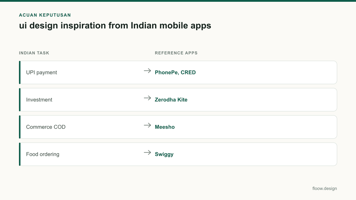
Indian mobile app references organised by task and reusable interaction insight
| Indian task | Reference apps | What to inspect | Original direction to create |
|---|---|---|---|
| UPI payment | PhonePe, CRED | Recipient, amount, authentication and payment-status clarity | A payment review and pending-confirmation flow for your own service |
| Investment | Zerodha Kite | Information density, order review and consequential actions | A compact decision screen with clearly prioritised data |
| Commerce COD | Meesho | Variant, address, COD choice and order reassurance | A checkout that states payment choice and delivery implications |
| Food ordering | Swiggy | Discovery, customisation, basket context and tracking | A catalogue-to-basket flow that preserves choices |
| Train travel | MakeMyTrip | Search comparison, filters, itinerary review and passenger steps | A timeline-led booking flow with persistent journey context |
Common mistakes
Copying a reference screen’s visual skin without identifying its task.
Write the task, decision, uncertainty and confirmation requirement before creating any layout.
Using one checkout pattern for UPI, COD and train booking.
Match the flow to the commitment: payment needs status clarity, COD needs payment-choice clarity, and train travel needs itinerary comparison.
Designing only in short English labels on a large iPhone-sized artboard.
Test Android dimensions, system back behaviour, keyboard overlap and longer local-language labels from the first prototype.
Presenting borrowed screens as ui ux portfolio examples without attribution.
Credit the reference, explain the observed pattern, and show an independently designed solution with different content, brand and layout decisions.
Frequently asked questions
Where can I find ui design inspiration from Indian apps?
Find ui design inspiration from Indian apps by reviewing task flows in PhonePe and CRED for UPI payment, Zerodha Kite for investing, Meesho for COD commerce, Swiggy for food ordering and MakeMyTrip for train travel. Capture the user goal, decision points, error states, language needs and Android constraints rather than saving only attractive screenshots.
Which Indian apps have good UI UX?
PhonePe, CRED, Meesho, Swiggy, Zerodha Kite and MakeMyTrip are useful Indian mobile UI UX references because they address distinct, high-frequency tasks. PhonePe and CRED help study payment confidence, Kite shows dense investment information, Meesho covers COD checkout, Swiggy supports food ordering, and MakeMyTrip helps analyse train-travel comparison and itinerary review.
Can I use app inspiration in my portfolio?
You can use app inspiration in a portfolio when you clearly label it as a reference and demonstrate your own reasoning and execution. Explain the observed task pattern, then create an original mobile screen with different content, brand, layout and interaction decisions. Do not present copied screens, logos, illustrations or proprietary assets as your own ui ux portfolio examples.
How should I adapt an Indian app pattern for multilingual Android users?
Adapt an Indian app pattern for multilingual Android users by preserving the task logic while testing translated label length, system back behaviour, smaller screens and keyboard overlap. Keep critical details such as amount, recipient, order total, station pair and journey date in a consistent visual structure. Avoid text baked into images and verify every important state in the supported languages.
Where this leaves you
Use these references to articulate a pattern insight—such as clearer UPI status, visible COD choice or persistent train context—then use floow.design to generate an original mobile screen direction built for your product rather than a copy of an existing Indian app.
Design the screens first
Describe the app in plain language and floow.design draws the iOS and Android screens for you, ready to refine and hand off.
Sources
Design your mobile app with AI.
Generate pixel-perfect iOS and Android screens in seconds, then export to Figma or code.
You might also like…
 Roundups20 September 2026ui ux portfolio examples for India rolesExplore India-focused mobile app portfolio projects using UPI, COD, OTP, local addresses and Hindi or regional-language flows recruiters can assess.By floow.design Team, Mobile Design
 Roundups20 September 2026app design ideas for India-first startupsExplore India-first mobile app concepts for UPI, kiranas, regional travel and public services, with multilingual flows for Hindi and regional languages.By floow.design Team, Mobile Design
 Insights20 September 2026ui ux portfolio for India product jobsBuild a ui ux portfolio for India product jobs with mobile case studies for UPI, COD, OTP and multilingual onboarding, tailored to recruiters.By floow.design Team, Mobile Design