
ui ux portfolio examples for India roles
Explore India-focused mobile app portfolio projects using UPI, COD, OTP, local addresses and Hindi or regional-language flows recruiters can assess.

Strong ui ux portfolio examples for India roles show an original mobile flow built around familiar local behaviour: UPI payment, OTP sign-in, cash on delivery, or a multi-line Indian address. Research patterns from PhonePe, Meesho, Swiggy and MakeMyTrip, then document your own problem framing, screens, states and Hindi or regional-language variant.
Key takeaways
- •Choose a narrow India-specific task, not a generic “shopping app” redesign.
- •Use familiar patterns as research evidence, but create original flows, visual systems and interaction decisions.
- •Show failure, validation and recovery states for OTP, UPI, COD and address entry.
- •A Hindi or regional-language variant can demonstrate that your interface is designed for more than English-first users.
- •Turn a selected direction into an original multi-screen concept with floow.design, then refine the case study with your rationale.
What's on this page
- •What makes an India-facing portfolio project credible
- •Gallery: six portfolio-project directions
- •Show localisation as a design decision, not a translated screenshot
- •Package the case study for an Indian product-team review
What makes an India-facing portfolio project credible
For India roles, the best ui ux portfolio work makes a recognisable local workflow easier to assess. A recruiter should be able to see the user goal, the constraint and your screen-level decisions within minutes. Start with one job: paying a merchant, completing a COD order, booking a trip, or entering a delivery address.
Use established products as research references rather than copy targets. Study how PhonePe frames payment confidence and status, how Meesho supports value-led commerce and delivery choices, how Swiggy handles time-sensitive ordering, and how MakeMyTrip structures search, traveller details and booking review. Their product surfaces reveal familiar conventions; they are not a component library to recreate. Cite the observed pattern in your case study, then explain what you changed for a different audience or use case.
A useful project includes the happy path plus the moments that decide whether the interface is usable: an expired OTP, a pending UPI confirmation, an unavailable COD option, an invalid PIN code, or an incomplete address. This turns polished app design ideas into evidence that you can design a production-minded mobile experience.
Gallery: six portfolio-project directions
1. UPI tuition-fee collection. Design a parent flow to review a fee breakdown, select a UPI app, return from payment and handle a pending confirmation. Include a receipt and support route.
2. COD fashion exchange. Create an exchange journey for a value-conscious shopper: choose a reason, pick a replacement, confirm whether COD is available, select pickup timing and track the reverse pickup.
3. OTP onboarding for a local service. Design phone-number entry, consent copy, OTP autofill or manual entry, resend timing, incorrect-code feedback and account recovery. Do not treat the OTP screen as a single static mock-up.
4. Indian address assistant. Help users enter house or flat number, building or street, landmark, locality, city, state and PIN code. Offer a clear “save as home” label and a delivery-instruction field.
5. Regional food-order repeat flow. Design a quick re-order, substitutions and delivery notes for a neighbourhood restaurant. Show Hindi and one relevant regional-language variant as part of the same system.
6. Intercity trip planner. Create a mobile flow that compares dates, captures traveller details, explains fare changes and presents a final review. MakeMyTrip is useful research for information density, not a layout to imitate.
Show localisation as a design decision, not a translated screenshot
Hindi and regional-language variants can make a portfolio example more persuasive when they change the design work. Select a realistic audience and explain why a language option matters for that task. Then show how the interface responds: longer labels, text wrapping, button width, numerals, error messages, address terminology and mixed-language content such as merchant names.
For example, a Hindi version of an OTP flow needs more than translated headings. Test whether the instruction, expiry notice and resend action remain scannable on a small screen. In an address flow, keep fields familiar to Indian delivery behaviour: house or flat, landmark, locality, city, state and PIN code. Avoid assuming a Western two-line address form is sufficient.
If you include a regional language, use text you can validate with a fluent reviewer. Do not generate decorative copy and claim localisation. Document the language choice, the content review process and one or two layout changes it caused. That gives recruiters concrete evidence of UX judgement. floow.design can help turn the chosen direction into an original multi-screen concept; the localisation rationale and validation remain your portfolio contribution.
Package the case study for an Indian product-team review
Lead with a one-sentence brief: who is trying to do what, and where does the current experience fail? Follow it with a compact flow map, key screens and annotated decisions. Six to ten focused mobile screens usually communicate more than a long gallery of isolated shots.
For a UPI project, show initiation, app switch or hand-off expectation, pending status, success, failure and receipt. For COD, clarify when availability is checked and what happens when the option disappears after an address or cart change. For OTP, show rate limits, incorrect entry and recovery. These details let a reviewer assess interaction design rather than just visual styling.
End with what you would test: comprehension of fee or payment status, completion time for address entry, confidence before placing a COD order, or error recovery after an expired OTP. Label assumptions honestly. If you used PhonePe, Meesho, Swiggy or MakeMyTrip as research references, name the observed convention without presenting their UI as your own.
Use floow.design to generate an original multi-screen starting point for one selected concept, then edit each screen until the flow, language and states support your stated problem.
India-specific elements worth showing in a mobile portfolio flow
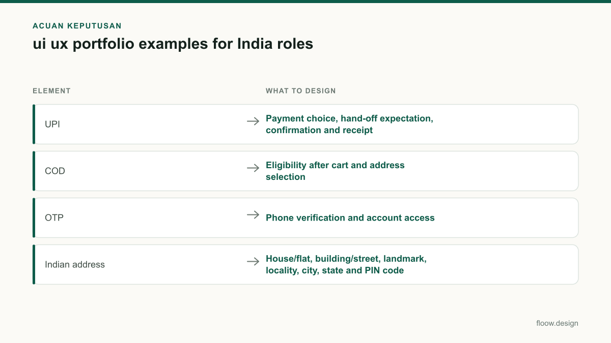
| Element | What to design | Useful states to include |
|---|---|---|
| UPI | Payment choice, hand-off expectation, confirmation and receipt | Pending, failed, cancelled, payment not confirmed |
| COD | Eligibility after cart and address selection | Available, unavailable, order-value restriction, changed address |
| OTP | Phone verification and account access | Wrong code, expired code, resend, number change |
| Indian address | House/flat, building/street, landmark, locality, city, state and PIN code | Missing PIN code, unsupported delivery area, saved-address edit |
| Hindi or regional language | A validated language variant within the same design system | Longer labels, wrapped errors, mixed-language names |
Common mistakes
Recreating a PhonePe, Meesho, Swiggy or MakeMyTrip screen pixel for pixel.
Use each app only to research a familiar product pattern. Reframe the user, task, information architecture and visual system so the resulting mobile flow is clearly original.
Showing only a successful UPI payment or OTP verification screen.
Design and annotate recovery states: pending payment, failed confirmation, incorrect OTP, expired OTP and a clear next action.
Using a generic international address form for an India delivery concept.
Design for house or flat details, building or street, landmark, locality, city, state and PIN code, then show delivery-area feedback.
Adding Hindi or a regional language as decorative text at the end.
Include the language variant in core screens and show how its content affects hierarchy, wrapping, controls and error copy.
Frequently asked questions
What are good ui ux portfolio examples for India?
Good ui ux portfolio examples for India focus on familiar mobile tasks with original execution: a UPI fee-payment flow, a COD exchange journey, OTP-based onboarding, an Indian address-entry assistant, a food re-order flow, or an intercity booking review. Include success and failure states, and show Hindi or a validated regional-language variant where it serves the target audience.
Can I redesign Indian apps for my portfolio?
You can study Indian apps for your portfolio, but a direct redesign is weaker than an original problem-led concept. Use PhonePe, Meesho, Swiggy and MakeMyTrip as research references for recognised patterns, clearly credit the reference, and design a different user need, flow, interface system and edge cases. Do not present copied screens as original work.
Which app projects impress Indian UI UX recruiters?
Indian UI UX recruiters can assess projects that show practical mobile constraints: UPI status and recovery, OTP verification, COD eligibility, Indian address entry, delivery exceptions and language variants. A focused case study with user context, interaction states, rationale and a test plan is more convincing than a generic app with only polished home screens.
How can floow.design help build an India-focused portfolio project?
floow.design can turn an India-focused project direction into an original multi-screen mobile concept, such as a UPI collection flow, COD exchange flow or OTP onboarding journey. Use it to explore screen structures quickly, then tailor address fields, payment states, content hierarchy, Hindi or regional-language variants and case-study annotations to your design rationale.
Where this leaves you
Pick one bounded local workflow, research familiar Indian product conventions without copying them, and show the operational states that make mobile UX credible. Build the original multi-screen concept in floow.design, then present the decisions, localisation and validation plan that make it yours.
Design the screens first
Describe the app in plain language and floow.design draws the iOS and Android screens for you, ready to refine and hand off.
Sources
- •National Payments Corporation of India — UPI
- •PhonePe — official website
- •Meesho — official website
- •Swiggy — official website
Related reading
Design your mobile app with AI.
Generate pixel-perfect iOS and Android screens in seconds, then export to Figma or code.
You might also like…
 Roundups20 September 2026ui design inspiration from Indian mobile appsStudy ui design inspiration from PhonePe, CRED, Meesho, Swiggy, Kite and MakeMyTrip through Indian tasks, Android and multilingual patterns.By floow.design Team, Mobile Design
 Insights20 September 2026ui ux portfolio for India product jobsBuild a ui ux portfolio for India product jobs with mobile case studies for UPI, COD, OTP and multilingual onboarding, tailored to recruiters.By floow.design Team, Mobile Design
 Roundups20 September 2026app design ideas for India-first startupsExplore India-first mobile app concepts for UPI, kiranas, regional travel and public services, with multilingual flows for Hindi and regional languages.By floow.design Team, Mobile Design