
figma mobile app design for Indian teams
Plan Indian mobile screens in Figma for OTP, UPI, addresses and language expansion, then move a floow.design direction into a reusable UI system.

figma mobile app design for Indian product teams starts with reusable mobile components for +91 numbers, OTP entry, UPI account selection and PIN-code-led addresses. Test Hindi and regional-language expansion before handoff, analyse flows in PhonePe, Meesho and Swiggy, and use floow.design for initial directions before systematising the selected route in Figma.
Key takeaways
- •Model Indian onboarding as a set of reusable inputs: +91 number, OTP, UPI selector and address fields.
- •Test Hindi and regional-language content with realistic copy before locking component widths and screen height.
- •Use PhonePe, Meesho and Swiggy as pattern-review references, not as templates to copy.
- •Generate early mobile directions in floow.design, then rebuild the selected direction as a maintainable Figma system.
What's on this page
- •Set up a Figma workflow around Indian mobile flows
- •Build components for Indian numbers, OTP, UPI and addresses
- •Design for Hindi and regional-language expansion before visual polish
- •Use Indian app references for analysis, then prototype decisions
Watch: Learn Figma Fast | Mobile App Design Tutorial for Beginners (Step by Step + Pro tips)
Video by Design With Elwakil, embedded from YouTube.
Set up a Figma workflow around Indian mobile flows
Start with a small flow map rather than a component library: entry, mobile-number verification, account or UPI setup, address capture, confirmation and recovery states. This keeps the first Figma file tied to a product journey instead of becoming a catalogue of disconnected controls.
Among ui design tools, Figma is most useful here when pages separate exploration from production. Keep one page for flow maps, one for low-fidelity mobile screens, one for approved components, and one for prototype-ready screens. Name frames by task and state, such as OTP / empty, OTP / error, and UPI selector / accounts loaded.
Use floow.design to generate several initial mobile directions for the same flow. Select the route that best matches the product’s task, recreate it in Figma, then replace one-off layers with components, text styles, colour variables and spacing rules. Do not export a generated direction directly as the system of record. Figma’s official developer resources are a useful reference when your design system will later need tokens or engineering handoff: Figma Developers.
Build components for Indian numbers, OTP, UPI and addresses
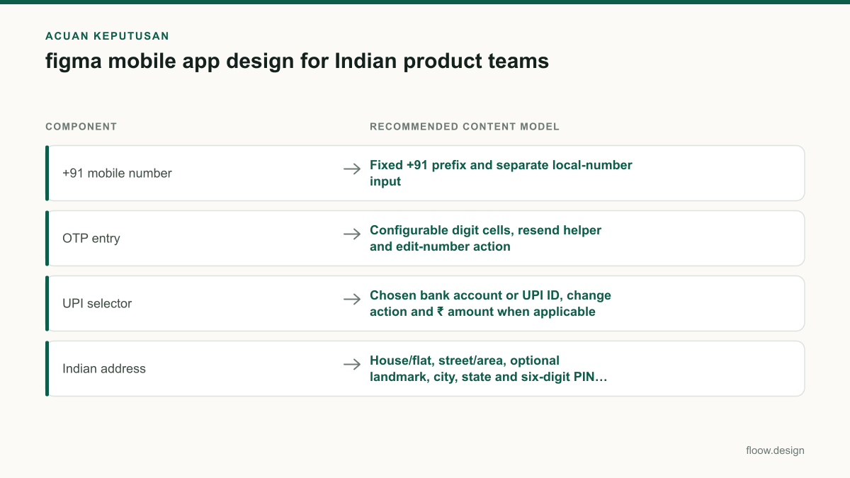
Treat identity and payment inputs as stateful mobile components. For a phone-number field, make +91 a fixed country prefix and keep the local number visually distinct from the prefix. Design empty, focused, invalid, loading and verified states. Avoid using placeholder text as the only explanation of what is required.
Create an OTP group that supports paste, automatic focus movement, resend timing and a clear edit-number action. The exact OTP interaction can vary by authentication provider, so make the component’s cell count and helper text configurable rather than hard-coded.
For a UPI selector, show the chosen bank account or UPI ID, a change action, loading and unavailable states, and the payment amount in ₹ when the amount is known. UPI is operated by NPCI; use its terminology and current product guidance as the reference point rather than inventing payment labels: NPCI.
Indian address forms need room for house or flat, street or area, optional landmark, city, state and PIN code. A PIN code is six digits; validate the format without implying that a valid format confirms deliverability. Confirm postal conventions against India Post.
Design for Hindi and regional-language expansion before visual polish
Hindi and regional-language text expansion is a layout problem, not a translation QA task to postpone until release. Populate key screens with realistic translated strings before approving button widths, card heights, error areas and bottom sheets. A short English label can become a longer Hindi phrase, while other regional-language strings may wrap differently or need a different font family.
Use Auto Layout for buttons, list rows, form labels and alert content. Set sensible minimum heights, permit multi-line labels where the task allows it, and avoid fixed-width text layers for action labels. For controls that genuinely require one line, define a reviewed short-copy variant instead of truncating silently.
Test Hindi in Devanagari plus the regional languages relevant to the product’s launch markets. Check numeral treatment, line breaks, font coverage, clipped matras or vowel marks, and the visual weight of mixed Latin and Indian scripts. A component is not ready just because English fits.
Keep language variants in the same component documentation: default copy, longer-copy stress case, error message and disabled state. Figma’s own documentation is the appropriate source for current text, font and collaboration capabilities: Figma Help Center.
Use Indian app references for analysis, then prototype decisions
Review PhonePe, Meesho and Swiggy as working Indian mobile references, but analyse the interaction pattern rather than copying their visual surface. In PhonePe, note how payment choice, account context and confirmation are separated. In Meesho, inspect how product discovery, trust cues and address collection are sequenced. In Swiggy, look at how address, delivery context and time-sensitive actions compete for attention on a small screen.
Turn observations into neutral notes: what is the primary action, what information appears before commitment, what can be edited, and what state is shown when data is missing? This prevents a reference review from becoming imitation.
Build an app prototype from the approved Figma components for the critical path only: enter mobile number, verify OTP, choose a UPI account, enter or select an address, and reach a success or recovery state. Test the prototype on a phone-sized frame with long Hindi and regional-language strings enabled. Record where a person hesitates, then change the component rule rather than manually correcting a single screen. That is how the floow.design direction becomes a system that survives future flows.
Indian mobile form components to define in the Figma library
| Component | Recommended content model | States to include |
|---|---|---|
| +91 mobile number | Fixed +91 prefix and separate local-number input | Empty, focused, invalid, loading, verified |
| OTP entry | Configurable digit cells, resend helper and edit-number action | Empty, partially filled, error, resend available |
| UPI selector | Chosen bank account or UPI ID, change action and ₹ amount when applicable | Loading, selected, unavailable, payment error |
| Indian address | House/flat, street/area, optional landmark, city, state and six-digit PIN code | Empty, field error, saved address, serviceability response |
Common mistakes
Making a single English-only button component with a fixed text width.
Use Auto Layout, test Hindi and target regional-language strings, and define a reviewed short-label variant only where one line is essential.
Treating OTP as one static mock-up.
Design entry, paste, error, resend, edit-number and verification states as part of the same OTP component.
Using a generic dropdown for UPI selection.
Show account or UPI identity, selected state, change action, loading and failure states, with the payment context visible.
Copying PhonePe, Meesho or Swiggy screens directly.
Document the underlying task sequence and decision hierarchy, then apply those findings to your own product’s components and brand.
Frequently asked questions
How do I start figma mobile app design?
Start figma mobile app design by mapping one Indian mobile journey, such as +91 number entry, OTP verification, UPI selection and address capture. Generate early alternatives in floow.design, choose one direction, then rebuild it in Figma with Auto Layout, reusable components and states for errors, loading and confirmation.
How do I design UPI screens in Figma?
Design UPI screens in Figma as a sequence of payment states: amount and payee context, account or UPI ID selection, loading, confirmation, success and failure. Show the selected payment identity clearly, use ₹ for known amounts, and keep a visible change action. Check current UPI terminology against NPCI guidance.
How can I handle Indian languages in Figma layouts?
Handle Indian languages in Figma layouts by testing Hindi and relevant regional-language strings inside real mobile components before approval. Use Auto Layout, allow labels and errors to wrap, check font support for each script, and test long text in buttons, address fields, bottom sheets and payment confirmations rather than relying on English placeholders.
Should I copy patterns from PhonePe, Meesho and Swiggy?
Use PhonePe, Meesho and Swiggy for pattern analysis, not screen-by-screen copying. Study how each app prioritises actions, explains status and handles address or payment context. Convert those observations into your own flow rules, then prototype them in Figma with your product’s content, language needs and component system.
Where this leaves you
Indian mobile design in Figma improves when local flows are built into the system from the first frame: +91 numbers, OTP states, UPI selection, address capture and language expansion. Use floow.design to explore directions quickly, then let Figma hold the chosen route, its variants and the rules that make future screens consistent.
Design the screens first
Describe the app in plain language and floow.design draws the iOS and Android screens for you, ready to refine and hand off.
Sources
Design your mobile app with AI.
Generate pixel-perfect iOS and Android screens in seconds, then export to Figma or code.
You might also like…
 Insights20 September 2026ui design tools for Indian app teamsCompare UI tools for Indian mobile teams by INR billing, distributed collaboration, developer handoff and prototypes for UPI, OTP and multilingual flows.By floow.design Team, Mobile Design
 How-to20 September 2026app prototype for Indian mobile user testingPlan an Indian mobile app prototype for UPI, OTP, addresses and language variants. Run usability testing on representative Android devices before build.By floow.design Team, Mobile Design
 Insights20 September 2026ui ux developer salary in India: INR pay guideCompare UI UX developer pay in India with frontend and product design roles, coding skills, city hiring patterns and mobile-screen handoff steps.By floow.design Team, Mobile Design