
What is ux and ui in a Raast payment flow?
A Pakistan Raast payment case study showing where UX journey decisions end and user interface design begins on payment, confirmation, and receipt screens.

What is ux and ui in a Raast payment flow? UX defines the Pakistan payer’s path from choosing a recipient to seeing a successful transfer; UI is the visible payment, confirmation, and receipt screen. Raast launched person-to-person payments in 2021, making recipient confidence and clear transaction status central design problems.
Key takeaways
- •UX decides the payment journey, including recipient selection, review, authentication, error recovery, and proof of payment.
- •UI turns each decision into visible controls: recipient identity, amount fields, review rows, status states, and receipt actions.
- •For Raast, distinguish person-to-person transfers from Person-to-Merchant QR payments so labels and entry points match the payer’s intent.
- •Design payment, confirmation, and receipt screens in floow.design first, then connect them into the full journey.
What's on this page
- •The case: one Raast transfer, two design disciplines
- •Map the Raast payment journey before styling it
- •Turn the journey into three accountable mobile screens
- •Where teams commonly confuse UX with UI
The case: one Raast transfer, two design disciplines
A Raast payment is a useful way to separate UX from UI because the user has one high-stakes goal: send money to the right person and know whether it arrived. UX covers the sequence and rules behind that goal: how a payer starts, whether they enter a Raast ID or choose a saved recipient, when the app asks for authentication, what happens if the service is unavailable, and how the payer finds the receipt later.
UI is the screen-level expression of those choices. It includes the recipient card, account or Raast ID presentation, PKR amount input, fee disclosure where applicable, primary button label, loading state, success message, and receipt layout. A polished button cannot repair a journey that lets users pay an ambiguous recipient; equally, a sensible journey fails if the amount field, review information, or status signal is hard to read.
Raast launched person-to-person payments in 2021. In this context, the most important UX decision is not decorative styling: it is ensuring the payer can verify the intended recipient before authorising the transfer. The State Bank of Pakistan (SBP), Pakistan’s banking regulator, oversees the country’s payment-system context; treat clarity and traceability as core product requirements, not optional polish. SBP
Map the Raast payment journey before styling it
Start with a narrow P2P scenario: a user opens a banking app, chooses Send money, selects Raast, enters or selects a recipient, confirms identity, enters an amount in PKR, reviews the transfer, authenticates, and receives a result. This is the UX map. For each step, write the user question and the recovery path.
For example, after a Raast ID is entered, the app should resolve and display the recipient identity before the amount is authorised. On the review screen, repeat the recipient, destination identifier or masked account detail, amount, transfer type, and any relevant charges or notices. During processing, prevent duplicate submission while giving a plain status such as “Sending payment”. If the outcome is uncertain, do not show a false success state; explain that the user should check transaction history or receipt status.
Raast Person-to-Merchant QR payments were introduced in Pakistan in 2023. Do not force that flow into the P2P pattern. A merchant QR journey begins with scanning and should surface merchant identity and payment context; a P2P journey begins with finding a person. That distinction is UX. Whether the scanner button is filled, outlined, or placed in a bottom sheet is user interface design.
Generate the payment, confirmation, and receipt screens in floow.design before mapping every branch of the full payment journey. This exposes missing information and status states early.
Turn the journey into three accountable mobile screens
Build the first pass around three screens rather than a broad banking-app redesign.
Payment screen: show a clear P2P or merchant context, a recipient identity block, an editable PKR amount, and a review action. Keep the amount formatting stable while typing. If the recipient is not resolved, disable the payment action and explain what is needed.
Confirmation screen: this is the decision screen, not a duplicate form. Put the recipient name first, then the amount and the selected Raast route. Use a deliberate authorisation action such as “Confirm payment”; avoid vague labels such as “Continue” when money will move. Give users a way back to correct the recipient or amount.
Receipt screen: show success, pending, or failed as distinct states. A successful receipt needs a recognisable recipient, amount in PKR, date and time, and a transaction reference when the app provides one. Include practical actions such as share receipt, save, or return to activity. For a pending result, preserve the reference and explain that status can be checked in transaction history.
The UX acceptance test is simple: can a user identify whom they paid, how much they sent, and the current result without guessing? The UI acceptance test is equally concrete: can they find and read those facts at a glance on a mobile screen?
Where teams commonly confuse UX with UI
Teams often call a visual refresh “UX work” after changing colours, spacing, and icons. Those changes may improve readability, but they do not answer the harder Raast questions: when is a recipient verified, what does an unresolved ID mean, and what should happen after an interrupted payment attempt?
Conversely, journey maps can become too abstract if they never specify the information visible at the moment of authorisation. A payment review step is only useful when the UI presents the recipient and amount in a hierarchy that makes mistakes noticeable before confirmation.
Use a short case-study review with product, operations, and compliance stakeholders. Walk through one successful P2P payment, one failed recipient lookup, one pending transfer, and one merchant QR payment. Record the required user message, available actions, and proof shown after each outcome. Then use floow.design to produce comparable screen variants for payment, confirmation, and receipt. Review the variants against the same scenarios instead of choosing a direction only because it looks more modern.
This method keeps the boundary clear: UX defines the journey, states, and recovery logic; UI defines the mobile components and visual hierarchy that let users act on that logic.
Raast contexts that change the payment journey
| Context | Pakistan-specific point | Design implication |
|---|---|---|
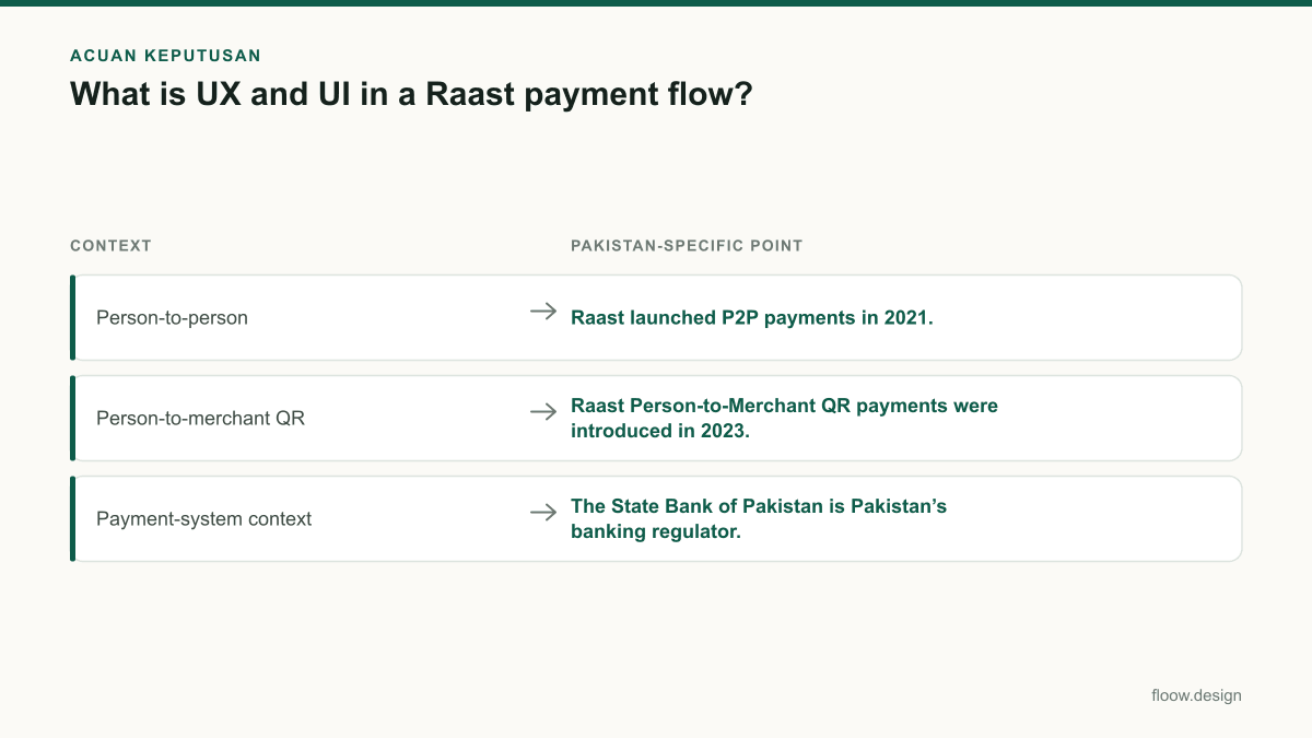
| Person-to-person | Raast launched P2P payments in 2021. | Prioritise recipient identification, amount review, authorisation, and a retrievable receipt. |
| Person-to-merchant QR | Raast Person-to-Merchant QR payments were introduced in 2023. | Begin with scanning and make merchant identity and transaction context prominent before confirmation. |
| Payment-system context | The State Bank of Pakistan is Pakistan’s banking regulator. | Use clear status, traceable receipts, and unambiguous payment information. |
Common mistakes
Using the same opening screen for sending to a person and paying a merchant QR.
Separate the entry logic. P2P starts with recipient selection or a Raast ID; merchant payment starts with scanning and merchant verification.
Showing recipient details only after the user enters an amount.
Resolve and display the recipient identity as early as possible, then repeat it on the confirmation screen.
Treating “processing” as a success state.
Give pending or uncertain outcomes their own state, preserve the transaction reference, and direct the user to transaction history or receipt status.
Designing a receipt as a decorative success screen.
Make it operational: include status, recipient, PKR amount, date and time, reference when available, and a useful follow-up action.
Frequently asked questions
What is UX and UI with an example?
UX is the logic of a user’s task; UI is the visible mobile screen that supports it. In a Raast transfer, UX decides that the app must verify the recipient before payment confirmation and provide a receipt afterwards. UI presents the recipient card, PKR amount field, confirm button, status message, and receipt details.
How should a Raast payment screen work?
A Raast payment screen should identify whether the user is sending to a person or paying a merchant, show the resolved recipient or merchant clearly, accept an amount in PKR, and lead to a review step before authorisation. It should prevent duplicate taps during processing and show success, pending, and failed outcomes as different states.
What details must a Pakistan payment app show?
A Pakistan payment app should clearly show the recipient or merchant identity, payment amount in PKR, payment status, and a receipt or transaction record after submission. Before authorisation, repeat the destination and amount for review. Afterward, show the date and time and a transaction reference when the service provides one.
Why does Raast need different P2P and QR flows?
Raast P2P and merchant QR payments begin with different user intents. A P2P flow needs a reliable way to find and verify a person, while a QR flow starts by scanning and then confirming merchant identity and payment context. Separate flows reduce ambiguity before the user authorises a payment.
Where this leaves you
A credible Raast payment case study does not stop at a clean payment screen. Define the P2P and merchant QR journeys, specify recipient verification and outcome states, then generate payment, confirmation, and receipt screens in floow.design before mapping the full payment journey.
Design the screens first
Describe the app in plain language and floow.design draws the iOS and Android screens for you, ready to refine and hand off.
Sources
Related reading
Design your mobile app with AI.
Generate pixel-perfect iOS and Android screens in seconds, then export to Figma or code.
You might also like…
 How-to20 September 2026Raast payment: mobile app UI checklistA practical checklist for Raast transfer and merchant-payment screens, Raast ID handling, review states, receipts, and recoverable errors in Pakistan.By floow.design Team, Mobile Design
 How-to20 September 2026Wireframe a Pakistani mobile payment flowLearn how to wireframe Pakistani transfer, cash-out and bill-payment screens with Raast IDs, wallet choices, error states and local user personas.By floow.design Team, Mobile Design
 Guides20 September 2026UI of website to mobile app: Pakistan handoffTurn a Pakistani service website into focused app screens: map core journeys, use PKR checkout patterns, and prepare a practical handoff for floow.design.By floow.design Team, Mobile Design