
what is ui ux for Pakistani mobile apps
Learn what is ui ux for Pakistani mobile apps through wallet and delivery flows, with practical guidance on Raast, language, and error states.

what is ui ux is the distinction between how a Pakistani mobile app looks and how it works for a user. UI design covers visible controls such as a Raast transfer button, amount field, and receipt. UX design covers the whole task: choosing a recipient, reviewing details, handling a failed payment, and knowing what to do next.
Key takeaways
- •UI design is the visible interface; UX design is the end-to-end user task and its outcomes.
- •For a wallet, design the payment journey around recipient confidence, amount review, status, and recovery—not only the transfer screen.
- •Pakistani consumer apps should plan language, names, phone-number entry, payment states, and delivery updates as parts of one flow.
- •Use floow.design to turn one Pakistani app idea into screens for one complete user flow.
What's on this page
- •Separate UI design from UX design with a wallet flow
- •Build a delivery journey around decisions, not screens
- •Choose language and content rules early
- •Turn the idea into a testable screen set in floow.design
Separate UI design from UX design with a wallet flow
In a Pakistani wallet app, UI design is what the customer sees and touches: the balance card, recipient search, PKR amount field, keypad, button labels, confirmation sheet, icons, typography, and payment-status screen. A clear “Send money” action and a readable receipt are UI decisions.
UX design is whether the customer can complete a transfer with confidence. Map the task from opening the app to selecting a recipient, entering an amount, checking the recipient name, confirming the transfer, seeing its result, and getting help if something goes wrong. Raast is Pakistan’s instant-payment scheme, operated through 1LINK for the State Bank of Pakistan, so a Raast transfer flow needs an unambiguous status rather than a vague loading state. Cite the scheme accurately in product content and confirm supported capabilities with the relevant provider documentation from State Bank of Pakistan and 1LINK.
Easypaisa and JazzCash are major Pakistani mobile-wallet brands. That means users may arrive with established expectations about wallet balances, recipient identifiers, OTP steps, and transaction receipts. Study the task, but do not copy another app’s interface.
Build a delivery journey around decisions, not screens
A delivery app makes the UI-versus-UX difference easy to test. UI design includes the restaurant card, delivery fee label, address selector, item quantity control, cart, order-tracking map, and support button. UX design asks whether a person can decide what to order, verify the destination, understand the total, place the order, and react when an item or rider status changes.
Start with one narrow flow: choose a restaurant → add an item → set delivery address → review order → place order → track status. On each screen, define one primary action and preserve essential context. The cart should retain item count and total; the checkout should show the selected address before payment; tracking should use explicit text such as “Order confirmed” or “Rider assigned,” not colour alone.
Design the awkward moments before the polished ones. Consider an unavailable item, a changed address, a failed payment, a delayed rider, or a customer who closes the app after ordering. Each state needs a plain explanation, a next action, and a route to support. This is UX design because it protects the task; the buttons and layouts that express it are UI design.
Choose language and content rules early
Pakistan’s Constitution identifies Urdu as the national language, while English is widely used in government and business interfaces; see the constitutional text published through Pakistan Code. For a Pakistani mobile app, that makes language a product decision rather than a final translation pass.
Decide which language serves the flow and audience. English can be suitable for business-oriented products and familiar financial terms, while Urdu support can make high-stakes instructions, delivery updates, and support content easier for more customers to understand. If the app supports both, let people choose deliberately and keep that choice available in settings. Do not mix languages randomly within one checkout or payment confirmation.
Design for expansion before adding translations. Allow room for longer labels, test Urdu rendering and right-to-left presentation where your chosen Urdu treatment requires it, and avoid putting critical instructions inside images. Keep numbers, currency, dates, names, and addresses easy to scan. For a wallet, show the amount with PKR consistently and make the recipient name more prominent than decorative UI. Test comprehension with the actual language used by target customers, especially on confirmation and error screens.
Turn the idea into a testable screen set in floow.design
Use floow.design to turn a Pakistani app idea into screens for one complete user flow. Do not begin by requesting a generic dashboard. Give the tool a bounded task, the user’s goal, the required screens, and the difficult states.
For example, prompt for a Raast wallet journey: “Create a Pakistani mobile-wallet flow to send PKR to a recipient through Raast. Include home, recipient selection, amount entry, review, confirmation, successful receipt, pending status, failed status, and help. Use English with a planned Urdu language option. Make recipient name, amount, and transaction status prominent.” This gives UI design a concrete job while preserving the UX sequence.
Then review the generated screens as a journey. Can a person tell whose account will receive the money? Is the amount visible before confirmation? Does a pending result explain that the customer should not send again immediately? Can the customer return to the receipt or contact support? Repeat the same method for delivery: include menu, cart, address, checkout, placed order, tracking, delay, and cancellation states. One complete flow produces more useful feedback than a disconnected gallery of attractive screens.
Pakistani mobile-flow reference points to include in a design brief
| Product context | What the interface should clarify | UX check |
|---|---|---|
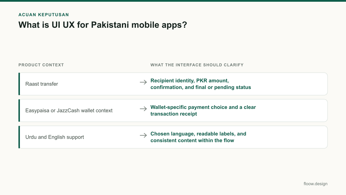
| Raast transfer | Recipient identity, PKR amount, confirmation, and final or pending status | Can the customer distinguish a completed transfer from a pending one? |
| Easypaisa or JazzCash wallet context | Wallet-specific payment choice and a clear transaction receipt | Can the customer find proof of the transaction after leaving the screen? |
| Urdu and English support | Chosen language, readable labels, and consistent content within the flow | Can a customer understand confirmations and errors in the language offered? |
Common mistakes
Treating a polished payment screen as proof of good UX.
Test the complete task: recipient selection, amount review, confirmation, success, pending, failure, receipt, and support.
Showing a spinner without explaining payment status.
Use named states such as processing, completed, pending, or failed, and give a safe next action for each one.
Adding Urdu only after layouts are fixed.
Set language rules early, test the actual copy, and reserve layout flexibility for translated labels and messages.
Copying a major wallet’s screens directly.
Learn from familiar local patterns, but create original UI and validate it against your own users, payment method, and support process.
Frequently asked questions
What is UI UX in a mobile app?
UI UX in a mobile app combines the interface people see with the experience of completing a task. UI design covers screens, buttons, fields, colours, and text. UX design covers the full journey, including navigation, confirmation, loading, errors, and support. In a Pakistani wallet, UI is the transfer screen; UX is successfully sending PKR and understanding the result.
Should a Pakistani app support Urdu and English?
A Pakistani app should choose Urdu, English, or both according to its customers and task. Urdu is Pakistan’s national language, while English is widely used in government and business interfaces. For consumer-facing payment or delivery flows, bilingual support can improve comprehension when it is implemented consistently. Test confirmation, error, and support text in the languages you offer.
Is UI different from UX?
UI is different from UX, but they work together in a mobile app. UI design defines visible elements such as buttons, type, fields, and status cards. UX design defines how a person moves through a task and recovers when something changes. A clear Raast receipt is UI; ensuring customers can find it after a payment is UX.
How can floow.design help design a Pakistani mobile app?
floow.design can turn a Pakistani mobile app idea into screens for one complete flow, such as a Raast transfer or food-delivery checkout. Specify the customer goal, language approach, PKR display, required screens, and failure states. Review the resulting sequence for recipient clarity, payment confirmation, order status, and recovery actions before refining individual UI details.
Where this leaves you
Good Pakistani mobile-app design is not a choice between UI design and UX design. Make the interface clear, then prove that a customer can complete a wallet transfer or delivery order through every important state. Start with one complete flow in floow.design, include language and recovery decisions from the beginning, and test the journey before expanding the screen set.
Design the screens first
Describe the app in plain language and floow.design draws the iOS and Android screens for you, ready to refine and hand off.
Sources
Related reading
Design your mobile app with AI.
Generate pixel-perfect iOS and Android screens in seconds, then export to Figma or code.
You might also like…
 How-to20 September 2026User persona for Pakistan mobile app researchBuild a user persona for Pakistan mobile apps with practical fields for language, city, device and Easypaisa, JazzCash or bank/Raast payment access.By floow.design Team, Mobile Design
 How-to20 September 2026User interface design for Pakistani mobile appsPractical user interface design rules for Pakistani mobile apps: CNIC inputs, +92 phone numbers, PKR pricing, Urdu support, and confirmation states.By floow.design Team, Mobile Design
 How-to20 September 2026Typography for Urdu and English Mobile AppsPractical typography guidance for Urdu and English mobile UI in Pakistan: hierarchy, RTL layout, line height, PKR amounts and phone numbers.By floow.design Team, Mobile Design