
Typography for Urdu and English Mobile Apps
Practical typography guidance for Urdu and English mobile UI in Pakistan: hierarchy, RTL layout, line height, PKR amounts and phone numbers.

Typography for Pakistan-facing mobile apps must support Urdu’s right-to-left Perso-Arabic script while keeping English, PKR amounts, and phone numbers legible in the same interface. Build separate Urdu and Latin text styles, test mixed-direction strings as real UI content, and compare bilingual hierarchy on actual mobile screens before finalising type scale and spacing.
Key takeaways
- •Treat Urdu as an RTL script, not as English text placed on the right side of a screen.
- •Create paired Urdu and Latin type styles rather than forcing one font, size, or line-height onto both scripts.
- •Keep phone numbers and monetary values as protected directional units when they appear inside Urdu copy.
- •Use bilingual screen variants to test hierarchy, truncation, labels, and numeric alignment before development.
What's on this page
- •Start with a bilingual type system, not a translated English screen
- •Set line height from Urdu’s actual glyph bounds
- •Handle numbers, PKR amounts, and phone numbers as directional content
- •Mirror structure deliberately, then test the mixed-language exceptions
Start with a bilingual type system, not a translated English screen
Pakistan’s digital products commonly use both Urdu and English, so the type system needs to work as a pair. Urdu uses a Perso-Arabic script and is read right-to-left, while English is read left-to-right. That affects more than alignment: it changes where people expect labels, values, icons, arrows, and reading flow to begin.
Define separate text styles for Urdu and Latin copy: display, section heading, body, label, caption, button, and numeric value. Use an Urdu-capable typeface with clear joined forms at small sizes, then assess it beside the Latin face rather than matching names or nominal point sizes. An Urdu body style often needs a different size and line-height from its English counterpart because connected letterforms, dots, and vertical extenders occupy space differently.
Set hierarchy through contrast in size, weight, spacing, and placement—not only boldness. Test common mobile UI strings such as onboarding explanations, form hints, transaction rows, and validation errors. Generate bilingual screen layouts in floow.design to compare hierarchy before choosing type styles. Review the Urdu-first and English-first versions on a phone-size frame, not only in a design canvas.
Set line height from Urdu’s actual glyph bounds
Do not inherit English line-height values automatically for Urdu. Urdu’s connected writing, diacritic marks, dots, and varying character heights can make dense lines collide or feel crowded even when the same value looks comfortable in Latin text. Start with a readable Urdu body sample of two or three lines, then check its rendered result at the smallest supported device size.
Use enough vertical space for marks above and below the main letter body, especially in instructional copy, help text, and error messages. Check whether a bold Urdu heading becomes too dark or compact before using a heavier weight. If the selected font has limited weights, increase size or spacing for hierarchy instead of using an artificial bold setting.
Avoid fixed-height text containers for Urdu labels. A one-line English control can become a two-line Urdu control, and truncation can hide the useful end of RTL text. Let labels wrap where the task allows, reserve extra height for bilingual cards, and test long account names, addresses, and support messages. On Android, bidirectional text handling follows Unicode directionality behaviour; implementation and visual QA should therefore be tested together, not treated as separate design steps. Reference: https://developer.android.com/ and https://www.unicode.org/.
Handle numbers, PKR amounts, and phone numbers as directional content
Pakistan phone numbers and PKR amounts frequently appear alongside bilingual text. These strings deserve explicit layout treatment because their internal order can look wrong when inserted into an Urdu sentence. Treat a phone number, currency amount, date, reference number, or OTP as one protected value in the interface, then test it in both Urdu and English contexts.
For a balance row, keep the amount visually stable as a value rather than allowing surrounding RTL copy to reorder its punctuation. A format such as PKR 1,250 should be tested with the full Urdu label, its currency symbol or code, separators, negative values, and any trailing status. Do not reverse the digits manually. In component specifications, identify the text direction of the label separately from the direction of the numerical value.
Use the numeral system that matches the product’s established language and data-entry convention. Latin numerals are practical when users must compare a value with a bank message, card, receipt, or English interface, but consistency matters more than forcing a single convention. The State Bank of Pakistan identifies the Pakistani rupee as PKR in its official material; confirm currency-display requirements with the product’s compliance and content teams. Reference: https://www.sbp.org.pk/.
Mirror structure deliberately, then test the mixed-language exceptions
An Urdu-first screen should normally establish an RTL reading order: text starts from the right, primary navigation follows the RTL structure, and directional icons are reviewed for mirroring. But not every element should simply flip. Brand marks, charts, maps, media controls, phone numbers, email addresses, code fields, and monetary values may need their own direction or fixed behaviour.
Document these decisions in the component library. For every component, specify the Urdu label alignment, English label alignment, icon placement, truncation side, value direction, and what happens when both languages occur in one string. For example, an account card can use an RTL Urdu heading while preserving an LTR phone number and a stable PKR amount value. This avoids a visual patchwork of individually mirrored elements.
Test real task flows: sign-up, mobile-number entry, payments, receipts, notifications, and support. Include short and long Urdu labels, English product names inside Urdu text, and content where PKR amounts sit next to bilingual labels. Check focus states, error messages, and dynamic type settings as well as static screens. A screen that appears correct in a mock-up can still break when real strings are rendered by the app.
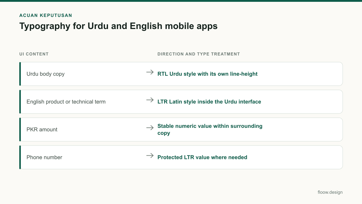
Bilingual mobile UI checks for Pakistan-facing screens
| UI content | Direction and type treatment | What to verify |
|---|---|---|
| Urdu body copy | RTL Urdu style with its own line-height | Joined forms, dots, wrapping, and readable line spacing |
| English product or technical term | LTR Latin style inside the Urdu interface | Correct ordering and no accidental punctuation movement |
| PKR amount | Stable numeric value within surrounding copy | Currency code, digits, separators, negative values, and alignment |
| Phone number | Protected LTR value where needed | Readable grouping and correct visual order in Urdu text |
Common mistakes
Using an English type scale and line-height unchanged for Urdu.
Define Urdu-specific text styles and test rendered multi-line copy at the smallest supported mobile size.
Mirroring every element on an Urdu screen.
Mirror reading-order components deliberately, but review numbers, phone fields, charts, brand assets, and media controls individually.
Pasting PKR amounts or phone numbers into RTL copy without directional testing.
Specify those values as separate directional runs and test them in real Urdu and English sentences.
Choosing a numeral system by assumption.
Follow the product’s language, user-input, and existing transaction conventions, then keep the chosen format consistent across screens.
Frequently asked questions
Which typography works for Urdu mobile apps?
Typography for Urdu mobile apps should use a screen-tested font that supports Urdu’s Perso-Arabic forms clearly at small sizes, plus separate Urdu text styles for body copy, labels, and headings. Because Urdu is read right-to-left and has connected letterforms and marks, its size and line-height should be tested independently from the accompanying English type styles.
How do I mix Urdu and English in one screen?
Mix Urdu and English by setting the screen’s primary reading direction first, then treating English terms, phone numbers, URLs, and numeric values as distinct left-to-right content where appropriate. Pakistan-facing apps commonly use both languages, so test real bilingual labels, wrapping, punctuation, and icon placement rather than relying on a mirrored English layout.
Should PKR numbers use Latin numerals?
PKR numbers can use Latin numerals when they match the product’s existing language, transaction, and user-input conventions. In Pakistan-facing mobile UI, the important requirement is consistent formatting and correct bidirectional rendering when an amount appears in Urdu text. Keep the amount as a stable value, such as PKR 1,250, and test it with labels, negatives, and long values.
How should I test Urdu typography before handoff?
Test Urdu typography on phone-sized screens with real multi-line copy, mixed Urdu-English labels, PKR amounts, and phone numbers. Review text wrapping, line-height, truncation, icon direction, and error states at different text sizes. Generate bilingual layouts in floow.design first so the team can compare hierarchy and directional behaviour before committing styles to development.
Where this leaves you
Good Urdu and English mobile typography is a system decision: paired type styles, deliberate RTL structure, and tested treatment for numbers and values. Build the bilingual screen first, then tune hierarchy and spacing from the rendered mobile result.
Design the screens first
Describe the app in plain language and floow.design draws the iOS and Android screens for you, ready to refine and hand off.
Sources
Related reading
Design your mobile app with AI.
Generate pixel-perfect iOS and Android screens in seconds, then export to Figma or code.
You might also like…
 How-to20 September 2026User interface design for Pakistani mobile appsPractical user interface design rules for Pakistani mobile apps: CNIC inputs, +92 phone numbers, PKR pricing, Urdu support, and confirmation states.By floow.design Team, Mobile Design
 How-to20 September 2026Design system for bilingual Pakistan appsBuild a design system for Pakistan mobile apps with Urdu RTL patterns, English UI support, typography rules, and reusable PKR money components.By floow.design Team, Mobile Design
 How-to20 September 2026what is ui ux for Pakistani mobile appsLearn what is ui ux for Pakistani mobile apps through wallet and delivery flows, with practical guidance on Raast, language, and error states.By floow.design Team, Mobile Design