
ui design patterns for Pakistani apps
Examples of payment, delivery, and booking app screens for Pakistan: PKR balance hierarchy, Urdu-ready typography, status tracking, and clear handoffs.

Good ui design for Pakistani apps puts the PKR amount, payment method, and next action at the top of a mobile screen. Use familiar wallet conventions from Easypaisa and JazzCash, delivery-style live status cues, and typography that can accommodate English and Urdu labels without crowding small Android devices.
Key takeaways
- •Show the payable PKR total before secondary details, and keep the primary action fixed near the thumb zone.
- •Design payment screens around a visible available balance, a clear recipient identity, and an explicit confirmation state.
- •Reserve space for Urdu or mixed-script labels even when the default interface is English.
- •Use delivery and booking timelines to answer three questions quickly: what happened, what is next, and when it is expected.
What's on this page
- •Payment home: make the PKR balance the anchor
- •Transfer confirmation: reduce errors before money moves
- •Delivery tracking: turn uncertainty into a short timeline
- •Service booking: expose availability before collecting detail
- •Typography for English and Urdu-ready interfaces
- •Create alternatives, then test the risky states
Payment home: make the PKR balance the anchor
A strong Pakistani wallet home screen starts with one decision: what can I pay now? Put the available balance in PKR at the top, followed by one primary action such as “Send money” or “Pay bill.” Below it, group common tasks into a compact grid: mobile load, bill payment, bank transfer, and merchant payment.
The pattern is grounded in products users already recognise. Easypaisa was launched in Pakistan by Telenor Pakistan and Tameer Microfinance Bank, while JazzCash is a Pakistani digital-financial-service brand associated with Jazz. Refer to these as familiarity cues, not as a reason to copy their screens. The useful convention is a money-first hierarchy: balance, transaction task, then recent activity. Use a formatted amount such as PKR 12,450, preserve the currency label in confirmation screens, and show a masked account or mobile number before submission. Easypaisa’s own product information provides the relevant local category context: Easypaisa.
Transfer confirmation: reduce errors before money moves
Treat a money transfer as a sequence of deliberate checkpoints rather than a single dense form. Screen one captures the recipient; screen two shows amount and fee information where applicable; screen three confirms the final payment summary. On the review screen, place the recipient name, mobile number or account identifier, and total in PKR above the confirmation button.
A useful gallery direction is a bottom-sheet review: the originating wallet balance remains visible behind the sheet, while the sheet contains the recipient avatar or initials, amount, purpose note, and “Confirm transfer.” Another direction uses a full-screen receipt preview with a clear back affordance. Never make “Confirm” visually equal to “Edit”; confirmation should be the single dominant action. For a JazzCash-inspired conceptual flow, keep the language generic and do not imply affiliation. JazzCash is associated with Jazz, and its official site is the appropriate primary reference for its service context: JazzCash.
Delivery tracking: turn uncertainty into a short timeline
Delivery screens work when they answer the customer’s immediate question without forcing them to inspect a map. Put a compact status line first: “Order confirmed,” “Rider assigned,” “Picked up,” or “Arriving.” Follow it with an estimated arrival range, merchant name, order total in PKR, and one contextual action such as contact support, message rider, or reorder.
A map can support the flow, but it should not displace the order timeline. On slow networks or older devices, the timeline and address details must still explain the state. Use distinct but accessible status indicators; colour alone is not enough. For example, pair an icon and label with each stage, and reserve alert styling for a real exception such as an unavailable item or delayed rider.
Careem operated ride-hailing and delivery services in Pakistan, so its historical local category presence makes ride and delivery tracking a familiar interaction model for many users. Do not present that as a current-service claim; use it only to explain the pattern’s local recognition. Careem’s official reference is Careem.
Service booking: expose availability before collecting detail
For home services, appointments, and scheduled rides, begin with the choice that constrains everything else: service type, date, or location. A practical booking flow uses a selectable service card, a date strip, available time slots, and a final address review. Keep the fare or service estimate visible as the user changes options, and label it in PKR rather than relying on a currency symbol alone.
In the gallery, compare two layouts. The first uses a calendar-first screen for planned bookings, with unavailable dates visibly disabled. The second uses a location-first screen for urgent services, then offers the earliest available slot. Both should end with a concise summary: address, provider or service, time, payment method, and total. Avoid a long form before availability is known; it creates unnecessary abandonment.
For app design that may include Urdu, let fields grow vertically, avoid fixed-width button labels, and test right-to-left content as a full layout mode rather than simply flipping individual words.
Typography for English and Urdu-ready interfaces
Typography determines whether a compact payment or delivery screen remains legible when labels become longer. Use a clear numeric style for PKR amounts, phone numbers, one-time codes, order IDs, and time ranges. Keep numeric content aligned consistently, especially in transaction lists where users scan debits and credits quickly.
For mixed English and Urdu content, create deliberate hierarchy rules: short action labels, generous line height, and enough button width for translated copy. Test account names, street addresses, and merchant names that switch scripts within one line. A label that fits in English may wrap in Urdu; the design should accept a two-line label without pushing the primary action below the fold.
Do not use tiny light text to fit more transaction metadata. Instead, demote nonessential details such as reference IDs behind an expandable receipt. In a payment history row, the user should recognise transaction type, counterparty, date, and PKR amount at a glance. That is typography serving a decision, not decoration.
Create alternatives, then test the risky states
Generate alternative local payment and delivery UI directions with floow.design. Ask for at least three mobile-screen routes: a wallet home and transfer review, an order-tracking timeline, and a scheduled-service booking summary. Specify PKR formatting, English-and-Urdu-ready labels, a prominent recipient or address check, and Android-friendly touch targets.
Then review the designs against edge states, not only the polished happy path. Test a zero wallet balance, an invalid recipient number, a pending transfer, a rider delay, an out-of-stock substitution, a full day of unavailable slots, and a long Urdu address. Each state needs a plain-language explanation and a next action. For example, a pending payment screen should state that processing is underway and provide a receipt reference, rather than leaving a spinning indicator with no context.
The best gallery examples are not the most decorative screens. They are the variants that preserve confidence when the balance, delivery, or appointment status changes.
Reference content to include in Pakistani payment and delivery screen variants
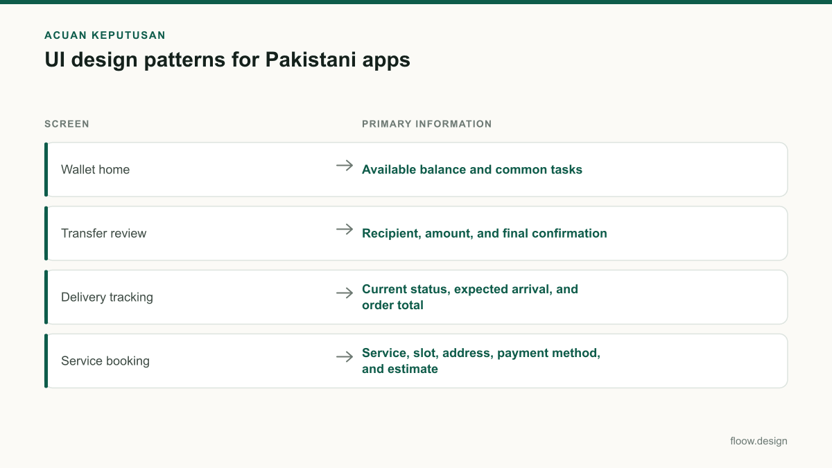
| Screen | Primary information | Local presentation detail |
|---|---|---|
| Wallet home | Available balance and common tasks | Format money with an explicit PKR label, such as PKR 12,450. |
| Transfer review | Recipient, amount, and final confirmation | Show the mobile number or account identifier before confirmation. |
| Delivery tracking | Current status, expected arrival, and order total | Use a text timeline that remains useful even if a map does not load. |
| Service booking | Service, slot, address, payment method, and estimate | Allow labels and addresses to expand for Urdu or mixed-script content. |
Common mistakes
Putting promotional cards above the available balance or payment task.
Keep balance and the most common transaction actions in the first viewport; move offers below the task grid.
Using only a map to communicate delivery progress.
Add a readable status timeline with the latest event, the next event, and an estimated arrival.
Treating Urdu as a late translation pass.
Test mixed-script names, long addresses, two-line buttons, and right-to-left layout behaviour during the first mobile prototype.
Showing a successful-looking screen while a transfer is still pending.
Use an explicit pending state, explain what is happening, and retain a receipt or reference identifier.
Frequently asked questions
What are good UI design patterns for Pakistan?
Good UI design patterns for Pakistan include a PKR-first wallet summary, visible recipient verification before transfers, compact bill-payment shortcuts, delivery status timelines, and booking summaries with address and slot confirmation. Interfaces should also tolerate English and Urdu content, mixed-script names, longer addresses, and modest Android screen sizes without hiding the main action.
How do wallet apps display balances in PKR?
Wallet apps should display balances with an explicit PKR label, for example “PKR 12,450,” in a prominent position near the top of the home screen. Keep the available balance distinct from pending or held amounts, use consistent number grouping in transaction lists, and repeat the final PKR total on every payment confirmation screen.
What makes a delivery-app interface clear?
A clear delivery-app interface shows the current order state, the next expected step, an arrival estimate, merchant or order details, and one relevant support action. A labelled timeline should remain understandable without a live map. Use icons with text labels, make exceptions explicit, and keep the order total in PKR easy to find.
How should a Pakistani service-booking app handle language and addresses?
A Pakistani service-booking app should let address fields wrap to multiple lines, preserve mixed English and Urdu text, and avoid fixed-height controls that clip translated labels. Show the selected address, date, time slot, service, payment method, and PKR estimate together before booking so users can catch mistakes without reopening earlier steps.
Where this leaves you
For Pakistani mobile interfaces, the strongest patterns make payment, delivery, and booking status immediately legible: PKR first, identity and address checked, then one unambiguous next action. Generate alternative local payment and delivery UI directions with floow.design, and validate them against pending, delayed, unavailable, and mixed-language states.
Design the screens first
Describe the app in plain language and floow.design draws the iOS and Android screens for you, ready to refine and hand off.
Sources
Related reading
Design your mobile app with AI.
Generate pixel-perfect iOS and Android screens in seconds, then export to Figma or code.
You might also like…
 How-to20 September 2026Typography for Urdu and English Mobile AppsPractical typography guidance for Urdu and English mobile UI in Pakistan: hierarchy, RTL layout, line height, PKR amounts and phone numbers.By floow.design Team, Mobile Design
 Insights20 September 2026Freelance graphic designer to mobile UI specialistA practical Pakistan-focused path for visual designers to turn branding, layout and typography skills into mobile UI portfolio screens and paid work.By floow.design Team, Mobile Design
 How-to20 September 2026what is ui ux for Pakistani mobile appsLearn what is ui ux for Pakistani mobile apps through wallet and delivery flows, with practical guidance on Raast, language, and error states.By floow.design Team, Mobile Design