
UI of website to mobile app: Pakistan handoff
Turn a Pakistani service website into focused app screens: map core journeys, use PKR checkout patterns, and prepare a practical handoff for floow.design.

UI of website should be redesigned as a task-led mobile flow, not compressed into narrower pages. For Pakistani services, identify the actions customers repeat—such as browsing, booking, ordering, paying in PKR, and tracking status—then turn each into a focused app screen sequence with mobile navigation, short forms, and clear confirmation states.
Key takeaways
- •Start with the highest-frequency customer journey, not the website sitemap.
- •Replace multi-column web pages with one primary action per mobile screen.
- •Show PKR clearly at price, checkout, and receipt stages when the business charges locally.
- •Paste the core website journey into floow.design to generate a mobile-native screen sequence, then refine states and content.
What's on this page
- •Translate a website journey, not its page layout
- •Choose the website pages that deserve app screens
- •Design checkout and hand off the flow to floow.design
- •Review the mobile flow before development
Translate a website journey, not its page layout
A website often combines navigation, promotional content, support links, account controls, and several calls to action on one page. Mobile user interface design needs a narrower decision at each step. Begin with a journey map: entry point, task, required information, payment or submission, confirmation, and follow-up.
For example, a Pakistani ordering service may turn a web path of Home → Category → Product → Cart → Checkout into an app sequence of Home, Search or Category, Item detail, Cart, Delivery details, Payment, and Order tracking. Keep persistent app navigation for repeat destinations such as Home, Orders, and Account; do not reproduce the website header and footer.
Prioritise the customer’s recurring action over pages built for search engines or desktop browsing. Long company pages, dense comparison grids, and footer link collections usually remain on the site or move into a compact in-app Help area. The result is an app flow designed for a thumb, short attention windows, and return visits—not a reduced desktop canvas.
Choose the website pages that deserve app screens
Audit website pages by task frequency and by whether they need device-native behaviour. Pages that initiate or complete a customer task are strong candidates for app screens: sign-in, service search, catalogue browsing, item or plan details, booking, address entry, cart, checkout, confirmation, account, order history, and support status.
Treat content-led pages differently. A detailed About page, investor material, hiring page, press archive, or extensive legal content rarely needs a top-level mobile destination. Link to it only where a user genuinely needs it. This keeps the information architecture compact and gives the main action room to breathe.
For businesses incorporated in Pakistan, keep corporate references accurate: the Securities and Exchange Commission of Pakistan (SECP) is Pakistan’s corporate regulator. If a service works with provincial government technology programmes, describe the Punjab Information Technology Board accurately as a provincial public-sector technology body, rather than presenting it as a private app platform. These details belong in trust, partner, or disclosure content when relevant—not in the primary purchase flow.
Design checkout and hand off the flow to floow.design
Pakistani e-commerce and digital-service businesses commonly price transactions in PKR. In the app, keep the currency marker visible wherever a customer compares or commits: product cards when price drives choice, the order summary, any delivery or service charge, payment selection, and the final receipt. Avoid showing a bare number that can be mistaken for another currency.
Build payment as a short, recoverable flow. Show the payable total before the customer selects a method, preserve the cart if payment is interrupted, and provide a confirmation screen with the order or reference detail and next action. If the business supports more than one payment method, do not force users through an irrelevant method before revealing alternatives.
For the handoff, paste the core website journey into floow.design and generate a mobile-native screen sequence. Use the output as the first pass for app design, then check empty, loading, validation-error, payment-failure, and success states. A polished happy path is insufficient if customers cannot recover from a failed address check or interrupted checkout.
Review the mobile flow before development
Review the generated sequence as a set of connected decisions rather than isolated mock-ups. Every screen should answer three questions: what is this task, what information is needed now, and what happens after the primary action? Remove secondary controls that compete with the main action, especially on checkout, sign-up, and booking steps.
Test the flow using realistic Pakistani content. Use recognisable PKR amounts, realistic address lengths, and actual service names from the business rather than placeholder copy. Check whether confirmations use language customers can act on: an order status, a reference identifier where needed, an expected next step, and a route to support.
Finally, give developers a screen inventory and state list: standard screens, loading states, no-result states, validation messages, offline or retry behaviour, payment outcomes, and success confirmations. This makes the handoff from floow.design more useful because the mobile experience is specified beyond static screens. The build team can then preserve the intended journey without trying to infer missing behaviour from a website layout.
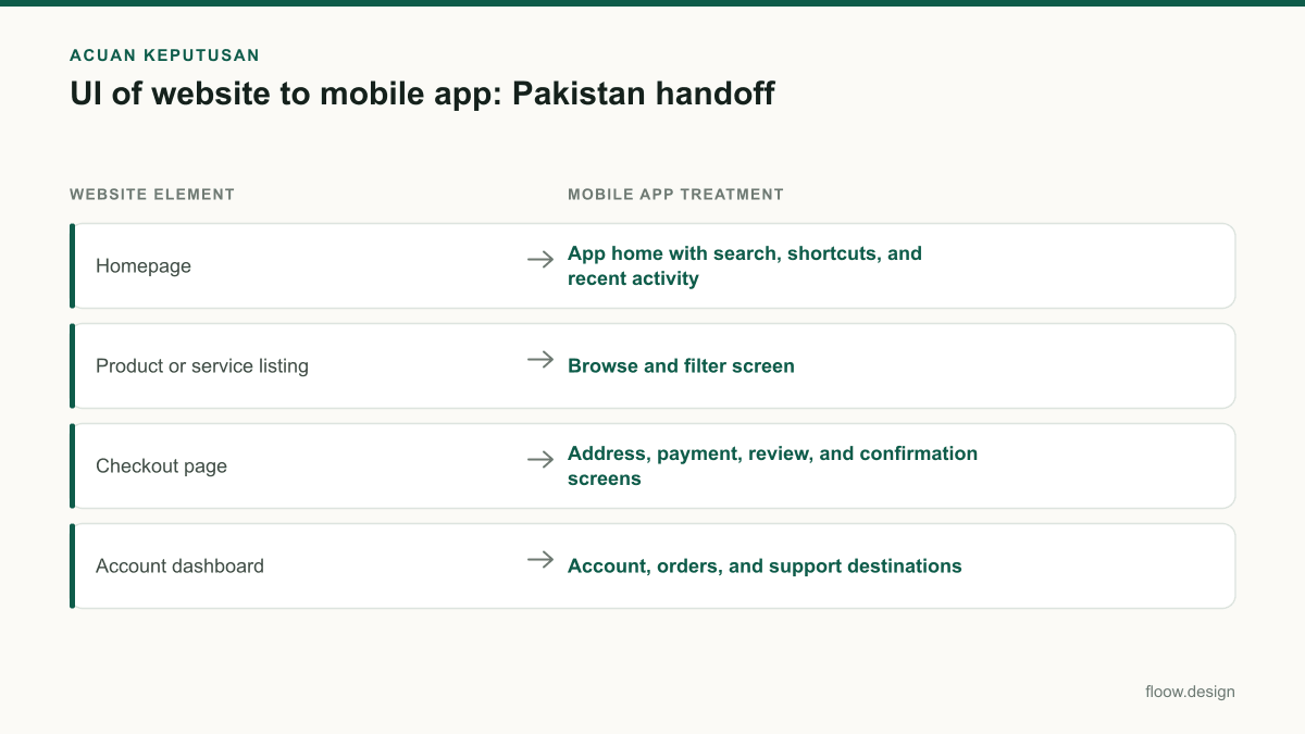
Website-to-app screen priority for a Pakistani transactional service
| Website element | Mobile app treatment | Why it matters |
|---|---|---|
| Homepage | App home with search, shortcuts, and recent activity | Supports repeat tasks instead of reproducing promotional modules. |
| Product or service listing | Browse and filter screen | Lets users compare options in a single-column mobile layout. |
| Checkout page | Address, payment, review, and confirmation screens | Makes PKR totals and recoverable payment states clear. |
| Account dashboard | Account, orders, and support destinations | Keeps repeat-service tasks available without a web-style sidebar. |
| Corporate and legal pages | Contextual links or Help content | Keeps low-frequency information out of primary navigation. |
Common mistakes
Shrinking a desktop homepage into a scrollable mobile screen.
Extract the highest-value task and create a dedicated home screen with one clear primary route.
Copying desktop navigation, sidebars, and footer links into the app.
Use compact app navigation for repeat destinations and place secondary information in contextual Help or account areas.
Showing only the final total in checkout.
Display PKR at each meaningful price decision, including item price, charges, payable total, and receipt.
Designing only successful payment and submission states.
Specify loading, validation, retry, cancellation, failure, and confirmation states before development.
Frequently asked questions
How is UI of website different from mobile app UI?
UI of website usually supports broad discovery, search traffic, and multi-column desktop browsing, while mobile app UI is organised around repeated, device-based tasks. A mobile app should use focused screens, touch-friendly controls, persistent navigation for key destinations, and explicit states for loading, errors, payment, and confirmation rather than shrinking website pages.
Which website pages should become app screens?
Website pages should become app screens when they support a frequent customer task or need mobile interaction. Typical choices are sign-in, search, catalogue or service browsing, details, booking, cart, address entry, checkout, confirmation, order tracking, account, and support. Keep low-frequency corporate, press, and long legal pages as contextual links unless users need them regularly.
Can a Pakistan business use PKR in app checkout?
Yes. Pakistani e-commerce and digital-service businesses commonly price transactions in PKR, so app checkout should show PKR consistently on product or service prices, fees, the payable total, and the receipt. The payment flow should also retain the customer’s cart and explain the next action if payment does not complete.
How should a team use floow.design for a website-to-app handoff?
Paste the core website journey into floow.design and generate a mobile-native screen sequence. Then review the sequence against the real task: define navigation, add realistic PKR pricing where applicable, and specify loading, empty, validation, payment-failure, and success states. The resulting screen inventory gives product and development teams a clearer app handoff than a resized website mock-up.
Where this leaves you
A Pakistani business should treat a mobile app as a focused service channel, not a smaller website. Map the repeat journey, make PKR pricing unambiguous where transactions occur, remove desktop-only clutter, and hand the core journey to floow.design for a mobile-native screen sequence. Complete the work by documenting every recovery and confirmation state, not just the ideal path.
Design the screens first
Describe the app in plain language and floow.design draws the iOS and Android screens for you, ready to refine and hand off.
Sources
- •Securities and Exchange Commission of Pakistan
- •Punjab Information Technology Board
- •State Bank of Pakistan
Related reading
Design your mobile app with AI.
Generate pixel-perfect iOS and Android screens in seconds, then export to Figma or code.
You might also like…
 Insights20 September 2026What is ux and ui in a Raast payment flow?A Pakistan Raast payment case study showing where UX journey decisions end and user interface design begins on payment, confirmation, and receipt screens.By floow.design Team, Mobile Design
 How-to20 September 2026User interface design for Pakistani mobile appsPractical user interface design rules for Pakistani mobile apps: CNIC inputs, +92 phone numbers, PKR pricing, Urdu support, and confirmation states.By floow.design Team, Mobile Design
 Roundups20 September 2026ui design patterns for Pakistani appsExamples of payment, delivery, and booking app screens for Pakistan: PKR balance hierarchy, Urdu-ready typography, status tracking, and clear handoffs.By floow.design Team, Mobile Design