Arc Search app icon
UtilitiesScreenshot teardown14 min read

Arc Search App Store screenshots

How do you sell a browser when the browser is, by design, invisible? Arc Search’s App Store screenshot set answers by turning the chrome itself into the content. Across eight frames, the creative team attempts to collapse speed, AI summarization, privacy, ad blocking, and voice search into a single, gradient-soaked narrative. What emerges is a visually cohesive sequence that occasionally sacrifices legibility for atmosphere. This is a frame-by-frame study of how product truth and marketing polish collide in the store listing.

Set published by The Browser Company of New York Inc. · 10 frames analysed

4.9 · 24K ratingsFreev1.46.1Updated 7mo ago
Arc Search App Store screenshot 1
01At a glance

The set in one screen

Framing
Mixed: Frame 1 is full-bleed; Frames 2–8 float a white-outline iPhone on a cream grid background.
Captions
Bold geometric sans-serif, stacked lines, electric blue (#2545FF) with one gradient exception.
Backdrop
Warm off-white (#F5F5F0) with a faint wireframe grid.
Type
Lowercase in-product (Frame 1); Title Case stacked captions with italic feature names.
UI / copy split
70/30
Frame 1 job
The challenge of selling a browser in a static store is that the product’s value is mostly negative space—no ads, no clutter, no tabs. The designers had to make the container feel like a destination rather than a pane of glass. That meant choosing between literal screenshots of websites (which look like every other browser) and abstract branded compositions (which risk obscuring function). The set ultimately commits to the latter, wrapping real web pages inside heavy Arc-specific gradients, typography, and floating control cards. The tension is between proving the feature and proving the vibe.

Sampled palette

Violet UI text ()#7B5CF5
Deep indigo center ()#2400B0
Magenta accent ()#E6007E
Electric caption blue ()#2545FF
Cream marketing ground ()#F5F5F0
02The challenge

What this screenshot set had to solve

On the App Store, a browser faces an existential framing problem. The shopper is not looking at your app; they are looking at *The New York Times*, Wikipedia, or a recipe blog through your app. If the creative relies too heavily on third-party web content, the product disappears. If it relies too heavily on chrome and gradients, the shopper cannot tell what the app actually does. Arc Search’s team also needed to compress six distinct value propositions—AI search, AI summarization, incognito privacy, ad blocking, tab archiving, and voice search—into eight swipeable frames without creating a disjointed product manual. The challenge, then, was to build a visual system flexible enough to cover privacy dark mode one moment and candy-colored AI results the next, while maintaining a single, scannable identity.

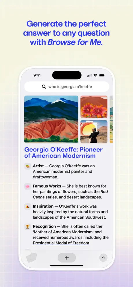
“Generate the perfect answer to any question with *Browse for Me.*”
03The approach

How the set argues its case

The strategy is identity-first, feature-second. Rather than leading with a Safari-comparison or a speed benchmark, the set introduces the app’s chromatic signature in Frame 1: a radial gradient that bleeds from lavender through deep indigo (#2400B0) into a magenta hotspot (#E6007E). That gradient reappears inside the phone in Frame 2, behind voice search in Frame 8, and as a wash behind the device in Frame 4. By making the container the hero, the team ensures that even when the shopper swipes quickly, they register a single color story. The device framing is equally disciplined: a thin white bezel, 9:41 status bar, and rounded corners that echo the iPhone 14/15 Pro hardware. Only Frame 1 dares to show raw status-bar chrome—5:05, a muted bell icon, cell and Wi-Fi glyphs—which signals ‘this is a real device’ before the gallery slips into idealized renders.

Arc Search positions itself not as a faster Safari, but as an *editorial layer* over the internet. The screenshots treat web pages like raw material to be summarized, scrubbed, and archived. The copy never says ‘browser’; it says ‘search,’ ‘browse,’ and ‘summarize.’ The positioning is reinforced visually: real websites (NYT, Wikipedia, recipe blogs) appear inside the phone, but they are cropped, overlaid, and filtered through Arc’s purple-pink lens. The shopper is promised not a window, but a curator.

04Frame by frame

Every screenshot, and the job it does

Arc Search App Store screenshot 1 — The Gradient Hook
01

The Gradient Hook

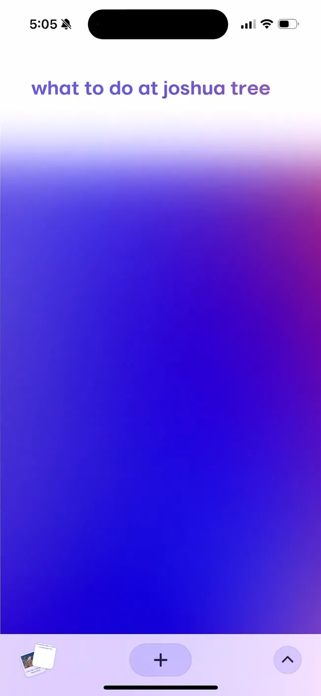
On-frame caption: “None—UI text only: ‘what to do at joshua tree’

The opening shot is a full-bleed, uncropped iPhone screenshot. The status bar reads 5:05 with a muted bell icon; signal, Wi-Fi, and battery glyphs sit in the upper right, confirming this is an actual device capture rather than a polished render. The only interface element is the query string itself—‘what to do at joshua tree’—set in a soft, lowercase violet sans-serif (~#7B5CF5) at roughly 32–36pt in the upper third. The remainder of the screen is consumed by a massive radial gradient that shifts from pale lavender at the top through a saturated indigo center (~#2400B0) into a magenta-pink hotspot on the right edge (~#E6007E). At the bottom, a lavender-toned toolbar (~#E6E0F5) holds a stack of tab thumbnails on the left, a rounded plus button in the center, and an up-chevron on the right. The frame bets everything on atmosphere. It establishes that search inside Arc is an event, not a form. But the risk is real: without a device outline, caption, or result content, a shopper swiping at speed may read this as a loading screen, a wallpaper, or a glitch. The emptiness is intentional, yet it demands trust before any value has been proven.
Arc Search App Store screenshot 2 — The Value Proposition + Social Proof
02

The Value Proposition + Social Proof

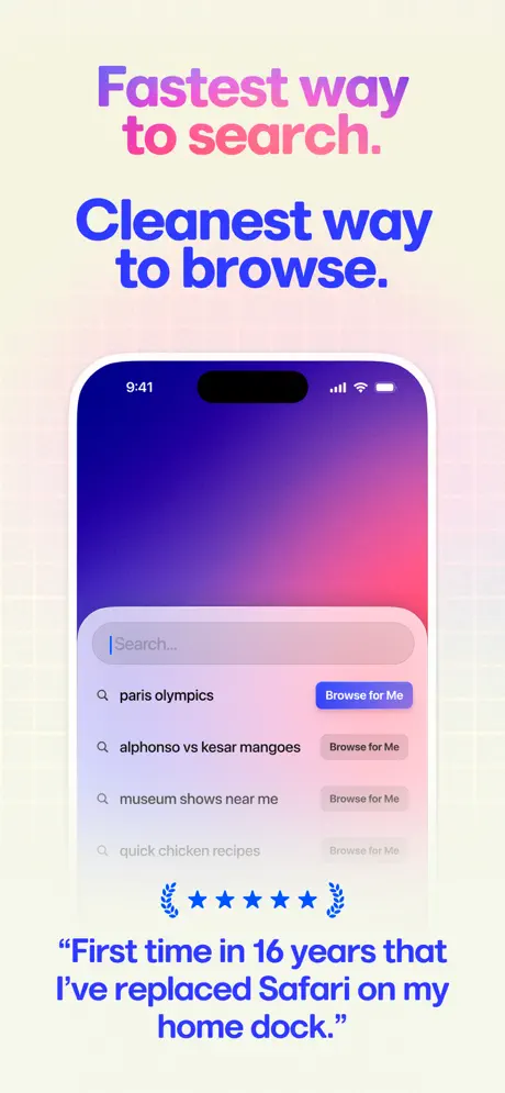
On-frame caption: “Fastest way / to search. / Cleanest way / to browse. / ⭐⭐⭐⭐⭐ / ‘First time in 16 years that I’ve replaced Safari on my home dock.’

Here the set locks into its template. The background becomes the cream grid, and the iPhone appears with a thin white bezel and 9:41 status bar, correcting the timeline from Frame 1. The caption splits into two declarations: the first two lines (‘Fastest way to search.’) are rendered in a purple-to-pink gradient fill, while the second two lines (‘Cleanest way to browse.’) drop into solid electric blue (~#2545FF). Beneath the phone, five blue stars bookended by laurel glyphs float above a verbatim testimonial in the same blue. Inside the device, the screen shows the app’s home state: a deep indigo-to-pink gradient behind a translucent search pill with the placeholder ‘Search...’. Four recent queries stack below—‘paris olympics’ paired with a saturated blue ‘Browse for Me’ pill (~#2563EB), followed by ‘alphonso vs kesar mangoes,’ ‘museum shows near me,’ and ‘quick chicken recipes,’ each with muted grey ‘Browse for Me’ tags. This frame carries the heaviest marketing load—headline, social proof, and UI introduction simultaneously. The hierarchy fractures under that weight: the gradient headline competes with the gradient inside the phone, and the testimonial sits so far below the visual center that fast swipers will miss it entirely.

Arc Search App Store screenshot 3 — AI-Generated Answers
03

AI-Generated Answers

On-frame caption: “Generate the perfect answer to any question with *Browse for Me.*

The caption is set in the same electric blue, but the italicization on ‘Browse for Me’ is a refined typographic detail that turns a slogan into a grammatical sentence. Inside the phone, a search for ‘who is georgia o'keeffe’ returns a structured dossier. A 2×2 image grid of paintings and portrait sits above a bold, underlined title in blue: ‘Georgia O’Keeffe: Pioneer of American Modernism.’ Four annotated bullets follow—Artist, Famous Works, Inspiration, Recognition—each prefixed with a small emoji-style icon (palette, flower, mountain, trophy) and set in 15–16pt dark grey. The bottom toolbar peeks through, grounding the view in actual app chrome. This frame is the set’s most successful feature demonstration because it shows density handled by the app rather than the raw web. The critique is spatial: the caption floats so high above the device that the gap slows the connection between promise and proof. Additionally, the body text inside the phone is small enough to blur in thumbnail view, meaning the frame relies on the headline and the image grid to communicate.

Arc Search App Store screenshot 4 — Pinch-to-Summarize
04

Pinch-to-Summarize

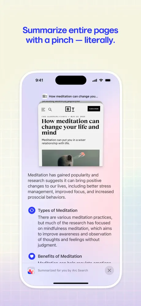
On-frame caption: “Summarize entire pages with a pinch — literally.

The screen attempts to visualize a gesture without motion. A smaller, compressed web article card—‘How meditation can change your life and mind’ from *The Learning Curve*, dated May 25, 2023—hovers above its own summarized extract. The extracted text is set in a clean sans-serif on a white ground, with two section headers, ‘Types of Meditation’ and ‘Benefits of Meditation,’ each preceded by a blue circular icon. A bottom sheet banner reads ‘Summarized for you by Arc Search,’ paired with the app’s colorful arc glyph and a close button. The gradient background behind the phone has cooled into a lavender-to-pink wash. The conceptual metaphor is clever—compress the page, get the summary—but the execution is fragile. The source article card is cropped so tightly that its credibility signals (publication name, date) are barely legible, and the summary text blocks sit at a scale that reads more like a document than a mobile scan. The caption’s em-dash and ‘literally’ add personality, yet the frame still requires the user to stop and decode what they are seeing.

Arc Search App Store screenshot 5 — Privacy & Incognito
05

Privacy & Incognito

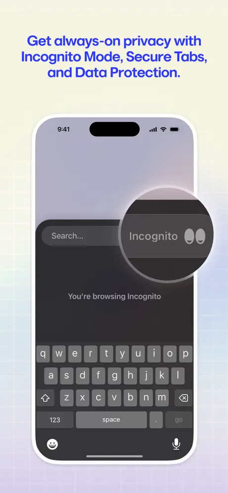
On-frame caption: “Get always-on privacy with Incognito Mode, Secure Tabs, and Data Protection.

This is the only frame committed to dark mode, and it feels visually necessary after six frames of candy color. The phone screen turns charcoal (~#121214), with a dark grey search bar at top. Centered mid-grey text reads ‘You’re browsing Incognito.’ The iOS keyboard occupies the lower 45% of the screen in its system dark grey palette (~#1C1C1E keys), eating a massive amount of real estate. A circular loupe magnification bubble is superimposed on the right side of the search bar, calling out an ‘Incognito 👀’ tag with an eyes emoji. The bubble casts a soft shadow that separates it from the flat UI beneath. While the tonal shift provides contrast, the loupe is the frame’s weakest element. It does not obey the phone’s perspective or the app’s flat design language; it looks pasted on, like a sticker added in post-production. More critically, the keyboard is not a differentiator—every browser has one—yet it dominates the composition. A tighter crop on the Incognito toggle, or an inset detail panel, would have communicated the feature without surrendering half the frame to system UI.

Arc Search App Store screenshot 6 — Ad & Tracker Blocking
06

Ad & Tracker Blocking

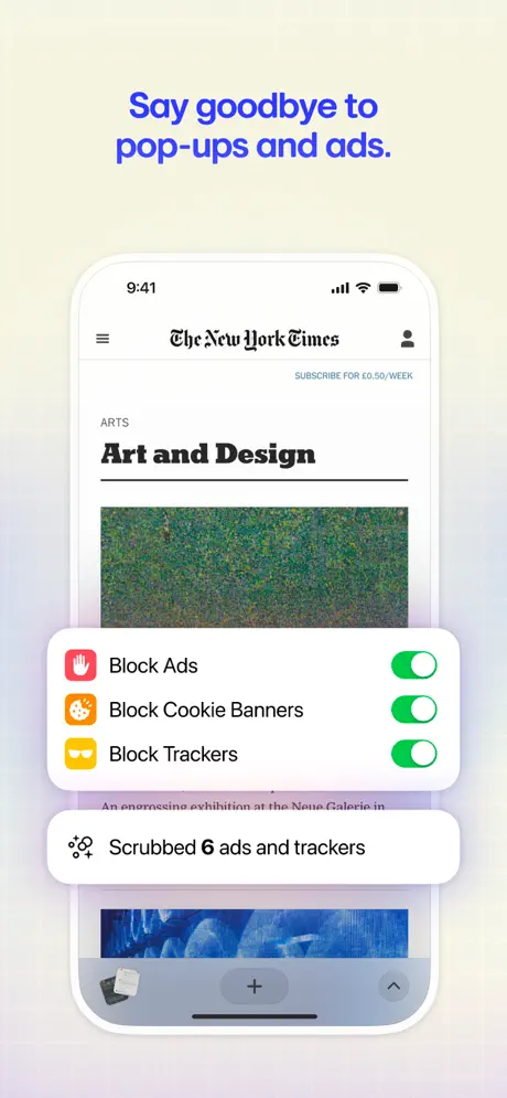
On-frame caption: “Say goodbye to pop-ups and ads.

The screen loads a New York Times ‘Art and Design’ section page, identifiable by its blackletter logo, hamburger menu, and subscription callout. Over this page, two rounded white cards float in the lower half. The upper card lists three toggle rows: ‘Block Ads’ with a red stop-hand icon (~#FF3B30), ‘Block Cookie Banners’ with an orange cookie icon (~#FF9500), and ‘Block Trackers’ with a yellow incognito-mask icon (~#FFCC00). Each toggle switch is iOS system green (~#34C759). A second, smaller card beneath states ‘Scrubbed 6 ads and trackers’ beside a sparkles icon. The app’s bottom toolbar is visible beneath the cards. This is the set’s most literal frame, and it works because the floating cards explain a background context everyone recognizes. The color coding is immediate and intelligible. The weakness is that the cards obscure the article image and headline, turning the browser into a dashboard rather than a window. A shopper might momentarily mistake the toggles for system settings rather than in-app controls. Showing the cards sliding in from an edge, or reducing their vertical footprint, would preserve the NYT context while keeping the blocking UI legible.

Arc Search App Store screenshot 7 — Tab Management
07

Tab Management

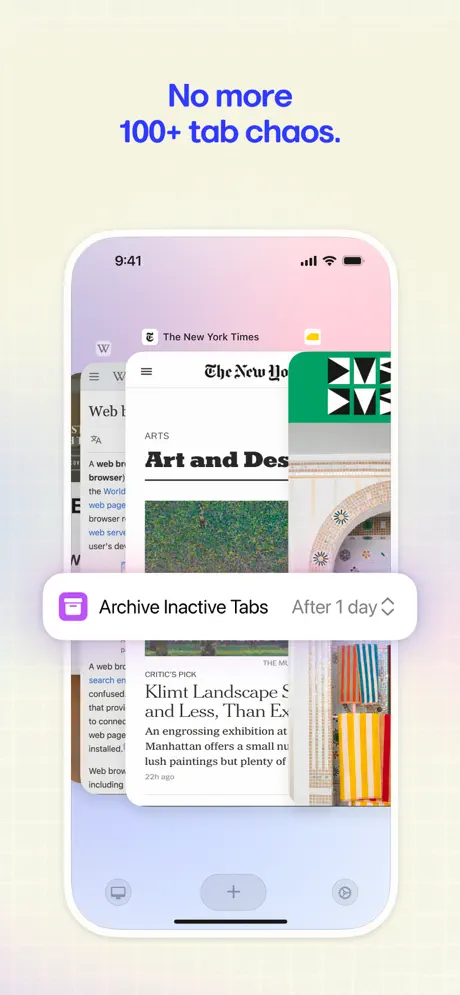
On-frame caption: “No more 100+ tab chaos.

The view is the app’s tab switcher. Three browser cards overlap in a staggered fan: a Wikipedia entry on the left, the NYT Art and Design page in front, and a geometric green-patterned page on the right. A floating pill overlays the center: ‘Archive Inactive Tabs’ with a purple calendar icon, and ‘After 1 day’ paired with a dropdown chevron. The bottom toolbar shows two additional icons flanking the central plus. This frame communicates spatial management by actually showing clutter, which is conceptually honest but visually noisy. The tabs are cropped at different angles, so no single page is readable. The ‘Archive Inactive Tabs’ pill is the true focus, yet its lavender fill is so close to the background cream that it softens rather than snaps. The caption promises an end to chaos, but the image required a little chaos to prove the point; the tension is palpable. For a cleaner read, the front tab could have been the only one in full view, with the others reduced to slivers, allowing the archive pill to sit on a calmer ground.

Arc Search App Store screenshot 8 — Voice Search
08

Voice Search

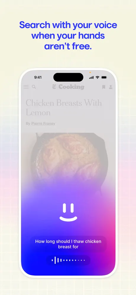
On-frame caption: “Search with your voice when your hands aren’t free.

The phone displays a faded, ghosted NYT Cooking article—‘Chicken Breasts With Lemon’ by Pierre Franey—under a heavy gradient overlay that rises from the bottom like a tide. A white smiley mark (two vertical bars and a curved line) centers the gradient field. Below it, the transcribed query reads ‘How long should I thaw chicken breast for’ in 16–17pt white sans-serif. A voice-waveform pill sits at the bottom, rendered as vertical white bars inside a translucent capsule. The status bar reads 9:41 with an orange recording-indicator dot. This frame is the most abstract in the set after Frame 1. It sacrifices the article content entirely to emphasize the voice UI layer. The gradient here is the same indigo-to-pink family, so brand continuity is intact, but the frame reads more like an onboarding illustration than a screenshot. The blurred food photography behind the gradient adds texture yet no information; it could be any recipe, which weakens the scenario. A more persuasive approach would keep the recipe page fully visible at 60% opacity while pinning the voice pill and waveform to the bottom, proving the hands-free context without drowning the content.

05The craft

Captions, colour and the mechanics of the sell

Caption pattern

Captions are stacked, centered, and set in a heavy geometric sans-serif. Frame 2 uses a gradient fill (violet to hot pink) for the first two lines, while Frames 3–8 default to solid electric blue (#2545FF). The gradient caption competes with the gradient inside the phone in Frame 2, creating a moiré of color that flattens hierarchy. The decision to italicize feature names (‘Browse for Me’) in Frame 3 is a subtle but effective way to turn a headline into a sentence, softening the marketing tone.

Visual system

The off-white grid background acts as a neutral studio cyclorama. It never changes hue, which anchors the chaotic color inside the phones. The white device bezel provides a crisp border against both the cream backdrop and the saturated gradients on-screen. The only frame that abandons this system is Frame 1, which is a raw screenshot with black status-bar text and a lavender bottom toolbar. That rupture is intentional—it pulls the viewer into the product before the gallery reveals its commercial scaffolding.

The thumbnail test

At thumbnail size, the set reads as a sequence of blue headlines against beige. The first frame is the riskiest: without a device outline or caption, it collapses into an abstract purple blob that could be a wallpaper app or a meditation timer. Frames 2 and 6 are the most legible because the device frame and floating cards create high-contrast focal points. Frame 5’s dark mode is visually distinct but loses detail in small sizes. The social-proof stars in Frame 2 are too small to register unless viewed on a tablet.

Conversion mechanics

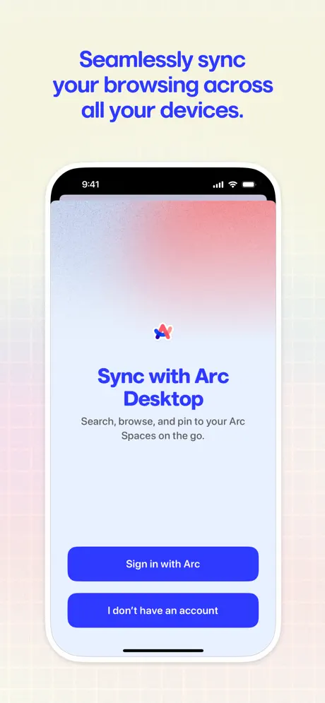
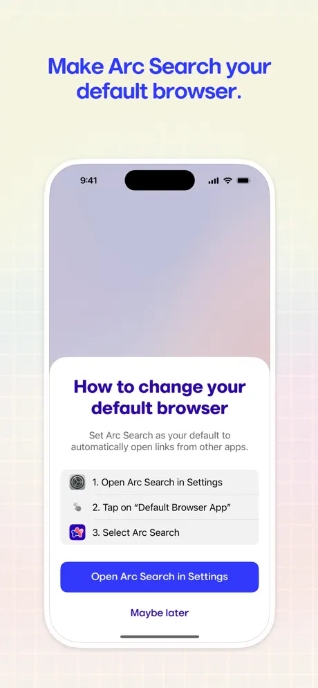
The set’s conversion architecture relies on feature breadth rather than a single killer use case. Frame 1 hooks with vibe; Frame 2 anchors with social proof; Frames 3–8 act as a checklist. That breadth is useful for educated shoppers comparing browsers, but it risks fatigue. There is no pricing frame, no account-sync reassurance, and no ‘set as default browser’ callout—omissions that may hurt conversion for users still on the fence. The set assumes the shopper already wants a new browser and merely needs to be convinced that Arc has the right features.

06Where it slips

What we would change

Status Bar Inconsistency

Frame 1 reads 5:05; every subsequent frame reads 9:41. That single detail undermines the polish of an otherwise meticulous set. Fix: standardize to 9:41, or use a branded time (e.g., 10:24) across all renders. If Frame 1 is intended to feel raw, add a subtle ‘Live UI’ badge rather than leaving the discrepancy unacknowledged.

Frame 1’s Abstraction Tax

A pure gradient with a query string is too ambiguous to convert. The shopper cannot tell if this is a loading state, an error, or an intentional empty state. Fix: show a partial AI result or a ‘Browse for Me’ button materializing in the gradient, preserving the atmosphere while providing functional context.

Frame 2’s Hierarchy Collapse

Three competing layers—gradient headline, gradient phone interior, and long testimonial—flatten the visual stack. Fix: move the testimonial into a pull-quote overlay on the device itself, or give it its own frame. Let the headline and UI breathe separately.

Frame 5’s Loupe

The magnifying glass callout breaks the flat design language and looks composited. Fix: replace the loupe with a simple inset crop of the Incognito toggle, or zoom the entire top bar uniformly rather than floating a circular mask.

Frame 8’s Content Suffocation

The gradient overlay obscures the hands-free use case. Fix: reduce the gradient to a bottom-third wash, keep the recipe page legible, and let the voice UI read as an overlay rather than a replacement.

07The recipe

How to apply this to your own app

  1. Standardize your production chrome

    If you use a device frame, align status bar times, battery icons, and carrier text across every single frame. One errant screenshot can make the entire set feel amateur.

  2. Use full-bleed frames sparingly

    A raw screenshot can be a powerful hook, but only if it contains enough UI to orient the viewer. If you break your own framing convention, make sure the content payoff is immediate.

  3. Let real content sell the feature

    When demonstrating blocking, summarization, or voice UI, resist the urge to cover the screen with opaque marketing cards. Crop tighter on the native control instead, so the shopper sees both the problem (the ad, the article) and the solution in the same plane.

  4. Build a caption system, not just captions

    Arc’s stacked blue headlines create rhythm. Decide early whether your captions will be imperatives, questions, or statements, and stick to that grammar. A single deviation—like the gradient text in Frame 2—can fracture the system.

08Takeaways

Five things worth stealing

  • A disciplined background (cream grid + white bezel) can unify wildly different features and color modes.
  • Frame 1’s full-bleed gradient is a high-risk, high-reward move that works only if the adjacent frames immediately establish context.
  • Social proof belongs in the visual center, not below the fold of the screenshot.
  • Dark mode frames need extra care; system UI like the keyboard can dominate the composition if not cropped aggressively.
  • Floating cards and loupe effects should obey the app’s own flat design language or they read as stickers.
09The verdict

What the set actually achieves

The team landed on a studio-portrait system. Seven of the eight frames place the iPhone inside a consistent marketing wrapper: a warm cream backdrop (#F5F5F0) traced with a faint grid, bold stacked headlines in an electric blue sans-serif, and generous vertical padding. Frame 1 breaks that wrapper entirely, acting as a full-bleed immersion into the product’s gradient soul. Inside the device, the app’s own violet-indigo-magenta gradient becomes a recurring character, unifying the marketing layer with the product layer. The captions speak directly in second-person imperative or declarative mode—‘Say goodbye,’ ‘Summarize,’ ‘Get always-on privacy’—creating a tempo that feels instructional rather than aspirational. The cost of this consistency is that some frames hide the very content they promise to improve.

Designers building screenshot sets for utility, productivity, or browser apps where the interface is minimal and the value is abstract. The set is a useful reference for anyone trying to brand-wrap third-party content without losing feature clarity.

10Questions

Frequently asked

Why does Frame 1 lack a device frame?

It is a deliberate immersion tactic, placing the viewer directly inside the app rather than showing a remote preview. The trade-off is reduced immediate comprehension.

What typeface is used in the captions?

The captions appear to be a bold geometric sans-serif, likely a custom or tightly tracked variant of Inter, Sora, or Montserrat. The heavy weight and tight leading are the identifiable traits, not the specific family.

How does the set handle dark mode?

Only Frame 5 uses a dark interface. It provides tonal contrast but breaks the bright gradient rhythm established by the other seven frames.

What is the weakest frame?

Frame 5 is the weakest due to the pasted-on loupe and the keyboard consuming nearly half the frame. Frame 8 is a close second for obscuring its own use case with an opaque gradient.

11Keep reading

Build your own screenshot set

The full set

10 shots
Arc Search App Store screenshot 1Arc Search App Store screenshot 2Arc Search App Store screenshot 3Arc Search App Store screenshot 4Arc Search App Store screenshot 5Arc Search App Store screenshot 6Arc Search App Store screenshot 7Arc Search App Store screenshot 8Arc Search App Store screenshot 9Arc Search App Store screenshot 10

About the app

Arc Search is the modern, AI-enabled mobile browser you’ve been waiting for —focused on getting you to an answer faster, and without all the clutter of the internet. SEARCH YOUR The Browser Company of New York Inc., via the App Store listing.

Screenshots and store metadata belong to The Browser Company of New York Inc.. They are shown here for design commentary and criticism. The analysis on this page is original work by floow.design. View the original listing.

More Utilities teardowns

Browse all →