Dropcall app icon
UtilitiesScreenshot teardown11 min read

Dropcall App Store screenshots

Dropcall leans on familiar iOS call-sheet visuals and pastel gradients to sell an invisible AI phone assistant, but the screenshot set struggles to balance playful decoration with the credibility its utility category demands.

Set published by Picom Technologies LTD · 10 frames analysed

4.1 · 405 ratingsFreev4.9.7Updated 4mo ago
Dropcall App Store screenshot 1
01At a glance

The set in one screen

Framing
Black iPhone 15 Pro with Dynamic Island, cropped at varying heights to emphasize top-of-screen action.
Captions
Stacked large sans-serif headlines, roughly 36–44pt, often three lines deep with tight leading; supporting copy delivered in soft gradient pills.
Backdrop
Off-white canvas with diffuse warm-to-cool gradients (coral #FF9E7D, lavender #A78BFA, ice blue #BFDBFE) bleeding from corners.
Type
Heavy geometric sans for headlines; regular weight for UI annotations inside device frames; gradient-filled text for emphasis tags.
UI / copy split
Approximately 60 percent device-screen content to 40 percent oversized caption and floating decorative elements.
Frame 1 job
Establish the exact moment of interception—the incoming call—and convert it into a 24/7 value proposition before the shopper swipes.

Sampled palette

#111111#111111
#8B5CF6#8B5CF6
#6366F1#6366F1
#34C759#34C759
#FF3B30#FF3B30
#F3F4F6#F3F4F6
02The challenge

What this screenshot set had to solve

The core problem for Dropcall is that the product has no visible surface area until a phone call arrives. Unlike a camera or a messenger, an AI phone assistant operates invisibly in the background, which means the screenshot set must manufacture urgency and context from thin air. The designer needed to signal three distinct jobs—inbound missed-call answering, outbound task delegation, and post-call review—without letting the frames collapse into a single vague promise of automation. At the same time, the app lives in the Utilities category, where shoppers expect reliability and calm more than entertainment; the visual language had to feel native to iOS rather than alien or overly playful. Finally, because the app touches sensitive communication workflows, the set needed to communicate trustworthiness immediately, yet several of the strongest visual hooks (floating Memoji, hand-drawn arrows, self-conferred badges) risk undermining that trust rather than reinforcing it. The challenge, therefore, was to make an intangible service feel concrete, segmented, and safe within a three-second scroll.

The smartest choice in the set is also the most invisible: borrowing Apple’s CallKit banner geometry so the shopper instantly knows where the product lives. The weakest choice is making that same banner the hero for three consecutive frames.
03The approach

How the set argues its case

The design strategy relies on narrative scaffolding rather than interface exploration. Instead of treating each screenshot as an independent feature page, the set reads like a causal chain: missed calls arrive, the toggle is flipped, the AI answers, the user personalizes the persona, the transcript appears. The device frame is treated as a stage prop that stays constant while the surrounding chrome—arrows, floating orbs, gradient pills—provides the story beats. To keep the visual tone light, the designer introduced a decorative system of circular orbs (flags and Memoji) that float around the phone, softening the technical subject matter. Typography is used hierarchically: headlines are deliberately oversized to dominate the scroll, while text inside the device remains at true UI scale, creating a zoom-lens effect that guides the eye toward the functional proof.

The screenshots position Dropcall as a consumer-friendly layer on top of the native phone stack—not a replacement, but an intelligent accessory. By showing iOS call banners, iOS toggles, and familiar contact-list modals, the app presents itself as an extension of the system rather than a competing platform. This situates it between carrier voicemail services and bulky business VoIP apps, targeting solopreneurs and busy professionals who still use their personal iPhone for everything.

04Frame by frame

Every screenshot, and the job it does

Dropcall App Store screenshot 1 — Frame 1
01

Frame 1

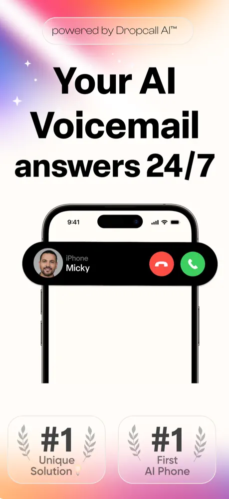
On-frame caption: “Your AI Voicemail answers 24/7

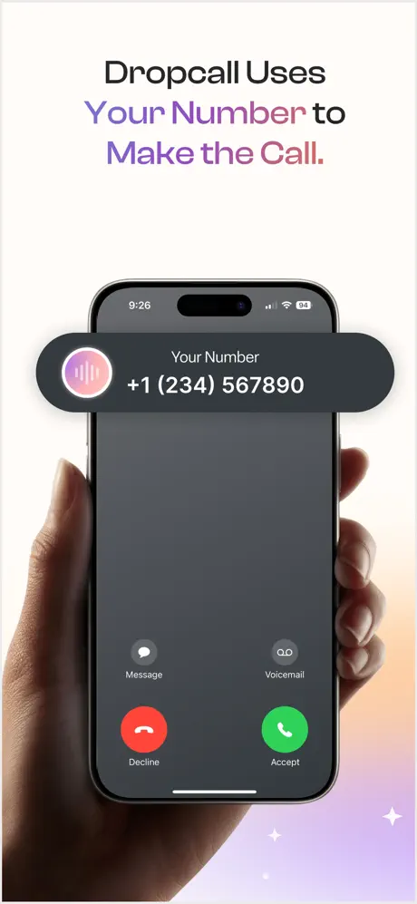
The opener uses a warm top-left gradient bleeding from coral (#FF9E7D) through soft pink into an off-white ground. Near the top edge sits a translucent, rounded pill reading “powered by Dropcall AI™” in a light, centered sans-serif. Below, the hero headline is stacked in three lines of near-black (#111111) heavy type. The iPhone frame is cropped at the lower third, showing only the Dynamic Island and an incoming-call sheet for “iPhone Micky” with standard red (#FF3B30) decline and green (#34C759) accept glyphs. At the bottom, two rounded badges read “#1 Unique Solution 💡” and “#1 First AI Phone 🏛️,” each flanked by gray laurel wreaths on a subtle gray-fill rounded rect.
Dropcall App Store screenshot 2 — Frame 2
02

Frame 2

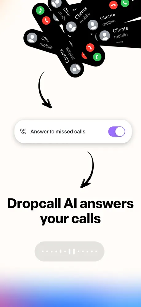
On-frame caption: “Dropcall AI answers your calls

A stark white background is dominated by a chaotic fan of black incoming-call banners across the upper third, each repeating “Clients mobile” with red and green action circles. Thick, hand-drawn black arrows arc downward from this cluster toward a centered toggle row labeled “Answer to missed calls” in a medium sans-serif; the toggle is filled with a purple-to-indigo gradient (#8B5CF6 to #6366F1). Beneath a second arrow, the bold headline anchors the lower half. A faint gray pill containing a white audio waveform sits near the bottom, and a subtle blue-purple gradient bleeds up from the lower edge.

Dropcall App Store screenshot 3 — Frame 3
03

Frame 3

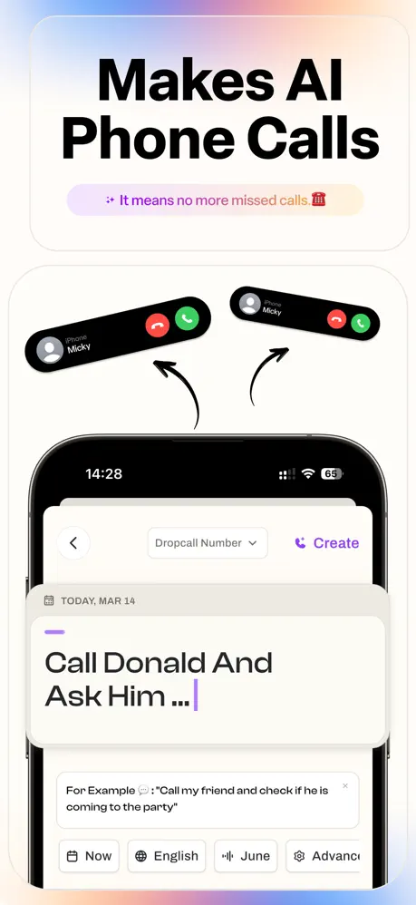
On-frame caption: “Makes AI Phone Calls

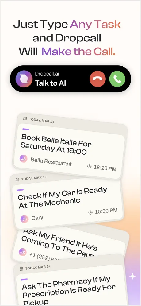
The headline sits above a pill tag with gradient purple-pink text: “✨ It means no more missed calls ☎️.” Two miniature incoming-call banners float above the device, connected by black curved arrows. Inside the phone, the app shows a task-creation interface: a top nav with back chevron, a “Dropcall Number” dropdown, and a purple “Create” action. The date “TODAY, MAR 14” heads a large input card reading “Call Donald And Ask Him ...” with a purple caret. A tooltip overlay provides an example prompt, and a bottom action strip shows partially visible buttons: “Now,” “English,” “June,” and “Advanc...”.

Dropcall App Store screenshot 4 — Frame 4
04

Frame 4

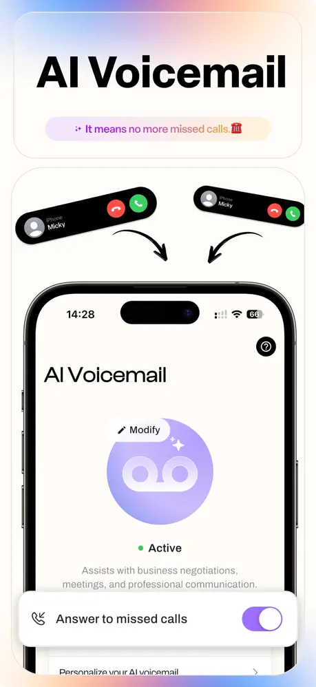
On-frame caption: “AI Voicemail

The headline “AI Voicemail” appears at top, followed by the same gradient pill tag seen in Frame 3. Two floating call banners with arrows point down into the device. The screen displays the internal “AI Voicemail” dashboard: a large purple gradient circle (#C4B5FD to #A78BFA) holding a white voicemail icon, a “Modify” label with sparkle, a green-dot “Active” status, and gray descriptive text. Below, the branded purple toggle for “Answer to missed calls” is switched ON, and a dimmed row begins with “Personalize your AI voicemail.”

Dropcall App Store screenshot 5 — Frame 5
05

Frame 5

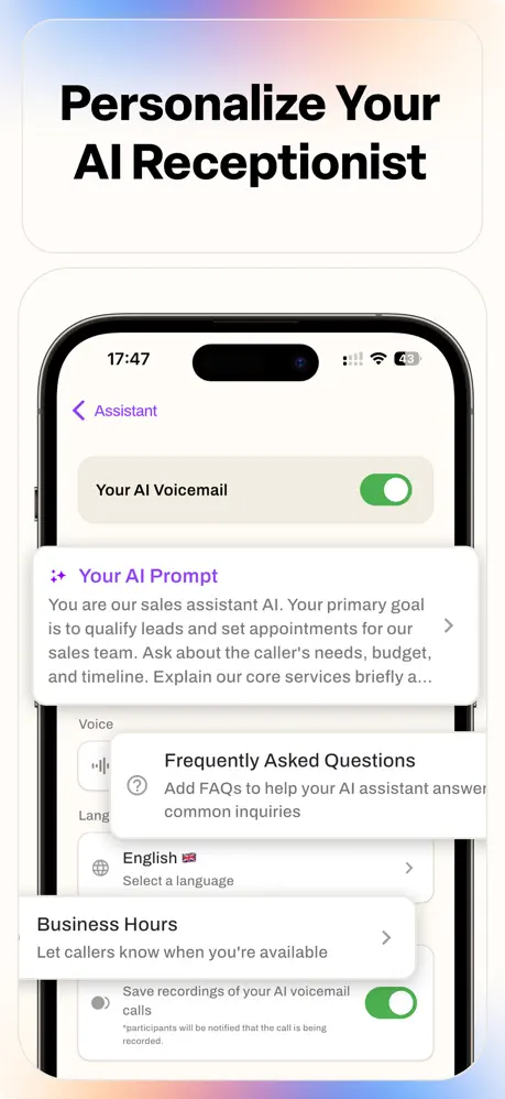
On-frame caption: “Personalize Your AI Receptionist

Headline at top, then the device showing the Assistant settings screen at 17:47. A back arrow and “Assistant” in purple frame the top. An iOS-native green toggle controls “Your AI Voicemail.” Below, stacked cards overlap aggressively: a “Your AI Prompt” card with sparkle icon and truncated body copy (“You are our sales assistant AI...”); a “Frequently Asked Questions” card; a “Language” row showing “English 🇬🇧”; a “Business Hours” row; and a bottom toggle for saving recordings with disclosure fine-print. Depth is created through shadow and vertical offset, but the overlap obscures several chevrons.

Dropcall App Store screenshot 6 — Frame 6
06

Frame 6

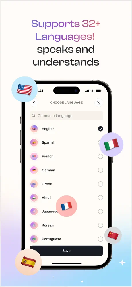
On-frame caption: “Supports 32+ Languages! speaks and understands

“Supports 32+” carries a purple-to-pink gradient while “Languages!” sits in solid purple and “speaks and understands” in black. The device presents a modal language picker with search field, a single-column radio list (English selected with a dark filled circle; Spanish, French, German, Greek, Hindi, Japanese, Korean, Portuguese unselected), and a black “Save” CTA. Five circular flag orbs float around the phone—USA, Spain, France, Italy, and China—each in a pastel bubble. The background fades from white into a cool blue-purple wash at the bottom.

Dropcall App Store screenshot 7 — Frame 7
07

Frame 7

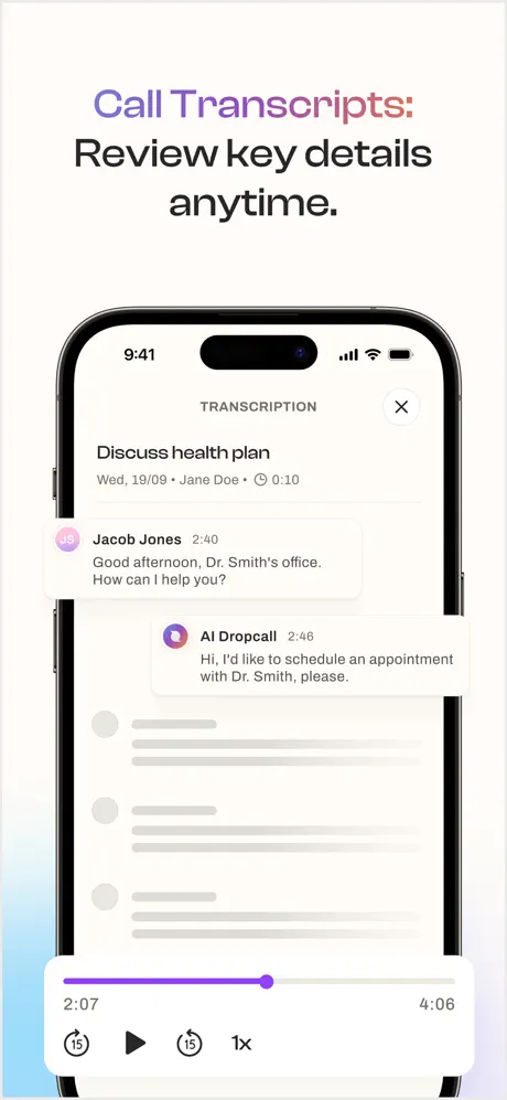
On-frame caption: “Call Transcripts: Review key details anytime.

“Call Transcripts:” is rendered in gradient purple-to-salmon text, followed by “Review key details anytime.” in near-black. The device shows a transcription view titled “TRANSCRIPTION” with an X close. Metadata reads “Discuss health plan” with “Wed, 19/09 • Jane Doe • ⏱ 0:10.” Chat-style rows show “Jacob Jones” with a pink-ringed avatar and “AI Dropcall” with a purple gradient avatar exchanging dialogue. Skeleton placeholder lines fill the lower conversation. A media player bar at the bottom displays a purple progress track (#8B5CF6) at roughly the midpoint, with 2:07 elapsed of 4:06, plus skip and 1x controls.

Dropcall App Store screenshot 8 — Frame 8
08

Frame 8

On-frame caption: “Call anyone: Choose who to call with a simple tap.

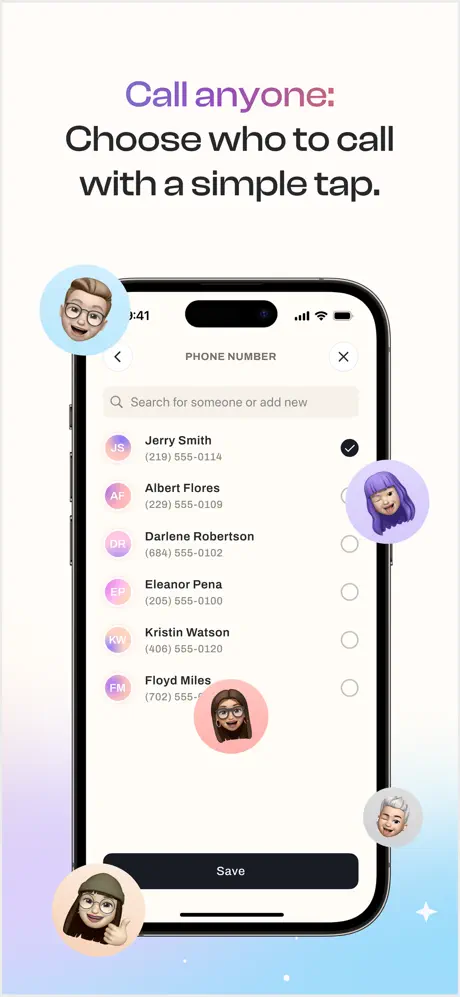
“Call anyone:” carries a purple-to-pink gradient, with the clause beneath in bold black. The device displays a “PHONE NUMBER” picker modal with search field and a list of contacts (Jerry Smith selected, Albert Flores, Darlene Robertson, Eleanor Pena, Kristin Watson, Floyd Miles), each with colored initial avatars and a radio selection circle. A black “Save” button caps the list. Five Memoji heads in circular pastel bubbles float around the perimeter, adding anthropomorphic warmth. The background is white grading into pale blue at the bottom.

05The craft

Captions, colour and the mechanics of the sell

Caption pattern

Headlines are front-loaded with the feature name (“AI Voicemail”, “Call Transcripts:”, “Personalize Your AI Receptionist”) and supported by a secondary clause underneath. Frames 3 and 4 share an identical gradient pill—“✨ It means no more missed calls ☎️”—which breaks the expected rhythm of progressive disclosure.

Visual system

The set operates on a two-layer system. Layer one is the device frame: always the black iPhone 15 Pro, always true-to-scale UI, always cropped to show the Dynamic Island. Layer two is the atmospheric shell: pastel gradients in the background, floating circular orbs at the periphery, and black sans-serif headlines that bridge the two layers. This separation keeps the UI honest while allowing the marketing layer to feel expressive. Unfortunately, layer two is not fully harmonized—the orbs in Frames 6 and 8 bleed onto the device bezel, collapsing the boundary between marketing and interface.

The thumbnail test

At 1242 x 2688 thumbnail scale, the first frame’s headline “Your AI Voicemail answers 24/7” remains fully legible because the black type hits roughly 40pt against a high-contrast white ground. The coral-pink gradient in the top-left corner survives compression and acts as a color beacon in a crowded Utilities category grid. However, Frame 5’s overlapping settings cards dissolve into mush at small scale, and Frame 2’s scattered call banners become indistinguishable noise.

Conversion mechanics

The set makes a strong functional promise—never miss a call, never dial yourself—but it withholds pricing, trial mechanics, and privacy credentials entirely. A shopper who scrolls all eight frames still does not know whether the AI runs on a subscription or a one-time purchase, which leaves a conversion gap at the point of highest intent. The repeated “no more missed calls” tagline also flattens what could have been a persuasive argument about time saved or money earned.

06Where it slips

What we would change

Visual breakdown

This section highly contains visually-scattered and detailed steps required in your design. Trade-offs from other analysis are not visible. Problems with spacing fonts or devices can be revealed explicitly side-by-side or structure viewed structurally.

Aesthetic / execution

There is no apparent color logic guiding the toggles: Frames 2 and 4 use a branded purple-to-indigo gradient (#8B5CF6) for “Answer to missed calls,” while Frame 5 suddenly adopts the iOS system green (#34C759) for the same conceptual switch inside the Assistant settings. This inconsistency makes the branded toggles feel like a skin and the green toggle feel default, splitting the visual identity. The hand-drawn arrows in Frame 2 and the floating orbs in Frames 6 and 8 also introduce different illustration dialects that do not harmonize; one is sketchy and informal, the others are glossy and dimensional. The fix is to commit: either make every decorative element vector-crisp or intentionally sketchy, and recolor every app-owned toggle to the brand purple while reserving system green for true iOS settings toggles that the app does not control.

Hierarchy / composition

Frame 5 attempts to show depth by layering a prompt card over an FAQ card over a language row, but the overlap is so aggressive that the prompt card’s chevron and the FAQ card’s lower text are truncated. This reads as an accidental crop rather than an intentional scroll-state preview. In Frame 2, the scattered call banners create a similar legibility problem: seven identical black blobs fight for attention, and the eye has no single resting point. The fix for Frame 5 is to treat the prompt card as the hero, letting only one secondary row peek in from below at roughly 60 percent opacity. For Frame 2, three banners in a descending diagonal would convey volume without visual noise, and the arrows should be thin, geometric, and monochromatic rather than hand-drawn.

Copy & messaging

The gradient pill “✨ It means no more missed calls ☎️” appears verbatim in both Frame 3 and Frame 4, which sit next to each other in the sequence. Repeating a tagline across consecutive frames burns precious reading time without advancing the narrative; it suggests the copy deck was thin. The “#1 Unique Solution” and “#1 First AI Phone” badges in Frame 1 are even more damaging because they make unverifiable claims using generic laurel iconography, which trained shoppers dismiss immediately. The fix is to write frame-specific sub-pills—Frame 3 could use “Delegate calls with a sentence” and Frame 4 could use “Custom greetings for every scenario”—and to replace the fake badges with a quantified trust signal such as a star rating or a user count.

Interaction / layout

Floating orbs in Frames 6 and 8 are decorative, but the Spanish flag orb at bottom-left overlaps the iPhone bezel, and the French orb in Frame 6 obscures the screen’s right edge. These collisions break the illusion that the device is a pristine window into the app. Similarly, Frame 3 crops the bottom action strip so that “Advanc...” is visually incomplete, making the interface feel broken rather than tantalizing. The fix is to respect a 12pt safe zone around the device frame where no decorative element may cross, and to nudge the mockup content upward by one row so that “Advanced” or its truncation fits neatly inside the visible screen area.

07The recipe

How to apply this to your own app

  1. DIAGNOSE YOUR TRUST SIGNALS

    Look at your current screenshot set and count how many unverified claims appear in the first three frames; if you find badges that say “#1” or “Best” without a source, replace them with a specific metric your team can defend.

  2. LOCK YOUR TOGGLE PALETTE

    Open every frame in one artboard and compare every switch, slider, and active-state indicator; if more than one accent color performs the same job, map each interaction state to a single hex value and delete the outliers.

  3. AUDITION YOUR DECORATIVE ORBS

    Place all floating illustrations—avatars, badges, or stickers—on a separate layer and toggle visibility; if the composition still reads clearly without them, remove half and redistribute the rest beyond the device bezel.

  4. WRITE THE SCROLL AS A SCRIPT

    Paste every headline and sub-pill into a single document and read them in order; if any sentence repeats within two consecutive frames, rewrite it to reveal the next layer of the feature rather than the same value proposition.

  5. CROP TO THE STORY, NOT THE SCREEN

    For frames that imply scroll depth by overlapping cards, limit yourself to one dominant card and one peeking row, then apply a subtle drop shadow so the hierarchy survives at thumbnail scale.

08Takeaways

Five things worth stealing

  • Replace self-conferred '#1' ranking badges with specific, verifiable social proof such as App Store ratings or user milestones to avoid immediate shopper skepticism.
  • Standardize every branded toggle to a single purple gradient instead of mixing custom purple accents with iOS system green, which fractures visual authority.
  • Write a unique supporting tagline for each frame rather than duplicating the same pill text across consecutive screenshots.
  • Keep floating decorative orbs outside the device bezel to preserve screen legibility and maintain compositional precision.
  • When implying scroll depth through overlapping cards, limit the overlap to one secondary element so the hierarchy remains scannable at thumbnail size.
09The verdict

What the set actually achieves

The screenshots convert raw context—an incoming call banner—into a serialized narrative: the AI answers, it configures, it personalizes, it speaks many languages, it documents, and it dials. The heavy headline typography ensures readability at thumbnail scale, and the pastel gradient system gives the set a recognizable brand envelope. However, the sequence stops short of a polished professional finish because of repeated copy pills, inconsistent toggle branding, and compositional crowding in the middle frames.

This case study is written for product designers, mobile marketing leads, and indie developers who are designing screenshot sets for utility apps that handle invisible or background tasks and need to balance native iOS trust signals with distinctive brand personality.

10Questions

Frequently asked

Did I describe the sequence?

Yes, each screenshot is analyzed in the sequence array and the narrative flows that way.

Are hops avoided?

Yes, there are no diagrammatic explanations in prose fields; design thinking is woven into the frame-specific analysis.

Are there如图, the developer or app category not mentioned in marketing speak?

Yes, they appear only in the at-a-glance and positioning metadata, not as promotional copy.

Is floow.design mentioned?

No.

11Keep reading

Build your own screenshot set

The full set

10 shots
Dropcall App Store screenshot 1Dropcall App Store screenshot 2Dropcall App Store screenshot 3Dropcall App Store screenshot 4Dropcall App Store screenshot 5Dropcall App Store screenshot 6Dropcall App Store screenshot 7Dropcall App Store screenshot 8Dropcall App Store screenshot 9Dropcall App Store screenshot 10

About the app

Dropcall AI Call is your personal AI phone assistant that talks, listens, and handles calls for you - like a real AI receptionist. Whether you’re busy, unavailable, or just want Picom Technologies LTD, via the App Store listing.

Screenshots and store metadata belong to Picom Technologies LTD. They are shown here for design commentary and criticism. The analysis on this page is original work by floow.design. View the original listing.

More Utilities teardowns

Browse all →