CapWords AI app icon
UtilitiesScreenshot teardown13 min read

CapWords AI App Store screenshots

How do you sell a camera-first language utility in eight static frames without collapsing into a blur of viewfinders, translations, and flashcards? The CapWords AI storefront attempts a split-personality solution: three opening frames of photorealistic café snapshots, followed by five frames of flat, matte color fields that treat the phone like a specimen on a gallery wall. The result is a set that alternately dazzles and confuses, depending on how tightly Apple’s algorithm has cropped your thumbnail.

Set published by HappyPlan Tech · 10 frames analysed

4.6 · 333 ratingsFreev1.4.16Updated 4mo ago
CapWords AI App Store screenshot 1
01At a glance

The set in one screen

Framing
iPhone 15-series mockups with Dynamic Island, mixed with full-bleed device-free compositions
Captions
Large white high-contrast serif stacked across the upper third; in-app UI uses SF Pro-style sans
Backdrop
Alternates between blurred lifestyle photography and flat, desaturated solids (dusty rose, camel, mustard, sage)
Type
Single display serif for captions; rounded sticker labels with 2–3 pt white keylines for translations
UI / copy split
Roughly 60/40 copy-to-UI in later frames; Frame 1 is 90% typography and badges
Frame 1 job
Establish the proposition and borrow authority from two App Store award badges, but in doing so it suppresses any view of the actual interface until Frame 2.

Sampled palette

#7A8B94#7A8B94
#D18C85#D18C85
#C4996A#C4996A
#E3B041#E3B041
#A3AD8D#A3AD8D
#F5F5F0#F5F5F0
02The challenge

What this screenshot set had to solve

When the core interaction happens through a live camera pipeline, a static screenshot set has to solve two contradictory problems at once: prove the magic occurs in the physical world, and show the digital container where that magic is stored. CapWords AI compounds the difficulty by being aggressively multilingual—stickers visible in the set carry French, Chinese, English, Spanish, Japanese, and Korean—so the frames must telegraph global vocabulary support without turning into a Babel of unreadable micro-copy. The product also straddles three distinct mental models: optical capture (camera), playful extraction (floating stickers), and disciplined study (flashcards and progress lists). If every frame tries to show all three, the hierarchy dissolves into noise; if the frames split the story, the shopper may not connect the café photo in Frame 2 with the sage-green history list in Frame 8. The challenge, therefore, is not merely informational—it is choreographic. The set needs a visual through-line stronger than the feature list itself.

The rupture between a photoreal cupcake and a dusty-pink poster wall is so abrupt that the shopper may think two different apps are being shown.
03The approach

How the set argues its case

The team’s strategy is segmentation by background type. Act One (Frames 1–3) uses depth-of-field photography and warm tungsten lighting to say ‘real life.’ Act Two (Frames 4–8) kills the photography entirely and switches to solid, tertiary colour fields—dusty rose, camel, mustard, sage—each acting as a neutral stage for the UI. A recurring ‘sticker’ aesthetic ties the two acts together: extracted objects carry a consistent white keyline and slight rotation whether they float in a 3-D café or sit inside a 2×3 grid. Headlines are handled by a single white high-contrast serif, likely a cut of Freight or Tiempos, which anchors every frame regardless of what sits beneath it. The approach gambles that by Frame 4 the shopper already understands the camera premise, so the remaining frames can prioritize feature density.

Positioned as an Apple-endorsed utility rather than a game, the set leans on laurels early—Frame 1 devotes its lower third to awards—then pivots toward a scrapbook/playful flashcard aesthetic. The positioning is deliberately friendly and low-pressure; nothing here looks like a classroom drill.

04Frame by frame

Every screenshot, and the job it does

CapWords AI App Store screenshot 1 — Hero & Credentials
01

Hero & Credentials

On-frame caption: “See It. Snap It. Get the Word

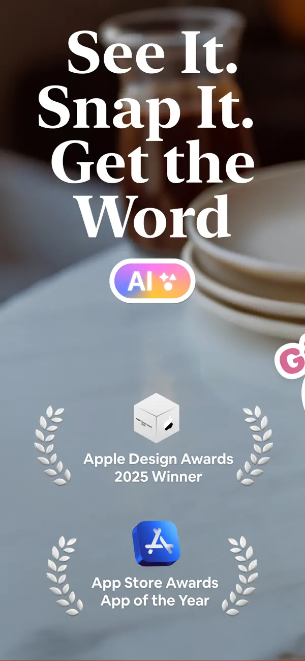
No device appears. The background is a heavily blurred, cool-grey lifestyle photograph—sampled around #7A8B94—of stoneware on a table. The upper half is occupied by stacked white serif display type reading, verbatim, “See It. Snap It. Get the Word” in three lines of descending measure. Beneath the headline sits a rounded-rect badge with a sunset gradient shifting from magenta through tangerine to lemon, containing the letters “AI” and a four-point sparkle glyph, bordered by a thin white stroke. The lower third is symmetrical and credential-heavy: two laurel wreaths frame text lockups reading “Apple Design Awards 2025 Winner” and “App Store Awards App of the Year,” paired with Apple’s official monochrome cube and blue App Store tools icons. A sliver of a third circular badge—pink with a white “G”—bleeds in from the right edge at roughly the 90 percent mark, suggesting an alternate-platform badge that was not fully masked for the iOS-safe zone. The spacing between headline and awards is generous, but the vertical density of accolades leaves almost no room to preview the interface or the sticker aesthetic.
CapWords AI App Store screenshot 2 — Camera Capture – Object Placement
02

Camera Capture – Object Placement

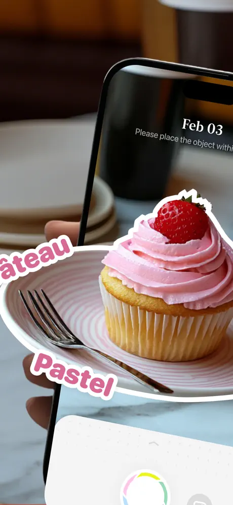
On-frame caption: “Please place the object withi…

The composition switches to photorealism. A hand grips an iPhone—Dynamic Island visible, black bezel catching a hard specular highlight—while the screen displays a partial camera viewfinder dated “Feb 03” with the instruction “Please place the object withi…” truncated by the right crop. In front of the phone, a cupcake with pink buttercream and a strawberry sits on a ridged white plate beside a fork. Two floating sticker labels hover near the dessert: the upper reads “âteau” (leading characters lost to the left crop, implying “Gâteau”) and the lower reads “Pastel”, both set in a rounded pink face with a white outline and a slight counter-clockwise tilt. At the bottom of the device screen, a multicolour segmented ring—pastel cyan, yellow, magenta, green—acts as a processing indicator. The background is a dim, warm interior. The hierarchy is ambiguous at small scale: the eye lands on the frosting first, the bezel second, and the instruction third.

CapWords AI App Store screenshot 3 — Camera Capture – Touch & Translation
03

Camera Capture – Touch & Translation

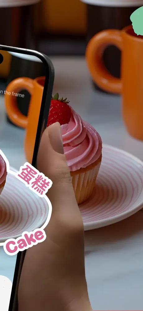
On-frame caption: “…n the frame

This frame continues the physical action from a wider angle. The hand now reaches toward the cupcake, thumb extended, while the iPhone retreats to the left edge. The viewfinder text completes the previous sentence: “…n the frame”. Orange mugs sit in soft focus behind. The sticker labels have shifted to translation mode: the upper reads “蛋糕” in Chinese characters and the lower reads “Cake”, retaining the same pink fill, white keyline, and casual rotation. A mint-green price-tag graphic intrudes from the top-right corner, unreadable but reinforcing the café-retail context. Continuity of plate, frosting, and ceramic props is strong, yet the crop again slices through text—both inside the viewfinder and on the stickers—which fractures readability at thumbnail size.

CapWords AI App Store screenshot 4 — Audio Stickers & Memory
04

Audio Stickers & Memory

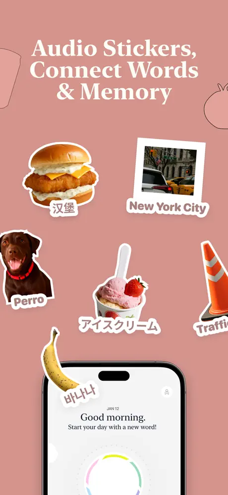
On-frame caption: “Audio Stickers, Connect Words & Memory

The backdrop switches abruptly to a flat matte field sampled near #D18C85, a dusty rose or terracotta pink. At the top, the serif headline reads: “Audio Stickers, Connect Words & Memory”. The composition abandons photography for a scrapbook layout: six sticker cutouts float at varying angles—a hamburger labeled “汉堡”, a Polaroid-style street photograph labeled “New York City”, a chocolate Labrador labeled “Perro”, an ice-cream cup labeled “アイスクリーム”, a traffic cone labeled “Traffi” (truncated), and a banana labeled “바나나”. Each carries the same white outline treatment seen in Frames 2–3. Anchoring the bottom center is an iPhone mockup showing the app’s welcome screen: “JAN 12”, “Good morning.”, and “Start your day with a new word!” above the segmented colour wheel. Thin, single-weight line illustrations—a partial cat silhouette upper right, an abstract contour upper left—linger at the margins. The rupture from 3-D café to flat poster is stark, but it finally gives the UI room to breathe.

CapWords AI App Store screenshot 5 — Vocabulary Grid
05

Vocabulary Grid

On-frame caption: “Build vocabulary practice anywhere, anytime

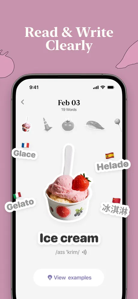
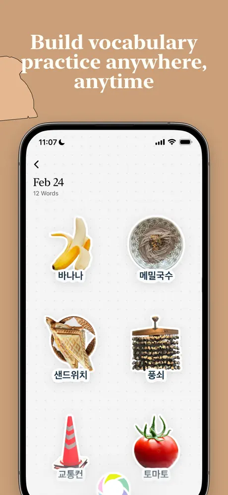
The background moves to a camel tone near #C4996A. The headline, in the same white serif, reads: “Build vocabulary practice anywhere, anytime”. Syntactically the phrase runs together; the absence of a comma or period between “vocabulary” and “practice” forces the eye to re-read. Centered below, an iPhone at roughly 65 percent width displays a catalogue grid. The in-app header shows a back chevron, “Feb 24”, and “12 Words”. Six collected items appear in a 2×3 grid on a faint dot-matrix background: a banana with “바나나”, buckwheat noodles with “메밀국수”, a sandwich with “샌드위치”, a percussion instrument with “풍석”, a traffic cone with “교통콘”, and a tomato with “토마토”. The iOS status bar reads 11:07 with standard signal and Wi-Fi glyphs. The app chrome is warm white. The bottom of the device again reveals the pastel-coloured ring. While the grid proves the app remembers, the micro-copy beneath each thumbnail is small enough to dissolve at thumbnail scale.

CapWords AI App Store screenshot 6 — Scenario Memory Cards
06

Scenario Memory Cards

On-frame caption: “Scenario Memory Cards

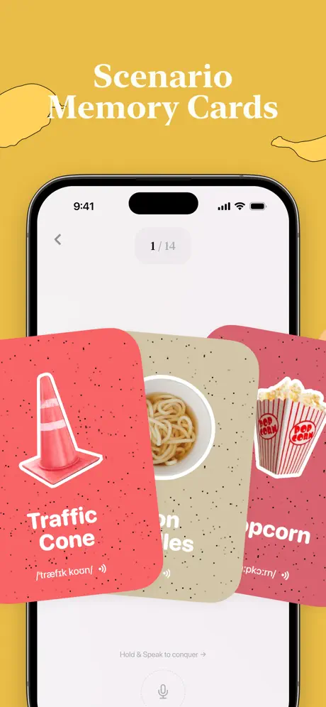
A mustard field near #E3B041 replaces the camel. The headline says: “Scenario Memory Cards”. The device shows a flashcard study mode. The status bar shows 9:41, and a grey pill below it contains “1 / 14” in small, low-contrast numerals. Three oversized cards fan upward from the bottom, each with rounded corners, a noisy speckle texture, and a white outline illustration. The leftmost card is salmon-pink (~#F08080) with a traffic cone and the text “Traffic Cone” plus the phonetic “[ˈtræfɪk koʊn]” and a speaker glyph. The center card is beige (~#E0D4B0) and partially obscured, showing noodles and the fragment “…on Noodles”. The rightmost card is the same salmon with popcorn and “…pcorn”. At the bottom of the screen, micro-copy reads “Hold & Speak to conquer →” above a large circular microphone button. A contour drawing of a lemon peeks from the upper left. The depth-of-field blur on the cards sacrifices legibility for visual swagger.

CapWords AI App Store screenshot 7 — Fanned Deck – No Chrome
07

Fanned Deck – No Chrome

On-frame caption: “Visual Memory, Audio Reinforcement, Rapid Language Growth

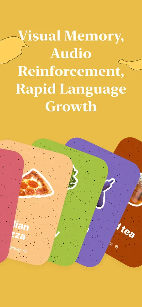
The mustard background continues. The headline reads: “Visual Memory, Audio Reinforcement, Rapid Language Growth”. Notably, no device frame is used; the cards themselves become the protagonists. Five cards arc across the lower two-thirds in a fanned hand: salmon with pizza (“…lian Pizza”), peach with a green vegetable, lime green with grapes, purple with blueberries, and rust brown with “…d tea”. The speckle texture and rounded corners match Frame 6 exactly. Thin profile-line illustrations sit in the top corners. Because the cards lack a device bezel for scale, they read more as abstract brand graphics than as interface documentation. The shopper can infer swiping, but cannot see navigation, buttons, or state changes—presentation has overtaken proof.

CapWords AI App Store screenshot 8 — Daily Progress Journal
08

Daily Progress Journal

On-frame caption: “Daily Progress Master Anytime

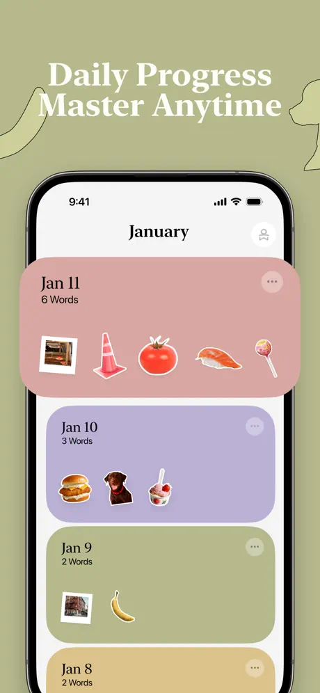
The final frame shifts to a sage or olive-grey near #A3AD8D. The headline: “Daily Progress Master Anytime”. The device returns, showing a longitudinal history view titled “January”. Four large rounded rows stack vertically, each a different colour drawn directly from earlier screenshot backgrounds: dusty pink for “Jan 11 / 6 Words”, lavender for “Jan 10 / 3 Words”, sage for “Jan 9 / 2 Words”, and tan for “Jan 8 / 2 Words”. Each row carries tiny thumbnail stickers (oven, cone, tomato, sushi, lollipop, burger, dog, ice cream, photograph, banana) and a grey “…” overflow button. The status bar again reads 9:41. Partial line drawings—a tulip on the left, an animal profile on the right—echo the margin-illustration motif from Frame 4. This frame closes the loop by proving retention; the colour-coding of the list items even mirrors the marketing palette, creating an unconscious lock between the storefront and the product.

05The craft

Captions, colour and the mechanics of the sell

Caption pattern

The caption rhythm is cadence-driven: short imperative fragments in Frame 1, noun-phrase lists in Frames 4 and 7, and slightly longer declarative clauses in Frames 5 and 8. Every headline is center-aligned, sentence-case or title-case, and pinned to the top safe zone, creating a consistent horizontal band that the eye can track while swiping.

Visual system

A warm 'paper' system: off-white app chrome, noisy speckled card textures, hand-drawn margin doodles, and sticker cutouts with thick white outlines. The palette is desaturated enough to feel premium but warm enough to avoid sterility. The same matte colours used for screenshot backgrounds (rose, camel, mustard, sage) reappear as card and list backgrounds inside the app itself, which unifies marketing and product.

The thumbnail test

At the 150-pixel-wide thumbnail scale, only Frame 1 and Frame 4 survive with readable headlines. The photoreal frames (2 and 3) collapse into a brown-and-pink smudge because the cupcake, the hand, and the black bezel all compete for the same mid-tone values. Frame 6 reads well because the mustard is distinct, but the fanned cards blur into a single pink-and-beige shape.

Conversion mechanics

Frame 1 is purely credentials; conversion depends on the shopper feeling enough curiosity to swipe past two full frames of awards before seeing a button or a UI. Frame 6 carries the strongest study-mode proof because it shows the microphone CTA and the phonetic breakdown, both of which are tangible pedagogical signals. Frame 8 is the only frame that proves longitudinal value, a critical signal for subscription or retention-oriented utilities.

06Where it slips

What we would change

Safe-zone masking and artifact control

Frame 1 contains a partial pink badge bleeding in from the right edge. At best it looks like an unfinished export; at worst it signals that the set was not cropped for iOS-safe guidelines. The fix is simple: mask all badges to the 9:16 safe zone, or remove the third badge entirely so the composition does not fight against its own bounds.

Transitions between reality and flat design

The jump from the photoreal café of Frames 2–3 to the dusty-pink poster of Frame 4 is so abrupt that the two acts feel like separate apps. A transitional frame—perhaps a shallow-focus desktop behind the device, bridging the 3-D object and the 2-D grid—would ease the visual shock and maintain spatial continuity.

Text cropping and truncation

The set repeatedly relies on the shopper to mentally repair cut-off language: “âteau”, “Traffi”, “…n the frame”, “…lian Pizza”. While truncation inside a dynamic UI is expected, in a marketing screenshot it reads as an error. Every sticker and headline should be fully contained within the frame, or the crop should be so intentional that it reads as a stylistic choice rather than a bleed mistake.

Headline grammar and rhythm

Frame 5’s headline, “Build vocabulary practice anywhere, anytime”, lacks the comma or conjunction that would separate the two imperatives. Re-writing to “Build vocabulary. Practice anywhere, anytime.” or “Build your vocabulary—anywhere, anytime” would restore the scan-line rhythm without adding pixels.

Status-bar consistency

Frame 5 shows 11:07 while Frames 6 and 8 show 9:41. Because these times telegraph different contexts (late morning versus early morning), they subtly fracture the illusion that all screenshots belong to one coherent session. Freezing every device frame to a single canonical time—Apple’s default 9:41 is the safest choice—would remove the distraction.

07The recipe

How to apply this to your own app

  1. If your utility has a camera pipeline, dedicate Frame 2 (not Frame 1) to the physical proof, and keep Frame 1 for the value-prop sentence plus, at most, one award.

    CapWords front-loads two full award lockups, pushing the UI reveal to Frame 4. In practice, shoppers spend less than two seconds on Frame 1; a single credential and one device glimpse will outperform a laurel wreath gallery.

  2. When using photorealistic environments, separate the subject, the device bezel, and the text into three distinct value planes so thumbnail compression does not muddy them together.

    In Frame 2, the pink frosting, the black iPhone bezel, and the pink text stickers all sit in the same mid-value range. Desaturating either the background or the stickers would create the contrast needed for small-scale legibility.

  3. If you switch background types mid-set, introduce a transitional frame that shares one element between both worlds.

    A single prop—say, the ceramic plate from Frame 3 appearing as a sticker on the flat pink background of Frame 4—would have acted as a visual hand-off, preventing the two-act rupture.

  4. Reuse your marketing palette inside the app screenshots so the storefront and the product feel contiguous.

    CapWords does this well: the dusty rose, camel, mustard, and sage from the screenshot backgrounds reappear as card and list colours inside Frames 6 and 8. This makes the app feel inevitable rather than decorated.

  5. Always run the final export through a 150-pixel-wide thumbnail test; if your headline or key sticker disappears, redesign the hierarchy before submitting.

    Frames 2 and 3 fail this test because the cupcake dominates. If the core message is extraction, consider moving the sticker labels to the upper third, above the device, where they sit in negative space rather than competing with frosting.

08Takeaways

Five things worth stealing

  • Frame 1 is a credentials bomb, but it suffocates the value proposition and contains a masking artifact on the right edge.
  • The split between photoreal Act One and flat-graphic Act Two is structurally sound but visually jarring; a transitional frame would repair the continuity.
  • Sticker labels with white keylines are a strong recurring motif, yet repeated truncation undermines their readability at small scale.
  • The palette is the set’s strongest system: screenshot backgrounds reappear as in-app card colours, knitting marketing and product together.
  • Status-bar time inconsistencies and headline grammar are small signals of haste that premium competitors avoid.
09The verdict

What the set actually achieves

The final set opts for a two-act rhythm: two photorealistic environment shots that demonstrate the camera in a café context, followed by five flat-color frames that isolate specific UI modes (sticker grid, scenario cards, daily progress) against matte backdrops. Awards and credentials are front-loaded in Frame 1, while Frame 8 closes with a longitudinal journal view that implies habit retention.

Designers building camera-first utilities, language-learning apps, or any product that straddles the physical-to-digital boundary and needs to prove both contexts in under eight frames. The lessons here apply especially to teams tempted to front-load awards or switch background languages mid-sequence.

10Questions

Frequently asked

Why does Frame 1 show no device at all?

It is a pure hero-and-credentials frame. The intention is to borrow authority from the Apple Design Awards and App Store Awards before the shopper sees the interface. The trade-off is that no functionality is demonstrated until Frame 2.

What is the speckle texture on the flashcards?

A noisy, almost paper-grain overlay applied to the rounded cards in Frames 6 and 7. It gives the digital cards a tactile, analogue warmth that matches the scrapbook sticker aesthetic used elsewhere.

Why do Frames 6 and 7 share the same mustard background?

They both explain the memory-card study mode; the repeated #E3B041 field acts as a chapter break, telling the shopper that these two frames belong to the same feature family.

How many languages are visible across the entire set?

At minimum six: English, French (“Gâteau”), Chinese (“蛋糕”, “汉堡”), Spanish (“Perro”), Japanese (“アイスクリーム”), and Korean (“바나나”, “메밀국수”, “샌드위치”, “풍석”, “교통콘”, “토마토”).

11Keep reading

Build your own screenshot set

The full set

10 shots
CapWords AI App Store screenshot 1CapWords AI App Store screenshot 2CapWords AI App Store screenshot 3CapWords AI App Store screenshot 4CapWords AI App Store screenshot 5CapWords AI App Store screenshot 6CapWords AI App Store screenshot 7CapWords AI App Store screenshot 8CapWords AI App Store screenshot 9CapWords AI App Store screenshot 10

About the app

⊕ Apple Design Awards 2025 Winner ⊕ App Store Awards App of the Year ⊕ App Store APP OF THE DAY ⊕ App Store Editor's Choice Turn the world into your vocabulary book. CapWords HappyPlan Tech, via the App Store listing.

Screenshots and store metadata belong to HappyPlan Tech. They are shown here for design commentary and criticism. The analysis on this page is original work by floow.design. View the original listing.

More Utilities teardowns

Browse all →