Qewie app icon
UtilitiesScreenshot teardown14 min read

Qewie App Store screenshots

The Utilities category on the App Store is a graveyard of monochrome tool icons and feature-list fatigue. A QR-code generator faces an immediate existential challenge: the product is invisible by default, and the category is saturated with free alternatives that lead with intrusive advertising. The screenshot set for Qewie answers this by choosing saturation over subtlety. Across eight frames, the design pivots away from the expected black-and-white utility aesthetic and instead constructs a narrative arc that treats each QR code as a designed artifact rather than a scannable utility. The set alternates between abstract product-isometric compositions and framed iPhone UI, using color not merely as decoration but as the primary navigational signal. The persuasive burden is carried entirely by hex values, typographic weight, and deliberate cropping. For a designer building a screenshot set inside a commodity category, Qewie offers a textbook example of value-prop pacing: hook with visual variety, demonstrate tactile customizability, handle objections late, and close with permanence.

Set published by Joseph Albanese · 10 frames analysed

4.8 · 91 ratingsFreev1.1.5Updated 1y ago
Qewie App Store screenshot 1
01At a glance

The set in one screen

Framing
Alternates between device-free isometric grids and an iPhone 15 Pro frame with consistent top-crop at the Dynamic Island
Captions
Centered, heavy San Francisco Display in near-black #000000 against pure white backgrounds
Backdrop
Pure white #FFFFFF for all out-of-device frames; no environmental context or hand models
Type
Large 48–56pt headline, 17–20pt supporting text, smaller 13pt metadata inside UI cells
UI / copy split
Roughly 75 percent UI and 25 percent caption copy across the full set
Frame 1 job
Establish that QR codes can be colorful, branded objects before the user sees a single input field

Sampled palette

#2B7FFF#2B7FFF
#EF4444#EF4444
#00BFA5#00BFA5
#A855F7#A855F7
#FF1A1A#FF1A1A
#EC4899#EC4899
02The challenge

What this screenshot set had to solve

A QR generator has no physical presence; its output is a square of black modules. The challenge is making that square feel premium and customizable while proving the app is not ad-supported spyware. The set must also differentiate against dozens of competitor thumbnails that rely on blue header bars and list-based feature screens.

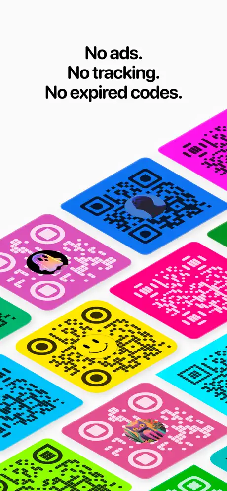
No ads. No tracking. No expired codes.
03The approach

How the set argues its case

The designer leads with output, not interface. By showing colorful QR artifacts before the editor, the set reverses the usual SaaS screenshot logic: here, the promise is visible before the tool. Once the device frame appears in Frame 3, the subsequent UI frames maintain a locked camera angle—status bar and QR canvas fixed, bottom chrome cropped—to create a flip-book effect as the color alone changes. Privacy is handled only after the user has already imagined creating a code, which is a deliberate objection-handling sequence. The final frame resolves anxiety about retention by showing a timestamped, savable library.

Positioned as a premium, privacy-first creative tool rather than a generic generator. The bright color system and logo-friendly editor target small-business owners, event planners, and creators who need brand-aligned codes.

04Frame by frame

Every screenshot, and the job it does

Qewie App Store screenshot 1 — The Hook
01

The Hook

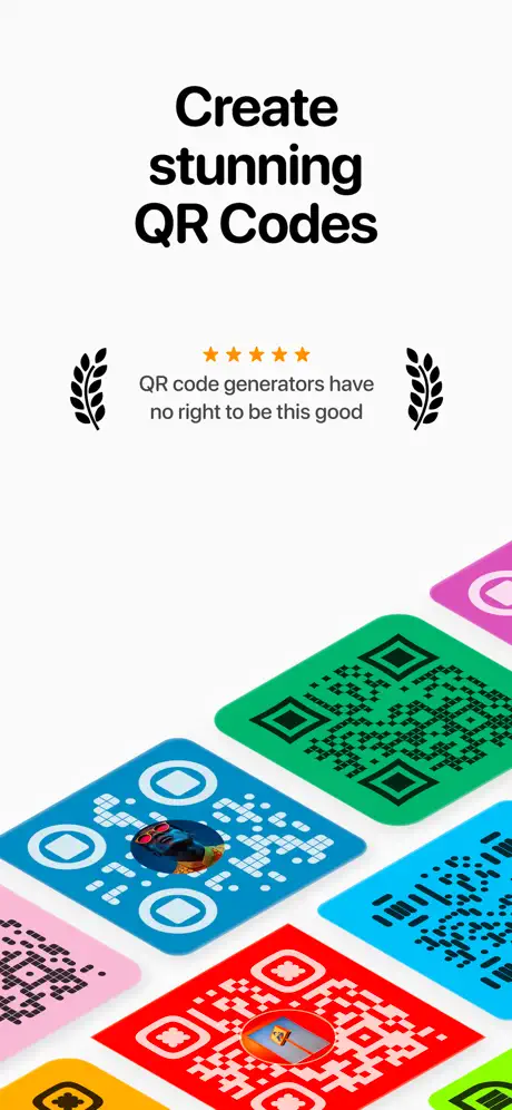
On-frame caption: “Create stunning QR Codes

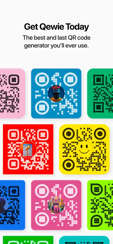
The opening frame is a pure white-field composition anchored by a heavy, centered headline reading “Create stunning QR Codes” in what appears to be San Francisco Display at roughly 48–56pt, set in near-black #000000. The text sits in the upper 40 percent of the canvas, leaving the lower 60 percent open for an isometric cloud of rounded-square QR cards that emerge from the bottom edge at roughly a 30-degree angle. Between the headline and the cards, a review quote is set in a smaller gray-toned sans-serif, approximately 17–20pt: “QR code generators have no right to be this good.” It is flanked by two symmetrical black laurel-leaf ornaments and preceded by a row of five orange #FF9500 stars. The cards themselves act as a de facto color palette reveal: a blue card with white modules and a circular photo insert, a green card with black modules, a red card with white modules and a central logo badge, a pink card, and a yellow card. By presenting the QR codes as physical, collectible objects, the frame sidesteps the commodity trap. The spacing between the headline, social proof, and product artifacts is generous—roughly 60–80pt—allowing each layer to breathe on a small screen. No device frame is present; the product is shown as output, not interface.
Qewie App Store screenshot 2 — The Promise
02

The Promise

On-frame caption: “No ads. No tracking. No expired codes.

Frame 2 retains the identical isometric grid vocabulary but shifts the value proposition from social proof to policy. The headline “No ads. No tracking. No expired codes.” is set in the same heavy sans-serif, centered, and broken into three rhythmic lines that read like a manifesto. The cards below rotate in composition: a magenta card with black modules sits at the top right, a blue card with a heart-shaped logo insert appears near center, a pink card with an anime-style face logo anchors left, and a yellow card with a smiley-face icon rests near the bottom center. The background remains #FFFFFF, and the crop continues to shave off the lower edges of the bottom-most cards, implying an infinite scroll of possibilities. What is notable here is the restraint in caption length—only twelve words—against the visual density of the grid. The contrast between the stark, clipped copy and the candy-colored chaos underneath creates a brand voice that feels confident rather than apologetic. However, the structural echo of Frame 1 is nearly absolute: same text placement, same angular grid, same empty white vault above. For a viewer swiping quickly, this could register as a duplicate rather than a progression. The frame would benefit from a slight lateral shift in the grid angle or an asymmetric text block to confirm forward motion.

Qewie App Store screenshot 3 — The Editor Reveal
03

The Editor Reveal

On-frame caption: “Fun, simple, and easy to use.

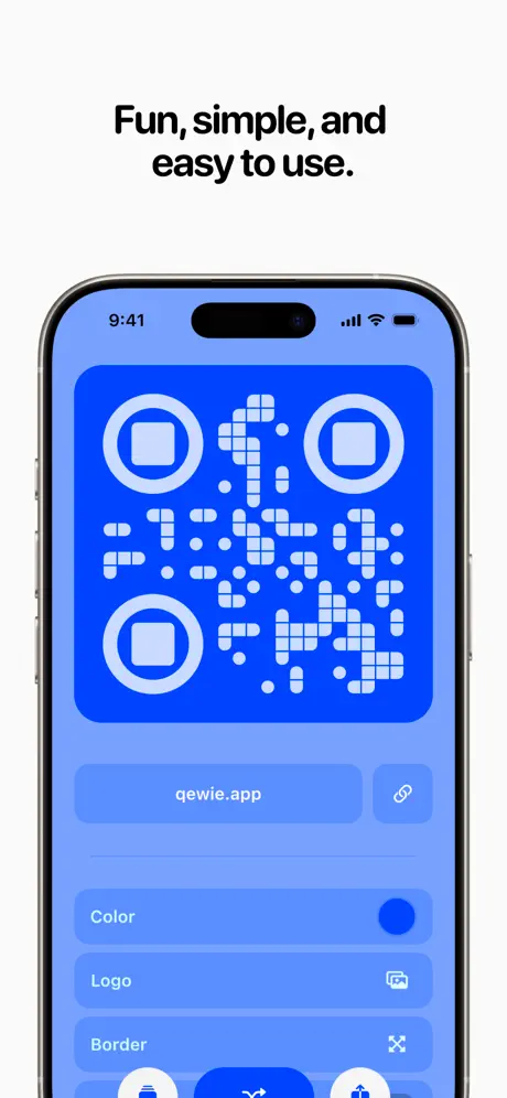
This is the first appearance of the iPhone 15 Pro device frame, immediately grounding the abstraction of the first two frames in tangible UI. The caption “Fun, simple, and easy to use.” occupies the white space above the device in the same heavy centered typesetting. Inside the phone, the status bar reads 9:41 with full cellular and Wi-Fi indicators, and the Dynamic Island is unobscured. The app interface is dominated by a massive QR canvas set in vivid blue #2B7FFF with white position markers and data modules. The position markers are stylized as nested rounded squares rather than traditional QR squares, signaling customizability. Below the canvas, a URL input pill reads “qewie.app” alongside a link icon, set against a lighter periwinkle background that bleeds to the edges at roughly #8AABFF. Further down, three rows labeled “Color,” “Logo,” and “Border” sit as full-width tappable cells with right-aligned icons. The bottom of the frame crops away the tab bar, focusing all attention on the editor itself. The hierarchy is unmistakable: canvas first, input second, controls third. The color coordination between the QR card, the URL pill, and the implied system tint is tightly controlled. This frame answers the question “what does it look like to make one?” with a single, uncluttered glance.

Qewie App Store screenshot 4 — Logo Proof
04

Logo Proof

On-frame caption: “Add your logo and make it pop.

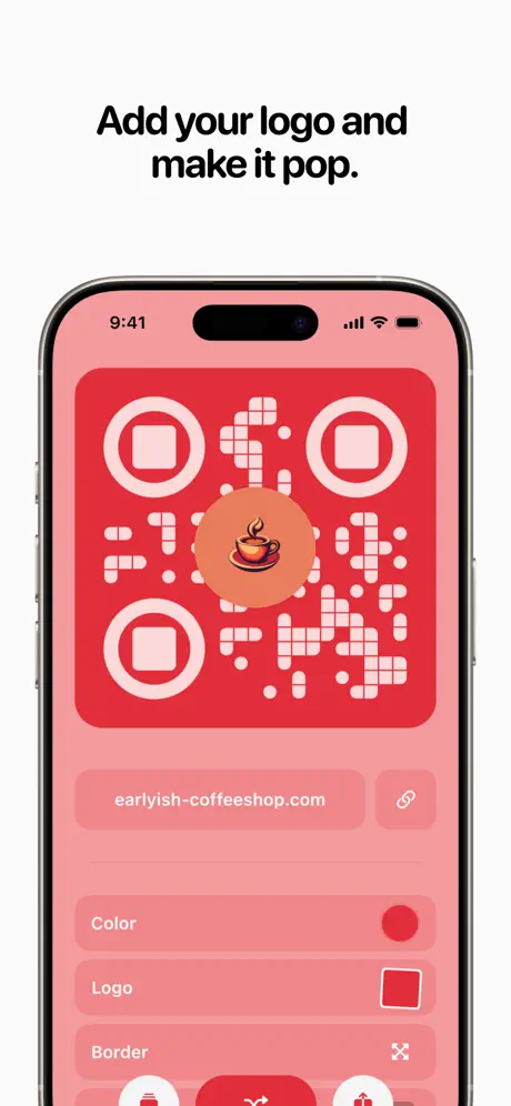
Frame 4 demonstrates logo insertion by shifting the entire interface into a warm red palette. The caption reads “Add your logo and make it pop.” Inside the device frame, the QR canvas is now #EF4444 with white modules, and a coffee-cup illustration is centered in a peach-toned circular badge. The URL field updates to “earlyish-coffeeshop.com,” reinforcing the small-business use case. The three control rows remain, but the “Logo” row now displays a generic red square thumbnail instead of the actual coffee icon—a subtle production discontinuity that breaks the promise of the caption. The rest of the UI chrome, including the bottom action bar, inherits the red tint, proving the app’s adaptive color engine. The crop remains consistent with Frame 3: status bar intact, bottom nav cropped. The transition from blue to red between these two frames is the most important narrative beat so far; it proves polymorphism. The viewer learns that the app is not a single-theme toy but a brand-aligned tool. The white device bezel provides necessary separation from the saturated UI, preventing color bleed at thumbnail size. Every element here is centered and axis-aligned, reinforcing the “simple” claim in Frame 3 through visual symmetry.

Qewie App Store screenshot 5 — Color Depth
05

Color Depth

On-frame caption: “Find the perfect color or add your brand color.

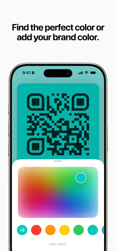
Color selection is the focus here, captioned “Find the perfect color or add your brand color.” The device frame once again shows the editor, but the QR canvas has inverted to a teal #00BFA5 background with black modules—a departure from the white-on-color treatment in Frames 3 and 4, and a necessary demonstration of reversed contrast capability. The bottom half of the screen is occupied by a color picker presented as a full-bleed gradient mesh ranging from scarlet through lime to cobalt, with a white-ringed selector knob positioned in the teal quadrant. Below the gradient, a horizontal row of circular swatches includes a shuffle icon followed by solids in #FF3B30, #FF9500, #FFCC00, #34C759, and #00BFA5. The label “PRO TOOLS” appears in small gray caps beneath the swatch row, teasing a feature tier without displaying a paywall. The crop cuts off immediately below this text, removing any bottom-safe-area context. Status bar elements remain consistent at 9:41. The frame effectively communicates spectrum choice, but the abrupt bottom crop creates ambiguity about whether the picker is a modal sheet or an inline panel. Still, the gradient mesh itself is the hero, and its wide-gamut saturation reads clearly even when the screenshot is scaled down in search results.

Qewie App Store screenshot 6 — Format Variety
06

Format Variety

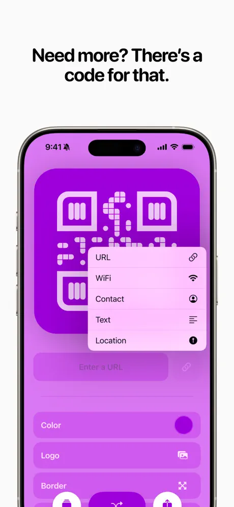
On-frame caption: “Need more? There's a code for that.

This frame addresses format variety with the caption “Need more? There's a code for that.” The UI inside the iPhone frame shifts to a vibrant violet #A855F7. The QR code’s position markers are stylized as vertical white bars resembling books or file stacks. A rounded modal sheet overlays the center of the screen, listing “URL,” “WiFi,” “Contact,” “Text,” and “Location” in left-aligned rows with corresponding icons on the right—link, Wi-Fi, person, list, and information glyphs. The sheet background is a lighter lavender #F3E5F5, creating a clear material hierarchy against the violet canvas. Behind the sheet, the underlying editor UI is dimmed but still readable, including a ghosted “Enter a URL” input field and the familiar Color/Logo/Border rows. The modal corners are approximately 20–24pt radius, matching iOS sheet conventions. The status bar now shows a small alarm or notification badge adjacent to the time, a detail that humanizes the screenshot with a lived-in device state. This is the most information-dense frame so far, yet it avoids clutter by isolating the format list inside a single centered card. The copy’s conversational tone—“Need more?”—mirrors the voice established in Frame 2, maintaining brand consistency across the set.

Qewie App Store screenshot 7 — Privacy
07

Privacy

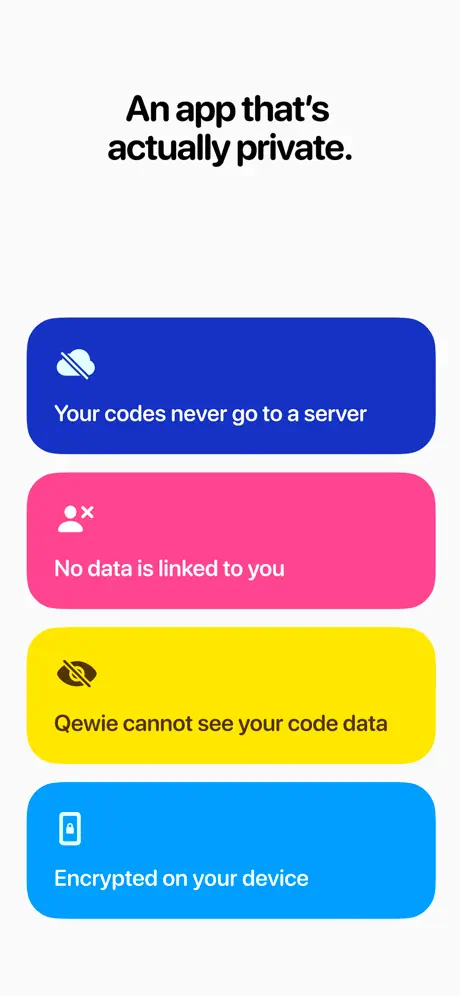
On-frame caption: “An app that's actually private.

Frame 7 breaks the device-frame cadence to deliver privacy assurances, captioned “An app that's actually private.” The composition consists of four oversized, full-width rounded rectangles stacked vertically against a white background with roughly 16pt gutters between them. The top card is deep blue #1D4ED8 with a cloud-slash icon and the text “Your codes never go to a server” in white. The second is hot pink #EC4899 with a person-x icon and “No data is linked to you.” The third is yellow #FDE047 with an eye-slash icon and dark text reading “Qewie cannot see your code data”—the only dark-on-light treatment, necessary because white text would fail contrast against the bright ground. The fourth is sky blue #0EA5E9 with a lock icon and “Encrypted on your device.” The corner radius on each card is large, approximately 32pt, giving them a friendly, button-like presence. The icons are simple line glyphs at roughly 24pt, sitting in the top-left of each card with generous padding. By abandoning the device frame here, the set creates a visual deceleration that forces the reader to absorb the trust signals. However, the abrupt shift from four consecutive device shots to this flat card stack is jarring; the viewer’s eye has been trained to look for the phone bezel, and its absence feels like a context switch rather than a continuation. Structurally, though, the information is unmistakable: privacy is treated as a feature, not a footnote.

Qewie App Store screenshot 8 — Collection
08

Collection

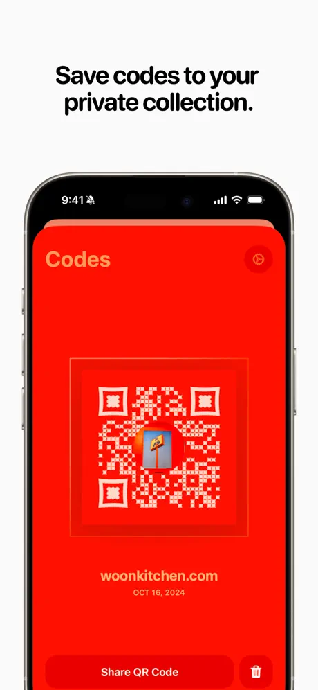
On-frame caption: “Save codes to your private collection.

The final frame returns to the iPhone device frame with the caption “Save codes to your private collection.” The screen is drenched in an aggressive red #FF1A1A, far more intense than the cherry red of Frame 4. The header “Codes” sits top-left in yellow #FBBF24, while a settings gear icon occupies the top-right corner. Centered on the canvas is a card containing a saved QR code with white modules on the same red ground and a centered street-lamp logo. Below the card, “woonkitchen.com” is rendered in yellow, followed by “OCT 16, 2024” in a smaller, slightly desaturated orange. At the bottom, a large pill button reads “Share QR Code” alongside a trash icon. This frame functions as the collection view or detail screen, closing the narrative loop by showing that created codes persist beyond the editing session. The choice of red here is a bold full-stop; it ensures the final frame is as memorable as the opener. Yet the yellow-on-red pairing for the secondary metadata “OCT 16, 2024” is risky—the thin weight and small size likely dip below WCAG AA contrast thresholds against the saturated ground. The crop once again trims the bottom edge just below the action bar, which is acceptable for a closing frame because the action is centered and readable. The frame answers the unspoken question “Where does my code go?” with a definitive, timestamped receipt.

05The craft

Captions, colour and the mechanics of the sell

Caption pattern

Each caption is a centered, two-to-four-line statement. Frames 1, 3, 4, 5, 6, and 8 describe capability or delight; Frame 2 and 7 describe policy and trust. The alternation creates a cadence of ‘what you get,’ ‘what we promise,’ ‘what you get.’

Visual system

A strict pairing of heavy black display type against white negative space, with the product color bleeding upward from the bottom third like a rising tide. Inside the device frames, the same logic holds: the QR card dominates the upper two-thirds, controls settle below.

The thumbnail test

At small scale, the isometric opening frames read as color fields rather than QR codes, which is risky for search comprehension. However, the red Frame 8 and purple Frame 6 are highly distinguishable in a horizontal scroll strip. The white backgrounds keep the set from feeling cluttered against the App Store’s own dark separators.

Conversion mechanics

The set front-loads visual delight and back-loads trust, which is the correct hierarchy for a leisure-plus-utility hybrid. The shopper first imagines the branded output, then learns the logistics, then encounters the privacy promise. This mirrors the actual conversion funnel: desire first, justification second.

06Where it slips

What we would change

Frame 1 & 2 Redundancy

Frames 1 and 2 are compositionally identical: a centered headline in the upper 40 percent, social proof or value copy in the middle, and the same isometric card cluster rising from the bottom. In an 8-frame sequence, spending the first two slots on near-duplicates squanders the opportunity to accelerate comprehension. A shopper swiping horizontally may not register Frame 2 as a discrete message. Fix: In Frame 2, move the text block to the left third and crop the card cluster laterally, or introduce the device frame early to anchor the abstraction.

Frame 4 Logo Thumbnail Discontinuity

The “Logo” row thumbnail displays a generic red square rather than the coffee-cup logo rendered in the center of the QR canvas. This is a falsifiable continuity error that contradicts the caption “Add your logo and make it pop.” Fix: Populate the list-cell thumbnail with the same 1:1 asset used in the QR center.

Frame 5 Bottom Crop Ambiguity

The screenshot is cropped immediately below the swatch row and “PRO TOOLS” label. The viewer cannot tell whether the swatch row is scrollable, how the sheet is dismissed, or whether a button row sits below. Fix: Extend the canvas by roughly 120pt to include the drag handle or a confirmation button, clarifying the picker modality.

Frame 7 Device Frame Abandonment

After four consecutive device-framed shots (Frames 3–6), Frame 7 abruptly drops to flat cards. This interrupts the scroll rhythm without warning. Fix: Present these privacy claims inside a device-framed settings screen or use a transitional visual cue so the reader does not perceive a broken sequence.

Frame 8 Contrast Risk

The red background at #FF1A1A with yellow metadata at #FBBF24 works for large text, but the smaller date stamp “OCT 16, 2024” likely falls below WCAG AA contrast thresholds. Fix: Shift the metadata to white #FFFFFF or increase the font weight to bold to survive thumbnail compression.

07The recipe

How to apply this to your own app

  1. Establish color grammar in Frame 1

    Define the full palette in the first impression so subsequent frames read as variations, not new information.

  2. Crop ruthlessly around the canvas

    Hiding the tab bar and peripheral chrome keeps attention on the output. Show only what the user will make.

  3. Invert contrast at least once

    If your output is a graphic object, prove it works on both light and dark grounds to demonstrate flexibility.

  4. Place trust signals after desire

    Show the fun or result first, then handle privacy objections once the user already wants the product.

08Takeaways

Five things worth stealing

  • Color can be the primary differentiator in a commodity category if it is applied consistently across both UI and output.
  • Alternating between device-free and device-framed shots prevents scroll fatigue, but the cadence must be planned so that dropping the device does not feel like an error.
  • Every production detail inside a device frame—including list thumbnails and bottom-safe-area context—must match the promise of the caption.
  • A narrative arc of create → customize → save is more persuasive than a feature list, even when the underlying features are identical to competitors.
  • Privacy messaging lands harder when it is visually separated from creation messaging, but separation should not break the established framing system.
09The verdict

What the set actually achieves

The set converts a utility into a visceral color statement. The viewer understands within two swipes that the app produces branded, multi-format, persistently saved codes without leaving the device. However, the sequence sacrifices compositional variety for brand consistency, and production details such as thumbnail continuity and bottom-safe-area cropping occasionally break the illusion.

Small-business owners, event organizers, and brand-conscious creators who need logo-friendly, colorful QR codes without surrendering data to third-party servers. The copy and visuals speak to users who care about aesthetics first and policy second, but who still require the policy to be stated clearly.

10Questions

Frequently asked

Why does Frame 2 repeat the layout of Frame 1?

It reinforces the isometric visual language while swapping the message from social proof to policy. However, the structural repetition is a weakness; the set would be stronger with compositional variation between the two abstract frames.

Is the red in Frame 8 too aggressive?

It is the most saturated frame in the set, but that makes it highly visible in a horizontal scroll strip. The risk is not the hue itself, but the yellow-on-red contrast of the secondary metadata, which should be tightened for accessibility.

Why drop the device frame in Frame 7?

The designer likely wanted to slow the pacing and isolate the privacy claims as absolute statements rather than in-app settings. The trade-off is a broken rhythm; the same claims could have been delivered inside a settings screen to maintain continuity.

What typeface is used for captions?

The captions appear to be set in San Francisco Display, heavy weight, in near-black against white. The visual system relies on size contrast rather than weight contrast.

How does the set handle multiple QR formats?

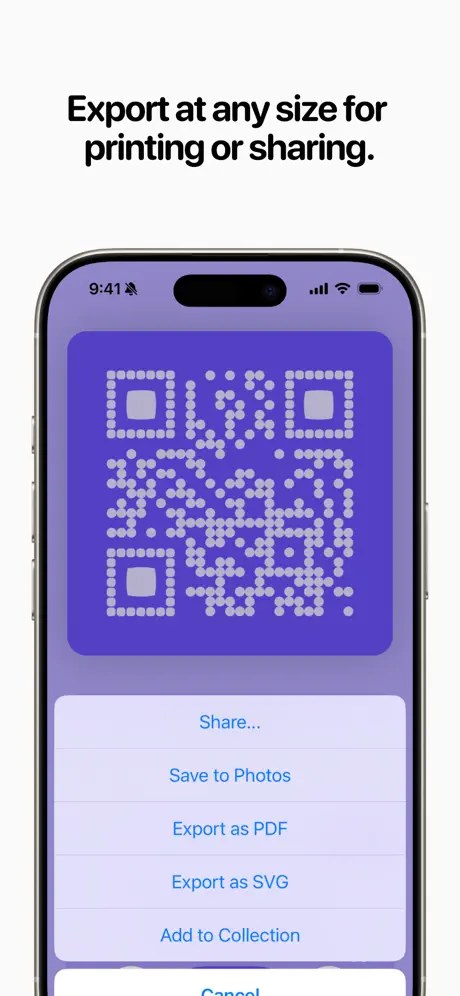
Frame 6 shows a modal sheet listing URL, WiFi, Contact, Text, and Location, proving the app generates more than URL-based codes. This is the only frame where multiple formats are visible.

11Keep reading

Build your own screenshot set

The full set

10 shots
Qewie App Store screenshot 1Qewie App Store screenshot 2Qewie App Store screenshot 3Qewie App Store screenshot 4Qewie App Store screenshot 5Qewie App Store screenshot 6Qewie App Store screenshot 7Qewie App Store screenshot 8Qewie App Store screenshot 9Qewie App Store screenshot 10

About the app

Transform the way you make QR codes with Qewie – Say no to bland QR codes and create eye-catching works of QR art with only a tap. Say goodbye to boring black and white squares Joseph Albanese, via the App Store listing.

Screenshots and store metadata belong to Joseph Albanese. They are shown here for design commentary and criticism. The analysis on this page is original work by floow.design. View the original listing.

More Utilities teardowns

Browse all →