ElevenLabs app icon
UtilitiesScreenshot teardown12 min read

ElevenLabs App Store screenshots

ElevenLabs App Store Screenshots: A Study in Systemic Restraint and Feature Density

Set published by ElevenLabs, Inc. · 9 frames analysed

4.9 · 10K ratingsFreev1.1.18Updated 4mo ago
ElevenLabs App Store screenshot 1
01At a glance

The set in one screen

Framing
iPhone 15 Pro, Dynamic Island visible, titanium bezel, consistent 9:41 status bar.
Captions
Centered, heavy sans-serif, near-black (#000000), uniform size and weight across all eight frames.
Backdrop
Pure white (#FFFFFF) with no environmental context or gradient.
Type
Large headline above device, small native iOS labels inside. No custom display typeface observed.
UI / copy split
Frames alternate between dense interface (keyboards, lists, buttons) and sparse output previews (video stills, waveforms).
Frame 1 job
Voiceover speed + script composer UI + floating speech bubbles above device.

Sampled palette

#000000#000000
#1C1C1E#1C1C1E
#FFFFFF#FFFFFF
#F2F2F2#F2F2F2
#C7C7CC#C7C7CC
#007AFF#007AFF
02The challenge

What this screenshot set had to solve

Selling a utility that generates synthetic speech, video, and still images through a static, silent storefront is a fundamental interface paradox. ElevenLabs must communicate voice cloning, lip-sync acting, image generation, emotion tagging, and a discovery marketplace before a shopper swipes away, all without audio or motion. The design team therefore has to build a rapid visual taxonomy: each frame must telegraph a distinct feature while maintaining enough systemic consistency that the set reads as a single product, not a bundle of disconnected tools. By choosing a neutral #FFFFFF field and a single hardware frame, the designers removed environmental distraction, which means color, typographic scale, compositional layers, and UI chrome alone must carry the narrative arc. Every keyboard, tab bar, and modal header becomes a loaded storytelling decision that either clarifies the workflow or adds cognitive weight. The challenge is not merely to decorate the page, but to make a deeply technical, multi-modal engine feel legible at thumbnail size and persuasive at full resolution.

The set treats the App Store carousel as a horizontally scrollable interface rather than a collection of isolated posters—which is both its greatest structural strength and its narrative weakness.
03The approach

How the set argues its case

The team adopted a rigid grammatical system: every frame centers an iPhone 15 Pro with the Dynamic Island fully visible, preserving the 9:41 status bar and titanium bezel across all eight shots to eliminate device-switching fatigue. Headlines are uniformly centered in a heavy near-black sans-serif, establishing a strong vertical axis that pulls the eye downward into the UI. Inside the device, the palette is deliberately restrained—pure white canvases, #1C1C1E primary text, and #F2F2F2 secondary surfaces—so that the product’s own content supplies chromatic interest: generated tanukis, waveform bars, metallic voice avatars, and purple emotion tags. The narrative sequencing alternates between creation interfaces and output previews, letting the shopper oscillate between input (script composers, recorders, keyboards) and result (video players, image grids, browsing lists). Out-of-device floating cards appear in three frames to suggest multiplicity without multiplying phones. In other words, the approach treats the carousel as one continuous canvas rather than eight independent posters.

The screenshots occupy a middle ground between corporate utility and consumer creator tool. The generous white space and native iOS typography signal engineering credibility, while the generated art (tanukis, squirrels, emotional dialogue) injects personality that keeps the set from reading as enterprise software.

04Frame by frame

Every screenshot, and the job it does

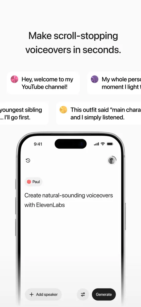
ElevenLabs App Store screenshot 1 — Make scroll-stopping voiceovers in seconds.
01

Make scroll-stopping voiceovers in seconds.

On-frame caption: “Make scroll-stopping voiceovers in seconds.

The opening frame anchors the set with a strict vertical rhythm. Above the phone, four pill-shaped speech bubbles float in a staggered two-up arrangement, each bled aggressively off the left and right edges. The bubbles carry gradient avatar icons—pink, purple, yellow—and truncated copy: 'Hey, welcome to my YouTube channel!', 'My whole perso...', 'youngest sibling ... I’ll go first.', and 'This outfit said “main chara... and I simply listened.' The cropping is severe enough that several lines fragment, reading as unfinished rather than atmospheric. The device itself sits low in the frame, showing the script composer UI. Inside, a coral-red dot labels the speaker 'Paul,' with the sentence 'Create natural-sounding voiceovers with ElevenLabs' set in dark #1C1C1E against a clean white canvas. At the bottom action bar, a light gray stroked '+ Add speaker' button sits beside a solid black 'Generate' pill. By keeping the status bar at 9:41 and hiding the bottom home indicator, the frame maximizes vertical space for the floating bubbles, yet the truncation of those bubbles introduces an immediate readability tension.
ElevenLabs App Store screenshot 2 — Bring your voice to life with lip sync.
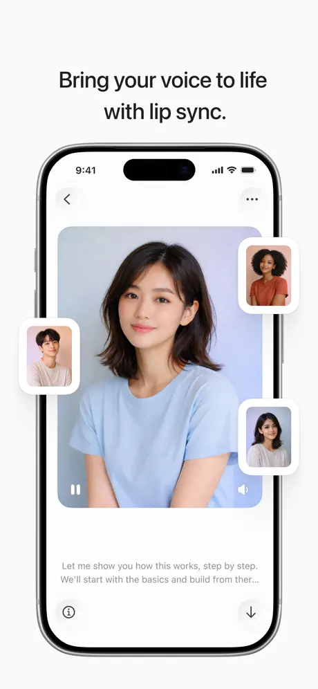
02

Bring your voice to life with lip sync.

On-frame caption: “Bring your voice to life with lip sync.

Frame two shifts into video output while preserving the identical hardware frame. Inside the device, a paused video player shows a woman in a pale blue shirt against a soft blue backdrop; a pause icon sits at lower left and a volume icon at lower right. Outside the bezel, three smaller portrait cards float with generous white padding, roughly twelve-point corner radii, and diffuse drop shadows that read as #000000 at roughly six percent opacity. These cards display alternate talent options: a man in beige on the left, a woman in orange at upper right, and another woman in white at lower right. Beneath the video, two lines of subdued gray caption text—'Let me show you how this works, step by step. We’ll start with the basics and build from ther...'—trail off with an ellipsis, implying a scrolling transcript. A back chevron and 'more' ellipsis occupy the top navigation, while an info icon and download icon anchor the bottom. The composition externalizes the concept of avatar choice, though the shadow softness makes the floating cards melt into the white background when viewed as a thumbnail.

ElevenLabs App Store screenshot 3 — Create any image or video you can imagine.
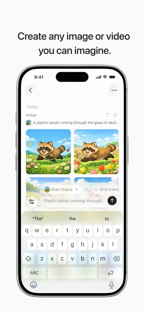
03

Create any image or video you can imagine.

On-frame caption: “Create any image or video you can imagine.

This frame carries the highest information density in the set. The device screen is split between image results and video generation controls. At the top, under a 'Today' header and an 'Image' label, a prompt row reads 'A playful tanuki running through the grass in dayli...' alongside a thumbnail icon. Below that, two square generated images appear side by side: the left tanuki illustration sits in a meadow with butterflies; the right places the same creature among red tulips. Immediately beneath, a video keyframe interface intrudes, showing 'Start frame' and 'End frame' chips with a text input reading 'Playful tanuki running through|' and a dark send arrow. The iOS system keyboard occupies the lower third, its translucent white keys and #007AFF return button adding significant visual noise. The decision to leave the keyboard visible is honest about text input, but it compresses the generated artwork into the upper half of the screen. The images carry roughly eight-point rounded corners, yet the overall frame fights for attention because three competing systems—gallery, timeline, and keyboard—share one viewport.

ElevenLabs App Store screenshot 4 — Clone your voice in less than 30 seconds.
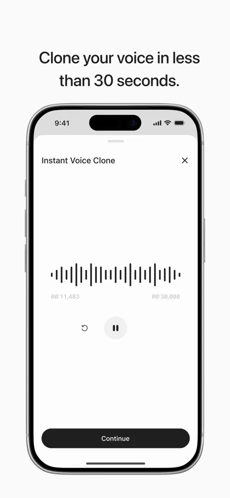
04

Clone your voice in less than 30 seconds.

On-frame caption: “Clone your voice in less than 30 seconds.

The fourth frame is the most austere. A modal sheet titled 'Instant Voice Clone' is distinguished by a light #F5F5F7 header strip behind the title and a close 'X' at the far right. The body is deliberately empty except for a central audio waveform rendered with thick black vertical bars—each roughly two to three points wide—arranged in a symmetric amplitude envelope. Time stamps in small gray sans-serif read '00:11,483' and '00:30,000,' grounding the recording in measurable progress. Below the waveform, a small circular rewind button with a #1C1C1E arrow sits beside a larger pause button housed in a #F2F2F2 circle. At the bottom edge, a full-width black pill button labeled 'Continue' uses high-contrast white type. By stripping away navigation, avatars, and generated media, the frame forces the viewer to focus on the mechanics of capture. However, the gray-white field surrounding the waveform feels underconsidered; without a subtle texture or progress track, the screen reads as unfinished rather than intentionally minimal.

ElevenLabs App Store screenshot 5 — Describe the voice and create it in seconds.
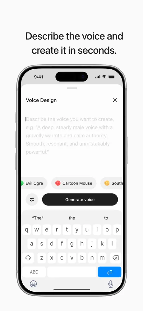
05

Describe the voice and create it in seconds.

On-frame caption: “Describe the voice and create it in seconds.

Here the app surfaces the 'Voice Design' modal. A close 'X' mirrors frame four’s placement exactly. The dominant element is a multiline text view filled with placeholder copy: 'Describe the voice you want to create, e.g. “A deep, steady male voice with a gravelly warmth and calm authority. Smooth, resonant, and unmistakably powerful.”' The placeholder sits in a light #C7C7CC gray, making it recede against the white input field. Below, a horizontally scrolling row of preset chips offers 'Evil Ogre' with a #30D158 green dot, 'Cartoon Mouse' with a #FF375F pink dot, and a partially truncated 'South...' with a #FFCC00 yellow dot. A sliders icon—suggesting fine-tuning—sits left of the black 'Generate voice' pill. The iOS keyboard again rises from the bottom, its bright #007AFF return key drawing the eye away from the primary CTA. The frame demonstrates textual voice authoring clearly, but the keyboard’s presence creates the same compression issue seen in frame three, and the truncated 'South...' chip looks unintentional in a static marketing asset.

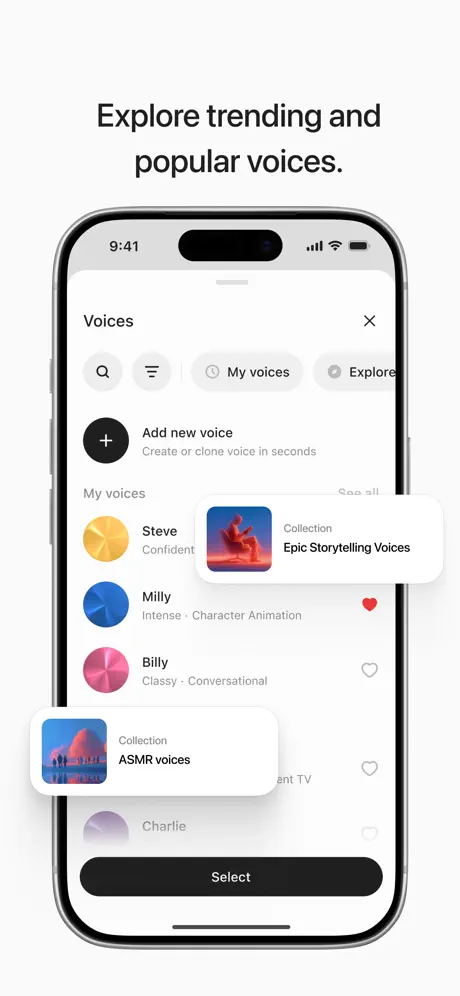
ElevenLabs App Store screenshot 6 — Explore trending and popular voices.
06

Explore trending and popular voices.

On-frame caption: “Explore trending and popular voices.

This frame introduces the discovery layer. A top navigation bar inside the device offers a search icon, filter icon, and two segmented pills: 'My voices' and 'Explore,' the latter active with a light gray background. Below, an 'Add new voice' row uses a stark black circle with a white plus, paired with the sublabel 'Create or clone voice in seconds.' The list beneath shows circular avatar chips with metallic gradients—gold for 'Steve · Confident,' blue for 'Milly · Intense · Character Animation,' pink for 'Billy · Classy · Conversational,' and a partial purple entry for 'Charlie.' Milly carries a filled red heart; Billy and Charlie show empty heart outlines in #C7C7CC. Two collection cards float above the list in a layered composite: 'Epic Storytelling Voices' with a fiery orange cover, and 'ASMR voices' with a muted pink textile cover. A fixed black 'Select' button bottoms the screen. The floating cards add depth, yet their shadow weight is nearly identical to the device bezel, causing them to flatten against the list in smaller views.

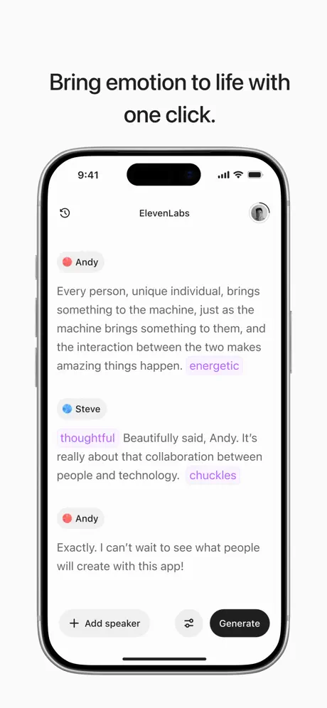
ElevenLabs App Store screenshot 7 — Bring emotion to life with one click.
07

Bring emotion to life with one click.

On-frame caption: “Bring emotion to life with one click.

The seventh frame returns to the script composer from frame one, now populated with a three-turn dialogue. The header reads 'ElevenLabs,' flanked by a history clock icon and a profile avatar. Andy, marked by a coral-red dot, opens with dense copy: 'Every person, unique individual, brings something to the machine, just as the machine brings something to them, and the interaction between the two makes amazing things happen.' Inline, the word 'energetic' appears in a light purple or lavender #AF52DE instead of the default body color. Steve, marked by a blue dot, replies with 'thoughtful' in the same purple, followed by gray body text and 'chuckles' again in purple. Andy closes with 'Exactly. I can’t wait to see what people will create with this app!' The bottom bar repeats the '+ Add speaker' and 'Generate' pairing. This frame leverages color as syntax, turning emotion tags into inline highlights without pill containers. The result is an unusually text-heavy screenshot that assumes the shopper will pause to read the dialogue; at thumbnail size, the purple tags are the only readable accents.

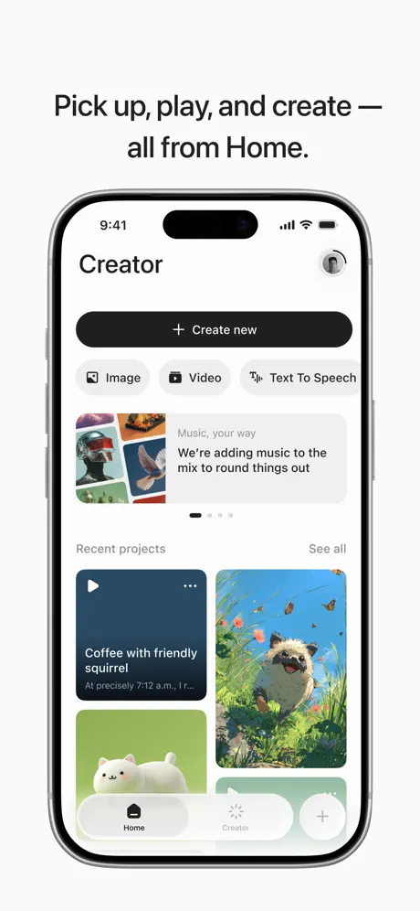
ElevenLabs App Store screenshot 8 — Pick up, play, and create — all from Home.
08

Pick up, play, and create — all from Home.

On-frame caption: “Pick up, play, and create — all from Home.

The final frame presents the 'Creator' hub. The screen title 'Creator' sits at the top left in bold black type, while a profile thumbnail occupies the right. A dominant black '+ Create new' pill spans most of the width. Below, three category chips—'Image,' 'Video,' and 'Text To Speech'—use monochrome glyphs inside light gray rounded rectangles. A carousel banner follows, titled 'Music, your way' with the subtitle 'We’re adding music to the mix to round things out,' accompanied by a four-dot pagination indicator where the first dot is filled black. Under 'Recent projects,' a grid displays cards: a dark navy video thumbnail labeled 'Coffee with friendly squirrel,' the familiar bright tanuki still from frame three, a white abstract figure on green, and a partial teal card. The bottom floating tab bar is a white capsule with soft shadow, containing a filled black 'Home' icon and label, a gray 'Creator' icon and label, and a circular plus. Notably, the active tab reads 'Home' while the screen title reads 'Creator,' a navigational discontinuity that undermines the frame’s authority as a parting statement.

05The craft

Captions, colour and the mechanics of the sell

Caption pattern

Every caption uses the same centered, bold, near-black treatment. No frame breaks the pattern with scale, color, or alignment variation, which makes it difficult for any single feature to own the first impression in search results.

Visual system

The hierarchy is headline > device > floating embellishments > caption. Internal app navigation (back arrows, close buttons, tab bars) is preserved rather than cropped away, which adds realism but also visual noise at smaller sizes.

The thumbnail test

At small scale, the pure white background causes many of the floating out-of-device elements—speech bubbles in frame one, portrait cards in frame two, collection cards in frame six—to lose definition because their shadows are too diffuse. Only the frames with large black headlines and dark media interiors (frame four’s waveform, frame eight’s dashboard) remain legible.

Conversion mechanics

The set maps the product funnel well—creation, output, clone, design, browse, emotion, hub—but it never sacrifices UI realism for marketing clarity. A designer replicating this should note where literalism wins and where it fails.

06Where it slips

What we would change

Floating-element cropping

Frame one bleeds speech bubbles so aggressively that copy fragments like 'My whole perso...' and 'main chara...' look broken rather than teased. The fix is to resize the canvas or reduce the bubble count so every visible line terminates cleanly.

Keyboard compression

Frames three and five leave the iOS keyboard visible, which adds realism but devours vertical real estate. In frame three, the keyboard compresses the generative artwork into the top half of the screen. Cropping the keyboard out or showing the image results full-bleed would let the tanuki illustrations breathe.

Shadow definition at thumbnail scale

Frames two and six rely on soft drop shadows to separate floating cards from the device and background. At search-result sizes, those shadows dissolve into the white backdrop. Increasing opacity by roughly forty percent or adding a one-point hairline border would recover depth.

Navigational contradiction

Frame eight shows the screen title 'Creator' while the bottom tab bar highlights 'Home.' This mismatch registers as editorial sloppiness. The fix is to either activate the 'Creator' tab or change the screen title to match the active state.

Monotonous headline scale

All eight headlines share an identical weight, size, and color. While consistent, the pattern prevents any frame from punching above the rest. Elevating the first headline by roughly ten percent or shifting it to a darker weight would create a proper narrative entry point and improve search-result legibility.

07The recipe

How to apply this to your own app

  1. Pick one piece of hardware and stick with it.

    If your product is multi-modal, a consistent device frame is the cheapest way to create systemic coherence across disparate features.

  2. Truncate mercilessly, but never mid-word.

    Floating out-of-device elements are effective only when the shopper can still parse the sentence. Crop at clause boundaries, not inside words.

  3. Vary headline scale to control pacing.

    A uniform headline stack turns a carousel into a slideshow. Treat the first frame as a poster and the rest as supporting evidence.

  4. Audit every floating element at forty-percent opacity.

    If you are layering cards outside the device bezel, shrink the image down to thumbnail size and verify that the shadow still separates the layers. If not, increase contrast.

08Takeaways

Five things worth stealing

  • Maintaining a single hardware frame and white background across eight frames creates instant systemic coherence.
  • Floating out-of-device elements must be readable even when cropped; mid-word truncation undermines polish.
  • Showing the iOS keyboard demonstrates honest workflow but steals vertical space from the actual output.
  • Color-coded inline tags (like the purple emotion labels) are an efficient way to add visual interest without reshaping the layout.
  • Headline uniformity aids brand recognition but hurts narrative hierarchy; consider modulating scale or weight for the opening frame.
  • Navigation states inside screenshots should be cross-checked for consistency—an active tab mismatched with a screen title breaks trust.
  • Shadows that look elegant at full resolution often disappear at thumbnail scale; test legibility early.
09The verdict

What the set actually achieves

The final set is disciplined to a fault. The unchanged device frame, persistent white background, and uniform headline weight create a coherent visual system that scans cleanly as a professional utility. However, that same rigidity introduces monotony, and several frames sacrifice marketing legibility for literal UI fidelity—floating bubbles bleed off-canvas with truncated copy, keyboards compress generated artwork, and one frame contains a navigational contradiction between its screen title and active tab. The palette inside the app is confident—coral, blue, gold, and pink avatar chips against neutral whites and blacks—but the screenshot wrapper never exploits those colors to differentiate frames. The sequence does successfully map the product’s breadth, yet it misses opportunities to scale headlines or adjust shadow weights for thumbnail impact. In short, the set is a textbook example of systemic consistency meeting editorial timidity.

This case study is written for mobile product designers, ASO leads, and creative directors who are building screenshot sets for multi-feature utilities and need to balance interface fidelity with marketing legibility. It is not written for the ElevenLabs marketing team.

10Questions

Frequently asked

What device is used in the screenshots?

An iPhone 15 Pro with the Dynamic Island centered at the top and a titanium bezel. The status bar is locked to 9:41 across all frames.

What is the dominant background color?

Pure white (#FFFFFF) with no gradient, texture, or environmental context.

How many screenshots are in the set?

Eight frames, presented in the order a shopper would swipe through them on the App Store.

What typography is used for the headlines?

A heavy, near-black sans-serif weight centered above the device. It appears to be system-native or very close to San Francisco.

What are the weaknesses of the set?

Aggressive cropping of out-of-device speech bubbles, keyboard compression in two frames, overly diffuse floating-card shadows, identical headline scale across all frames, and a navigational mismatch in the final frame where the active tab does not match the screen title.

11Keep reading

Build your own screenshot set

The full set

9 shots
ElevenLabs App Store screenshot 1ElevenLabs App Store screenshot 2ElevenLabs App Store screenshot 3ElevenLabs App Store screenshot 4ElevenLabs App Store screenshot 5ElevenLabs App Store screenshot 6ElevenLabs App Store screenshot 7ElevenLabs App Store screenshot 8ElevenLabs App Store screenshot 9

About the app

Welcome to ElevenLabs, the leading AI voice generator app designed for content creators, influencers and professionals. By delivering human-like AI voices, ElevenLabs lets you ElevenLabs, Inc., via the App Store listing.

Screenshots and store metadata belong to ElevenLabs, Inc.. They are shown here for design commentary and criticism. The analysis on this page is original work by floow.design. View the original listing.

More Utilities teardowns

Browse all →