Universe app icon
UtilitiesScreenshot teardown14 min read

Universe App Store screenshots

If you are building a screenshot set for a tool that spans creation, commerce, and analytics, the central tension is always the same: you have to sell the dream in frame one and prove the infrastructure by frame eight. Universe’s eight-frame App Store sequence tries to resolve that tension by wrapping every screen in an electric-blue blueprint aesthetic and marching the viewer from template discovery to revenue dashboard. Below is a frame-by-frame dissection of how that sequence works, where it holds together, and where the seams show.

Set published by Universe Exploration Company · 10 frames analysed

4.5 · 9.8K ratingsFreev2026.7Updated 4mo ago
Universe App Store screenshot 1
01At a glance

The set in one screen

Framing
Front-facing iPhone with Dynamic Island, identical angle across all eight frames
Captions
Bold, centered, white sans-serif, 2–3 lines, stacked above the device
Backdrop
Electric blue (#0040FF) with a faint white engineering grid
Type
System-style sans-serif inside the device; large bold static headlines outside
UI / copy split
high
Frame 1 job
Show breadth of templates and ease of starting

Sampled palette

(marketing background)#0040FF
(caption text, device UI backgrounds)#FFFFFF
(editor chrome, dashboard text)#000000
(subscriber analytics hero)#AF52DE
/ #FF9500 (status indicators)#34C759
02The challenge

What this screenshot set had to solve

The App Store page for a no-code website builder faces a narrative problem: the product is simultaneously a blank canvas and a back-office suite. A shopper swiping in portrait mode needs to believe, within three seconds, that they can design something attractive, and within eight frames, that they can process payments, own a domain, and read subscriber analytics. Universe’s team therefore had to avoid two common failure modes. The first is looking like a toy—too many template-gallery screenshots and the app reads as a glorified Link-in-Bio maker. The second is looking like SAP on a phone—too many dashboard screenshots and the creative audience bounces. The challenge, then, was sequencing eight static images so that creative action and commerce administration felt like contiguous parts of the same workflow, not two different apps cobbled together. Every frame needed to telegraph depth without triggering UI fatigue, and the set had to read in chronological order (build → publish → measure) because that is the mental model of a first-time entrepreneur.

The blueprint wrapper unifies the visual field so that light-mode dashboards and dark-mode block pickers feel like chapters in the same book.
03The approach

How the set argues its case

The blueprint aesthetic is the single strongest strategic choice here. By wrapping every device in an electric-blue grid, Universe frames itself as a construction tool before the shopper even parses a pixel of the UI. That color (#0040FF) is deliberately echoed inside the product as the selection border for active elements, creating a chromatic thread between marketing promise and interface behavior. The device itself—an iPhone 14/15 Pro with Dynamic Island—is cropped tightly enough to feel immersive but not so tightly that gesture bars or status icons are amputated. The sequence order mimics a jobs-to-be-done timeline rather than a feature list: you do not see a settings screen until frame eight, and you never see a sign-up form. The captions use a terse, noun-heavy syntax ('Drag and Drop Editor', 'Instant Custom Domain') that front-loads the mechanism rather than the benefit, which is appropriate for a utility-category shopper who is comparison-hunting for specific capabilities.

The positioning sits between creative playground and business OS. Frame 2 (editor) and Frame 5 (style customization) speak to designers and makers; Frame 3 (domain), Frame 6 (commerce), Frame 7 (email), and Frame 8 (analytics) speak to founders and operators. By alternating these modes—Frame 2 is an editor, Frame 3 is a configuration list, Frame 4 is a dark modal, Frame 5 is an editor again—the set avoids the monotony of four consecutive dashboards. It also implies that the same thumb can move from dragging a flower image to checking an order balance without switching apps. That implicit claim is the core of Universe’s competitive differentiation, and the screenshot architecture is built to support it.

04Frame by frame

Every screenshot, and the job it does

Universe App Store screenshot 1 — Professional Designs
01

Professional Designs

On-frame caption: “Professional Designs

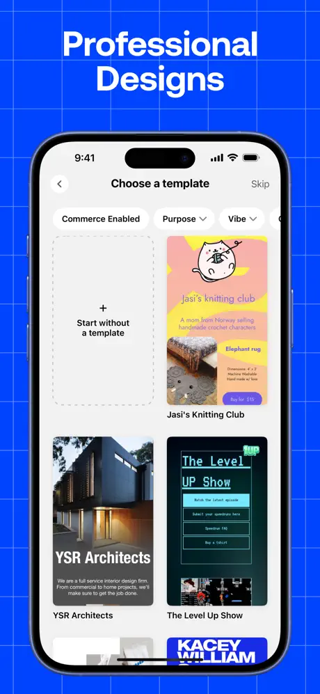
Frame 1 drops the shopper into a template gallery titled 'Choose a template'. The in-device navigation is standard iOS: a back chevron left, 'Skip' right, and a segmented filter bar below with chips reading 'Commerce Enabled', 'Purpose', and 'Vibe'. The template cards themselves are the real content. A dashed-border 'Start without a template' card on the left establishes an escape hatch for creators who want a blank slate. To its right, 'Jasi's knitting club' shows a pink-and-yellow card with a hand-drawn cat illustration, a product tile for an 'Elephant rug', and a purple 'Buy for $15' button. Below that row, 'YSR Architects' uses a moody architectural photograph with reversed-out white text, while 'The Level UP Show' leans into neon green editorial type on black. The variety is intentional: it signals that the tool can hold hobbyists, service firms, and media properties in the same grid. The status bar reads 9:41. The weakness is at the bottom edge, where a card labeled 'KACEY WILLIAM' in white on blue is amputated mid-ascender, and a floating white pill indicator hovers just above the iPhone home indicator. The crop makes the vertical scroll state look accidental rather than deliberate.
Universe App Store screenshot 2 — Drag and Drop Editor
02

Drag and Drop Editor

On-frame caption: “Drag and Drop Editor

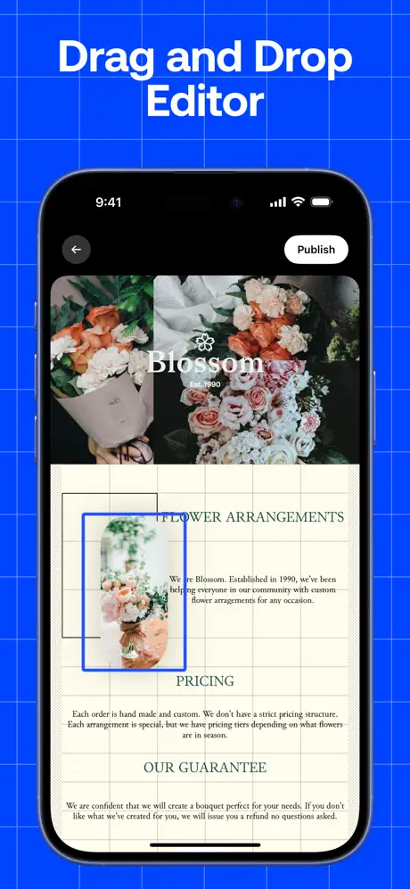
The second frame shifts from selection to manipulation. The device shows a website for 'Blossom Est. 1990' in a WYSIWYG canvas. The top half is a full-bleed photograph of flower arrangements; the bottom half sits on a warm cream field (#FFF8E7) overlaid with a faint gray construction grid. A floral image element is actively selected, ringed by a 2–3pt blue (#0040FF) bounding box with nub handles at the corners and midpoints. Below it, editorial text reads 'FLOWER ARRANGEMENTS', followed by a body paragraph, 'PRICING', another paragraph, and 'OUR GUARANTEE'. The translation from template (Frame 1) to canvas (Frame 2) is immediate: the shopper sees that 'design' means direct manipulation, not form-filling. The editor chrome is minimal—only a back arrow and a white 'Publish' pill on a black top bar—so the content dominates. The grid lines inside the canvas are roughly 20pt squares, faint enough to read as guides rather than artwork. This frame does the heaviest persuasive lifting in the set.

Universe App Store screenshot 3 — Instant Custom Domain
03

Instant Custom Domain

On-frame caption: “Instant Custom Domain

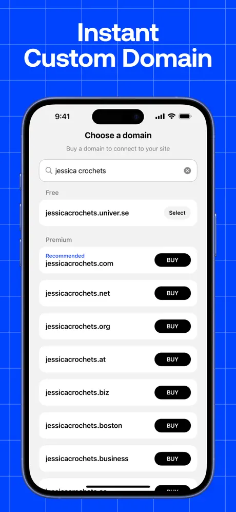
Frame 3 is a pure utility screen. The in-device page, titled 'Choose a domain', presents a search field pre-filled with 'jessica crochets' and a gray #8E8E93 clear icon. Below, a 'Free' section offers 'jessicacrochets.univer.se' paired with a muted gray 'Select' pill. The 'Premium' section is where the visual hierarchy sharpens: a blue #0040FF 'Recommended' tag sits above 'jessicacrochets.com', paired with a high-contrast black 'BUY' capsule. Subsequent rows—.net, .org, .at, .biz, .boston, .business—repeat the black pill pattern. The background inside the device is white #FFFFFF, making this the brightest interior in the sequence. The caption 'Instant Custom Domain' is accurate, but the frame's real strength is showing domain search as an in-app purchase flow rather than a redirect to Safari. The 44pt-tall search field and the generous 16pt margins between list cells make the information scannable despite the density.

Universe App Store screenshot 4 — Everything You Need
04

Everything You Need

On-frame caption: “Everything You Need

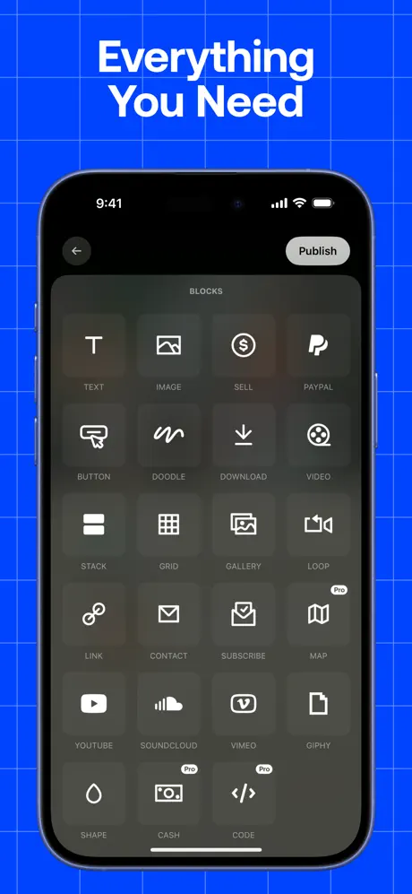
This frame shows a dark modal overlay titled 'BLOCKS'. A four-column grid displays twenty-two block types, each represented by a white line icon on a translucent gray tile. Reading left-to-right, top-to-bottom: TEXT, IMAGE, SELL, PAYPAL, BUTTON, DOODLE, DOWNLOAD, VIDEO, STACK, GRID, GALLERY, LOOP, LINK, CONTACT, SUBSCRIBE, MAP, YOUTUBE, SOUNDCLOUD, VIMEO, GIPHY, SHAPE, CASH, and CODE. Two blocks—CASH and CODE—carry small 'Pro' lozenges in the upper-right corner, white text on black, roughly 12pt. The dark modal chrome (#1C1C1E) creates a visual punch against the electric-blue marketing frame, making this screenshot the most distinct in the carousel. The problem is the caption. Unlike the other seven frames, 'Everything You Need' names no concrete action or object; it relies entirely on the grid to communicate value. The grid succeeds—showing PayPal, Sell, and YouTube in the same breath proves the platform’s breadth—but the headline wastes an opportunity to echo the 'BLOCKS' title inside the UI.

Universe App Store screenshot 5 — Unlimited Customizations
05

Unlimited Customizations

On-frame caption: “Unlimited Customizations

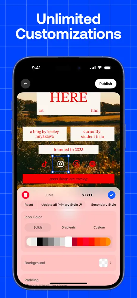
Frame 5 returns to the editor, this time emphasizing styling granularity. The canvas displays a personal website with a landscape photograph background and large red serif type reading 'HERE'. Below, white cards carry red text: 'a blog by keeley miyakawa', 'currently: student in la', and 'founded in 2023'. A row of social icons—TikTok, Instagram, Pinterest, Spotify—sits above a red banner that reads 'good things are coming'. The Instagram icon is selected, surrounded by the same blue #0040FF bounding box seen in Frame 2. A bottom sheet covers the lower 45% of the device, colored in a pink-to-peach gradient (#FFD1D1). Inside the sheet, the 'STYLE' tab is active, flanked by a red trash icon and a blue checkmark. Controls include 'Reset', 'Update all Primary Style', and 'Secondary Style'. Below that, an 'Icon Color' section offers tabs for 'Solids', 'Gradients', and 'Custom', followed by a color ramp running from white through black into warm reds and oranges. At the very bottom, a 'Padding' label and slider track are visible, though the slider is cropped by the device bezel. The frame demonstrates fine-grained control, but the bottom-sheet truncation feels unintentional.

Universe App Store screenshot 6 — Online Store and Payments
06

Online Store and Payments

On-frame caption: “Online Store and Payments

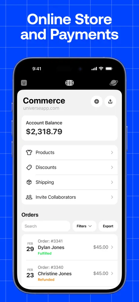
The sequence pivots here from creation to administration. The device shows a 'Commerce' dashboard for 'universeapp.com'. A hero card at the top displays 'Account Balance $2,318.79' in 34pt bold black type. Below, grouped list cells—'Products', 'Discounts', 'Shipping', 'Invite Collaborators'—use 1px #E5E5EA hairline separators and right-facing chevrons. The 'Orders' section introduces a secondary toolbar: a search field, a 'Filters' dropdown, and an 'Export' button. Two order rows follow. The first, dated FEB 29, lists 'Dylan Jones', 'Order: #3341', '$45.00', and a green #34C759 'Fulfilled' badge. The second, dated FEB 23, lists 'Christine Jones', 'Order: #3340', '$45.00', and an amber #FF9500 'Refunded' badge. The specificity of the dollar amounts and the color-coded statuses lend credibility; this is not a mocked-up zero-state. The background is system gray #F2F2F7. Notably, no bottom tab bar is visible, which isolates the commerce view but also hides the app's navigation model.

Universe App Store screenshot 7 — Branded Email and Newsletters
07

Branded Email and Newsletters

On-frame caption: “Branded Email and Newsletters

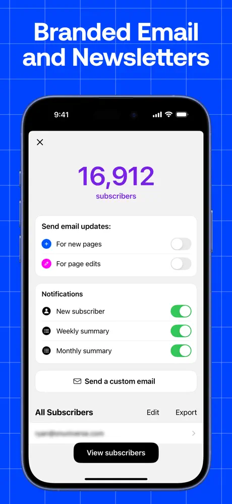
Frame 7 opens on a subscriber-management screen. A massive hero metric dominates the top third: '16,912' rendered in a vivid purple #AF52DE at roughly 64pt, with the word 'subscribers' tucked beneath it at 17pt. Below, a white card labeled 'Send email updates:' contains two toggle rows—'For new pages' (blue plus icon) and 'For page edits' (pink pencil icon)—both in the off/gray position. A second card, 'Notifications', houses three toggles in the on/green position: 'New subscriber', 'Weekly summary', and 'Monthly summary'. A tertiary row, 'Send a custom email', uses a centered envelope icon. At the bottom, an 'All Subscribers' header is flanked by 'Edit' and 'Export' text buttons, above a blurred email row and a black #000000 pill reading 'View subscribers'. The alternating toggle colors (gray vs. green) communicate state without requiring labels. The purple hero number is an immediate attention hook, though its repetition with Frame 8 could feel redundant to a careful viewer.

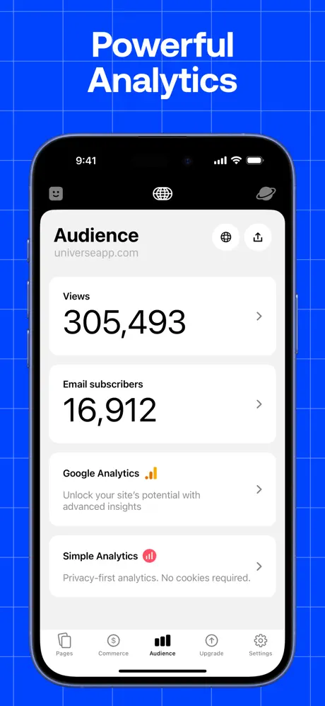
Universe App Store screenshot 8 — Powerful Analytics
08

Powerful Analytics

On-frame caption: “Powerful Analytics

The final frame resolves the set by revealing the bottom tab bar for the first time. The device displays the 'Audience' tab, with four sibling tabs visible: Pages, Commerce, Audience (active), Upgrade, and Settings. The screen shows two hero cards, 'Views 305,493' and 'Email subscribers 16,912', each with a right-facing chevron. Beneath them, two integration rows appear: 'Google Analytics' with an orange #E37400 bar-chart icon, and 'Simple Analytics' with a red #FF3B30 dot-bar icon. The descriptive text under each—'Unlock your site's potential with advanced insights' and 'Privacy-first analytics. No cookies required.'—is set in 15pt secondary gray. The spacing between cards is approximately 12pt, maintaining the airy list density seen in Frame 6. By finally exposing the tab bar, the frame retroactively suggests that Frames 6 and 7 were simply deeper navigations within this same architecture. The numerical continuity (16,912 subscribers matching Frame 7) is a deliberate bit of proof that these modules are connected. The weakness is that it took eight frames to show wayfinding; a shopper who dropped off at Frame 3 may never realize the app has a persistent tab model.

05The craft

Captions, colour and the mechanics of the sell

Caption pattern

All eight captions are set in the same bold, geometric sans-serif, centered, in all-caps or title-case white type. They occupy the top 18–20% of the vertical canvas, leaving the device to dominate the lower 75%. The line breaks are aggressively stacked: 'Professional / Designs', 'Drag and Drop / Editor', 'Instant / Custom Domain'. This stacking forces the eye to pause, but it also guarantees that no caption is so wide it competes with the device width. The trade-off is that some phrases become abstract ('Everything You Need') when compressed into two lines.

Visual system

Inside the device, the UI alternates between light and dark modes. Frames 1, 3, 6, 7, and 8 use light iOS-style tables and cards (white cells on #F2F2F7 gray). Frames 2 and 5 use a warm editorial canvas (cream #FFF8E7 backgrounds, photographic fills, serif type). Frame 4 uses a translucent dark modal (#1C1C1E). That alternation prevents screen burn-in during a rapid swipe, but it also means the shopper must recalibrate contrast expectations four times. The only constant is the blue selection chrome (#0040FF), which appears in Frame 2 (image bounding box), Frame 3 ('Recommended' label), and Frame 5 (icon bounding box). That blue acts as a spatial anchor.

The thumbnail test

At thumbnail size, the electric blue field and white type read as a single coherent brand. The problem is that every frame is visually identical in silhouette: blue rectangle, black notch, white words. Only Frame 4 (dark block grid) and Frame 5 (red editorial typography) break the midsize thumb-scroll pattern enough to earn a second glance. A shopper swiping quickly could mistake frames 6, 7, and 8 for a single generic dashboard unless they stopped to read the captions.

Conversion mechanics

The set is built for a high-intent shopper who already knows they need a website builder. It does not waste time on lifestyle photography or smiling founders; every pixel is UI. That honesty is refreshing, but it also means there is no emotional hook for the casual browser. A shopper comparing Universe against a competitor on aesthetic vibe will see a lot of gray tables and blue grids, not aspirational finished sites. The conversion logic is therefore cognitive, not emotional: if you recognize the problem (I need to sell crochet online), the sequence shows you the exact toolpath to solve it.

06Where it slips

What we would change

Locked Orthographic Framing

The iPhone is presented in identical front-facing perspective across all eight frames. For an app about creative freedom, the presentation is oddly rigid. Fix: Tilt the device 8–12 degrees in the dashboard frames (6–8) or zoom the canvas slightly in the editor frames (2 and 5). This introduces parallax and breaks the ‘contact-sheet’ monotony without breaking brand.

Awkward Bottom Crops

Frame 1 truncates the 'KACEY WILLIAM' card mid-letter, and Frame 5 severs the Padding slider at its track. These feel like unpolished scroll positions rather than deliberate compositions. Fix: In Frame 1, scroll the template list up by one row or crop the device taller to fully contain the next card. In Frame 5, increase the bottom-sheet height by 20pt so the slider sits fully inside the safe area.

Vague Headline in Frame 4

'Everything You Need' is the weakest caption in the sequence. It names no verb, no object, and no user outcome. Fix: Replace it with copy that echoes the UI title inside the modal, such as 'Blocks for Every Feature' or '40+ Content Blocks'. Specificity converts better than abstraction.

Delayed Navigation Reveal

The bottom tab bar appears only in Frame 8. For the first seven frames, a shopper cannot tell whether the app uses persistent tabs, modal stacks, or single-page flows. Fix: Ensure Frame 6 or Frame 7 includes the tab bar, or add a subtle inset of the tab chrome to the bottom of the commerce and email frames. Wayfinding confidence reduces perceived complexity.

Chromatic Competition Between Frame and UI

The marketing background is #0040FF, and the in-app selection borders and 'Recommended' labels are nearly identical in hue. When the eye tracks from the outer blue field to the inner blue bounding box, the two planes vibrate against each other. Fix: Desaturate the blueprint background to #0033CC or add a 10% black overlay so that in-app accents pop independently of the marketing wrapper.

07The recipe

How to apply this to your own app

  1. Pinterest-style blueprint or 3D-devices?

    Universe proves that a 2D flat-lay can work for utility apps, but the device must be cropped with surgical precision. If you use a colored wrapper, treat it as a stage, not a wallpaper: leave enough vertical margin so captions do not crowd the notch.

  2. Sequence your frames by job stage, not by feature list

    Universe’s ordering—Template → Edit → Domain → Blocks → Style → Commerce → Email → Analytics—mirrors a founder’s Saturday afternoon. When planning your own set, map the swipe order to a user story rather than to your navigation hierarchy.

  3. Use in-device color accents to echo marketing accents

    The blue selection border inside the app matches the blue background outside the device. Pick one product accent color and repeat it in your screenshot frame background so the marketing layer and the product layer feel like one continuous surface.

  4. Show real numbers, not zero states

    $2,318.79 and 305,493 views are more persuasive than empty charts. If your app has dashboard capabilities, populate screenshots with plausible, specific data. It signals that the product is alive and trusted by real users.

08Takeaways

Five things worth stealing

  • Relentless background consistency can unify disparate UI modes (editor vs. dashboard) into a single brand experience
  • Bounding-box selection states are a high-leverage way to communicate 'drag and drop' without animation
  • Specific dollar amounts and subscriber counts outperform zero-state mocks for commerce and analytics frames
  • A locked front-facing device angle is safe but can induce scroll fatigue; introduce subtle perspective shifts to maintain visual rhythm
  • Bottom navigation chrome should appear earlier than frame eight if wayfinding is a selling point
09The verdict

What the set actually achieves

Read from left to right, the sequence tells a complete founder story: choose a starting point, drag content into place, buy a domain, add function blocks, fine-tune visual style, process orders, mail subscribers, and review traffic. The blueprint wrapper unifies the visual field so that light-mode dashboards and dark-mode block pickers feel like chapters in the same book. However, the rigid orthographic device framing and the occasional vague headline dilute the set’s momentum, suggesting that consistency was chosen over visual rhythm.

Mobile product designers, growth marketers, and indie developers building screenshot sets for multi-module tools that span creative and administrative workflows. The case study is most useful if you are debating whether to sequence by feature or by user journey, or if you are trying to marry a dark editor UI with light dashboard UI under one visual umbrella.

10Questions

Frequently asked

Why does the blueprint background work here?

It signals construction and design without using verbs. The blue also reappears inside the app as the selection border, creating a chromatic contract between marketing frame and product UI.

Is the identical device angle a strength or weakness?

It is a strength for brand consistency but a weakness for swipe engagement. In a set of eight, identical angles start to look like a specification sheet rather than a story. Introducing 8–12 degree perspective shifts in later frames would help.

What is the most persuasive micro-detail?

The specific dollar amount '$2,318.79' in the commerce frame. It grounds the feature in reality and implies social proof more effectively than a generic 'Start selling today' caption.

Which frame does the heaviest lifting?

Frame 2, 'Drag and Drop Editor'. It translates the abstract promise of Frame 1 into a concrete mechanic: a selected image on a grid, proving that the editor is spatial and direct-manipulation, not form-based.

11Keep reading

Build your own screenshot set

The full set

10 shots
Universe App Store screenshot 1Universe App Store screenshot 2Universe App Store screenshot 3Universe App Store screenshot 4Universe App Store screenshot 5Universe App Store screenshot 6Universe App Store screenshot 7Universe App Store screenshot 8Universe App Store screenshot 9Universe App Store screenshot 10

About the app

Universe is the fastest and easiest way to build a custom website for you, your brand, or business with everything you need built in. In minutes publish a custom domain and accept Universe Exploration Company, via the App Store listing.

Screenshots and store metadata belong to Universe Exploration Company. They are shown here for design commentary and criticism. The analysis on this page is original work by floow.design. View the original listing.

More Utilities teardowns

Browse all →