Linktree app icon
UtilitiesScreenshot teardown11 min read

Linktree App Store screenshots

When a product occupies the link-in-bio slot on the App Store, it has about two seconds to prove it is more than a URL builder. Linktree’s screenshot set treats each frame as a distinct poster: a sequence of seven locked canvases that alternate between aspirational creator profiles and literal app utility. The result is a carousel that reads like a mood board with a product attached—dense with color, deliberate in its repetitions, and confident enough to let actual iOS chrome share the stage with 3D pistachios and Instagram Story stickers.

Set published by Linktree · 7 frames analysed

4.8 · 57K ratingsFreev3.39.0Updated 4mo ago
Linktree App Store screenshot 1
01At a glance

The set in one screen

Framing
Mixed—four frames use floating, bezel-less cards; three frames use full iPhone hardware chrome with status bars. Frame 6 introduces a black bezel specifically for Instagram Story context.
Captions
Heavy, condensed sans-serif display type, always top-aligned in sentence case. Color changes per frame to contrast the dominant background.
Backdrop
Solid, saturated monochrome per frame: burgundy, violet, royal blue, chocolate brown, olive green, crimson, charcoal.
Type
Bold, poster-grade headlines in complementary brights; UI type is native iOS system style in functional frames.
UI / copy split
Roughly 55/45. Four frames lead with UI; three frames (3, 4, 7) lead with brand imagery or mosaic collage.
Frame 1 job
Reframing the product as a shoppable creator home base, not a link list. It does this by hiding all iOS chrome and foregrounding profile identity, product shelves, and earned revenue.

Sampled palette

#880E4F#880E4F
#4A148C#4A148C
#1565C0#1565C0
#5D4037#5D4037
#2E4C25#2E4C25
#8B0000#8B0000
02The challenge

What this screenshot set had to solve

In the link-in-bio category, the existential threat is commoditization. To a shopper thumbing through Utilities, Linktree can scan as a simple URL container rather than a creator operating system. The screenshot set therefore faces a positioning challenge: it must communicate functional depth—link management, product grids, analytics dashboards, and brand customization—without feeling like enterprise software, while still speaking to wildly divergent personas including hairstylists, fitness coaches, food brands, and musicians. At the same time, the frames cannot abandon interface literacy; shoppers need to see enough actual UI to trust the app is real. Balancing emotional appeal with proof-of-work, and doing it across seven slides that may be seen in any order, is the central tension.

The set’s biggest strength is chromatic confidence—each frame owns a single hue so aggressively that the carousel reads as a deck of posters rather than a product walkthrough.
03The approach

How the set argues its case

The team solves the tension by enforcing a strict alternation between two visual modes. Poster-style profile frames sell aspiration; centered-device UI frames sell capability. Each frame is keyed to a single dominant background color—burgundy, violet, royal blue, chocolate brown, olive green, crimson, charcoal—so the carousel registers as seven distinct cards rather than a monotonous screen recording. Headlines are set in a dense, heavy sans-serif behaving like display type, always locked to the top third to survive truncation on smaller iPhones. A recurring acid-lime earnings badge acts as a conversion anchor in monetization frames, while functional frames rely on accurate iOS status bars, native tab bars, and standard navigation icons to signal production value. The sequencing loosely follows a creator journey: identity, aggregation, sales, brand control, analytics, distribution, and finally scale.

Instead of opening with the link-management UI, Frame 1 opens with a finished creator storefront. The positioning argument is that Linktree is the destination, not the conduit. Revenue and product shelves appear before the user ever sees a toggle switch or a chart, reframing the app as a commerce and identity platform first. Only after that emotional hook does the set reveal the utilitarian dashboards—Links, Analysis—implying that the beauty is easy to achieve.

04Frame by frame

Every screenshot, and the job it does

Linktree App Store screenshot 1 — Home base as destination
01

Home base as destination

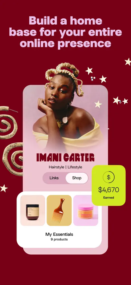
On-frame caption: “Build a home base for your entire online presence

The dominant canvas is a deep burgundy (#880E4F) flooded behind a floating, bezel-less device card. The headline sits in a pale pink (#F8BBD0) that offers high contrast without feeling corporate. Inside the device, the profile for “IMANI CARTER” uses a deep red serif logotype (#B71C1C) above a “Hairstyle | Lifestyle” descriptor and a “Links / Shop” segmented control. Below, a product shelf titled “My Essentials / 9 products” shows three rounded thumbnails. A sculptural beige spiral enters from the left margin, while white stars scatter the upper right, giving the frame tactile depth. The commercial cue is an acid-lime (#CDDC39) rounded square overlaid on the right, reading “$4,670 Earned.” By cropping away the status bar and home indicator, the frame presents Linktree as a finished destination rather than a raw utility.
Linktree App Store screenshot 2 — Content management
02

Content management

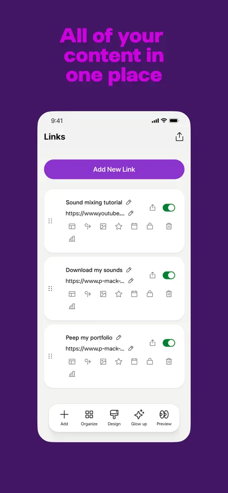
On-frame caption: “All of your content in one place

The background shifts to deep violet (#4A148C), with the headline rendered in bright magenta (#D500F9) that sits at lower contrast against its ground than any other frame in the set. A centered iPhone displays the “Links” management screen at 9:41. A purple pill button (#8E24AA) reads “Add New Link.” Three stacked white cards hold “Sound mixing tutorial,” “Download my sounds,” and “Peep my portfolio,” each with truncated URLs, a six-dot grip handle on the left, and a bright green toggle (#00C853) on the right. A dense icon toolbar beneath each card offers analytics, linking, imagery, favoriting, duplication, locking, and deletion. The bottom tab bar introduces human-sounding copy: “Add,” “Organize,” “Design,” “Glow up,” and “Preview.” This is the least decorated frame, trading flair for proof of density and administrative control.

Linktree App Store screenshot 3 — Digital commerce
03

Digital commerce

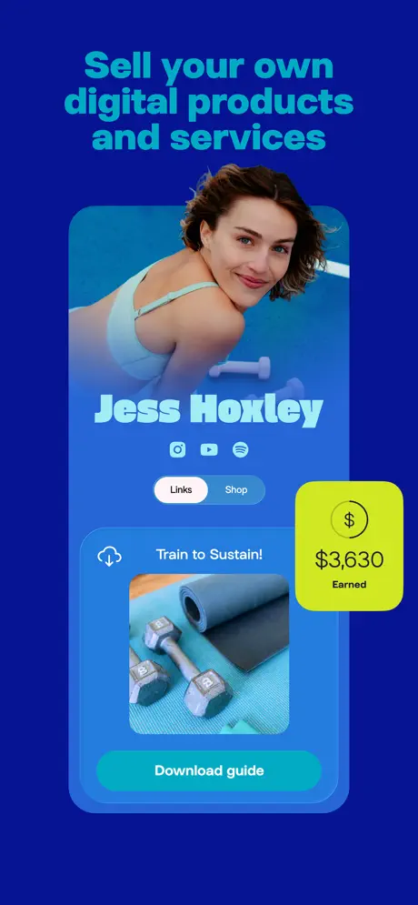
On-frame caption: “Sell your own digital products and services

Royal blue (#1565C0) dominates the background, with the headline in cyan (#00B0FF). The layout mirrors Frame 1 almost exactly: a floating profile card, no device chrome, and the same lime earnings badge now reading “$3,630 Earned.” The profile features “Jess Hoxley” in a light blue display type above Instagram, YouTube, and Spotify icons. The active tab is “Shop,” revealing a digital product card titled “Train to Sustain!” with a product photo of dumbbells and a yoga mat, plus a “Download guide” call-to-action in teal. The repetition of the badge and the floating-card composition creates instant visual rhyme with Frame 1, conditioning the viewer to associate the profile view with direct revenue.

Linktree App Store screenshot 4 — Brand control
04

Brand control

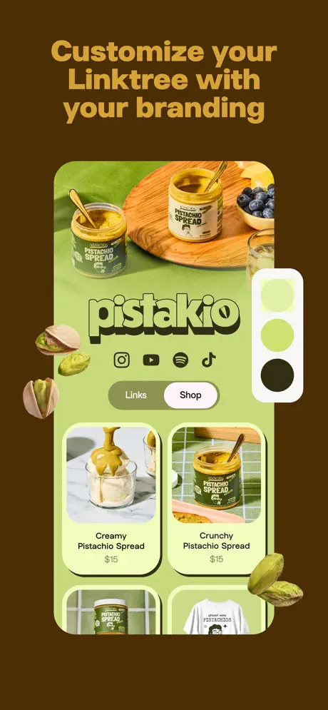
On-frame caption: “Customize your Linktree with your branding

A chocolate brown (#5D4037) background sets off a tan headline (#D4A373). The device shows the “pistakio” brand page: a food-photography hero, a bubbly green logotype, and social icons for Instagram, YouTube, Spotify, and TikTok. The product grid displays “Creamy Pistachio Spread $15” and “Crunchy Pistachio Spread $15” inside heavily shadowed, rounded cards. The frame’s unique gesture is the floating color-swatch panel on the right—three circles in off-white, lime, and dark olive—making the customization promise literal. Three-dimensional pistachio nuts break the frame’s left and right edges, continuing the tactile motif introduced by Frame 1’s spiral and anchoring the brand in physical texture.

Linktree App Store screenshot 5 — Analytics
05

Analytics

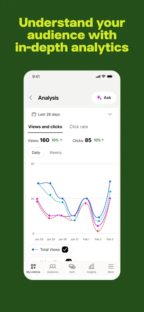
On-frame caption: “Understand your audience with in-depth analytics

The background is a muted forest green (#2E4C25), with the headline in acid lime (#C6FF00). A centered iPhone shows the “Analysis” dashboard. The header includes a back chevron, a “Last 28 days” dropdown with a calendar icon, and an “Ask” button with a sparkle glyph. Metrics read “Views: 160 10% ↑” and “Clicks: 85 10% ↑” beside a “Click rate” tab. A segmented control toggles “Daily” against “Weekly.” The line chart tracks four series from Jan 28 to Feb 3: a solid blue “Total Views” line, a cyan dashed line, a magenta dashed line, and a red dotted line, with corresponding legend chips. The bottom tab bar roots the product in standard iOS patterns. This frame shifts the tone from creator aspiration to business rationalism.

Linktree App Store screenshot 6 — Distribution
06

Distribution

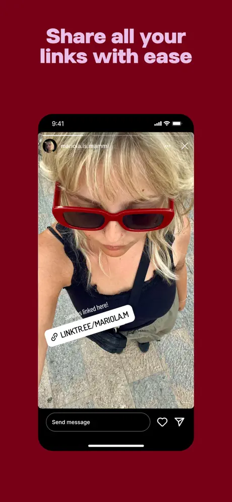
On-frame caption: “Share all your links with ease

A dark crimson (#8B0000) background holds the headline in pale lavender (#FCE4EC). The device is a black-bezel iPhone displaying an Instagram Story from user “mariola.is.mammi.” The story shows a portrait with red sunglasses; a white angled sticker overlays it with “Sunglasses linked here!” and a link icon followed by “LINKTREE/MARIOLAM.” The Instagram chrome—“Send message,” heart, and paper-plane icons—grounds the frame in a third-party ecosystem. Unlike every other frame, this does not show the Linktree UI; it shows the result of using Linktree inside someone else’s funnel. The black bezel distinguishes the hardware context, though it introduces a framing inconsistency against the set’s otherwise bezel-less vocabulary.

Linktree App Store screenshot 7 — Social proof
07

Social proof

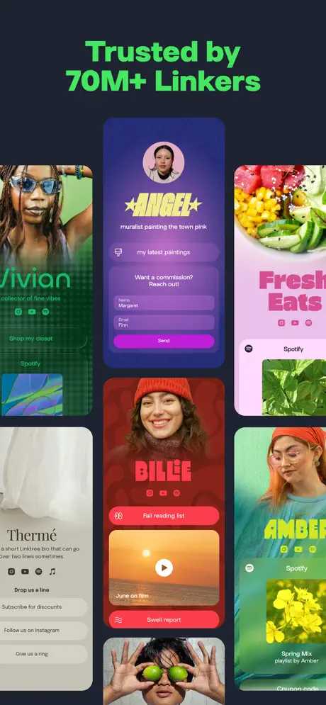
On-frame caption: “Trusted by 70M+ Linkers

The finale drops the device frame entirely. A charcoal near-black (#121212) canvas is tiled with a bento-style collage of Linktree profiles: “Vivian” against a green checkerboard, “ANGEL” on a purple gradient with star typography, “Fresh Eats” on pink with a food hero, “Thermé” in beige minimalism, “BILLIE” in red with a video thumbnail, “AMBER” on teal with a Spotify embed, and a portrait with limes over eyes. The headline in neon green (#00E676) sits above the mosaic. This frame sacrifices UI legibility for macrographic proof of variety; each tile is too small to read, but the color-block diversity argues scale and inclusivity. It functions as a visual testimonial rather than a feature demonstration.

05The craft

Captions, colour and the mechanics of the sell

Caption pattern

Every headline is sentence-case, bold, and occupies the top 20 percent of the frame. The pattern is rigid: two to four lines of large type, flush left or centered, with no subtitle line. This consistency turns the headline block into a recognizable brand asset across the set.

Visual system

The system is built on background color ownership. Each frame gets one dominant hue, and every other element is selected to either harmonize or punch against it. Profile frames use decorative 3D objects—spirals, stars, pistachio nuts—that bleed off the canvas edges, while functional frames are ruthlessly flat. The acid-lime accent (#CDDC39) is reserved exclusively for the earnings badge, creating a Pavlovian association between that color and monetization.

The thumbnail test

At thumbnail size, the set survives because of its color discipline. A thumb scrolling past sees seven hard color swatches—red, purple, blue, brown, green, crimson, black—rather than a blur of white app interfaces. However, Frame 2’s magenta-on-violet headline begins to disappear at small scale, and Frame 7’s mosaic collapses into a noisy abstraction. The strongest thumbnail is Frame 1, where the pale pink headline on deep burgundy maintains luminance, and the lime badge reads as a bright dot even when the dollar amount is unreadable.

Conversion mechanics

The set is engineered for conversion through repetition of the earnings badge and the profile-as-outcome framing. By showing revenue before showing the work of link management, the carousel taps into outcome bias. The “Earned” badge is the only element that repeats with identical styling across multiple frames, making it a persistent call to value. However, the conversion path is emotional rather than sequential; there is no arrow, no numbered step, and no end-frame CTA beyond the social proof headline. The set assumes the user is already problem-aware and seduces them with identity, not instruction.

06Where it slips

What we would change

Headline contrast failure in Frame 2

The magenta headline (#D500F9) on deep violet (#4A148C) fails the quick-thumb readability test. At thumbnail scale the text vibrates and sinks into the background. The fix is to lighten the headline tint by roughly 20 percent or shift the background toward a darker indigo to restore separation.

Lazy duplication of the earnings badge in Frame 3

The lime earnings badge is identically positioned, scaled, and cornered in Frame 3 as in Frame 1, differing only by the dollar amount. This reads as templating, not motif. The fix is to vary the badge’s position—nudge it lower on Frame 3, or change its container shape to a pill—so the repetition feels intentional.

Frame 6’s black bezel breaks visual contract

Five preceding frames establish a bezel-less device language. The sudden black iPhone bezel in Frame 6 is jarring and unexplained. The fix is to composite the Instagram Story inside a bezel-less frame with subtle Instagram chrome, or to commit to bezel devices throughout the entire set.

Frame 7’s mosaic collapses into noise

At thumbnail size the bento grid reads as abstract color noise rather than 70 million distinct creators. The fix is to reduce the tile count from seven-plus to four larger mini-profiles, allowing each identity’s layout and color theme to register clearly.

Uniform headline weight fights functional UI

The headline type is uniformly heavy across all frames. On Frame 5’s dense analytics UI, the lime headline competes with the purple data lines for attention. The fix is to pull the headline weight down by one grade on functional frames so the interface can breathe while the poster frames keep their punch.

07The recipe

How to apply this to your own app

  1. Background color ownership

    Assign each screenshot a single dominant background hue. It thumbnails better than white or gray and lets you segment features by mood.

  2. Alternating rhythm

    Alternate between emotional profile frames and literal UI frames. This prevents fatigue and lets you sell both aspiration and capability without either drowning the other.

  3. Recurring anchor motif

    Introduce one repeated visual element—an earnings badge, a checkmark, a color swatch—that carries a single promise across the set. Vary its position or scale so it does not feel copy-pasted.

  4. Status bar literacy

    When showing actual iOS UI, include accurate status bars and native navigation. It signals that the product is a real, shipped app, not a concept mock.

  5. End with abstraction only if scaled up

    A mosaic or collage finale works only if the individual tiles remain legible at thumbnail size. If they do not, reduce tile count or enlarge the key examples.

08Takeaways

Five things worth stealing

  • Single-color background ownership is the fastest way to make a carousel read as distinct posters rather than a blur of white UI.
  • Recurring motifs need intentional variation in position or scale; identical duplication undermines craft.
  • Showing outcome before mechanic—earnings before link editing—can reframe utility apps as platforms.
  • Hardware framing must be consistent; mixing bezel-less cards with black-bezel phones breaks visual trust.
  • Headline weight should flex with frame density; UI-heavy screens need lighter typographic competition.
09The verdict

What the set actually achieves

Linktree opts for chromatic ownership and visual rhythm over a seamless screen recording. Each frame is a self-contained argument—some for creativity, some for commerce, some for control—tied together by recurring motifs (the lime earnings badge, the heavy headline style) rather than continuous UI flows. The outcome is a set that thumbs well at small sizes because of its color blocking, even when the UI details inside the devices are illegible.

This set is best studied by designers working on creator tools, marketplace apps, or any utility that must sell identity alongside function. It is especially useful if your app serves diverse personas and you need to prove breadth without building seven separate screenshot sets.

10Questions

Frequently asked

Why does Frame 1 hide the iOS status bar?

By cropping away all device chrome, the frame presents the Linktree profile as a finished destination rather than an app screen. It reframes the product from 'tool' to 'home'.

What is the purpose of the 3D decorative objects?

The spiral, stars, and pistachio nuts add tactile depth and signal that the frame is a curated poster, not a screenshot. They also visually separate the profile frames from the flat, utilitarian UI frames.

Why show Instagram in Frame 6 instead of the app?

Frame 6 sells distribution context. By showing the Linktree URL inside an Instagram Story, it demonstrates where the product lives in a creator’s workflow rather than how the interface looks.

What does the lime green color signify?

The acid-lime accent (#CDDC39) is reserved almost exclusively for the earnings badge, creating a conditioned association between that specific color and revenue generation.

Why does the headline color change on every frame?

The headline tint is selected to maximize contrast against each frame’s dominant background. This chromatic adaptability keeps the headline block legible while letting the overall palette shift wildly across the carousel.

11Keep reading

Build your own screenshot set

The full set

7 shots
Linktree App Store screenshot 1Linktree App Store screenshot 2Linktree App Store screenshot 3Linktree App Store screenshot 4Linktree App Store screenshot 5Linktree App Store screenshot 6Linktree App Store screenshot 7

About the app

Linktree is the largest link in bio tool used by over 70 million people and organizations around the world. Make your free Linktree in minutes to focus your fans, grow your Linktree, via the App Store listing.

Screenshots and store metadata belong to Linktree. They are shown here for design commentary and criticism. The analysis on this page is original work by floow.design. View the original listing.

More Utilities teardowns

Browse all →