Ahead app icon
Health & FitnessScreenshot teardown18 min read

Ahead App Store screenshots

There is a peculiar tension in designing App Store screenshots for behavioral-health apps. The canvas has to feel clinical enough to earn trust, yet playful enough to promise daily engagement. Ahead, an emotional-intelligence coach positioned in Health & Fitness, tackles this brief with a deep-purple stage, a cast of soft-body mascots, and a headline strategy that borrows category recognition from familiar language-learning apps. The result is an eight-frame sequence that moves quickly from elevator pitch to UI evidence, but not without some zig-zags in visual grammar that are worth dissecting frame by frame.

Set published by ahead Solutions GmbH · 10 frames analysed

4.7 · 22K ratingsFreev1.60.22Updated 4mo ago
Ahead App Store screenshot 1
01At a glance

The set in one screen

Framing
Angle perspective (Frames 1–2) / Flat crop (Frames 5, 6, 8) / No device (Frames 3, 4, 7)
Captions
Centered headline, keyword highlighted in lavender, white text on violet ground
Backdrop
Deep purple gradient with soft radial glow; white cloud motifs at bottom edge
Type
Bold, geometric sans-serif, ~56–64 pt for headlines; lighter weight for sub-captions
UI / copy split
9:4 UI-weighted
Frame 1 job
Positioning via analogy + immediate credibility stacking

Sampled palette

#6A1B9A#6A1B9A
#E1BEE7#E1BEE7
#FFFFFF#FFFFFF
#FFD740#FFD740
#FF5252#FF5252
#4CAF50#4CAF50
02The challenge

What this screenshot set had to solve

Ahead’s core obstacle on the App Store is categorical skepticism. Health & Fitness shoppers have been trained to expect either austere, clinical layouts (meditation timers, CBT worksheets) or hyper-gamified streak machines. Ahead needed to telegraph 'evidence-based' and 'approachable' simultaneously. That meant the screenshot sequence had to do three things in under eight seconds: (1) explain the app’s purpose without relying on the store description, (2) show enough actual interface to prove the product exists beyond a concept, and (3) inject emotional warmth so the prospect doesn’t assume this is another homework-for-therapy worksheet. The designers solve this by front-loading social credentials and a familiar analogy, then alternating between mascot-driven brand moments and dense UI proof.

"The Duolingo for emotional Intelligence" — Frame 1 headline text, verbatim.
03The approach

How the set argues its case

The strategy is essentially modular persuasion. Each frame is treated as a self-contained billboard with a single proposition: (1) We are credible, (2) We are recommended, (3) Here is what you browse, (4) Here is what you gain, (5) Here is how short the lessons are, (6) Here is the method, (7) Here is what users say, (8) Here is your reason to return. The background never changes—deep violet holds the sequence together even when the foreground oscillates between 3D angled phones, flat cropped screens, and pure illustration. Lavender accent type is used as a semantic highlighter across every headline, training the eye to read the keyword before the surrounding clause. Mascots are deployed to soften moments that might otherwise feel like product screenshots (peek-a-booing behind devices, floating in clouds, or topping the review stack).

Ahead positions itself as consumer-grade emotional fitness, not clinical remediation. The copy choices—'Keep your cool,' 'Be confident,' 'Pick your journeys'—avoid diagnostic language. Screenshots of technique cards show conversational micro-copy ('Clench one fist real tight...') rather than DSM terminology. Even the review frame steers clear of medical endorsements; instead it highlights accountability and self-awareness. The positioning is therefore self-improvement with a therapeutic flavor, and the screenshots respect that line carefully.

04Frame by frame

Every screenshot, and the job it does

Ahead App Store screenshot 1 — The Analogy + Credential Lockup
01

The Analogy + Credential Lockup

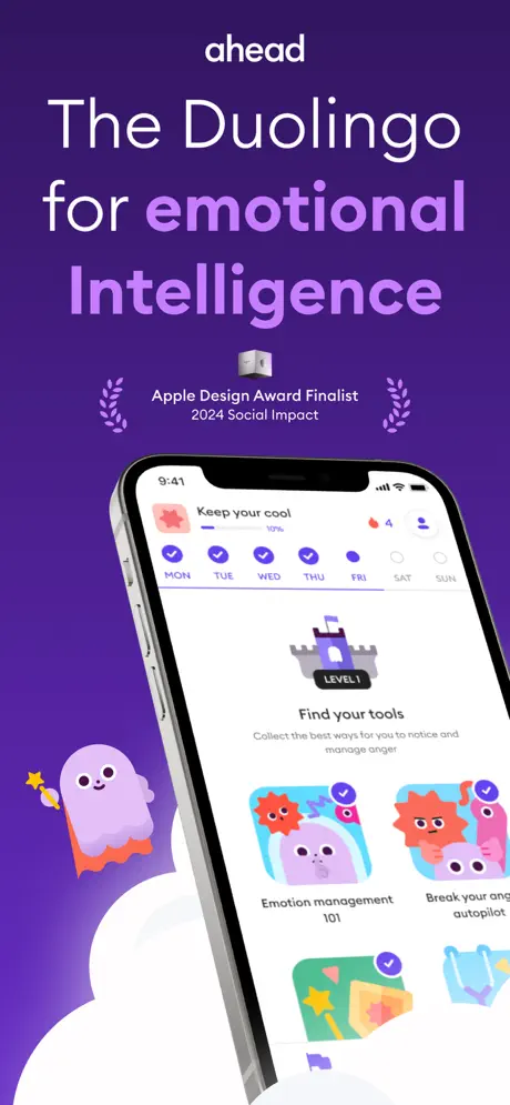
On-frame caption: “ahead / The Duolingo for emotional Intelligence / Apple Design Award Finalist 2024 Social Impact

The first frame is built around a stacked typographic lockup. The wordmark 'ahead' sits alone at the top in a small, white, centered sans—roughly 24 pt with generous top margin (~70 px from edge). Below it, the headline occupies the upper third: 'The Duolingo for' in white, then 'emotional Intelligence' in lavender (#E1BEE7), sized at approximately 64 pt. The line break falls between 'emotional' and 'Intelligence,' giving the latter word visual weight. Beneath the headline, a centered social-proof cluster contains a small silver 3D cube icon, the text 'Apple Design Award Finalist' and '2024 Social Impact' in two lines, flanked by stylized laurel wreaths in a lighter purple stroke. The device—an iPhone in Graphite, angled roughly 12 degrees on the Y-axis—enters from the lower right. Its screen shows the 'Keep your cool' journey at 10% progress, a Monday-through-Friday streak bar with purple checkmarks, and a 'Find your tools' section beneath a Level 1 castle badge. The physical volume buttons are visible on the phone's left rail. A purple blob mascot with an orange scalloped bottom and a yellow star wand floats at lower left, partially obscured by the phone and by soft white cloud shapes that bleed off the bottom edge. The status bar reads 9:41 with standard signal and battery glyphs. The overall density is high, yet the hierarchy holds because the headline is large enough to compete with the device.
Ahead App Store screenshot 2 — Distribution Proof + Journey Selection
02

Distribution Proof + Journey Selection

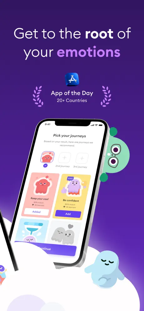
On-frame caption: “Get to the root of your emotions / App of the Day / 20+ Countries

Frame 2 mirrors the headline architecture of Frame 1 but swaps the award badge for an App of the Day lockup. The headline reads 'Get to the root of your emotions,' with the word 'emotions' tinted lavender. Centered below is the App Store cube in its blue gradient (#007AFF shifting to #5AC8FA), followed by 'App of the Day' and '20+ Countries,' again flanked by laurel wreaths. The device maintains the same angled perspective as Frame 1, creating spatial continuity, though an unexplained sliver of a second phone bezel intrudes from the left edge—roughly 20 px of black rim and screen glare that suggests this composition was originally a wider multi-device scene. The app screen shows 'Pick your journeys' with the subhead 'Based on your result, here are journeys we recommend,'. A pink 'Keep your cool' card is marked 'Added,' while a yellow 'Be confident' card carries a purple 'Add' button. At bottom, a purple 'Continue' button sits above the safe area. A green one-eyed monster mascot peeks from behind the phone's right edge, and a blue sleeping blob rests on a white cloud at bottom right. The background gradient is consistent with Frame 1, though slightly warmer toward the lower right.

Ahead App Store screenshot 3 — Category Browse, No Chrome
03

Category Browse, No Chrome

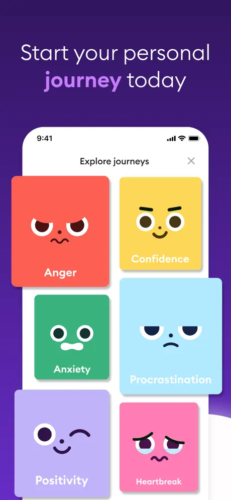
On-frame caption: “Start your personal journey today

The third frame abruptly removes the device frame entirely. The headline 'Start your personal journey today' keeps the pattern—'journey' in lavender—set high on the violet field. Below it, the app UI is presented as a full-bleed floating sheet with rounded top corners (~28 pt radius). The UI header reads 'Explore journeys' with an 'X' dismiss button at the upper right. The content is a near-masonry grid of large emotional-state cards: 'Anger' on a red-orange ground (#FF5252), 'Confidence' on yellow (#FFD740), 'Anxiety' on green (#4CAF50), 'Procrastination' on light blue (#81D4FA), 'Positivity' on lavender (#B39DDB), and 'Heartbreak' on pink (#F48FB1). Each card carries a white, line-art facial expression and a white label in bold sans-serif. The cards bleed slightly off the left and right edges of the UI sheet, revealing the purple background behind them, which creates an odd spatial contradiction: the UI appears modal but isn't contained by any physical device. The top of the UI sheet sits very close to the headline, leaving minimal safe area.

Ahead App Store screenshot 4 — Benefit Promise, Pure Illustration
04

Benefit Promise, Pure Illustration

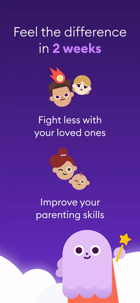
On-frame caption: “Feel the difference in 2 weeks

Frame 4 is the only screenshot that contains no interface at all. It is a pure brand illustration set against the same deep violet gradient. The headline 'Feel the difference in 2 weeks' places '2 weeks' in lavender. Two benefit rows are stacked in the middle third. The top row shows a male avatar with a flame icon erupting from his forehead beside a sad female avatar; the text below reads 'Fight less with your loved ones.' The second row shows a female avatar with a bun beside a baby avatar; the text reads 'Improve your parenting skills.' Both text blocks are white, centered, and set at roughly 28 pt. The lower third is dominated by the large purple blob mascot, wand in hand, rising from a bank of white clouds. The vertical spacing between the two benefit blocks is generous—roughly 120 px—which leaves a noticeable purple void. Without a device, screenshot-text inset, or UI chrome, the frame reads as a morale slide rather than a product shot. Its role in the sequence is emotional reassurance between the browse frame and the technique frames.

Ahead App Store screenshot 5 — Session Structure + Leveling
05

Session Structure + Leveling

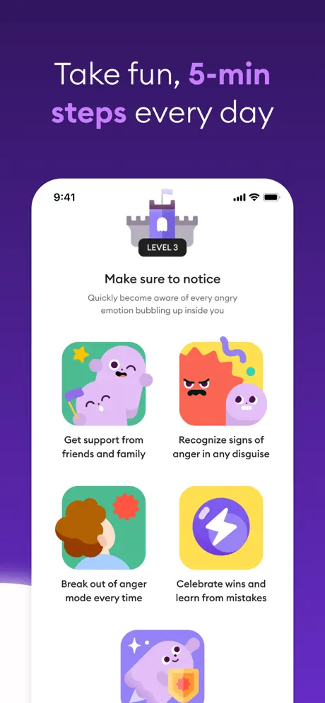
On-frame caption: “Take fun, 5-min steps every day

Frame 5 introduces a new device grammar: a flat, straight-on iPhone cropped at the bottom so roughly the bottom 15 percent of the bezel is missing. The headline 'Take fun, 5-min steps every day' highlights both '5-min' and 'steps' in lavender. Inside the phone, the status bar still reads 9:41. The app screen centers on a 'LEVEL 3' castle badge with a small flag, above the heading 'Make sure to notice' and the subhead 'Quickly become aware of every angry emotion bubbling up inside you.' Below this is a 2x2 grid of technique cards with ~16 pt corner radii: 'Get support from friends and family' (green card, purple ghosts hugging), 'Recognize signs of anger in any disguise' (yellow card, red anger monster), 'Break out of anger mode every time' (green card, person viewed from behind with red anger burst), and 'Celebrate wins and learn from mistakes' (yellow card, purple lightning bolt in a circle). A fifth card is partially visible at the very bottom edge, showing only the top half of the purple ghost holding an orange shield. Because the phone itself is cropped, the partial card feels less like intentional teaser content and more like a composition oversight.

Ahead App Store screenshot 6 — Technique Density, Masonry Cards
06

Technique Density, Masonry Cards

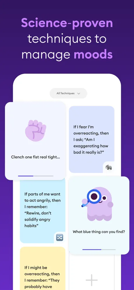
On-frame caption: “Science-proven techniques to manage moods

The sixth frame continues the flat, cropped-device treatment. The headline reads 'Science-proven techniques to manage moods,' with 'moods' in lavender. The phone shows a masonry-style grid under a dropdown pill labeled 'All Techniques' with a down chevron. The cards vary in background color and height. Top left: a white card with a lavender fist icon and the text 'Clench one fist real tight...' plus a short purple progress bar. Top right: a pale periwinkle card (#E8EAF6) containing the text 'If I fear I'm overreacting, then I ask; 'Am I exaggerating how bad it really is?'' with a tiny elephant icon at the lower right. Middle left: a light-blue card reading 'If parts of me want to act angrily, then I remember: 'Rewire, don't solidify angry habits'' with a chain-link icon. Middle right: a white card with the purple blob holding a magnifying glass and the prompt 'What blue thing can you find?' plus a progress bar. Bottom left: a yellow card that begins 'If I might be overreacting, then I remember: 'They probably have'—and is severed by the bottom crop of the phone. The truncation is awkward because it cuts mid-sentence, creating an unintentional cliffhanger that communicates poor cropping rather than abundant content.

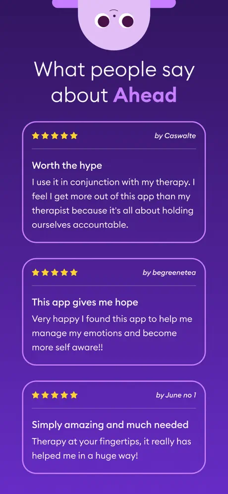
Ahead App Store screenshot 7 — Testimonial Stack
07

Testimonial Stack

On-frame caption: “What people say about Ahead

Frame 7 returns to a no-device composition. The headline 'What people say about Ahead' tints 'Ahead' in lavender. At the very top edge, the bottom half of the purple blob mascot's face is visible—two large eyes and a small smile—cropped hard by the top boundary of the canvas. Below it, three testimonial cards are stacked vertically, each roughly 85 percent of the canvas width and centered. The cards appear to have a subtle lavender outline (#BA68C8) or very slightly lighter fill than the background. Each card carries five yellow stars (#FFD700) at the upper left and a 'by [username]' attribution at the upper right in a lighter weight. Card one, by Caswalte, is titled 'Worth the hype' and reads: 'I use it in conjunction with my therapy. I feel I get more out of this app than my therapist because it's all about holding ourselves accountable.' Card two, by begreenetea, is titled 'This app gives me hope' and reads: 'Very happy I found this app to help me manage my emotions and become more self aware!!' Card three, by June no 1, is titled 'Simply amazing and much needed' and reads: 'Therapy at your fingertips, it really has helped me in a huge way!' The card spacing is even (~24 px between cards), and the typography is white, left-aligned, and highly legible.

Ahead App Store screenshot 8 — Profile Dashboard + Progress Loop
08

Profile Dashboard + Progress Loop

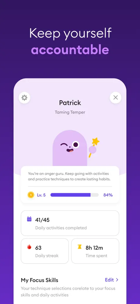
On-frame caption: “Keep yourself accountable

The final frame shows a flat, fully visible iPhone with a light lavender in-app background (#F3E5F5). The headline 'Keep yourself accountable' highlights 'accountable' in lavender. The app screen is a user profile for 'Patrick' under the journey 'Taming Temper.' A settings gear icon sits at the upper left and an 'X' close at the upper right. The avatar is a large purple blob winking and holding the star wand. Below it, a centered encouragement message reads: 'You're an anger guru. Keep going with activities and practice techniques to create lasting habits.' A level indicator shows a yellow sun badge labeled 'Lv. 5,' a track bar filled to 84 percent in purple (#7E57C2), and the numeral '84%' to the right. Stats cards follow: '41/45 Daily activities completed' (full width, calendar icon), '63 Daily streak' (half width, fire icon), and '8h 12m Time spent' (half width, yellow icon). A section header 'My Focus Skills' sits above a caption that reads: 'Your technique selections corelate to your focus skills and daily activities.' The word 'corelate' appears as a typo. An 'Edit >' link in purple sits at the right of the section header. The frame functionally closes the loop by showing retention mechanics—streaks, levels, and time invested.

05The craft

Captions, colour and the mechanics of the sell

Caption pattern

Every headline follows a rigid, repeatable pattern: white sans-serif text in two to four lines, with one strategically chosen word (or phrase) rendered in a lighter lavender (#CE93D8 to #E1BEE7). In Frame 1 it is 'emotional Intelligence'; Frame 2, 'emotions'; Frame 3, 'journey'; Frame 4, '2 weeks'; Frame 5, '5-min' and 'steps'; Frame 6, 'moods'; Frame 8, 'accountable'. Frame 7 breaks the pattern by tinting 'Ahead' in lavender. This rhythm creates a blink effect while swiping—the purple word acts as a visual metronome.

Visual system

The visual system rests on three pillars: the violet gradient field, the white in-app baseline, and the mascot illustration language. The gradient is not flat; it carries a subtle radial glow that pools slightly brighter toward the center-right, keeping the backdrop from feeling like a solid color block. In-app, the UI favors white sheets, rounded cards (~16–24 pt corner radii), and friendly blob characters in saturated accent colors (red, yellow, green, blue). The mascots themselves are soft, amorphous ghosts with minimal facial features—two dots and a line—keeping them emotionally legible at any size. When the set stays inside this system, it feels cohesive. When it breaks the system (sudden flat crops, missing device frames, awkward mascot decapitations), the spell weakens.

The thumbnail test

Frame 1 passes the thumbnail test well. At small scale, the high-contrast white type on deep purple remains legible, the lavender 'emotional Intelligence' keyword catches light, and the Apple Design Award cube acts as a trust pixel even when the text is illegible. The angled device creates diagonal motion, which helps the static thumbnail resist visual flatness. However,Frames 3, 4, and 7 have no device frame at all, meaning if the App Store algorithm ever surfaces an interior frame as a preview, the viewer loses the immediate context of a phone app. The set is therefore fragile outside its ordered sequence.

Conversion mechanics

The sequence is front-loaded for conversion. Frames 1 and 2 handle objection-killing (awards, editorial placement) before the user ever sees a feature. Frames 3 through 6 handle feature education. Frame 7 handles social proof at the exact moment a skeptic might think 'this looks too simplistic.' Frame 8 closes with an accountability dashboard, implying retention before install. The pacing is smart, though the no-device frames (3, 4, 7) create a subtle trust gap—shoppers are trained to see screens inside phones. When the device disappears, the viewer must mentally re-orient. The set also relies heavily on North American English copy; there is no localization evidence in the screenshots.

06Where it slips

What we would change

Inconsistent Device Grammar Breaks Continuity

The set oscillates between three distinct spatial modes: angled 3D devices with mascots (Frames 1–2), flat cropped devices (Frames 5, 6, 8), and zero-device illustrations or UI (Frames 3, 4, 7). In a swipeable carousel viewed at speed, this reads as three different design systems stapled together. The angled phones imply a playful, physical product world; the flat crops feel like production screenshots; the no-device frames feel like marketing posters. The fix is to commit to one grammar. If the angled perspective is the brand's signature, every frame should contain an angled device, even if the UI inside is static. If full-bleed UI is preferred, drop the angled phones entirely and keep the device chrome consistent throughout.

Frame 6 Truncates Copy Mid-Sentence

In Frame 6, the yellow technique card at bottom left is cropped so tightly that the visible text ends on 'They probably have.' This is not a usable teaser; it looks like a layout error. A shopper pausing on this frame cannot know what the technique advises. The fix is simple: adjust the internal scroll offset of the app UI so the card is either fully visible or entirely hidden. Never crop instructional copy mid-clause.

Frame 8 Displays a Typo

The profile screen in Frame 8 contains the sentence 'Your technique selections corelate to your focus skills and daily activities.' The misspelling of 'correlate' is visible at full resolution. For a product in the Health & Fitness category that leans on scientific credibility, a spelling error in a screenshot is disproportionately damaging. The fix is to correct the in-app copy and re-render the screenshot.

Lavender-on-Violet Contrast Is Marginal

The headline accent words in lavender (#CE93D8) against the deep purple field (#6A1B9A) are decorative but sit near the edge of legibility on dim displays. In Frame 2, the word 'emotions' is particularly thin against the gradient. The fix is to push the accent tint lighter—to at least #E1BEE7—or to add a subtle semitransparent dark scrim behind the headline block to guarantee minimum contrast ratios without killing the brand color.

Frame 4's Vertical Rhythm Is Too Loose

Frame 4 sandwiches two benefit lines between a headline and a giant mascot. The result is a vast expanse of underutilized purple space between 'Fight less with your loved ones' and 'Improve your parenting skills.' The composition loses energy in the middle of the frame. The fix is to tighten the vertical stack—bring the two benefit blocks closer together—or introduce a third benefit so the eye has stepping stones across the full height.

07The recipe

How to apply this to your own app

  1. Pick one device grammar and enforce it for the entire sequence. Angled, flat, or full-bleed—mixing them forces the viewer to re-orient on every swipe.Think of the carousel as a single motion picture, not a slide deck of different formats.

    Ahead’s strongest visual asset is its mascot world. The angled phones in Frames 1 and 2 establish a playful, dimensional stage. When the set suddenly drops to flat crops and no-device illustrations, that stage collapses. If you are building a screenshot set, decide whether your product lives inside a physical device at all times. If the answer is yes, render every frame with the same bezel, angle, and lighting. If the answer is no, commit to full-bleed UI and use consistent corner radii and shadows to create a virtual frame.

  2. Never let a screenshot ship with partial instructional text or typos.Copy that is visible inside the device mockup is part of the creative asset, not the live product.Proofread it with the same rigor as the store description.

    Ahead’s Frame 6 cuts a technique card mid-sentence, and Frame 8 shows 'corelate.' Both errors are baked into static images that require a full app update or at least a re-export to fix. When preparing screenshots, treat the in-app text as final copy. Scroll lists to positions that show complete thoughts, and run a spellcheck on every visible word before uploading to App Store Connect. A typo in a screenshot feels more permanent than a typo on a website.

  3. Use keyword highlighting as a rhythmic device, but ensure the accent color passes contrast checks.A colored keyword only works if it is still legible at thumbnail size and low brightness.

    Ahead’s lavender headline accents are a clever way to create visual rhythm across eight frames. However, the chosen tint is only a few shades lighter than the background violet. A designer building a similar system should test the accent hex at 2x reduction and 50% screen brightness. If the keyword vanishes, lighten the tint or add a subtle text-shadow/darken layer behind the headline block. Readability beats brand exactness in screenshot typography.

  4. Place your highest-leverage social proof in Frame 1 or 2, not in the middle.Shoppers bounce fast; credibility badges that appear late in the sequence often reach no one.

    Ahead correctly front-loads its Apple Design Award and App of the Day badges. If your app has editorial recognition, awards, or a notable user count, lead with it. The store carousel is not a mystery novel; it is an elevator pitch. Reveal your trust signals before you reveal your feature grid. A good rule of thumb is that the first two frames should answer 'Why should I trust you?' and the next three should answer 'What do I actually do?'

  5. If you shift from UI to illustration-only frames, maintain the same visual weight so the sequence does not deflate.

    Ahead’s Frame 4 is a brand promise frame with large illustrations and minimal text. That is a valid storytelling beat, but its composition is top-heavy and its center is diffuse. When you insert a non-UI frame, ensure the layout still carries enough density—through text, character scale, or graphic elements—to match the frames beside it. Otherwise the swipe rhythm stalls, and the shopper may assume the product shots have ended.

08Takeaways

Five things worth stealing

  • A consistent background gradient can unify an otherwise inconsistent set of framing choices.
  • Social proof belongs in the first two frames; do not bury credentials where impatient scrollers miss them.
  • Headline keyword highlighting in a contrasting tint is an effective rhythmic device across a multi-frame sequence.
  • Mascots humanize utility screenshots, but they need predictable placement rules—peeking, floating, or inhabiting devices—not random cropping.
  • Cropped UI must never sever instructional text mid-sentence; adjust internal scroll position before exporting.
  • A single typo visible inside a device mockup undermines category credibility, particularly in health apps.
09The verdict

What the set actually achieves

The sequence reads as a rapid crescendo from concept to content. Frame 1 secures the metaphor and the Apple Design Award badge. Frame 2 adds App of the Day distribution proof. Frame 3 reveals the emotional taxonomy (Anger, Anxiety, Confidence, etc.) without device chrome. Frames 4 through 6 layer on session length, technique depth, and content variety. Frame 7 switches to social proof via reviews, and Frame 8 anchors the loop with a profile dashboard. The set efficiently covers the funnel—awareness, consideration, trust, retention—in eight swipes. Whether the visual grammar supports that flow without jolting the viewer is another question.

This set is best suited for consumer wellness apps that need to feel friendly rather than clinical. The approach works if your product has strong illustration, a daily-usage loop, and enough content density (articles, lessons, techniques) to fill masonry grids. It is less appropriate for minimalist or utilitarian tools where the absence of device chrome would confuse the shopper about platform. If you are a designer building for behavioral health, education, or habit formation, Ahead’s mixture of credential stacking and mascot warmth is a useful template—provided you tighten the framing consistency.

10Questions

Frequently asked

Why does the set alternate between angled and flat devices?

There is no functional reason visible in the images. The angled devices in Frames 1–2 create a brand-world feel with mascots, while the flat crops in Frames 5, 6, and 8 appear to be direct production screenshots dropped into the same purple background. The result is visual whiplash. A stricter art-direction pass would have unified the angle or eliminated the device entirely in favor of full-bleed UI.

What is the hex of the headline accent color?

Approximate sampling places the lavender accent between #CE93D8 and #E1BEE7 depending on the frame and gradient overlay. It is a light violet tint that sits roughly 30–40 percent lightness above the deep purple background.

How does Frame 3 avoid a device frame?

Frame 3 presents the 'Explore journeys' UI as a full-bleed floating sheet with rounded top corners. The purple background bleeds through at the left and right edges because the UI container does not span the full width of the canvas. This treatment emphasizes the colorful emotion cards but removes the physical context of a phone, which can weaken the immediate 'this is an app' signal.

Is there a mistake in Frame 8?

Yes. The profile screen visible inside the device contains the sentence 'Your technique selections corelate to your focus skills and daily activities.' The word 'corelate' is misspelled; the correct spelling is 'correlate.' Because this is baked into a static screenshot, the error requires a corrected export.

11Keep reading

Build your own screenshot set

Guides

The full set

10 shots
Ahead App Store screenshot 1Ahead App Store screenshot 2Ahead App Store screenshot 3Ahead App Store screenshot 4Ahead App Store screenshot 5Ahead App Store screenshot 6Ahead App Store screenshot 7Ahead App Store screenshot 8Ahead App Store screenshot 9Ahead App Store screenshot 10

About the app

Ahead - the app that teaches us what school didn’t: How to be in charge of our emotions! Developed by learning behavior-change scientists Do you sometimes regret having been so ahead Solutions GmbH, via the App Store listing.

Screenshots and store metadata belong to ahead Solutions GmbH. They are shown here for design commentary and criticism. The analysis on this page is original work by floow.design. View the original listing.

More Health & Fitness teardowns

Browse all →