
Caffeine Tracker app icon
Health & FitnessScreenshot teardown12 min read

Caffeine Tracker App Store screenshots

Caffeine Tracker — App Store Screenshot Case Study

Set published by Anthony Harvey · 10 frames analysed

5.0 · 5 ratingsFreev1.3Updated 11mo ago
Caffeine Tracker App Store screenshot 1
01At a glance

The set in one screen

Framing
Editorial poster layout—device anchored in the lower two-thirds, headline in the top third, mascots in corners.
Captions
Uniform heavy rounded sans-serif in pure white (#FFFFFF), same weight across all eight frames.
Backdrop
Continuous soft-focus gradient dominated by violet (#7C3AED to #9333EA), punctuated by cyan (#3B82F4) and red (#EF4444) halos.
Type
Geometric rounded sans, ultra-bold, large point size, no tracking modulation regardless of line length.
UI / copy split
UI occupies roughly 55–65% of canvas height; captions occupy 15–20%; mascots and negative space fill the remainder.
Frame 1 job
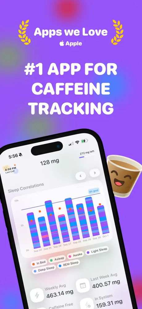
Leads with Apple social proof (“Apps we Love”) and a quantified category claim to establish immediate store credibility.

Sampled palette

#7C3AED#7C3AED
#9333EA#9333EA
#3B82F4#3B82F4
#EF4444#EF4444
#FACC15#FACC15
#FFFFFF#FFFFFF
02The challenge

What this screenshot set had to solve

Health & Fitness shoppers expect clinical authority—white space, sparse grids, and medical-grade restraint—yet Caffeine Tracker is a consumer logger that also surfaces sleep science, AI parsing, iOS Visual Look Up, and Home Screen widgets. The challenge is squeezing that breadth into eight 9:19.5 frames without turning every screenshot into an unreadable dashboard. The designer has to signal trust (this app knows its milligrams), platform fluency (Apple Intelligence, widgets, Live Text), and approachability (people log lattes, not lab results) all at once. Furthermore, the set must function as a rapid-swipe sequence where each thumbnail earns a tap, while remaining recognizable enough that a user scrolling past sees a single cohesive billboard rather than eight disconnected screen grabs. Balancing feature density against legibility at thumbnail scale is the core tension here.

Consistency is not the same as uniformity. Lock the palette, but let the cropping and headline scale breathe so every feature gets its own visual signature.
03The approach

How the set argues its case

rather than using 8 isolated screens, the set functions as 8 parts of a single editorial spread. each frame locks the same gradient bg and rotates light/dark UIs to create rhythm. 3d device renderings are cropped tighter on data-heavy screens and straight-on for broad feature explanations, while flat vector mascots occupy safe-corner zones to prevent them from fighting the UI for attention.

Positioned as a mass-market health companion rather than a clinical tool—social proof is front-loaded, sleep science is conversational, and AI features are framed with casual language like “Log using AI.” rather than technical jargon.

04Frame by frame

Every screenshot, and the job it does

Caffeine Tracker App Store screenshot 1 — Social proof and the dashboard promise
01

Social proof and the dashboard promise

On-frame caption: ““Apps we Love” / “ Apple” / “#1 APP FOR CAFFEINE TRACKING”

The set opens with authority. Gold laurel wreaths in #FACC15 flank the words “Apps we Love,” with the Apple logo and wordmark set beneath in white. The headline “#1 APP FOR CAFFEINE TRACKING” is stacked in four lines of massive bold sans-serif, consuming roughly the top 20% of the canvas. The device is rotated approximately 12° counter-clockwise and anchored low, so the Dynamic Island, status bar (5:56, muted bell), and screen content all remain legible. Inside the app, the interface is in light mode, centering on “128 mg” in a large dark weight. Below that, a “Sleep Correlations” module shows a stacked horizontal bar chart spanning September 24 to October 1, segmented by six legend colors: In Bed (#F97316), Asleep (#22C55E), Awake (#EC4899), Light Sleep (#A855F7), Deep Sleep (#2563EB), and REM Sleep (#06B6D4), with orange correlation dots plotted above the bars. At the bottom of the screen, four stat pills read “Weekly Avg 463.14 mg,” “Last Week Avg 400.57 mg,” and “In System 159.31 mg.” A winking coffee-cup mascot floats just to the right of the bezel, clear of the data. The rotation imparts kinetic energy, though it also tilts the horizontal chart so the bars appear to slide slightly downhill.
Caffeine Tracker App Store screenshot 2 — AI logging
02

AI logging

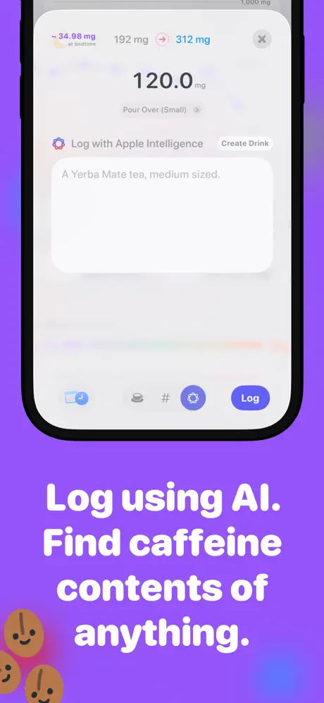
On-frame caption: ““Log using AI. Find caffeine contents of anything.”

In this frame, the caption is pushed entirely below the device, which is now perfectly vertical and cropped tightly to the left and right edges. The top third of the canvas is almost empty, leaving a wide field of saturated violet (#9333EA). Inside the phone, the UI presents an AI logging sheet. A top row reads “~34.98 mg at bedtime” in muted violet, “192 mg” in dark gray, and “312 mg” in cyan (#06B6D4) beside a sparkle icon. The central figure is “120.0 mg” set over “Pour Over (Small)” with a right chevron. Below, a segmented action bar shows “Log with Apple Intelligence” beside a gray “Create Drink” pill. A large rounded input field contains the text: “A Yerba Mate tea, medium sized.” The bottom toolbar uses four inline icons (calendar, cup, hashtag, settings) and a blue “Log” button at roughly #2563EB. In the bottom-left corner, three small coffee-bean mascots huddle together. Because the headline sits below the device, the composition feels top-heavy; the eye hits the purple void before it reaches the copy.

Caffeine Tracker App Store screenshot 3 — Sleep forecasting
03

Sleep forecasting

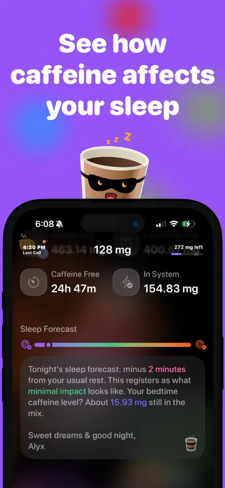
On-frame caption: ““See how caffeine affects your sleep”

Dark mode enters the sequence. The device sits centrally beneath the headline, and a coffee-cup mascot wearing a sleep mask with floating “Zzz” occupies the narrow gap between the text and the notch. The status bar reads 6:08. The interface background is near-black, approximately #0F172A. Visible screen content includes a top row with a “4:30 PM Last Call” micro-card on the left, center “128 mg,” and right “272 mg left” with a short progress bar. Two summary pills sit below: “Caffeine Free 24h 47m” and “In System 154.83 mg.” The dominant module is “Sleep Forecast,” a horizontal spectrum bar shifting from purple through orange to red, bookended by sleep icons. Beneath it, a paragraph reads: “Tonight's sleep forecast: minus 2 minutes from your usual rest. This registers as what minimal impact looks like. Your bedtime caffeine level? About 15.93 mg still in the mix.” It closes with “Sweet dreams & good night, Alyx,” signed with a tiny coffee-cup avatar. The contrast between white text and the dark card (#1E293B) is comfortable, though the paragraph length is risky at thumbnail scale.

Caffeine Tracker App Store screenshot 4 — Visual Look Up
04

Visual Look Up

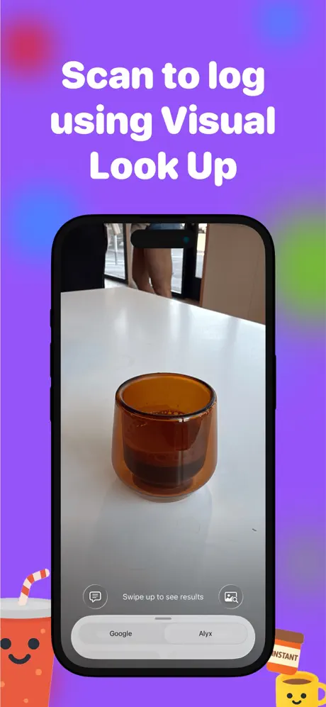
On-frame caption: ““Scan to log using Visual Look Up”

This frame switches to a camera-centric presentation. The device is upright and slightly smaller relative to the canvas, revealing more of the purple gradient around it. The screen shows a live camera feed of an amber glass on a white table, with a blurred figure visible in the background. iOS-style chrome overlays the bottom: “Swipe up to see results” is centered between a chat bubble icon and a viewfinder icon, above a pill-shaped switcher reading “Google” and “Alyx.” The headline occupies the upper third in the same heavy white sans. Decorative mascots—a cartoon fountain cup with a straw in the bottom left, plus an “INSTANT” jar and yellow mug in the bottom right—anchor the corners. Because the camera feed is photographic and the rest of the set is vector-flat, this frame introduces a deliberate material break that signals “real world” functionality. The “Alyx” tab in the switcher is small enough that it may register only as a gray smudge in thumbnail view.

Caffeine Tracker App Store screenshot 5 — Last Call
05

Last Call

On-frame caption: ““Know exactly when to have your last sip”

This is the most aggressive crop in the sequence. Only the upper-left quadrant of the device is visible, sliced just below the status-bar clock (6:21) and muted bell icon. The visible screen shows a glassmorphic card with a coffee-cup icon, an orange notification dot, the words “4:30 PM Last Call,” and the faint gray header “Weekly Intake” underneath. Nothing else inside the app is legible. Above the device, an orange alarm-clock mascot and an orange notification-bell character compete for space at the bezel line, while a layered burger-like mascot is partially visible at the bottom left. The cropping is meant to isolate the feature, but it sacrifices too much context. Without the full device outline and rounded corners reading clearly as an iPhone, the card could be mistaken for a system notification rather than in-app UI.

Caffeine Tracker App Store screenshot 6 — Fast logging
06

Fast logging

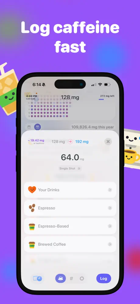
On-frame caption: ““Log caffeine fast”

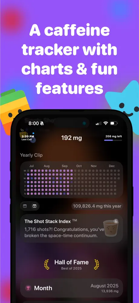
The device returns to full-frame, light mode, showing a bottom-sheet logger. Behind the sheet, the home screen displays a calendar heatmap in purple dots and the cumulative figure “109,826.4 mg this year.” The sheet itself lists “~19.42 mg at bedtime” in violet, then “128 mg” and “192 mg” in a header row. Dominating the sheet center is “64.0 mg” with “Single Shot >” beneath it. The list continues with four tappable rows separated by hairline dividers: “Your Drinks” (orange heart), “Espresso” (beans), “Espresso-Based” (cup), and “Brewed Coffee” (cup), each with a right chevron. The bottom app nav mirrors Frame 2: calendar, active coffee tab (filled blue circle at ~#2563EB), hashtag, settings, and the blue “Log” pill. A juice-box mascot leans in from the left, and two smiling mugs peer from the right. This frame is the clearest expression of the app’s information architecture, though the sheet’s top edge blends into the calendar behind it because both share a light gray value.

Caffeine Tracker App Store screenshot 7 — Health impact
07

Health impact

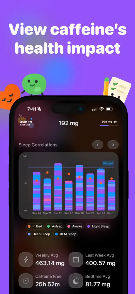
On-frame caption: ““View caffeine's health impact”

A direct dark-mode companion to Frame 1. The status bar reads 7:41. The headline is anchored in the upper third, accompanied by three small mascots: a sleeping orange heart, a green circle character, and a clipboard with pencil. The device presents the same “Sleep Correlations” chart seen in Frame 1, but rendered against a near-black background (#0F172A) with slightly more saturated bars. The legend order is identical: In Bed, Asleep, Awake, Light Sleep, Deep Sleep, REM Sleep. Below the chart, a 2×2 stat grid now reads “Weekly Avg 463.14 mg,” “Last Week Avg 400.57 mg,” “Caffeine Free 25h 52m,” and “Bedtime Avg 81.77 mg,” each with a glyph icon. This frame proves dark-mode support and reinforces the health narrative through repetition. Because the chart architecture is already familiar from Frame 1, the shopper’s cognitive load is lower, allowing the four stats to read as new information rather than noise.

Caffeine Tracker App Store screenshot 8 — Widgets
08

Widgets

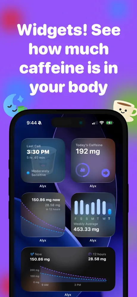
On-frame caption: ““Widgets! See how much caffeine is in your body”

The only frame that abandons in-app chrome entirely for the iOS Home Screen. The wallpaper is a dark, abstract purple swirl. Five widgets are arranged across three rows: a medium “Last Call” widget at top left showing “3:30 PM,” “5 hr, 45 min,” and “Moderately Sensitive” with a blue dot, labeled “Alyx”; a small “Today's Caffeine 192 mg” widget at top right; a medium decay-curve widget at mid-left reading “150.86 mg now / 28.58 mg in 12 hours”; a small weekly bar chart at mid-right showing “Weekly Average 453.33 mg” over days F S S M T W T; and a large bottom widget repeating the decay curve with axis labels (0, 100, 200 mg; 9 AM, 3 PM). A blue moon mascot rests top left, and a coffee-cup mascot floats top right. The frame functions as a feature inventory, but because all five widgets are rendered at equal brightness and with similar translucency, there is no focal path—the eye bounces from the medium top-left to the large bottom without a clear hierarchy.

05The craft

Captions, colour and the mechanics of the sell

Caption pattern

Every caption is an imperative sentence or a direct promise: “Log using AI,” “See how caffeine affects your sleep,” “Know exactly when to have your last sip.” There are no feature lists; the user is addressed in the second person, positioning the app as an action rather than a product.

Visual system

Mascots include winking coffee cups, sleeping hearts, alarm clocks, and anthropomorphic beans. They are flat, strokeless, and brightly colored, serving as category signifiers rather than characters with narrative arcs. The background gradient is the true unifying system—it never changes hue or intensity, making the set feel like one continuous pan.

The thumbnail test

At small scale, the frames collapse into a bright violet strip with white blobs of text. Only the lead frame’s gold laurels and the last frame’s widget array break the silhouette enough to suggest different content. The dark-mode frames recede slightly, which helps Frame 3 and Frame 7 read as visual punctuation marks during a fast swipe.

Conversion mechanics

The lead frame front-loads Apple editorial social proof, which is a high-conversion move in a crowded category. The closing frame surfaces system-level value (widgets) that extends utility beyond the app icon. Mid-sequence frames assume the viewer is already intrigued; they do not repeat the social proof, which risks losing shoppers who swipe only to Frame 3 before bouncing.

06Where it slips

What we would change

Headline typography never modulates

Every caption uses the same ultra-bold weight and roughly the same point size, whether the text is two words (“Log caffeine fast”) or seven (“Know exactly when to have your last sip”). In Frame 5, the long headline crowds the device bezel; in Frame 8, the exclamation point in “Widgets!” gets visually buried because the letterforms are uniformly dense. The fix: introduce optical sizing. Drop the point size by 8–12% and increase tracking for captions longer than five words, preserving even typographic color and preventing horizontal congestion.

Device rotation is inconsistent

Only Frame 1 uses a pronounced rotation (~12°); every other frame is straight-on or heavily cropped. The result is that Frame 1 feels like it belongs to a different template, and its drop-shadow angle does not match the static gravity of the other seven. The fix: either rotate every device by a consistent 6–8° or keep the hero frame straight-on so the set feels mechanically unified.

Frame 5’s crop deletes too much context

By slicing through the Dynamic Island and rendering the “Weekly Intake” header as a ghosted blur, the frame sacrifices readable context. At thumbnail scale, shoppers may not recognize the object as an iPhone screen. The fix: pull the crop back to expose the full device width and status bar, or add a subtle blurred backplate of the phone outline behind the card so bezel context remains legible.

Mascot scale is arbitrary

In Frame 2, the coffee-bean cluster is tiny and tucked; in Frame 5, the alarm clock overlaps the device corner. The spatial relationship between mascot and phone is inconsistent. The fix: establish a grid rule—mascots anchor exclusively in the bottom corners, never crossing the top edge of the device, and never exceeding 0.15× canvas height.

Frame 8 suffers from flat hierarchy

Five widgets compete for attention with no callout stroke, number, or desaturation to guide the eye. The fix: either dim secondary widgets to roughly 60% opacity or add a subtle 2pt stroke / soft shadow behind the primary “Last Call” medium widget to establish a clear reading order.

07The recipe

How to apply this to your own app

  1. Lock one background system

    If you want cohesion across eight frames, pick a single gradient or texture and repeat it. Caffeine Tracker proves that a bold violet field can make a math-heavy utility feel approachable.

  2. Alternate light and dark mode deliberately

    Use light frames for data input and dark frames for passive monitoring (sleep, forecasts). The contrast creates rhythm and suggests the app respects system appearance without saying so.

  3. Let captions drive the swipe, not the UI

    Each headline is a complete value proposition. The shopper does not need to parse bar charts to understand the offer. When you design your own set, write the captions first, then pick the UI state that proves each sentence.

  4. Crop with context, not just drama

    Frame 5 shows that extreme cropping can abstract the device into unrecognizability. If you zoom in, keep either the status bar or the rounded bezel visible so the brain still registers “this is an app.”

08Takeaways

Five things worth stealing

  • A single locked gradient can unify a feature-heavy set more effectively than white backgrounds, but it requires mascot and type discipline to avoid monotony.
  • Leading with third-party social proof (Apple editorial) before showing any feature UI is a high-trust move that pays off in the Health & Fitness category.
  • Alternating light and dark interfaces is a low-effort way to create visual rhythm without changing the surrounding canvas.
  • Headline copy should vary in length, but the type treatment needs to adapt with it; uniform sizing across short and long strings flattens hierarchy.
  • When showing widgets, pick a hero widget and visually subordinate the others, or the frame becomes a wall of equal rectangles.
  • Mascots work best when they obey a strict scale and placement grid; arbitrary resizing makes them look pasted on rather than designed in.
09The verdict

What the set actually achieves

The set sacrifices typographic variation for brand consistency. It succeeds in unifying eight disparate features under one purple roof, but the rigid repetition of type weight, mascot placement, and headline position flattens the narrative arc and weakens the middle frames.

Independent developers and product designers building data-centric utilities who need to balance credibility with consumer appeal, especially in categories where shoppers expect clinical restraint but the product experience is meant to be daily and casual.

10Questions

Frequently asked

Why does the set start with an Apple endorsement rather than the app itself?

Because Health & Fitness shoppers have low patience for unproven tools. The “Apps we Love” laurels act as borrowed authority, answering “why trust you?” before the first feature is shown.

Does alternating light and dark mode help or hurt conversion?

It helps if the alternation maps to a narrative rhythm—here, light for input and dark for sleep/passive tracking. Random alternation would feel like a mistake; patterned alternation feels intentional.

Is the mascot system necessary, or could the set work without it?

Technically the set could work without mascots, but the purple field would feel empty and generic. The mascots provide category recognition at thumbnail scale. The real question is whether their scale and placement are consistent enough; in this set, they are not.

What is the weakest frame, and why?

Frame 5. The extreme crop removes the device outline, the headline is long and crowded, and the mascot overlaps the bezel. It breaks the spatial contract established in the other seven frames.

11Keep reading

Build your own screenshot set

The full set

10 shots
Caffeine Tracker App Store screenshot 1Caffeine Tracker App Store screenshot 2Caffeine Tracker App Store screenshot 3Caffeine Tracker App Store screenshot 4Caffeine Tracker App Store screenshot 5Caffeine Tracker App Store screenshot 6Caffeine Tracker App Store screenshot 7Caffeine Tracker App Store screenshot 8Caffeine Tracker App Store screenshot 9Caffeine Tracker App Store screenshot 10

About the app

Fuel your day with precision—track every sip, shot, and energy boost with Caffeine Tracker! Whether you’re a coffee connoisseur, tea fanatic, or energy-drink devotee, Caffeine Anthony Harvey, via the App Store listing.

Screenshots and store metadata belong to Anthony Harvey. They are shown here for design commentary and criticism. The analysis on this page is original work by floow.design. View the original listing.

More Health & Fitness teardowns

Browse all →