Gentler Streak app icon
Health & FitnessScreenshot teardown14 min read

Gentler Streak App Store screenshots

In the Health & Fitness category, most screenshot sets borrow from Apple’s own visual grammar: black type on white, neon activity rings, and an assumption that intensity equals trust. Gentler Streak’s eight-frame App Store sequence deliberately rejects that playbook. Instead, the set deploys a chubby orange mascot, poster-grade background gradients, and a shifting relationship between iPhone and Apple Watch hardware. What follows is a frame-by-frame structural teardown of how the team balanced emotional warmth against data density, and where the discipline of the system falters.

Set published by Gentler Stories LLC · 10 frames analysed

4.7 · 8.8K ratingsFreev5.12.1Updated 5mo ago
Gentler Streak App Store screenshot 1
01At a glance

The set in one screen

Framing
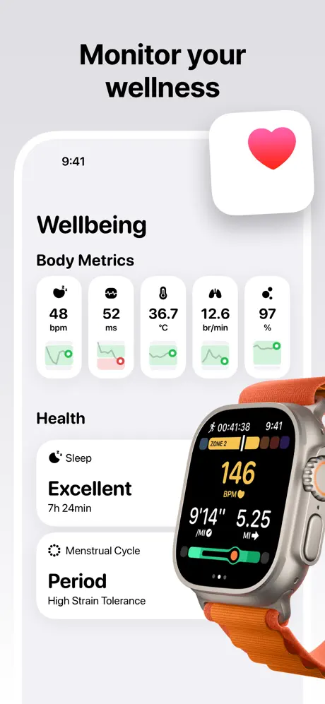
Inconsistent. Frame 1 uses a held iPhone with a Dynamic Island notch and visible antenna glyphs. Frame 2 uses a soft white rounded rectangle with no device bezel. Frame 3 tints the phone border purple. Frame 5 uses a thick white hardware frame. Frame 6 is watch-only.
Captions
Bold, centered, sentence-case headlines. No subheadlines beneath the main H1 except in Frame 4, where the headline is followed by five stacked declarative sentences.
Backdrop
Vertical gradients. Each frame owns a unique hue family: coral (#FF7A45), neutral gray (#F2F2F7), deep purple (#2E1B4E), cool gray (#E8EAED), yellow (#F4C430), light gray (#E5E5EA), mint green (#7ED957), sky blue (#8DB4E6).
Type
Headlines are set in a geometric sans at a heavy weight, roughly equivalent to 48–56 pt at @1x scale. Body copy inside the UI is smaller, likely 15–17 pt, with generous line height. Captions are never all-caps, preserving a conversational rhythm.
UI / copy split
Approximately 60% interface, 40% surrounding canvas across the set. Frame 4 inverts this, dedicating nearly 70% of the canvas to typography and mascot illustration.
Frame 1 job
Establish the emotional premise and social proof immediately, before the shopper sees a single data point.

Sampled palette

#FF7A45#FF7A45
#F2F2F7#F2F2F7
#2E1B4E#2E1B4E
#E8EAED#E8EAED
#F4C430#F4C430
#E5E5EA#E5E5EA
02The challenge

What this screenshot set had to solve

The designers needed to communicate two platform contexts—iOS and watchOS—while selling a philosophy that explicitly avoids the aggressive language of fitness gamification. In a category where users expect to see quantified outputs (rings closed, calories burned, streaks maintained), Gentler Streak had to prove it could display rich data without visually shouting. The additional constraint was privacy: the app’s architecture is on-device, a selling point that is text-heavy and abstract. Condensing that promise into a glanceable image, without losing the warmth that differentiates the brand from Apple Fitness and Strava, became the central creative tension. The team also faced the classic indie dilemma: limited frame real estate had to cover onboarding, daily tracking, sleep analysis, privacy, step counting, heart-rate monitoring, historical trends, and guided workout recommendations.

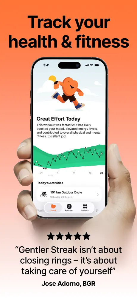
“Gentler Streak isn’t about closing rings — it’s about taking care of yourself.” — Jose Adorno, BGR
03The approach

How the set argues its case

The team adopted a “one feature, one mood” chromatic strategy. Rather than locking every frame into a single brand tint, they assigned a distinct gradient to each feature: coral for the daily summary, purple for sleep, yellow for steps, green for trends, blue for guided activities. This maximizes per-frame distinctiveness in the scroll view, though it weakens serial cohesion. To counteract the rainbow effect, the designers introduced two rigid constants: the headline typeface and the orange mascot. Every frame centers its hardware or UI roughly on the vertical axis, while the headline floats in the upper 15% of the canvas. Device framing was treated as a stylistic variable rather than a fixed system—hands appear when humanity is needed, bezel-less crops when the UI needs to breathe, and overlapping hardware when cross-platform continuity is the message. The mascot is deployed strategically: running in Frame 1, sleeping in Frame 3, guarding data in Frame 4, creating an emotional through-line that outshines the shifting background palette.

Positioned as the anti-burnout tracker. The screenshots avoid competitive sports photography, sweat, or dark-mode aggression. Even the heart-rate zone frame is rendered in a pastel gray with mint-green sliders, suggesting management rather than exertion.

04Frame by frame

Every screenshot, and the job it does

Gentler Streak App Store screenshot 1 — Track your health & fitness
01

Track your health & fitness

On-frame caption: “Track your health & fitness

A warm coral-to-peach gradient fills the canvas, shifting from roughly #FF7A45 at the top to #FFD6C7 at the bottom. Centered is an iPhone 15 Pro held by two photorealistic hands; the left thumb rests on the lower-left bezel while the right thumb intrudes over the right edge of the screen, partially obscuring the tab bar. The tab bar shows four items: “Well,” “Streak” (active, filled with an orange heart), “Activities,” and “Insights.” On the phone screen, the orange mascot runs beneath a yellow sun cutout and above a green-filled area chart tracking late August. Below the graph sits a “Today’s Activities” header and a chevron row reading “101 km Outdoor Cycle,” with the date “Saturday 23 August” in smaller gray type. Under the hands, five solid black star glyphs sit above a verbatim pull quote in quotation marks: “Gentler Streak isn’t about closing rings – it’s about taking care of yourself,” attributed to Jose Adorno, BGR. The black against orange delivers high contrast, but the thumbs physically mask the bottom 12% of the UI, including the active tab state.
Gentler Streak App Store screenshot 2 — Monitor your wellness
02

Monitor your wellness

On-frame caption: “Monitor your wellness

The background switches to cool neutral gray near #F2F2F7. The composition abandons photorealism for a collage aesthetic. A faceless iPhone rectangle with thick white rounded corners contains the “Wellbeing” screen. At top right, a white super-ellipse floats, carrying a pink-to-red gradient heart icon resembling Apple’s Health app glyph. Inside the phone, the word “Wellbeing” is set in black, followed by “Body Metrics” and five equal-width cards reading “48 bpm,” “52 ms,” “36.7 °C,” “12.6 br/min,” and “97 %,” each with a mini sparkline in green or red. Below, the “Health” section lists “Sleep” (“Excellent,” “7h 24min”) and “Menstrual Cycle” (“Period,” “High Strain Tolerance”). An Apple Watch Ultra with an orange alpine loop intrudes from the bottom right, angled roughly 15 degrees clockwise, displaying a run interface with “146 BPM” in yellow, pace at “9'14”,” and distance at “5.25 MI.” The watch bezel and orange strap introduce metallic and textile texture against the otherwise flat UI. Notably, the phone display omits a visible status-bar antenna icon, creating a softer edge than Frame 1.

Gentler Streak App Store screenshot 3 — Analyze your sleep
03

Analyze your sleep

On-frame caption: “Analyze your sleep

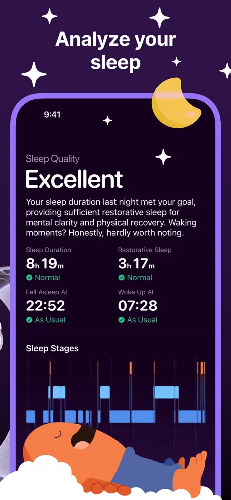
A deep, saturated purple near #2E1B4E serves as the backdrop, decorated with four white four-pointed stars and a stylized yellow crescent moon positioned above the device. The phone itself is rendered with a purple-tinted bezel or case outline, making the hardware feel submerged in the background color. The screen runs in dark mode. At top, a small “Sleep Quality” label in muted lavender precedes the word “Excellent” in massive white type. Body copy reads: “Your sleep duration last night met your goal, providing sufficient restorative sleep for mental clarity and physical recovery. Waking moments? Honestly, hardly worth noting.” Below, a four-up data grid shows “Sleep Duration 8h 19m” (“Normal”), “Fell Asleep At 22:52” (“As Usual”), “Restorative Sleep 3h 17m” (“Normal”), and “Woke Up At 07:28” (“As Usual”). A “Sleep Stages” header introduces a blue hypnogram with vertical dotted lines. At the very bottom, the orange mascot sleeps on a pillow of white clouds, wearing a navy sleep shirt with feet protruding rightward. The frame sacrifices some screen-edge definition because the purple phone border and purple background share similar luminance values.

Gentler Streak App Store screenshot 4 — Your Data Stays Yours
04

Your Data Stays Yours

On-frame caption: “Your Data Stays Yours

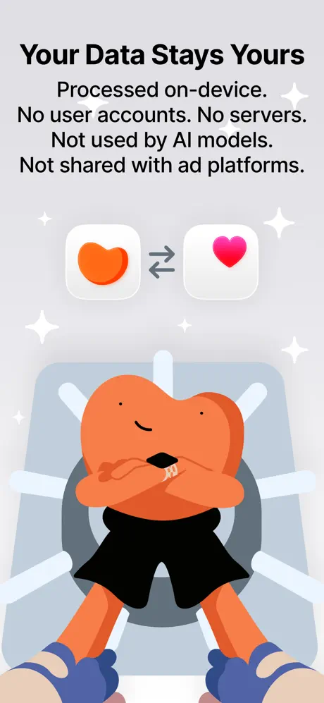
The headline “Your Data Stays Yours” is set in bold black against a cool light gray, slightly bluer than Frame 2, near #E8EAED. A manifesto follows in five declarative sentences: “Processed on-device. No user accounts. No servers. Not used by AI models. Not shared with ad platforms.” Centered beneath the text are two white rounded squares with super-elliptical masking: the left carries the app’s orange heart icon, the right carries the pink Health app heart, joined by a gray double-headed arrow. Dominating the lower two-thirds is the orange mascot, arms crossed, wearing black shorts and blue sneakers, standing in front of a large, pale vault wheel rendered in flat gray-blue tones. White four-pointed stars are scattered sparsely. The hierarchy here is unusual: the mascot’s head sits directly on the same vertical axis as the arrow icons, causing the eye to jump between the privacy promise and the character without a clear resting point. The body text spans almost the full width of the canvas, unusual in a set where headlines usually occupy a narrower central column.

Gentler Streak App Store screenshot 5 — Automatic Step Counter
05

Automatic Step Counter

On-frame caption: “Automatic Step Counter

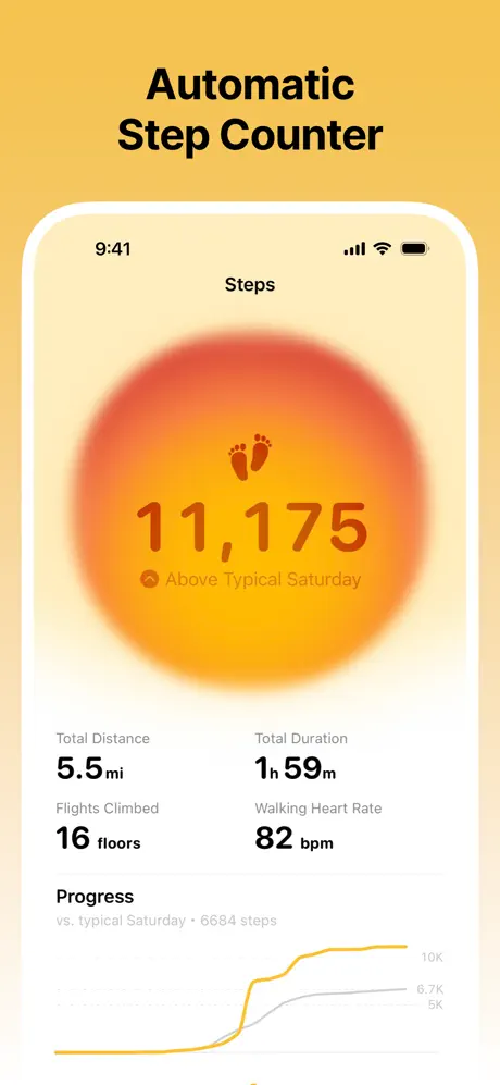
The background shifts to a rich yellow gradient, roughly #F4C430 at top fading to #FFF4D1 at bottom. An iPhone with a thick white hardware bezel frames the Steps screen. The UI centers a massive radial gradient heat-map orb in orange and red behind the step count. Small brown footprints sit above the numerals “11,175,” set in a heavy orange-brown near #C55A2A. Below: “Above Typical Saturday” with a small location-pin glyph. A four-up metric grid follows: “Total Distance 5.5 mi,” “Total Duration 1h 59m,” “Flights Climbed 16 floors,” and “Walking Heart Rate 82 bpm.” At bottom, a “Progress” section compares today’s yellow line against a gray baseline labeled “typical Saturday · 6684 steps.” This frame commits fully to a single warm hue family; even the typography inside the phone abandons black for burnt orange, making it the most monochromatic frame in the set. The heavy white phone bezel feels deliberately retro, almost like an iPhone 11 frame, contrasting with the bezel-less treatment in Frame 2.

Gentler Streak App Store screenshot 6 — Stay energized, know your limits
06

Stay energized, know your limits

On-frame caption: “Stay energized, know your limits

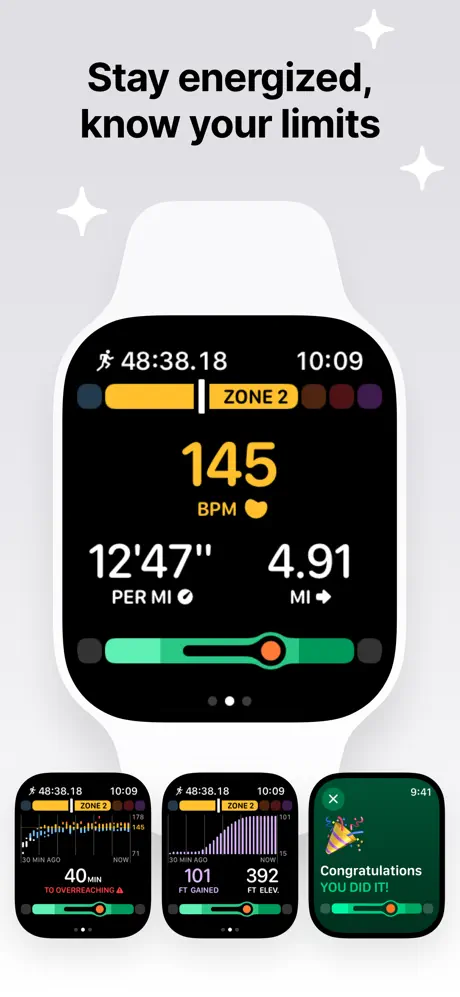
The background returns to light gray near #E5E5EA. The composition is watch-first: a large Apple Watch with a white sport band shows a workout in progress. The watch face is black with yellow numerals: “145 BPM,” a yellow heart glyph, “12'47” PER MI” with a checkmark, and “4.91 MI.” A yellow and brown segmented pill reads “ZONE 2” beside a horizontal bar. A green activity-effect slider sits at the bottom of the display. Below the hero watch, three smaller watch screens sit in a horizontal row. The left shows a heart-rate distribution graph with “40 min TO OVERREACHING” in red. The center shows a purple elevation graph with “101 FT GAINED” and “392 FT ELEV.” The right shows a green congratulations screen: “Congratulations YOU DID IT!” with confetti. White sparkles appear in the top corners. The triptych is structurally interesting, but the three bottom screens are reduced to roughly 18% of the canvas height each, rendering their text illegible at store-listing thumbnail scale.

Gentler Streak App Store screenshot 7 — Keep track of your progress
07

Keep track of your progress

On-frame caption: “Keep track of your progress

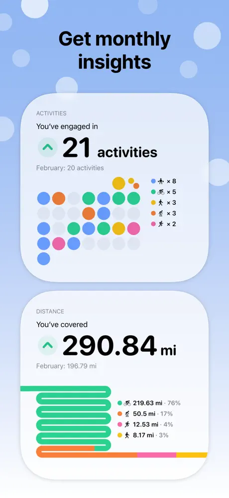
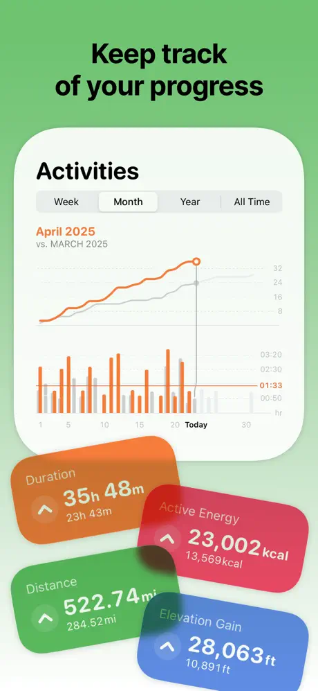
The background is a mint-to-grass green gradient, about #7ED957 at top softening to a pale lime at bottom. A white, rounded-rectangle iPhone frame shows the “Activities” view. A segmented control reads “Week / Month (selected) / Year / All Time.” Below: “April 2025 vs. MARCH 2025,” with the current month in orange and the prior in gray uppercase. A line graph in orange and gray tracks across an x-axis labeled 1 through 30, with a vertical callout at “Today.” Underneath, a bar chart shows daily activity in orange. In front of the phone, four large metric cards float at skewed angles: an orange card for “Duration 35h 48m” (up from “23h 43m”), a pink-red card for “Active Energy 23,002 kcal” (up from “13,569kcal”), a green card for “Distance 522.74 mi” (up from “284.52 mi”), and a blue card for “Elevation Gain 28,063 ft” (up from “10,891 ft”). Each card uses a translucent backdrop-blur aesthetic with rounded corners and small up-arrow icons. This is the most information-dense frame, relying on overlapping z-layers to suggest depth.

Gentler Streak App Store screenshot 8 — Pursue healthy activity levels
08

Pursue healthy activity levels

On-frame caption: “Pursue healthy activity levels

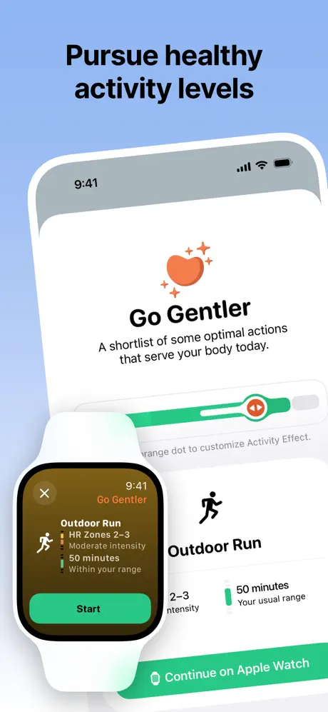
The background is a sky-blue gradient, approximately #8DB4E6. The composition layers an Apple Watch in front of an iPhone. The phone screen shows the “Go Gentler” feature: an orange heart icon with three sparkles, the title “Go Gentler,” and body copy reading, “A shortlist of some optimal actions that serve your body today.” A green slider handle with an eye-like icon appears mid-screen, partially obscured by the overlapping watch. Below, an “Outdoor Run” row shows a runner glyph, “2-3 intensity,” “50 minutes Your usual range,” and a green button reading “Continue on Apple Watch.” The Apple Watch itself (white band) displays “Go Gentler” in orange at top, then “Outdoor Run,” “HR Zones 2-3,” “Moderate intensity,” “50 minutes,” “Within your range,” and a mint-green “Start” button. A top-left “X” close button is visible. The overlap sacrifices readability: the watch hides the central slider instruction, and the phone’s left margin is cropped by the canvas edge, making the composition feel tighter than the generous negative space seen in Frame 2.

05The craft

Captions, colour and the mechanics of the sell

Caption pattern

Each headline is a verb-led imperative: Track, Monitor, Analyze, Keep track, Pursue. The exception is Frame 4, which uses a possessive declaration: “Your Data Stays Yours.” This grammatical break signals a tonal shift from feature to principle.

Visual system

No consistent border radius unifies the frames. Frame 2’s phone uses an exaggerated, almost squircle white container. Frame 5 uses an equally thick but more literal iPhone bezel. Frame 3 abandons bezel realism for a colored outline. For a designer building a set, this is the most instructive tension: the team prioritized narrative variety over manufacturing a recognizable template.

The thumbnail test

At 25% scale, only three elements remain legible: the black headlines, the orange mascot, and the bright yellow orbs in the step-counter frame. The purple sleep frame recedes into a dark blob, and the watch-only frame becomes a gray square with indistinguishable detail.

Conversion mechanics

Frame 1 carries the only external social proof in the set—the BGR quote and five stars—making it the de facto conversion workhorse. Frame 4 carries the privacy value proposition, which historically drives downloads in health apps but is visually the least scannable because it demands reading. The remaining six frames are pure feature evidence, supporting the shopper’s post-click confidence rather than triggering the initial tap.

06Where it slips

What we would change

Inconsistent Device Framing

Frame 1 uses a full iPhone in photorealistic hands. Frame 2 uses a bezel-less white rectangle. Frame 3 tints the device edge to match the background. Frame 5 uses a thick white phone casing. For a shopper swiping rapidly, the hardware itself becomes a variable rather than a constant, which undermines UI learnability. The fix: pick one frame treatment—either always show the full bezel or always float the UI in a rounded container—and apply it universally. If cross-platform continuity is the message, use a single hand model holding consistent hardware rather than jumping between collage and photography.

Rainbow Fragmentation

The chromatic progression—coral, gray, purple, gray, yellow, gray, green, blue—makes each frame individuated but prevents the app from owning a single branded environment. In a crowded Health & Fitness category, brand recall depends on repeated color hits; here, only the orange mascot and black headlines repeat. The fix is to anchor at least 60% of the frames with a signature tint—perhaps the coral orange of Frame 1—while allowing one or two accent frames to break for specific features like sleep. A unifying gradient direction (top-heavy vs. bottom-heavy) would also help.

Frame 4 Text Density

Frame 4’s privacy messaging is text-heavy for a visual medium. Five sentences stacked without visual interruption force the user to read rather than scan. In a carousel context where the average dwell time is under four seconds, the frame would benefit from condensing the promise to one declarative line—'No servers. No sharing. Ever.'—and letting the vault iconography carry the remaining meaning. The current layout privileges completeness over glanceability.

Frame 6 Micro-Screens

The three bottom watch screens in Frame 6 are illegible at thumbnail size. The specific copy—'40 min TO OVERREACHING' and 'Congratulations YOU DID IT!'—is compelling, but rendered at a sub-10pt effective size it becomes noise. The fix is to promote one secondary watch state to a larger inset, roughly 40% of the canvas, or to move that narrative to an App Preview video rather than compressing three distinct states into a strip. If all three must stay, remove the hero watch and tile them equally.

Frame 7 Floating Cards

The four metric cards in Frame 7, while dynamic, risk looking like generic iOS widgets rather than in-app UI because they break the phone rectangle. The orange card especially sits so close to the canvas edge that it feels like an export mistake. The fix is to add a subtle shadow direction consistent with the phone’s light source, or to tuck the cards inside the screen bounds with a slight overlap, clarifying that these are native summaries rather than graphic overlays added in post.

07The recipe

How to apply this to your own app

  1. If your app has a mascot, give it a strict choreography. The orange character works because it repeats across multiple frames without overstaying its welcome. Do not introduce it once and abandon it; turn it into a spatial constant.

    The mascot anchors the brand across color shifts. Designers should map mascot poses to emotional beats: active for tracking, resting for recovery, defensive for privacy.

  2. Pick a device grammar and enforce it.

    Whether you use 3D hands, flat bezels, or pure UI crops, the shopper should recognize the frame architecture by Frame 3. Gentler Streak breaks this rule for variety; most indie apps cannot afford the resulting confusion.

  3. If you rely on pull quotes for conversion, place them in Frame 1 or Frame 2 only.

    Social proof buried in Frame 5 or 6 is social proof wasted. The BGR quote in Frame 1 is correctly positioned, but it competes with the hands for visual dominance. Consider masking the hands lower to give the quote more negative space.

  4. Never let hardware overlap mission-critical UI.

    Frame 8’s watch obscures the green slider and the 'range dot' instruction. In your own sets, offset overlapping devices so that no text sits behind them, or use transparency to reveal the layer beneath.

  5. Treat privacy as a texture, not a paragraph.

    Frame 4 proves that on-device processing is hard to visualize. A single lock glyph, a local-server illustration, or a disabled cloud icon communicates faster than five sentences. Text can live in the subtitle field below the screenshot; the image itself should show the vault, not explain it.

08Takeaways

Five things worth stealing

  • Emotional warmth in the Health category is a differentiator, but warmth requires discipline. Gentler Streak’s mascot and gentle gradients give it personality; the shifting background palette subtracts from that personality by refusing to cohere.
  • The set is strongest when it shows data in context—Frame 3’s sleep hypnogram and Frame 7’s trend cards feel native and legible—and weakest when it asks the shopper to read policy copy.
  • Designers should study Frame 2 and Frame 5 as opposing poles: one uses hardware collage to sell cross-platform utility, the other uses a single saturated hue to own a feature category. Both work; using both in the same set without a bridge is the tension.
  • For indie teams with limited production time, the lesson is to reduce variables: one background family, one device frame, one headline weight, and one organic anchor. The shopper’s eye will thank you.
  • closingVerdict:
09The verdict

What the set actually achieves

The set achieves high emotional resonance but sacrifices brand cohesion. Shopper recall tests would likely surface the mascot and the coral color, yet the other seven frames dilute that association across six additional background hues.

Indie health and lifestyle apps that need to signal empathy before metrics. Teams with a strong character or mascot who want to avoid the sterile, high-contrast aesthetic of mainstream fitness trackers. Designers comfortable trading brand-system rigidity for per-frame poster impact. If your app has a privacy story that is technical by nature, study Frame 4 as a cautionary example of how much text the carousel format can absorb before it stops converting.

10Questions

Frequently asked

Should every screenshot use a different background color?

No. Gentler Streak does this to distinguish features, but the cost is diluted brand recognition. A safer strategy is to use one signature color for six of eight frames, reserving one or two accent colors for thematic outliers like sleep or privacy.

Why does Frame 1 use photorealistic hands when other frames do not?

The hands introduce human scale and warmth, grounding the app in a real body. The inconsistency is a trade-off: the team chose narrative variety over template discipline. For most apps, that trade-off is not worth the systemic cost.

Is the dark-mode sleep frame effective?

Structurally yes—the purple background and dark UI read instantly as nighttime. However, the purple phone bezel bleeds into the purple canvas, softening the device edge. A thin white keyline around the hardware would restore the silhouette without breaking the mood.

How should I handle cross-platform screenshots?

If you need to show Apple Watch and iPhone together, avoid overlapping them in a way that hides text. Frame 2 succeeds by placing the watch at a corner intrusion; Frame 8 fails by centering the watch over the primary control. Use depth and shadow to separate layers, and never let hardware occlude the CTA or the explanatory slider.

11Keep reading

Build your own screenshot set

The full set

10 shots
Gentler Streak App Store screenshot 1Gentler Streak App Store screenshot 2Gentler Streak App Store screenshot 3Gentler Streak App Store screenshot 4Gentler Streak App Store screenshot 5Gentler Streak App Store screenshot 6Gentler Streak App Store screenshot 7Gentler Streak App Store screenshot 8Gentler Streak App Store screenshot 9Gentler Streak App Store screenshot 10

About the app

Hey, welcome the Gentler Streak - the app that keeps your active life alive! An award-winning health and fitness tracker offers personalized guidance that adapts to your daily Gentler Stories LLC, via the App Store listing.

Screenshots and store metadata belong to Gentler Stories LLC. They are shown here for design commentary and criticism. The analysis on this page is original work by floow.design. View the original listing.

More Health & Fitness teardowns

Browse all →