pliability app icon
Health & FitnessScreenshot teardown12 min read

pliability App Store screenshots

How an eight-frame App Store set moves from emotional poster to UI proof, and where a single placeholder paragraph nearly collapses the narrative.

Set published by pliability, LLC · 10 frames analysed

4.8 · 9.4K ratingsFreev3.28.0Updated 4mo ago
pliability App Store screenshot 1
01At a glance

The set in one screen

Framing
1 atmospheric poster; 1 angled composite; 6 flat-color device frames
Captions
Bold sentence-case headline + tracked all-caps subhead
Backdrop
Dark gym photography (Frames 1–2); solid chartreuse (Frames 3–8)
Type
Heavy sans-serif, tight leading, left-aligned on flat frames
UI / copy split
70/30 in device frames; 0/100 in Frame 1
Frame 1 job
Emotional hook and social proof without revealing the interface

Sampled palette

#E4FF00#E4FF00
#121212#121212
#FFFFFF#FFFFFF
#1A2E20#1A2E20
#34C759#34C759
#FFEA00#FFEA00
02The challenge

What this screenshot set had to solve

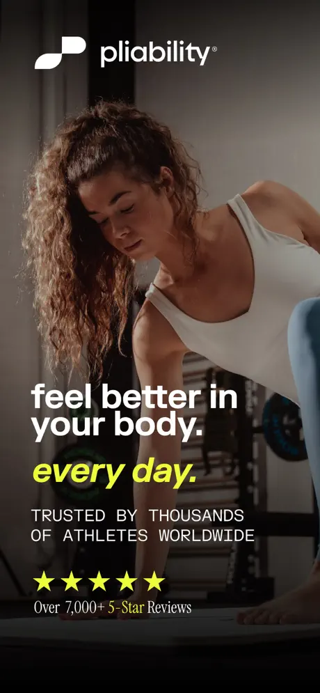
The set must resolve a category tension that is visible from the first pixel: how to sell software to athletes without leading with chrome. Frame 1 answers this by filling the entire 1290×2796 canvas with photography. A woman in a white tank top and blue leggings performs a forward fold inside a gym. The pliability mark—white, geometric, paired with a lowercase wordmark—sits in the top-left safe area. The bottom fifth is crushed to near-black (#0A0A0A) through a heavy vignette that carries a typographic lockup: “feel better in your body.” in bold white sans-serif, “every day.” in chartreuse (#E4FF00) italic, and stacked social proof in wide-tracking caps plus a five-star rating. That opening move establishes that the product is willing to withhold the device in favor of human context. The challenge, then, is to sustain credibility across seven additional frames without letting the UI feel like a generic template. The designers must bridge gritty, warm photography and a dark-mode interface, and they must justify an eight-frame length—longer than the category average—by ensuring each new screen communicates a distinct information architecture rather than a cosmetic variation.

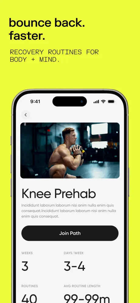
Frame 6 ships with verbatim placeholder Lorem ipsum under “Knee Prehab” and a broken “99–99m” metadata string—an error that undermines the credibility built by the preceding five frames.
03The approach

How the set argues its case

The approach is a hard three-act pivot. Act I is Frame 1: pure mood, no interface. Act II is Frame 2: a hinge frame that retains the photographic environment but introduces a tilted iPhone 15 Pro to prove the product exists. Act III is Frames 3–8: a rigid system in which the background flattens to uniform chartreuse (#E4FF00), forcing the shopper’s attention onto the screen content inside a front-facing device. The designers lock the type system into two tiers—a bold, sentence-case headline in black (roughly 64–72pt equivalent) and a smaller, tracked all-caps subhead—to create rhythm through repetition. The sequencing follows a feature-descent logic: program catalog, search and discovery, personalization, prehab detail, schedule tracking, and curated collections. By holding the canvas and the device constant, the set trains the eye to read only the UI changes as variables, which makes the app feel deep. The color choice is the gravitational center; no adjacent competitor is likely to share that exact hex value, so the swipe continuity is unmistakable.

Athletes who want structured mobility but reject generic yoga branding. The set filters from broad (“feel better in your body”) to niche (“yoga for athletes. zero fluff.”) over eight frames, narrowing the psychographic with each swipe.

04Frame by frame

Every screenshot, and the job it does

pliability App Store screenshot 1 — The poster frame
01

The poster frame

On-frame caption: “"feel better in your body. every day."

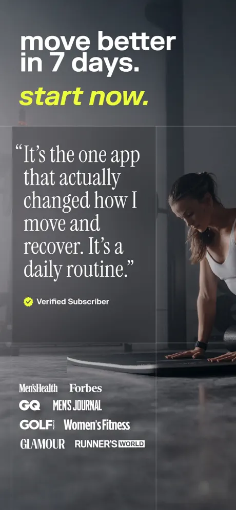
Frame 1 is a pure brand poster. The canvas is entirely photographic: a woman with curly brown hair, wearing a white tank top and blue leggings, bends forward in a gym environment. The pliability mark and wordmark sit in the top-left, white against shadow. The bottom of the frame carries a heavy vignette—effectively a gradient from transparent to near-black (#0A0A0A)—that isolates the text from the busy background. The headline reads, verbatim, “feel better in your body.” in white, followed by “every day.” in chartreuse (#E4FF00) italic. Beneath this, in wide-tracking white sans-serif caps: “TRUSTED BY THOUSANDS OF ATHLETES WORLDWIDE”. Five filled yellow stars (#FFEA00) are arranged horizontally, followed by “Over 7,000+ 5-Star Reviews” in a lighter white weight. The left margin is roughly 48pt; the bottom margin is tight, perhaps only 32pt from the descenders to the canvas edge. The absence of any device frame means the shopper sees a human first and software second, a deliberate reversal of the usual app-store formula.
pliability App Store screenshot 2 — The hinge
02

The hinge

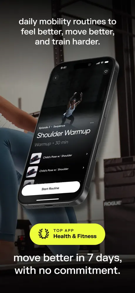
On-frame caption: “"daily mobility routines to feel better, move better, and train harder."

Frame 2 transitions from poster to product using the same photo subject, now cropped below the waist. An iPhone 15 Pro in dark titanium enters at a roughly 15-degree clockwise tilt, dominating the central vertical axis. The screen shows a sequence detail view: a navigation bar with a back chevron and heart icon, a hero video thumbnail of an athlete holding a PVC pipe overhead, and metadata reading “Episode 2 • Sequence”, “Shoulder Warmup”, and “Warmup • 30 min”. Below, two list rows display “Child's Pose w/ Shoulder” with small thumbnails, and a wide white pill button reads “Start Routine”. The caption above the device states: “daily mobility routines to feel better, move better, and train harder.” The caption below reads: “move better in 7 days, with no commitment.” A chartreuse pill badge interrupts the lower third, containing a black laurel wreath icon and “TOP APP Health & Fitness” in black. The phone casts no visible shadow on the background, which flattens the compositional depth. The status bar shows 9:41 and standard connectivity glyphs, confirming the screenshot was captured on iOS.

pliability App Store screenshot 3 — The template lockup
03

The template lockup

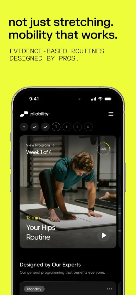
On-frame caption: “"not just stretching. mobility that works."

Frame 3 initiates the flat-color formula that persists through Frame 8. The background is a solid, aggressive chartreuse (#E4FF00). The headline is black and flush-left: “not just stretching. mobility that works.” The subhead beneath, in tracked all-caps, reads: “EVIDENCE-BASED ROUTINES DESIGNED BY PROS.” The iPhone is front-facing, positioned in the lower half. Its screen displays a program dashboard: a top navigation bar with the pliability logo and hamburger menu; a day-selector pill train (M T W T F S S) with checkmarks on the first two days; and a large session card. The card contains a video still of a male athlete in a teal shirt on a mat, a “View Program →” link, “Week 1 of 4”, and a circular 25% progress indicator in yellow. Timestamped “12 min” in chartreuse, the card headline reads “Your Hips Routine”. Below the card, a section header states “Designed by Our Experts” with explanatory body copy. A bottom pill reads “Monday”. The lockup proves the template: headline, subhead, phone, nothing else. The contrast between the neon field and the black UI (#121212) is extreme and intentional.

pliability App Store screenshot 4 — Browse and depth
04

Browse and depth

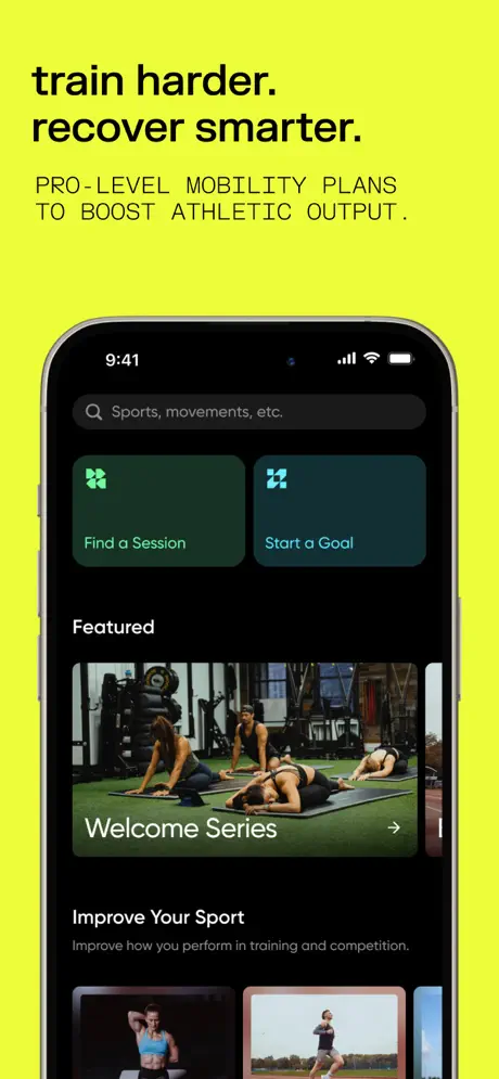
On-frame caption: “"train harder. recover smarter."

Frame 4 repeats the chartreuse field and black type. Headline: “train harder. recover smarter.” Subhead: “PRO-LEVEL MOBILITY PLANS TO BOOST ATHLETIC OUTPUT.” The phone presents a search-first browsing experience. A dark search bar at top contains the placeholder “Sports, movements, etc.” in grey. Below are two dark green square tiles (#1A2E20) labeled “Find a Session” and “Start a Goal”, each with a white geometric icon. A “Featured” header introduces a wide hero card for the “Welcome Series”, showing a group of athletes stretching on outdoor turf, with a right-facing arrow. Further down, an “Improve Your Sport” section pairs a header with the line “Improve how you perform in training and competition.” and a partially clipped row of thumbnails. The design decision to show partially visible content below the fold implies scroll depth and content abundance, a classic app-store persuasion pattern.

pliability App Store screenshot 5 — Personalization
05

Personalization

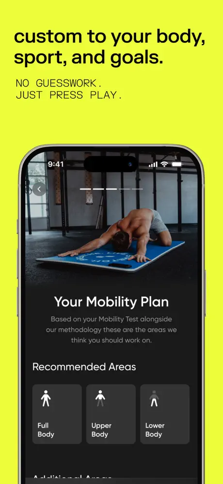
On-frame caption: “"custom to your body, sport, and goals."

Frame 5 keeps the chartreuse background. The headline reads “custom to your body, sport, and goals.” and the subhead reads “NO GUESSWORK. JUST PRESS PLAY.” The phone shows a personalization screen. A video hero occupies roughly the top 35% of the phone display, featuring a shirtless male athlete in a child’s pose on a bright blue mat inside a gym. Below, centered white text states “Your Mobility Plan” followed by light-grey explanatory copy: “Based on your Mobility Test alongside our methodology these are the areas we think you should work on.” A “Recommended Areas” label introduces three dark grey cards (#2A2A2A) with white pictogram figures: “Full Body”, “Upper Body”, and “Lower Body”. The tonal difference between the cards and the screen background is subtle—perhaps only 10–15% lightness—which reads as sleek in isolation but risks turning to mud when the screenshot is compressed to thumbnail size in the App Store feed.

pliability App Store screenshot 6 — The credibility fracture
06

The credibility fracture

On-frame caption: “"bounce back. faster."

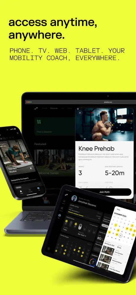
Frame 6 is the weakest link. The headline says “bounce back. faster.” and the subhead says “RECOVERY ROUTINES FOR BODY + MIND.” The phone displays a detail view titled “Knee Prehab”. The hero thumbnail shows a muscular athlete at the bottom of a kettlebell squat. Under the title, the body copy is verbatim placeholder Latin: “Incididunt laborum laborum nisi anim nulla enim quis consequat.Incididunt laborum laborum nisi anim nulla enim quis consequat.” Beneath this failure sits a black pill button reading “Join Path”. A metadata grid displays “WEEKS 3”, “DAYS/WEEK 3–4”, “ROUTINES 40”, and “AVG ROUTINE LENGTH 99–99m”. The “99–99m” string is clearly a template rendering bug. Visually, the layout follows the same dark-mode language seen elsewhere, but the content breakdown is catastrophic for credibility. The fix is obvious: replace the placeholder with two lines of real program description and render the actual duration range.

pliability App Store screenshot 7 — Schedule and state
07

Schedule and state

On-frame caption: “"nagging issues? we've got you."

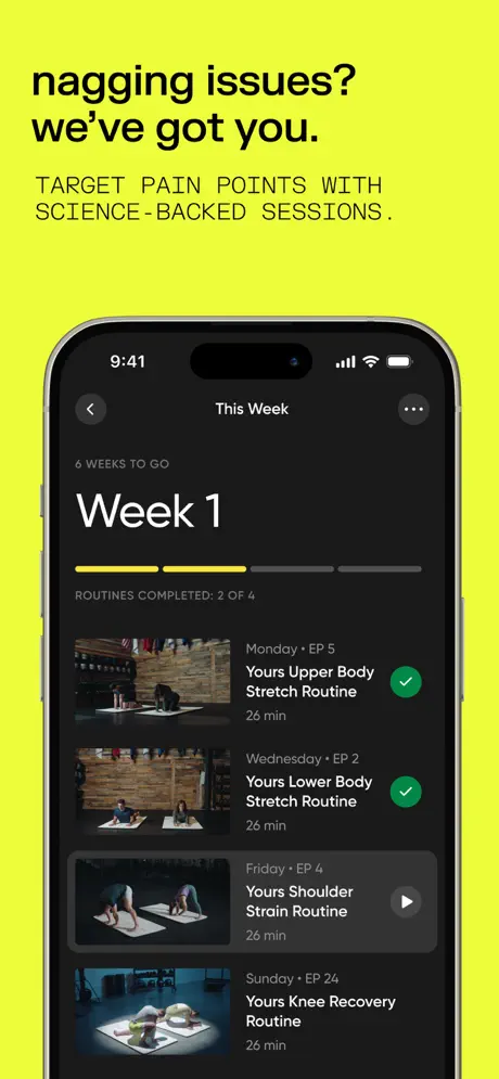
Frame 7 shows scheduling and adherence. Headline: “nagging issues? we've got you.” Subhead: “TARGET PAIN POINTS WITH SCIENCE-BACKED SESSIONS.” The phone screen shows a weekly list under the header “This Week”. A back chevron and overflow menu flank the title. “6 WEEKS TO GO” appears above a massive “Week 1” heading. A segmented progress bar—two segments filled in chartreuse, two in dark grey—sits above the label “ROUTINES COMPLETED: 2 OF 4”. Four list rows follow, each with a thumbnail, day and episode label, title, duration, and state icon. The first two rows—“Yours Upper Body Stretch Routine” and “Yours Lower Body Stretch Routine”—carry green checkmarks. The third, “Yours Shoulder Strain Routine”, shows a grey play circle. The fourth, “Yours Knee Recovery Routine”, is partially visible. Every routine is timestamped “26 min”, which creates a reassuring rhythmic consistency. The row height is generous, approximately 72–80pt, making the list breathable.

pliability App Store screenshot 8 — The niche filter
08

The niche filter

On-frame caption: “"yoga for athletes. zero fluff."

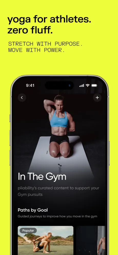
Frame 8 closes the set. Headline: “yoga for athletes. zero fluff.” Subhead: “STRETCH WITH PURPOSE. MOVE WITH POWER.” The phone shows a curated collection titled “In The Gym”. The hero image is a female athlete in a blue sports bra and black shorts performing a seated neck stretch on a white mat against a pure black studio background. Below, the copy reads “pliability's curated content to support your Gym pursuits”. A “Paths by Goal” section follows with the line “Guided journeys to improve how you move in the gym”. A bottom card carries a grey “Popular” tag over a desert landscape image featuring two men in a partner mobility pose. The navigation bar includes a back arrow and a plus icon. This frame filters the audience down to a specific psychographic—iron-sport athletes who would normally dismiss yoga—completing the narrative arc from broad aspiration to niche specialization.

05The craft

Captions, colour and the mechanics of the sell

Caption pattern

Every flat frame uses the same formula: a bold, sentence-case claim followed by a smaller, tracked all-caps descriptor. Secondary captions end with periods; primary headlines use terminal periods inconsistently but read as intentional staccato.

Visual system

The system is built on extreme contrast. The acid-lime field (#E4FF00) provides a 90%+ lightness delta against the black UI (#121212) inside the phone. Typography is exclusively sans-serif, heavily weighted, and left-aligned. Imagery inside the phone screens is photography-forward, showing real athletes in gym environments rather than illustrations. The pliability mark appears in white on dark UI and black on light contexts, maintaining its geometry without color adaptation.

The thumbnail test

At small scale, the set reads as a lime-green flash against the App Store’s usual blue and purple fitness aisle. Frame 1’s dark photography and white type remain legible, though the bottom lockup sits close to the edge and could clip. Frame 2’s tilted device becomes illegible in thumbnail; the flat frames (3–8) read as black rectangles on neon, which scans faster.

Conversion mechanics

The headline-to-CTA flow is implicit rather than explicit. There is no “Download” or “Start Free Trial” overlay on the frames; the copy relies on benefit statements. Frame 2 mentions “no commitment,” which is the only direct risk-reversal visible in the set.

06Where it slips

What we would change

Frame 6: content-readiness

The most urgent fix is the abandonment of placeholder copy. The description under “Knee Prehab” is pure Lorem ipsum, and the “99–99m” duration string reads as a template fault. These should be replaced with real program copy and the correct average routine length before the set is live.

Frame 2: compositional grounding

The tilted iPhone floats without a cast shadow on the photographic background, making the device feel pasted rather than placed. Reducing the tilt or adding a soft, dark shadow aligned with the gym’s key light would anchor the phone in the scene.

Frames 3–8: chromatic monotony

Six consecutive frames of identical chartreuse (#E4FF00) create fatigue. Introducing one alternate background—perhaps near-black or off-white—for a single frame would restore visual rhythm and give the shopper’s eye a resting point.

Frame 5: card contrast

The grey recommendation cards (#2A2A2A) against the black screen (#121212) are too close in value. Either lightening the cards to #404040 or adding a 1px #555555 stroke would preserve their edges under compression.

Frame 1: safe-area tightness

The bottom text lockup sits within approximately 32pt of the canvas edge. Raising the block by 24–32pt would prevent the review stars and caption from clipping against device corners or App Store overlay gradients.

07The recipe

How to apply this to your own app

  1. Lead with a human, not a device

    If your category is emotional, Frame 1 proves you can sacrifice interface clarity for mood. Just ensure the following frame introduces the device before the shopper loses patience.

  2. Lock the canvas, vary the screen

    Once the flat-color system begins at Frame 3, every subsequent frame uses the same background hex and headline position. This trains the shopper to parse only the UI changes, which is efficient but demands that each screen show genuinely different architecture.

  3. Audit every string before export

    Frame 6 is a reminder that placeholder text survives into production. Build a QA checklist that includes every caption, button, and metadata field in the screenshot pipeline.

  4. Let the background be the brand

    The chartreuse field is doing more brand work than the logo in Frames 3–8. If you have a distinctive accent color, consider expanding it to fill the frame rather than confining it to badges.

08Takeaways

Five things worth stealing

  • Frame 1’s no-device poster strategy is correct for emotional categories, but it needs safe-area padding.
  • The chartreuse background is a high-risk, high-reward move that solves thumbnail recognizability.
  • Frame 6’s placeholder copy is a production error that damages credibility and must be fixed immediately.
  • Flat-color frames are only as strong as the UI contrast inside the phone; Frame 5’s grey cards need a value shift.
  • Eight frames are justified here only because the UI depth is real; shorter sets might not need this length.
09The verdict

What the set actually achieves

The sequence lands on a distinctive visual system: a neon chartreuse field that acts as a category billboard, a disciplined typographic hierarchy, and a clear arc from aspiration to scheduling. However, production errors in Frame 6 and compositional softness in Frame 2 prevent the set from feeling fully finished.

Designers building long-form App Store sets for content-heavy fitness or wellness apps, especially those who need to bridge gritty photography with clean dark-mode UI while maintaining a single brand color across the carousel.

10Questions

Frequently asked

Why does Frame 1 omit the device?

It prioritizes aspiration over interface. The shopper sees a body first, which is the product promise; the device is introduced only in Frame 2.

What is the exact background color on Frames 3–8?

A saturated chartreuse, sampled at approximately #E4FF00. It is consistent across all six frames with no gradient or texture.

Is the placeholder text in Frame 6 visible at thumbnail size?

No, the blur and scale of the gallery view hide the Latin text, but it is fully legible once the frame is Swipe to fullscreen on a product page.

What device model is used throughout?

An iPhone 15 Pro with the Dynamic Island notch, shown in dark titanium in Frame 2 and a lighter natural titanium in Frames 3–8.

11Keep reading

Build your own screenshot set

The full set

10 shots
pliability App Store screenshot 1pliability App Store screenshot 2pliability App Store screenshot 3pliability App Store screenshot 4pliability App Store screenshot 5pliability App Store screenshot 6pliability App Store screenshot 7pliability App Store screenshot 8pliability App Store screenshot 9pliability App Store screenshot 10

About the app

Improve mobility, flexibility, recovery + performance with pliability – your powerful mobility and stretching app designed for every body. pliability (formerly ROMWOD) is your pliability, LLC, via the App Store listing.

Screenshots and store metadata belong to pliability, LLC. They are shown here for design commentary and criticism. The analysis on this page is original work by floow.design. View the original listing.

More Health & Fitness teardowns

Browse all →