
Waterllama app icon
Health & FitnessScreenshot teardown14 min read

Waterllama App Store screenshots

App Store browsers spend roughly 1.7 seconds on a screenshot before they swipe. Waterllama’s eight-frame sequence bets that an illustration of a sunglassed llama sipping through a curly straw will slow that swipe more than a dashboard of hydration metrics ever could. The set is a study in trading interface for personality: four frames contain no recognizable app chrome at all, two contain stylized device silhouettes, and the remaining two float UI cards in mid-air. The result reads like a children’s picture book that occasionally reveals an iPhone screen.

Waterllama App Store screenshot 1
01At a glance

The set in one screen

Framing
Custom colored silhouettes with Dynamic Island notches appear in Frames 3, 4, 6, and 8. Frames 1, 2, 5, and 7 are full-bleed posters with no device chrome.
Captions
Heavy rounded sans-serif, white, stacked 2–3 lines, top-anchored. Subheads use a lighter weight or desaturated tint.
Backdrop
Episodic flat fills: #00BCD4 cyan (Frames 1–3, 8), #3F5DC6 cobalt (Frame 4), #009B77 emerald (Frame 5), #9B7EDE lavender (Frame 6), #6D4C41 chestnut (Frame 7).
Type
Large, rounded, almost childlike geometric sans. Consistent across headlines, UI numerals, and card labels.
UI / copy split
Roughly 40% product UI / 60% illustration across the full set. Individual frames swing between 0% and 90% UI.
Frame 1 job
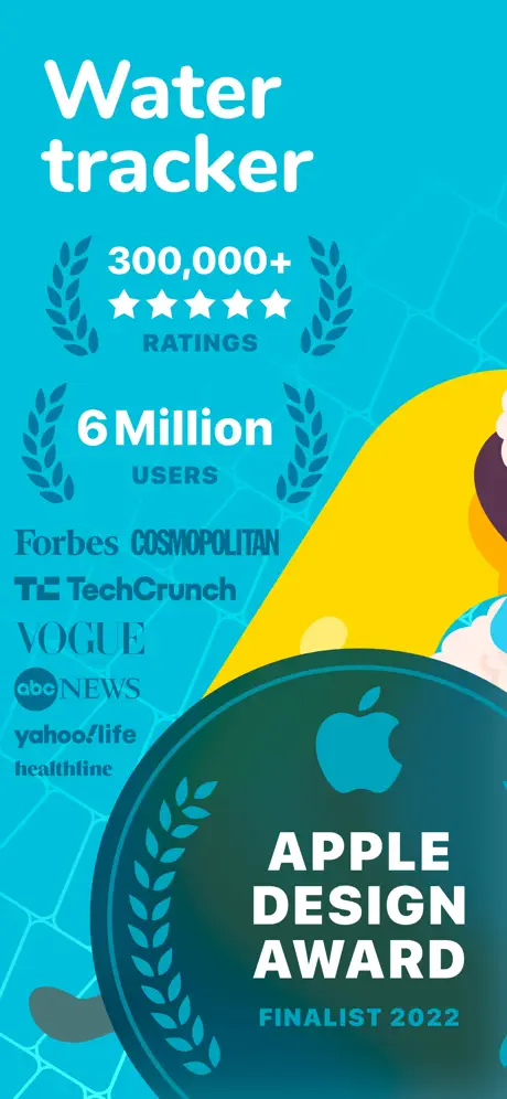
Establish authority and category. The opening frame must answer 'what is it?' and 'why trust it?' before the shopper’s thumb moves. Waterllama answers with a credential wall rather than a product shot: an Apple Design Award badge, six-figure ratings, and a vertical column of press logos stacked above an oversized award seal. No phone, no buttons, no hydration number is visible. The frame treats social proof as the primary visual layer.

Sampled palette

#00BCD4#00BCD4
#3F5DC6#3F5DC6
#009B77#009B77
#9B7EDE#9B7EDE
#6D4C41#6D4C41
#FFFFFF#FFFFFF
02The challenge

What this screenshot set had to solve

The structural problem for any water-tracking app is that the core loop fits inside a single button tap. There are no chat threads, no map layers, no photo filters—just a volume and a timestamp. In the App Store, that simplicity collapses into sameness: every competitor shows the same Progress Ring, the same ounces label, the same light-blue interface. Waterllama’s design challenge, therefore, is to make a two-tap utility feel like a world worth inhabiting. The sequence attempts this by foregrounding characters over chrome, turning a segmented llama silhouette into a progress bar and a peacock into a widget icon. But the risk is immediate legibility. When four of eight frames omit the device entirely, the shopper cannot quickly verify that the product is software. Frame 1 does not show an interface; Frame 2 does not show a screen; Frame 5 shows a grid of challenge cards that could just as easily be in-app marketing; Frame 7 shows a share card that resembles a printed postcard. The tension is between brand warmth and product evidence, and the set leans so far toward the former that it risks losing readers who need to see an app before they install one.

Waterllama turns the App Store gallery into a picture book, then hopes you stay long enough to find the software tucked inside.
03The approach

How the set argues its case

The team built the set around three rules. First, chromatic episoding: each major feature gets its own dominant background color, so a swiper always knows when the topic has changed. Second, character-as-data: animals are not mere decoration; they replace conventional progress rings, bar charts, and empty states. Third, soft containment: when UI is shown, it sits inside a colored silhouette that matches the stage, avoiding the sterile realism of a stock iPhone mockup. Social proof is front-loaded in Frame 1, actual logging UI is delayed until Frame 3, widget extensibility appears in Frame 4, lifestyle programming in Frame 5, collection mechanics in Frame 6, social proof-of-use in Frame 7, and retention data in Frame 8. The ordering follows a narrative arc from trust to habit to streak, even if the UI density curve is jagged.

Against the Health & Fitness category trend of clinical dashboards and restrained palettes, Waterllama positions itself as a character collection experience that happens to track ounces. The App Store page does not argue on precision or science; it argues on ritual and personality. Every frame suggests that hydration is a side effect of caring for a digital menagerie.

04Frame by frame

Every screenshot, and the job it does

Waterllama App Store screenshot 1 — The Credential Wall
01

The Credential Wall

On-frame caption: “Water tracker

Frame 1 is a pure social-proof poster set against a saturated cyan field approximating #00BCD4, with a faint lighter geometric mesh pattern barely visible beneath the content. The headline 'Water tracker' sits near the top in a very large, white, rounded sans-serif. Below it, two metric blocks are stacked vertically: '300,000+' flanked by five white stars and the label 'RATINGS,' then '6 Million' with the label 'USERS,' each block bordered by flat cyan laurel wreaths. A vertical column of press logos—Forbes, COSMOPOLITAN, TC TechCrunch, VOGUE, abc NEWS, yahoo!life, healthline—occupies the center-left in muted grays and blacks, rendered small enough that they become noise at thumbnail scale. An oversized dark-teal circular badge dominates the lower right, containing a solid Apple logomark silhouette and the text 'APPLE DESIGN AWARD' above 'FINALIST 2022' in a smaller cyan sans. A yellow curved shape and a gray foot intrude from the right and bottom edges, hinting at the character system without fully revealing it. There is no device frame, no app UI, and almost no negative space; the frame chooses authority over scannability.
Waterllama App Store screenshot 2 — The Lifestyle Poster
02

The Lifestyle Poster

On-frame caption: “Drink water reminders

The background remains the same cyan with geometric line work. The caption 'Drink water reminders' is locked to the upper left in white rounded sans; a small white notification bell icon floats at the upper right. The rest of the canvas is given over to a single full-bleed illustration of a cream-colored llama wearing orange sunglasses, drinking from a blue bottle through an orange curly straw while reclining on a yellow slope. A dark laurel badge intrudes from the bottom left corner, visually linking back to Frame 1. No interface elements, no buttons, no phone chrome, no scheduling UI is visible. The llama’s fleece is rendered in scalloped vector shapes that create texture without shading. The frame reads as a lifestyle poster rather than a product screenshot: it communicates tone, but a shopper cannot infer how reminders are set, edited, or delivered. It is pure brand continuity without product disclosure.

Waterllama App Store screenshot 3 — The First Software Surface
03

The First Software Surface

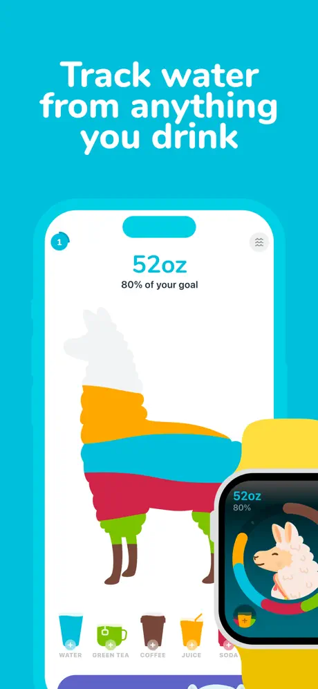
On-frame caption: “Track water from anything you drink

Frame 3 introduces the first actual app UI. The cyan backdrop continues, with the headline 'Track water from anything you drink' at top. A stylized device frame—rounded rectangle, cyan bezel, pill-shaped notch—appears centered. Inside the white screen, '52oz' appears in bold cyan, with '80% of your goal' in dark gray beneath it. The central graphic is a llama silhouette filled with horizontal color bands—orange, blue, red, green, brown—acting as a segmented progress meter. A bottom toolbar presents five drink types with icons and plus signs: WATER, GREEN TEA, COFFEE, JUICE, SODA. A cyan circle with '1' sits top left; a gray wavy icon sits top right. Overlapping the lower right is a black Apple Watch mockup displaying the same 52oz/80% metric with a llama head inside a cyan ring, resting on a yellow cylindrical form. This frame finally exposes the logging mechanic while retaining the brand’s illustrative logic.

Waterllama App Store screenshot 4 — Widgets as Character Cards
04

Widgets as Character Cards

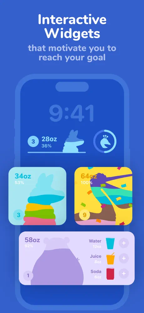
On-frame caption: “Interactive Widgets that motivate you to reach your goal

The background shifts to cobalt blue, approximating #3F5DC6. The headline reads 'Interactive Widgets' in white, with the subhead 'that motivate you to reach your goal' in a lighter, desaturated tint beneath. A soft device frame shows a lock screen at 9:41 with two widgets: a horizontal bar widget showing '3', '28oz', '36%' alongside a blue llama silhouette, and a circular widget with a peacock-like bird icon. Below the phone, three freestanding widget mocks float at varying depths: a light-cyan square showing '34oz', '53%', a layered llama, and badge '3'; a yellow square showing '64oz', '100%', a peacock amid confetti, and badge '9'; and a lavender rectangle showing '58oz', '92%', a purple hippo or blob silhouette, and list rows for Water, Juice, and Soda with plus buttons. The widgets prove the art system scales down to glanceable sizes, though the lavender rectangle is cropped at its right edge by the canvas boundary. The color break successfully signals a new feature chapter.

Waterllama App Store screenshot 5 — The Challenge Bazaar
05

The Challenge Bazaar

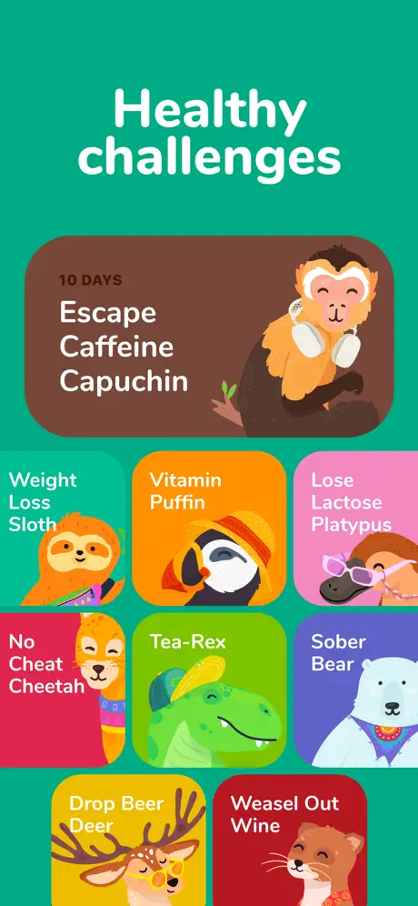
On-frame caption: “Healthy challenges

Frame 5 switches to emerald green, approximating #009B77, and displays 'Healthy challenges' at top. No device frame appears. The body is an irregular masonry grid of rounded-rectangle cards. A dominant top card in brown reads '10 DAYS' above 'Escape Caffeine Capuchin' beside a monkey wearing white headphones. Below, smaller cards include 'Weight Loss Sloth' on orange, 'Vitamin Puffin' on amber, 'Lose Lactose Platypus' on pink, 'No Cheat Cheetah' on red, 'Tea-Rex' on lime green, 'Sober Bear' on purple, 'Drop Beer Deer' on yellow, and 'Weasel Out Wine' on red. Each card pairs white rounded sans-serif text with a centered animal portrait. The layout reads as a content library rather than a tracking interface. The internal rainbow of card colors—eight distinct hues—vibrates against the emerald container and edges toward visual clutter when viewed at small scale.

Waterllama App Store screenshot 6 — Habit Theater
06

Habit Theater

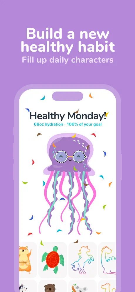
On-frame caption: “Build a new healthy habit / Fill up daily characters

The background becomes lavender, approximating #9B7EDE. The headline 'Build a new healthy habit' sits above the subhead 'Fill up daily characters.' A soft purple device frame encloses a white screen. At top, 'Healthy Monday!' appears in a dark playful sans, with confetti shards scattered around it; beneath, the caption '68oz hydration · 106% of your goal' in cyan. The center is dominated by a large purple jellyfish with pink and teal tentacles and round glasses. At bottom, a horizontally scrollable row of character thumbnails shows a hamster, a red turtle, a unicorn outline, and a dragon outline, with a second row partially visible. The phone’s notch is filled with solid lavender, making the bezel feel like a physical matte cutout. This frame sells collection and completionism; the UI is minimal, letting the celebratory character art and confetti drive the composition.

Waterllama App Store screenshot 7 — The Shareable Keepsake
07

The Shareable Keepsake

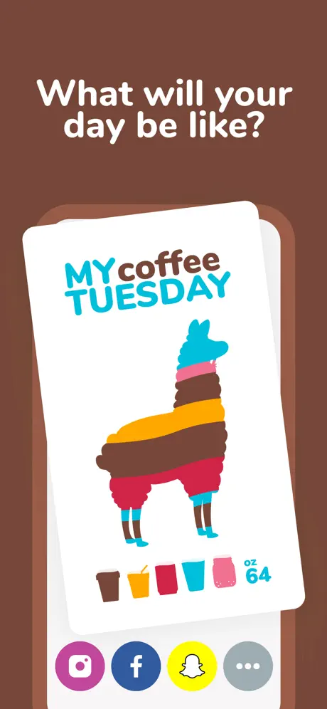
On-frame caption: “What will your day be like?

Frame 7 adopts a chestnut brown background, approximating #6D4C41, the warmest and most chromatically isolated tone in the sequence. The headline asks, 'What will your day be like?' Centered is a tilted white card with rounded corners and subtle depth shadow. On the card, 'MYcoffee TUESDAY' is set in two colors—cyan for 'MY' and 'TUESDAY,' brown for 'coffee'—above a block-color llama composed of horizontal bands: cyan head, pink neck, brown torso, orange midsection, red legs, cyan hooves. Below the animal, five drink icons in brown, orange, red, cyan, and pink are followed by 'oz 64.' Under the card, four circular social buttons appear: Instagram in pink-purple, Facebook in blue, Snapchat in yellow, and a gray 'More' button with an ellipsis. A second white card peeks behind. No phone frame is shown; the share sheet is presented as a physical keepsake rather than a screenshot of a modal.

Waterllama App Store screenshot 8 — Data Density as Closer
08

Data Density as Closer

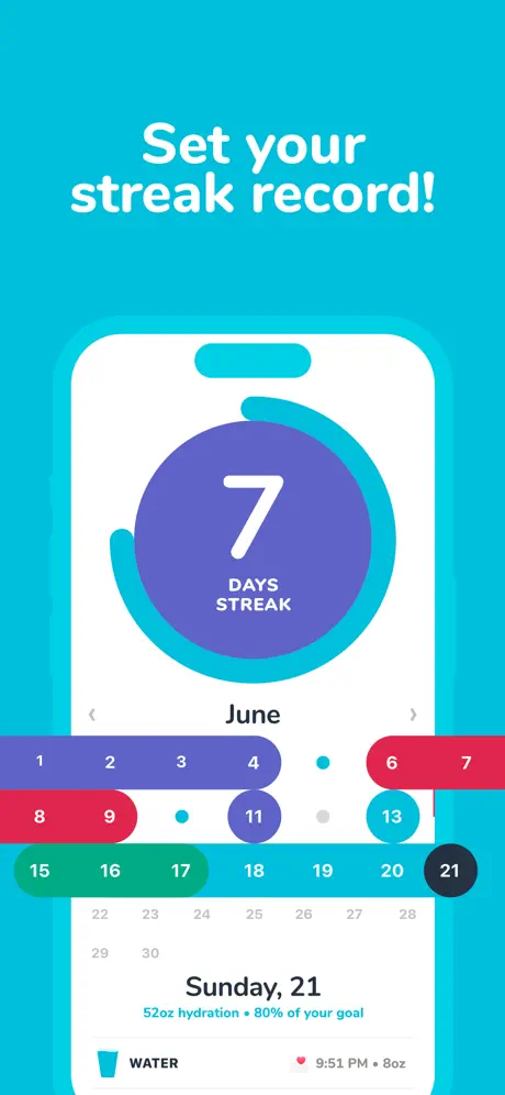
On-frame caption: “Set your streak record!

Frame 8 returns to cyan. The headline 'Set your streak record!' sits at top. A soft cyan device frame holds the densest UI of the set. A large circular badge dominates the screen: a cyan progress ring surrounding a purple fill, with a white '7' and 'DAYS STREAK' centered. Below, 'June' with left and right chevrons anchors a calendar grid. Date indicators use colored pill shapes—blues, reds, greens, purples, and a black circle for the 21st—with gray dots marking remaining days. Near the bottom, 'Sunday, 21' appears above '52oz hydration • 80% of your goal,' followed by a list row containing a water glass icon, the label 'WATER,' a heart icon, and the timestamp '9:51 PM • 8oz.' This frame finally delivers historical data density, completing the narrative arc from branding to utility.

05The craft

Captions, colour and the mechanics of the sell

Caption pattern

Headlines are always short, noun-first phrases: 'Water tracker,' 'Drink water reminders,' 'Track water from anything you drink,' 'Interactive Widgets,' 'Healthy challenges,' 'Build a new healthy habit,' 'What will your day be like?,' 'Set your streak record!' Subheads appear only in Frames 4 and 6, adding a secondary clause in a lighter weight. There are no complete sentences; the copy assumes the image carries the narrative weight.

Visual system

The visual system is built on flat vector illustration, heavy rounded type, and aggressive cropping. Characters bleed off edges, colored shapes overlap without shadows, and the only depth comes from occasional overlapping cards or the share-sheet tilt in Frame 7. The palette is fully saturated, almost潘通-level bright, which keeps thumbnails visible against the white App Store page but also raises the risk of visual fatigue when eight frames are viewed in sequence.

The thumbnail test

At small thumbnail size, Frame 1 collapses into a bright cyan field with a dark badge and some gray noise where the press logos used to be. The headline 'Water tracker' remains legible, but the metrics and laurels blur together. Frame 2 reads as a white blob (the llama) on cyan. Frame 3 finally resolves into a recognizable white phone rectangle. A shopper scanning the filmstrip from above will see: cyan text wall, cyan animal poster, cyan phone, blue phone, green grid, purple phone, brown card, cyan phone. The set passes the color test—every frame is distinct—but fails the immediate UI test until the third frame.

Conversion mechanics

The sequence is front-loaded with social proof and brand, back-loaded with product UI. In classic conversion logic, the first three frames should prove the product exists; here, the first UI does not appear until Frame 3. That works only if the shopper is intrigued enough by the llama to keep swiping. The set also omits pricing, onboarding, or account creation entirely—there is no frame of paywall or settings, which keeps the mood light but hides the business model.

06Where it slips

What we would change

Inconsistent Device Framing

The rhythm of the gallery is broken by the alternating presence and absence of device frames. Frames 1, 2, 5, and 7 are frameless posters; Frames 3, 4, 6, and 8 use soft device silhouettes. The shopper experiences an irregular pattern—poster, poster, phone, phone, poster, phone, poster, phone—which makes the set feel like two different templates stitched together. The fix is simple: either commit to full-bleed illustrations across all eight frames and trust the UI cards to communicate product, or place every frame inside a soft colored bezel so the gallery cadence becomes predictable.

Frame 1 Is Structurally Overloaded

At thumbnail scale, Frame 1 becomes a bright cyan field with a dark badge and a column of illegible gray noise where the press logos sit. Nine logos, two metric blocks, one headline, and an oversized award badge compete for the same 1.7 seconds of attention. The Apple Design Award seal is powerful visual shorthand, but it is crowded by the vertical logo stack. The fix is to delete at least half the press logos, increase the whitespace between the metric blocks and the badge, and let the award seal occupy the lower third alone.

Frame 2 Shows Zero Interface

A shopper who stops on Frame 2 sees a llama, sunglasses, and a bottle. There is no notification UI, no toggle, no time stamp, no settings surface—nothing that proves the app delivers reminders. For a frame whose caption is 'Drink water reminders,' this is a missed evidence opportunity. The fix is to overlay a small notification card or lock-screen banner in the upper right, adjacent to the existing bell icon, so the frame remains illustration-forward but still demonstrates the feature.

Frame 7’s Chromatic Isolation

The chestnut brown (#6D4C41) of Frame 7 is the only warm earth tone in the entire sequence. While it differentiates the sharing feature, it visually severs the cool aquatic family established by the surrounding cyan, cobalt, emerald, and lavender frames. The abrupt temperature shift suggests a different app entirely. The fix is to keep the share frame in a color that belongs to the established palette—perhaps a desaturated purple or a deep navy—so the sequence feels like one continuous world rather than a borrowed scene.

Frame 5’s Internal Rainbow Clash

The emerald background of Frame 5 is strong, but the eight challenge cards introduce orange, pink, red, lime, purple, yellow, and brown simultaneously. The result is a vibrating mosaic where no single card owns attention. The fix is to constrain the card palette to two or three tones per frame, or to mute the card backgrounds and let the animal portraits carry the color instead.

07The recipe

How to apply this to your own app

  1. 01

    If your app category is visually homogeneous, consider a recurring character or mascot system that can replace standard UI chrome—progress rings, empty states, and icons—without destroying usability. The character must be flexible enough to scale from widget size to full-bleed poster.

  2. 02

    Use background color as a chapter marker. Waterllama’s cyan-cobalt-emerald-lavender-chestnut rhythm tells the shopper when a new feature is starting before they read the headline. Pick a palette that is distinct in thumbnails but not so broad that it feels like separate apps.

  3. 03

    Commit to a containment rule for every frame. If you use device silhouettes, use them everywhere; if you go frameless, ensure the UI surfaces inside the frame are still recognizable as software at a glance. Inconsistent framing breaks the swipe rhythm.

  4. 04

    Front-load social proof only if you can keep it scannable. Waterllama’s press-logo wall becomes noise at small sizes. A single award badge or one headline metric converts better than a laundry list of logos.

08Takeaways

Five things worth stealing

  • Chromatic episoding can pace an 8-frame sequence like chapters in a book, but the palette must stay within a unified temperature family to avoid feeling disjointed.
  • Animal or character systems can replace conventional data visualization if they maintain enough geometric clarity to read at widget scale and thumbnail size.
  • Front-loading Frame 1 with social proof instead of UI trades immediate product comprehension for authority; this works only if Frames 2 and 3 reward the shopper with actual interface.
  • Soft custom device frames are more brand-coherent than realistic iPhone mocks, but their intermittent use weakens gallery cadence.
  • The most honest lesson is that Waterllama’s screenshots convert on personality, and they pay for that choice by delaying recognizable app UI until the third frame.
09The verdict

What the set actually achieves

The set converts through episodic color and animal continuity rather than feature density. A browser swiping left encounters a sequence that feels like chapters: trust (cyan), reminders (cyan), tracking (cyan), widgets (cobalt), challenges (emerald), habits (lavender), sharing (chestnut), streaks (cyan). The return to cyan in Frame 8 creates a bookend that signals the end of the tour. Typography acts as the unifying rail: every headline uses the same rounded weight, so the eye always knows where to land regardless of background hue. The soft device frames—single rounded rectangles with notches, colored to match their surrounding stage—are a smart alternative to realistic iPhone mocks, but their intermittent use means the gallery alternates between poster and product without a predictable cadence.

Any designer or team building a consumer utility in a saturated category where differentiation is emotional rather than functional. The case is especially relevant for habit trackers, wellness apps, and children’s productivity tools where illustration can plausibly replace chrome.

10Questions

Frequently asked

Why does Frame 1 avoid showing any UI?

Frame 1 treats social proof and awards as the primary conversion layer. It assumes the shopper needs trust before they need features, but it pays for that assumption by hiding the product entirely.

How does the set handle Apple Watch?

The watch appears once, in Frame 3, as a black rounded rectangle overlapping the phone’s lower right. It mirrors the phone’s metric (52oz / 80%) and reuses the llama head inside a circular ring, proving the art system translates to a smaller canvas.

What is the weakest frame in the sequence?

Frame 2 is the weakest for conversion because it shows no interface and no device frame despite promising 'Drink water reminders.' It is a branding win and a product-loss.

How important is the color consistency?

Critical for rhythm. The return to cyan in Frame 8 creates a bookend that signals the end of the tour, while the brown detour in Frame 7 disrupts the cool family just enough to feel like an outlier.

11Keep reading

Build your own screenshot set

The full set

10 shots
Waterllama App Store screenshot 1Waterllama App Store screenshot 2Waterllama App Store screenshot 3Waterllama App Store screenshot 4Waterllama App Store screenshot 5Waterllama App Store screenshot 6Waterllama App Store screenshot 7Waterllama App Store screenshot 8Waterllama App Store screenshot 9Waterllama App Store screenshot 10

About the app

Screenshots and store metadata belong to Waterllama. They are shown here for design commentary and criticism. The analysis on this page is original work by floow.design. View the original listing.

More Health & Fitness teardowns

Browse all →