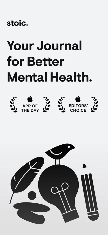
Frame 1 is a wasted first impression on search results
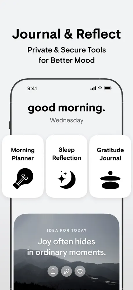
The opening frame contains zero interface pixels. In the App Store, search results display the first portrait screenshot at roughly 280 px wide; at that scale, Frame 1 resolves as an off-white rectangle with black text and a blob of illustration. A shopper cannot tell whether this is a journal, a widget, or a meditation timer. The awards are trust signals, but trust requires context. The fix is not to delete the frame, but to move it to position eight, or to split the canvas so that the poster occupies the top half and a device preview sits below.
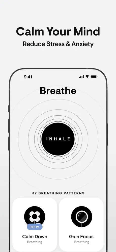
Frame 3's dark mode is tonally dissonant and semantically vague
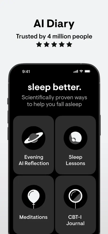
After two airy, light-interface frames, the plunge into pure OLED black is jarring. If the intention was to signal nighttime or sleep, a midnight blue or deep charcoal unique to the brand would have felt more ownable than generic black. More importantly, the caption 'AI Diary' is unsupported by the visible UI. The shopper sees a sleep hub, not an AI conversation. The fix is to align caption and content: either show a diary/chat interface and keep the 'AI Diary' header, or change the caption to 'Sleep Better' and accept the dark screen as a mood shift.
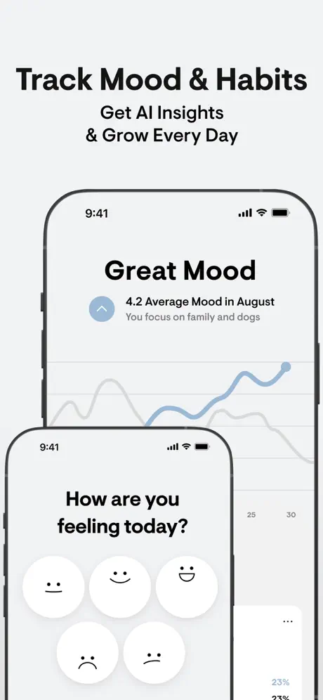
Frame 5's overlap hides the evidence
The dual-device stack in Frame 5 physically covers the insight text 'You focus on family and dogs' and truncates the chart's narrative arc. Because the caption explicitly promises 'AI Insights,' the composition is actively working against its own marketing claim. The fix is to offset the devices diagonally—upper-right and lower-left—so that no critical data is occluded, or to composite the mood selector and chart into a single coherent screen if the engineering allows.
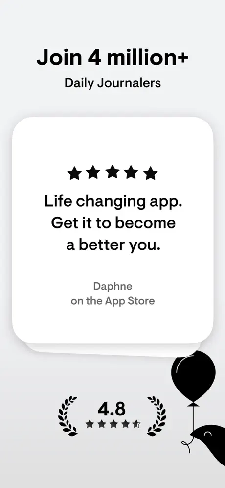
Frame 7 breaks the device pattern without purpose
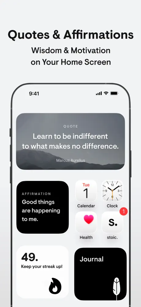
Six consecutive frames establish a strict spatial contract: text above, device below. Frame 7 shatters that contract by floating a white card in a void. The absence of a phone makes the testimonial feel like a web landing page rather than proof of an active community inside the app. The fix is to frame the review inside a device—perhaps an App Store review sheet or an in-app community hub—or, at minimum, to place a faint device silhouette behind the card so the eye retains its scale reference.
Icon semantics are stretched beyond recognition
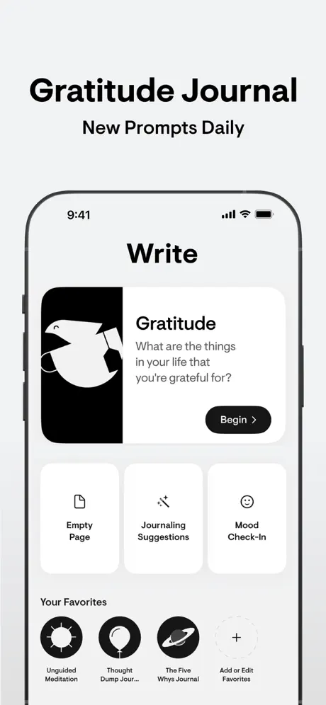
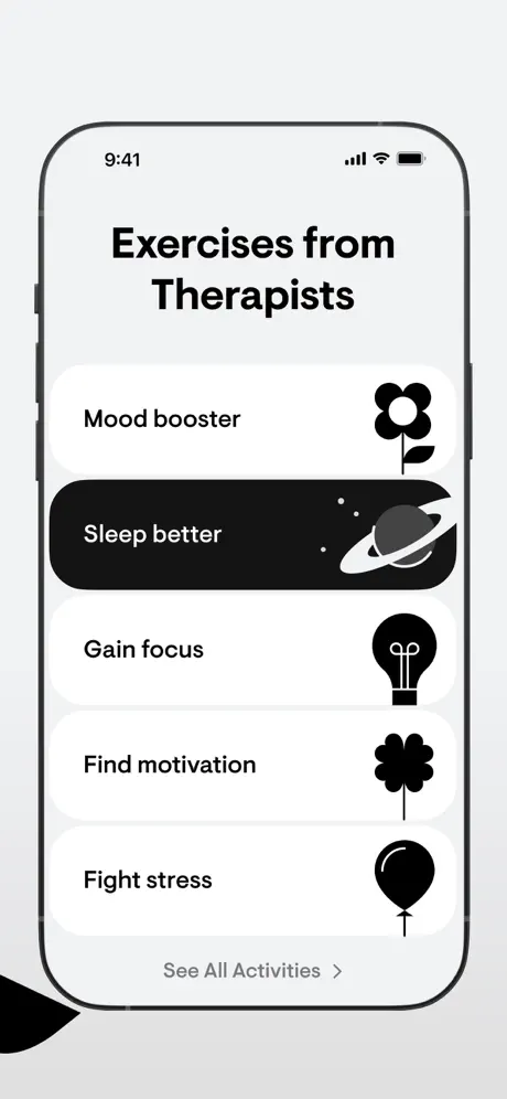
The balloon icon stands in for 'Meditations' in Frame 3, 'Thought Dump Journal' in Frame 4, and 'Fight stress' in Frame 8. The ringed planet represents 'Evening AI Reflection' in Frame 3 and 'Sleep better' in Frame 8. Because the symbols are purely decorative abstractions rather than readable metaphors, they fail to differentiate verticals; the shopper must read every label rather than recognizing categories at a glance. The fix is to lock one icon to one domain—balloon for release, planet for sleep, lightbulb for focus—and never recycle them across unrelated features.