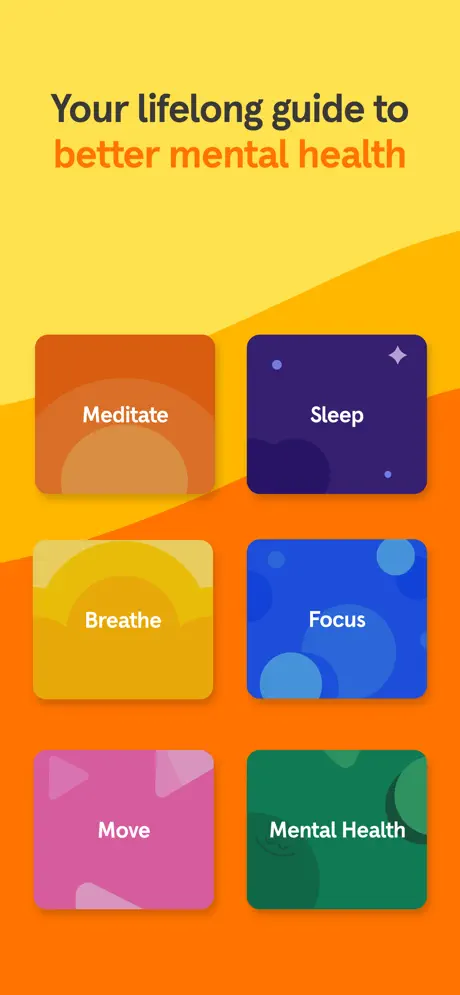
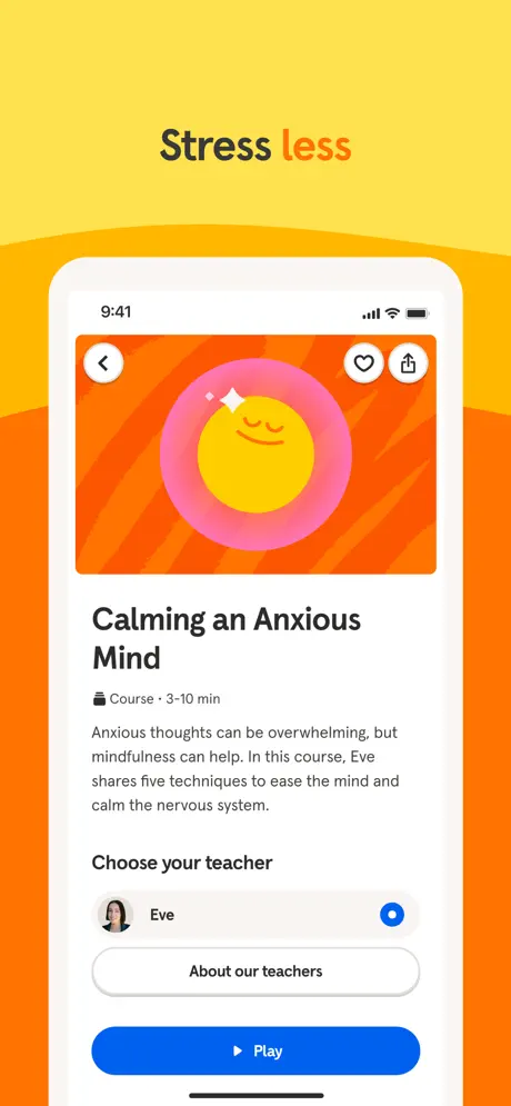
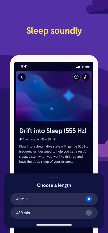
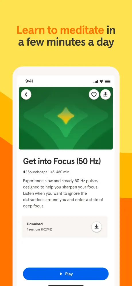
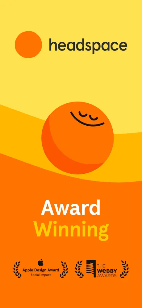
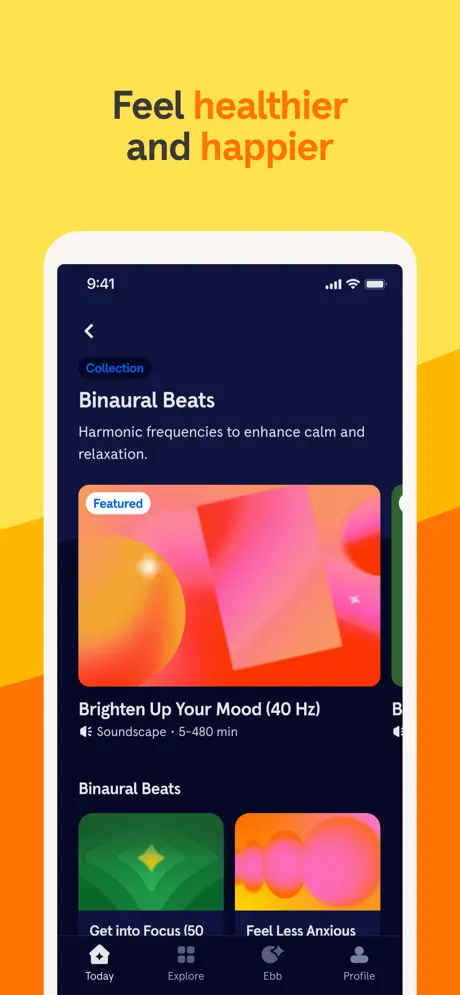
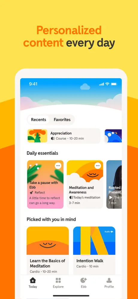
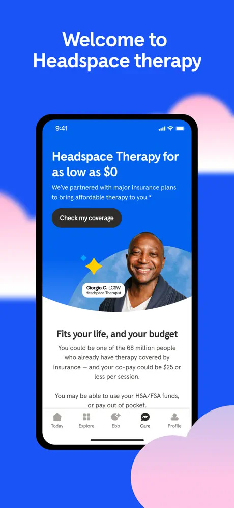
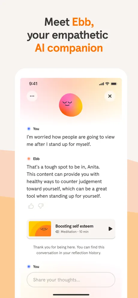
The overarching strategy is systemic repetition with controlled modulation. The background wave, rendered in a yellow (#FCE356) to orange (#FF6A00) gradient, appears in Frames 1, 2, 3, 5, 6, and 7, creating a scroll-stopping color block that reads as unmistakably Headspace. Against this canvas, captions use a two-tone type treatment: a near-black (#1F2937) for the first part of the headline and a burnt orange (#FF5F00) for the second, establishing a consistent scan pattern across six of the eight frames. Device framing is used as a content delimiter: Frame 3 introduces a white iPhone bezel to host the 'Stress less' course page, and this same white frame recurs in Frames 4 through 7, acting as a stable window before Frame 8 abruptly switches to a black device against a cobalt (#2563EB) background to signal the therapy vertical. The approach relies heavily on the rule of thirds—captions sit in the upper safe zone, devices occupy the middle two-thirds, and CTAs or supporting body copy anchor the lower portion of the screen mock. Frame 2 notably breaks the device pattern entirely, using six oversized category tiles with 16pt-radius corners and soft drop shadows to communicate taxonomy before showing any real UI.
Premium but accessible. The award laurels in Frame 1 justify the subscription price point, while the warm palette and rounded UI keep the tone approachable rather than clinical. Frame 8’s insurance-coverage message doubles down on accessibility by anchoring therapy to a $0 copay.