Algbra app icon
FinanceScreenshot teardown14 min read

Algbra App Store screenshots

Designing an App Store screenshot set for a financial app that foregrounds ethics and environmental impact means solving a compositional contradiction before a single hex value is locked. The shopper has to feel institutional stability—regulated, card-bearing, certified—while simultaneously reading the product as a modern alternative to legacy banking. Algbra’s set compresses an unusually broad product story into eight frames: onboarding velocity, physical card credentials, charitable giving, granular savings, carbon tracking, offset checkout, and spend analytics. That is seven distinct user jobs, each of which normally demands its own headline and hero image, now forced to compete inside a single thumb-swipe journey. The team also faces the App Store’s ruthless pacing dynamics; a viewer spends perhaps 1.8 seconds per frame, so any break in visual rhythm kills retention. The central question becomes how to stage a cinematic, trust-heavy opener without making the subsequent feature frames feel visually deflated, and how to prevent a predominantly white UI from collapsing into a series of identical rectangles on a white background. It is a sequencing problem as much as a graphic-design problem.

Set published by Algbra FS UK Limited · 9 frames analysed

5.0 · 19 ratingsFreev0.309.11Updated 5mo ago
Algbra App Store screenshot 1
01At a glance

The set in one screen

Framing
Full iPhone bezel mockup, vertically centered, identical scale across frames 2–8. Frame 1 has no device.
Captions
Centered, bold geometric sans, two-line headlines with sentence or title case; single subcaption beneath in medium-grey.
Backdrop
Frame 1: dark gradient. Frame 2: solid pastel pink. Frame 3–7: white. Frame 4: white with pink blobs. Frame 8: white with silver 3D coins.
Type
Clean, high-contrast sans-serif; large numerals for balances and metrics; light grey for secondary metadata.
UI / copy split
Approximately 70 % device/UI surface and 30 % caption/negative space on feature frames.
Frame 1 job
Trust and brand positioning through physical cards and regulatory marks.

Sampled palette

#0B0F1E#0B0F1E
#F8D7E0#F8D7E0
#FFFFFF#FFFFFF
#F472B6#F472B6
#10B981#10B981
#3B82F6#3B82F6
02The challenge

What this screenshot set had to solve

Designing an App Store screenshot set for a financial app that foregrounds ethics and environmental impact means solving a compositional contradiction before a single hex value is locked. The shopper has to feel institutional stability—regulated, card-bearing, certified—while simultaneously reading the product as a modern alternative to legacy banking. Algbra’s set compresses an unusually broad product story into eight frames: onboarding velocity, physical card credentials, charitable giving, granular savings, carbon tracking, offset checkout, and spend analytics. That is seven distinct user jobs, each of which normally demands its own headline and hero image, now forced to compete inside a single thumb-swipe journey. The team also faces the App Store’s ruthless pacing dynamics; a viewer spends perhaps 1.8 seconds per frame, so any break in visual rhythm kills retention. The central question becomes how to stage a cinematic, trust-heavy opener without making the subsequent feature frames feel visually deflated, and how to prevent a predominantly white UI from collapsing into a series of identical rectangles on a white background. It is a sequencing problem as much as a graphic-design problem.

Once the eye learns the layout in frame two, it can skip straight to the UI surface inside the device without re-parsing chrome.
03The approach

How the set argues its case

Bifurcate the narrative: let frame one carry all trust and brand, then switch to a rigid, repeatable UI module for frames 2–8 so the viewer can process features at speed without relearning the page structure. Use background color and soft 3D props as environmental brand signals rather than altering the UI chrome.

Ethical finance positioned as transparent and design-forward, leading with B Corp and FCA credentials before revealing savings sub-accounts and carbon tooling inside a pastel-accented interface. The tone sits between Monzo’s straightforward product photography and a lifestyle brand’s environmental storytelling.

04Frame by frame

Every screenshot, and the job it does

Algbra App Store screenshot 1 — Trust and atmosphere
01

Trust and atmosphere

On-frame caption: “Not Money As Usual.

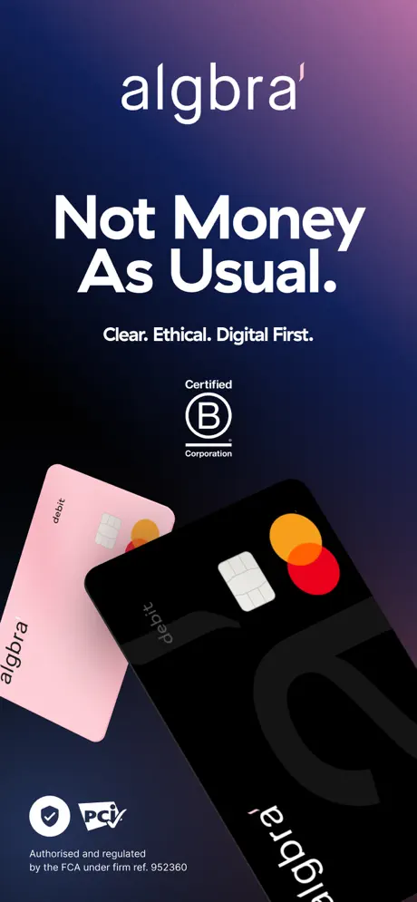
The hero frame is entirely atmosphere. A deep gradient fills the canvas, moving from a near-black navy—roughly #0B0F1E at the lower left—up through midnight blue and finally into a desaturated violet-magenta at the top right corner. No device frame appears; the composition relies on typography, certification marks, and physical card renders. The 'algbra' logotype sits top-center in a lowercase white sans, with a distinctive apostrophe that acts as a brand signifier. Below it, the headline 'Not Money As Usual.' is set extra-bold, white, and stacked across three lines, followed by the sub-line 'Clear. Ethical. Digital First.' in a lighter weight. The B Corp certification mark—white line art inside a circle with 'Certified' above and 'Corporation' below—is centered beneath the copy. The lower half is dominated by two floating debit cards: a matte pink card angled toward the left, and a black card angled right with an oversized, cropped letterform. Both carry Mastercard’s overlapping red and yellow circles. The bottom-left corner anchors regulatory trust with a shield checkmark, a PCI logo, and the line 'Authorised and regulated by the FCA under firm ref. 952360' set small. The entire frame is a bet on brand over product.
Algbra App Store screenshot 2 — Onboarding and dashboard breadth
02

Onboarding and dashboard breadth

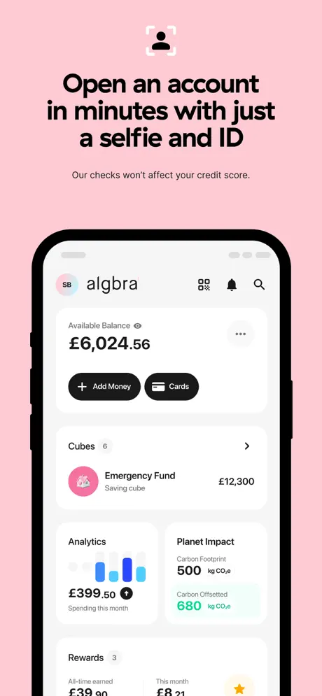
On-frame caption: “Open an account in minutes with just a selfie and ID

The background switches abruptly to a solid, saturated pastel pink—approximately #F8D7E0—dropping the darkness entirely. A thin, outlined user icon with corner brackets floats at the top center. The headline 'Open an account in minutes with just a selfie and ID' shifts to black, set in the same bold geometric sans, and the subcopy 'Our checks won't affect your credit score.' sits beneath in a smaller, lighter grey. The iPhone mockup reveals the app’s dashboard on a light grey ground. Inside, the header shows profile initials 'SB', the algbra wordmark, and utility icons for scan, notification, and search. The 'Available Balance' reads £6,024.56 in large black numerals, followed by two black pill buttons: '+ Add Money' and 'Cards'. Below, a 'Cubes' summary row shows an 'Emergency Fund' of £12,300 beside a pink circular icon, while an 'Analytics' card displays a blue bar chart and '£399.50 Spending this month'. A 'Planet Impact' module lists a 500 kg CO2e footprint and 680 kg offset in teal and mint. This frame sacrifices white space for breadth, acting as a product table of contents.

Algbra App Store screenshot 3 — Physical card credentials
03

Physical card credentials

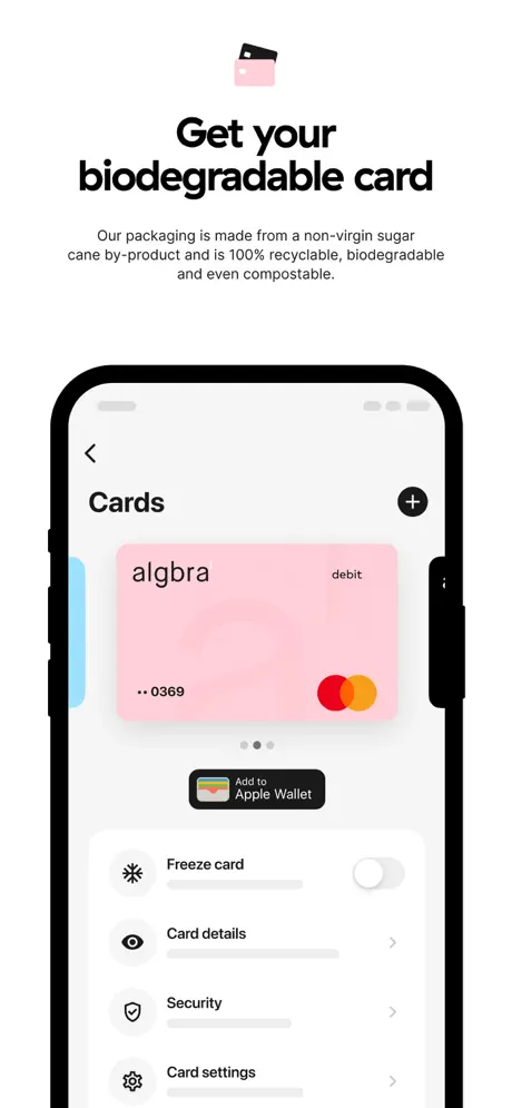
On-frame caption: “Get your biodegradable card

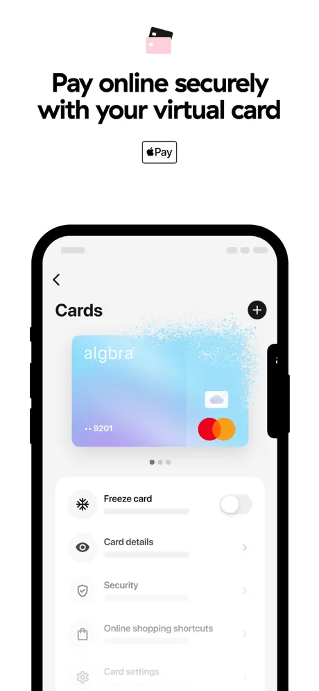
The background drops to pure white (#FFFFFF). A small, filled card icon with pink accents tops the frame. The headline reads 'Get your biodegradable card'. The subcopy is unusually dense: 'Our packaging is made from a non-virgin sugar cane by-product and is 100% recyclable, biodegradable and even compostable.' The iPhone shows the Cards management screen. Dominating the upper half is a pink Algbra card with the brand name in lowercase left-aligned, 'debit' right-aligned, masked digits '...0369', and the Mastercard mark. Pagination dots suggest multiple cards. Below sits an 'Add to Apple Wallet' button with the colored Apple logo on a black ground. A list follows: 'Freeze card' with a deactivated toggle, then 'Card details', 'Security', and 'Card settings' with leading icons and grey chevrons. The layout is calm, but the lower half of the phone screen is mostly empty, making the composition feel bottom-heavy outside the device and spacious inside it.

Algbra App Store screenshot 4 — Charitable giving
04

Charitable giving

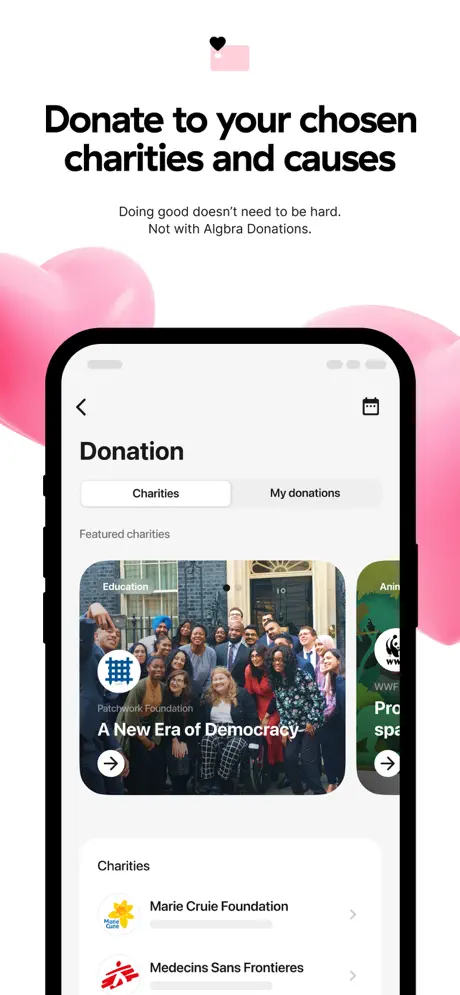
On-frame caption: “Donate to your chosen charities and causes

The background remains white, but two large, soft, semi-transparent pink organic blobs bleed in from the left and right edges, adding environmental depth. A small heart icon sits above the headline 'Donate to your chosen charities and causes'. The subcopy reads: 'Doing good doesn't need to be hard. Not with Algbra Donations.' The device shows a 'Donation' screen with a segmented control ('Charities' / 'My donations'). A horizontally scrolling 'Featured charities' section shows a Patchwork Foundation card with a photograph of a group of people and the caption 'A New Era of Democracy', plus a partially cropped WWF card. Below, a vertical list begins with 'Marie Cruie Foundation'—a visible misspelling—and 'Medecins Sans Frontieres'. This frame introduces photographic realism and social proof, breaking from the illustrated and UI-heavy language of the surrounding frames. The typographic weight of the list rows is light, relying on charity logos to carry recognition.

Algbra App Store screenshot 5 — Sub-accounts and savings goals
05

Sub-accounts and savings goals

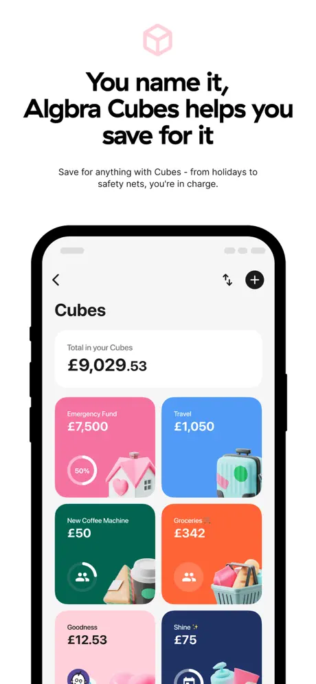
On-frame caption: “You name it, Algbra Cubes helps you save for it

Plain white returns. A pink-outlined hexagon or cube line icon tops the frame. The headline is stacked: 'You name it, Algbra Cubes helps you save for it'. Subcopy: 'Save for anything with Cubes - from holidays to safety nets, you're in charge.' The device displays the Cubes grid. A white summary card shows 'Total in your Cubes £9,029.53', followed by a two-column masonry-style grid of savings cards. Colors are explicit: hot pink (#F472B6) for 'Emergency Fund £7,500', blue (#60A5FA) for 'Travel £1,050', green (#10B981) for 'New Coffee Machine £50', and orange (#FB923C) for 'Groceries £342'. Each card contains a 3D illustration—a house, suitcase, coffee gear, and shopping basket. A second row shows a pink 'Goodness £12.53' card and a dark navy 'Shine £75' card. The hierarchy relies entirely on color blocking and emoji-like 3D assets rather than typography, making the screen feel like a mood board for financial goals.

Algbra App Store screenshot 6 — Carbon footprint tracker
06

Carbon footprint tracker

On-frame caption: “Track your carbon footprint with every purchase

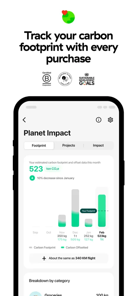
White background. The top icon changes to a green circle (#34D399) with a red heart. The headline: 'Track your carbon footprint with every purchase'. Below the headline, three certification marks sit in a horizontal lockup: B Corp, Climate Neutral, and Sustainable Development Goals. The device shows the 'Planet Impact' screen with three tabs—'Footprint', 'Projects', 'Impact'—rendered inside a light grey pill. The active tab reveals a large '523 ton CO2e' in bold teal, with '10% decrease since January' beneath a green arrow. A bar chart compares carbon footprint in grey against carbon offset in green across six months; February shows 523 kg offset against a 1t footprint. A contextual line at the bottom reads 'About the same as 340 KM flight'. The data visualization dominates, but the headline number uses 'ton' while the chart uses 'kg' without clear conversion, creating an avoidable moment of friction for a detail-oriented finance audience.

Algbra App Store screenshot 7 — Offset checkout
07

Offset checkout

On-frame caption: “Offset through causes and projects that matter to you

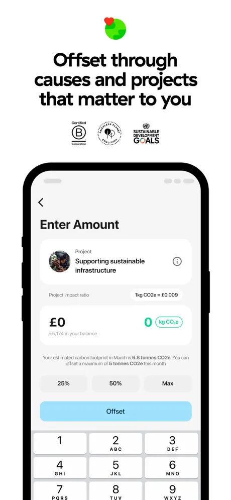
The icon and certification lockup are identical to frame 6, creating deliberate repetition. The headline shifts to 'Offset through causes and projects that matter to you'. The device displays an 'Enter Amount' screen. A project card shows a circular thumbnail and the title 'Supporting sustainable infrastructure'. The project impact ratio is stated as '1kg CO2e = £0.009'. A large input field shows '£0' with a matching '0 kg CO2e' in green. Account balance is noted as '£5,174'. Contextual copy reads: 'Your estimated carbon footprint in March is 6.8 tonnes CO2e. You can offset a maximum of 5 tonnes CO2e this month.' Three grey quick-action pills sit below: '25%', '50%', 'Max'. A bright blue (#7DD3FC) CTA button labeled 'Offset' spans the width above a numeric keypad that includes T9 lettering (2 ABC, 3 DEF, etc.). This frame is the clearest transactional moment in the set, showing the actual conversion of money into carbon offset.

Algbra App Store screenshot 8 — Spend analytics
08

Spend analytics

On-frame caption: “Analytics & Spending Insights

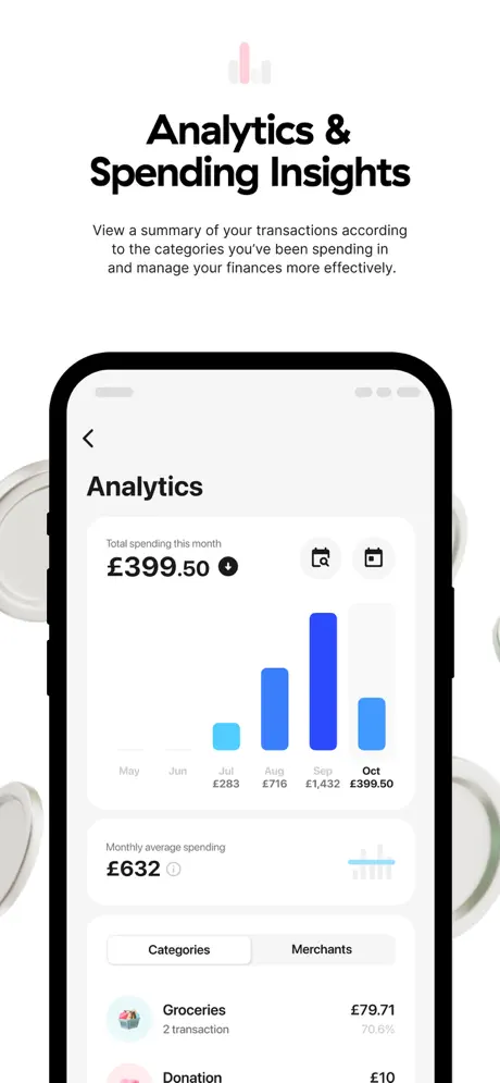
The final frame keeps the white ground but adds partially cropped 3D silver coin or pill shapes at the far left and right edges—metallic objects with no visual precedent in the previous seven frames. A pink bar-chart icon sits above the headline 'Analytics & Spending Insights'. Subcopy: 'View a summary of your transactions according to the categories you've been spending in and manage your finances more effectively.' The device shows the Analytics screen. A white card displays 'Total spending this month £399.50' with a small downward arrow icon, alongside calendar controls. A blue bar chart tracks months July through October, with September peaking at £1,432. Below, 'Monthly average spending £632' appears next to an info icon. Tabs for 'Categories' and 'Merchants' sit above a list row: 'Groceries £79.71, 2 transaction, 70.6%'. The frame closes the sequence on practical self-awareness rather than brand values, an interesting choice for the final swipe.

05The craft

Captions, colour and the mechanics of the sell

Caption pattern

Each frame opens with a two-line headline in a bold geometric sans, typically title case, occasionally sentence case. A short subcaption in a lighter grey weight follows immediately. No frame exceeds two lines of body copy, keeping the reading load low. Frame 3 is the outlier: its subcopy runs to three dense lines about sugar-cane packaging, breaking the brevity rule and creating a visible grey block.

Visual system

A dual-mode system. Mode A (frame 1) is atmospheric: dark gradient from roughly #0B0F1E to #2D1B4E, violet-magenta at the top right, no device, all typography and certification lockup. Mode B (frames 2–8) is clinical: pure white or near-white ground, black iPhone bezel centered at identical scale, status-bar notch visible but generic. The transition between modes is intentionally abrupt, trading visual continuity for the thumb-stopping contrast of frame 1.

The thumbnail test

Frame 1 is the only real thumbnail contender. The dark gradient reads instantly as premium and distinct from the sea of white-background fintech screenshots. The floating cards and oversized headline 'Not Money As Usual.' are legible at icon scale. Frames 2–8 will blur together in search results because the white backgrounds and identical layouts disappear at small sizes. The fix would be to inject a high-contrast frame—perhaps the carbon tracker with its bold green data—earlier in the sequence to create a second visual anchor in the gallery strip.

Conversion mechanics

The set is strong on top-of-funnel trust but light on conversion urgency. There is no social proof frame, no referral incentive, and no rate or fee comparison. For a financial product fighting high acquisition costs, the absence of any numeric value proposition—no savings rate, no cash-back percentage, no monthly fee notice—means the viewer must enter the listing page to find a reason to install. The carbon-offset frame comes closest to a conversion moment by showing a specific price-to-impact ratio (£0.009 per kg), but it is buried at frame 7.

06Where it slips

What we would change

Template fatigue across frames 2–8

Frames 2 through 8 share an identical compositional formula—centered icon, bold headline, grey subcopy, centered iPhone—which makes the middle frames blur together during a fast swipe. The fix is to vary the device treatment in two frames: crop to a card detail at full bleed in frame 3, or let the analytics chart break the bezel in frame 8, to re-engage the eye.

Abrupt color jump from hero to feature frames

The transition from the dark navy gradient of frame 1 to the solid pastel pink of frame 2 is structurally jarring; without a transitional frame, the brand reads as two different identities. Introducing a mid-tone bridge or carrying a navy accent into frame 2 would smooth the visual arc.

Visible data-hygiene errors

Frame 4 misspells 'Marie Curie' as 'Marie Cruie,' which undermines the credibility of a regulated financial product. Frame 6 displays a personal footprint of '523 ton CO2e'—a figure so large it implies industrial-scale emissions—while the adjacent chart cites '523 kg'. Sanitizing mock data to realistic personal ranges (e.g., 0.2–0.5 ton) and aligning units would eliminate skepticism.

Inconsistent environmental iconography

The top-icon language changes every frame: corner-bracket user outline, filled card, heart on blob, hexagon outline, green circle with heart, bar chart. They do not read as a unified system. Locking every icon to the same stroke weight and fill logic would make the sequence feel like a single design system rather than a collection of separate illustrations.

Disjointed 3D props in frame 8

The silver coin or pill shapes at the edges of frame 8 borrow a visual language nowhere else present and feel like stock assets. Removing them and letting the UI breathe would end the set on the product itself rather than on decorative noise.

07The recipe

How to apply this to your own app

  1. If your brand opens with a dark hero, carry at least one accent from that frame into the next screen so the transition does not feel like an app switch.

    A navy tab bar, a dark headline, or a small gradient residual in frame 2 would have kept Algbra’s identity continuous.

  2. Use a strict module for only four consecutive frames maximum, then break the pattern before the viewer’s eye learns to skip.

    After frame 5, Algbra could have shown a full-bleed 3D card render or a zoomed-in transaction row to create visual punctuation.

  3. Sanitize every line of mock copy as if it were legal copy.

    A typo in a charity name or an impossible carbon number erodes the exact trust that frames 1 and 6 work hard to build through B Corp and FCA marks.

  4. Repeat certification marks only when the context supports them.

    Frames 6 and 7 both show the B Corp/Climate Neutral/SDG lockup, but the lockup is small and dense. Using it once in frame 6 and letting frame 7 focus purely on the offset action would reduce clutter.

  5. End on value, not decoration.

    Frame 8’s 3D coins add no product information. Replacing them with a solitary, high-contrast data point—like '70% less spend than last month'—would close the sequence with a reason to install.

08Takeaways

Five things worth stealing

  • A dark, device-free hero is a powerful trust anchor in finance screenshots—use it to carry regulatory and certification marks without cluttering the UI.
  • Rigorous template consistency (icon + headline + subcopy + device) speeds up comprehension, but repeating it across seven frames creates swipe fatigue; plan a deliberate pattern break at frame 5 or 6.
  • Environmental brand signals (pink blobs, green data accents) work best when threaded through backgrounds rather than injected into the UI chrome, preserving interface clarity.
  • Mock data is part of the brand experience. Spelling errors and implausible metrics in screenshots directly contradict the credibility established by B Corp and FCA logos.
  • The final frame should either restate the core value proposition or present a conversion moment; decorative 3D assets that appear nowhere else in the set waste the last impression.
09The verdict

What the set actually achieves

The set lands on a strict modular system. A dark, device-free hero establishes credibility through regulatory language, certification marks, and physical card renders. Frames two through eight repeat an identical layout—centered icon, headline, subcopy, device—turning the sequence into a rapid-fire product tour. A pink environmental accent threads through backgrounds and 3D assets to maintain brand continuity across the white frames. The UI inside the devices favors monochrome cards with disciplined blue and green data accents, keeping readability high while allowing the feature set itself to change from frame to frame.

Designers and product teams building screenshot sets for fintech, neobanks, or mission-driven consumer apps that need to balance institutional credibility with approachable UI storytelling. Anyone wrestling with how to sequence multiple distinct features without losing visual rhythm will find the modular approach instructive—especially the tension between its efficiency and its monotony.

10Questions

Frequently asked

Why does the set start with a dark frame when the app UI is predominantly white and pastel?

Frame 1 is a pure brand-trust play. The dark gradient allows white typography and certification marks to read as premium and serious, while the physical card renders add tangibility. It front-loads credibility so that the lighter feature frames feel like a reveal rather than a lightweight app.

How does the set handle regulatory messaging without feeling bureaucratic?

It buries the FCA reference and PCI mark in the lower-left corner of frame 1 at a small size, using them as texture rather than headline. The B Corp mark is centered but rendered in clean white line art, so it reads as a design element rather than a legal disclaimer.

What is the main risk of the identical layout used from frames 2–8?

Thumb-stopping power collapses after frame 3. A viewer scrolling quickly sees the same silhouette repeatedly and learns to skip. The content inside the device changes, but the outer architecture does not, so the brain filters it as the same frame.

Is the pink background in frame 2 a wise choice for accessibility?

The black headline on pastel pink passes contrast checks, but the solid color is so saturated that it competes with the device for attention. A lower-saturation tint or a white background with pink card accents might have let the UI surface dominate.

What is the single most important fix for this set?

Sanitize the mock data and break the template once between frames 5 and 7. Correcting 'Marie Cruie' and the 523-ton carbon figure would restore credibility, while a full-bleed detail crop of the offset keypad or analytics chart would reawaken visual interest before the final frame.

11Keep reading

Build your own screenshot set

The full set

9 shots
Algbra App Store screenshot 1Algbra App Store screenshot 2Algbra App Store screenshot 3Algbra App Store screenshot 4Algbra App Store screenshot 5Algbra App Store screenshot 6Algbra App Store screenshot 7Algbra App Store screenshot 8Algbra App Store screenshot 9

About the app

Algbra is the ethical finance platform designed to help you spend, save, and manage money in a way that puts people and the planet first. Open an account with ease, manage Algbra FS UK Limited, via the App Store listing.

Screenshots and store metadata belong to Algbra FS UK Limited. They are shown here for design commentary and criticism. The analysis on this page is original work by floow.design. View the original listing.

More Finance teardowns

Browse all →