
Eversend app icon
FinanceScreenshot teardown9 min read

Eversend App Store screenshots

Eversend’s eight-frame App Store set attempts to package a sprawling fintech stack—remittance, multicurrency wallets, virtual cards, stablecoins, and FX—into a single swipeable narrative. The result is a densely produced sequence that alternates between photography, device mockups, and 3D illustration, all orbiting a core purple brand system.

Set published by Eversend · 8 frames analysed

3.9 · 1.0K ratingsFreev0.7.998Updated 5mo ago
Eversend App Store screenshot 1
01At a glance

The set in one screen

Framing
iPhone 14 Pro with Dynamic Island; mix of frontal portraits, three-quarter angles, and one frame without any device at all.
Captions
Bold, centered sans-serif headline in dark indigo (~#1A1B5E) with a secondary qualification line or lozenge badge directly beneath.
Backdrop
Rotating pastel fields: electric violet (#5B4DFF), pale lilac (#F2EBFF), mint cyan (#E6F9FF), and warm cream (#FFF8E7).
Type
Geometric sans, heavy weight for headlines, regular for subheads; no serif accents.
UI / copy split
High UI exposure—every frame except one centers an actual app screen or product card.
Frame 1 job
Humanize the product with photography, state the global thesis, and anchor trust with a Trustpilot badge.

Sampled palette

#5B4DFF#5B4DFF
#F2EBFF#F2EBFF
#E6F9FF#E6F9FF
#FFF8E7#FFF8E7
#1A1B5E#1A1B5E
02The challenge

What this screenshot set had to solve

Eversend sits at the crowded intersection of remittance, neobanking, and cryptocurrency, which means its App Store screenshot set must compress an unusually broad feature matrix into just eight swipes. A shopper scrolling the Finance category is likely comparing this app against single-corridor transfer tools and incumbent banks, so the set needs to signal both breadth—multicurrency wallets, virtual cards, stablecoins, and foreign-exchange conversion—and institutional trust, because moving money across borders demands credibility that marketing copy alone cannot manufacture. The visual challenge is therefore twofold: first, to prevent feature sprawl from becoming cognitive noise, and second, to make abstract financial instruments feel concrete and safe. Virtual dollar cards, USD routing numbers, and stablecoin balances are intangible by nature, so the imagery must substitute digital artifacts with enough visual weight that they read as real, graspable products. Additionally, the imagery must telegraph localization for African markets without alienating a global user base, evidenced by NGN-denominated interface states, East and West African flags, and a beneficiary list filled with regional names. All of this must resolve into a scannable vertical rhythm on a six-inch screen while competing for attention against every other finance app in the store.

The team treats each screenshot as a self-contained vertical poster with three locked tiers: headline, credibility badge, and central stage—a structure that keeps the narrative legible even when the feature set is not.
03The approach

How the set argues its case

The team treats each screenshot as a self-contained vertical poster with three locked tiers: a top-line value proposition set in a heavy geometric sans, a credibility sub-line or social-proof badge, and a central stage for either a device capture or a 3D product render. To manage cognitive density, they segment the eight-frame journey by background temperature. A saturated electric violet near #5B4DFF owns Frame 1 as the brand punch; from there, the set rotates through pale lavender (#F2EBFF), mint cyan (#E6F9FF), and warm cream (#FFF8E7), creating subconscious chapter breaks between send, spend, bank, exchange, and secure. Three-dimensional props function as narrative extras—globes, bank façades, shopping-cart icons, and glossy coin tokens—orbiting the phone to suggest capability without crowding the interface itself. Social proof is strategically bifurcated: a Trustpilot 4.3 badge opens the set in Frame 1 and reappears in Frame 8, while regulatory seals are quarantined to Frame 7 so they act as a friction-removal checkpoint near the end of the swipe journey rather than a front-loaded distraction. Crucially, the interface is never presented as a generic template; real account numbers, routing digits, and fluctuating stablecoin prices lend the kind of specificity that polished mockups usually erase.

Rather than positioning the app as a neobank for a single market, the set uses regional names, African flags, and NGN-denominated screenshots to signal primary-market fluency, while USD, EUR, and GBP framing broadens the addressable audience.

04Frame by frame

Every screenshot, and the job it does

Eversend App Store screenshot 1 — The Easiest Way to Move Money Globally
01

The Easiest Way to Move Money Globally

On-frame caption: “The hero frame floods the canvas with a saturated violet at roughly #6355FF. The headline "The Easiest Way to Move Money Globally" sits in stark white, tightly tracked sans, directly above a mint-green pill containing a globe avatar and the text "Join 1,000,000+ users." The lower two-thirds is occupied by photography: a user in a teal sweater holds an iPhone 14 Pro showing a balance of "NGN 250,500.2" and a transaction list with withdrawals and peer-to-peer sends. Glassy 3D ornaments—a globe, a wallet, and a classical bank—float in the remaining negative space. A white Trustpilot lozenge reading "Rated 4.3" caps the bottom edge. By using photography here and nowhere else, the frame injects human warmth before the rest of the set shifts to pure render.

The phone’s bottom tab bar is visible, exposing Home, Cards, Send, Earn, and More, with Send in an active state. The status bar shows 9:41, full Wi-Fi, and a near-full battery.
Eversend App Store screenshot 2 — Send Money Globally with Zero Hidden Fees
02

Send Money Globally with Zero Hidden Fees

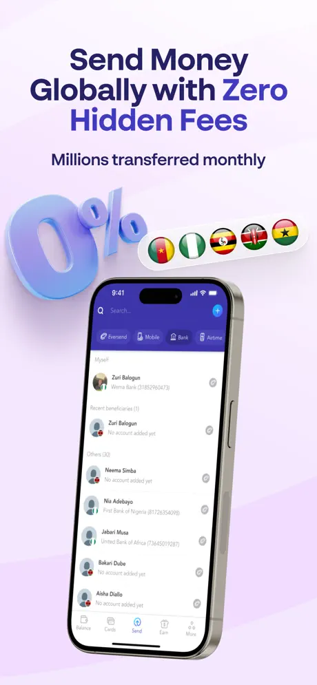
On-frame caption: “Against a pale lilac ground around #F2EBFF, the headline reads "Send Money Globally with Zero Hidden Fees" in deep indigo, with the word "Zero" carrying the conceptual load. Beneath it, "Millions transferred monthly" provides secondary social proof. A large, glossy 3D "0%" in periwinkle occupies the left mid-ground, while a white capsule on the right strings together five circular flags: Cameroon, Nigeria, Uganda, Kenya, and Ghana. The iPhone is shown in three-quarter view with the power-button edge visible, displaying a beneficiary list under tabs labeled "Eversend," "Mobile," "Bank," and "Airtime." Names such as Zuri Balogun, Neema Simba, and Jabari Musa localize the product. The crop deliberately omits the bottom navigation bar to keep focus on the recipient list.

The search bar at the top of the screen carries a blue plus icon on the right, suggesting add-recipient logic. The list entry for Zuri Balogun shows a Wema Bank account suffix.

Eversend App Store screenshot 3 — Save Up to 13% When Spending in Dollars
03

Save Up to 13% When Spending in Dollars

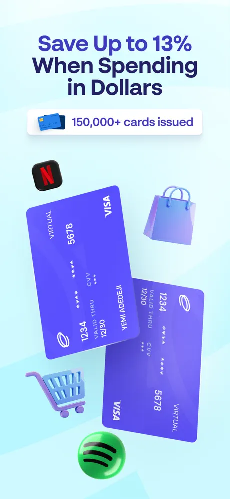
On-frame caption: “The background shifts to a pale cyan near #E6F9FF, and the device disappears entirely. Instead, two purple virtual Visa cards—printed with the name "IFEDOLA AWODEYI," numbers ending in 5678 and 1234, expiry 12/30, and CVV placeholders—float diagonally across the center. The headline "Save Up to 13% When Spending in Dollars" tops the frame, supported by a white pill that reads "150,000+ cards issued." Surrounding the cards are 3D lifestyle markers: a Netflix app icon, a Spotify orb, a shopping bag, and a checkout cart. The card purple matches the brand hue in Frame 1, maintaining chromatic continuity even as the subject changes. Removing the phone is a risky gambit: it elevates the card to a hero product, but it also severs the immediate context that this is an in-app virtual feature.

Both cards carry the word VIRTUAL vertically along the left edge and the Visa mark top-right, while the Eversend spiral logo sits opposite the chip zone. The 3D shopping cart uses a softer, more matte plastic than the glossy media icons.

Eversend App Store screenshot 4 — Get a USD/EUR/GBP Bank Account
04

Get a USD/EUR/GBP Bank Account

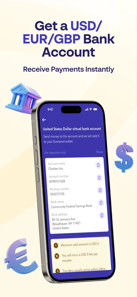
On-frame caption: “A warm cream ground near #FFF8E7 introduces banking. "Get a USD/EUR/GBP Bank Account" and "Receive Payments Instantly" frame an iPhone tilted to show the left-side volume buttons. On screen is a "United States Dollar virtual bank account" interface for a user named Charles Ivia, exposing plaintext account number 8398101628, routing number 026073150, and the bank address for Community Federal Savings Bank in Woodhaven, NY. Each field carries a copy icon. At the bottom, three yellow warning boxes disclose a $6 minimum, a $5 transfer fee, and a 24-hour arrival window. Decorative 3D props—a bank building, a dollar sign, and a euro sign—orbit the device. The honesty of the fee disclosures is unusual for App Store imagery, where competitors often hide friction.

A blue lozenge at the top of the screen reads, alongside a Share button. The bank address is fully typeset: 89-16 Jamaica Ave, Woodhaven, NY 11421, United States.

Eversend App Store screenshot 5 — Exchange Currency at the Best Rates
05

Exchange Currency at the Best Rates

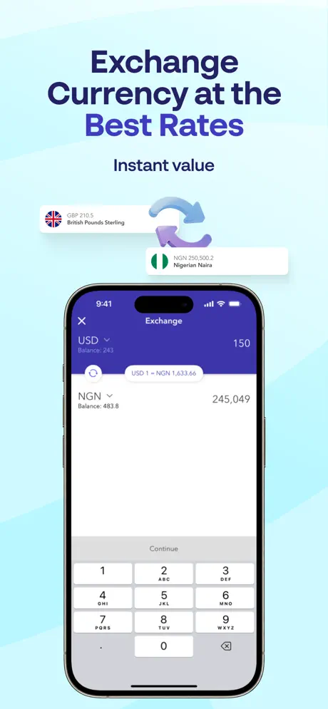
On-frame caption: “Returning to the mint-cyan palette, the headline "Exchange Currency at the Best Rates" sits above "Instant value." Floating tickets above the device show "GBP 210.5 British Pounds Sterling" and "NGN 250,500.2 Nigerian Naira" connected by a circular arrow icon. The iPhone displays an active exchange screen: a USD balance of 243, an input of 150, converting to NGN 245,049 at a stated rate of USD 1 = NGN 1,633.66. The native numeric keypad fills the bottom third. The deep indigo header bar contrasts sharply with the white sheet below, and the large NGN result number anchors the composition. There is minimal decorative clutter around the bezel, letting the functional UI speak.

The header carries a close X on the left and the title Exchange centered. Each currency row shows a dropdown caret, current balance, and the large input figure.

Eversend App Store screenshot 6 — Send & Receive Stablecoins Instantly
06

Send & Receive Stablecoins Instantly

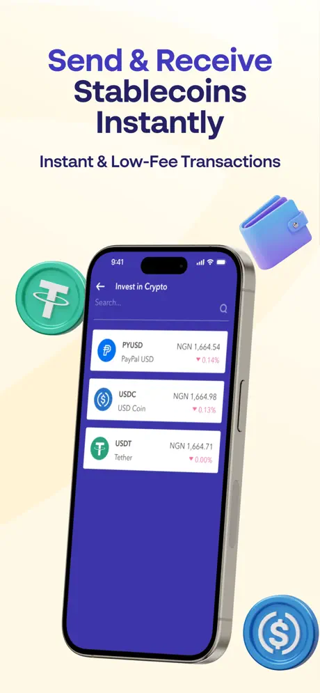
On-frame caption: “The cream background returns for the stablecoin frame. "Send & Receive Stablecoins Instantly" leads, with "Instant & Low-Fee Transactions" beneath. An angled iPhone shows an "Invest in Crypto" screen listing PYUSD, USDC, and USDT against NGN prices near 1,664, each flagged with small red downward ticks of -0.14%, -0.13%, and 0.00%. Floating props include a green USDT coin, a blue USDC coin, and a gradient wallet. The list is sparse—just three rows on a solid purple field—which prevents the crypto feature from feeling intimidating. However, the red negative indicators, while truthful, introduce a subtle note of volatility into a frame that promises stability.

The back chevron and Search placeholder are visible in the screen header. Each row pairs a circular token icon with its ticker, full name, NGN conversion, and percentage delta in red.

Eversend App Store screenshot 7 — Bank-Grade Security Protected
07

Bank-Grade Security Protected

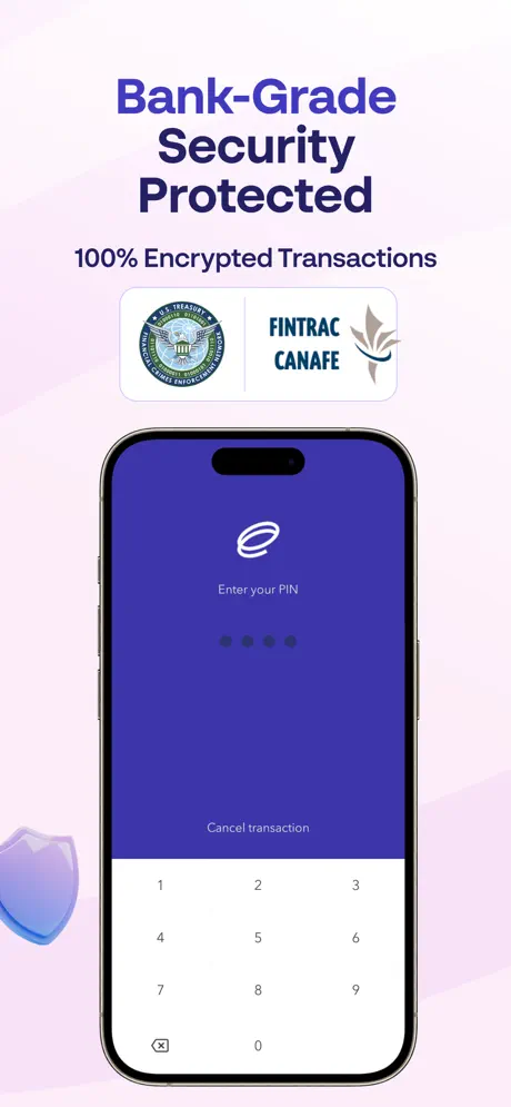
On-frame caption: “A lavender ground hosts the security frame. "Bank-Grade Security Protected" and "100% Encrypted Transactions" headline the scene. Above the phone, a white card bisected by a hairline displays two regulatory seals: the U.S. Treasury FinCEN seal on the left and the FINTRAC CANAFE logo on the right. The iPhone runs a PIN-entry screen with the Eversend spiral logo, the prompt "Enter your PIN," five dot indicators, and a white numeric keypad. A translucent purple shield rests in the lower left. The composition is deliberately sparser than the others, using negative space to evoke calm. Yet the regulatory badges are rendered too small for their text to resolve at gallery size; they register as colorful blobs rather than legible credentials, undermining the trust they are meant to establish.

The keypad uses a hairline grid with numbers 1–9 and 0, plus a backspace icon. The option to Cancel transaction sits above the keypad in the indigo area of the screen.

Eversend App Store screenshot 8 — Global Payments Without Borders
08

Global Payments Without Borders

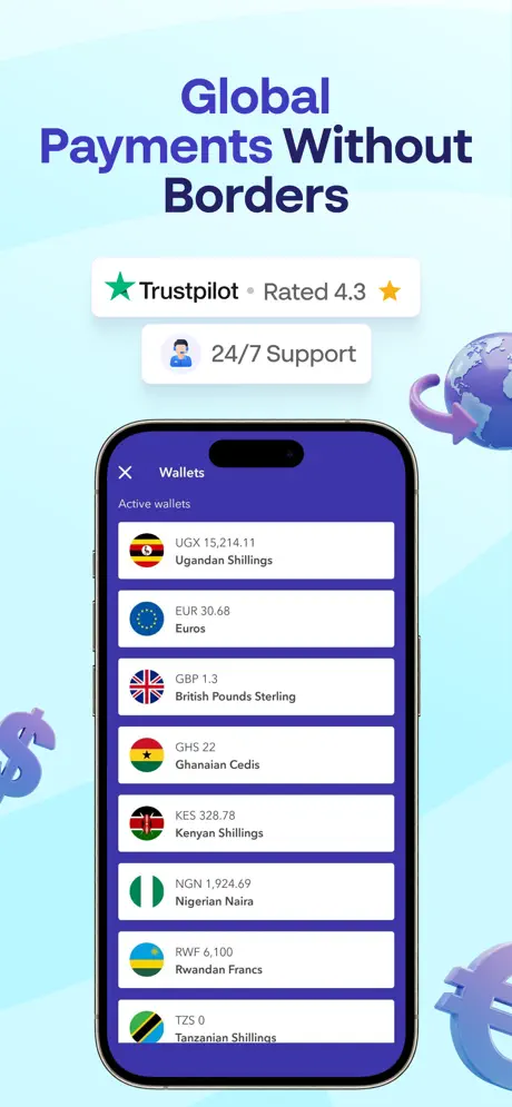
On-frame caption: “The final frame reuses the cyan ground to close the loop. "Global Payments Without Borders" revives the Trustpilot "Rated 4.3" badge and adds a "24/7 Support" lozenge with a headset avatar. The iPhone shows a Wallets screen listing eight active balances: UGX 15,214.11, EUR 30.68, GBP 1.3, GHS 22, KES 328.78, NGN 1,924.69, RWF 6,100, and TZS 0, each paired with a circular flag. A globe with arrows and 3D currency symbols frame the device. The list is truncated at the bottom edge, implying additional wallets below the fold. This frame acts as a portfolio proof-point, summarizing the product’s multicurrency breadth in a single scroll-stopped image.

The leftmost currency is Ugandan Shillings and the last fully visible entry is Tanzanian Shillings at TZS 0; the presence of a zero-balance wallet suggests the app lets users hold dormant accounts without penalty.

05The craft

Captions, colour and the mechanics of the sell

Caption pattern

Every caption follows a strict binary rhythm: a bold promise line (typical length six to eight words) followed by a shorter qualification or proof line (two to four words, or a lozenge with an icon). No frame breaks this cadence.

Visual system

A single family of floating 3D assets is reused across the set—globes, currency symbols, bank buildings, and wallet objects—grounded by a consistent drop shadow and glass-shader vocabulary, though lighting direction drifts between frames.

The thumbnail test

In the gallery strip, Frame 1’s saturated violet and photographed face will outperform the pastel frames for raw stop-rate, but the abrupt color shifts from violet to lilac to cyan may make the app look like three different products until the user enters the full-screen carousel.

Conversion mechanics

The set front-loads social proof in Frame 1 (Trustpilot + user count), repeats the rating in Frame 8, and buries regulatory seals in Frame 7—an effective trust gradient that reserves institutional evidence for users who have already bought into the feature story.

06Where it slips

What we would change

Gallery cohesion fractures across pastel chapters

By assigning a unique background hue to nearly every frame, the team makes individual screenshots scannable but turns the gallery thumbnail strip into a patchwork. A shopper pausing on the search results page will see violet, lilac, cyan, and cream fighting for attention instead of one recognizable aura. The fix is to introduce a single repeating brand texture—perhaps a subtle dot grid or the spiral logo watermark—across every ground so the set stitches together visually.

Frame 3 severs the device contract

Removing the iPhone to float the virtual cards is visually arresting, but it breaks the established rule that every feature lives inside the app. A user scanning quickly may mistake the virtual Visa for a physical card program. The fix is to retain a faint device reflection or a sliver of phone chrome behind the cards so the digital context is preserved.

Headline contrast fails to prioritize the key word

In Frame 2, the most persuasive word in the sentence—Zero—sits in the same dark indigo as the rest of the headline against a pale lilac field. Because the surrounding frames all use similar indigo type, nothing signals that this word carries the conversion hook. The fix is to render Zero in the brand purple (#5B4DFF), or give it a high-contrast pill of its own, so it punches through the pastel.

3D asset lighting is inconsistent

The Netflix and Spotify icons in Frame 3 carry a wet, candy-shell specularity, while the bank building in Frame 4 is matte and softly shadowed, and the shield in Frame 7 is translucent. The scattering light sources make the environment feel like a kitbash rather than one ecosystem. The fix is a single art-direction pass on shader roughness, specular intensity, and shadow softness before any asset is approved for export.

Regulatory badges in Frame 7 are illegible

FinCEN and FINTRAC marks are shrunk to a size where their typography and seal detail dissolve into noise on a phone screen. Because these are presented as trust tokens, their illegibility signals opacity rather than authority. The fix is to enlarge that white badge by roughly 40 percent and scale the phone down slightly so the seals resolve at a credible minimum size of 24 pt equivalent.

07The recipe

How to apply this to your own app

  1. Establish a repeating anchor

    Eversend’s color-chapter system works for reading speed but fails for brand recognition. When you segment by background hue, thread one constant element—an accent line, a watermark, or a persistent device shadow—through every frame so the gallery strip reads as a single product, not a collage.

  2. Anchor headlines with contrast hierarchies

    Identify the single word in each headline that carries the conversion promise—Zero, Instantly, 13%—and isolate it on the highest-contrast ground available, either by color shift, scale bump, or containment in a lozenge, rather than letting it dissolve into a pastel field.

  3. Keep the device visible for digital products

    If your feature is a virtual card, a digital wallet, or an in-app account, never remove the phone entirely without a UI tether. Add a reflection, a sliver of bezel, or a screen-glow behind the hero asset so shoppers instantly register the feature as software, not hardware.

  4. Expose real interface data

    Eversend’s use of real routing numbers, localized names, and live currency rates lends credibility that generic placeholder content destroys. When capturing screenshots, populate screens with believable regional data rather than lorem ipsum balances or John Doe contacts.

  5. Size trust seals for legibility, not decoration

    Regulatory badges, certifications, and ratings should be treated as readable text, not texture. Before exporting, view the screenshot at the actual thumbnail scale; if the seal text is illegible, enlarge the badge or simplify to a wordmark that survives compression.

  6. Standardize 3D shader vocabulary

    If you are compositing 3D icons from multiple asset packs, run a normalization pass on roughness, specularity, and shadow softness. Mismatched lighting models are more distracting than simple flat illustration because they signal unpolished art direction.

08Takeaways

Five things worth stealing

  • When segmenting a long screenshot set by background color, thread one repeating brand texture or accent through every frame to prevent the gallery strip from reading as a patchwork of unrelated apps.
  • Isolate the highest-conversion word in each headline on the strongest contrast ground available instead of letting it sit in uniform indigo against a pastel field.
  • If you replace a device frame with a floating product render, retain a screen reflection or bezel sliver so users do not mistake a virtual feature for a physical one.
  • Render regulatory badges and trust seals at a legible minimum size of roughly 24 pt equivalent, because unreadable credentials signal insecurity rather than authority.
  • Run a single art-direction pass on roughness, specularity, and shadow direction across all 3D assets so the composite environment feels like one ecosystem rather than a kitbash.
  • Truncate a scrollable list at the bottom edge of the final screenshot to imply depth and additional features without consuming an extra frame.
  • Populate every interface screen with realistic regional data—names, flags, currency codes, and routing numbers—because believable specificity converts faster than sanitized placeholder content.
09The verdict

What the set actually achieves

Eversend uses a color-chapter system to turn eight dense propositions into a scannable journey, but the set sacrifices gallery cohesion for frame-by-frame contrast, and occasional lapses in typographic hierarchy and 3D consistency weaken the authority it tries so hard to build.

Founders and product designers building multi-feature fintech apps who need to turn a complex value proposition into a scannable, trust-first App Store narrative without relying on generic marketing platitudes. Also useful for teams debating whether to use photography, 3D illustration, or pure UI mocks in finance screenshot sets.

10Questions

Frequently asked

Does the set use real photography or is it entirely 3D?

Frame 1 is the only screenshot that uses a photographed human subject; Frames 2 through 8 rely on 3D props, device renders, and pure UI capture.

How many distinct background colors are used across the eight frames?

Four: saturated violet in Frame 1, pale lilac in Frames 2 and 7, mint cyan in Frames 3, 5, and 8, and warm cream in Frames 4 and 6.

Are there any frames without a device mockup?

Yes—Frame 3 removes the iPhone entirely and floats two virtual Visa cards as hero products.

What social proof elements appear, and where?

A Trustpilot "Rated 4.3" badge appears in Frame 1 and Frame 8; regulatory seals for FinCEN and FINTRAC appear in Frame 7.

Which currencies are visible in the interface?

NGN, USD, EUR, GBP, UGX, GHS, KES, RWF, TZS, and the stablecoins PYUSD, USDC, and USDT.

11Keep reading

Build your own screenshot set

The full set

8 shots
Eversend App Store screenshot 1Eversend App Store screenshot 2Eversend App Store screenshot 3Eversend App Store screenshot 4Eversend App Store screenshot 5Eversend App Store screenshot 6Eversend App Store screenshot 7Eversend App Store screenshot 8

About the app

Eversend is your go to app, offering you a full range of financial services, straight from your mobile phone. Unlike banks, we don’t have hidden fees, inconvenient operating hours Eversend, via the App Store listing.

Screenshots and store metadata belong to Eversend. They are shown here for design commentary and criticism. The analysis on this page is original work by floow.design. View the original listing.

More Finance teardowns

Browse all →