
NEXT Insurance app icon
FinanceScreenshot teardown13 min read

NEXT Insurance App Store screenshots

NEXT Insurance: App Store Screenshot Case Study

NEXT Insurance App Store screenshot 1
01At a glance

The set in one screen

Framing
iPhone notch frames on the device shots; frames 1 and 5 are full-bleed poster cards with no device
Captions
Centered black serif above the phone frames, acting as traditional marketing scaffolding
Backdrop
Frames 1–4 float on a light cyan (#B3F7FF) ground; frames 5–8 switch to pale lime green (#D4FFBD) with an electric lime (#00FF41) poster in frame 5
Type
A single condensed, geometric sans-serif used at poster scale both inside the app UI and on the marketing cards, creating continuity between promotional graphics and live screens
UI / copy split
UI occupies roughly sixty-five percent of each phone frame; custom illustrations consume the remaining thirty-five percent in cyan header bands
Frame 1 job
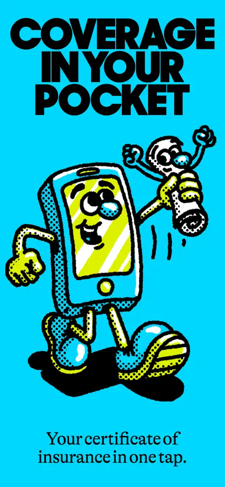
Establish tone before utility—frame 1 contains no screenshot at all, only a mascot illustration and the stacked headline COVERAGE IN YOUR POCKET

Sampled palette

#00E5FF#00E5FF
#00FF41#00FF41
#007AFF#007AFF
#000000#000000
#FFFFFF#FFFFFF
#FF2D92#FF2D92
02The challenge

What this screenshot set had to solve

The primary challenge in designing store screenshots for a finance product is that the category has trained users to look for shorthand signals of institutional stability: dark navies, shield iconography, muted palettes, and human hands carefully holding phones. NEXT Insurance discards nearly all of these conventions. The set therefore faces a twofold problem: it must visually educate a small-business owner that dense administrative tasks—issuing live certificates of insurance, adding named insureds, filing claims—can be executed inside a mobile app, while simultaneously convincing that same user that the app is credible enough to handle liability coverage. The product surface is administratively complex: follower lists, destructive confirmations, notification permissions, and multi-holder certificates. The screenshot set must compress that complexity into eight swipeable frames without collapsing into abstract feature lists. Doing this under a playful, illustration-heavy art direction raises the stakes; every functional screen has to work harder to prove it is not merely a toy wrapper around a serious tool.

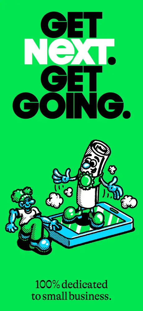
No device appears. The frame is a flat, saturated cyan field, functioning as a pure brand billboard that values attitude over literal app architecture.
03The approach

How the set argues its case

The creative solution treats every frame as a poster first and a screenshot second. A single condensed geometric sans—stacked, tightly tracked, and set in all caps—dominates both the marketing cards and the in-app headlines, dissolving the boundary between promotional graphics and live UI. Inside the phone frames, the app mirrors this poster logic: massive black type sits atop two-tone modules of electric cyan and white, with pill-shaped CTAs in a bright interface blue. A recurring family of anthropomorphic mascots—an iPhone with sneakers, a superhero certificate, a clipboard with arms—provides narrative continuity across otherwise disparate features. The set alternates between full-bleed non-device frames and framed iPhones to create swipe rhythm, and it splits the sequence into two chromatic chapters: a cyan run that introduces core certificate creation and sharing, and a lime-green run that shifts toward account management and notifications. The result is a scroll that feels episodic rather than monotonous, though that episodic structure introduces its own editorial risks.

Instead of competing on trust cues, the set competes on memorability. It behaves more like a skate-brand lookbook than a brokerage tool, gambling that a small-business owner will trade the expected navy-shield visual grammar for a system that feels fast, graphic, and mobile-native.

04Frame by frame

Every screenshot, and the job it does

NEXT Insurance App Store screenshot 1 — Brand Poster
01

Brand Poster

On-frame caption: “Coverage in your pocket

No device appears. The frame is a flat, saturated cyan field, approximately #00E5FF, functioning as a pure brand billboard. Occupying the upper half is a massive stacked headline in an ultra-bold black grotesque: COVERAGE / IN YOUR / POCKET. The tracking is tight and the lines are centered, extending to within roughly a thumbnail’s width of the frame edges. Below the type sits the set’s primary mascot: an anthropomorphic iPhone with a yellow-green screen for a face, blue eyes, gloved hands, and oversized sneakers. The character is drawn in a retro underground-comic style defined by thick black outlines and halftone dot shading in cyan and yellow. The phone figure grips a smaller, cheering certificate character. At the bottom, centered in a smaller black serif, the line reads: Your certificate of insurance in one tap. It is a tone-setting statement that values attitude over literal app architecture.
NEXT Insurance App Store screenshot 2 — Proof of Insurance
02

Proof of Insurance

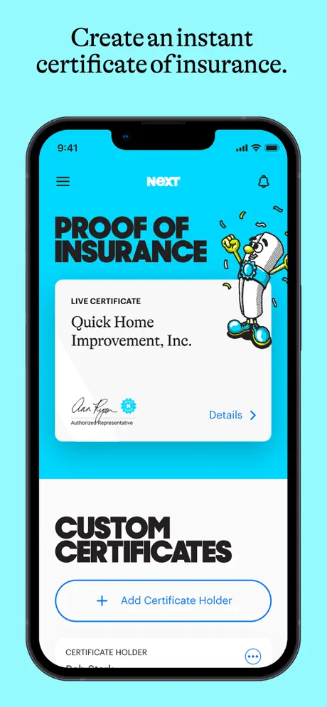
On-frame caption: “Create an instant certificate of insurance

The surrounding canvas shifts to a lighter cyan, roughly #B3F7FF. The caption above the phone reads, Create an instant certificate of insurance. The iPhone is rendered with a black bezel and notch, the status bar showing 9:41 and full signal. Inside, the app header carries a hamburger icon on the left, the white NEXT logotype centered on cyan, and a bell icon on the right. Below, in the same poster sans from frame one, the screen headline says PROOF / OF / INSURANCE in black against the cyan ground. A white rounded card overlaps this headline, labeled LIVE CERTIFICATE in small sans caps, followed by Quick Home Improvement, Inc. in a larger text. A script signature, a blue gear icon, the micro-copy Authorized Representative, and a blue Details chevron complete the card. To its right, the certificate mascot dances amid confetti lines. The lower half of the screen switches to white, stenciling CUSTOM / CERTIFICATES in heavy black above an outlined blue pill button that reads + Add Certificate Holder.

NEXT Insurance App Store screenshot 3 — Customize Live Certificates
03

Customize Live Certificates

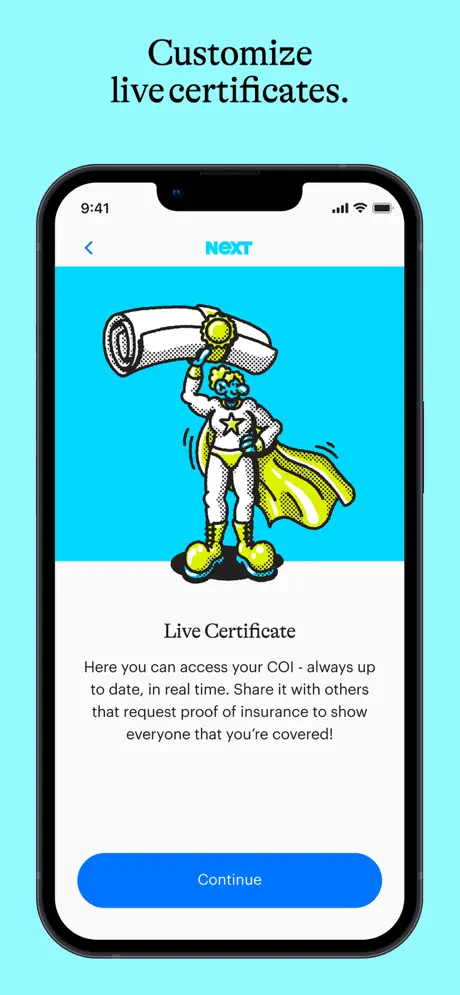
On-frame caption: “Customize live certificates

The background stays in the light cyan family. Caption: Customize live certificates. The phone screen is bisected horizontally: the top roughly forty-five percent is electric cyan, the bottom is white. Centered in the cyan zone stands a new mascot—a superhero figure with blue skin, a yellow cape, and star-spangled briefs, hoisting an oversized rolled certificate overhead. The halftone texture and black contour lines match frame one exactly. The white zone contains centered text: the heading Live Certificate in black sans, followed by a paragraph that reads, Here you can access your COI - always up to date, in real time. Share it with others that request proof of insurance to show everyone that you're covered! A solid blue pill button labeled Continue sits near the bottom edge. The frame reads as an onboarding or feature-explainer modal rather than a live tool screen.

NEXT Insurance App Store screenshot 4 — Add Third Parties
04

Add Third Parties

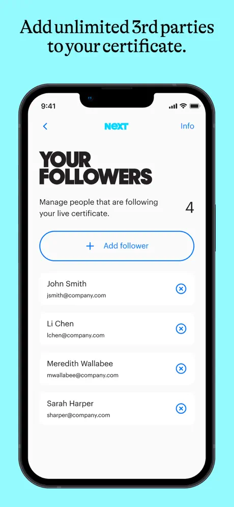
On-frame caption: “Add unlimited 3rd parties to your certificate

Light cyan surround continues. Caption: Add unlimited 3rd parties to your certificate. The phone screen is almost entirely white. The header carries a back arrow, the cyan NEXT logotype, and an Info action on the right. The page title YOUR / FOLLOWERS is stacked in the same heavy black sans, with a subtitle below: Manage people that are following your live certificate. A large numeral 4 floats right of that subtitle. Beneath it, an outlined blue pill button says + Add follower. The list shows four clean rows of user data: John Smith with jsmith@company.com, Li Chen with lchen@company.com, Meredith Wallabee with mwallabee@company.com, and Sarah Harper with sharper@company.com. Each row pairs the name in bold with a gray email address and terminates in a circular blue-outline remove icon. The absence of avatars keeps the list typographic and function-forward.

NEXT Insurance App Store screenshot 5 — Stop Waiting
05

Stop Waiting

On-frame caption: “Stop waiting. Start working.

The sequence ruptures. No phone frame appears. The top third is filled with an aggressive, electric lime green, approximately #00FF41. The same black poster sans from earlier fills this band with four stacked lines: STOP / WAITING. / START / WORKING. The bottom two-thirds is documentary photography: a smiling construction worker in an orange high-visibility vest and white hard hat stands among massive industrial cable spools in teal, red, black, and blue. The lighting is fluorescent and unglamorous, the pose candid. This frame acts as a lifestyle interlude, grounding the preceding UI abstraction in a literal trade environment. The palette break is intentional and violent; it resets the viewer’s eye before the second half of the set. Whether that rupture strengthens the narrative or severs it depends on how well the green chapter ties back to the product—an issue the later frames do not fully resolve.

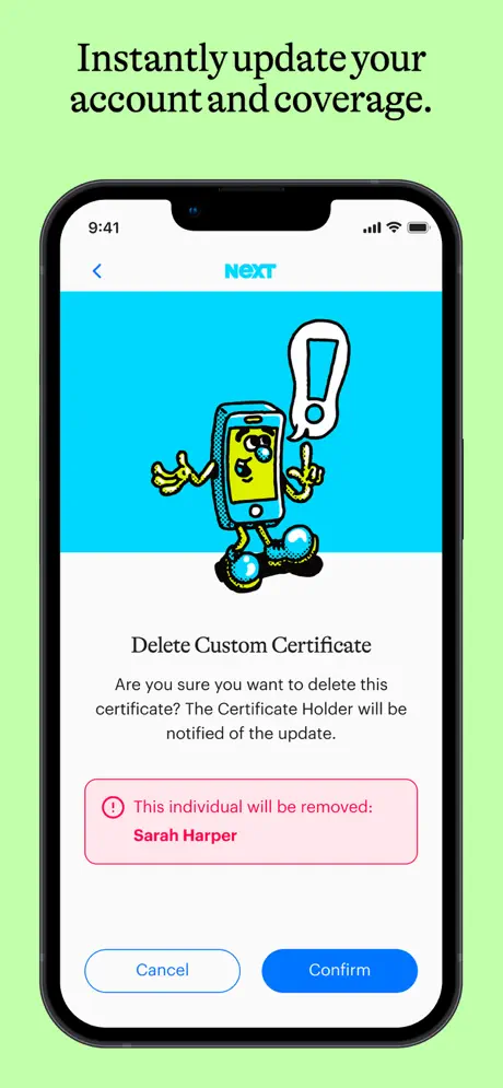
NEXT Insurance App Store screenshot 6 — Delete Custom Certificate
06

Delete Custom Certificate

On-frame caption: “Instantly update your account and coverage

The surrounding canvas switches to pale lime green. Caption: Instantly update your account and coverage. Inside the phone, the app again uses the cyan-top, white-bottom split. The iPhone mascot returns, now holding a tall white exclamation mark with a blue outline. The heading reads Delete Custom Certificate, followed by explanatory body copy: Are you sure you want to delete this certificate? The Certificate Holder will be notified of the update. Below that, a pink alert module with rounded corners and a red circular exclamation icon states: This individual will be removed: Sarah Harper, with the name set in bold red type. The bottom row offers two pill buttons: a left-hand outlined Cancel in blue and a right-hand solid-blue Confirm. Choosing to devote one of only six device frames to a destructive confirmation dialog is a bold, potentially wasteful curatorial decision.

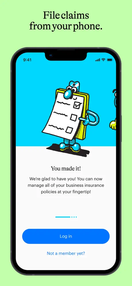
NEXT Insurance App Store screenshot 7 — You Made It
07

You Made It

On-frame caption: “File claims from your phone

Pale lime green surround persists. Caption: File claims from your phone. The screen layout mirrors frame three: cyan top, white bottom. The hero illustration is a clipboard character with a face, gloved hands, and legs, its paper surface showing two empty checkboxes and one checked box. A second mascot peeks in from the right edge. The centered headline reads You made it! followed by: We're glad to have you! You can now manage all of your business insurance policies at your fingertip! A four-step pagination indicator—one cyan bar and three gray dots—sits above a solid blue Log in CTA. Beneath the button is a blue text link: Not a member yet? The frame is conceptually jarring because it presents an onboarding terminus screen late in the sequence, after the shopper has already seen a populated dashboard in frame two and follower management in frame four.

NEXT Insurance App Store screenshot 8 — Notifications
08

Notifications

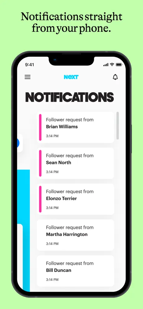
On-frame caption: “Notifications straight from your phone

Pale lime green surround again. Caption: Notifications straight from your phone. The phone shows a white-ground list under the black stacked title NOTIFICATIONS. The header nav matches frame two: hamburger left, cyan NEXT center, bell right. Five stacked cards appear, each reading Follower request from [Name] with a 3:14 PM timestamp beneath. The names shown are Brian Williams, Sean North, Elonzo Terrier, Martha Harrington, and Bill Duncan. The first three cards carry a bright magenta left border roughly four to six points wide; the fourth and fifth cards lack this accent entirely, creating an unexplained inconsistency in the list treatment. A sliver of cyan sidebar is visible along the far left edge of the screen, suggesting a partially revealed navigation drawer. The frame attempts to prove that the app carries a social-permission layer, though the repetitive timestamps and uneven card chrome undercut its credibility.

05The craft

Captions, colour and the mechanics of the sell

Caption pattern

Every device frame carries a centered black serif caption above the phone that states the benefit in plain sentence case—e.g., Create an instant certificate of insurance—functioning as a quiet title card for the UI scene below.

Visual system

Three layers define the identity: the condensed poster sans, the electric cyan-and-lime palette, and the retro-comic mascot illustrations unified by thick black outlines and halftone dot shading in cyan and yellow. Within the UI itself, the same poster sans reappears in page titles such as PROOF OF INSURANCE and YOUR FOLLOWERS, so the marketing graphics and the product interface read as siblings rather than strangers.

The thumbnail test

At parade scale, the massive condensed sans and high-contrast cyan headlines remain legible, but the body copy inside feature-explainer screens and the elegant serif captions above the phones compress into illegible texture. The black headline shapes survive; the explanatory nuance does not.

Conversion mechanics

The set sacrifices linear product storytelling in favor of graphic impact. A shopper swiping quickly may not reconstruct the actual task flow because the frames jump from dashboard to onboarding to destructive modal to notification feed without a clear user journey. What converts here is memorability; what may lose the shopper is navigational confusion about where the app begins and what state it requires.

06Where it slips

What we would change

Graphic Bravery

What works is the commitment to a graphic system. The halftone mascots, the poster sans, and the two-tone split screens inside the app create a unified world that feels closer to a skate-brand lookbook than a brokerage tool. The decision to alternate full-bleed posters with device frames gives the swipe rhythm breathing room; frame one sells tone, frame two sells utility, and the pattern prevents fatigue. The palette swap at frame five is risky but effective as a hard reset. The typography inside the UI is admirably large and high-contrast, which survives thumbnail scaling better than the small body copy does.

Narrative Fracture

For all its graphic bravado, the sequence suffers from curatorial misalignment. Frame seven, an onboarding completion screen with a Log in button, appears after frames that already imply an authenticated user session; this non-linear storytelling will confuse shoppers trying to reconstruct the app flow. Frame six’s deletion confirmation is a poor investment of limited real estate—no one downloads an insurance app to see how gracefully it removes people. Frame eight’s notification list has obvious production sloppiness: the magenta left borders disappear on the last two rows, and every timestamp reads 3:14 PM, which reads as unconsidered placeholder data rather than a deliberate mock. The captions above the phones, set in a refined serif, are too visually passive; they recede against the electric UI inside the bezels and fail to guide the eye.

Honest Verdict & Fixes

Most of the problems here are editorial, not visual. First, reorder: place the onboarding frame seven immediately after frame one, so the sequence moves from brand promise to account creation to live dashboard. Second, eject the delete confirmation from the main set or demote it to the final slot; replace it with a frame showing additive value, such as adding a new certificate holder and seeing the live update propagate. Third, fix frame eight so every notification card shares identical chrome—either all five rows get the magenta accent or none do—and vary the timestamps to avoid placeholder uniformity. Fourth, tether the lime-green backgrounds to an actual in-app element, such as a status badge or success banner, so the external palette shift reads as a system feature rather than a container error. Preserve the illustration system and the poster type at all costs; they are the set’s only moat in a numbingly conservative category. Rationalize the narrative, and the finish will match the punch.

07The recipe

How to apply this to your own app

  1. Lead with a two-tone identity

    Limit your in-app palette to one electric brand color plus white and black. Let that color own the header band, and let every marketing frame outside the phone echo it so the app does not look like a stranger to its own store page.

  2. Mascots must earn their keep

    If you use illustration, give each mascot a functional role. The certificate superhero in frame three and the clipboard in frame seven succeed because they map to real features; the iPhone mascot in frame one is pure branding, which is acceptable only because it is confined to the opening poster.

  3. Guard the narrative order

    Never show a logged-in dashboard before you show the door. If your sequence includes an onboarding or login screen, place it early so the shopper understands the entry point. Jumbling authenticated and unauthenticated states breaks the illusion of accessibility.

  4. Polish the mock data

    Uniform timestamps and inconsistent list borders read as production errors at parade scale. Vary your dummy data slightly, and ensure repeated components share identical treatment. Shoppers unconsciously trust detail.

08Takeaways

Five things worth stealing

  • A utilitarian B2B category can be disrupted with poster-grade typography and illustration, but the disruption must still obey narrative logic.
  • Splitting a screenshot set into two color chapters creates rhythm, yet the second chapter must share at least one UI element with the first or the app will feel like two different products.
  • Showing destructive actions like deletion confirmations consumes precious shopper attention without proving value; prioritize additive, celebratory, or reassuring states in your first six frames.
  • Custom illustration systems are expensive to maintain but pay dividends in thumbnail recognition—provided they do not obscure the actual interface.
  • Even the most aggressive brand graphics cannot compensate for inconsistent component states inside the UI; polish the mock data as carefully as the marketing copy
09The verdict

What the set actually achieves

The final set deploys a custom heavy sans-serif at poster scale, a recurring cast of anthropomorphic mascots, and a bisected color narrative that runs cyan for the first half and lime green for the second. It succeeds as a distinctive graphic system but fractures its own narrative logic by placing an onboarding login screen after authenticated dashboard states and by devoting scarce frames to destructive UI.

Founders and lead product designers at early-stage B2B or insurtech startups who have outgrown default screenshot templates and need to see how far brand personality can be pushed before category credibility erodes. Also useful for illustrators and brand designers entering mobile UI, because the set demonstrates how to transplant a poster aesthetic into App Store constraints without breaking the device frame convention entirely.

10Questions

Frequently asked

Why does the sequence switch from cyan to lime green?

The color rupture at frame five acts as a hard narrative reset. The first four frames establish certificate creation and sharing; the final four shift to account management, updates, and notifications. The green is meant to re-energize the scroll, though the set fails to tie that environmental color to an actual in-app element, which makes the shift feel arbitrary.

Does showing a delete confirmation help conversion?

Probably not. Frame six devotes one of only six device frames to a destructive modal that warns the user about removing Sarah Harper. While it demonstrates administrative control, it does not sell the primary value of coverage or speed. Store screenshots are too brief to spend on edge-case warnings.

Is the onboarding screen in the wrong place?

Yes. Frame seven, which reads You made it! and offers a Log in button, appears after frames two and four have already shown a fully populated dashboard and a follower list. That sequencing implies the user is already authenticated. Moving the onboarding frame earlier would restore logical flow.

How does the set perform at thumbnail size?

The massive condensed sans headlines and high-contrast cyan modules survive well, but the elegant serif captions and long body copy inside feature screens compress into unreadable texture. The brand impression survives; the explanatory detail does not.

11Keep reading

Build your own screenshot set

The full set

9 shots
NEXT Insurance App Store screenshot 1NEXT Insurance App Store screenshot 2NEXT Insurance App Store screenshot 3NEXT Insurance App Store screenshot 4NEXT Insurance App Store screenshot 5NEXT Insurance App Store screenshot 6NEXT Insurance App Store screenshot 7NEXT Insurance App Store screenshot 8NEXT Insurance App Store screenshot 9

About the app

Screenshots and store metadata belong to NEXT Insurance. They are shown here for design commentary and criticism. The analysis on this page is original work by floow.design. View the original listing.

More Finance teardowns

Browse all →