Aave app icon
FinanceScreenshot teardown13 min read

Aave App Store screenshots

Aave App Store Screenshot Set: Compound Interest in Layout Form

Set published by Aave Interfaces Ltd · 8 frames analysed

4.6 · 199 ratingsFreev0.2Updated 4mo ago
Aave App Store screenshot 1
01At a glance

The set in one screen

Framing
Contains 8 screenshots, mostly iPhone 15 Pro with occasional tight crops
Captions
Bold sans-serif, sentence case, period-terminated (mostly)
Backdrop
Lavender geometric shards on white or near-black ground
Type
Neutral grotesk (heavy for captions, medium for UI body)
UI / copy split
Roughly 60% device, 40% caption and negative space
Frame 1 job
App name and primary value prop lead the first frame, with the 9.00% APY hook in color

Sampled palette

Lavender accent#8B5CF6
Light tint#E0E7FF
Earn green#10B981
Dark mode exterior#0F172A
Dark mode interior#0B0F19
Muted text#6B7280
02The challenge

What this screenshot set had to solve

When a shopper lands on a fintech product page, they are not evaluating features—they are evaluating risk. The screenshot set must prove the app is solvent, intuitive, and insured before the user ever reads a review. Aave’s gallery attempts this by running a full-funnel arc in eight frames: yield, funding, forecasting, automation, activity, withdrawal, protection, and summary. The challenge is that every frame must feel like the same product; any break in hardware treatment, palette logic, or caption rhythm snaps the shopper out of the flow and into skepticism.

The lavender identity is distinctive and consistently applied, but the set is held back by uneven hardware treatment and a final frame that breaks the product-evidence contract.
03The approach

How the set argues its case

Brand-glue strategy: a single violet near #8B5CF6 and its tint variants are threaded through headlines, bar charts, progress bars, and background shards so that the gallery reads as one continuous environment rather than eight disconnected screens. The narrative order mimics a user journey: see rate → add funds → forecast → automate → track → withdraw → protect → believe.

Category: Finance / High-Yield Savings. Positioned against legacy banks through color warmth and modal simplicity rather than feature density. The tone is calm, not casino-like; greens are used sparingly, and large balances are presented in sober black rather than hype-driven gold.

04Frame by frame

Every screenshot, and the job it does

Aave App Store screenshot 1 — Earn up to 9.00% on your Savings.
01

Earn up to 9.00% on your Savings.

On-frame caption: “Industry-leading rates and account protection up to $1M.

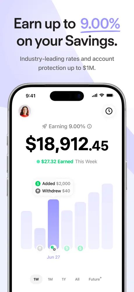
Frame 1 introduces the product in the upper third with a bold sans-serif headline at roughly 40pt. The figure “9.00%” is rendered in a lavender near #A78BFA and underlined by a thin manual rule, creating a color lockup against the black text. Beneath it, the subhead “Industry-leading rates and account protection up to $1M.” appears in a muted gray near #6B7280 at a lighter weight. The iPhone is anchored to the lower two-thirds, its Dynamic Island and 9:41 status bar fully visible. Inside the app, a circular avatar roughly 36pt in diameter balances a clock icon in the top-right corner. The balance “$18,912.45” is set at roughly 48pt bold, making it the dominant typographic element on the canvas. A green indicator near #10B981 marks “$27.32 Earned This Week.” Below, two metadata rows—“Added $2,000” and “Withdrew $40”—ride above a bar chart where inactive columns are tinted in a ghostly #E0E7FF and the selected column is saturated in #8B5CF6. The time-filter pills sit at the bottom, with “1W” filled in black. The tab bar is cropped out entirely, which removes navigational context but keeps the shot uncluttered. Lavender geometric shards drift behind the device against an otherwise white ground, giving the frame a soft sense of depth without introducing foreign colors.
Aave App Store screenshot 2 — No fees, no mins, withdraw anytime.
02

No fees, no mins, withdraw anytime.

On-frame caption: “No fees, no mins, withdraw anytime.

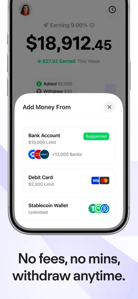
This frame crops the iPhone aggressively: the top bezel and Dynamic Island are gone, and the bottom chin is either missing or flush with the image edge. What remains is essentially a screen grab wearing side bezels. A bottom-sheet modal titled “Add Money From” with a rounded top corner—roughly 24px radius—slides up over the dimmed dashboard. Three rows appear: “Bank Account” carrying a green pill badge that reads “Suggested” on a #22C55E fill with white text; “Debit Card” with a $2,000 limit; and “Stablecoin Wallet” labeled “Unlimited.” Each row leads with a title in #111827 and trailing logos clustered in small circles. The caption sits low, its baseline close to the safe-area margin. The background continues the lavender diagonal planes established in frame one, which preserves brand continuity, but the loss of the phone’s silhouette makes the device feel less tangible than in the fully-framed shots. The decision to show a modal rather than a pushed screen is a deliberate efficiency play—it signals that deposits are quick and contextual—but the crop costs the frame some hardware prestige at thumbnail scale.

Aave App Store screenshot 3 — Simulate your Future Balance.
03

Simulate your Future Balance.

On-frame caption: “Simulate your Future Balance.

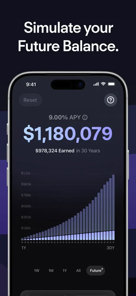
The only dark-mode frame in the set, and therefore a tonal outlier. The exterior background behind the phone shifts to a near-black near #0F172A with deeper violet geometric blocks. Inside the device, the UI flips to a dark navy around #0B0F19. A “Reset” pill floats top-left, while a help icon sits top-right. The hero figure “$1,180,079” is rendered in a light lavender near #A5B4FC at a large display size. Beneath it, “$978,324 Earned in 30 Years” is set in a lighter weight. The bar chart spans from 1Y to 30Y, using stacked columns that pair a light lavender base with a darker slate segment. At the bottom, the time-filter pills repeat, with “Future+” receiving a filled treatment. The contrast between the pastel lavender text and the dark interior is lower than the black-on-white pairings used elsewhere, which slightly dulls the numerical punch. As a gallery swipe, the transition from the light exterior of frame two to the dark exterior of frame three is abrupt—almost a strobe effect—because no transitional frame bridges the two modes. The content itself is compelling compound-growth proof, but its placement risks breaking the warm, airy rhythm the first two frames established.

Aave App Store screenshot 4 — Automate your Savings.
04

Automate your Savings.

On-frame caption: “Automate your Savings.

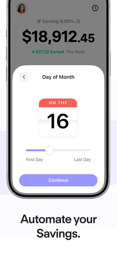
Another modal shot. The “Day of Month” sheet overlays the same dashboard seen in frame one, dimmed behind a black scrim at roughly 40% opacity. The sheet’s header carries a back chevron and the title “Day of Month.” Center stage is a calendar abstraction: a coral-red header near #F87171 bearing the words “ON THE” in white small-caps, followed by a massive “16” in black. Below, a slider track runs from “First Day” to “Last Day,” its filled portion tinted in #818CF8 and its knob rendered as a white circle roughly 28pt in diameter. The primary action button, “Continue,” is a full-width lavender rounded rectangle roughly 52pt tall with white centered text. The caption “Automate your Savings.” sits well below the device, leaving more negative space than in frame two or frame six, which introduces vertical rhythm inconsistency. While the modal keeps the workflow visually compact, the red-coral calendar accent is a hue not seen elsewhere in the lavender-green brand vocabulary, making it feel momentarily like a different app. The background shards are still present but faint, doing little to tie the color departure back to the set’s core palette.

Aave App Store screenshot 5 — Track your savings activity.
05

Track your savings activity.

On-frame caption: “Track your savings activity.

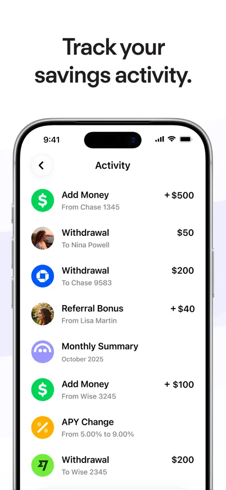
This frame returns to a full-screen, fully-framed light-mode presentation. The caption “Track your savings activity.” occupies the top third, while the iPhone sits below showing an “Activity” list. A back chevron and screen title are visible in the navigation bar. The list itself uses standard iOS-style rows: each entry leads with a circular icon or avatar and trails with a monetary value. “Add Money” rows use a green #10B981 circle with a white dollar sign and a leading “+ $500” in black. Withdrawals drop the plus sign and switch to person avatars or service glyphs—Chase appears in a blue circle, Wise in green. An “APY Change” row breaks the pattern with a yellow-orange #F59E0B circle containing a percentage symbol. Primary labels sit in a dark gray near #111827 at roughly 17pt, with secondary metadata in #6B7280 at 14pt. The background shards are minimal here, letting the information density of the feed dominate. No tab bar is shown, so the screen reads as a pushed view rather than a modal, adding architectural variety to the sequence. The hierarchy within the rows is clear, though the inconsistent use of avatars versus generic icons for withdrawals is a minor tax on pattern recognition.

Aave App Store screenshot 6 — Withdraw anytime, your way.
06

Withdraw anytime, your way.

On-frame caption: “Withdraw anytime, your way.

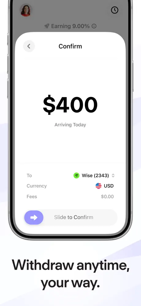
A confirmation modal presented in the same tight crop as frame two. The header reads “Confirm” with a back chevron, and the hero amount “$400” is centered at roughly 36pt bold. Beneath it, “Arriving Today” is rendered in a muted gray. Detail rows follow a strict label-value structure: “To” paired with “Wise (2343)” and a dropdown chevron; “Currency” paired with “USD” and a small US flag; “Fees” paired with “$0.00.” At the bottom, a slide-to-confirm interaction places a lavender circular handle—near #818CF8, roughly 44pt in diameter with a white arrow—inside a light-gray #F3F4F6 track. The caption “Withdraw anytime, your way.” anchors the lower portion of the canvas. The device crop again trims the top bezel, focusing attention on the transaction details. The use of a real service icon and a zero-fees line reinforces the frame’s utility, but the modal’s top-corner radius feels slightly softer than the sharper sheet corners shown in frame two, introducing a subtle shape-language inconsistency across overlays. The flag icon is a nice touch of specificity, yet the gray track behind the slide handle sits very close to the modal’s bottom edge, making the gesture target feel cramped against the hardware margin.

Aave App Store screenshot 7 — Industry leading protection.
07

Industry leading protection.

On-frame caption: “Industry leading protection.

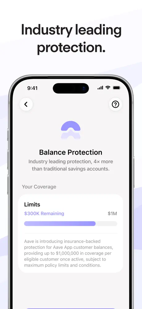
The trust frame. The iPhone is fully visible, showing a “Balance Protection” screen with a back chevron left and a help icon right. A large gradient umbrella glyph—roughly 64pt—sits centered above the headline. Below, a coverage card titled “Limits” pairs “$300K Remaining” in lavender #818CF4 on the left with “$1M” on the right. A progress bar track in #E0E7FF is roughly 70% filled with lavender. The visual logic here is inverted: because “Remaining” is the smaller quantity, a user scanning the bar will intuit the filled portion as the consumed or protected slice, yet the label calls out the remainder. The discrepancy between the large fill and the small remaining label creates a moment of cognitive friction. Body copy beneath the card explains Aave insurance-backed protection in 14pt gray. The caption “Industry leading protection.” floats high in the same bold grotesk, and the background shards return faintly behind the device. The exterior background is near-white, making this frame feel visually lighter than frame three despite the serious subject matter, a tonal choice that keeps the gallery from ending on a dark note before the final card. This frame carries heavy conversion responsibility—mitigating fear—but the progress-bar semantics undermine the clarity it aims to project.

Aave App Store screenshot 8 — The best savings rate.
08

The best savings rate.

On-frame caption: “No visible external caption; copy is internal

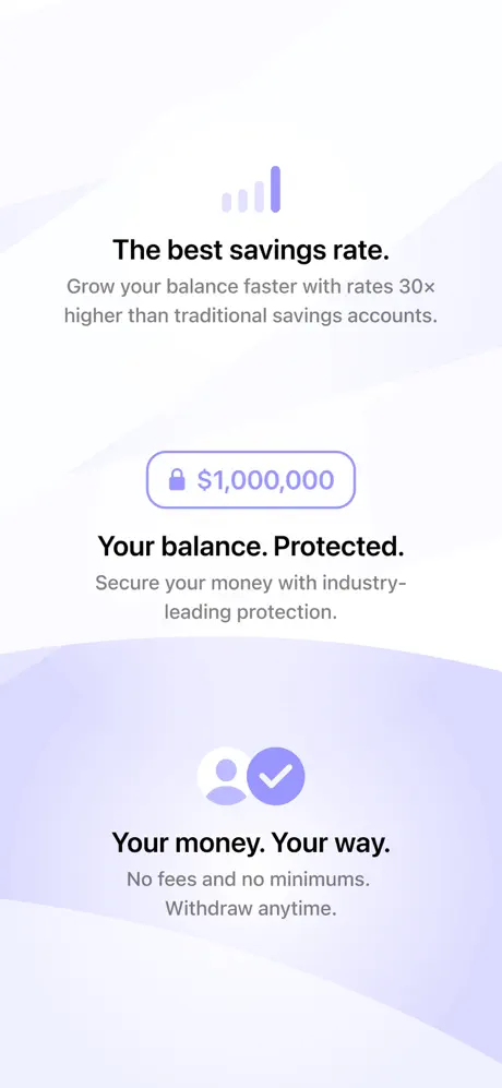
The final frame abandons the device entirely. After seven screenshots of iPhone hardware, the shopper is presented with a pure vector composition. At top, a signal-strength icon in lavender introduces the line “The best savings rate.” followed by supporting copy claiming “30x higher than traditional savings accounts.” Centered below is an outlined pill containing a lock icon and “$1,000,000.” Further down, a user icon paired with a checkmark in a lavender circle introduces “Your money. Your way.” with “No fees and no minimums. Withdraw anytime.” beneath it. The background is a white-to-lavender wave near #DDD6FE that bisects the canvas diagonally. The abrupt removal of the phone frame breaks the implicit contract of the preceding set, which had trained the viewer to expect product evidence. Moreover, the lock icon, signal-strength glyph, and user-check mark do not appear in any prior UI screenshot, so the frame reads as marketing collateral rather than interface. For a shopper evaluating the app’s real functionality, this poster-like closing card feels less persuasive than an additional screen showing, for example, the profile or settings area where these value props might live inside the actual product.

05The craft

Captions, colour and the mechanics of the sell

Caption pattern

Top-loaded headlines in 38–44pt bold sans, sentence case. Frame 1: “Earn up to 9.00% on your Savings.” Frame 2: “No fees, no mins, withdraw anytime.” Frame 3: “Simulate your Future Balance.” Frame 4: “Automate your Savings.” Frame 5: “Track your savings activity.” Frame 6: “Withdraw anytime, your way.” Frame 7: “Industry leading protection.” Frame 8 has no external caption; copy is internal.

Visual system

The set relies on a two-tone system: near-black headlines for primary captions and lavender for accent figures. Inside the UI, hero balances are rendered in #111827 at display scale while supporting metadata sits in #6B7280. Background geometry uses soft, low-opacity lavender planes that avoid competing with the device. The only departure is frame three, where the external background shifts to near-black #0F172A and the interior UI text lightens to #A5B4FC. Dark-mode UI elements—Reset pill, help icon, filled Future+ tab—use reduced-contrast fills that keep the frame from glowing.

The thumbnail test

At small scale, the first frame’s headline locks in because of the size delta between the black text and the lavender 9.00%. Frames two, four, and six lose their hardware silhouette in thumbnail, reading as white rectangles rather than phones. The dark frame three gains contrast against its neighbors, which may actually improve scroll-stop, but the abstract final frame blends into a lavender blur with no device anchor.

Conversion mechanics

Frame 1 does the heavy lifting: the 9.00% figure is the largest text on the page and the color break draws the eye before the shopper even processes the app name. Frame 6 closes the liquidity objection by showing a real service (Wise) and a zero-fees line. Frame 7 attempts to resolve risk aversion with the $1M mention, but the progress bar may stall readers who try to parse it.

06Where it slips

What we would change

Inconsistent Device Cropping

Frames one, three, five, and seven respect the iPhone’s full silhouette—status bar, corners, and chin visible—while frames two, four, and six crop the bezel unevenly, sometimes shaving the top Dynamic Island, sometimes the bottom chin. At thumbnail size, this makes the cropped frames read as floating screen captures rather than tangible phones. The fix is simple: lock the hardware to a consistent bounding box with equal padding—roughly 24pt—on all four sides, even when showing modals. Let the modal float inside the device; do not crop the device to fit the modal.

Abstract Final Frame Breaks the Product-Evidence Contract

After seven frames of actual UI, frame eight violates the shopper’s expectation with generic illustrations that do not appear anywhere in the preceding interface. The fix is to replace the illustration with a real device screen—perhaps a profile or settings view—that communicates the same three value props through actual interface elements, or to move an abstract poster to position one as a cover frame and close with product instead.

Dark-Mode Frame Is a Tonal Speed Bump

The exterior background in frame three jumps from white-with-lavender to near-black, creating a jarring swipe transition. If dark mode must be shown, keep the exterior gallery background light and let the dark UI speak for itself inside the device, or insert a transitional frame that uses a mid-tone exterior to bridge the two.

Progress-Bar Semantics Are Backward in Frame 7

A ~70% lavender fill sits beneath the label “$300K Remaining,” yet $300K is only 30% of the $1M limit. Most users read fill width as consumption, so the bar implies $700K is gone. The fix is to fill only 30% of the track to match the remaining quantity, or to relabel the figure to match the fill—e.g., “$700K Protected.”

Caption Anchoring Is Erratic

Frame four’s caption sits much lower relative to the device than frame two’s. Establishing a strict baseline grid—say, 64pt below the device bottom edge—would unify the vertical rhythm across all eight frames.

07The recipe

How to apply this to your own app

  1. 1. Choose one brand tint and thread it through every headline accent, chart highlight, and button fill so the gallery feels like a single environment.

    The set uses the same lavender family (#8B5CF6 through #E0E7FF) in headlines, bar charts, slide handles, and background shards. For your own set, pick one hue and map it to at least three touchpoints per frame.

  2. 2. Lock your device frame to a strict bounding box, even when showing modals.

    Aave loses hardware presence in frames two, four, and six because the phone is cropped to the modal. Show the full device and let the sheet float internally; the bezel provides scale and trust.

  3. 3. Use the first caption to quantify the value prop and the fourth to prove liquidity.

    Shoppers swipe in three-frame bursts. Front-load the rate or savings claim, then by frame four show money moving out easily. Delay trust badges until frame six or seven when skepticism peaks.

  4. 4. Avoid abstract end cards unless you lead with one.

    If the rest of the gallery is product screenshots, ending on an illustration feels like running out of footage. Close with UI, or place the poster frame first as a cover.

08Takeaways

Five things worth stealing

  • A single violet thread can unify disparate screens, but only if hardware padding and caption grids obey an equally strict system.
  • Modal overlays suggest speed, yet they tempt designers into cropping the device frame—a mistake that costs tangible credibility.
  • Dark-mode frames need transitional handling when dropped into a light-dominant set, otherwise they read as visual errors.
  • The final frame should never introduce iconography that has not already appeared inside the product UI.
  • verdict
09The verdict

What the set actually achieves

A cohesive, violet-threaded sequence that front-loads the rate promise and closes with insurance-backed trust signals. The set uses light-mode consistency for frames one, two, four, five, six, and seven, inserts a single dark-mode simulation frame in slot three, and ends on a device-less abstract card.

Fintech and neobank designers who need to front-load yield without looking predatory. The set is especially relevant for apps offering APY, insurance, or stablecoin on-ramps that must resolve trust within eight swipes. Not recommended as a literal template for dark-mode-heavy apps or for games, where the tonal restraint would feel underwhelming.

10Questions

Frequently asked

Why does frame 3 use a dark exterior background while the rest stay light?

The designer likely wanted to telegraph dark-mode support, but the execution skips a transitional frame, so the swipe feels like a hard cut. A better approach is a light exterior with a dark device screen.

Why is frame 8 device-less?

It functions as a summary poster, but because frames 1–7 established a product-evidence pattern, the shift to abstract illustration reads like a marketing afterthought rather than a confident close.

Does the set follow a strict grid?

Horizontally yes—the device is centered. Vertically no. Captions drift between 40pt and 80pt of clearance from the device edge, which weakens the swipe rhythm.

What is the strongest conversion asset in the set?

Frame 1’s headline lockup. The size delta between the black text and the lavender 9.00% grabs the thumbnail eye before any other element, which is exactly what a rate-led fintech app needs.

11Keep reading

Build your own screenshot set

The full set

8 shots
Aave App Store screenshot 1Aave App Store screenshot 2Aave App Store screenshot 3Aave App Store screenshot 4Aave App Store screenshot 5Aave App Store screenshot 6Aave App Store screenshot 7Aave App Store screenshot 8

About the app

Save smarter with Aave. Earn Up to 9% APY with up to $1 million in account protection. Your money, working harder for you. * Earn up to 9% APY automatically on your cash * Aave Interfaces Ltd, via the App Store listing.

Screenshots and store metadata belong to Aave Interfaces Ltd. They are shown here for design commentary and criticism. The analysis on this page is original work by floow.design. View the original listing.

More Finance teardowns

Browse all →