Monzo app icon
FinanceScreenshot teardown12 min read

Monzo App Store screenshots

When you commit to eight App Store screenshots, you are no longer designing a teaser—you are editing a short film. Monzo’s US listing accepts that bargain. The sequence has to introduce a neobank value proposition, quote cash-back and APY numbers that satisfy legal scrutiny, demonstrate security controls, and still leave room for product charm. Eight frames is enough space to tell a story, but it is also enough rope to hang a layout. What follows is a frame-by-frame study of how the team balances brand heat, regulatory density, and swipe-by-swipe coherence.

Set published by Monzo Bank Limited · 9 frames analysed

4.7 · 5.5K ratingsFreev7.23.0Updated 4mo ago
Monzo App Store screenshot 1
01At a glance

The set in one screen

Framing
True-to-scale iPhone 14/15-style hardware with rounded corners, interrupted by one floating-card composite in frame 2.
Captions
Bold geometric sans, white on dark navy for seven frames; white on coral for frame 1. Mostly left-flush, with one notable center-aligned outlier.
Backdrop
Solid coral #FF4B3E for frame 1; deep navy #0F1A25 for frames 2–8.
Type
Single-weight bold headlines with tight leading; app UI uses a dark near-black #0B1120 for primary text and system-blue/teal for secondary actions.
UI / copy split
Approximately 30% headline, 50% device canvas, 20% padding and disclaimers.
Frame 1 job
Stop-scroll brand recognition + value prop in one breath.

Sampled palette

#FF4B3E#FF4B3E
#0F1A25#0F1A25
#FFFFFF#FFFFFF
#00C853#00C853
#FF8A5B#FF8A5B
02The challenge

What this screenshot set had to solve

Finance apps face a unique App Store paradox: the more competitive your rates, the more fine print you have to show, and the smaller your marketing copy becomes. Monzo’s set must promise cash back, quote APY, prove funds are safe, and explain open-banking aggregation, all while competing against thumbnails the size of a postage stamp. The challenge is not simply visual; it isinformation architecture. How do you keep regulatory disclosures from flattening the visual hierarchy? How do you prevent eight frames from collapsing into an indistinguishable dark-mode blur? And how do you teach a shopper to read floating UI layers—notification pills, modals, charts—when they are used to seeing square device crops?

Eight frames is enough space to tell a story, but it is also enough rope to hang a layout.
03The approach

How the set argues its case

The team treats the first screenshot as a billboard and the remaining seven as a gallery. Frame one sacrifices detail for velocity: a flat coral ground, a three-line headline, and a busy dashboard that communicates maturity through density rather than minimalism. Once the shopper swipes, the background locks to navy so the eye can relax into a predictable stage. From there, the sequence organises itself by trust layer: reward (frame 2), growth (frame 3), security (frame 4), automation (frames 5 and 8), aggregation (frame 6), and insight (frame 7). The repetition of the white floating pill in frames 5, 7, and 8 creates a secondary rhythm above the hardware, suggesting that Monzo talks to its users before they even open the app. Typography never drops below a threshold of confidence; even the on-screen UI labels inside the phone are rendered at a size that survives App Store compression. The cost of that confidence is rigidity: when one headline breaks alignment or one device shifts scale, the error is magnified across the entire sequence.

Positioned between aspirational fintech and sober bank. The set uses lifestyle photography (frame 2), whimsical jar illustrations (frames 3, 5, 8), and serious security chrome (frame 4) to signal that it is neither a pure budget tracker nor a legacy institution. It competes on personality as much as rate.

04Frame by frame

Every screenshot, and the job it does

Monzo App Store screenshot 1 — The Coral Interruption
01

The Coral Interruption

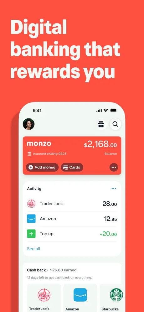
On-frame caption: “"Digital banking that rewards you"

The canvas is a flat, saturated coral that reads at approximately #FF4B3E. The headline is set in a heavy white sans, left-flush, occupying the upper third across three lines with generous but not excessive leading. Below it, a white iPhone with rounded corners and a visible iOS status bar (9:41, signal, Wi-Fi, battery) is centered in the lower two-thirds. The screen shows the Monzo dashboard: a red card header with the white logotype and a balance of $2,168.00; a sub-line reading 'Account ending 0823'; and a row of pill buttons—'Add money,' 'Cards,' and a darker ellipsis 'more' button. Underneath, an 'Activity' section stacks three transactions: Trader Joe’s in red, Amazon in blue, and a green 'Top up' tile worth +20.00. A 'See all' link in teal sits at the right. The bottom of the device reveals a cashback module—'Cash back • $26.80 earned'—and three circular merchant favicons (Trader Joe’s, Amazon, Starbucks). The density is intentional; the frame communicates that the product is a complete dashboard, not a single-feature toy.
Monzo App Store screenshot 2 — The Product Shot
02

The Product Shot

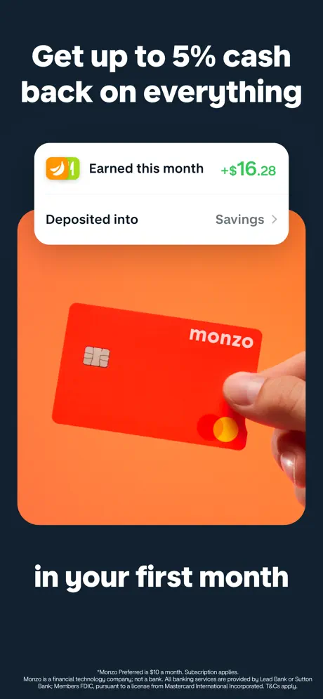
On-frame caption: “"Get up to 5% cash back on everything" / "in your first month"

The background switches to the deep navy #0F1A25. The headline is split: the offer sits at the top, the urgency anchor 'in your first month' sits at the bottom, both in the same bold white sans. For the only time in the set, the device bezel is removed. A large rounded rectangle with an orange-to-peach gradient (from roughly #FF8A5B to #FF5E3A) floats in the centre. Inside, a white sheet with rounded corners carries a flame icon, the line 'Earned this month,' and a bright green '+$16.28.' Below that, 'Deposited into' is paired with a chevroned 'Savings.' Under the sheet, a photographic hand enters from the right, gripping a physical red Monzo Mastercard. The bottom of the canvas is crowded with regulatory fine print in a pale grey at roughly 6 pt, the first intrusion of legal texture into the gallery.

Monzo App Store screenshot 3 — The Rate Frame
03

The Rate Frame

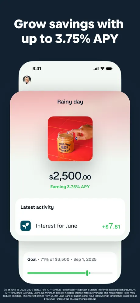
On-frame caption: “"Grow savings with up to 3.75% APY"

The navy stage returns, and the white iPhone is back at a larger scale. The status bar and a small circular user avatar are visible at the top. The screen shows a 'Rainy day' savings jar. The header area carries a soft blush-to-white gradient. Centred is a square lifestyle photograph of a peanut-butter jar on a red surface. Below it, '$2,500.00' is rendered in a heavy dark weight, followed by 'Earning 3.75% APY' in green. A 'Latest activity' row displays a teal plant icon, 'Interest for June,' and '+$7.81' in green. The device is cropped low enough to reveal a goal tracker underneath the hardware: 'Goal • 71% of $3,500 • Sep 1, 2025,' with a green progress fill against a pale grey rail. The bottom fifth of the frame is again consumed by dense compliance copy in small grey type.

Monzo App Store screenshot 4 — The Trust Modal
04

The Trust Modal

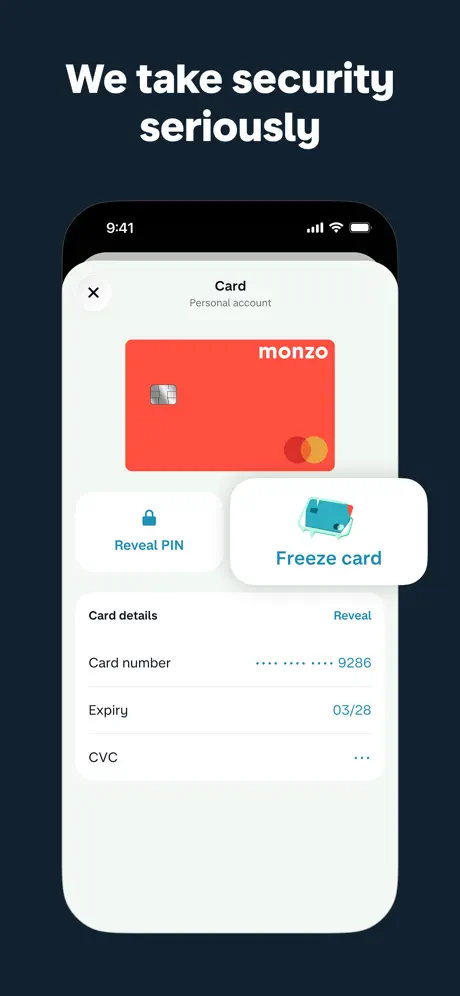
On-frame caption: “"We take security seriously"

This frame is the set’s single alignment outlier: the headline 'We take security seriously' appears centre-aligned above the device, whereas every other headline is left-flush. The iPhone displays a card-management modal. At top left is an 'X' close button; the title 'Card' and subtitle 'Personal account' are centred. The red Monzo card sits below. Two action tiles follow: 'Reveal PIN' on the left, flat and white with a blue lock icon; and 'Freeze card' on the right, dramatically elevated with a 3D tilt, soft shadow, and an isometric illustration of a frozen blue card. Beneath, a 'Card details' section masks the number as '•••• •••• •••• 9286,' shows an expiry of '03/28,' and hides the CVC behind three dots. The layout is clean, but the centred headline breaks the vertical rhythm established by the rest of the sequence.

Monzo App Store screenshot 5 — The Salary Sort
05

The Salary Sort

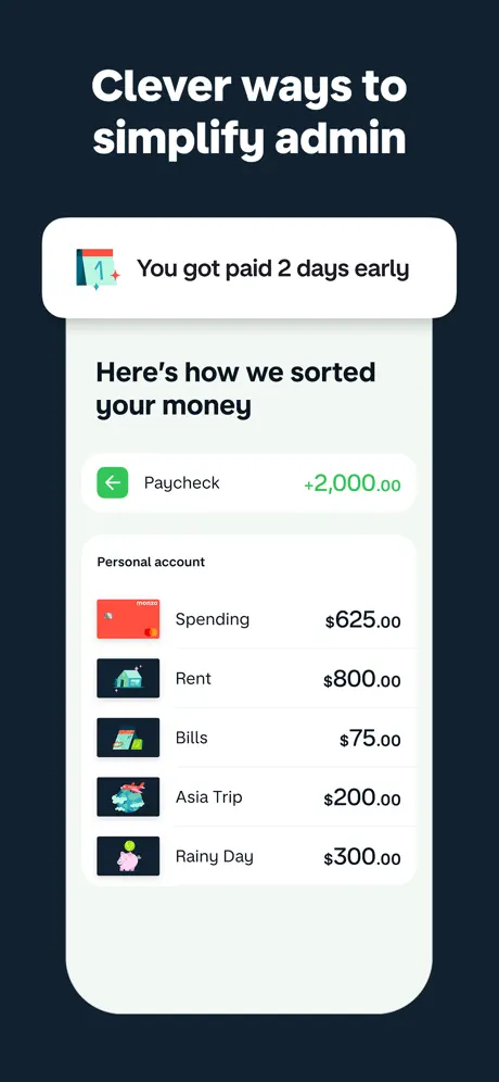
On-frame caption: “"Clever ways to simplify admin"

A white floating pill appears above the device for the first time, containing a calendar icon with a red '1' and sparkle, plus the micro-copy 'You got paid 2 days early.' Inside the phone, a screen titled 'Here’s how we sorted your money' shows a green paycheck row—'Paycheck,' '+2,000.00'—followed by a categorised list: Spending ($625.00), Rent ($800.00), Bills ($75.00), Asia Trip ($200.00), and Rainy Day ($300.00). Each row carries a custom rounded-square illustration: a Monzo card, a house, a bill, a plane, and a piggy bank. The background inside the app is an off-white #F5F7FA, and the list uses hairline separators rather than contained cards, letting the green inflow tile breathe as the single actionable highlight.

Monzo App Store screenshot 6 — The Open-Bank Layer
06

The Open-Bank Layer

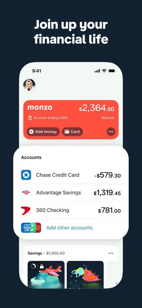
On-frame caption: “"Join up your financial life"

The device repeats the red Monzo home header—balance '$2,364.80,' account ending 2325—only now a white 'Accounts' sheet overlaps the lower half, creating a layered depth effect. Inside that sheet: Chase Credit Card (-$579.30) with a blue octagon icon; Advantage Savings ($1,319.45); 360 Checking ($781.00) with a red chevron-style icon; and an 'Add other accounts' row trailing a cluster of card-brand marks inside a rounded square. Below the device, a partial 'Savings' module peeks up with illustrated goal tiles. The composition communicates aggregation without leaving the viewport, though the negative balance on the Chase row is rendered in the same dark text as positive balances, relying solely on the minus sign for differentiation.

Monzo App Store screenshot 7 — The Insight Card
07

The Insight Card

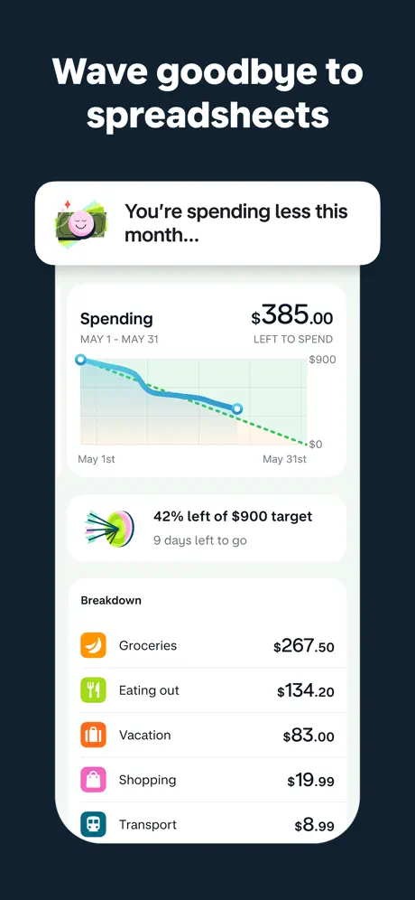
On-frame caption: “"Wave goodbye to spreadsheets"

A second floating pill hovers above the hardware, this time with a pink smiley-face money icon and the copy 'You’re spending less this month...' The screen shows a spending tracker: 'Spending' paired with '$385.00 LEFT TO SPEND' and the range 'MAY 1 - MAY 31.' A line chart follows, with a solid blue curve descending across a faint grid and a dashed green projection toward '$0.' A target card beneath reads '42% left of $900 target' with '9 days left to go.' A breakdown list closes the frame: Groceries ($267.50), Eating out ($134.20), Vacation ($83.00), Shopping ($19.99), and Transport ($8.99), each with a distinct coloured glyph. The chart area uses a subtle blue-green wash that keeps the data legible without boxing it in.

Monzo App Store screenshot 8 — The Automation Close
08

The Automation Close

On-frame caption: “"Automate your bills"

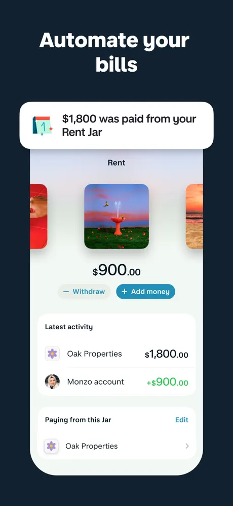
A third floating pill opens the frame: a calendar icon and '$1,800 was paid from your Rent Jar.' Inside the device, a jar detail screen for 'Rent' shows a horizontal photo carousel of three square images; the centre image is a surreal red-fountain landscape, while the flanking images are cropped hard by the device bezel. Below sits '$900.00' and a dual-button row: a subdued grey 'Withdraw' text button and a filled blue '+ Add money' pill. The 'Latest activity' feed lists 'Oak Properties' at '$1,800.00' and 'Monzo account' at '+$900.00.' A 'Paying from this Jar' section terminates in 'Oak Properties' with a right chevron. It is the most visually ornate frame, relying on photography and architectural UI to sell automation after the preceding frames have established trust and rate.

05The craft

Captions, colour and the mechanics of the sell

Caption pattern

Headlines are written as direct promises, not feature labels. 'Digital banking that rewards you' is a thesis; 'Get up to 5% cash back on everything' is an offer; 'Wave goodbye to spreadsheets' is an emotional payoff. The pattern is benefit-first, mechanism-second, and each line is short enough to read in under a second.

Visual system

The navy ground functions as a darkroom. Against it, the white iPhone bezel becomes a mat border that frames the UI. The app’s interior palette is restrained: red for Monzo-owned surfaces, green for positive money movement, blue/teal for actions and links, and near-black for text. The only departure is frame 2, where an orange-to-peach gradient panel introduces warmth that echoes—but does not match—the frame 1 coral. Custom illustrations (frozen card, calendar icons, category glyphs) are rendered in a flat, friendly style that avoids the clinical coldness of stock iconography.

The thumbnail test

In search-grid thumbnail view, frame 1’s coral field and white headline are immediately legible. The subsequent navy frames lose some differentiation at small scale because the white-on-dark pattern is common in finance, but the large headline type and floating pills still register as tonal variation. The red Monzo card art inside nearly every frame acts as a secondary beacon.

Conversion mechanics

The headline-first strategy is built for swipe speed. By placing the promise outside the device bezel, Monzo ensures the offer survives even if the shopper never parses a single UI label inside the phone. The floating pills in frames 5, 7, and 8 act as push-notification proxies, suggesting proactive intelligence. That is a smart conversion move: it frames the app as a speaker, not just a ledger.

06Where it slips

What we would change

Headline alignment is inconsistent

Frame 4 centres 'We take security seriously' while every other frame keeps the headline left-flush. In a rapid swipe sequence, that single centred block reads as a layout slip, not a purposeful shift. Fix: lock every headline to the same left margin—roughly 48 pt from the canvas edge—or centre the entire set consistently.

Device scale drifts across frames

The iPhone hardware is noticeably smaller in frame 1, leaving generous coral padding, while frame 3 pushes the phone to within a few points of the headline. The lack of a locked base height makes the gallery feel like isolated posters rather than a continuous deck. Fix: establish a constant device height—around seventy-eight percent of canvas—and hold it across all eight frames.

Regulatory footnotes compete for attention

Frames 2 and 3 cram dense legal copy into the bottom five percent at roughly 6 pt white-on-navy. The text is unreadable on a phone screen and registers as grey noise that undermines the premium finish. Fix: consolidate the densest disclosures into the final frame, or render fine print at 35% opacity so it satisfies compliance without competing for contrast.

Frame 2’s gradient drifts from brand temperature

The orange-to-peach panel in frame 2 is warmer and more yellow than the core coral red used on the card art in frames 1 and 4. That shift dilutes brand recognition across the swipe. Fix: tighten the gradient so it maps directly to the Monzo card red family—roughly #FF4B3E to #FF6B5B.

Frame 8’s carousel is cropped awkwardly

The side images in the photo carousel are sliced by the device bezel with no padding, so they read as clipping errors rather than intentional peeking neighbours. Fix: reduce card width to show partials with deliberate gutter space, or replace the carousel with a single hero image to close the sequence more calmly.

07The recipe

How to apply this to your own app

  1. Union of a Duo

    Think of pair-painting a typical checkout flow as a React component. Select two key frames from the set—like Frame 1 (value prop) and Frame 4 (trust)—and isolate their headline positions, device scale, and background colours. Strip away the marketing copy and regulatory text, then layer only the structural rules into a reusable Figma component set. This gives you a scaffold that stays coherent whether you ship four screenshots or eight.

  2. Reconcile Background

    Pick a canvas colour that can absorb half your story. Monzo uses navy for seven frames; if your brand lacks a dark neutrals, identify the deepest shade in your palette and stress-test it behind white hardware. Ensure your contrast ratio against white stays above WCAG AA so the device bezel never dissolves into the background.

  3. Lock Device Height

    Before writing copy, define a single pixel height for your phone artwork and apply it to every frame. Monzo’s variance proves that even a ten percent scale shift breaks continuity. Set your base frame to 78–82 percent of the artboard height and never deviate.

  4. Hide the Fine Print

    If compliance requires disclaimers, treat them as texture, not text. Drop opacity to 30–40 percent or move them entirely to the last frame. The shopper is not reading footnotes in a screenshot; they are reading headlines. Protect your hierarchy accordingly.

08Takeaways

Five things worth stealing

  • A two-phase colour strategy—brand punch, then dark gallery—can carry an eight-frame narrative without visual fatigue.
  • Floating pills above the hardware are an efficient way to simulate proactive app behaviour outside the device boundary.
  • Every alignment and scale inconsistency is magnified in a long sequence; lock your grid before you lock your copy.
  • Regulatory text is unavoidable in finance, but its visual weight is controllable through opacity and frame placement.
  • Breaking the device frame for a product photograph (frame 2) adds tactile variation, but the colour temperature of that photograph must stay inside brand guardrails.
09The verdict

What the set actually achieves

The set lands on a repeatable dark-gallery rhythm that lets the white hardware pop. It uses three distinct compositional modes—full device, floating pill over device, and product photography without hardware—to keep the swipe journey alive. The result is dense but readable, and the brand coral from frame 1 anchors the memory of the icon in search results. However, inconsistencies in headline alignment, device scale, and gradient temperature keep the set from feeling like a single, continuous deck.

Best suited for mid-stage fintech or neobank products that need to communicate both emotional reward (cash back, savings goals) and functional trust (security, aggregation, bill pay) in a single swipe journey. Less useful for single-purpose budget tools that do not carry regulatory complexity.

10Questions

Frequently asked

Why does frame 1 use a different background colour?

The coral field is a stop-scroll device. In search results, the first screenshot is the only one visible before the user taps through; the bright, warm ground guarantees contrast against the white text and the red UI inside the phone, making the thumbnail legible at sizes as small as a postage stamp.

How does the set handle regulatory disclaimers?

Badly, but understandably. Frames 2 and 3 paste dense legal copy at the bottom in tiny grey type. The text is present for compliance but unreadable as design. A cleaner approach would consolidate all fine print into frame 8 or render it at reduced opacity so it does not compete with the headline layer.

What is the purpose of the floating notification pills?

They simulate push insights—'You got paid 2 days early,' 'You’re spending less this month'—outside the device bezel. By placing these messages above the hardware, the designers suggest the app is proactive rather than passive, turning the screenshot set into a preview of the notification experience.

Why is frame 4’s headline centred?

It appears to be an inconsistency rather than an intentional design statement. Every other headline in the sequence is left-flush. Centring the security headline breaks the vertical rhythm and weakens the gallery’s swipe coherence. The fix is simple: align it to the same left margin as the rest.

11Keep reading

Build your own screenshot set

The full set

9 shots
Monzo App Store screenshot 1Monzo App Store screenshot 2Monzo App Store screenshot 3Monzo App Store screenshot 4Monzo App Store screenshot 5Monzo App Store screenshot 6Monzo App Store screenshot 7Monzo App Store screenshot 8Monzo App Store screenshot 9

About the app

Monzo is the digital banking app that rewards you for being you. With one app to manage all your finances, in real time. CASH BACK FOR ALL Get cash back on all your purchases for Monzo Bank Limited, via the App Store listing.

Screenshots and store metadata belong to Monzo Bank Limited. They are shown here for design commentary and criticism. The analysis on this page is original work by floow.design. View the original listing.

More Finance teardowns

Browse all →