
Trust app icon
FinanceScreenshot teardown13 min read

Trust App Store screenshots

Trust Wallet App Store Screenshots: A Frame-by-Frame Study in Crypto Onboarding Visual Hierarchy

Set published by DApps Platform Software Services Ltd. · 9 frames analysed

4.7 · 197K ratingsFreev26.17.0Updated 4mo ago
Trust App Store screenshot 1
01At a glance

The set in one screen

Framing
Captions
Backdrop
pale blue-to-white
Type
UI / copy split
Frame 1 job

Sampled palette

02The challenge

What this screenshot set had to solve

Designing App Store screenshots for a non-custodial crypto wallet means solving a visual paradox: the product must signal institutional-grade security while also communicating the speed and abstraction of on-chain finance. The shopper is likely comparing four to five wallets in under thirty seconds. They need to see that they can buy, earn, swap, and stake without leaving the app, yet they also need to feel that their private keys and transactions are safe. For Trust Wallet, the challenge is compounded by the breadth of the product—stablecoin vaults, native staking, in-app Apple Pay on-ramps, MEV protection, and multi-chain swaps. The screenshot set must sequence these features so that a casual scroller grasps the hierarchy: wallet first, breadth second, yield third, fiat on-ramp fourth, swap fifth, stake sixth, and security last. Each frame has to carry enough UI fidelity to prove the app is production-grade, but enough branded chrome to avoid looking like bare engineering screenshots. The background canvas, caption placement, 3D asset system, and device rotation all have to work as a single scrolling narrative on a 393×852 pt iPhone display in portrait mode.

03The approach

How the set argues its case

The set anchors itself with a hyper-consistent visual system: a pale #E8ECF4-to-white gradient background, a saturated primary blue near #001EFF for all captions and CTAs, and a recurring kit of glossy 3D coins that float at the periphery of device frames. The typographic voice is a single bold grotesque—likely a tightly tracked Inter or Helvetica variant—set in all-caps for subtitles and sentence-case for feature headlines. The designers alternate device posture to control pacing: Frame 1 uses a bold ~25-degree counter-clockwise rotation to break the grid and grab attention; Frame 2 pivots to pure illustration; Frames 3 and 4 return to shallow angles; then Frames 5 through 8 flatten to dead-on frontal views. This progression from dynamic to static mirrors the shopper’s journey from brand impression to task evaluation. Captions are stripped of body copy—only H2-level statements survive—forcing the UI inside the device to carry the explanatory weight. The blue is never desaturated; it remains electric against the sterile gray-white backdrop, ensuring brand recall even at thumbnail size in search results.

executive-accessible impression leaning on literal blue-chip banking trust cues, with product proofs swapped in rapidly to force the eye from scrolling pause to conversion certainty in under three swipes, capped with an info-row that flattens purchase ambiguity into keypad input scrutiny rather than wait-and-see pacing.

04Frame by frame

Every screenshot, and the job it does

Trust App Store screenshot 1 — Hero Billboard
01

Hero Billboard

On-frame caption: “Tokenized Real World Assets are now available on Ethereum via our partners

The opening frame functions as a brand billboard rather than a feature dive. At the top, the Trust shield logo—rendered as a blue-to-teal gradient facet—sits above the word “Trust” in an oversized, tightly packed bold grotesque set in an electric blue near #001EFF. Beneath it, “THE #1 CRYPTO WALLET” is set in smaller all-caps with wide tracking. The iPhone itself is rotated roughly twenty-five degrees counter-clockwise, its Dynamic Island visible, displaying the app’s home dashboard: a balance of $1,228.20 with a green “+$239.43 (+24.43%)” delta beneath it. Four pill-shaped actions—Send, Receive, Buy (filled in the same primary blue), and Sell—sit above a trending list that includes SKYAI, BTC, BNB, ETH, and USDT. Glossy, semi-transparent 3D coins in blue, pink, and yellow float along the right edge, overlapping the bezel. The caption at the bottom-left reads, “Tokenized Real World Assets are now available on Ethereum via our partners,” set in the same blue as the logo. Structurally, this frame sacrifices immediate feature comprehension for top-of-funnel brand recognition, and it is the only frame in the sequence that places its caption at the bottom rather than the top.
Trust App Store screenshot 2 — Illustration-Only Breadth
02

Illustration-Only Breadth

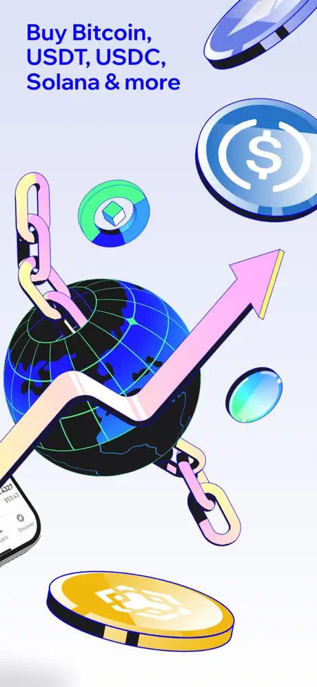
On-frame caption: “Buy Bitcoin, USDT, USDC, Solana & more

This is the only frame in the set that abandons the device entirely. The caption at the top-left reads, “Buy Bitcoin, USDT, USDC, Solana & more,” using the same bold sans and electric blue. The canvas is filled with an illustration of a wireframe globe in blue and black with neon-green grid lines, wrapped by a pink-to-yellow gradient chain. A massive pink arrow arcs upward across the globe, and assorted token icons—including a USDC dollar coin at upper-right, a Solana-esque sphere at mid-left, and a BNB-branded gold coin at bottom—float in orbit. A sliver of an iPhone appears at the extreme bottom-left, showing only a truncated balance of “$52.42,” which acts as a tenuous anchor back to the product. The style is heavy on black outlines and glossy fills, matching the 3D coin motif from Frame 1, but the absence of any recognizable UI makes this the most abstract moment in the sequence.

Trust App Store screenshot 3 — Earn Hub Overview
03

Earn Hub Overview

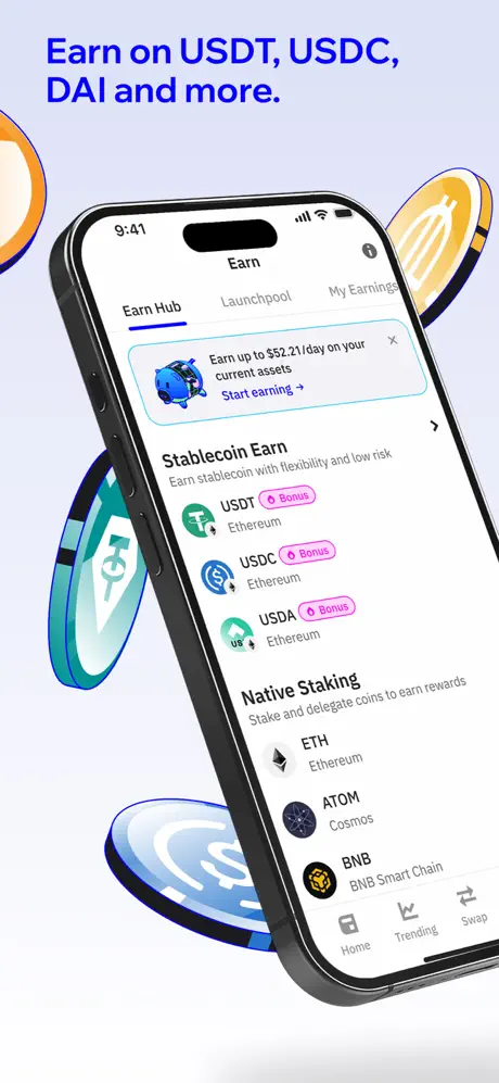
On-frame caption: “Earn on USDT, USDC, DAI and more.

The caption here is “Earn on USDT, USDC, DAI and more.” The iPhone returns, tilted roughly fifteen degrees clockwise, occupying the center-right. On screen, the app is open to the Earn Hub, where three top tabs—“Earn Hub,” “Launchpool,” and “My Earnings”—are visible, with “Earn Hub” underlined in the primary blue. A promotional banner shows a blue piggy-bank icon and the text “Earn up to $52.21/day on your current assets” with a “Start earning →” call-to-action. Below, the “Stablecoin Earn” section lists USDT, USDC, and USDA, each tagged with a pink “Bonus” pill and associated with Ethereum. Further down, the “Native Staking” section offers ETH, ATOM, and BNB. Floating token coins—orange, teal, and blue—are cropped aggressively at the left and right screen edges. The composition balances the angled device against the asymmetric coin fragments to create diagonal motion without obscuring the UI.

Trust App Store screenshot 4 — Stablecoin Vault Deep-Dive
04

Stablecoin Vault Deep-Dive

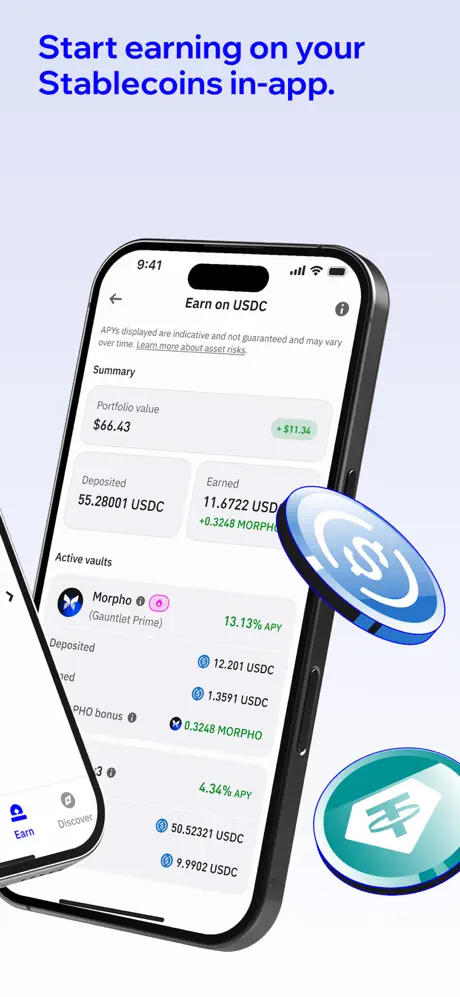
On-frame caption: “Start earning on your Stablecoins in-app.

Caption: “Start earning on your Stablecoins in-app.” The iPhone is near-frontal, angled only slightly, and pushed toward the right side of the canvas. It displays a deep-dive screen titled “Earn on USDC.” A regulatory disclaimer sits at the top, followed by a Summary card showing a portfolio value of $66.43 and a green “+$11.34” pill. Two metric cards read “Deposited 55.28001 USDC” and “Earned 11.6772 USD +0.3248 MORPHO.” The “Active vaults” section exposes Morpho (Gauntlet Prime) at 13.13% APY, with line-item deposits and earnings, followed by a second vault at 4.34% APY. A second, partially visible iPhone intrudes from the far left, showing only its bottom navigation bar with “Earn” and “Discover” illuminated, creating an awkward overlap. A large blue USDC coin and a smaller teal coin float at the right. The density of numbers here signals that the app exposes raw on-chain data rather than hiding it behind simplified abstractions.

Trust App Store screenshot 5 — Fiat On-Ramp
05

Fiat On-Ramp

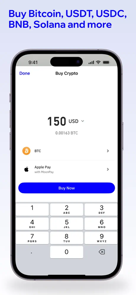
On-frame caption: “Buy Bitcoin, USDT, USDC, BNB, Solana and more

Caption: “Buy Bitcoin, USDT, USDC, BNB, Solana and more.” This frame snaps to a dead-on frontal view of the iPhone, zero rotation, emphasizing input legibility. The screen shows the “Buy Crypto” flow. At top-left, “Done” is rendered in primary blue, while the title “Buy Crypto” is centered. The main input reads “150 USD” with a small dropdown chevron, and beneath it the BTC equivalent “0.00163 BTC.” Two tappable rows follow: one for BTC selection with its orange coin icon, and one for “Apple Pay with MoonPay” carrying the Apple logo. A saturated blue “Buy Now” button spans the width. The bottom half of the screen reveals the native numeric keypad in a cool gray near #D1D5DB with white keys. No decorative coins appear; the frame relies entirely on the clarity of the transaction UI. This is the most stripped-down, conversion-oriented composition in the set.

Trust App Store screenshot 6 — Swap Execution
06

Swap Execution

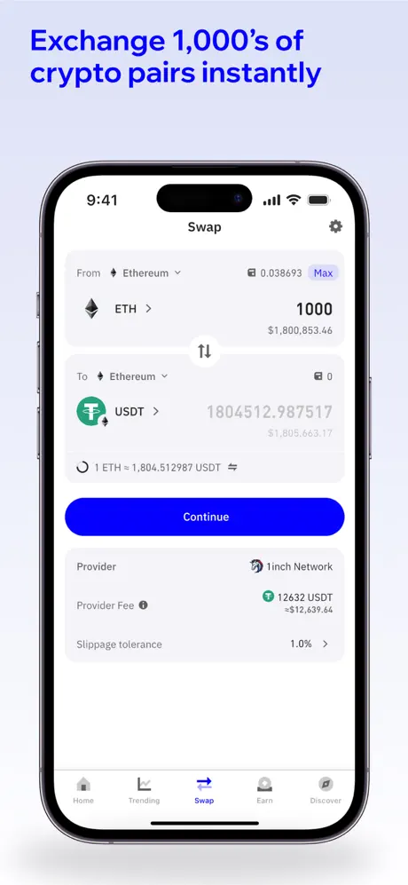
On-frame caption: “Exchange 1,000's of crypto pairs instantly

Caption: “Exchange 1,000's of crypto pairs instantly.” Another frontal device, this time on the “Swap” screen. The header contains “Swap” centered and a settings gear at right. The FROM card shows Ethereum selected, a balance of 0.038693 ETH, a “Max” text button, and an input of 1000 ETH valued at approximately $1,800,853.46. A circular flip icon separates the cards. The TO card shows Ethereum network, USDT selected, and an output of 1804512.987517. A rate line reads “1 ETH = 1,804.512987 USDT.” The blue “Continue” button sits below, followed by provider metadata: “1inch Network,” a provider fee of 12632 USDT, and slippage tolerance at 1.0%. The bottom tab bar is fully visible—Home, Trending, Swap (active), Earn, Discover—grounding the screen in the actual app architecture. The numbers are deliberately large, proving the engine can handle high-precision decimal display.

Trust App Store screenshot 7 — Native Staking Detail
07

Native Staking Detail

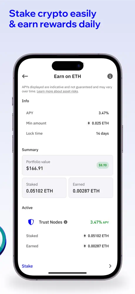
On-frame caption: “Stake crypto easily & earn rewards daily

Caption: “Stake crypto easily & earn rewards daily.” The device remains frontal. The screen is titled “Earn on ETH” with a back arrow and an information icon. A disclaimer about indicative APYs is followed by an info grid: APY 3.47%, Min amount 0.025 ETH, Lock time 14 days. The Summary section shows a portfolio value of $166.91 and a small green “$8.90” pill. Two cards divide Staked (0.05102 ETH) and Earned (0.00287 ETH). The Active section lists “Trust Nodes” with the shield icon at 3.47% APY, repeating the staked and earned figures. A bottom row offers a “Stake” link in primary blue with a right chevron. A microscopic sliver of a blue decorative coin appears on the far left edge, but otherwise the frame is UI-only. The composition feels like a bank statement rendered in mobile form.

Trust App Store screenshot 8 — Security Confirmation
08

Security Confirmation

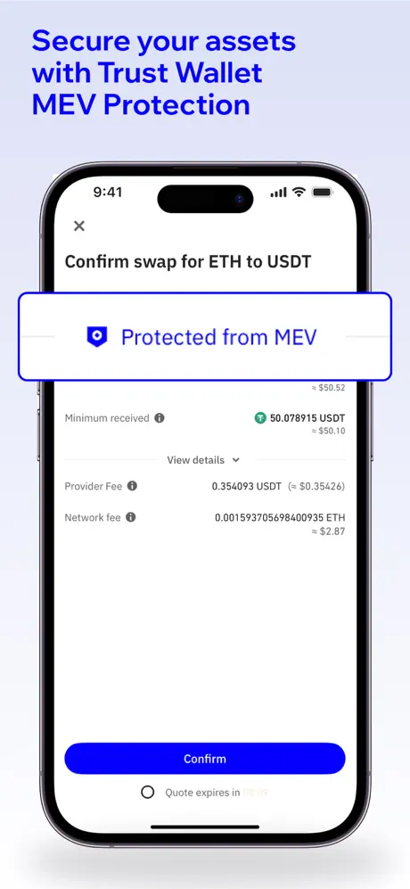
On-frame caption: “Secure your assets with Trust Wallet MEV Protection

Caption: “Secure your assets with Trust Wallet MEV Protection.” The final frame returns to a frontal confirmation screen titled “Confirm swap for ETH to USDT,” with an “X” close at top-left. Dominating the upper third is an outlined rounded rectangle in primary blue containing the shield icon and the words “Protected from MEV.” Below, the sheet lists minimum received (50.078915 USDT), provider fee (0.354093 USDT), and network fee (0.001593705698400935 ETH, or approximately $2.87). A blue “Confirm” button spans the width near the bottom, and a faint “Quote expires in 00:19” timer sits just beneath it. The frame uses the security message as a textual period at the end of the screenshot sentence, closing the sequence on risk mitigation rather than on another feature push.

05The craft

Captions, colour and the mechanics of the sell

Caption pattern

Each headline is a singular claim in sentence-case or light title-case, flush-left, never centered, set in the same weight and size across all eight frames. There is no body copy, no sub-head, and no disclaimer text outside the device screen itself. This discipline keeps the frame clean, but it also flattens hierarchy: Frame 8’s security message and Frame 6’s swap message receive identical visual priority.

Visual system

A single electric blue near #001EFF governs every caption, CTA button, and active tab state. The background gradient stays within a #E8ECF4-to-white range, providing a consistently cool undertone. Decorative 3D coins—rendered with thick black outlines, glossy gradients, and translucent faces—appear in Frames 1–4 and vanish thereafter. Inside the product UI, green denotes positive delta (APYs, earned rewards), pink labels bonus campaigns, and orange marks Bitcoin.

The thumbnail test

In the storefront gallery at thumbnail scale, only two elements survive: the saturated blue wordmark in Frames 1 and the large numerals inside the frontal devices. The pale background risks washing out against the store’s own white chrome, but the dark Dynamic Island notch in Frames 5–8 creates a high-contrast anchor that keeps the eye from sliding past. The set would benefit from slightly darker peripheral coins in the first three frames so the thumbnail silhouette reads as more than a floating phone.

Conversion mechanics

The Apple Pay row with MoonPay in Frame 5 lowers the perceived risk of a first-time crypto purchase by nesting a familiar payments brand inside the app UI. In Frame 6, the explicit provider fee and slippage tolerance address advanced-user anxiety, but the $12,639.64 provider fee on a $1.8M swap is large enough that it may actually increase drop-off in the screenshot if read at a glance. Frame 8’s attempt to alleviate that same anxiety with the MEV banner is smart positioning, though the modal styling makes it feel like a post-hoc guarantee rather than an integrated protocol setting.

06Where it slips

What we would change

Inconsistent caption placement breaks swipe rhythm

Only Frame 1 places its headline at the bottom-left (“Tokenized Real World Assets are now available on Ethereum via our partners”). Frames 2 through 8 standardize on top-left. That single deviation breaks the z-pattern reading rhythm a user develops after the first swipe. Fix: Move Frame 1’s caption to the top-left, condensing the hero logo lockup if necessary, or intentionally bottom-align all captions for a distinct cover treatment that never repeats.

Frames 2 and 5 are caption twins, flattening the narrative

Frame 2 reads, “Buy Bitcoin, USDT, USDC, Solana & more,” and Frame 5 reads, “Buy Bitcoin, USDT, USDC, BNB, Solana and more.” The near-verbatim repetition, differing only by the addition of BNB and an ampersand swap, suggests an editorial oversight rather than intentional pacing. A shopper swiping linearly will register the same value proposition twice, diluting the set’s information density. Fix: Rewrite Frame 2 to focus on global access or chain breadth, and reserve Frame 5 for the specific Apple Pay and keypad interaction.

Frame 2’s illustration-only treatment hides the product

This is the only frame without a device. For a finance app where credibility is tied to interface density and real flows, an illustration-only frame can read as conceptual rather than product-proof. The tiny sliver of phone in the corner is insufficient evidence. Fix: Composite the globe illustration as a faint background texture behind a device showing the token-selection list, or inset a phone at quarter-scale so the shopper sees actual purchase UI.

Device rotation grammar snaps abruptly

Frame 1 is aggressively rotated roughly twenty-five degrees, Frame 3 moderate fifteen degrees, Frame 4 slight five degrees, and Frames 5 through 8 are dead-on frontal. The snap to 0 degrees feels like a different designer took over at the midpoint. Fix: Establish a consistent system—hero at 20 degrees, feature previews at 10 degrees, and payment or swap confirmations at 0 degrees—so the transition feels governed rather than accidental.

Decorative coins disappear after Frame 4

The 3D coin kit that floats around Frames 1 through 4 vanishes entirely for the second half of the sequence. Frames 5 through 8 are visually colder and more generic as a result. Fix: Reintroduce a single coin motif in the bottom corner of Frames 5 through 8, reduced in scale, to sustain the brand’s visual energy without cluttering dense transactional UI.

07The recipe

How to apply this to your own app

  1. Lock your caption architecture before designing frames. Pick top-left or bottom-left and stay there.

    A one-frame deviation is not a stylistic beat; it is a speed bump.

  2. Never let two frames make the same promise with nearly identical copy.

    If the feature is complex enough to deserve two frames, split the promise into breadth and depth.

  3. If you use illustration-only frames in finance, anchor them aggressively to real UI.

    Trust is built by showing interface, not metaphor.

  4. Treat device rotation like a typographic scale, not a mood board.

    Assign degree values to frame types and stick to them so the scroll feels choreographed.

  5. Sustain one background motif through the entire sequence.

    Even a tiny recurring shape prevents the second half of a long set from feeling like a different app.

08Takeaways

Five things worth stealing

  • A disciplined blue-on-white palette can carry eight frames without fatigue, but only if the structural grammar—caption placement, rotation, and decorative motifs—stays consistent.
  • Showing raw APRs, provider fees, and vault names inside the UI builds more credibility than any marketing claim.
  • The set’s arc from brand impression to transactional confirmation is correct, yet the redundant Frame 2/Frame 5 captions and the disappearing 3D language halfway through blunt the impact.
  • Frame 8’s security banner is the right narrative closer, but its modal styling risks being read as an OS notification rather than an integrated protocol feature.
  • expose the numeral or onboarding input so the thumbnail reads as a conversion surface, not an illustration surface.
  • A single post-hoc protection badge on the final confirmation screen is not a trust or a full strategy, it is a patch on a sleeve.
09The verdict

What the set actually achieves

The Trust Wallet set succeeds at brand cohesion: the electric blue, pale background, and 3D coin kit tie the frames into a recognizable system. The progression from rotated hero to frontal transactional screens is a sound narrative choice, easing the shopper from emotional impression to analytical evaluation. However, the execution suffers from real structural inconsistencies that a designer commissioning their next set should avoid.

A designer building a fintech or crypto screenshot set who needs a reference for sequencing eight frames without losing brand cohesion, and who wants to see how dense product UI can be readable even at thumbnail scale if kept inside a strict two-color system.

10Questions

Frequently asked

Why does Frame 1 caption at the bottom while all others sit at the top?

It appears to be a hero-specific treatment made necessary by the large shield-and-wordmark lockup occupying the upper third. The trade-off is a broken reading rhythm.

Should Frame 2 have a device in it?

For finance apps, yes. The illustration is on-brand but offers no interface evidence; anchoring it to a device would prove the buy flow exists.

Are the decorative 3D coins part of the app UI or just marketing?

They are marketing chrome surrounding the device frames, not visible inside the app screenshots themselves.

What does the repetition between Frame 2 and Frame 5 do to conversion?

It forces the shopper to re-read the same value proposition, effectively wasting one frame that could have shown payment methods, KYC speed, or chain selection depth.

11Keep reading

Build your own screenshot set

The full set

9 shots
Trust App Store screenshot 1Trust App Store screenshot 2Trust App Store screenshot 3Trust App Store screenshot 4Trust App Store screenshot 5Trust App Store screenshot 6Trust App Store screenshot 7Trust App Store screenshot 8Trust App Store screenshot 9

About the app

A Wallet You Can Trust — Now Lets You Earn On Your Stablecoins Grow your crypto securely with the newest feature from Trust Wallet: Stablecoin Earn. Start earning daily rewards DApps Platform Software Services Ltd., via the App Store listing.

Screenshots and store metadata belong to DApps Platform Software Services Ltd.. They are shown here for design commentary and criticism. The analysis on this page is original work by floow.design. View the original listing.

More Finance teardowns

Browse all →