
Chime app icon
FinanceScreenshot teardown14 min read

Chime App Store screenshots

A celebrity handshake, a stack of disallowed gold coins, and seven shades of green: how Chime structures trust and feature velocity across an eight-frame App Store carousel.

Set published by Chime Financial, Inc. · 10 frames analysed

4.8 · 1.4M ratingsFreev5.323.0Updated 4mo ago
Chime App Store screenshot 1
01At a glance

The set in one screen

Framing
iPhone 14/15-style devices with 9:41 status bars, except Frame 1 (hand-held angled device) and Frames 4/8 (no device chrome).
Captions
Top-left eyebrow label in sentence case, followed by a 3–4 word bold headline, followed by a shorter explanatory line.
Backdrop
Alternating values of Chime green: pale mint (#E6F5ED), electric emerald (#17C36B), medium sage (#5CCF8A), and deep forest (#0B3D2E).
Type
A single geometric sans family set in three rigid hierarchies: 11–13pt eyebrow, 48–56pt bold headline, and 17–20pt body. Headline color toggles between dark forest (#0B3D2E) on light greens and pure white on dark greens.
UI / copy split
UI mockups occupy the lower 45–55% of each phone frame, while typography dominates the top safe zone, keeping text clear above the fold on the App Store detail page.
Frame 1 job
Establish seasonal relevance and social proof before the shopper questions utility.

Sampled palette

#E6F5ED#E6F5ED
#17C36B#17C36B
#5CCF8A#5CCF8A
#0B3D2E#0B3D2E
#FACC15#FACC15
#FFFFFF#FFFFFF
02The challenge

What this screenshot set had to solve

Finance apps face a brutal conversion window on the App Store. The shopper is not browsing; they are defending their current bank against the friction of switching. That means every screenshot has to answer two questions in under six seconds: Is this legitimate? And which of my daily problems does it solve? Chime’s set takes on an additional degree of difficulty by opening with a seasonal campaign message rather than a literal product shot, wagering that celebrity recognition and tone can buy the attention needed to explain MyPay, SpotMe, and APY yields in subsequent frames. The challenge, then, is whether a carousel that oscillates between polished UI, floating 3D coins, and isolated toggle switches can still feel like a single coherent product argument—or whether it fractures into a collection of disparate ads.

"Bank smarter this season." is not a feature claim; it is a campaign line dropped directly into the first slot of a utility-driven storefront. That choice tells you exactly how Chime values brand heat over immediate feature comprehension.
03The approach

How the set argues its case

Chime treats the carousel as a vertical funnel rather than a flat feature grid. Frame 1 is pure awareness: a seasonal promise plus a celebrity face to stop the thumb. Frames 2–3 move into cash-flow solutions (early pay, overdraft coverage) where the emotional need is highest. Frame 4 pauses the device pattern to hammer the fee-free value prop with a bold illustrative symbol. Frames 5–7 return to UI proof for credit, savings APY, and merchant deals. Frame 8 darkens the canvas again for security. The underlying system is strict: each frame gets one headline, one sentence of explanation, and one visual anchor. There are no multi-panel layouts, no cropped split-screens, and no inset annotations drawing circles on the UI. The discipline of one-idea-per-frame keeps the set legible at thumbnail size, even when the individual frames are visually loud.

The set positions Chime as a consumer lifestyle brand first and a bank second. By placing Jason Momoa in Frame 1 and using phrases like “Get paid when you say” rather than “Early direct deposit,” the copy speaks to outcome, not mechanism. This matters because banking screenshots often drown in feature density—here, the density is managed by isolating each claim inside its own full-bleed color block.

04Frame by frame

Every screenshot, and the job it does

Chime App Store screenshot 1 — The Celebrity Seasonal Hook
01

The Celebrity Seasonal Hook

On-frame caption: “Bank smarter this season.

The opening frame is built around a hand-held iPhone angled toward the viewer from the lower-left, the screen showing an account balance of $1,246.91 with a $200 SpotMe indicator and MyPay/Savings cards below. The phone is physically held by a person in a textured green blazer against a pale mint backdrop (#E6F5ED). Top-left carries the Chime wordmark in emerald green; the headline below it is set in a heavy dark-forest sans (#0B3D2E) at roughly 56pt, breaking across four lines: “Bank smarter this season.” A small superscript plus sign sits to the right of the period. In the lower-right corner, a semi-transparent pill label reads “Jason Momoa,” confirming the endorsement rather than implying a user testimonial. The bottom of the frame is capped by a dense legal disclaimer in tiny white text against the mint background. The layout splits the vertical real estate roughly 60/40 in favor of the photographic element, which means the actual app UI is crammed into the lower-left quadrant and partially obscured by the hand at thumbnail size. The shadow under the device is soft and diffuse, lifting it slightly above the fabric.
Chime App Store screenshot 2 — Early Payday & MyPay
02

Early Payday & MyPay

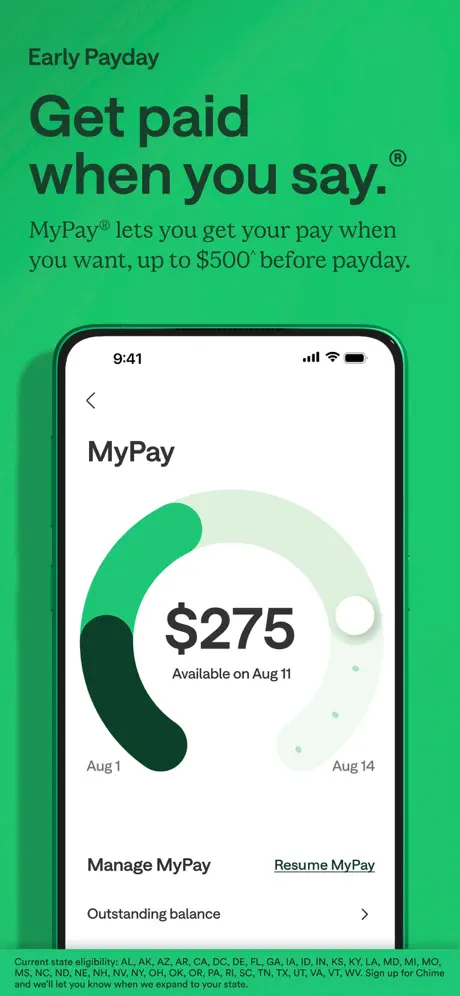
On-frame caption: “Get paid when you say.®

Background shifts to a saturated electric emerald (#17C36B). The eyebrow label “Early Payday” sits top-left in dark green. The headline “Get paid when you say.®” dominates the upper third in a bold forest type, followed by the subhead: “MyPay® lets you get your pay when you want, up to $500^ before payday.” The iPhone is centered, showing the MyPay screen: a large circular gauge rendered in two greens and a pale gray, reading “$275” in bold black with “Available on Aug 11” beneath. The gauge spans a date range from “Aug 1” to “Aug 14.” Below the gauge are two text actions—“Manage MyPay” and underlined “Resume MyPay”—followed by an “Outstanding balance” row. The phone casts a faint left-side shadow, grounding it on the green field. The very bottom of the frame is crowded by a long eligibility disclaimer in white micro-copy listing dozens of state abbreviations, which visually competes with the clean promise above it.

Chime App Store screenshot 3 — SpotMe Overdraft
03

SpotMe Overdraft

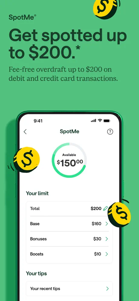
On-frame caption: “Get spotted up to $200.*

The background cools to a medium sage green (#5CCF8A). The eyebrow reads “SpotMe®,” with the headline “Get spotted up to $200.*” and the body line “Fee-free overdraft up to $200 on debit and credit card transactions.” Floating around the phone are three yellow coin illustrations (#FACC15) with black dollar signs, each ringed by a thin black motion line that suggests spinning. The iPhone shows the SpotMe interface: a circular progress ring in bright green with “Available $150.00” centered. Below that, a list breaks down the limit into “Total $200,” “Base $160,” “Bonuses $30,” and “Boosts $10,” each with chevrons. A section titled “Your tips” contains a single row, “Your recent tips.” The device framing is identical to Frame 2—rounded corners, 9:41 status bar, signal and battery glyphs—maintaining continuity. The playful coins are the only non-photographic, non-UI visual element inside the feature frames, and they introduce a slightly cartoonish texture that clashes with the clinical UI beneath them.

Chime App Store screenshot 4 — The Fee-Free Manifesto
04

The Fee-Free Manifesto

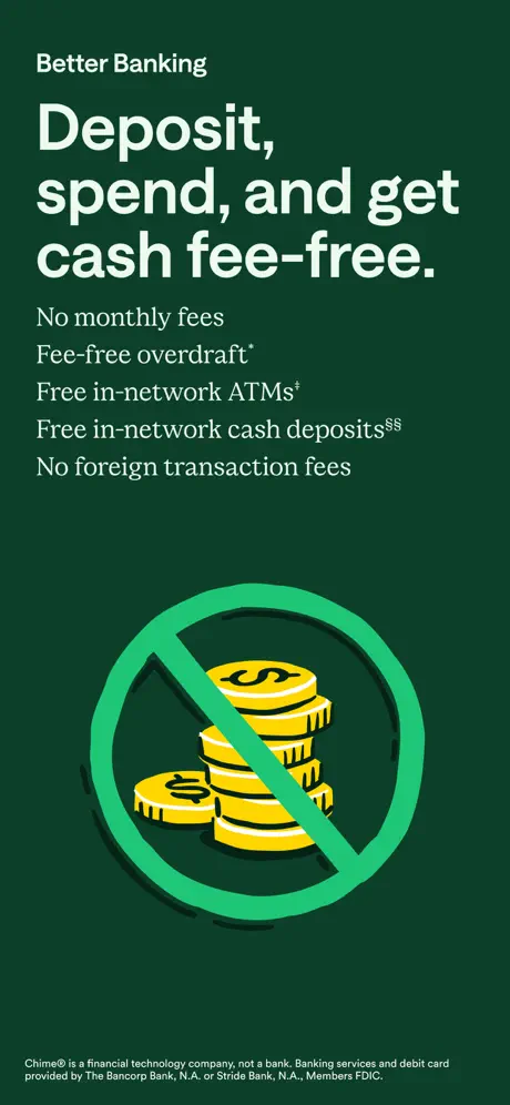
On-frame caption: “Deposit, spend, and get cash fee-free.

This is the only frame that abandons both the phone chrome and the light palette. The canvas is deep forest green (#0B3D2E). The eyebrow is “Better Banking” in white. The headline “Deposit, spend, and get cash fee-free.” is set in a large white sans, followed by a flush-left list of five promises: “No monthly fees,” “Fee-free overdraft*,” “Free in-network ATMs‡,” “Free in-network cash deposits§§,” and “No foreign transaction fees.” The visual anchor is a stack of yellow coins (#FACC15) centered in the lower half, overlaid by a thick green prohibition circle-slash (#17C36B) to telegraph “no fees.” The illustration is rendered in a flat, iconographic style with a long drop shadow. Because there is no device frame, the composition relies entirely on symmetry, yet the coin stack is relatively small—perhaps 35% of the frame’s width—leaving a vast sea of dark green above and below. A legal disclaimer sits at the very bottom in small white type. The frame functions as a palette cleanser between phone-centric shots, but the negative space feels unresolved rather than confident.

Chime App Store screenshot 5 — Credit Building
05

Credit Building

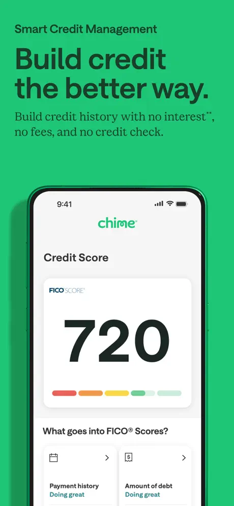
On-frame caption: “Build credit the better way.

The background snaps back to the electric emerald (#17C36B) used in Frame 2. The eyebrow label is “Smart Credit Management.” The headline reads “Build credit the better way.” with the subhead “Build credit history with no interest**, no fees, and no credit check.” The phone shows a Credit Score screen branded with a small “FICO SCORE” logo in the upper left of the card. The score itself—“720”—is rendered at an enormous weight, roughly 80pt, in near-black. Beneath it, a five-segment horizontal meter runs from red through orange, yellow, green, and pale green. Below the card, a section title asks “What goes into FICO® Scores?” followed by two small row cards: “Payment history / Doing great” and “Amount of debt / Doing great.” The UI is clean, high-contrast, and proof-driven; it is one of the most legible frames in the set because the large numerals read instantly even when the frame is scaled down.

Chime App Store screenshot 6 — High-Yield Savings
06

High-Yield Savings

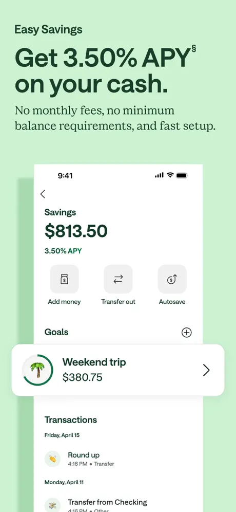
On-frame caption: “Get 3.50% APY§ on your cash.

The background lightens to a cool pale mint (#D4F5E0), distinct from Frame 1’s warmer mint. The eyebrow reads “Easy Savings.” The headline “Get 3.50% APY§ on your cash.” is paired with the subhead “No monthly fees, no minimum balance requirements, and fast setup.” The iPhone displays a Savings screen with “$813.50” in bold black and “3.50% APY” in green beneath. Three action icons appear in a row—“Add money,” “Transfer out,” and “Autosave”—each in rounded gray-surface buttons. A “Goals” header introduces a card for “Weekend trip” with $380.75, which physically overlaps the bottom edge of the phone bezel and bleeds downward into a “Transactions” list. That overlap is the only instance in the set where a UI card breaks the device frame, and it reads as an accident rather than an intentional pop-out; the bottom of the Weekend-trip card is clipped by the screenshot boundary, which undermines the otherwise tidy containment of the other frames.

Chime App Store screenshot 7 — Cash-Back Deals Map
07

Cash-Back Deals Map

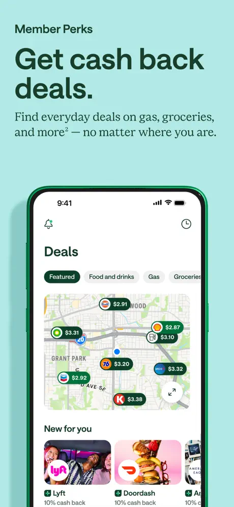
On-frame caption: “Get cash back deals.

The background shifts again to a cool aqua-mint (#B8E8D8). The eyebrow is “Member Perks,” the headline “Get cash back deals,” and the subhead “Find everyday deals on gas, groceries, and more² — no matter where you are.” The phone shows a map interface crowded with branded merchant pins: Shell, Chevron, 76, ARCO, and others, each advertising a cash-back amount ($2.87, $3.20, etc.) inside green lozenge bubbles. Above the map, a horizontal chip filter reads “Featured / Food and drinks / Gas / Groceries,” with “Featured” filled in dark green and the others in light gray. Below the map, a “New for you” header introduces merchant tiles for Lyft, Doordash, and a partially visible third brand, each with “10% cash back” captions. The map is visually busy—street grids, brand logos, and price callouts compete for attention—but that density is also proof of network breadth. The status bar remains 9:41, maintaining the illusion that all screenshots were captured in a single moment.

Chime App Store screenshot 8 — Security & Support
08

Security & Support

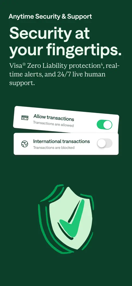
On-frame caption: “Security at your fingertips.

The sequence closes by returning to the deep forest green (#0B3D2E) of Frame 4. The eyebrow is “Anytime Security & Support.” The headline “Security at your fingertips.” is followed by “Visa® Zero Liability protection⁴, real-time alerts, and 24/7 live human support.” Instead of a phone, the frame presents two floating white UI cards. The top card shows an “Allow transactions” toggle switched on in bright green; the bottom card shows an “International transactions” toggle switched off in gray, with the caption “Transactions are blocked.” Both cards carry faint drop shadows and are set at a slight counter-clockwise rotation. Below them, a large shield illustration in pale green with a dark green checkmark anchors the bottom half. Because this frame lacks the familiar rounded device chrome, the toggles feel disconnected from the app context established in Frames 2, 3, 5, 6, and 7. The composition is top-heavy, with the typographic block occupying the upper 40% and the shield sitting low, leaving a gap in the vertical middle.

05The craft

Captions, colour and the mechanics of the sell

Caption pattern

Every frame follows an identical grammar: a small eyebrow label (Early Payday, SpotMe, etc.) in dark text at the top-left margin, followed by a 3–4 line headline set flush left, followed by a 1–2 line explanatory sentence, and then a bottom-heavy visual. That repetition creates scroll momentum; the shopper learns where to look for the promise before the image even resolves.

Visual system

The visual backbone is a green monochromatic scale that is, in practice, more of a green freestyle. Pale mint, neon emerald, sage, deep forest, and cool aqua all appear. The only constants are the typeface and the rounded iPhone frame, which acts as a visual stabilizer. Within the phone, the UI is nearly identical to the live app: real transaction lists, real map pins, real toggle states. That fidelity is a deliberate trust signal—there is no stylized ‘concept’ art here except for the coin illustration in Frame 4 and the shield in Frame 8.

The thumbnail test

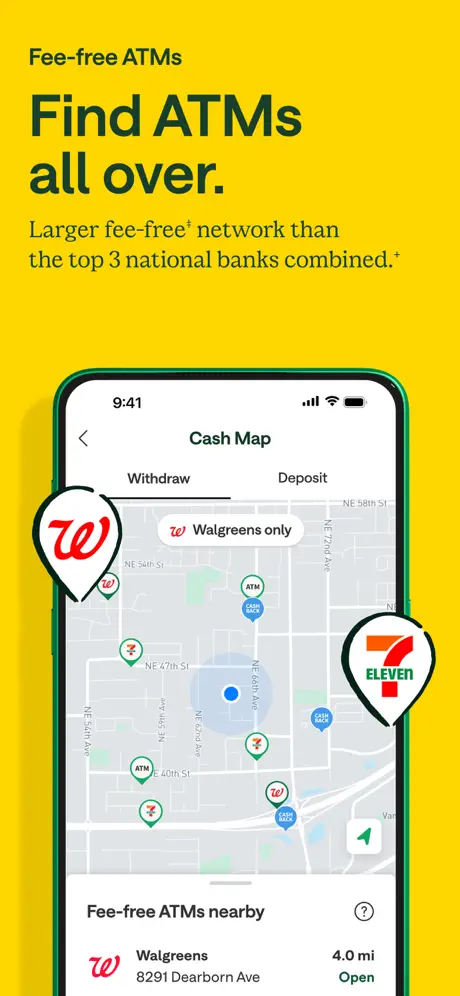
At the small preview size shown in search results and the Today tab, the frames that survive best are Frame 2 and Frame 5. The electric green backgrounds read as pure color fields, and the centered dark headlines hold contrast. Frame 1 collapses into a beige-green square with a face and a phone blob; the seasonal message is lost. Frame 4’s coin illustration shrinks to an ambiguous yellow smudge. Frame 8’s floating toggles lose context entirely. This is a set built for the detail-page swipe, not for the initial grid impression.

Conversion mechanics

The set is engineered for the detail-page swipe, not the search-result grid. At thumbnail scale, the alternating green backgrounds do more work than the UI details, which is exactly what a lifestyle finance brand wants: color recognition first, feature validation second. However, the first frame’s reliance on seasonal copy (“this season”) means the asset has a short half-life; it will look stale after the campaign period. The legal disclaimers in Frames 1 and 2 are necessary but visually penalizing, shrinking the available vertical space for the hero content.

06Where it slips

What we would change

Frame 1 sacrifices product clarity for star power

By handing roughly 60% of the canvas to the celebrity and his blazer, the phone UI is pushed into the lower-left corner and partially masked by fingers. The actual app interface becomes illegible at thumbnail size. A tighter crop on the device—or a reduction in headline point size by roughly 15%—would let the $1,246.91 balance and MyPay cards read as proof rather than decoration.

The background palette lacks a continuous thread

The sequence bounces between warm mint, electric emerald, medium sage, deep forest, cool aqua, and back to deep forest. The shopper swiping through feels tonal whiplash. Reining the eight frames into a tighter monochromatic ramp—perhaps moving from light to dark and back, or keeping a single accent frame—would reinforce the sense that this is one product, not eight separate ads.

Frame 4’s illustration is under-scaled and vibrates at small sizes

The yellow coins against deep forest are legible, but the green prohibition symbol (#17C36B) sits directly on top of yellow (#FACC15), creating a harsh edge that shimmers when scaled down. Increasing the illustration size by 30% and adding a subtle dark inner shadow or stroke would separate the layers and make the ‘no fees’ symbol readable in under a second.

Frame 6’s overlapping goal card looks like a crop mistake

The ‘Weekend trip’ card bleeds off the bottom of the phone and is truncated by the screenshot boundary. In every other frame, the UI is neatly contained within the device bezel. Either fully contain the card or push it far enough outside the phone that it reads as an intentional modal pop-over with a soft shadow bridging the gap. As it stands, the composition looks like an export error.

Frame 8 breaks the device pattern without a clear payoff

Seven frames train the eye to look for the rounded phone. Frame 8 replaces it with abstract floating toggles. The security message is important, but the toggles lose context without the chrome; they could belong to any settings panel in iOS. Inserting the toggles inside a dark-mode phone frame—or zooming into the shield icon alone—would preserve the visual language while still landing the security claim.

07The recipe

How to apply this to your own app

  1. Choose your first frame’s hierarchy based on acquisition channel

    If you expect most traffic from App Store Search, lead with the utility and keep the device large and centered. If you are driving paid social to your store page, you can afford a brand-first Frame 1 like Chime’s because the user is already warm.

  2. Treat legal text as a layout material, not an afterthought

    Chime’s disclaimers are jammed against the bottom edge in tiny type. Designate a consistent 4–5% safe zone at the base of every frame for compliance copy so it does not crash into your visual anchor.

  3. Lock your palette to three values, not eight

    Chime’s greens are ownable but erratic. For your own set, pick one light, one mid, and one dark value, then assign them by frame function—e.g., light for savings/growth, dark for security/foundation—to create a subconscious logic the shopper can feel as they swipe.

  4. Contain or commit when breaking the device frame

    Chime’s Frame 6 shows what happens when a UI element half-exits the phone: it looks broken. If you want an element to pop out, give it a dramatic shadow, overlap status-bar elements, or let it sit fully outside with a clear z-index story. Never let a card bleed off the canvas by accident.

  5. Use real UI states, not wireframes

    One of Chime’s smartest moves is showing actual balances, actual FICO scores, and actual map pins rather than sanitized lorem-ipsum screens. Real data builds trust instantly. Capture your screenshots from a production build with demo accounts populated by real-world numbers.

08Takeaways

Five things worth stealing

  • Chime proves that a finance app can behave like a consumer retail brand on the App Store, opening with a seasonal campaign and a celebrity face rather than a literal account screen.
  • The one-idea-per-frame rhythm is the set’s greatest structural strength; no frame tries to explain more than a single value prop, which keeps swipe momentum high.
  • However, the color inconsistency and occasional composition wobbles (Frame 6’s clipped card, Frame 8’s missing device) reveal the cost of producing campaign-style assets at carousel scale.
  • For designers building their own sets, the lesson is to separate brand heat from product proof cleanly: use the first frame to stop the thumb, but lock the remaining frames into a tighter visual system so the shopper knows they are still inside the same product story.
  • clickabilityScore
09The verdict

What the set actually achieves

The result is a rhythmically paced sequence that sacrifices some palette discipline for feature clarity. It converts the standard banking-app carousel into a branded slide deck: headline, subhead, proof element, repeat. For designers building their own sets, it is a useful study in how far you can push seasonal copy, celebrity framing, and non-device illos before the shopper loses the thread of the product itself.

Product teams at fintech or neobank apps that need to balance compliance, feature density, and lifestyle branding in a single storefront scroll. Also useful for designers who want to see how celebrity endorsement translates into a UI-centric screenshot set without fully abandoning product proof.

10Questions

Frequently asked

Why does Frame 1 use a seasonal headline instead of a feature?

It is a campaign-aware choice. Chime is running a seasonal brand push, and the store page is treated as a continuation of that upper-funnel messaging rather than a purely functional landing strip. The trade-off is relevance decay once the season ends.

How does the set handle disclaimers and legal copy?

Disclaimers are placed at the bottom of Frames 1, 2, and 4 in very small white or near-white type. They are readable in the full-size view but dissolve into texture at thumbnail size, which is the standard compromise for regulated financial products on the App Store.

What makes Frame 5 the most legible frame in the set?

Frame 5 pairs a high-contrast black numeral (720) against a white card on a bright green field. The number is large enough to function as the headline itself, so the shopper gets the value even if they skip the text above it.

Does the set use video or static images?

The frames provided are static screenshots. There is no autoplay video element or parallax frame visible in the sequence.

What is the weakest frame for conversion and why?

Frame 8 is the weakest for conversion because it removes the familiar iPhone frame and substitutes abstract toggle cards that could belong to any app. Without the device boundary, the shopper loses the immediate context of ‘this is inside the Chime app,’ and the security message feels generic rather than product-specific.

11Keep reading

Build your own screenshot set

The full set

10 shots
Chime App Store screenshot 1Chime App Store screenshot 2Chime App Store screenshot 3Chime App Store screenshot 4Chime App Store screenshot 5Chime App Store screenshot 6Chime App Store screenshot 7Chime App Store screenshot 8Chime App Store screenshot 9Chime App Store screenshot 10

About the app

Unlock financial progress™ with Chime—credit tools, access to early pay, and no monthly fees. Chime is a financial technology company, not a bank. Banking services provided by Chime Financial, Inc., via the App Store listing.

Screenshots and store metadata belong to Chime Financial, Inc.. They are shown here for design commentary and criticism. The analysis on this page is original work by floow.design. View the original listing.

More Finance teardowns

Browse all →