Art of Flora app icon
LifestyleScreenshot teardown9 min read

Art of Flora App Store screenshots

Art of Flora enters a saturated puzzle category where the default visual language leans on candy colors, neon gradients, or flat vector iconography. The central challenge for this screenshot set is to signal, within the first 1.2 seconds of a thumb-stop, that the product trades kinetic flash for archival restraint. Because the app pairs two distinct interaction models—an image-slider puzzle and a text-reconstruction puzzle—with a substantial educational layer drawn from 18th- and 19th-century botanical archives, the screenshots must sequence those mechanics so that a shopper never asks “Is this just another tile swapper?” The set also needs to establish trust around the source artworks: without evidence of resolution and curation, a browser may assume low-quality scraper assets. Additionally, the set must perform on a cream-dominant palette that offers lower edge contrast than the category norm, meaning typography, device framing, and negative-space choices have to work harder to separate foreground from background at thumbnail scale. Finally, the team needed to communicate depth—over a hundred puzzles, artist bios, chapter structures—without turning the carousel into a dense, unreadable spec sheet, while also telegraphing inclusivity through UI evidence rather than taglines alone.

Set published by Klemens Strasser · 9 frames analysed

4.9 · 355 ratingsFreev1.1.1Updated 4mo ago
Art of Flora App Store screenshot 1
01At a glance

The set in one screen

Framing
Device chassis withheld in Frame 1 and Frame 8; used in Frames 2–7
Captions
Large black serif, sentence case, consistent top placement
Backdrop
Warm beige #F2EAD9 across every canvas
Type
High-contrast Didone-style serif for captions and in-app headlines
UI / copy split
70
Frame 1 job
Brand mood and object promise without device chrome

Sampled palette

#F2EAD9#F2EAD9
#0F0F0F#0F0F0F
#A39B8F#A39B8F
#FFFFFF#FFFFFF
02The challenge

What this screenshot set had to solve

Art of Flora enters a saturated puzzle category where the default visual language leans on candy colors, neon gradients, or flat vector iconography. The central challenge for this screenshot set is to signal, within the first 1.2 seconds of a thumb-stop, that the product trades kinetic flash for archival restraint. Because the app pairs two distinct interaction models—an image-slider puzzle and a text-reconstruction puzzle—with a substantial educational layer drawn from 18th- and 19th-century botanical archives, the screenshots must sequence those mechanics so that a shopper never asks “Is this just another tile swapper?” The set also needs to establish trust around the source artworks: without evidence of resolution and curation, a browser may assume low-quality scraper assets. Additionally, the set must perform on a cream-dominant palette that offers lower edge contrast than the category norm, meaning typography, device framing, and negative-space choices have to work harder to separate foreground from background at thumbnail scale. Finally, the team needed to communicate depth—over a hundred puzzles, artist bios, chapter structures—without turning the carousel into a dense, unreadable spec sheet, while also telegraphing inclusivity through UI evidence rather than taglines alone.

By withholding the device bezel from Frame 1, the opening reads as a museum poster rather than a utilities screenshot.
03The approach

How the set argues its case

The designer chose to treat the App Store carousel as a single exhibition wall. Every frame shares the same warm parchment background—sampled at roughly #F2EAD9 outside the device and echoed inside the app chrome—so the transition from screenshot to screenshot feels like a slow pan across one continuous environment rather than a hard cut between isolated scenes. Typography is limited to a single high-contrast serif family, rendered in near-black #0F0F0F at display sizes that remain crisp when Apple compresses the gallery to preview dimensions. The device bezel is deliberately withheld from Frame 1 so the opening reads as a gallery invitation or book cover, then introduced in Frame 2 and maintained through Frame 7 to reassure viewers that this is a polished native app, not a web wrapper. Caption copy is written as a cumulative narrative: “Puzzle through timeless art / Or piece facts together / Learn about incredible plants / With over 110 Puzzles / Get to know the Artists / Accessible for everyone.” This rhythm alternates between mechanical promise and content depth, preventing the fatigue of repeated generic claims. The eighth frame abandons both device and caption entirely, letting a dense, nearly completed puzzle serve as a pure visual payoff that proves the artwork holds up without marketing scaffolding.

Down-calorie puzzle apps default to vector flatness; this set positions the product as a museum companion that happens to be playable. The beige field, classical serif, and 18th-century source plates together signal ‘slow luxury’ in a category optimized for dopamine.

04Frame by frame

Every screenshot, and the job it does

Art of Flora App Store screenshot 1 — Brand promise without device chrome
01

Brand promise without device chrome

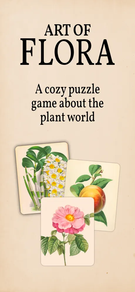
On-frame caption: “Frame 1 drops the shopper directly into a gallery poster rather than a phone screen. The canvas is uninterrupted warm beige, approximately #F2EAD9. “ART OF FLORA” sits high in an extremely high-contrast Didone-style serif; “ART OF” is rendered smaller above the outsized “FLORA” wordmark. Beneath it, the subtitle “A cozy puzzle game about the plant world” shifts to an italic of the same family at roughly 24 pt. The lower half is occupied by three overlapping botanical study cards with rounded corners near 16 pt radius and a diffuse, low-opacity shadow. The front card shows a pink wild rose with serrated leaves; behind it to the right sits a peach on its stem; to the left rear is a cluster of white narcissus and a stalk of bamboo. By presenting these illustrations as physical cards rather than screen grabs, the frame postpones the “app” reading and instead sells a tactile, collectible object.

No handset bezel; warm beige #F2EAD9 top to bottom; three botanical cards with rounded corners and diffuse shadow; high-contrast serif wordmark; italic subtitle centered beneath.
Art of Flora App Store screenshot 2 — Mechanic 1: image puzzle
02

Mechanic 1: image puzzle

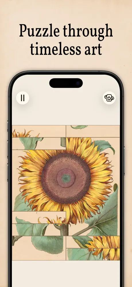
On-frame caption: “Frame 2 is captioned “Puzzle through timeless art”. An iPhone 15 Pro chassis appears, its black bezel and Dynamic Island creating a clear aperture. The in-app background maintains the same #F2EAD9 tone as the outer canvas, so the phone appears to float inside a seamless envelope. At the screen’s top-left is a 44 pt white circular pause button with two vertical black bars; top-right mirrors it with a white circular hint button carrying an interlocking-pieces glyph. The puzzle shows a vintage sunflower sliced into horizontal bands with several empty slots interrupting the petals and stem. The flower head is rendered in sepia browns and ochres, occupying roughly 60 percent of the screen height. The status bar is hidden, which removes clutter and keeps the composition centered on the artwork itself.

iPhone 15 Pro frame; Dynamic Island visible; pause and hint icons in white circles; sunflower puzzle in horizontal strips; hidden status bar; beige field continuous with outer background.

Art of Flora App Store screenshot 3 — Mechanic 2: text puzzle
03

Mechanic 2: text puzzle

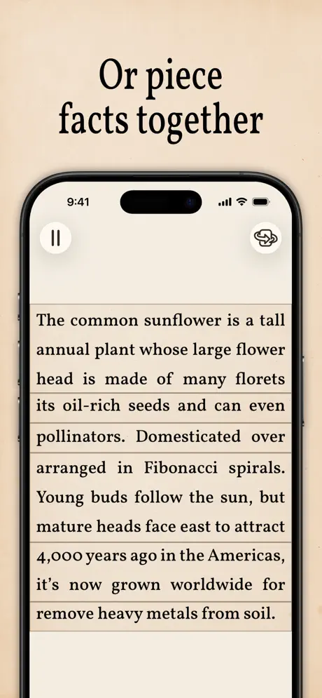
On-frame caption: “Frame 3 is captioned “Or piece facts together”. Same iPhone frame. The interior presents a text-reconstruction puzzle. Lines of black serif text are broken into horizontal strips that read, verbatim: “The common sunflower is a tall annual plant whose large flower head is made of many florets its oil-rich seeds and can even pollinators. Domesticated over arranged in Fibonacci spirals. Young buds follow the sun, but mature heads face east to attract 4,000 years ago in the Americas, it’s now grown worldwide for remove heavy metals from soil.” The jumbled state is immediately readable as scrambled. The system status bar returns at the top with the time 9:41 and standard cellular, Wi-Fi, and battery glyphs, lending an extra note of realism. The pause and hint icons remain in their exact positions from Frame 2, reinforcing UI consistency.

Text-reconstruction mechanic visible; verbatim copy mixed; 9:41 status bar shown; pause and hint icons unchanged; continuous beige background; caption in same serif.

Art of Flora App Store screenshot 4 — Structure: chapters
04

Structure: chapters

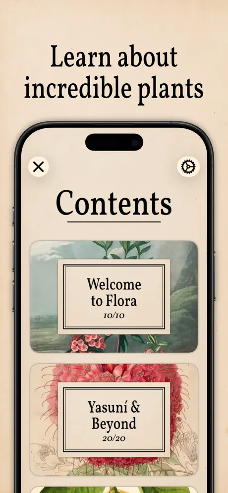
On-frame caption: “Frame 4 is captioned “Learn about incredible plants”. Inside the device, a centered “Contents” headline is underscored by a thick black rule roughly 2 pt in weight. Below it, chapter cards stack vertically with rounded 16 pt corners and faint botanical background imagery. The first visible card displays a misty landscape vignette behind a bordered label reading “Welcome to Flora” with a “10/10” completion marker. The second card shows a dense red floral study beneath the label “Yasuni & Beyond / 20/20”. Top-left sits a white circular close button with a black X; top-right carries a white circular settings gear. This frame pivots from mechanics to structure, proving the puzzles are gated inside curated chapters rather than served as an endless random stream.

Contents title underlined; chapter cards with rounded corners; Welcome to Flora 10/10; Yasuni & Beyond 20/20; close and settings icons in white circles; beige background.

Art of Flora App Store screenshot 5 — Volume signaled through density
05

Volume signaled through density

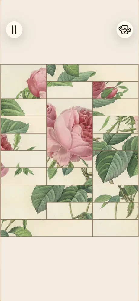
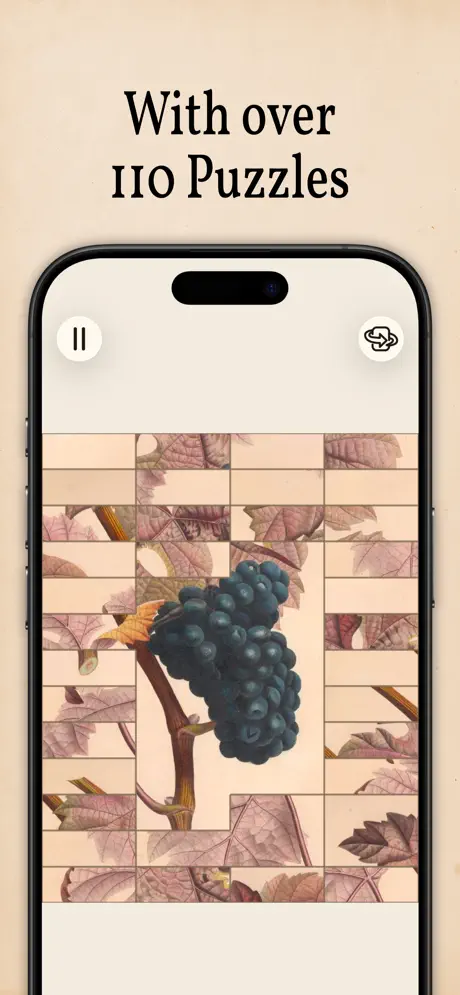
On-frame caption: “Frame 5 is captioned “With over 110 Puzzles”. The device returns to the puzzle view. The grid is noticeably denser than the sunflower in Frame 2—approximately an 8 by 10 lattice—showing a cluster of dark Concord grapes against reddish-purple autumn foliage. The grid lines are thin beige separators that match the paper background color. By increasing piece density, the frame communicates escalating difficulty and volume without relying on a bullet list. The pause and hint buttons persist in their established positions, maintaining the rhythm of the set.

Dense grid puzzle; grapes with purple foliage; 8x10 lattice visible; thin beige grid separators; pause and hint icons; iPhone frame retained; caption in black serif.

Art of Flora App Store screenshot 6 — Provenance: artist profile
06

Provenance: artist profile

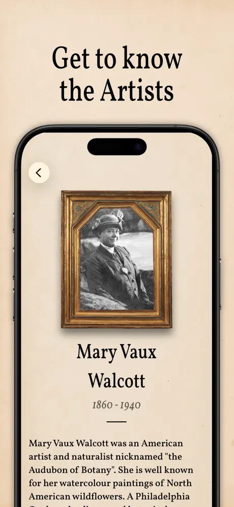
On-frame caption: “Frame 6 is captioned “Get to know the Artists”. The screen displays a portrait of Mary Vaux Walcott enclosed in an ornate faux-gilded frame with decorative corner bosses. Below the portrait, her name is set in the same serif at roughly 28 pt, followed by the years “1860 - 1940” in a lighter weight, then a short horizontal rule, then a biography paragraph beginning “Mary Vaux Walcott was an American artist and naturalist nicknamed 'the Audubon of Botany'. She is well known for her watercolour paintings of North American wildflowers. A Philadelphia...” The top-left corner holds a cream-colored back chevron inside a circle. This is the only screenshot centered on provenance rather than play, and it shifts the value proposition from puzzle utility to cultural heritage.

Artist portrait in ornate frame; name and dates centered; bio text begins verbatim; back button top-left; cream background continuous; caption in same serif treatment.

Art of Flora App Store screenshot 7 — Inclusivity: accessibility pane
07

Inclusivity: accessibility pane

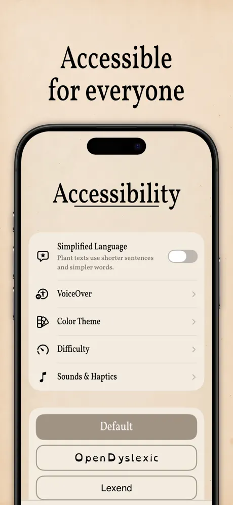
On-frame caption: “Frame 7 is captioned “Accessible for everyone”. The device shows an “Accessibility” settings pane. A top card offers “Simplified Language” paired with the sub-head “Plant texts use shorter sentences and simpler words.” and a grey inactive toggle to the right. Below are four icon-led rows—VoiceOver, Color Theme, Difficulty, Sounds & Haptics—each with a right-facing chevron. At the bottom, three large rounded rectangles offer font choices: “Default” filled in warm taupe #A39B8F with white text, “OpenDyslexic” outlined in black with its characteristic wide letterforms, and “Lexend” similarly outlined. This is the only utility-forward frame in the set, and it retains the parchment background to avoid feeling like a system dialog.

Accessibility title underlined; Simplified Language toggle; VoiceOver, Color Theme, Difficulty, Sounds & Haptics rows; Default filled #A39B8F; OpenDyslexic and Lexend outlined; cream background.

Art of Flora App Store screenshot 8 — Closer: raw gameplay bleed
08

Closer: raw gameplay bleed

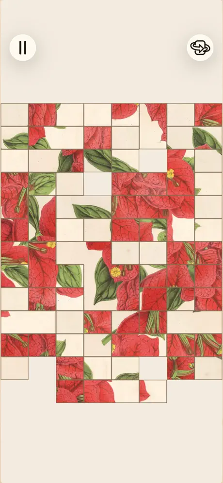
On-frame caption: “Frame 8 carries no caption text and no device bezel. This is a raw gameplay shot of a dense red-floral puzzle—likely bougainvillea or poinsettia—approaching completion. The piece grid is roughly 10 by 12. Pause and hint buttons float directly on the beige background, slightly larger relative to the grid than they appeared inside the device frames because the image is not inset. By stripping away all marketing chrome, the final screenshot lets the vintage illustration occupy the entire visual field, acting as a closing argument for color saturation and detail fidelity.

No device frame; no caption; full-bleed puzzle grid; red floral image; pause and hint buttons on raw beige; approximately 10x12 piece density; same environmental color.

05The craft

Captions, colour and the mechanics of the sell

Caption pattern

Sentence-case serif headlines that build a cumulative value proposition from frame to frame, alternating mechanic and depth claims in a steady rhythm: puzzle → facts → chapters → volume → artists → accessibility. No frame repeats the same semantic role.

Visual system

A single environmental color (#F2EAD9) wraps every frame. Inside the device, the app background matches the outer canvas exactly, making the phone appear to float inside a seamless envelope. UI chrome—pause buttons, hint icons, close buttons—uses a repeated white circular motif with black glyphs, creating a drumbeat of recognizable controls.

The thumbnail test

At small scale the set registers as a band of warm cream with bold black serifs, which stands out against competitors using saturated purples, blues, or neon greens. However, the identical caption treatment across all frames means utility screens and gameplay screens flatten into the same silhouette, slightly damping click-through curiosity on frames 3, 4, and 7.

Conversion mechanics

The set front-loads mood and mechanics before volume or accessibility, which means shoppers who drop off after two frames still understand the core loop. However, the lack of a quantity claim until Frame 5 may under-sell depth for users who never swipe that far. The final frame’s chrome-free bleed is a high-confidence move that relies entirely on the art’s visual punch to close the tab.

06Where it slips

What we would change

Flat hierarchy on utility frames

The unbroken beige #F2EAD9 wrapper is the set’s most distinctive structural choice, yet it also flattens hierarchy: Frame 7, which surfaces settings toggles and font names, receives the identical typographic treatment as Frame 2’s large-scale sunflower. A shopper scrolling at thumbnail size sees a cream field with black text in every slot, so the accessibility frame—critical for inclusivity messaging—visually flatlines against its more colorful neighbors. The fix is to introduce a contrasting caption background on utility frames, perhaps a deep charcoal #2A2A2A bar behind “Accessible for everyone” so the thumbnail silhouette varies.

Text-puzzle legibility risk

Frame 3’s text-puzzle is compositionally cluttered. The scrambled lines are honest to the mechanic, but the paragraph rag is severe and the missing punctuation fragments—“can even pollinators,” “Domesticated over arranged”—risk looking like broken English rather than intentional gameplay. Reordering the strips so the first line reads cleanly before the scramble begins would preserve the aha moment without inviting confusion.

Final frame scale inconsistency

Frame 8’s full-bleed gameplay is the right move for a finale, yet it introduces a subtle scale inconsistency: the pause and hint buttons appear softer and larger relative to the puzzle grid than they do inside the device frames in earlier shots, suggesting a direct export at a different resolution. Removing those chrome elements from the final artwork frame—or scaling them down to match the framed equivalents—would eliminate the visual bump.

Late volume claim

The set waits until Frame 5 to surface quantity (“110 Puzzles”). For category browsers who never swipe past Frame 2, that depth cue is lost. Planting a volume or variety hint earlier—perhaps as secondary micro-copy on Frame 1—would anchor the content promise before users bounce.

07The recipe

How to apply this to your own app

  1. 1

    Lock every screenshot background to a single hex value so the App Store carousel reads as one continuous canvas instead of eight disconnected files.

  2. 2

    Lead the sequence with a device-free brand frame to establish emotional tone before proving platform legitimacy with a handset bezel on subsequent screens.

  3. 3

    When displaying a text-reconstruction mechanic, ensure the first visible line is semantically intact so shoppers recognize intentionality rather than suspecting a localization error.

  4. 4

    Reserve the final slot for a chrome-free, full-bleed gameplay image that removes captions and device frames to let art quality act as the closing argument.

  5. 5

    Use a filled background shape behind captions on utility-heavy frames like Settings to prevent them from visually disappearing against more colorful gameplay neighbors.

  6. 6

    Place a quantity or depth cue within the first two frames to anchor content volume for users who do not swipe the full gallery.

08Takeaways

Five things worth stealing

  • Paint every screenshot background with the same hex value so the App Store carousel registers as one continuous environment instead of eight separate files.
  • Lead the sequence with a device-free brand frame to establish emotional tone before proving platform legitimacy with a handset bezel on subsequent screens.
  • When displaying a text-reconstruction mechanic, ensure the first visible line is semantically intact so shoppers recognize intentionality rather than suspecting a localization error.
  • Reserve the final slot for a chrome-free, full-bleed gameplay image that removes captions and device frames to let art quality act as the closing argument.
  • Use a filled background shape behind captions on utility-heavy frames like Settings to prevent them from visually disappearing against more colorful gameplay neighbors.
  • Place a quantity or depth cue within the first two frames to anchor content volume for users who do not swipe the full gallery.
09The verdict

What the set actually achieves

The set reads as a unified gallery wall where the app is consistently framed as a premium, content-heavy experience rather than a disposable hyper-casual title. The measured alternation between device-framed mechanics and editorial information gives browsing shoppers multiple entry points—visual, intellectual, or accessibility-driven—while the consistent parchment environment keeps the brand recognizable at swipe speed.

Designers building premium content apps, museum or archival products, and slow-loop games where artwork is the primary conversion driver. The lessons apply directly to any category where screenshots must balance mechanical explanation with cultural credibility.

10Questions

Frequently asked

Why does Frame 1 omit the device frame?

Removing the bezel turns the opening into a gallery poster or album cover, letting the brand establish mood before the shopper evaluates utility. It also avoids the ‘app-as-commodity’ read that a generic phone frame can trigger at first glance.

Does the beige background hurt contrast at thumbnail size?

The near-black serif (#0F0F0F) against #F2EAD9 still passes WCAG AA for large text, and the warmth differentiates the product from cooler competitors. The trade-off is worth it for brand identity, though utility frames benefit from added caption contrast.

Why show scrambled text in Frame 3?

It is the single most efficient way to communicate the second mechanic: shoppers instantly see sentences broken into strips and understand that reconstructing facts is a parallel activity to image puzzling. The risk is legibility, which is why the first line should ideally read cleanly.

What is the function of the final frame having no caption?

It acts as a visual exhale. After six frames of structured marketing copy, the shopper receives a pure gameplay image that proves the art holds up without scaffolding, similar to ending a portfolio on a full-bleed project shot.

11Keep reading

Build your own screenshot set

The full set

9 shots
Art of Flora App Store screenshot 1Art of Flora App Store screenshot 2Art of Flora App Store screenshot 3Art of Flora App Store screenshot 4Art of Flora App Store screenshot 5Art of Flora App Store screenshot 6Art of Flora App Store screenshot 7Art of Flora App Store screenshot 8Art of Flora App Store screenshot 9

About the app

Discover the wonders of the botanical world with "Art of Flora”, the official successor to Art of Fauna (App Store Award Winner in 2026)! Each artwork is paired with a Klemens Strasser, via the App Store listing.

Screenshots and store metadata belong to Klemens Strasser. They are shown here for design commentary and criticism. The analysis on this page is original work by floow.design. View the original listing.

More Lifestyle teardowns

Browse all →