Savee app icon
LifestyleScreenshot teardown13 min read

Savee App Store screenshots

Savee App Store Screenshot Set — A Visual Audit

Set published by Savee LLC · 7 frames analysed

4.6 · 115 ratingsFreev2.6.1Updated 5mo ago
Savee App Store screenshot 1
01At a glance

The set in one screen

Framing
iPhone device frames on off-white surround; Frame 1 is full-bleed with no chrome
Captions
Heavy neutral sans-serif, centered black text, consistent across Frames 2–7
Backdrop
True black (#000000) in Frame 1; gallery off-white (~#F2F2F2) in Frames 2–7
Type
Display sans-serif with tight leading in overlays; UI labels in iOS system-weights
UI / copy split
High image surface area; text restricted to top captions and sparse internal overlays
Frame 1 job
Establish cultural credentials before explaining utility

Sampled palette

#000000#000000
#F2F2F2#F2F2F2
#FFFFFF#FFFFFF
#FFFF02#FFFF02
#2C2C2E#2C2C2E
#FF1A1A#FF1A1A
02The challenge

What this screenshot set had to solve

The Savee screenshot set faces a conversion challenge that is as much anthropological as it is commercial. Its target user is someone who professionally judges images—who notices kerning, color profiles, and cropping for a living. In the App Store, this user scrolls through search results with a practiced skepticism, treating most screenshot sets as visual noise. The challenge, evidenced by the frames, is to signal cultural fluency before functional utility. The set must answer an unspoken hierarchy of questions: first, do you share my taste? second, do you respect the image? and only third, what do you actually do? Because the app traffics in found imagery, the screenshots cannot look like they were generated from a template; they must feel like the inside of a working designer’s moodboard. At the same time, the sequence has to communicate structural behaviors—saving, organizing, searching by color, home-screen widgets, and cross-app sharing—without collapsing into the UI-documentation aesthetic of enterprise software. The tension is between gallery and manual, between aspiration and instruction, and every frame competes not just with direct rivals but with the user’s own carefully cultivated camera roll.

The set treats the App Store carousel as a white-cube gallery. The risk is that a typo and a pixelated color grid shatter the illusion.
03The approach

How the set argues its case

The overarching strategy is what might be called the “white-cube to black-box” method. Frame 1 removes all hardware and interface to present the app as a movement or manifesto, establishing a black-dominated visual grammar that treats imagery as art object. Frames 2 through 7 then introduce the device as a literal frame, placing the iPhone against an off-white surround—sampled near #F2F2F2—that mimics gallery-wall neutrality. The captions never sell; they state. Each headline is a flat declaration in a single weight of neutral sans-serif, positioned with generous top margin and centered optical mass. Inside the device, the app alternates between two modes: the romantic overlay (Frames 2 and 3) and the literal interface (Frames 4, 5, 6, and 7). Overlay text—“Design,” “Open,” “Photography”—is set in large, white, heavy type and placed directly atop masonry grids, suggesting the screen is a canvas rather than a control panel. The masonry itself uses black gutters as negative space, making each tile feel like a separately mounted print. The set accepts a degree of ambiguity in early frames, trusting that a designer audience will swipe twice for atmosphere before demanding schematic clarity.

The structure benchmarks against fast-scrolling utility apps by slowing the cadence. It borrows from print editorial and museum signage: captions sit above the “frame” like wall labels; device screens read as hanging prints. For designers building their own sets, the lesson is that category norms—bright gradients, feature callouts, oversized icons—can be ignored if the visual tone is cohesive enough to suspend disbelief.

04Frame by frame

Every screenshot, and the job it does

Savee App Store screenshot 1 — The manifesto
01

The manifesto

On-frame caption: “Visual hook: full-bleed border collage with no device chrome

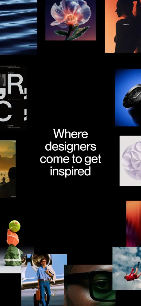
The opening frame is a full-bleed statement piece with no device chrome, no status bar, and no explanatory UI. The canvas is a pure black field—#000000—functioning as both background and spotlight. Around the perimeter, roughly twelve image tiles are scattered with deliberate asymmetry, leaving a vast central negative space that accounts for approximately sixty percent of the frame’s width. In that void, four lines of centered sans-serif copy read: “Where / designers / come to get / inspired.” The type is white (#FFFFFF), set at a display size—likely between 48 and 64pt in equivalent iOS metrics—with loose line height that prevents the stack from feeling cramped. The surrounding tiles are cropped as fragments, not full compositions. Clockwise from top-left: rippling water in deep navy (#081830); a translucent, bioluminescent flower in lavender and coral (#E8A0BF, #FF7F50); the silhouette of a woman against a tangerine gradient (#FF8C42); a luxury timepiece against cobalt blue (#1A3AEC); a white geometric paper sphere; a red figure in freefall through clouds; an extreme close-up of an eye behind green-tinted optical glass; a vintage aviation portrait with a propeller; a surrealist still life of a tennis ball and cone; and a sunset beach scene. The gutters between these tiles are irregular—some tight, some wide—preventing any suggestion of an algorithmic grid. The frame offers no functional information. It is pure tone-setting, asking the viewer to recognize their own visual appetite in the collage before explaining how the app satisfies it.
Savee App Store screenshot 2 — Browse
02

Browse

On-frame caption: “Headline: “Browse millions of curated assets”

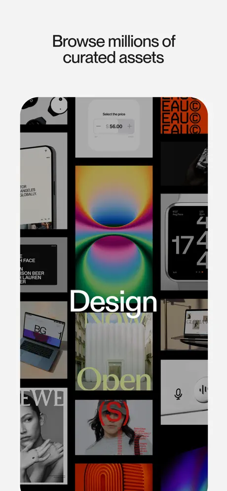
Frame two introduces the device for the first time, staging a black-bezel iPhone against the same off-white background—approximately #F2F2F2—that will persist through the remainder of the set. Above the hardware, the caption “Browse millions of curated assets” is centered in a heavy, neutral sans-serif, colored in a near-black (#1A1A1A) with comfortable top margin. The phone screen displays a masonry grid with thick black gutters, roughly 4–6pt wide, separating tiles of varying aspect ratios. Visible content includes a white price-stepper UI reading “Select the price” with “$56.00,” an orange typographic poster repeating “EAU” in a black field, a grayscale watch against saturated blue, a MacBook displaying “BG,” and a central hallucinatory gradient orb in neon green, hot pink, and amber (#39FF14, #FF10F0, #FFBF00). Two large typographic overlays interrupt the masonry: “Design” in white (#FFFFFF), centered in the lower third, and “Open” in a pale, acidic lime (#DCFF8C) positioned beneath it. These words behave as graphic insertions rather than native UI, letting the screenshot operate like a poster. The status bar and home indicator are absent, implying the content extends beyond the physical glass. By moving from Frame 1’s pure black void to this bright, contained gallery, the set recasts the phone as a portable exhibition space.

Savee App Store screenshot 3 — Save
03

Save

On-frame caption: “Headline: “Save anything that moves you”

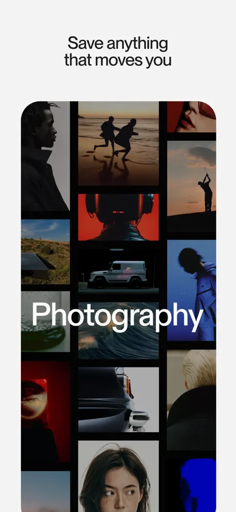
The third screenshot repeats the off-white surround and black device frame, maintaining rigorous template consistency, but shifts the emotional register of the grid. The caption—“Save anything that moves you”—is set in the same black sans-serif, same weight, same centered position as Frame 2, establishing a predictable cadence. Inside the phone, the masonry grid now privileges photography over graphic design. Identifiable tiles include a side-lit male silhouette in near-black shadow; two figures sprinting across wet sand at golden hour; a golfer mid-swing against a burnt-orange sky (#CC5500); a vehicle interior bathed in warning red (#FF1A1A); a white G-Wagon under streetlight; a breaker wave; and a profile bathed in electric blue (#0047FF). The large interior overlay reads “Photography” in the same heavy white sans-serif used for “Design” previously, anchoring the set’s typographic system. The black gutters remain, preserving the lattice structure. Unlike Frame 2’s mix of UI components and fine art, this frame commits to a single category. The caption’s verb—“moves”—is echoed kinetically by the runners, the wave, and the golf swing. It is the most cinematic frame, willing to sacrifice schematic detail for atmospheric cohesion.

Savee App Store screenshot 4 — Boards
04

Boards

On-frame caption: “Headline: “Keep it all in boards”

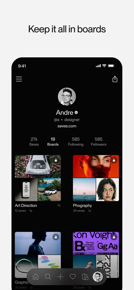
Here the set pivots from moodboard to structural inventory. The caption “Keep it all in boards” hovers above the device in the established black sans-serif. Inside the phone, the interface reveals its full navigational skeleton against a true black background (#000000). The status bar shows 9:41, cellular, Wi-Fi, and battery glyphs in white. A hamburger menu sits left; a share icon sits right. Centered beneath is a circular avatar, the name “Andre” with a verified badge, the handle “@a • designer,” and the URL “savee.com.” A stat row reads “27k Saves,” “19 Boards,” “585 Following,” and “585 Followers,” with small gray labels (#8E8E8E) underneath. Below, a two-column grid of boards appears. “Art Direction” (12 saves, 1y) shows a car engulfed in pink flowers, an iPhone mockup, and a coastal roadster. Beside it, a board labeled “Phography” [sic]—a spelling error visible in the screenshot that undermines credibility with a detail-oriented audience—hosts a red-lit face, a seascape, and a portrait. Further down, “Graphics” (30 saves, 1y) and another board featuring a purple poster with “Kon Voight” typography are visible. Small lock icons denote private boards. At the bottom, a tab bar presents five icons—Home, Search, Add, Likes, and Profile—rendered in muted gray (#636366), with the active profile avatar receiving a white stroke. This frame is the only one that proves the app’s underlying database architecture, and it is necessarily denser than its predecessors.

Savee App Store screenshot 5 — Color search
05

Color search

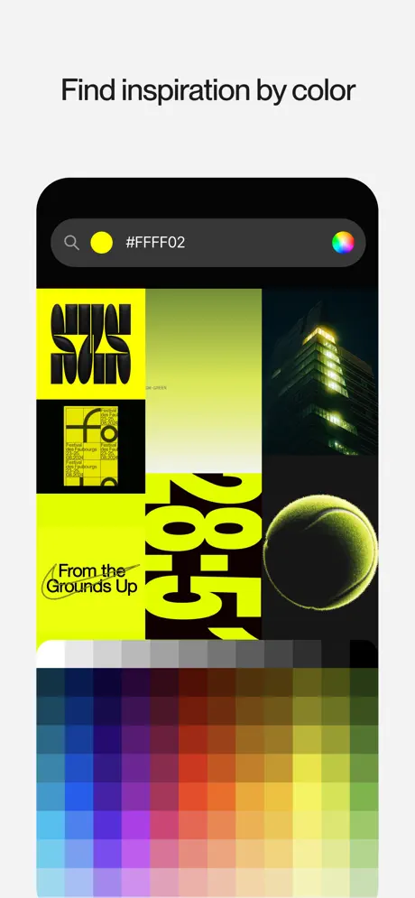
On-frame caption: “Headline: “Find inspiration by color”

Frame five returns to feature demonstration with the caption “Find inspiration by color.” The staging remains off-white background with black iPhone frame. Inside, a dark-mode search state is visible. A charcoal search bar (#333333) with full pill-radius sits near the top, containing a magnifying glass icon, a solid yellow circle swatch sampled near #FFFF00, the verbatim hex string “#FFFF02,” and a circular rainbow color-wheel picker on the far right. Below, the grid is ruthlessly filtered to that exact acidic yellow. Results include bold black typography on yellow reading “View New,” a poster stating “From the Grounds Up,” oversized numerals, a night-building photograph where interior light matches the search tone, and a close-up tennis ball. The lower third of the screen is occupied by a color-selection interface: a gray desaturation strip, followed by a coarse, pixelated spectrum grid transitioning through cyan (#00FFFF), blue, violet (#BF40BF), magenta, red (#FF0000), orange, and back to yellow. The grid’s low resolution—individual pixels are visible—creates a jarring contrast with the retina-sharp photography above it. There are no romantic text overlays here; the UI speaks literally. This frame answers the utilitarian question of search mechanics with unambiguous directness.

Savee App Store screenshot 6 — Widgets
06

Widgets

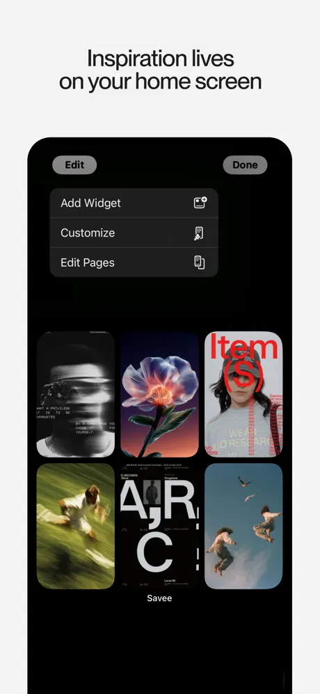
On-frame caption: “Headline: “Inspiration lives on your home screen”

The sixth frame addresses operating-system integration. Caption: “Inspiration lives on your home screen,” again in the identical black sans-serif above the device. Inside the phone, Apple’s native widget-customization interface is shown. Top-left and top-right pill buttons read “Edit” and “Done” in gray (#48484A). Beneath them, three list rows—“Add Widget,” “Customize,” and “Edit Pages”—appear on raised black cards (#1C1C1E) with system-style icons. The focal area is a 2×3 grid of Savee widgets, each a rounded rectangle displaying a saved image. Top row: a distorted face with terminal-like text; the recurring bioluminescent flower from Frame 1, establishing cross-frame visual continuity; and a red typographic poster reading “Item(s).” Bottom row: a motion-blur figure in green grass; a fragmented poster with “AIR C” in black and white; and two figures falling through a cyan sky. Below the grid, the label “Savee” appears in white. By borrowing Apple’s own edit-mode language—widget containers, corner radii, button shapes—the frame suggests the app is a native layer of iOS rather than a siloed destination. It explains value through context, not through new metaphors.

Savee App Store screenshot 7 — Share extension
07

Share extension

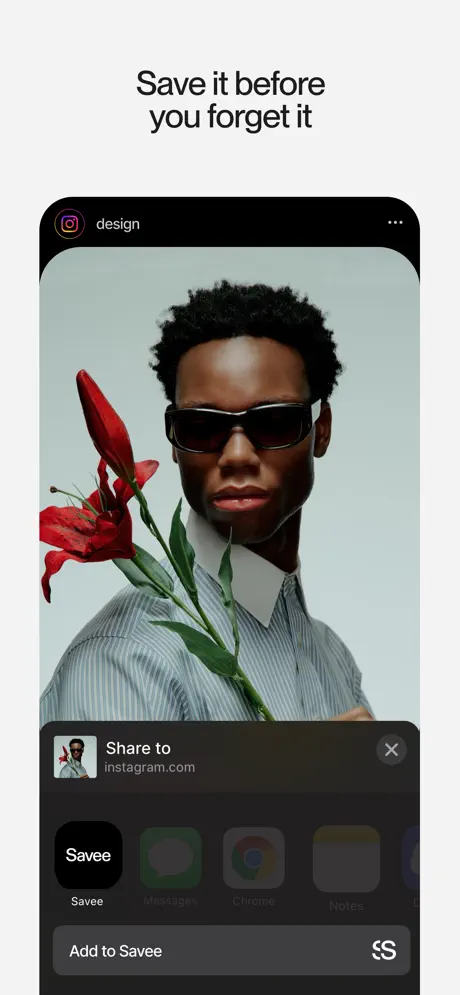
On-frame caption: “Headline: “Save it before you forget it”

The final frame demonstrates intake mechanics. Caption: “Save it before you forget it.” The device shows a simulated source view: an Instagram header with the gradient camera icon and the word “design” in white, followed by a three-dot menu, suspending a full-bleed editorial photograph. The image is a portrait of a man in narrow black sunglasses and a blue-gray pinstripe shirt with an exaggerated white collar, holding a large red amaryllis against a pale mint-gray background (#D0DDD8). Below, the iOS share sheet rises in dark charcoal (#2C2C2E). Its header presents a thumbnail, the text “Share to” and “instagram.com,” and an X close button. A horizontally scrolling app row follows: the Savee destination is a solid black square (#000000) with a white wordmark, clearly selected; beside it, blurred and grayed placeholders for Messages, Chrome, Notes, and Google Drive. Under Savee, the label is white (#FFFFFF); competing apps are dimmed to #8E8E93. At the very bottom, a persistent action row reads “Add to Save” with a link-slash-save icon. This frame closes the loop opened in Frame 2: if Frame 2 showed the destination library, Frame 7 shows the intake valve. It is the only frame that explicitly depicts content arriving from outside the app’s ecosystem.

05The craft

Captions, colour and the mechanics of the sell

Caption pattern

All six captioned frames use the same centered, black, sans-serif headline style. The copy is short: four to six words, always sentence case, always declarative. This creates a metronomic rhythm that flattens surprise but builds system trust.

Visual system

The set alternates between two surface temperatures: the absolute black void of Frame 1, and the warm gallery-white staging of Frames 2–7. Inside the device, black gutters (~#000000, 4–6pt) separate masonry tiles, turning the screen into a grid of discrete prints rather than a continuous feed. Typography is exclusively sans-serif; overlay words are heavy and white, while captions are heavy and dark. No frame uses color for interface chrome except Frame 5’s functional color picker.

The thumbnail test

Frame 1 is a pure black thumbnail with white text. In search results, it will read as either a bold negative-space mark or a broken image, depending on the viewer’s patience. The gamble is that designers will pause for the fragment collage rather than swipe past for something that looks more obviously like an app.

Conversion mechanics

Frame 1 sacrifices immediate comprehension for brand heat; Frames 4–7 pay down the utility debt. The share-sheet close is a smart loop because it answers the shopper’s last objection: ‘How does it get in there?’ The profile frame (Frame 4) is the hinge point where atmospheric interest must convert to feature trust.

06Where it slips

What we would change

Credibility fracture from a typo

In Frame 4, a board is titled “Phography,” omitting the second “o.” For an app whose value proposition rests on curation and visual authority, a spelling error in a featured screenshot is not trivial; it reads as negligence and erodes trust with the exact demographic the app courts. The fix is uncompromising: reshoot the frame with the corrected “Photography” board name, or select a different user profile entirely.

Resolution mismatch in the color picker

Frame 5’s color spectrum at the bottom of the screen is rendered at visibly low resolution; individual pixels are discernible in a way they are not in the photography above. The result is an unfinished, prototype-grade texture that undercuts the polish of the editorial imagery. Replacing the bitmap grid with a smooth, vector-rendered gradient or higher-resolution sampled swatches would restore visual coherence.

Trademark exposure in the share sheet

Frame 7’s reliance on Instagram’s trademarked header icon and brand name introduces unnecessary legal and editorial risk. App Store reviewers and trademark holders both scrutinize screenshots that imply platform endorsement. A more defensible approach would use a generic “Browser” header, or crop the source branding to a neutral gray bar that does not invoke a competitor’s protected identity.

Monotonous caption cadence

The caption typography is rigidly identical across Frames 2 through 7—same typeface, same weight, same optical size, same centered alignment, same distance from the device. While this creates predictability, it also flattens scrolling rhythm. A designer’s eye begins to treat the headline as boilerplate. Introducing calibrated variation—perhaps pushing the Frame 5 caption slightly smaller to let the color grid dominate, or left-aligning the Frame 7 caption to echo the share sheet’s lateral motion—would create cadence without sacrificing system integrity.

Frame 1’s missing category cue

Frame 1, for all its bravery, offers no hint that this is a mobile application. A shopper thumbing through search results might mistake it for a gallery advertisement and swipe past. Adding a subtle, ghosted device outline or a minimal UI signifier would clarify the product category without spoiling the black void.

07The recipe

How to apply this to your own app

  1. Lead with your audience’s taste, not your feature list. If your user is visually sophisticated, the first frame should look like the content they already save.

    Lead with your audience’s taste, not your feature list. If your user is visually sophisticated, the first frame should look like the content they already save.

  2. Use the device frame as a literal picture frame, not a screen边界.

    Use the device frame as a literal picture frame. The off-white surround in Frames 2–7 turns the phone into a museum object; the black gutters inside turn the screen into a print rack.

  3. Separate atmospheric frames from structural frames.

    Separate atmospheric frames from structural frames, but link them with repeating visual anchors—like the bioluminescent flower appearing in Frame 1 and Frame 6—to prove continuity.

  4. Proofread like the app is a publication.

    Proofread like the app is a publication. Screenshots are shipping interface. A typo in a featured board name is a conversion leak.

  5. Match the resolution of every element to the photography.

    Match the resolution of every element to the photography. A pixelated control in a retina world reads as broken, even if the code is fine.

08Takeaways

Five things worth stealing

  • A lifestyle app for designers can afford to behave like an exhibition on the storefront—but every production detail must hold up under scrutiny.
  • Repeating visual anchors across frames builds narrative continuity without explicit storytelling.
  • The share-sheet frame is a strong closer because it answers the final shopper objection: how does content enter the system?
  • Rigorous template consistency can become sonic monotony; vary caption scale or alignment to create scrolling rhythm.
  • verdict
09The verdict

What the set actually achieves

The sequence successfully sells aesthetic alignment before utility, though production oversights prevent it from being reference-grade. It demonstrates that a lifestyle app for designers can behave like a curated exhibition on the digital storefront—but only if the typography, hardware staging, and interface polish hold up under scrutiny.

Designers and creative directors evaluating moodboard tools, App Store optimization teams for visually driven lifestyle apps, and product designers debating whether to lead with atmosphere or utility in their own screenshot sets.

10Questions

Frequently asked

Why does Frame 1 omit the device entirely?

It is a manifesto frame. Removing hardware suspends the “app” category momentarily so the viewer reacts to taste before function. It is a high-risk move that bets the audience will swipe again for context.

Is the spelling error in Frame 4 real?

Yes. The board visible in the screenshot is labeled “Phography.” This transcription reflects exactly what appears in the asset.

Why does the caption style never change?

The set treats the headline like a gallery label—consistent, neutral, and authoritative. The trade-off is predictability; the benefit is system trust.

What is the color strategy inside the masonry grids?

Black gutters separate tiles so that each image reads as an independent print. The overlay text in Frames 2 and 3 is white and heavy, ensuring legibility against varied photography without needing dimmed overlays.

11Keep reading

Build your own screenshot set

The full set

7 shots
Savee App Store screenshot 1Savee App Store screenshot 2Savee App Store screenshot 3Savee App Store screenshot 4Savee App Store screenshot 5Savee App Store screenshot 6Savee App Store screenshot 7

About the app

Savee is where over 1 million creatives and designers find, save, and share inspiration. Browse millions of curated images and videos across design, photography, motion, and more. Savee LLC, via the App Store listing.

Screenshots and store metadata belong to Savee LLC. They are shown here for design commentary and criticism. The analysis on this page is original work by floow.design. View the original listing.

More Lifestyle teardowns

Browse all →