Flowie app icon
LifestyleScreenshot teardown12 min read

Flowie App Store screenshots

Strictly visual analysis of an eight-frame App Store set for Flowie, a Lifestyle app that pairs AI planning with a recurring mascot named FoFo. The sequence alternates full-bleed compositions against colored grounds with device-framed UI captures, shifting through cyan, mint, lavender, and pink backdrops while keeping the same bold, center-aligned headline treatment throughout.

Flowie App Store screenshot 1
01At a glance

The set in one screen

Framing
Mixed: 2 full-bleed composites (Frames 1, 3), 6 rounded device bezels (Frames 2, 4, 5, 6, 7, 8).
Captions
Bold geometric sans-serif, dark navy to deep purple depending on background, 2–3 lines centered.
Backdrop
Cyan (1), mint (2), lavender (3), pale pink (4), warm pink (5), pale pink (6), violet (7), pale blue (8).
Type
Large headlines (~48–60 pt equivalent), UI text in small rounded sans, chat copy in 14–16 pt system-style.
UI / copy split
Approximately 70% visual / 30% copy; no explanatory sub-body text outside screenshots.
Frame 1 job
Frame 1 must communicate the app’s primary category (planner/task manager) and its emotional differentiator (cheerleader/mascot) in one breath, without a device bezel to frame the UI edges.

Sampled palette

#A0E8F0#A0E8F0
#B2F2D9#B2F2D9
#F5E6FA#F5E6FA
#FFF0F5#FFF0F5
#FFE3EB#FFE3EB
#EDE7F6#EDE7F6
02The challenge

What this screenshot set had to solve

The set must explain that Flowie is not just another to-do app. The screenshots need to sell an AI companion that lives inside a planning interface, while also proving utility through widgets, timers, calendar views, and reporting. The real tension is tonal: productivity apps usually borrow corporate blues and tight grids, whereas Flowie wants to feel like a friendly chat. The designer has eight portrait frames to reconcile those two languages without confusing the shopper.

Headlines are short, bold, and sans-serif, each pegged to a single feature: planning, chat, widgets, AI goal-setting, timers, routine tracking, progress reporting, and immersive chat themes.
03The approach

How the set argues its case

The design strategy centers on mascot consistency and chromatic separation per frame. Every screenshot uses FoFo in a different pose or costume, creating narrative continuity even as the background hue shifts dramatically. Typography is uniformly heavy: headlines are set in a dark, geometric sans at roughly 48–60 pt equivalent, cropped to 2–3 lines and aligned center. Interface mockups inside device bezels show the iOS status bar at 9:41 with standard signal and battery glyphs, signaling native credibility. When the app’s real UI is not enough to fill the frame, the designer composites floating cards, angled widgets, or layered phone shells to suggest depth. The pacing follows a loose narrative arc: utility first, emotional support second, system integration third, and whimsy last. This structure assumes a shopper swipes linearly, so each frame isolates one value proposition without overwhelming the canvas.

Personal companion rather than corporate organiser. That positioning is reinforced by the decision to show emotional chat verbatim ('Hey FoFo, I’ve had a rough day today') rather than abstract UI chrome. Even the widgets speak in first-person ('I appreciate my efforts today'), which keeps the voice consistent across system surfaces.

04Frame by frame

Every screenshot, and the job it does

Flowie App Store screenshot 1 — Your Smart Planner / Your Pocket Cheerleader
01

Your Smart Planner / Your Pocket Cheerleader

On-frame caption: “Your Smart Planner Your Pocket Cheerleader

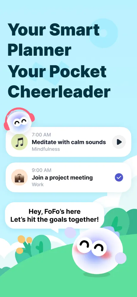
Frame 1 abandons any device bezel, letting the headline dominate the upper half against a flat cyan background near #A0E8F0. Below, two white schedule cards with generous corner radii float mid-screen. The top card displays '7:00 AM' in muted grey, then 'Meditate with calm sounds' in a near-black sans, and 'Mindfulness' in a lighter sub-grey; its left icon is a pale lime circle containing a black eighth-note, and its right action is a dark charcoal circle with a white play triangle. The second card shows '9:00 AM', 'Join a project meeting', and 'Work', with a taupe briefcase icon and a saturated blue checkmark. The lower third is a vivid grass-green shape near #5EE7A5 with stylised flora. FoFo appears twice: once at the upper left wearing pink headphones, and again at the bottom right inside a speech bubble that says, 'Hey, FoFo’s here / Let’s hit the goals together!' The headline type is tightly leaded and dark navy, approximately #0B2B35, creating strong contrast against the airy ground. No status bar or navigation is shown, so the viewer cannot immediately tell whether this is a widget, a notification stack, or an in-app dashboard.
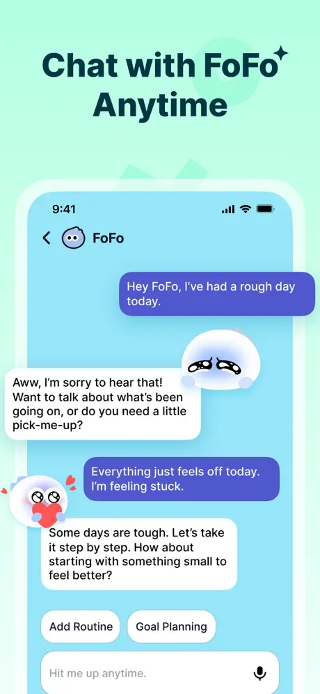
Flowie App Store screenshot 2 — Chat with FoFo* Anytime
02

Chat with FoFo* Anytime

On-frame caption: “Chat with FoFo* Anytime

The background outside the device is a pastel mint near #B2F2D9. A white, rounded device frame encloses a chat UI. The status bar reads 9:41 with standard iOS signal and battery icons. The nav bar shows a back chevron, a small FoFo avatar, and the name 'FoFo'. Inside, the user’s messages appear in deep indigo rounded bubbles near #5B6DED with white text: 'Hey FoFo, I’ve had a rough day today.' and 'Everything just feels off today. I’m feeling stuck.' FoFo’s replies sit in white bubbles with black text: 'Aww, I’m sorry to hear that! Want to talk about what’s been going on, or do you need a little pick-me-up?' and 'Some days are tough. Let’s take it step by step. How about starting with something small to feel better?' A crying FoFo face bubble overlaps the first reply. Below the last message are two white outlined pill buttons labeled 'Add Routine' and 'Goal Planning'. The input field shows placeholder 'Hit me up anytime.' with a microphone glyph. At the bottom left of the device, FoFo clutches a red heart. The headline color is a dark teal near #0B3D3D, shifted slightly warmer than Frame 1’s navy.

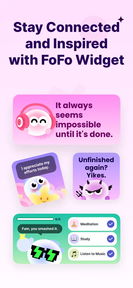
Flowie App Store screenshot 3 — Stay Connected and Inspired with FoFo Widget
03

Stay Connected and Inspired with FoFo Widget

On-frame caption: “Stay Connected and Inspired with FoFo Widget

The canvas is a pale lavender near #F5E6FA. No device frame is used; instead, three widget concepts float with soft drop shadows. The largest, top widget is a horizontal rectangle in a warm pink gradient near #FDEDF2, featuring FoFo in pink headphones at left and the quote 'It always seems impossible until it’s done.' in dark purple. Below it, two square widgets are rotated slightly: the left is a purple gradient near #D1C4E9 showing FoFo resting on a yellow star pillow with the text 'I appreciate my efforts today.'; the right is a darker violet near #B39DDB showing a devil-variant FoFo holding a pitchfork beside the text 'Unfinished again? Yikes.' At the bottom, a wide rectangular widget in a mint-green gradient near #80E3C0 displays a progress bar labeled '6/6', the phrase 'Fam, you smashed it.', and FoFo with a green zigzag mouth. To its right, a list shows 'Meditation', 'Study', and 'Listen to Music', each with a checkmark in a coloured circle. The headline is set in a deep aubergine near #311B92. The rotated widgets introduce dynamic tension but sacrifice horizontal legibility at thumbnail scale.

Flowie App Store screenshot 4 — Let AI* Plan Your Goals
04

Let AI* Plan Your Goals

On-frame caption: “Let AI* Plan Your Goals

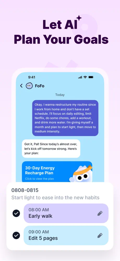
The background is a faint pink near #FFF0F5. A white device frame houses a chat interface. Status bar reads 9:41. The header contains a back arrow, FoFo avatar, and 'FoFo', with a 'Today' separator below. A large user bubble in medium blue near #5B8DEF contains wall-of-text: 'Okay. I wanna restructure my routine since I work from home and don’t have a set schedule. I’ll focus on daily editing, limit Netflix, do some chores, add a workout, and drink more water. I’m giving myself a month and plan to start light, then move to medium intensity.' FoFo replies in a white bubble: 'Got it, Pal! Since today’s almost over, let’s kick off tomorrow strong. Here’s your plan:' Beneath that reply sits a tappable blue card reading '30-Day Energy Recharge Plan' with subtext 'Click to view the plan' and FoFo wearing an orange sweatband. Below the bottom edge of the device frame, floating text reads '0808-0815 / Start light to ease into the new habits', followed by two rounded rows: '08:00 AM Early walk' and '09:00 AM Edit 5 pages', each with a black checkmark in a tinted lozenge and a pencil icon. By letting the schedule bleed past the bezel, the composite implies either scrolling content or an awkward crop.

Flowie App Store screenshot 5 — Find Your Flow* With Versatile Timers
05

Find Your Flow* With Versatile Timers

On-frame caption: “Find Your Flow* With Versatile Timers

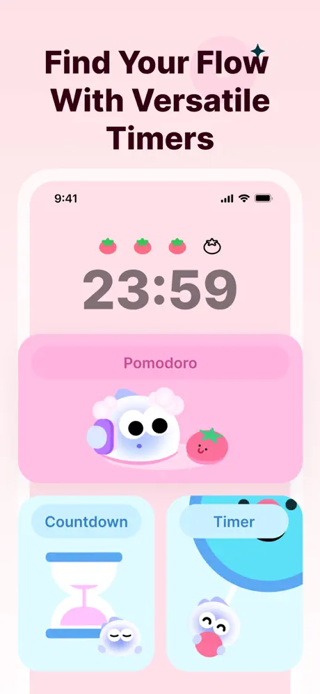
The background is a uniform light pink near #FFE3EB. Inside the white device frame, the screen shares the same pink tone. At top, four small glyphs sit in a row: three red tomatoes with green stems and one outlined FoFo face. Beneath them, the numerals '23:59' appear in a large, neutral grey near #8D8D8D, set in a monospaced or tabular sans. A prominent pink pill near #FFB6C1 fills the mid-screen, containing the word 'Pomodoro' in darker rose, FoFo wearing lavender earmuffs, and a smiling tomato character. Two smaller cards anchor the bottom: the left, on a light blue ground near #E1F5FE, shows an hourglass icon above the label 'Countdown' with a sleeping FoFo; the right, on an identical blue ground, shows a blue circular progress ring with the label 'Timer' and FoFo biting a pink sphere. The entire frame is locked in a single warm hue, making it the most chromatically unified of the set.

Flowie App Store screenshot 6 — Track Daily* Routine Your Way
06

Track Daily* Routine Your Way

On-frame caption: “Track Daily* Routine Your Way

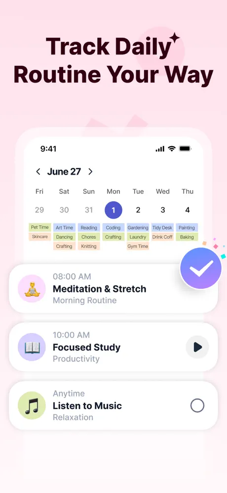
The background is pale pink near #FFF0F5. The device frame shows a white-screen routine tracker. Status bar 9:41. The header displays a back chevron, 'June 27', and week-day navigation: Fri 29 through Thu 4, with Monday the 1st highlighted in a saturated blue circle near #5B6DED. Below the calendar, a dense grid of pastel category tags spans the width: 'Pet Time', 'Art Time', 'Reading', 'Coding', 'Gardening', 'Tidy Desk', 'Painting', 'Skincare', 'Dancing', 'Chores', 'Crafting', 'Laundry', 'Drink Coff', 'Baking', 'Knitting', and 'Gym Time', rendered in soft yellow, green, blue, and peach fills with dark text. Three schedule rows follow: 08:00 AM 'Meditation & Stretch' tagged 'Morning Routine' with a yoga icon in a lilac circle; 10:00 AM 'Focused Study' tagged 'Productivity' with a book icon and dark play button; and 'Anytime' 'Listen to Music' tagged 'Relaxation' with a music note and an empty circle. A large blue-purple FAB with a white checkmark intrudes from the lower right, overlapping the last row. This frame prioritises density and colour-coded taxonomy over whitespace.

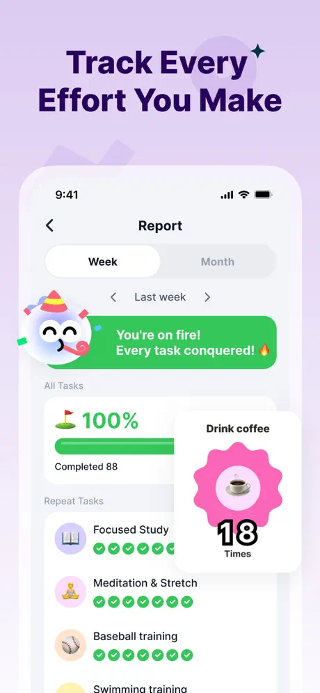
Flowie App Store screenshot 7 — Track Every* Effort You Make
07

Track Every* Effort You Make

On-frame caption: “Track Every* Effort You Make

The background is a pale violet near #EDE7F6. The device frame displays a 'Report' screen. A segmented control at top shows 'Week' selected inside a white pill against a light grey track, with 'Month' dimmed. Below, a nav row reads '< Last week >'. A bright green banner near #4ADE80 carries white text: 'You’re on fire! Every task conquered! 🔥' alongside a FoFo wearing a party hat and blowing a party horn. Under the banner, an 'All Tasks' summary shows '100%' in green and 'Completed 88' below a filled progress bar. A floating overlay card titled 'Drink coffee' sits on the right, displaying a scalloped hot-pink badge near #FF69B4, a coffee cup photo, and the figure '18 Times' in bold black. The 'Repeat Tasks' section lists 'Focused Study' with six green checkmarks, 'Meditation & Stretch' with seven, 'Baseball training' with six, and the beginning of 'Swimming training'. Each task has a circular thumbnail icon. The frame is information-dense, using celebratory colour to offset the statistical complexity.

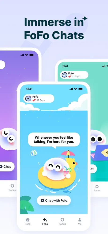
Flowie App Store screenshot 8 — Immerse in* FoFo Chats
08

Immerse in* FoFo Chats

On-frame caption: “Immerse in* FoFo Chats

The background is a very pale blue near #E8F4FD. Three white device bezels overlap in a fanned composition. The front-center phone is fully visible, showing a chat-themed environment rather than standard messages. The header shows FoFo’s avatar, the name 'FoFo', a red heart, and '99 Days'. The screen background depicts a sky-blue ocean scene with white clouds. FoFo floats in a yellow inner tube, holding a tropical drink, beside a small yellow duck under a pink umbrella. A white speech bubble states: 'Whenever you feel like talking, I’m here for you.' A bottom pill button reads 'Chat with FoFo'. The tab bar is visible: 'Task', 'FoFo' (active, marked by a star icon), 'Focus', and 'Me'. The left rear phone reveals a purple night-sky scene with FoFo winking and a 'Chat' label. The right rear phone shows a green underwater or nature scene with FoFo wearing glasses and a 'Focus' label. This frame sells environmental variety and longitudinal use through the '99 Days' streak indicator.

05The craft

Captions, colour and the mechanics of the sell

Caption pattern

Most captions follow a verb-led two-line structure ('Chat with FoFo Anytime', 'Let AI Plan Your Goals'). Roughly half append a four-point sparkle glyph after a keyword, which functions as punctuation but risks reading as noise when scaled down.

Visual system

The visual system relies on soft, candy-like pastels for backgrounds and high-contrast dark navy or deep purple for typography. Inside the app, user chat bubbles are indigo (#5B6DED) and system replies are white with black text. Schedule pills alternate between lavender and pale blue. The mascot is always white with pink cheeks, so it remains legible regardless of ground color.

The thumbnail test

At small thumbnail size, the mascot’s eyes and the bold headlines survive, but the chat copy and widget quotes disappear. The color shifts become the most prominent signal, which may help the gallery stand out in a category page but does not reinforce brand identity. The green checkmarks and bright pink badges in Frames 6 and 7 remain readable as colored dots.

Conversion mechanics

Linear storytelling works well here: utility first, emotion second, deep features third. The shopper sees a planner, feels the chat empathy, then discovers widgets, AI planning, timers, and habits before landing on long-term retention proof. The mascot repetition builds memory, but the chromatic roulette may dilute it.

06Where it slips

What we would change

Container inconsistency

Frames 1 and 3 omit device bezels entirely, while Frames 2, 4, 5, 6, 7, and 8 include them. That alternation forces the viewer to reorient with every swipe, breaking the illusion of a single coherent app. The fix is simple: unify the canvas. Either place every mockup inside a device silhouette, or establish a consistent 'floating UI' shadow language for the frames that lack bezels so they still feel physically grounded.

Background color roulette

The background shifts from cyan to mint to lavender to pink and back to purple; no single hue repeats exactly, so the store gallery reads like a gradient sampler rather than a branded product. A designer replicating this should pick one neutral ground—warm grey, soft cream, or pale slate—and reserve chromatic shifts for the UI accents only.

Widget legibility

Frame 3’s rotated widgets sacrifice legibility for dynamism; at thumbnail size, the 'Unfinished again? Yikes.' text becomes a dark smudge. Flattening the widgets and enlarging the type by two points would preserve the idea without compromising clarity.

Ambiguous spatial layering

Frame 4’s schedule items bleeding below the phone bezel is spatially confusing: the viewer cannot tell whether the content is inside or outside the app. Cropping the schedule flush to the screen edge, or explicitly breaking the frame with a shadowed overlap, would remove the ambiguity.

Overlapping report card

Frame 7’s 'Drink coffee' overlay crowds the task list beneath it; moving that card to a separate detail screenshot, or shrinking it to a non-blocking corner badge, would clean up the hierarchy.

07The recipe

How to apply this to your own app

  1. Anchor your backgrounds

    Pick one store-gallery background color and stick to it. If you need variety, shift the UI tint, not the canvas.

  2. Commit to a frame convention

    Device bezels help shoppers imagine the app in their hand. If you drop them, replace the missing boundary with a consistent shadow, card radius, or outline so the mockup still feels contained.

  3. Let real copy sell

    Flowie’s strongest decision is showing actual chat transcript ('Everything just feels off today') rather than marketing taglines. Real in-app copy builds trust faster than adjectives.

  4. Reserve rotation for hero frames only

    If you rotate UI elements for dynamism, confine that treatment to one frame; repeated tilts make the gallery look unstable.

  5. Check thumbnail legibility

    Shrink your screenshot to 200 px wide. If the headline and one UI element are still legible, the frame passes. If not, simplify.

08Takeaways

Five things worth stealing

  • The best part of this set is the pacing: it moves from functional promise to emotional proof before the shopper loses patience.
  • Mascot continuity across all eight frames creates instant recognisability, but only if the surrounding canvas is disciplined enough not to compete with it.
  • Headlines should read like a telegram. Flowie keeps them to 2–3 bold lines, which survives glance behaviour.
  • Chat apps face a credibility gap on the store; showing verbatim, empathetic replies inside the screenshots closes that gap.
  • The weakest structural choice is the alternating device/no-device convention, which costs the set a star in perceived polish.
09The verdict

What the set actually achieves

Flowie’s gallery reads as a mascot-led emotional pitch with functional proof points interleaved. The first frame establishes the planner, the second and eighth lock in the chat personality, the third sells system widgets, the fourth demonstrates natural-language planning, the fifth and sixth surface timers and routine tracking, and the seventh offers progress validation. The arc ends on an immersive, long-term relationship note (99 Days). The visual cost of this variety is a lack of canvas discipline: backgrounds rotate through cyan, mint, lavender, pink, and violet, so the brand never settles into a recognizable store-browsing color.

Teams building companion-style productivity apps that need to sell personality alongside utility. The flow works especially well if your app has a chat layer, a mascot, and a habit-tracking backend that needs to be surfaced without looking like a spreadsheet.

10Questions

Frequently asked

Why does the first screenshot omit a device bezel?

Frame 1 prioritises the mascot and schedule cards over hardware context. It opens with an illustration-like composition rather than a literal screengrab. That risks ambiguity but gains warmth.

How does the set handle dark mode?

None of the eight frames show a dark interface. Every screen uses light-mode chrome, white cards, and pastel grounds.

What typeface is used for the headlines?

The headlines appear to be a bold, geometric sans—possibly a custom brand font or a heavy weight of Inter/Roboto. The letterforms are closed, with a large x-height and tight tracking.

Is the mascot always the same size?

No. FoFo scales dramatically: tiny in chat headers, medium in widget cards, and oversized in the landscape/grass illustration. The eyes and cheek marks remain consistent, which preserves identity across scales.

11Keep reading

Build your own screenshot set

The full set

8 shots
Flowie App Store screenshot 1Flowie App Store screenshot 2Flowie App Store screenshot 3Flowie App Store screenshot 4Flowie App Store screenshot 5Flowie App Store screenshot 6Flowie App Store screenshot 7Flowie App Store screenshot 8

About the app

Screenshots and store metadata belong to Flowie. They are shown here for design commentary and criticism. The analysis on this page is original work by floow.design. View the original listing.

More Lifestyle teardowns

Browse all →