Nurilounge app icon
LifestyleScreenshot teardown15 min read

Nurilounge App Store screenshots

A creator-marketplace screenshot set must perform two contradictory tasks at once: it has to feel like a party—loud, tactile, and aspirational—while still proving the UI actually works. The Nurilounge store images choose the high-energy route, leaning on a violet-to-magenta palette, oversized 3D props, and a recurring purple mascot to sell the promise of free K-beauty products, paid campaigns, and VIP invites. What emerges is a seven-frame arc that moves from billboard-style value props to straight-on interface proof, then ends on a pure-lifestyle collage. For any designer building a two-sided platform pitch, the set is a useful study in how far you can push decorative clutter before it starts eating the very evidence you are trying to show.

Set published by Nurihaus Inc · 7 frames analysed

3.6 · 116 ratingsFreev2.79.2Updated 4mo ago
Nurilounge App Store screenshot 1
01At a glance

The set in one screen

Framing
Frames 1–2 use angled iPhones; frames 3–6 switch to straight-on orthographic; frame 7 drops the device entirely for a photo collage.
Captions
Bold sans-serif, stacked and centered at top or bottom; hashtags in neon-yellow blocks; monetary figures kept large and raw.
Backdrop
Deep purple (#3A0F5C) for discovery; warm pink-lavender (#F8BBD0) for money and events; consistent purple brand thread throughout.
Type
Heavy, condensed sans-serif for hashtags; rounded, inflated sans-serif for social-proof numerals; standard SF-style system type for UI innards.
UI / copy split
Roughly 60% device/UI and 40% 3D illustration in early frames; moves toward 80% UI in the payout frame before abandoning chrome entirely in the final image.
Frame 1 job
Establish the creator value loop—products, connection, and payment—in a single glance.

Sampled palette

Deep violet#3A0F5C
Highlighter yellow#F4FF60
Magenta#D500F9
Warm pink-lavender#F8BBD0
Dark indigo CTA#311B92
Paid green#4CAF50
02The challenge

What this screenshot set had to solve

The Nurilounge screenshot set faces the classic marketplace paradox: it must sell a two-sided network to a single viewer swiping in under three seconds. The shopper here is likely a creator hunting for free products, campaign volume, social linkage, and eventual payout—yet the frames also need to telegraph to brands that real inventory and an active community exist on the platform. All of this must live inside a 9:19.5 aspect ratio where every point of spacing counts. The designers have chosen to foreground the creator journey, leaning on a vivid violet-to-magenta palette, physics-based 3D props, and a recurring mascot to avoid the sterile white-card aesthetic typical of generic B2B platforms. The real challenge, then, is cohesion across seven distinct propositions: product discovery, social proof, campaign depth, VIP perks, social-account linking, monetization, and offline community. Each frame needs a falsifiable UI detail—an apply count, a dollar amount, a follower metric—to prove this is a working platform and not a concept deck, while the surrounding illustration layer must never occlude the very evidence it is meant to frame. Balancing emotive flair with readable interface proof is the tightrope this set attempts to walk.

The set treats the first two frames as an outdoor campaign rather than app-store documentation—demanding attention before the viewer parses a single tab bar.
03The approach

How the set argues its case

The team front-loads spectacle and back-loads evidence. Frames 1 and 2 function like billboards: deep purple backgrounds (#3A0F5C grading toward #5C258D) serve as night-sky stages for oversized foil balloons, reflective gold coins, and a purple blob mascot, while the iPhones are rotated roughly twelve degrees off-axis to inject kinetic energy. Headlines are delivered as stacked hashtags and metallic balloon numerals so the viewer reads value in milliseconds, not sentences. From frame three onward the grammar shifts: devices snap to straight-on orthographic views, letting grid layouts, segmented controls, and list rows do the persuasion. A deliberate color-temperature arc maps emotional payoff to hue, moving from cool, dark violet during discovery to warm pink-lavender (#F8BBD0) when discussing money and parties. Copy is kept telegraphic, relying on imperative verbs and raw metrics—apply ratios, follower counts, USD totals—so the shopper never has to read a paragraph to understand the offer. The gold coin and mascot recur just often enough to stitch disparate screens into one continuous brand moment without becoming wallpaper.

Positioned as a global creator platform where influencers apply to K-beauty campaigns, get sent physical products, publish content, and withdraw earnings. The screenshot set speaks exclusively to the influencer side of the marketplace, using creator-language—hashtags, follower counts, VIP invites, and UGC badges—rather than brand-side metrics like ROI or reach. The seven frames therefore act as a linear onboarding story: get connected, see the crowd, browse the shelf, claim the perk, link your socials, withdraw cash, and party at the event.

04Frame by frame

Every screenshot, and the job it does

Nurilounge App Store screenshot 1 — The Hook
01

The Hook

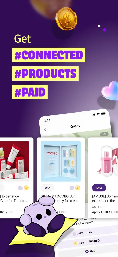
On-frame caption: “Get / #CONNECTED / #PRODUCTS / #PAID

The opening frame drops the viewer into a near-black violet void, roughly #3A0F5C at the top grading to a slightly warmer #5C258D toward the bottom. At top center hangs a reflective gold coin embossed with a dollar sign; its specular highlights catch a warm key light that separates it cleanly from the dark ground. Below, the word “Get” sits in a light cream sans-serif, modest in scale, acting as a quiet predicate for the three hashtags that follow: “#CONNECTED,” “#PRODUCTS,” “#PAID.” Each hashtag is rendered in a bold, condensed sans-serif, colored in deep electric purple and set inside a highlighter-yellow block (#F4FF60). The blocks are stacked with tight leading, creating a ragged left edge that mirrors the stepped product cards inside the phone. The iPhone is canted roughly twelve degrees counter-clockwise, its top tilting away. On screen, the “Quest” header is visible with a back chevron and a “1/10” pagination chip. Three campaign cards peek out: a red-tube skincare set on the left, a TOCOBO sun-care box in the center, and an AMUSE pink bottle on the right. Truncated titles read “] Experience Care for Trouble…,” “[PAY] *TOCOBO Sun - only for creat…,” and “[AMUSE] Join no experience the J…”. Below the cards, a list row shows “Paid 100 USD” next to a coin icon, reinforcing the money motif introduced by the floating coin. At the bottom left, the brand’s purple blob mascot slumps on a yellow star, its body partially masking the device bezel and the lower list rows. The overall density is high; the background is almost empty above the phone, yet the foreground feels crowded because the phone, mascot, and coin compete for the same focal plane.
Nurilounge App Store screenshot 2 — Social Proof
02

Social Proof

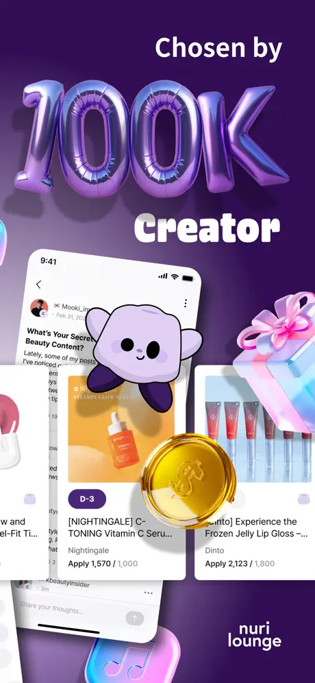
On-frame caption: “Chosen by / 100K / Creator

Social proof arrives in metallic balloon letters spelling “100K,” rendered with iridescent cyan-to-magenta gradients and soft drop shadows that lift them off the same deep violet backdrop. The words “Chosen by” and “Creator” bookend the numerals in a rounded, slightly inflated sans-serif colored in an off-white (#FFF8E7) that avoids the harshness of pure white against purple. Below, another tilted iPhone displays what appears to be a social feed; the username “Mooki_” and a date stamp “Feb 31, 20” sit above a truncated post title “What’s Your Secret Beauty Content?”. Two campaign cards are visible beneath the text: a NIGHTINGALE C-Toning Vitamin C Serum with a purple “D-3” badge reading “Apply 1,570 / 1,000,” and a Dinto Frozen Jelly Lip Gloss card at “Apply 2,123 / 1,800.” The recurrence of over-applied quotas—where applicants exceed available slots—is a deliberate credibility cue, though the truncation of product names makes scanning difficult. The purple mascot reappears, this time peeking over the phone’s top edge like a sticker. A gold coin overlaps the lower-right corner of the screen, and a holographic gift box nestles against the right margin. The “nuri lounge” logotype anchors the bottom right in lowercase white sans-serif, a rare moment of quiet branding.

Nurilounge App Store screenshot 3 — Inventory Depth
03

Inventory Depth

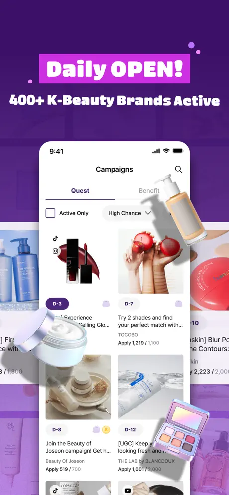
On-frame caption: “Daily OPEN! / 400+ K-Beauty Brands Active

Here the device snaps to a straight-on view, signaling a shift from billboard to browser. The background remains purple but lightens slightly, allowing ghosted product photography to bleed through behind the phone. The headline lockup is aggressive: “Daily OPEN!” in white, housed inside a jagged-edged magenta container (#D500F9), followed by “400+ K-Beauty Brands Active” in bold white sans-serif. Inside the screen, the “Campaigns” view is split between “Quest” (active, underscored in a vivid violet #6200EA) and “Benefit.” A search icon and filter chips—“Active Only” and “High Chance”—float beneath the header. The grid shows four campaign thumbnails: a black-and-red lipstick set (D-3), TOCOBO pomegranate hands (D-7), Beauty of Joseon cream jars (D-8), and a water-texture shot for THE LAB by BLANC DOUX (D-12). Real apply counts are visible: “Apply 1,219 / 1,100,” “Apply 519 / 700,” and “Apply 1,001 / 1,000.” Outside the device, three oversized 3D cosmetics—a white pump bottle, an open cream jar, and a pink eyeshadow palette—cast soft shadows onto the screen, almost grazing the card thumbnails. The effect is tactile but congested; the pump bottle, in particular, obscures the upper-right corner of the phone’s bezel.

Nurilounge App Store screenshot 4 — VIP & Benefits
04

VIP & Benefits

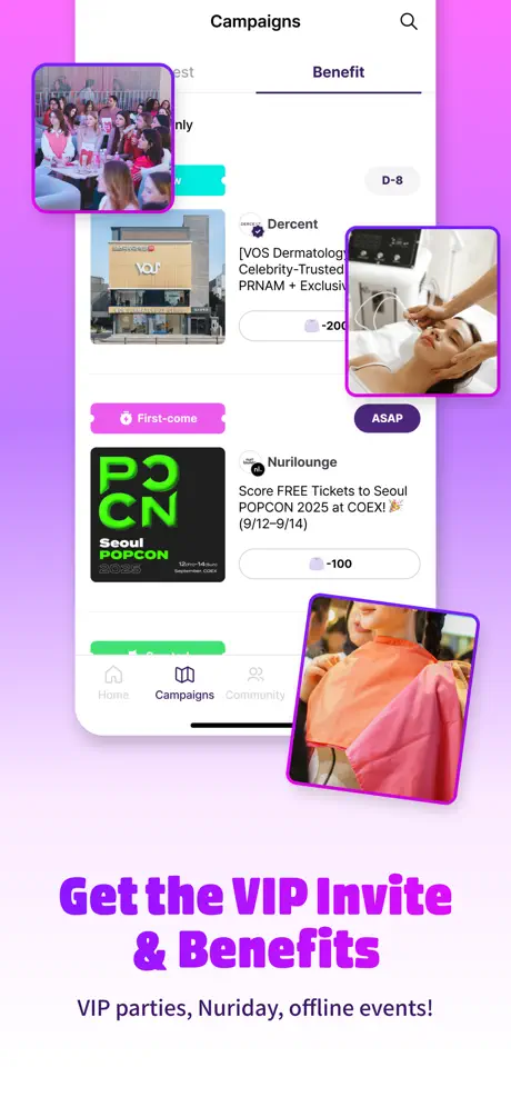
On-frame caption: “Get the VIP Invite & Benefits / VIP parties, Nuriday, offline events!

The palette pivots to a hot pink-to-lavender gradient (#EA80FC fading to #FAFAFA), instantly distinguishing the VIP frame from the deeper purple discovery frames. The device now shows the “Benefit” tab selected, revealing a different taxonomy of rewards. Visible cards include a “Dercent” dermatology service with a verified badge and a “-200” points chip, a “First-come” pink banner, and a black “Seoul POPCON 2025” ticket card with neon green lettering and a progress bar. The tab bar at the bottom exposes the app’s architecture: Home, Campaigns, Community, Chat, Profile. Surrounding the phone are four candid photos with thick purple borders (#AA00FF) and rounded corners—top left shows a group dinner, upper right a facial treatment, lower right a makeup session. These float at arbitrary rotations, creating a scrapbook energy that contrasts with the rigid UI inside the phone. At the bottom, a saturated purple headline reads “Get the VIP Invite & Benefits,” with a smaller subtitle: “VIP parties, Nuriday, offline events!” The frame is the busiest in the set, trading UI clarity for atmosphere.

Nurilounge App Store screenshot 5 — Social Linking
05

Social Linking

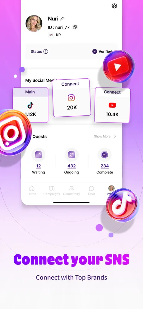
On-frame caption: “Connect your SNS / Connect with Top Brands

The background cools to a pale lavender (#F3E5F5) with faint radial halos. The device displays a profile screen for “Nuri,” complete with an avatar, verified badge, and ID “nuri_77.” A “My Social Media” section presents three outlined cards: a “Main” TikTok account at 1.12K, and two “Connect” states for Instagram (20K) and YouTube (10.4K). Below, a “Quests” summary shows “12 Waiting,” “432 Ongoing,” and “234 Complete,” each paired with a distinct purple icon. The tab bar at the bottom confirms the five main navigation zones. The frame is invaded by massive 3D platform icons: a glossy Instagram emblem at bottom left, a YouTube play button at top right, and a TikTok logo at bottom right, all rendered with chromatic aberration and glassy highlights. These icons are so large that the YouTube badge nearly covers the settings gear in the screen’s top-right corner. The headline “Connect your SNS” sits in bold purple (#D500F9) at the bottom, with the subtitle “Connect with Top Brands” underneath. The hierarchy is inverted; the decorative icons read louder than the functional UI they’re meant to support.

Nurilounge App Store screenshot 6 — Payout
06

Payout

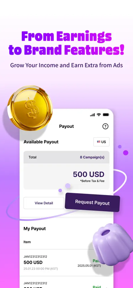
On-frame caption: “From Earnings to Brand Features! / Grow Your Income and Earn Extra from Ads

A soft pink-to-lilac gradient (#F8BBD0 deepening to #E1BEE7) sets a financial mood without turning corporate. The top headline, “From Earnings to Brand Features!” in bold purple (#7B1FA2), is followed by a sober gray subtitle: “Grow Your Income and Earn Extra from Ads.” The device shows a “Payout” screen. Inside a light gray summary box (#F5F5F5), the text reads “Total 8 Campaign(s)” and “500 USD” in large dark type (#212121), with a disclaimer “*Before Tax & Fee” in smaller gray. Two buttons sit beneath: “View Detail” as a white outline, and “Request Payout” as a solid dark indigo fill (#311B92) with white label. Below, transaction history lists “JAN12312312312” for “500 USD,” timestamped “25.01.23 00:00 PM (KST)” and marked “Paid” in green (#4CAF50). The floating gold coin returns at top left, and a purple macaron-shaped object anchors the bottom right. The composition is more restrained than earlier frames; the phone is centered, the decorative props are fewer, and the negative space lets the dollar figure register immediately.

Nurilounge App Store screenshot 7 — Community & Events
07

Community & Events

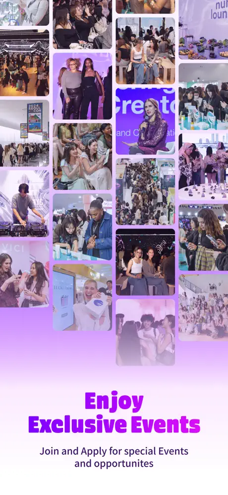
On-frame caption: “Enjoy Exclusive Events / Join and Apply for special Events and opportunities

The closing frame abandons the device entirely, opting for a dense mosaic of event photography that occupies roughly the top two-thirds of the canvas. The images vary in aspect ratio—some portrait, some landscape—packed in a masonry grid with rounded corners of approximately 8 to 12 points. Scenes include crowded party floors, DJ booths, product exhibition stands, and group portraits, all overlaid with a faint violet tint that unifies the collage and nods back to the brand’s purple roots. A partial “nuri lounge” banner is visible in the upper-right quadrant, grounding the montage in branded space. The bottom third is left open on a pale lavender field for the headline “Enjoy Exclusive Events” in heavy magenta (#E040FB) and the subtitle “Join and Apply for special Events and opportunities.” Without any UI chrome, the frame reads as pure lifestyle aspiration. It functions as a promise rather than proof, ending the sequence on a communal high note but offering the viewer no final interface artifact to anchor the fantasy to the app’s actual mechanics.

05The craft

Captions, colour and the mechanics of the sell

Caption pattern

Captions alternate between top-heavy and bottom-heavy lockups. Frames 1–3 stack headlines at the top; frames 4–6 anchor headlines at the bottom; frame 7 splits the difference with headlines below a collage. The typography is always center-aligned, always bold sans-serif, and always set in the brand’s electric purple or near-white against a contrasting shape.

Visual system

The visual system runs on three layers: a deep gradient background, a central device mockup, and a swarm of 3D props (coins, cosmetics, platform icons, mascot) that float in the foreground. Shadows are soft and diffuse, suggesting a shared light source from the top left. The system rewards repetition—the gold coin and mascot appear in multiple frames—but punishes inconsistency; when the background shifts to warm pink in frame 6 without any purple retaining thread, the brand fabric momentarily tears.

The thumbnail test

Frame 1 passes the thumbnail test through sheer contrast: neon yellow blocks with electric purple type against a near-black violet field read instantly even at 15% scale. The gold coin and mascot add recognizable silhouette value. However, the angled device and overlapping star push critical proof—the “Paid 100 USD” row—into the bottom 10% of the frame, where it risks being cropped by App Store rounded corners or iOSWidgets on the Store page.

Conversion mechanics

The set moves the viewer through a clear creator journey: value proposition → crowd validation → inventory → exclusivity → onboarding → withdrawal → belonging. That logic is sound. However, the truncation inside UI cards is relentless; nearly every product title is clipped, which undermines the claim of abundant inventory because the viewer cannot read what is actually on offer. The set would benefit from zooming out the device by 8–10 percent inside frames 2 and 4, or from selecting campaign cards with shorter titles that survive the crop. The gold coin motif is effective, but its reappearance in frame 6 is so large that it nearly touches the phone’s status bar, again crowding the UI canvas.

06Where it slips

What we would change

Frame 1: Mascot occlusion.

The mascot and yellow star overlap the device’s lower list rows, obscuring the “Paid 100 USD” proof point that is critical to the money narrative. Fix: shift the device upward by roughly 60 pt, or scale the mascot down by 15 percent and move it to the right margin so the payout row sits fully in the safe zone.

Frame 2: Balloon hierarchy.

The foil-balloon “100K” is so optically heavy—iridescent highlights at large scale—that it battles the phone’s internal headline for dominance. Fix: reduce the balloon scale to 0.8× or shift the cluster to the right margin so the social feed inside the device reads first.

Frame 3: Prop congestion.

The floating 3D pump bottle grazes the upper-right corner of the screen, obscuring part of the campaign grid. Fix: pull all three cosmetic props at least 20 px outside the phone’s bounding box, or reduce their scale to 0.85× so they frame the device without hiding inventory.

Frame 4: Scrapbook chaos.

The surrounding event photos with thick purple borders feel like stickers rather than integrated collage; their arbitrary rotations and inconsistent crops fracture the composition. Fix: unify border weight to 2 pt, limit rotation to ±3 degrees, and align the photos to a loose grid rather than scattering them.

Frame 5: Icon invasion.

The 3D YouTube, Instagram, and TikTok icons are so large and saturated that the YouTube badge covers the settings gear in the profile screen, breaking the illusion that this is a screenshot rather than a poster. Fix: scale all three icons to 0.7× and drop their opacity to 85 percent so the profile UI remains the hero.

07The recipe

How to apply this to your own app

  1. 1. Assign a temperature arc to your sequence.

    Nurilounge uses cold deep violet for discovery, then warms to pink-lavender for money and events. Map your palette to emotional beat—savings frames in cool blues, payout frames in warm golds—so the swipe feels like a journey, not a random shuffle.

  2. 2. Repeat one surreal prop.

    The gold coin and purple mascot act as GPS. Pick one 3D object that embodies your core value—perhaps a gem for rewards, a ticket for events—and place it in at least three frames at varied scale so the eye knows it is still inside thesame story.

  3. 3. Protect the bottom 10 percent of every frame.

    App Store pages crop screenshots dynamically depending on device size and iOS version. Keep critical UI rows, captions, and CTAs inside an 8–10 percent top-and-bottom safe margin. Nurilounge repeatedly pushes vital text to the bleed edge, risking invisible proof points.

  4. 4. Show truncated copy on purpose, not by accident.

    If every card title is clipped, the viewer learns nothing about inventory depth. Either zoom out the device so more text survives, or write placeholder copy that reads efficiently at two lines. Never let truncation be the dominant visual pattern.

  5. 5. End with UI, not just ambience.

    Frame 7’s pure collage is memorable but orphaned. Whenever you close on lifestyle photography, overlay a small device mockup showing the RSVP or ticket screen so the shopper knows exactly where to tap to enter that world.

08Takeaways

Five things worth stealing

  • Angle the device for emotion, flatten it for evidence.
  • Use raw metrics—apply counts, USD totals, follower numbers—as your trust signals; decoration alone does not convert.
  • One mascot or recurring 3D prop is branding; five unrelated floating objects is clutter.
  • Shift background hue with emotional tone, but retain at least one brand constant (here, the purple type) so the sequencedoes not feel like separate apps.
  • Always leave a safe margin for App Store dynamic cropping; bottom-aligned captions are the first to die on smaller screens.
09The verdict

What the set actually achieves

The set establishes a recognizable purple thread and a tactile toy-box aesthetic that separates it from corporate marketplace imagery. The recurring gold coin and mascot act as reliable GPS for the eye, and the deliberate shift from angled devices to straight-on UI creates a satisfying narrative arc from emotional hook to functional evidence. However, the set suffers from crowding and inconsistent hierarchy; decorative elements frequently overlap critical screen text, and the tonal jump between deep-violet discovery frames and warm-pink financial frames is abrupt. With stricter figure-ground separation, unified border treatments on floating photos, and a final frame that reconnects lifestyle aspiration back to interface proof, the sequence could convert curiosity into installs far more efficiently.

This case study is written for product designers, ASO leads, and creative directors who are building marketplace, creator-economy, or community-platform screenshot sets and need to balance 3D illustration with readable UI proof.

10Questions

Frequently asked

Why does the set switch from angled phones to straight-on phones?

Angled devices generate kinetic energy for emotional hooks (frames 1–2); straight-on views maximize readable screen real estate for functional browsing (frames 3–6). It is a reliable pattern: sell the vibe first, then show the shelves.

Does the bright pink background in frame 6 hurt brand consistency?

Not inherently, because the typography and 3D props maintain continuity. However, the tonal jump is abrupt because no purple bleed or vignette eases the transition. A subtle violet shadow behind the phone would stitch the frame back into the sequence.

Is it risky to drop the device entirely in the final frame?

Yes. App Store shoppers often swipe backward to re-check UI details. If the last image contains no chrome, they cannot verify where the event feature lives inside the app. A small mockup or floating RSVP card inside the collage wouldsolve this.

What makes the hashtag caption style effective?

The yellow blocks with purple type sit at maximum contrast against the dark violet background. They read instantly at thumbnail scale and speak the user’s language—hashtags feel native to creators in a way that corporate subheadlinesdo not.

Should the 3D platform icons in frame 5 be removed entirely?

No, but they need to be demoted. At current scale they compete with the profile screen. Scaling them to 0.7× and dropping opacity to 85 percent keeps the celebratory vibe without hiding the ‘Quests’ stats that prove platform activity.

How could frame 4’s collage feel more intentional?

By unifying the border weight to 2 pt, limiting rotation to ±3 degrees, and aligning the photos to an implied grid that mirrors the phone screen edges. Current arbitrary placement reads like a late-stage stamp brush.

11Keep reading

Build your own screenshot set

The full set

7 shots
Nurilounge App Store screenshot 1Nurilounge App Store screenshot 2Nurilounge App Store screenshot 3Nurilounge App Store screenshot 4Nurilounge App Store screenshot 5Nurilounge App Store screenshot 6Nurilounge App Store screenshot 7

About the app

Nurilounge – Your No.1 Global Creator Platform Join 100,000 creators worldwide! Over 2,500 K-Beauty campaigns and growing covering fashion, living, and inner beauty Nurihaus Inc, via the App Store listing.

Screenshots and store metadata belong to Nurihaus Inc. They are shown here for design commentary and criticism. The analysis on this page is original work by floow.design. View the original listing.

More Lifestyle teardowns

Browse all →