Planta app icon
LifestyleScreenshot teardown14 min read

Planta App Store screenshots

Planta App Store Screenshot Set: A Study in Atmospheric Consistency and Search-Risk Framing

Set published by Planta AB · 8 frames analysed

4.8 · 109K ratingsFreev3.112.1Updated 4mo ago
Planta App Store screenshot 1
01At a glance

The set in one screen

Framing
Silver iPhone with notch, centered, appearing in frames 2–8; frame 1 is device-free.
Captions
Two-line centered lockup: bold feature name in dark green (~#1B3A2F), followed by a lighter gray-green subhead.
Backdrop
Pale sage green (~#E1E9D8) with soft, out-of-focus leaf shadows used consistently behind devices from frame 2 onward.
Type
A clean, geometric sans-serif at two weights: bold for feature names and headers, regular for subheads and body copy inside the UI.
UI / copy split
Approximately 70 percent of each frame after the first is devoted to the device; the remaining 30 percent is headline and atmospheric background.
Frame 1 job
Brand + social proof, zero interface

Sampled palette

Forest green for headlines and primary buttons#1B3A2F
Warm off-white for interior app backgrounds#F7F7F2
Pale sage for exterior set backgrounds#E1E9D8
Pastel mint for tab bar in frames 6 and 8#C4DDB4
Charcoal for modal scrim in frame 7#555555
02The challenge

What this screenshot set had to solve

The design problem facing Planta’s screenshot set is one of categorical translation: how do you sell a digital reminder tool for an entirely analog, biological activity? Plant care involves soil, sunlight, humidity, and slow timeframes—none of which feel inherently pixel-friendly. The app itself bundles at least six distinct modes (task management, computer vision identification, environmental light reading, disease diagnosis, social feed, and household sharing) into a single binary. The screenshot sequence must therefore function as a compressed narrative that teaches a shopper the scope of the toolkit without overwhelming them in the first two seconds. Complicating matters further, the App Store search results page often displays only the first screenshot before the user ever taps through. That first frame must earn the click, yet Planta’s opening gambit contains no device, no interface, and no feature demonstration—only brand name, user count, and a testimonial. The tension between lifestyle seduction and functional credibility is the central conflict this set attempts to resolve.

The set’s greatest structural strength is also its biggest market-risk: it asks the shopper to trust the brand before they have seen the tool.
03The approach

How the set argues its case

The designers committed to an 'aperture' strategy. The iPhone acts as a moving window into the app’s various surfaces, while the exterior environment stays constant. This is intended to reduce cognitive load: the shopper’s eye never has to reorient because the device position, shadow direction, and background color remain static. The typography reinforces this with a militaristic headline rhythm. Every frame from two to eight opens with a large, centered, dark-green feature title ('Care reminders', 'Plant identification', etc.) and a smaller, desaturated subhead underneath. Inside the device, the interface language relies on rounded cards, pill-shaped tags, circular iconography, and warm lifestyle photography. The overall intent is to make a utility app feel like a gardening journal—domestic, calm, and physically grounded.

Planta positions itself not as a productivity app but as a lifestyle companion. This is achieved by refusing pure white backgrounds in favor of warm off-whites (~#F7F7F2) and by embedding every UI surface inside photography of real homes, real plants, and real hands.

04Frame by frame

Every screenshot, and the job it does

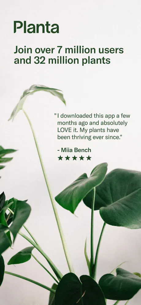
Planta App Store screenshot 1 — Brand Cover & Social Proof
01

Brand Cover & Social Proof

On-frame caption: “Join over 7 million users and 32 million plants

The opening frame contains no device. It is a full-bleed botanical photograph dominated by Monstera-type foliage in the lower two-thirds, set against a cool off-white background (~#F2F4F0). At the top left, the word 'Planta' appears in an oversized, weighty sans-serif (~#1B3A2F), establishing the wordmark as the dominant visual anchor. Beneath it, left-aligned, the line reads: 'Join over 7 million users and 32 million plants.' Mid-right, a testimonial quote is floated in the negative space between plant stems: 'I downloaded this app a few months ago and absolutely LOVE it. My plants have been thriving ever since.' Attribution follows as '- Miia Bench' with five solid black stars beneath. The layout is editorial but structurally split: the top block is anchored to the left margin, while the quote block sits in the center-right with no visible vertical alignment to the top text. This creates an asymmetry that feels intentional in a magazine spread but untethered in a mobile storefront context where a single reading column is safer. No interface, no CTA, no device frame is present, meaning this image lives or dies on brand recognition alone.
Planta App Store screenshot 2 — Care Reminders
02

Care Reminders

On-frame caption: “Care reminders for your unique plant

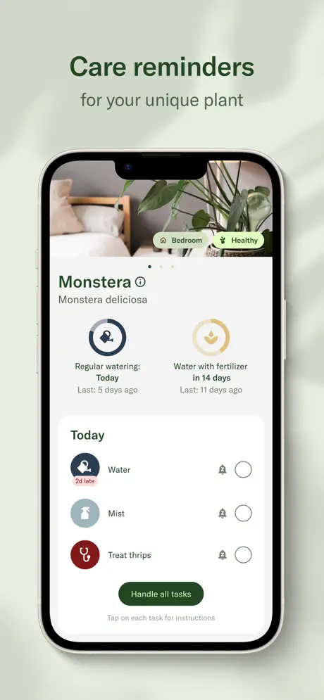
This frame establishes the template for the remaining six. Centered above a silver iPhone, the headline 'Care reminders' sits in bold dark green, with the subhead 'for your unique plant' directly underneath in a lighter grey-green. Inside the device, the app displays a plant detail screen for 'Monstera' with the latin name 'Monstera deliciosa' in smaller, lighter text. The top third is a hero photograph of the plant in a bedroom, overlaid with two pill tags reading 'Bedroom' and 'Healthy' in small dark text on a translucent light-green background. Below the hero, two circular status rings sit side by side: the left ring is a dark navy-blue (~#2C3E50) with a clock-and-droplet icon, captioned 'Regular watering: Today' and 'Last: 5 days ago'; the right ring is mustard-gold (~#C9A227) with a leaf icon, captioned 'Water with fertilizer in 14 days' and 'Last: 11 days ago'. A 'Today' task list follows with three rows: 'Water' flagged by a red-pink '2d late' badge on a salmon background (~#FFCDD2), 'Mist' with a teal spray icon, and 'Treat thrips' with a deep rust-red icon (~#8B2F2F). Each row carries a bell icon and an empty circular checkbox aligned to the right. At the bottom, a full-width dark-green button (~#1B3A2F) reads 'Handle all tasks,' with a subtle grey caption underneath: 'Tap on each task for instructions.' The device sits cleanly within the sage exterior, and nothing breaks the bezel boundary.

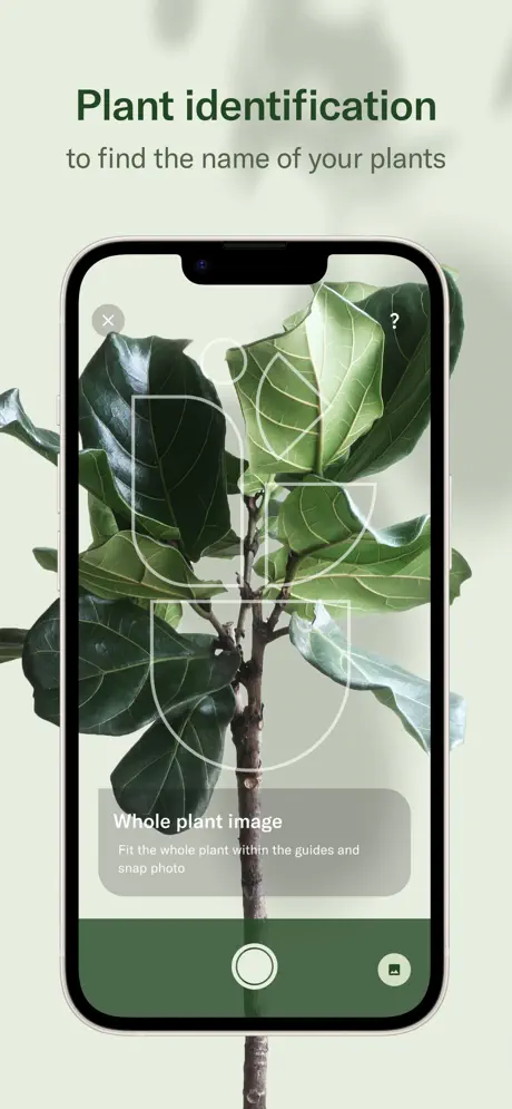
Planta App Store screenshot 3 — Plant Identification
03

Plant Identification

On-frame caption: “Plant identification to find the name of your plants

The third frame centers on computer vision. The headline reads 'Plant identification' with the subhead 'to find the name of your plants.' Inside the device, a camera viewfinder is filled with a Fiddle Leaf Fig. A white wireframe overlay—corner brackets and semicircular guides—occupies the center of the screen, instructing the user to frame the subject. At the top left is a grey circular 'X' close button; at the top right, a grey '?' help button. The bottom third contains a translucent instruction panel with the heading 'Whole plant image' and the sub-instruction 'Fit the whole plant within the guides and snap photo' in white text on a blurred dark panel. Below that sits a solid dark-green bar (~#1B3A2F) housing a large white circular shutter button and a small gallery icon. Unlike every other frame in the set, the plant stem breaks the bottom bezel of the iPhone and bleeds into the exterior sage background. This single breakout moment transforms the device from a contained screen into a composite collage, disrupting the 'aperture' consistency established in Frame 2.

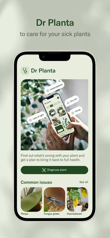
Planta App Store screenshot 4 — Dr Planta Diagnostics
04

Dr Planta Diagnostics

On-frame caption: “Dr Planta to care for your sick plants

Frame four introduces the diagnostic feature. The headline is the branded proper noun 'Dr Planta' rather than a plain verb, with the subhead 'to care for your sick plants.' Inside the device, the screen is densely layered. A large lifestyle photograph of two hands holding an iPhone occupies the upper portion; floating above this meta-image are four white pill-shaped labels with green checkmarks reading 'Underwatered,' 'Dry soil,' 'Thrips,' and 'Lack of light.' Below the photograph, body copy states: 'Find out what's wrong with your plant and get a plan to bring it back to full health.' A full-width dark-green CTA button with a stethoscope icon reads 'Diagnose plant.' Further down, a section header 'Common issues' sits left-aligned opposite a 'See all' link, above three square thumbnail images labeled 'Thrips,' 'Fungus gnats,' and 'Overwatered.' The interior background is a warm cream (~#F5F5F0). This is the busiest composition of the set: meta-photography, floating tags, body text, primary CTA, and a secondary content row all compete within a single viewport. Compared to the spacious list in Frame 2, the density here is noticeably higher, risking glance-level illegibility.

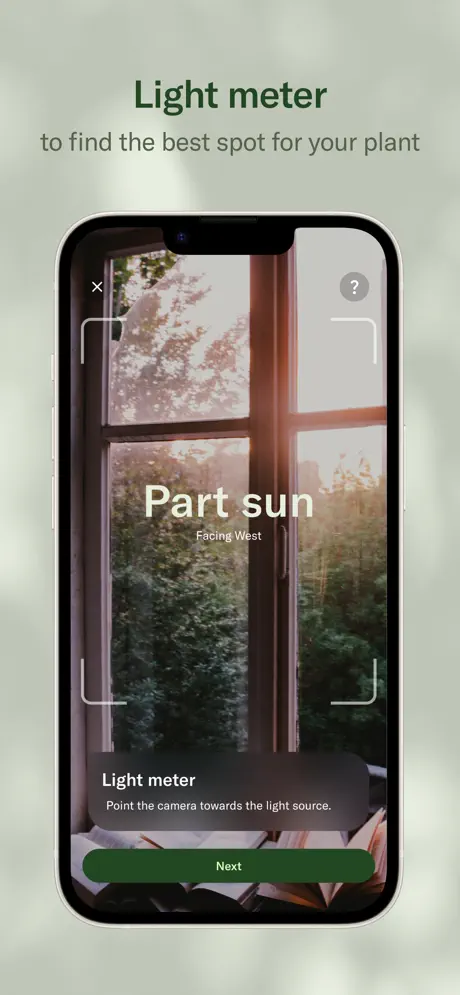
Planta App Store screenshot 5 — Light Meter
05

Light Meter

On-frame caption: “Light meter to find the best spot for your plant

The fifth frame demonstrates environmental measurement. The headline 'Light meter' is paired with the subhead 'to find the best spot for your plant.' Inside the device, the camera preview shows a sunlit window with strong golden-hour light. Centered in the viewfinder, the words 'Part sun' appear in a large, warm cream sans-serif (~#FFF8E7), with 'Facing West' set smaller underneath. Four white corner brackets form a focus reticle around the scene. The top left and right corners repeat the grey 'X' and '?' buttons from Frame 3. A bottom sheet contains the heading 'Light meter' and the instruction 'Point the camera towards the light source.' in white on a translucent dark panel, followed by a dark-green pill button labeled 'Next.' The lighting inside the preview is dramatically warm, contrasting with the cool, diffuse sage exterior. This temperature shift draws the eye inward, and unlike Frame 3, the scene is fully contained within the rounded device corners, reinforcing the illusion that the shopper is looking through the phone into their own room.

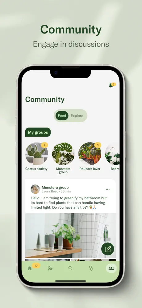
Planta App Store screenshot 6 — Community Feed
06

Community Feed

On-frame caption: “Community Engage in discussions

Frame six shifts to social features with the headline 'Community' and the subhead 'Engage in discussions.' Inside the device, the interface displays a feed layout. At the top right is a bell icon with a yellow badge containing the number '5.' Below the 'Community' header, a segmented toggle presents 'Feed' (selected, filled dark-green pill) and 'Explore' (unselected, light-grey pill). A horizontally scrolling row of circular group avatars follows, labeled 'Cactus society' (with a yellow '2' badge), 'Monstera group,' 'Rhubarb lover' (yellow '3' badge), and a truncated fourth group beginning with 'Bedro...' A post card from the Monstera group features a user avatar, the name 'Laura Reed,' a '30 min' timestamp, and the exact text: 'Hello! I am trying to greenify my bathroom but its hard to find plants that can handle having limited light. Do you have any tips? 🌿🙏' Below the text is a photo of a bathroom shelf with potted plants. A dark-green circular FAB with a white pencil icon hovers over the lower right. At the very bottom, a light pastel-green tab bar (~#C4DDB4) contains five icons: Home (with a yellow '10' badge), Care/Leaf, Search, Dr Planta/Stethoscope, and Community (active, filled). The interior background is off-white, while the tab bar introduces a tint that echoes but does not exactly match the exterior sage.

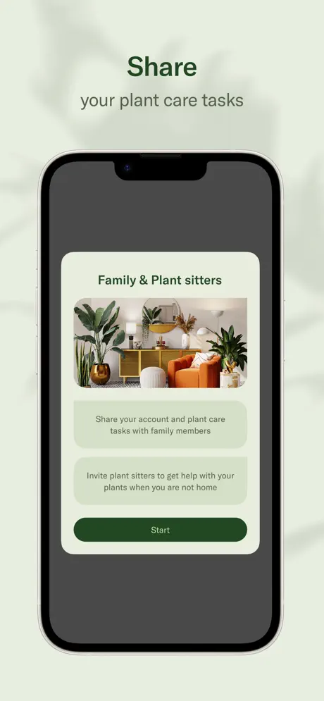
Planta App Store screenshot 7 — Share & Collaboration
07

Share & Collaboration

On-frame caption: “Share your plant care tasks

The seventh frame introduces collaboration. Headline 'Share' with subhead 'your plant care tasks.' Inside the device, the screen is dominated by a dark charcoal-grey scrim (~#555555) that dims the underlying interface almost to black. Centered on this scrim is a single white modal card with generously rounded corners (~20px radius). The card heading reads 'Family & Plant sitters,' followed by a lifestyle photograph of a mid-century living room filled with plants. Below the image are two light-green information blocks (~#E8F0E0) containing the text 'Share your account and plant care tasks with family members' and 'Invite plant sitters to get help with your plants when you are not home.' A dark-green 'Start' button anchors the bottom of the card. This frame is the tonal outlier of the entire sequence. After seven frames of bright, airy greens and warm photography, the sudden shift to heavy grey creates the visual equivalent of an overcast sky. It is the only frame where the app's interior environment is not welcomingly bright, and the darkness feels structurally disconnected from the palette cultivated in every other canvas.

Planta App Store screenshot 8 — Plant Collection Hub
08

Plant Collection Hub

On-frame caption: “Collect all your plants in one place

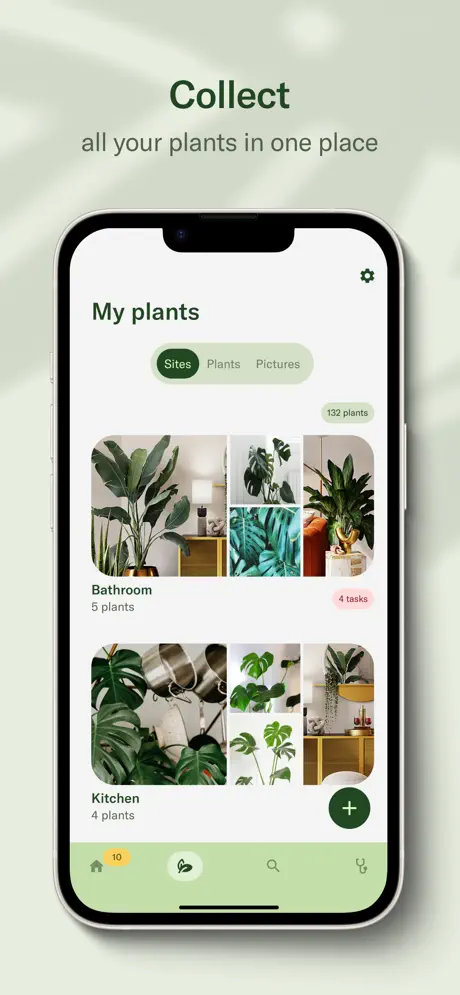
The final frame serves as an organizational anchor. Headline 'Collect' with subhead 'all your plants in one place.' Inside the device, the screen shows 'My plants' with a gear icon at the top right. A segmented control offers three options: 'Sites' (selected, dark-green pill), 'Plants,' and 'Pictures.' A small green pill to the right indicates '132 plants.' The main body is organized into site cards that function as photo collages. The first card, 'Bathroom,' displays a four-image grid featuring leafy plants in a domestic setting, labeled '5 plants' with a soft salmon-pink badge reading '4 tasks.' The second card, 'Kitchen,' shows another four-image collage with '4 plants.' A dark-green circular FAB with a white plus sign hovers at the lower right. The bottom tab bar matches Frame 6 exactly: pastel green (~#C4DDB4) with the same five icons, and the Home badge '10' still present. This closing shot emphasizes scale and spatial grouping rather than a single plant's care, suggesting that the user has graduated from individual tasks to collection management. It ends the sequence on a note of domestic maturity.

05The craft

Captions, colour and the mechanics of the sell

Caption pattern

Strict two-line hierarchy. Line one: feature verb or noun in bold (~34–40pt equivalent). Line two: benefit clause in lighter weight and smaller size (~20–24pt equivalent), always centered above the device. Frame 4 breaks the verb-noun rhythm by leading with the branded feature name 'Dr Planta' rather than a plain-English action.

Visual system

A 24-pt exterior margin frames the device on both sides. The phone sits at a consistent vertical center, leaving roughly 12–15% of the canvas above the notch for the headline pair and 10–12% below the home indicator for background texture. Shadow direction is top-left to bottom-right, suggesting ambient window light.

The thumbnail test

At thumbnail size, the dark-green headlines against the sage background remain legible, though the interior UI detail collapses into textured grey rectangles. Only the first frame’s large 'Planta' wordmark and the star rating survive at small scale.

Conversion mechanics

The sequence is front-loaded with social proof and lifestyle aspiration, deferring interface proof until Frame 2. In standard App Store search results, where only Frame 1 is visible without tapping, this means a shopper sees a plant photo, a star rating, and a user count—but zero evidence of the actual application. For a high-intent utility search ('plant care app,' 'water reminder'), this risks losing shoppers who need immediate functional confirmation.

06Where it slips

What we would change

Atmospheric discipline is the set's backbone

The repetition of the sage background, the centered device, and the two-line headline creates a scroll experience that feels intentional and expensive. The color restraint—forest green on off-white on pale sage—prevents the visual chaos common to feature-heavy utilities. Even when the interior UI grows dense, the exterior frame acts as a visual exhale.

Frame 1 sacrifices search-context conversion

The decision to open with a device-free lifestyle card is a high-risk bet on brand awareness. In search results, where the first screenshot appears as a tiny thumbnail, the shopper cannot see any interface, any button, or any task list. The fix is not to delete the frame but to relocate it. Moving it to the final position would close the narrative on an emotional high note while opening with functional proof. Alternatively, overlaying a device mockup onto the botanical photography would preserve the lifestyle mood without surrendering the interface entirely.

Frame 3's bezel break is a one-off inconsistency

The plant stem bleeding below the iPhone frame in Frame 3 is the only instance of content escaping the device boundary. In every other frame, the phone is a strict container. This creates a jarring composite effect that reads as graphic design rather than product demonstration. The fix is to crop the stem to the bezel line, maintaining the aperture logic, or to repeat the breakout motif deliberately across two or three frames so it becomes a system rather than an accident.

Frame 4 suffers from information obesity

Dr Planta is asking the shopper to parse a meta-photograph, four floating pill tags, a paragraph, a primary CTA, a section header, and three thumbnails in a single glance. The hierarchy collapses under its own weight. The fix is to isolate the value proposition: remove the 'Common issues' thumbnail row and let the 'Diagnose plant' button own the lower half of the screen. If secondary content is essential, it should be moved to a fifth frame dedicated to the diagnosis result, splitting 'initiate' and 'resolve' into two readable beats.

Frame 7's charcoal scrim kills the palette

The dark grey overlay (~#555555) in the sharing frame is tonally discordant. After seven frames of sunlit,green, and cream warmth, the shopper hits a visual wall. Modals do not have to be dark; a light blur or a white bottom sheet would have maintained the botanical atmosphere while still signaling a focused task. The fix is to reskin the sharing flow with a low-opacity white scrim or to present the collaboration card on a bright background, preserving tonal continuity.

07The recipe

How to apply this to your own app

  1. Consider the search result silhouette}

    Your first frame is your only guaranteed impression. Ask whether a shopper who has never heard of your brand can understand the app's core action from that single thumbnail. Lifestyle photography is compelling, but it should not come at the expense of functional context.

  2. Lock the container, then decide when to break it

    A consistent device frame creates a powerful rhythm. If you choose to break the bezel, do it twice or three times so it reads as a deliberate visual system rather than a stray Photoshop layer.

  3. Match your modal temperature to your environment

    Dark overlays are not neutral; they carry mood. If your brand palette is built on light and air, a charcoal scrim will feel like a mistake even if the UI pattern is technically correct. Sample your exterior background color into interior chrome whenever possible.

  4. Caption with verbs, not product names

    Headlines like 'Care reminders' and 'Light meter' communicate action immediately. Headlines like 'Dr Planta' require prior knowledge. Lead with the plain-English benefit and tuck the branded feature name inside the device or beneath the subhead.

08Takeaways

Five things worth stealing

  • Repetition of background, device position, and headline hierarchy creates a gallery-like scroll experience that reduces cognitive load across eight frames.
  • Opening with a device-free lifestyle frame is a brand-confidence move that only works if the shopper already knows the product; it sacrifices search-result comprehension.
  • The set’s color system is tightly controlled (forest / sage / cream) until Frame 7, where a charcoal modal scrim introduces a tonal dissonance that breaks the botanical mood.
  • Frame 4’s density proves that showing everything at once can obscure the value proposition; isolating the primary CTA would strengthen the narrative.
  • Breaking the device bezel in Frame 3 without repeating the effect elsewhere reads as an inconsistency rather than a creative motif.
09The verdict

What the set actually achieves

A disciplined, gallery-like sequence that prioritizes mood over immediate feature proofing, held together by repetition of a single centered-device motif and a tight, botanical palette. The set reads like a curated lookbook, but that same atmospheric discipline creates specific missed opportunities in search-context conversion and tonal consistency.

This case study is written for mobile product designers and growth teams preparing screenshot sets for lifestyle or utility apps that bridge digital tasks with physical-world outcomes. It is particularly relevant if you are weighing the trade-off between atmospheric brand storytelling and immediate functional proof.

10Questions

Frequently asked

Why is there no device in the first frame?

Frame 1 functions as a title card or brand cover. It relies on social proof ('7 million users,' a five-star testimonial) and botanical photography to set mood before introducing the interface in Frame 2. This is a high-risk choice for search-result visibility.

What is the hex value of the dark green used for headlines?

The headline green appears to be approximately #1B3A2F, used consistently for feature titles, primary buttons, and key UI text.

How does the set handle feature density?

The set sequences features across eight frames: brand, reminders, identification, diagnosis, light meter, community, sharing, and collection. Each frame isolates one major mode, though Frame 4 bundles diagnosis and common issues, making it the visually densest.

What is the biggest structural weakness?

The tonal fracture in Frame 7, where a dark charcoal modal overlay disrupts the light, airy palette established in the previous seven frames. Additionally, Frame 1 contains no interface, which may reduce tap-through rates from search results.

11Keep reading

Build your own screenshot set

The full set

8 shots
Planta App Store screenshot 1Planta App Store screenshot 2Planta App Store screenshot 3Planta App Store screenshot 4Planta App Store screenshot 5Planta App Store screenshot 6Planta App Store screenshot 7Planta App Store screenshot 8

About the app

*EDITORS' CHOICE & APP OF THE DAY* Keep your plants alive. Without guesswork. Planta helps you identify plants, understand their needs, and care for them with confidence. Get a Planta AB, via the App Store listing.

Screenshots and store metadata belong to Planta AB. They are shown here for design commentary and criticism. The analysis on this page is original work by floow.design. View the original listing.

More Lifestyle teardowns

Browse all →